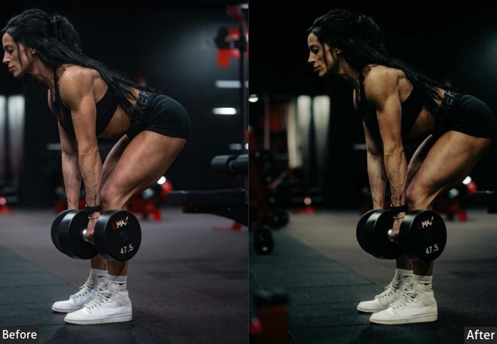
Moody edits are among the most requested looks in photography: deep shadows, controlled color tones, and the cinematic quality that makes an ordinary shot feel intentional. But getting there from scratch in Lightroom takes time, and most free presets I tried years ago were either too heavy-handed or just didn’t hold up across different lighting conditions.
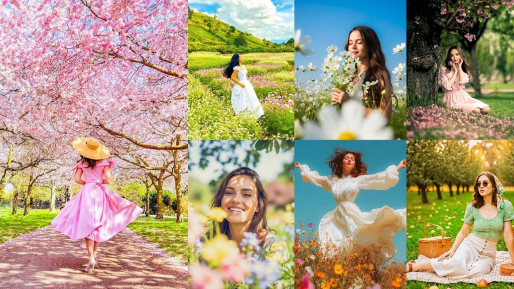
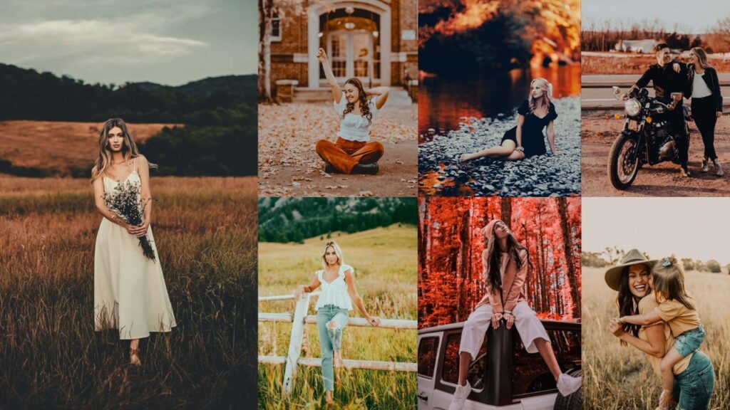
This collection is built around presets I actually use. Each style covers a specific situation: dark and dramatic for portraits, warm for golden-hour work, cold and desaturated for cityscapes at night. Below you’ll find 150 presets across various styles. all free to download as XMP (desktop) and DNG (mobile).
If you’re new to installing presets, jump to the installation guide.

Pauline Jackson
I’ve been editing in Lightroom since 2017, building presets for portrait and outdoor work. Every pack on this page was tested on real RAW files under multiple lighting conditions before publication.
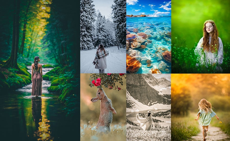
150 Moody Lightroom Presets Free Download
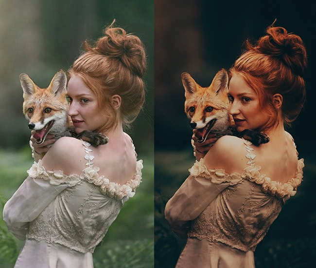
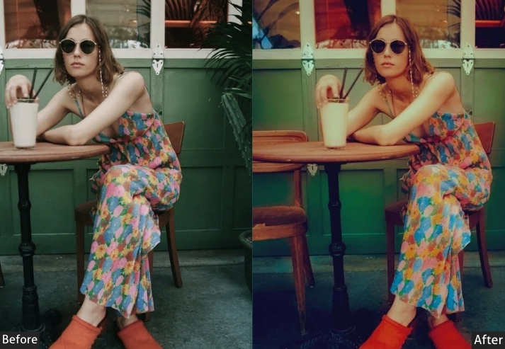
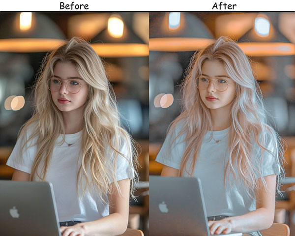
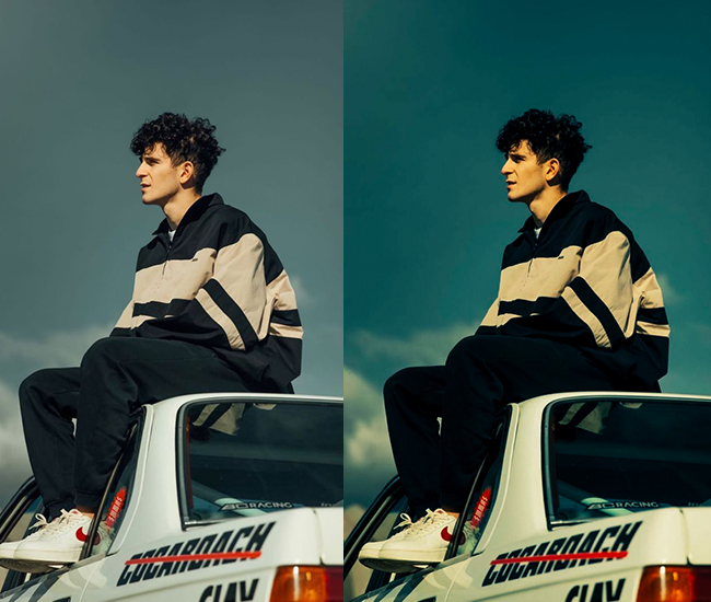
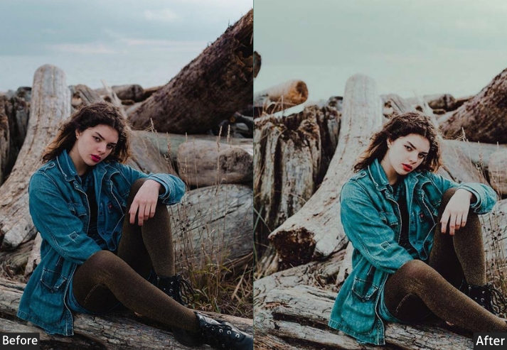
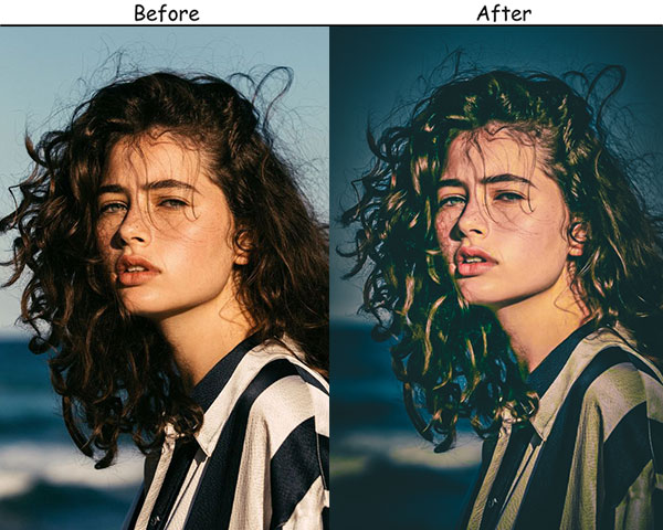
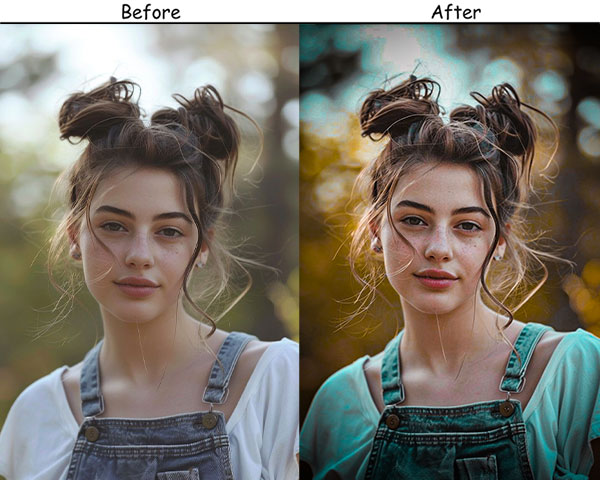
With a moody preset, you can add a layer of depth, drama, and emotion that takes the shot to a whole new level. Deep shadows, muted colors, rich textures…these presets are like magic filters that instantly make your photos feel more cinematic and intense. And all it takes is one click. Yup, really! Let’s see the preset effect with the creation process!
📦 What’s included in the download
- Formats: .XMP(Lightroom Classic & CC) and .DNG(Lightroom Mobile).
- Compatible with: Lightroom 4, 5, 6, Classic, CC, and Lightroom Mobile (iOS & Android).
- Works with Adobe Camera Raw (Photoshop) version 10.3+
- 150 presets across 19 styles – completely free, no watermark.
- Pauline Jackson
- 1. Dark Moody Preset
- 2. Vintage Moody Preset
- 3. Warm Moody Preset
- 4. Cold Moody Preset
- 5. Desaturated Moody Preset
- 6. Black & White Moody Preset
- 7. Matte Moody Preset
- 8. Forest Moody Preset
- 9. Urban Moody Preset
- 10. Blue Moody Preset
- 11. Sunset Moody Preset
- 12. Brown Moody Preset
- 13. Moody Green Preset
- 14. Moody Dark Blue Preset
- 15. Teal & Orange Moody Preset
- 16. Creamy Moody Preset
- 17. Light and Moody Preset
- 18. Moody Cinematic Preset
- 19. Moody Landscape Lightroom Preset
- 20. Moody Portrait Lightroom Preset
- 21. Moody Wedding Lightroom Preset
- 22. Moody Night Lightroom Preset
- 23. Moody Photography Preset
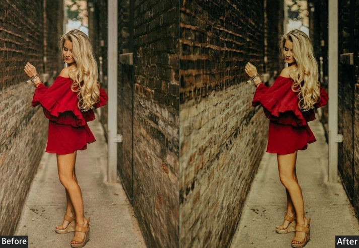
- 24. Moody Red Preset
- 25. Moody Citylight Preset
- 26. Moody Retro Preset
- 27. Moody Blush Preset
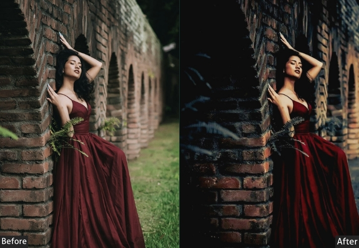
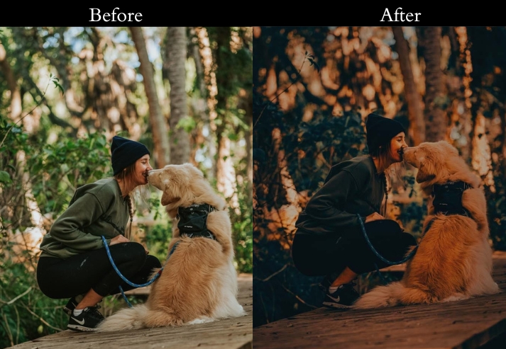
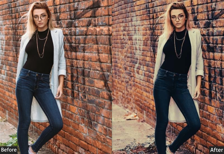
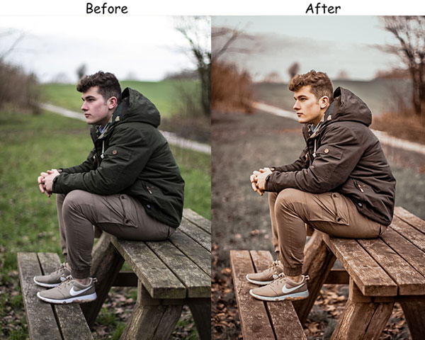
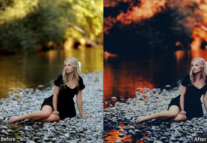
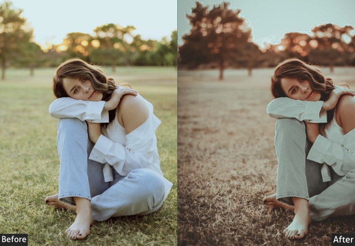
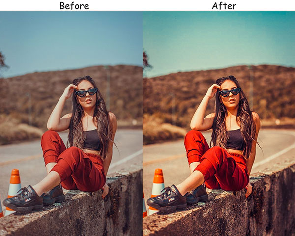
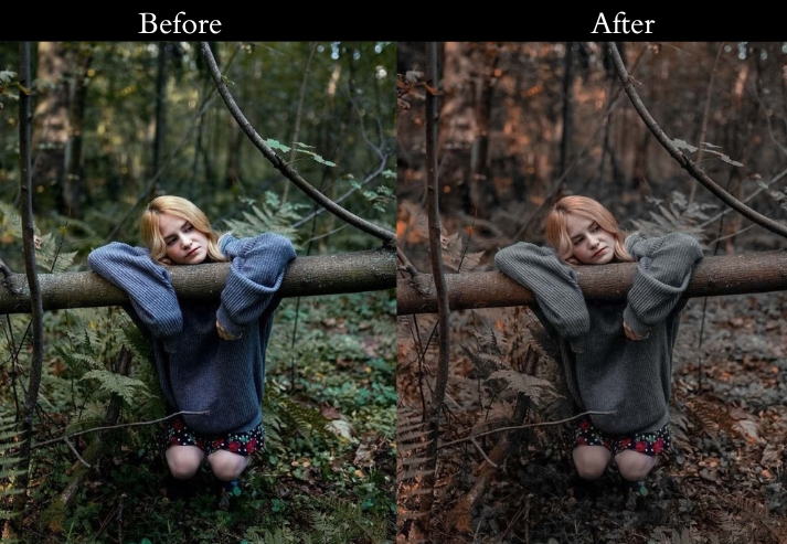
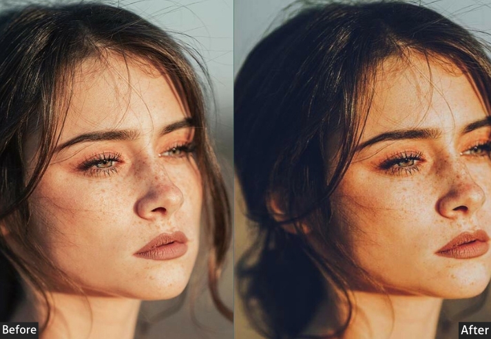
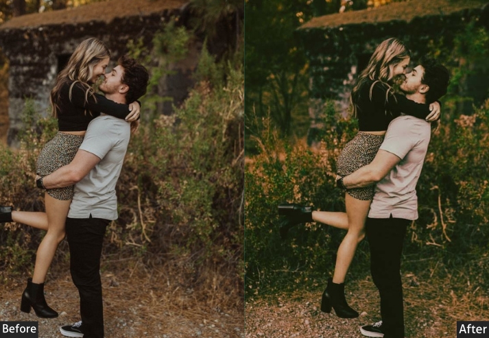
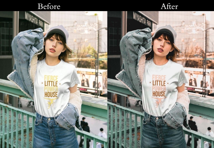
1. Dark Moody Preset
This is the most-used preset in the pack. It works by reducing exposure while increasing contrast, so darker tones stay rich rather than muddy. A bump in Clarity and Dehaze brings back edge detail that is usually swallowed by dark edits, essential for keeping portraits readable.
Best results: portraits in natural light or shade, urban scenes at dusk. Doesn’t work well on already-dark source files. You’ll need to lift Shadows slightly if your original is underexposed.
Exposure: -30% to -50% | Contrast: +30% to +40% | Highlights: -20% to -30% | Shadows: +20% to +30% | Whites: -20% to -30% | Blacks: -30% to -40% | Saturation: -10% to -20% | Clarity: +20% to +30% | Dehaze: +20% to +30%.
Purpose: Dramatic look with strong contrast and deep shadows.
Best For: Portraits, urban scenes, and dramatic landscapes.
Style: Rich, deep colors with strong contrast and pronounced shadows.
Use Case: Enhancing the mood in portraits, making urban scenes look more dramatic, and adding depth to landscapes.
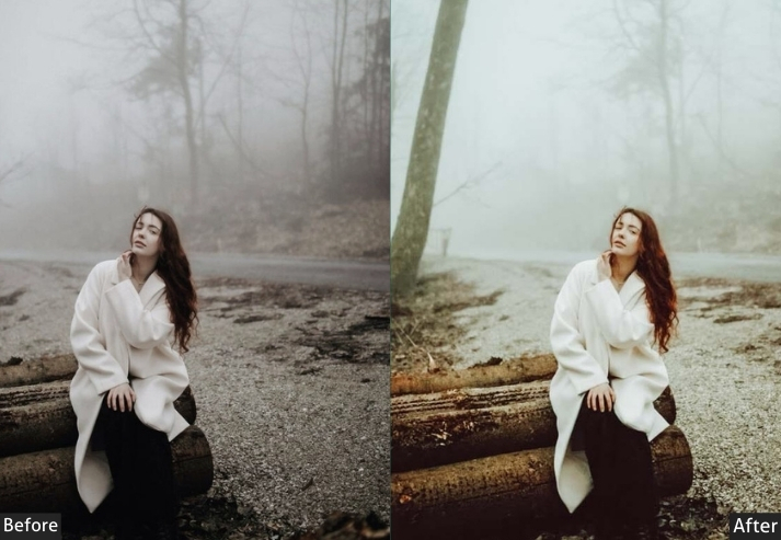
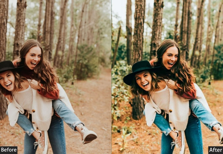
2. Vintage Moody Preset
The Vintage Moody preset draws on analog film aesthetics, specifically the faded look of Kodak color-negative film from the 1970s. A lifted tone curve keeps the blacks from going fully dark, giving that characteristic “faded” quality, while warm highlights and desaturated primaries prevent it from looking like a modern filter.
I use this most often on lifestyle shots and candid portraits where a sharp, punchy edit would feel out of place. It also handles skin tones well across different complexions because the saturation reduction is applied across all channels, not only the orange ones.
Exposure: +10% to +20% | Contrast: -20% to -30% | Highlights: -30% to -40% | Shadows: +30% to +40% | Whites: -20% to -30% | Blacks: +10% to +20% Vibrance: -20% to -30% | Clarity: -10% to -20% | Split Toning — Highlights: Hue 50, Sat 20% | Shadows: Hue 220, Sat 20%.
Purpose: Nostalgic, film-like look with soft, muted colors.
Best For: Retro-themed images, lifestyle photography.
Style: Soft, muted colors with a hint of nostalgia.
Use Case: a vintage look in lifestyle photos and retro-themed images.
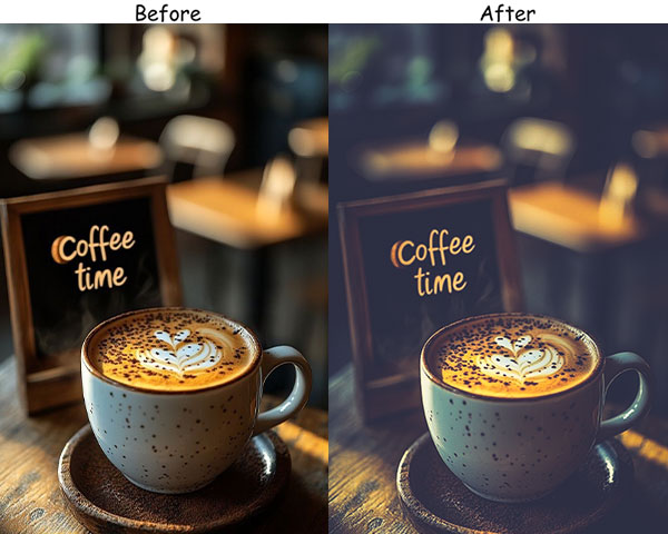
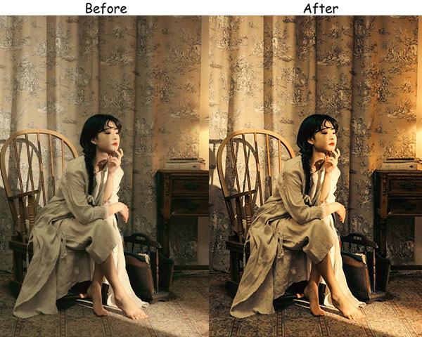
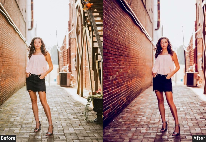
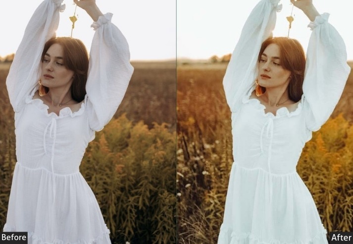
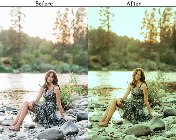
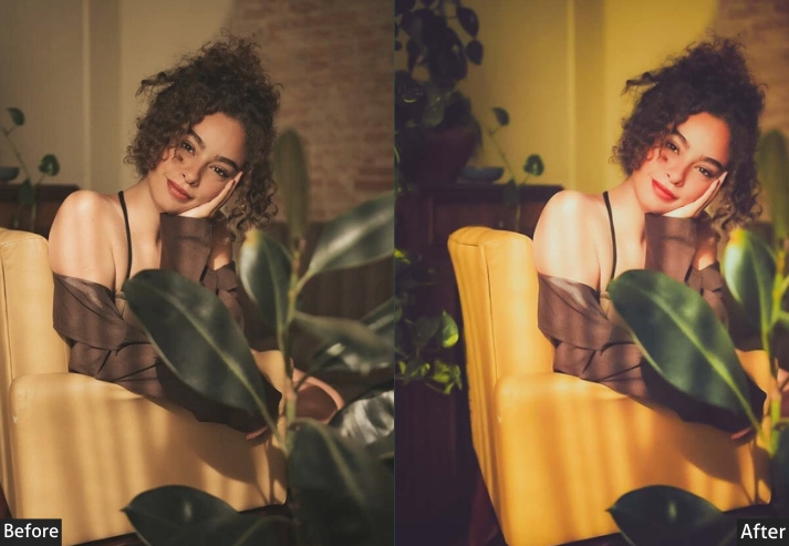
3. Warm Moody Preset
This one shifts color temperature toward yellow-orange while deliberately keeping contrast lower than you’d expect. Most warm edits blow out highlights. This one pulls them down first, which gives the warmth somewhere to sit without washing out the brightest parts of the frame.
It works especially well for autumn outdoor portraits and indoor shots with tungsten or candlelight. On outdoor scenes shot in shade, you may want to dial the temperature back 5-10 points, or it can read too yellow.
Exposure: +10% to +20% | Contrast: +10% to +20% | Highlights: -20% to -30% | Shadows: +20% to +30% | Whites: -10% to -20% | Blacks: -20% to -30% | Temperature: +10% to +20% | Vibrance: +10% to +20% | Split Toning - Highlights: Hue 50, Sat 20%.
Purpose: Warm, cozy atmosphere with golden tones.
Best For: Portraits, indoor scenes, autumn photography.
Style: Warm, inviting tones with enhanced vibrance.
Use Case: For enhancing portraits and indoor scenes, especially during autumn.
Tip: If skin tones go too orange, reduce the temperature by 5 after applying.
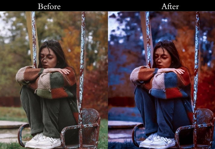
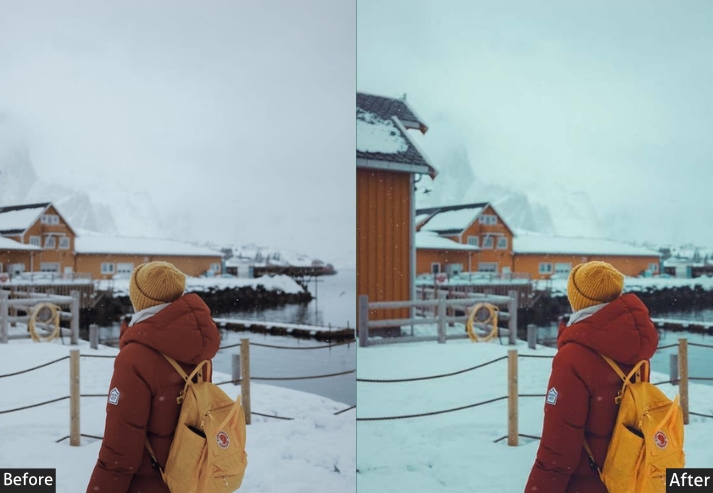
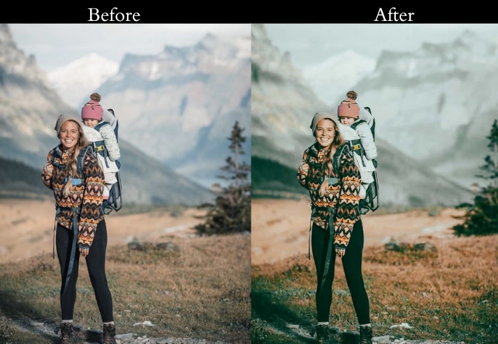
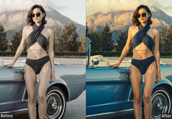
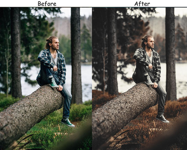
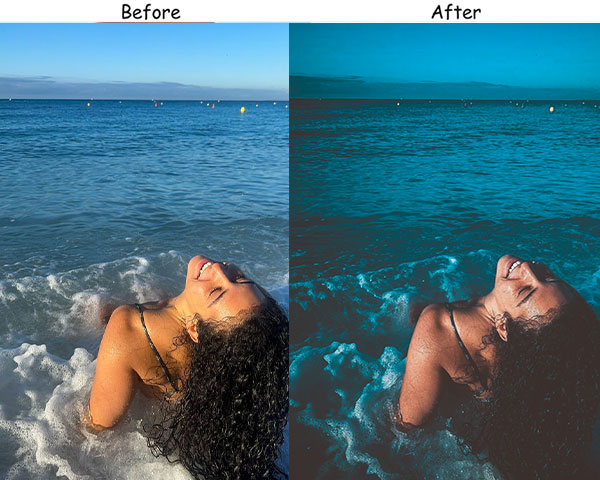
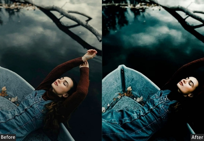
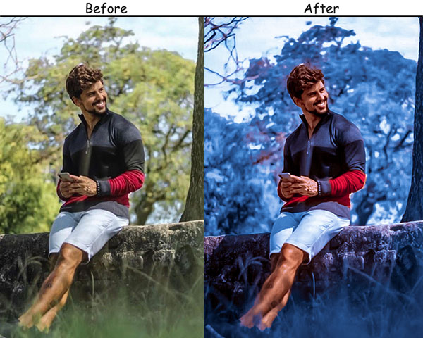
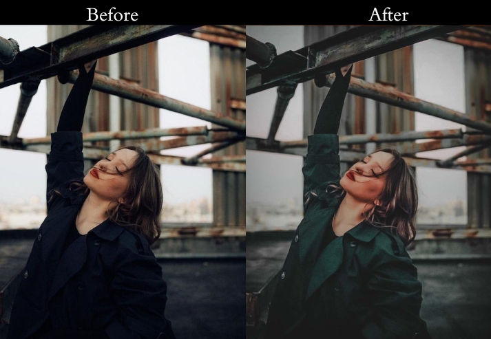
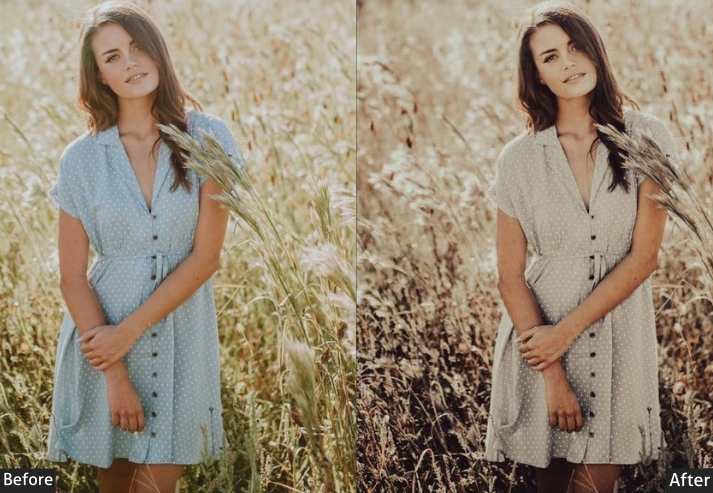
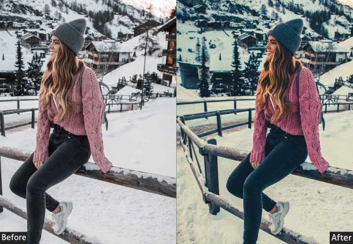
4. Cold Moody Preset
The Cold Moody preset shifts the white balance toward blue-teal while slightly increasing contrast and reducing vibrance. The effect is a clean, emotionally distant quality, controlled rather than cold for its own sake. It works by cooling the temperature slider and reinforcing that shift with a teal split tone in the highlights.
The strongest use cases are winter landscapes, cityscapes at night, and any scene with existing blue-toned ambient light (overcast sky, shade, or artificial blue lighting). Apply with caution to skin-heavy portraits. The cool shift can make skin look grey unless you re-warm the HSL Orange channel afterward.
Exposure: -10% to -20% | Contrast: +20% to +30% | Highlights: -20% to -30% | Shadows: +20% to +30% | Whites: -10% to -20% | Blacks: -20% to -30% | Temperature: -10% to -20% | Vibrance: -10% to -20% | Split Toning - Highlights: Hue 220, Sat 20%.
Purpose: Cool, somber feel with a wintry atmosphere.
Best For: Winter landscapes, cityscapes, and night photography.
Style: Cool, somber tones with a wintry feel.
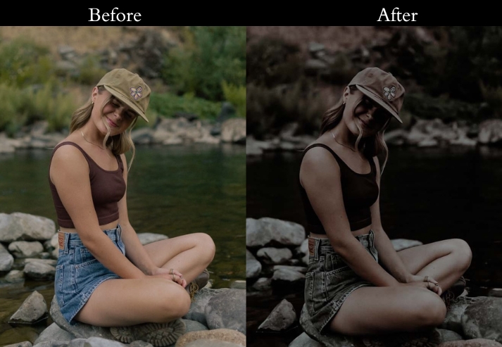
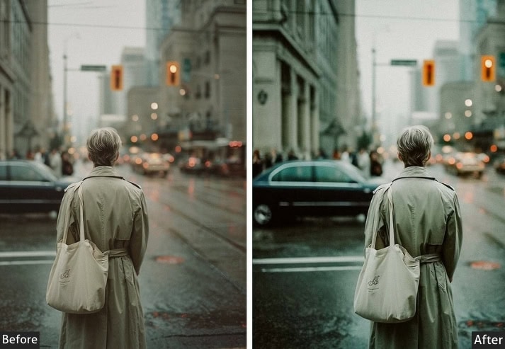
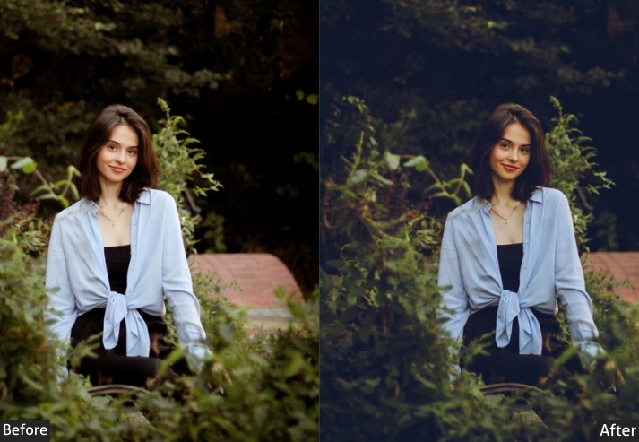
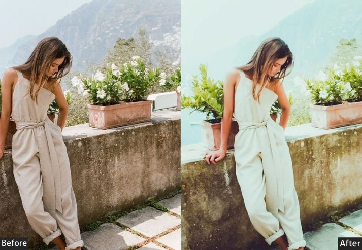
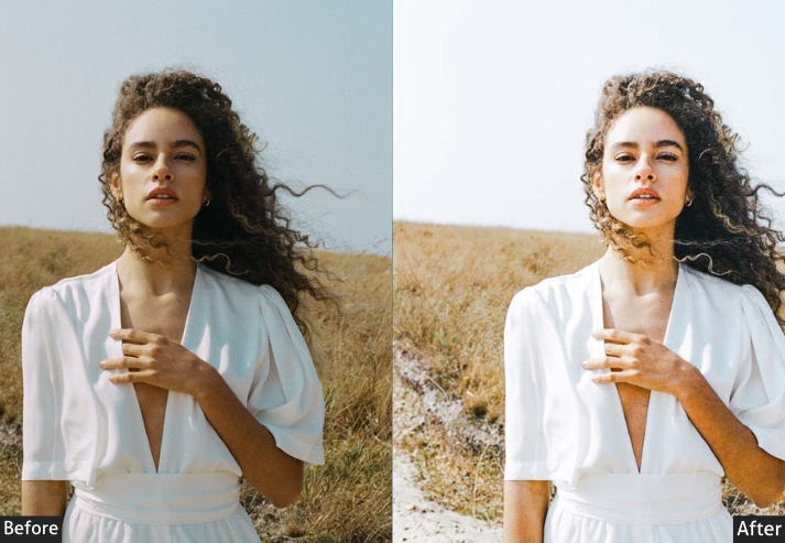
5. Desaturated Moody Preset
The Desaturated Moody preset brings both Vibrance and Saturation well below neutral, pushing colors toward near-monochrome without going fully black-and-white. The result keeps subtle hue information in the image; you can still tell a jacket is green or the sky is blue, but none of it competes for attention. The subject, texture, and light become the story.
This works particularly well for editorial portraits, architectural shots, and minimalist street photography, where bold colors would distract. It’s less effective on scenes where color is the main subject: sunsets, flower fields, or market photography will look drained rather than refined. If you want to pull back slightly from the full desaturation, try reducing Vibrance only and leaving Saturation at 0.
Exposure: -10% to -20% | Contrast: +20% to +30% | Highlights: -20% to -30% | Shadows: +20% to +30% | Whites: -10% to -20% | Blacks: -20% to -30% | Vibrance: -30% to -40% | Saturation: -20% to -30%.
Purpose: muted, minimalist look with desaturated colors.
Best For: Minimalist photography, portraits, and urban scenes.
Style: Muted colors with a minimalist look.
Use Case: For minimalist photography and creating a calm, subdued atmosphere.
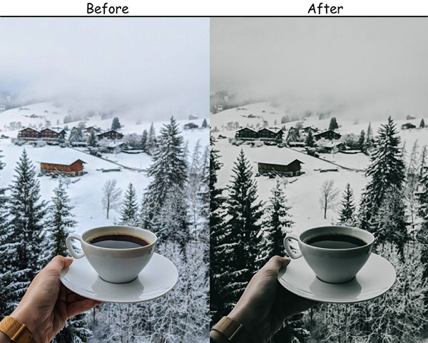
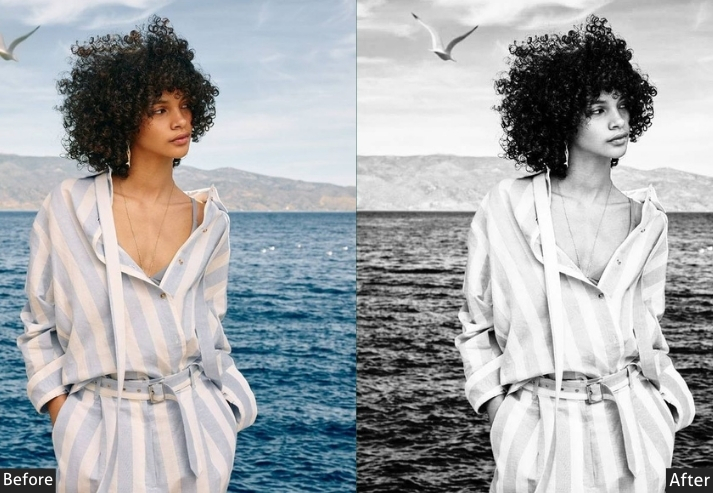
6. Black & White Moody Preset
This preset desaturates the image completely, then applies high contrast with crushed blacks and controlled highlights that stop just short of clipping. Clarity is pushed higher than in most B&W edits, which brings out fine texture in skin, fabric, concrete, and foliage. The details that give monochrome images their weight.
Portraits benefit most here, especially in shots with strong directional light, where shadows fall across the face. Architecture and fine-art photography are also strong use cases. For flat, evenly lit photos, the high-contrast setting can make tones look posterized; reduce Contrast by 10–15 and lift Blacks slightly if your source file lacks shadows.
Exposure: +10% to +20% | Contrast: +40% to +50% | Highlights: -30% to -40% | Shadows: +30% to +40% | Whites: +10% to +20% | Blacks: -40% to -50% | Clarity: +30% to +40%.
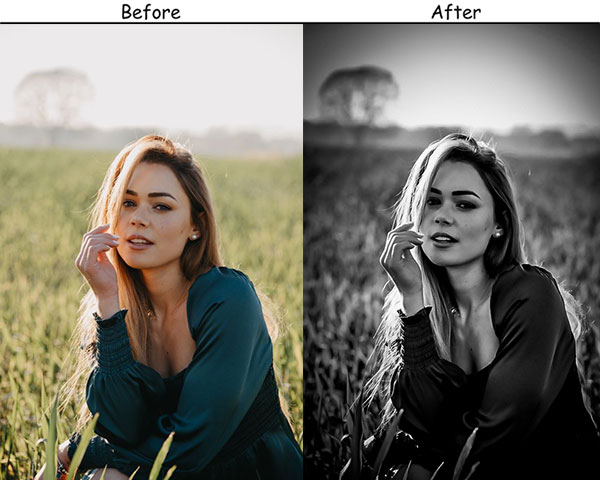
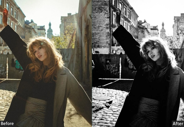
Purpose: High-contrast monochrome with strong texture.
Best For: Portraits, architecture, and dramatic scenes.
Style: High contrast black and white with enhanced texture.
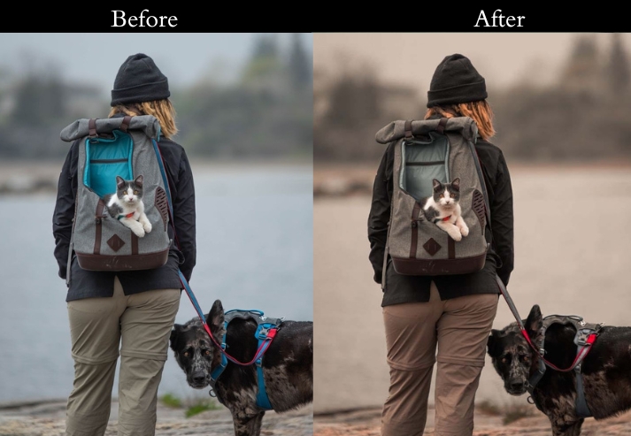
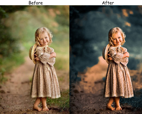
7. Matte Moody Preset
The Matte Moody gets its signature look from one specific move: the black point on the tone curve is lifted upward, turning what would be pure black into a dark grey. This flattens the overall contrast range of the image without affecting the midtones, creating the subtle, faded quality you see in magazine editorial photography and fashion work.
It pairs well with subjects that have smooth, even tones: fashion portraits, soft lifestyle photos, and product photography on neutral backgrounds. The matte treatment tends to look particularly strong on images that are slightly overexposed to begin with. The lifted blacks feel intentional rather than washed out. Avoid using it on already low-contrast scenes; the result will look underexposed rather than matte.
Exposure: +10% to +20% | Contrast: -30% to -40% | Highlights: -20% to -30% | Shadows: +30% to +40% | Whites: -10% to -20% | Blacks: +40% to +50% | Clarity: -10% to -20% | Tone Curve: Lift shadow point (bottom-left) upward by ~20%.
Purpose: To add a soft, muted effect with reduced contrast.
Best For: Lifestyle photography, portraits, and soft landscapes.
Style: Soft, muted tones with a gentle look.
Use Case: dreamy, elegant touch to lifestyle and portrait photos.
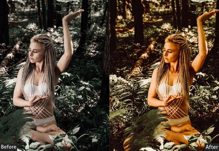
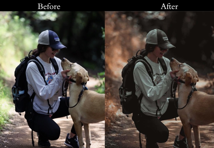
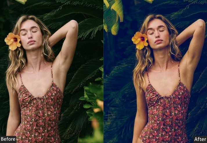
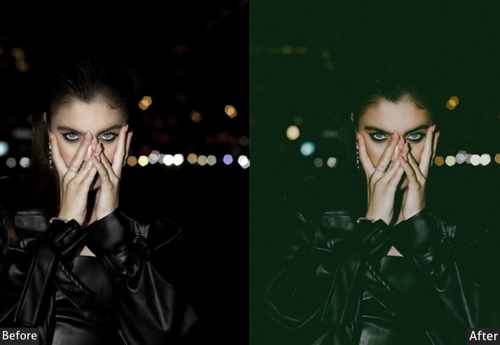
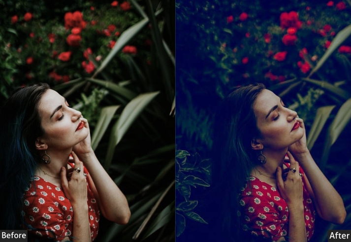
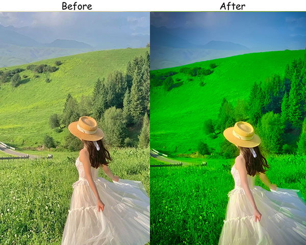
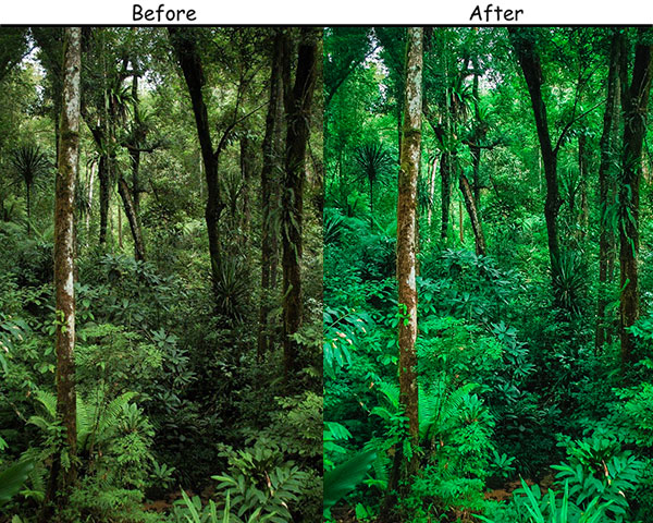
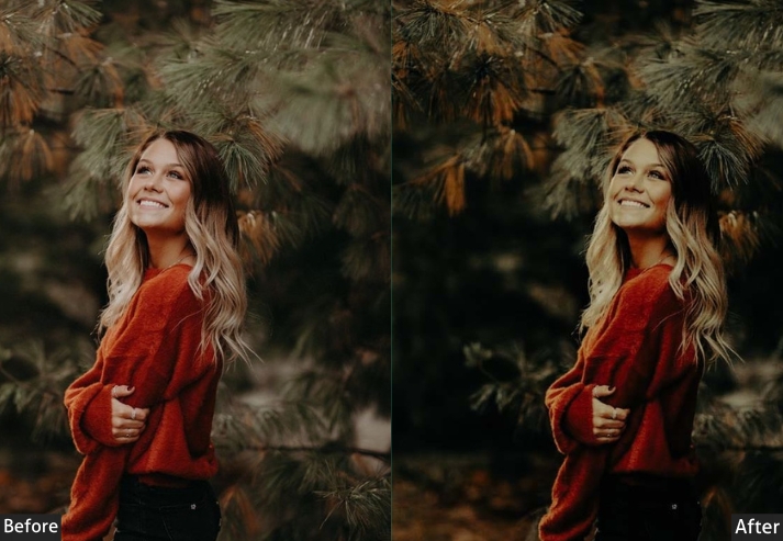
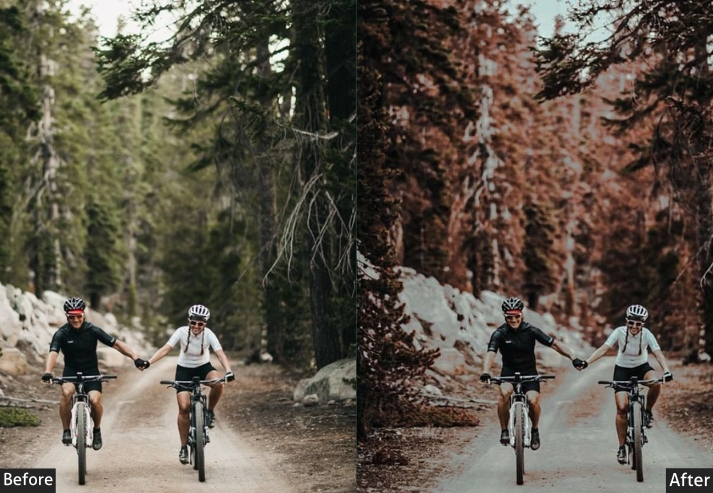
8. Forest Moody Preset
This one works by selectively enhancing the green and yellow-green channels in the HSL panel while darkening their luminance, which deepens the visual weight of foliage without making it look artificially saturated. Contrast is moderately pushed up, and blacks are pulled down, so the depth of a wooded canopy reads properly in the final image.
This preset was built specifically for outdoor woodland photography: trails, dense tree cover, mossy ground, and overcast-lit forest interiors all benefit from it. It does not translate as well to open landscapes without tree cover, where the green enhancement can make grass look oversaturated. For those scenes, lower the Green Saturation slider by 10-15 points after applying.
Exposure: -10% to -20% | Contrast: +20% to +30% | Highlights: -20% to -30% Shadows: +20% to +30% | Whites: -10% to -20% | Blacks: -30% to -40% | Vibrance: +10% to +20% | HSL - Greens: Saturation +20% to +30%, Luminance -10% to -20%.
Purpose: Enhance the greens and browns for a natural, earthy look.
Best For: Woodland and nature photography.
Style: Vibrant greens and browns with a natural feel.
Use Case: The beauty of nature in woodland and outdoor photos.
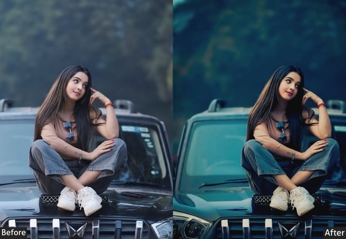
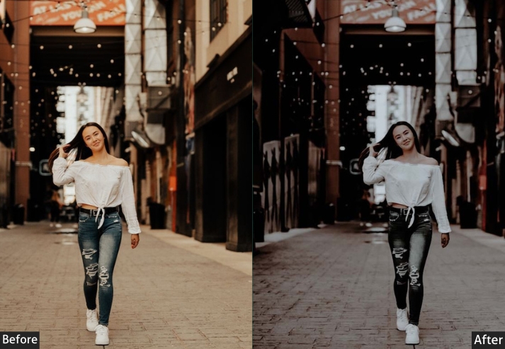
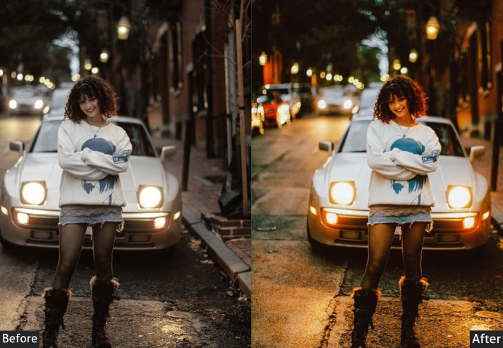
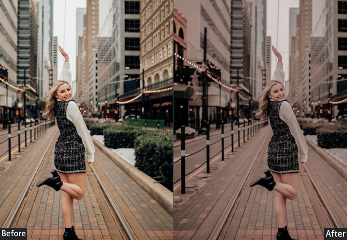
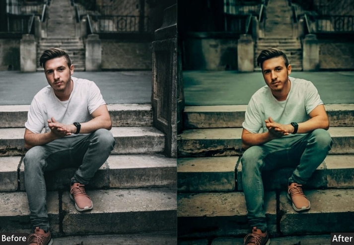
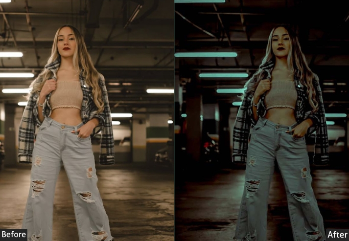
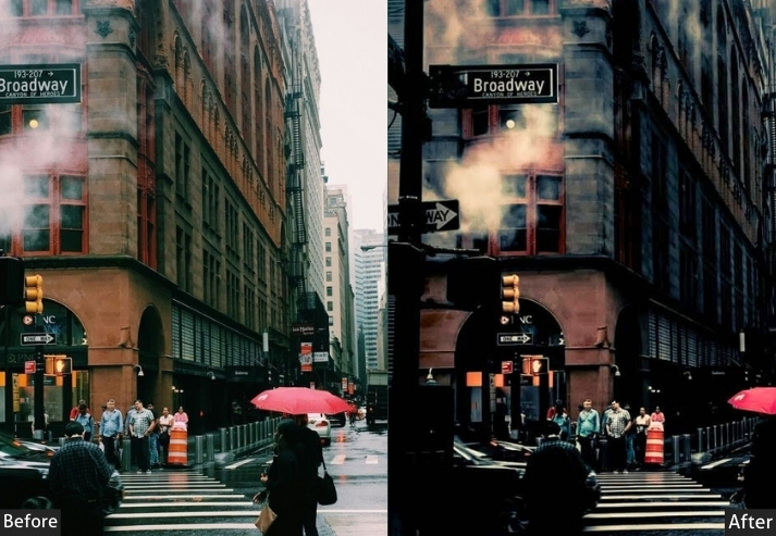
9. Urban Moody Preset
This preset is calibrated for artificial light environments: the mixed warm-cool quality of city lighting, neon reflections, and tungsten street lamps. It slightly desaturates the overall image while boosting Clarity, which separates the micro-contrast of concrete, glass, and steel textures without the harsh over-processing that HDR-style editing produces.
Works best in urban environments, photographed at dusk or night, and on overcast-day city shots where the flat light benefits from added contrast. It struggles in wide-open natural environments where the Clarity boost makes grass and foliage look over-sharpened. For daytime city photography in direct sunlight, pull Highlights down an additional 10–15 points to prevent blown-out building facades.
Exposure: -10% to -20% | Contrast: +25% to +35% | Highlights: -20% to -30% | Shadows: +10% to +20% | Whites: -10% to -20% | Blacks: -25% to -35% | Vibrance: -10% to -20% | Saturation: -10% to -15% | Clarity: +20% to +30% | Dehaze: +10%.
Purpose: gritty, dramatic look to urban scenes.
Best For: Cityscapes, street photography, and urban scenes.
Style: Gritty, dramatic tones with strong contrast.
Use Case: the raw energy and atmosphere of cityscapes and street photography.
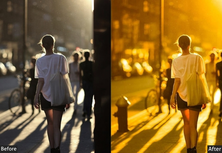
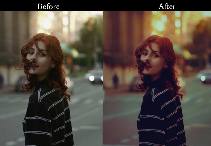
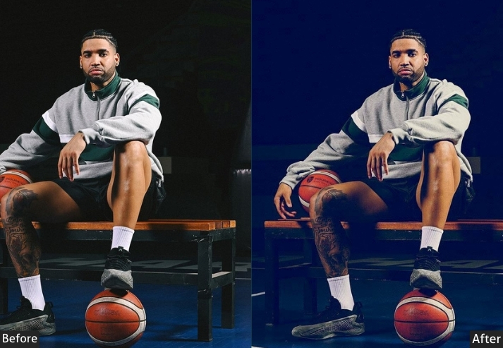
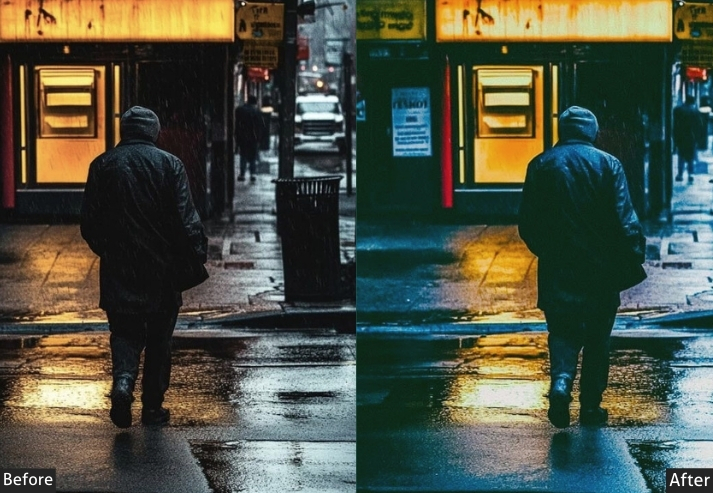
10. Blue Moody Preset
This preset captures and deepens that specific magic. It’s romantic and melancholic all at once, the kind of light that makes ordinary streets feel like movie sets. If you’ve ever chased that light and thought, “I need an edit that matches this feeling,” here you go.
Exposure: +10% to +20% | Contrast: +20% to +30% | Highlights: -20% to -30% | Shadows: +20% to +30% | Whites: -10% to -20% | Blacks: -30% to -40% | Temperature: -10% to -20% | Vibrance: +10% to +20% | Split Toning: Cool tones to highlights (Hue: 220, Saturation: 20%).

Purpose: the serene and mystical feel of twilight.
Best For: Evening landscapes, cityscapes, and night photography.
Style: Deep blues with soft lighting for a mystical feel.
Use Case: the serene beauty of blue hour moments.
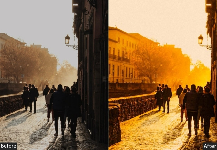
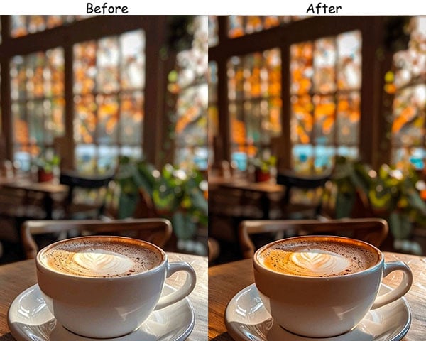
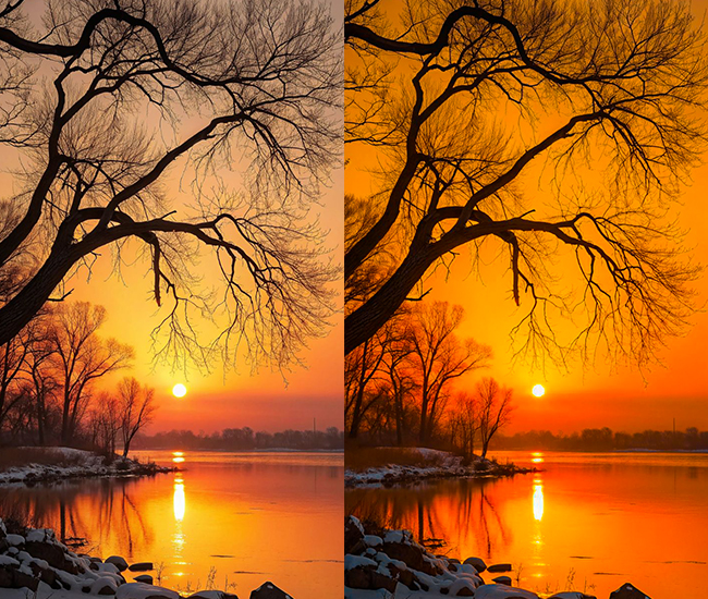
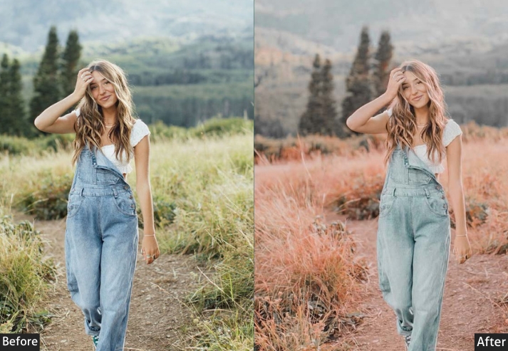
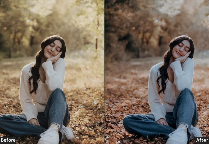
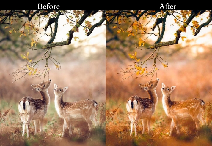
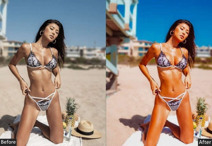
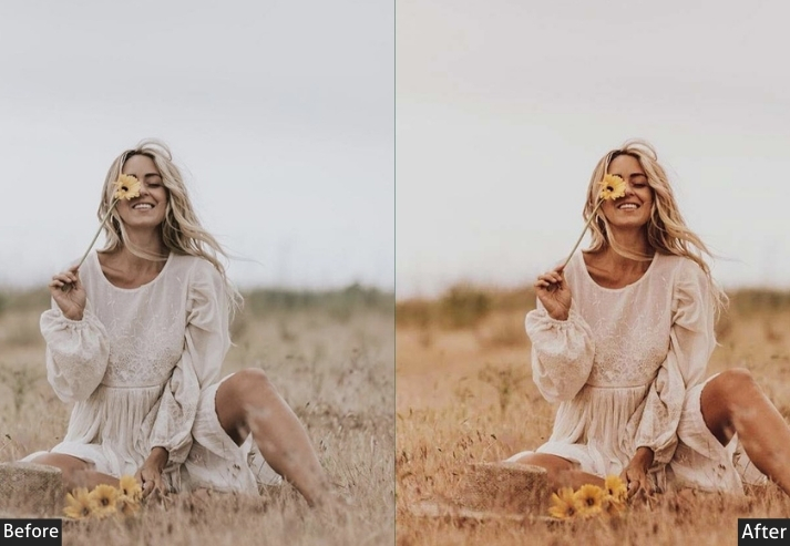
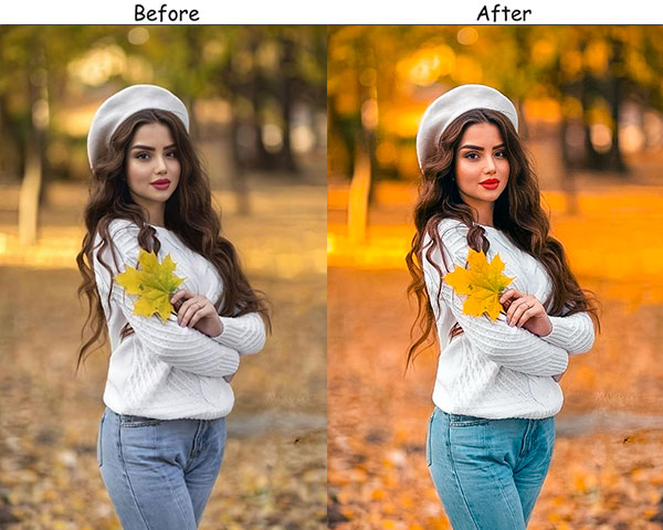
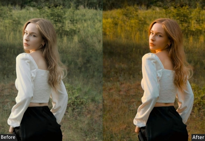
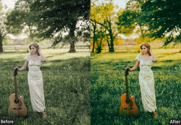
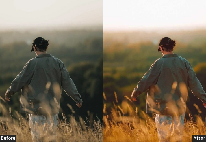
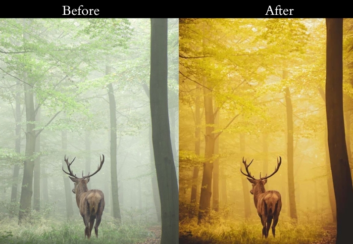
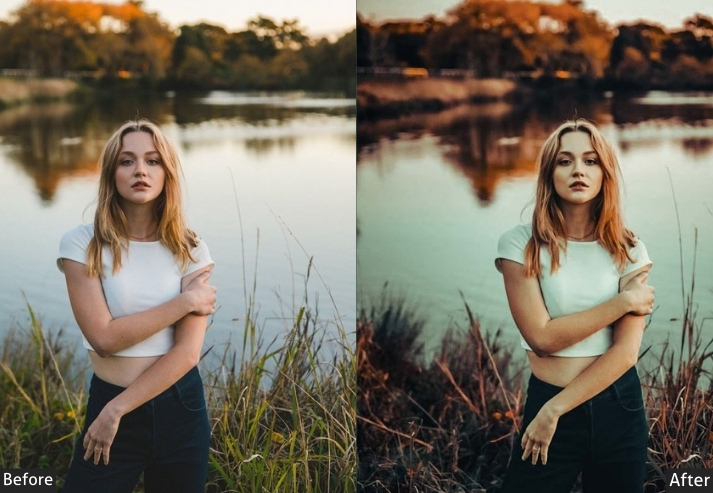
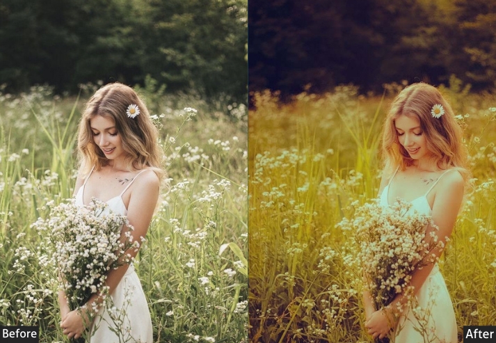
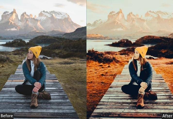
11. Sunset Moody Preset
This intensifies the amber and orange tones of late-afternoon and sunset light while keeping the overall image weighted toward darker midtones. Unlike typical sunset presets that push everything to maximum warmth, this one pulls Highlights down first, so the bright sky and light sources stay controlled, and the warmth reads in the midtones rather than washing out the whole frame.
It works on any scene photographed during the first or last hour of daylight, including backlit portraits, silhouettes, and wide landscape shots with the sun visible or a warm sky. For photos taken indoors under tungsten light, where the ambient light is already very warm, reduce the temperature by 10–15 points after applying. Without adjustment, the combined warmth can tip into yellow-green in the highlights.
Exposure: -10% to -20% | Contrast: +20% to +30% | Highlights: -30% to -40% | Shadows: +20% to +30% | Whites: -10% to -20% | Blacks: -20% to -30% | Temperature: +15% to +25% | Vibrance: +20% to +30% | HSL - Oranges + Reds: Saturation +15% to +20% | Split Toning - Highlights: Hue 45, Sat 25%.
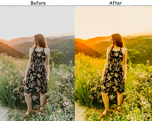
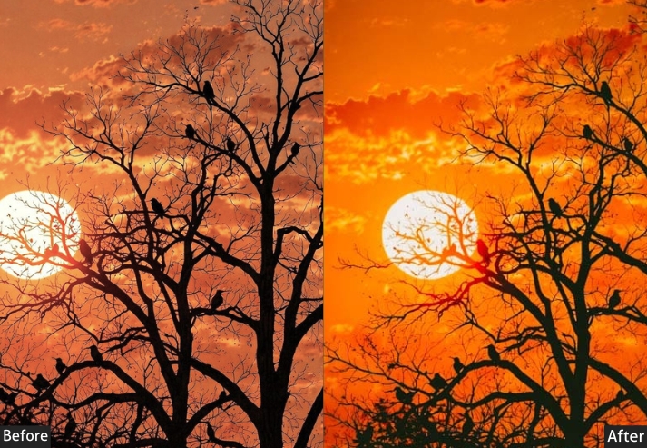
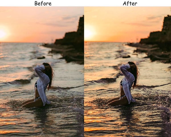
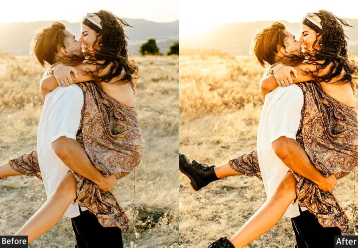
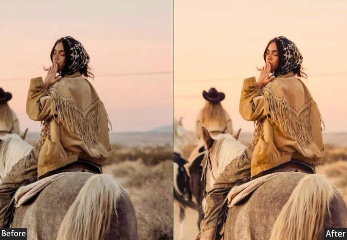
Purpose: enhance the warm, golden tones of sunset.
Best For: Sunset photography, outdoor scenes.
Style: Warm, golden tones with vibrant colors.
Use Case: look magical and vibrant.
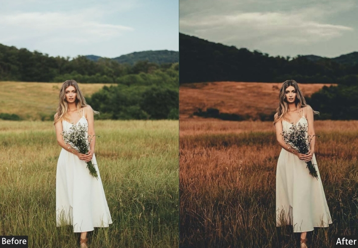
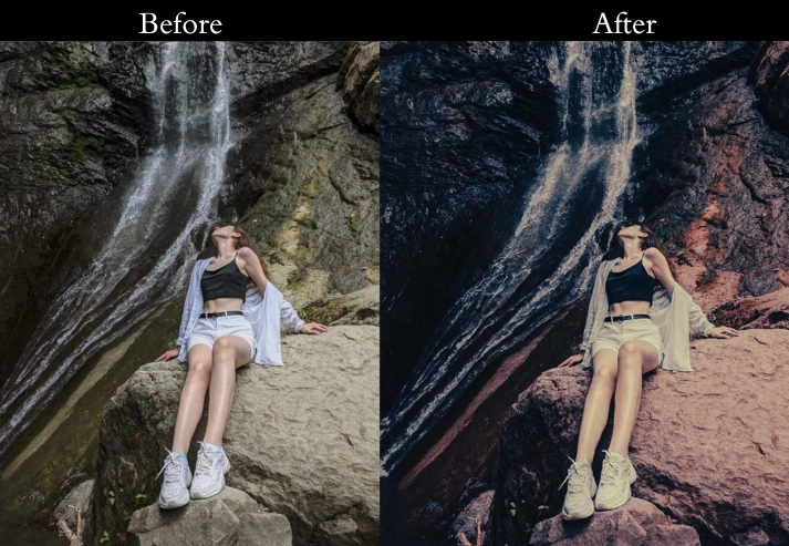
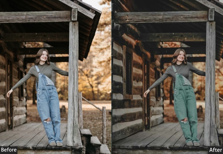
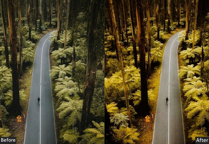
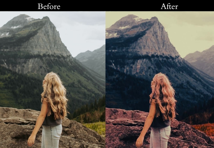
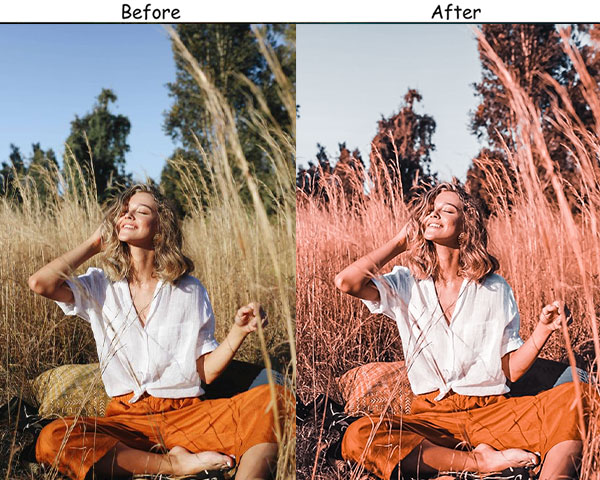
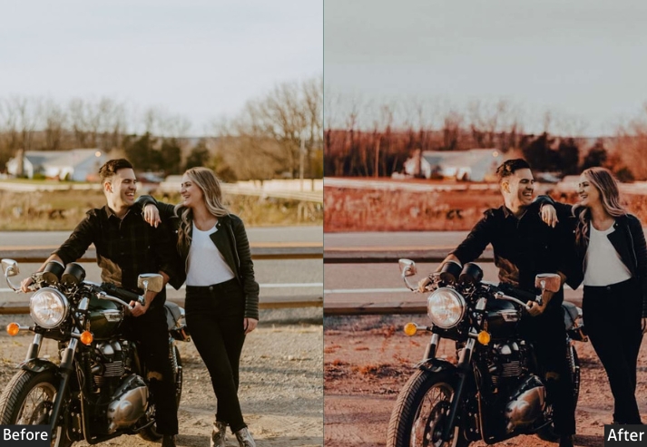
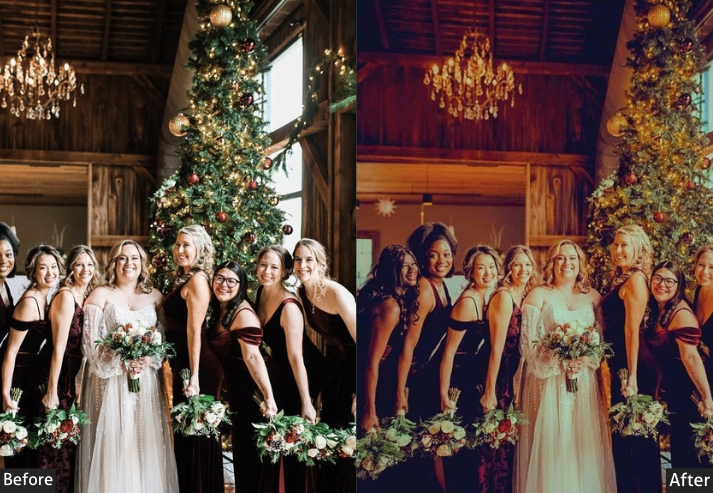
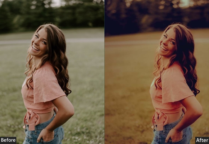
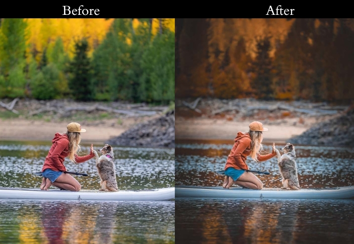
12. Brown Moody Preset
The Brown Moody is one of those edits that feels immediately familiar, like warm wood panels and leather books. It leans into sepia-adjacent tones without going full vintage, creating a grounded, almost tactile quality to images. There’s something genuinely satisfying about how it handles earthy environments: autumn forests, rustic interiors, desert landscapes. It’s the preset equivalent of a good bonfire.
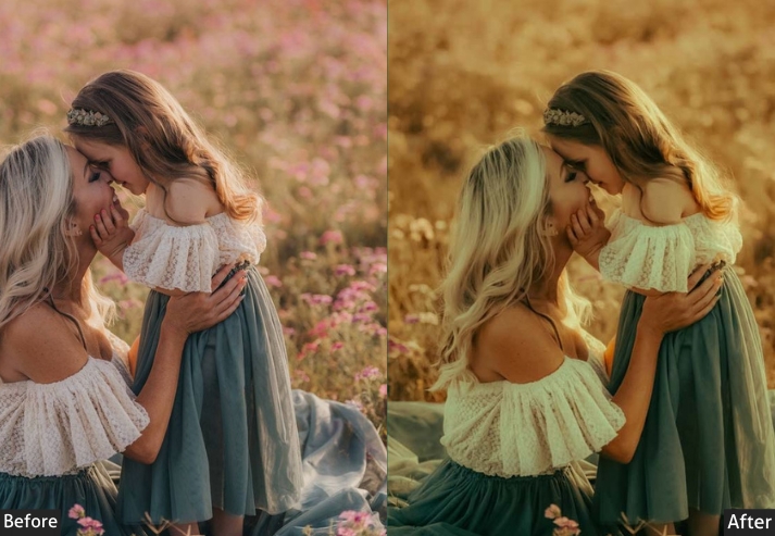
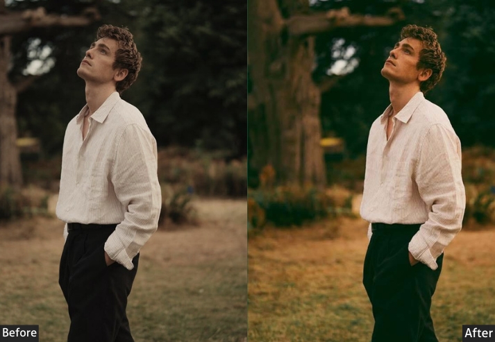
Purpose: rich, earthy tones and a warm, autumnal feel.
Best For: Nature photography, rustic scenes, and portraits.
Style: Warm, earthy tones with a cozy feel.
Use Case: Enhancing autumn landscapes and adding warmth to portraits and rustic scenes.
13. Moody Green Preset
The preset takes a different approach from the Forest preset. Rather than just deepening existing greens, it shifts all color channels slightly toward green-teal while reducing overall saturation, creating a cohesive, almost monochromatic green palette across the entire image. Shadows shift toward cooler green-teal tones via Color Grading, reinforcing the overall palette.
It works well on environmental portraits in green surroundings, rainforest and tropical photography, and any outdoor scene dominated by vegetation. The color shift can make skin look slightly olive-green in close portraits. Correct this afterward by reducing Green Hue by 5-10 in the HSL panel, or by adding a small amount of Magenta to the Tint slider.
Exposure: -10% to -20% | Contrast: +20% to +30% | Highlights: -20% to -30% | Shadows: +10% to +20% | Whites: -10% to -20% | Blacks: -20% to -30% | Vibrance: +10% to +20% | Saturation: -10% to -20% | HSL - Greens: Hue shift +10%, Saturation +20% to +30% | Color Grading - Shadows: Green-Teal (Hue 160, Sat 15%).

Purpose: vibrant and lush.
Best For: Nature and forest photography.
Style: Vibrant greens with a natural feel.
Use Case: the beauty of nature and lush landscapes.
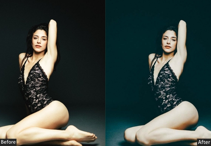
14. Moody Dark Blue Preset
This preset crushes the blacks and pulls all the color tones towards a dark, midnight blue. We use the color grading panel to cast a deep blue shadow over the entire image, while keeping the highlights relatively clean. It’s dramatic, cool, and incredibly powerful.
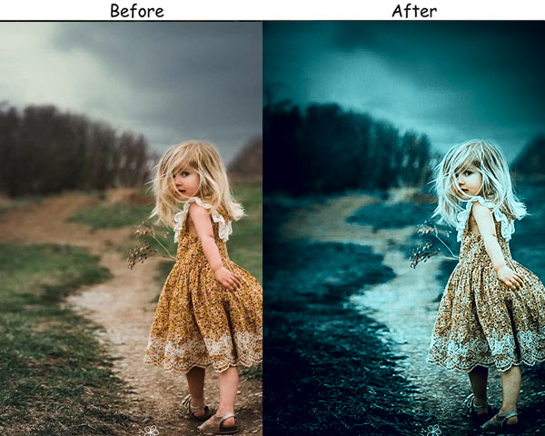
Purpose: deep, rich blue tones and a dramatic atmosphere.
Best For: Night photography, moody landscapes.
Style: Deep, rich blues with a cool feel.
Use Case: night scenes and drama in landscapes.
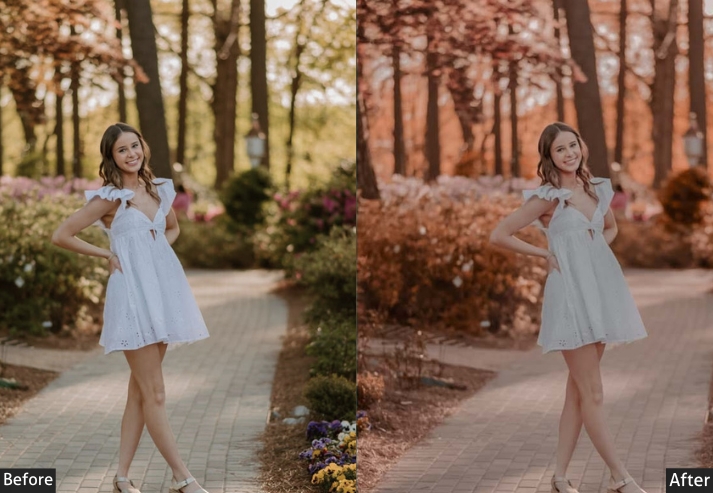
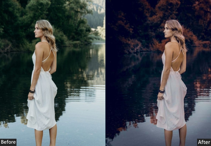
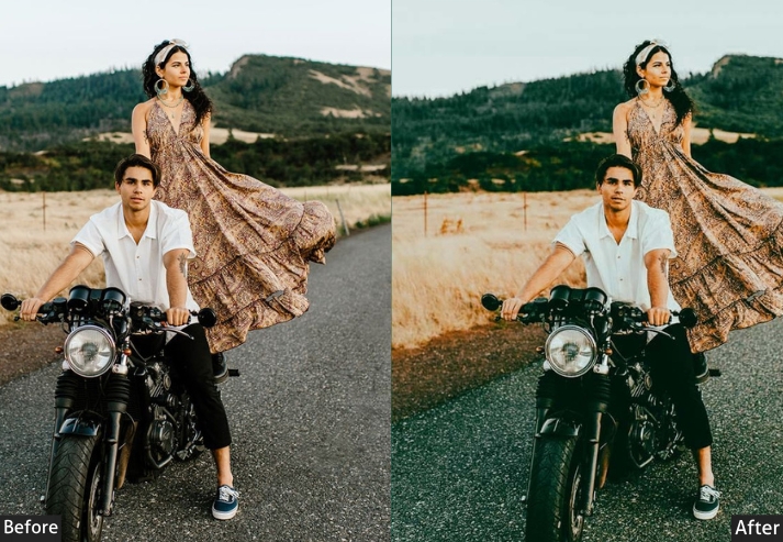
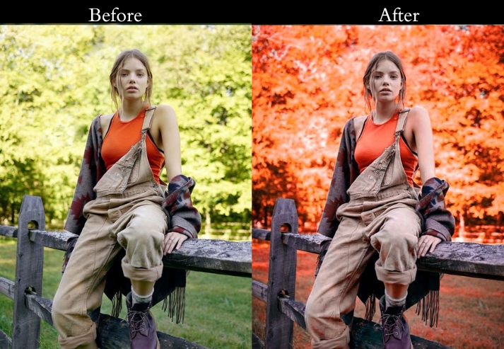
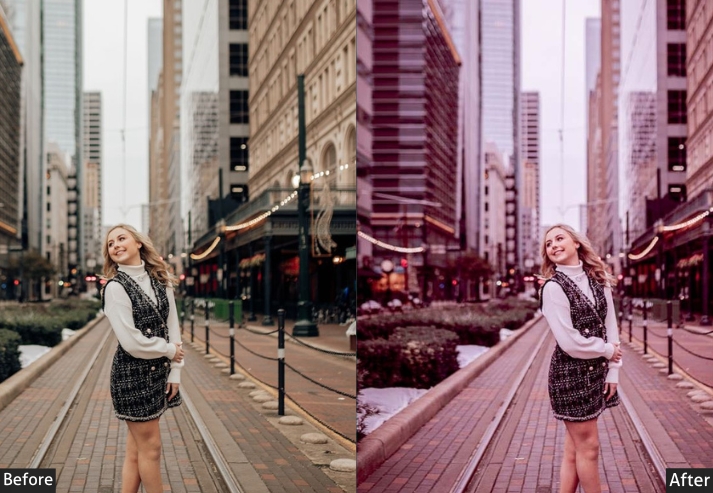
15. Teal & Orange Moody Preset
This uses the most widely recognized color-grading combination in commercial photography and film: warm orange tones in highlights and midtones against cool teal in the shadows. This works technically because orange and teal are near-complementary on the color wheel, creating natural contrast without the eye-fatigue of a full red-vs-cyan split.
It performs reliably on a wide range of subjects because most scenes already contain some skin tone (orange range) and some environmental shadow (teal range). The preset amplifies a separation that’s already there rather than forcing one. The main issue to watch for is that if your subject’s outfit, background, or environment is also orange, it can oversaturate. In those cases, reduce the Highlights saturation in Color Grading by half after applying.
Exposure: -10% to -20% | Contrast: +25% to +35% | Highlights: -10% to -20% Shadows: -10% to -20% | Whites: -10% to -20% | Blacks: -20% to -30% Vibrance: +20% to +30% | Saturation: -10% HSL - Blues: Hue shift toward Teal +20% | Oranges: Saturation +15% | Color Grading - Shadows: Teal (Hue 185, Sat 20%) | Highlights: Orange (Hue 40, Sat 20%).
Purpose: warm, orange tones, vibrant, inviting atmosphere.
Best For: Autumn photography, golden hour shots.
Style: Vibrant oranges with a warm feel.
Use Case: autumn scenes and the warmth of the golden hour.
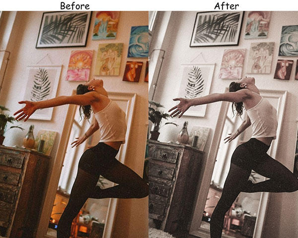
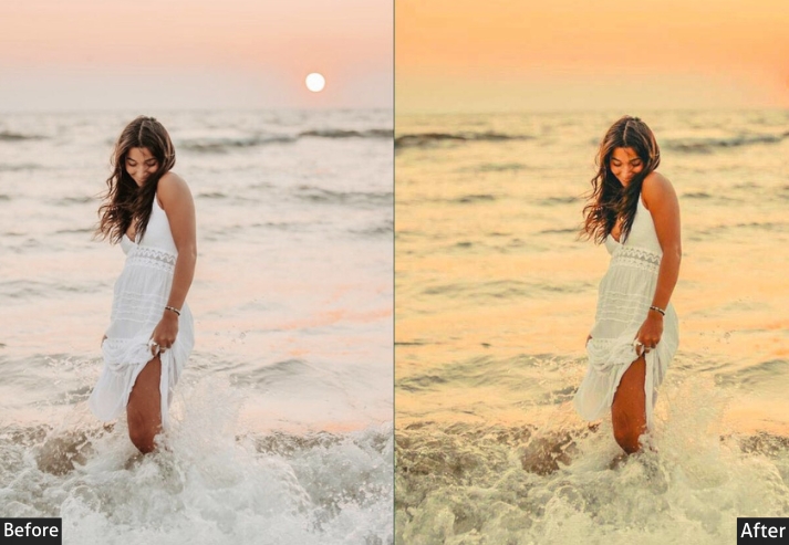
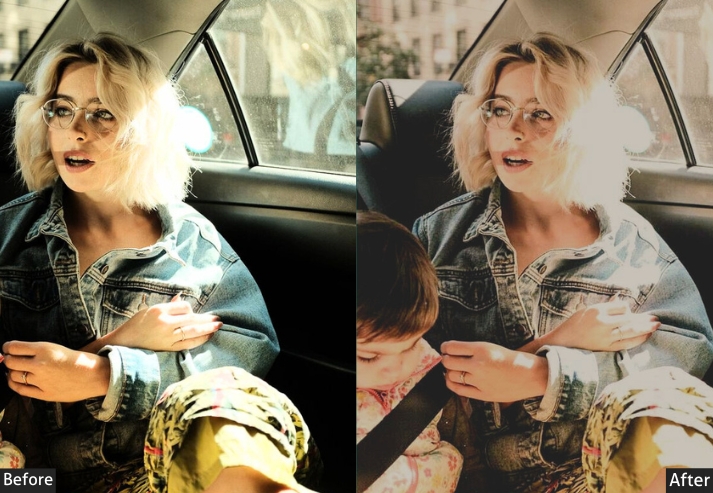
16. Creamy Moody Preset
The Creamy Moody preset is proof that “moody” doesn’t always mean “dark”. This one is softer, lifted, pastel-adjacent, warm, slightly milky, yet still unmistakably atmospheric. If the matte preset and a cappuccino had a baby, this would be it…
Purpose: soft, creamy effect with muted tones.
Best For: Portraits, lifestyle photography.
Style: Soft, creamy tones with a gentle look.
Use Case: dreamy, elegant atmosphere in portraits and lifestyle shots.
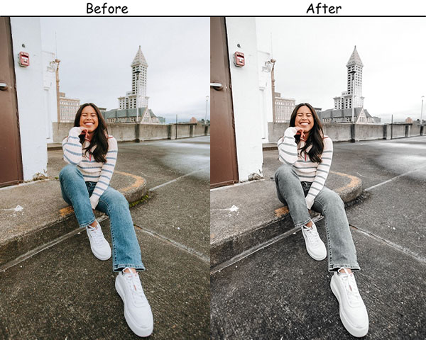
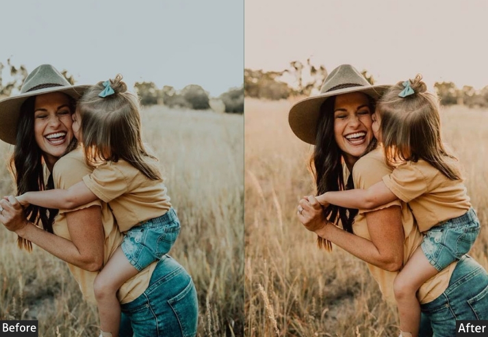
17. Light and Moody Preset
This preset finds the emotional depth of moodiness while keeping the exposure bright and airy. It’s the aesthetic that works perfectly for those who love the mood but shoot in bright, sunny environments.
Purpose: To brighten photos while maintaining a moody atmosphere.
Best For: Portraits, indoor scenes.
Style: Bright yet moody with balanced tones.
Use Case: the mood in portraits and indoor shots.
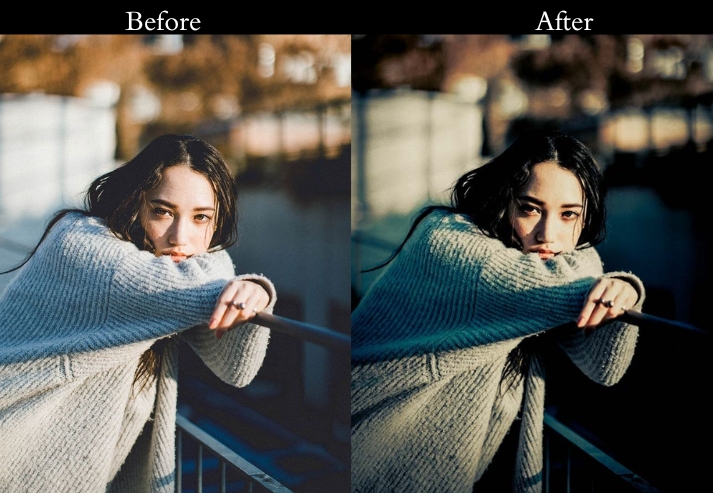
18. Moody Cinematic Preset
Lights, camera, action! The Cinematic Moody mimics the color science used in film color grading: a moderate S-curve on the tone curve, crushed blacks that stop short of pure black (giving a “lifted” feel), and a slight teal shift in the shadows offset by warmer highlights. The combination produces that recognizable Hollywood look where shadows feel deep but not empty, and highlights glow without blowing out.
It translates well across a wide range of subjects: dramatic portraits, golden-hour outdoor scenes, and urban streets at dusk. It works best on photos with a reasonably wide tonal range to begin with. A photo shot in harsh, flat light won’t gain the same S-curve depth. In that case, add a manual Tone Curve adjustment to create mid-tone contrast before applying it.
Exposure: -10% to -20% | Contrast: +30% to +40% | Highlights: -20% to -30% | Shadows: +10% to +20% | Whites: -10% to -20% | Blacks: -30% to -40% | Vibrance: +10% to +20% | Color Grading - Shadows: Teal (Hue 195, Sat 15%) | Highlights: Warm (Hue 40, Sat 10%) | Tone Curve: Moderate S-curve.
Purpose: Cinematic look with deep shadows and rich colors.
Best For: Dramatic scenes, portraits, and landscapes.
Style: Cinematic with deep shadows and rich colors.
Use Case: a movie-like atmosphere in dramatic scenes and portraits.
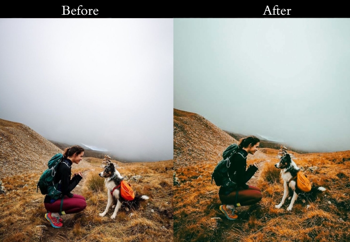
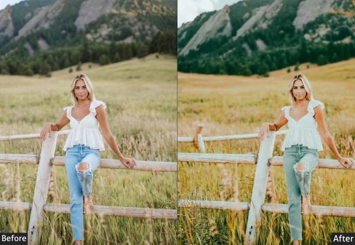
19. Moody Landscape Lightroom Preset
The preset is built around two adjustments working together: Vibrance is pushed up to bring out sky blues and foliage greens, while Dehaze cuts through atmospheric haze that flattens the sense of distance in wide shots. The result makes faraway elements – mountain ridges, horizon lines, forest layers. read with clarity and tonal depth that’s otherwise lost in JPEG compression or flat RAW files.
This preset performs best on photos with weather or atmospheric complexity, such as cloudy skies, mist, morning light, and rain. Bright midday shots in clean air will respond well but won’t benefit as dramatically from the Dehaze adjustment. If you’re working with a very bright sky, pull Highlights down an additional 10-15 points after applying to retain cloud detail.
Exposure: +10% to +20% | Contrast: +20% to +30% | Highlights: -20% to -30% | Shadows: +10% to +20% | Whites: -10% to -20% | Blacks: -30% to -40% | Vibrance: +20% to +30% | HSL - Greens + Blues: Saturation +20% to +30% | Clarity: +20% to +30% | Dehaze: +10% to +20%.

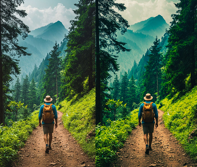
Purpose: landscapes with rich, deep tones and vibrant colors.
Best For: Outdoor and nature photography.
Style: Rich, deep tones with vibrant colors.
Use Case: depth and drama to landscape photos.
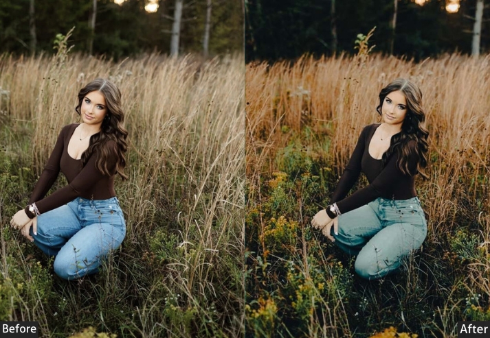
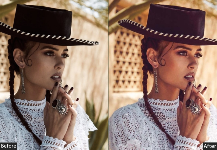
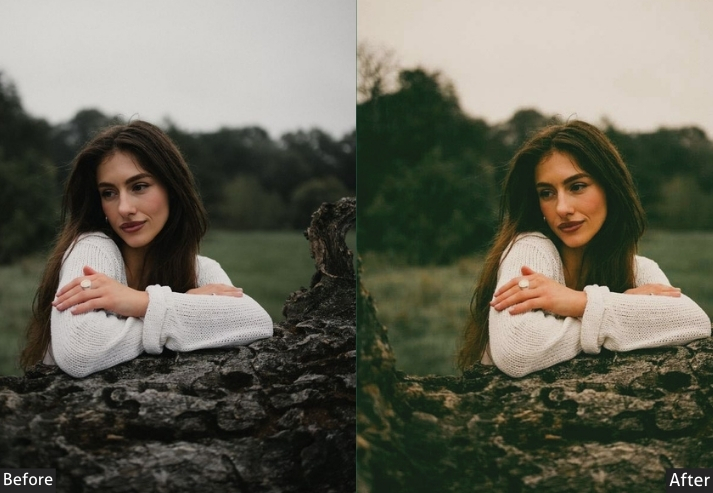
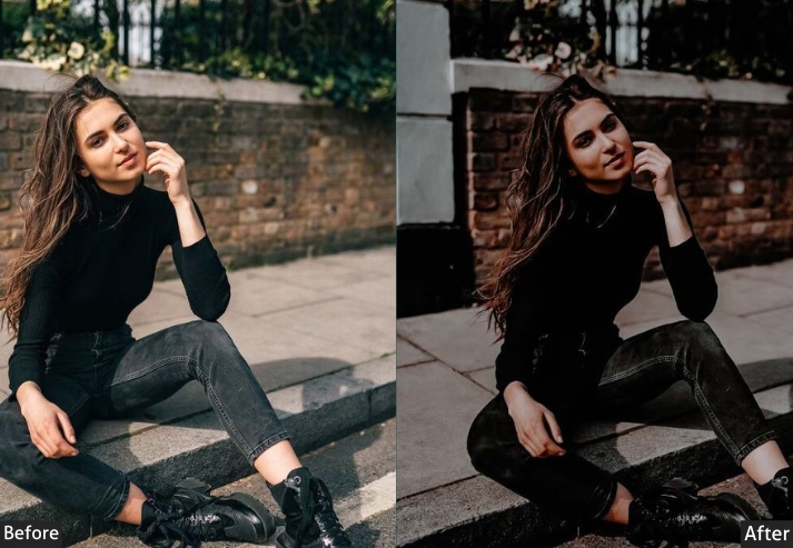
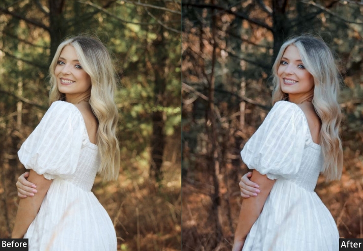
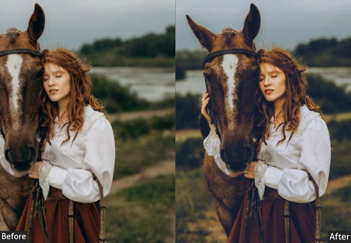
20. Moody Portrait Lightroom Preset
This preset is tuned specifically around skin tones. It deepens the overall image while being careful not to over-desaturate or cool the orange range in the HSL panel, which is where most skin tones live. Contrast and Clarity are kept moderate rather than pushed hard, which preserves smooth skin rendering while still producing a darker, moodier atmosphere.
It works across a wide range of skin tones because the adjustments avoid aggressive Saturation reductions in the Orange channel. The preset responds best to photos with some directional or window light that creates natural shadows on the subject’s face; flat studio or ring-light photos will look darker and won’t gain the tonal depth this preset is designed to enhance. Pair with a subtle radial filter to brighten the subject’s eyes if the overall darkening affects the face too much.
Exposure: -15% to -25% | Contrast: +25% to +35% | Highlights: -25% to -35% | Shadows: +10% to +20% | Whites: -10% to -20% | Blacks: -25% to -35% | HSL - Oranges: Saturation 0 (do not reduce) | Clarity: +15% to +25% | Vignette: -15 to -25 (to draw focus to subject).
Purpose: depth and emotion to portraits.
Best For: Portrait photography.
Style: Deep shadows with rich colors and emotional depth.
Use Case: dramatic and intimate portraits.
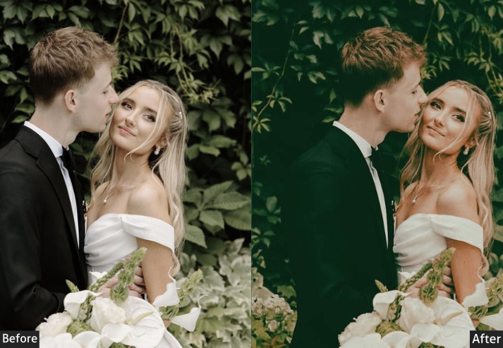
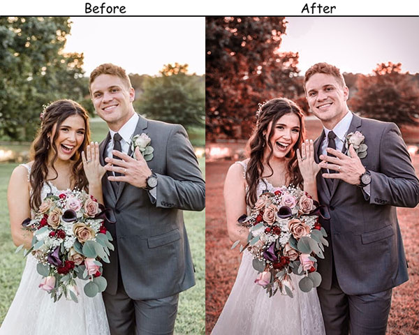
21. Moody Wedding Lightroom Preset
Wedding photography has its own unique editorial energy: timeless but contemporary, emotional but polished. This delivers exactly that: a slightly desaturated, warm-shadow, romantic quality that gives wedding images the “timeless editorial” treatment without sacrificing the joy in the moment. It’s one of those edits that clients see and immediately say, “That’s the aesthetic.”
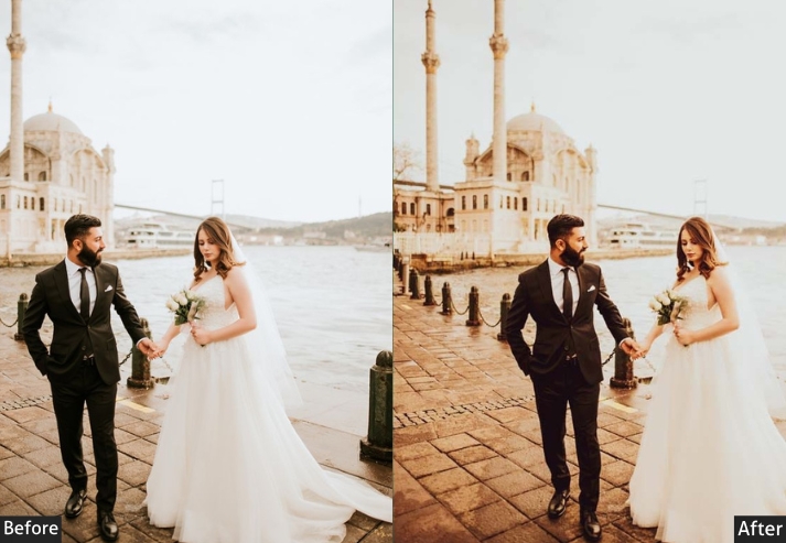
Purpose: romantic and emotional atmosphere in wedding photos.
Best For: Wedding photography.
Style: Soft, rich tones with deep shadows and emotional depth.
Use Case: intimate, romantic moments at weddings.
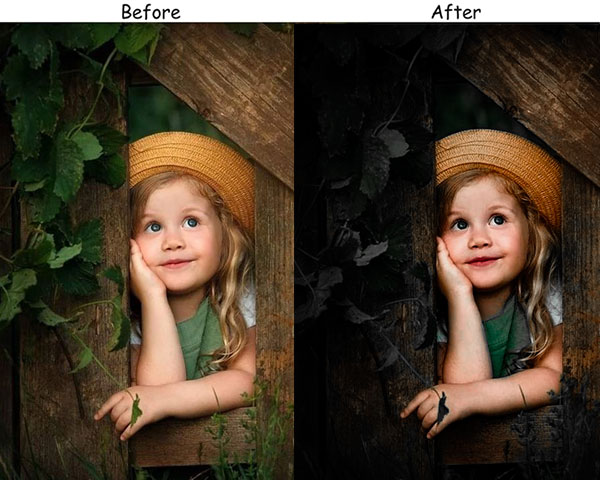
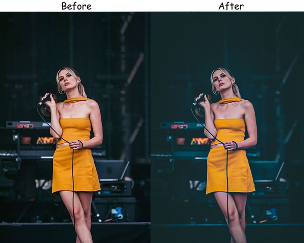
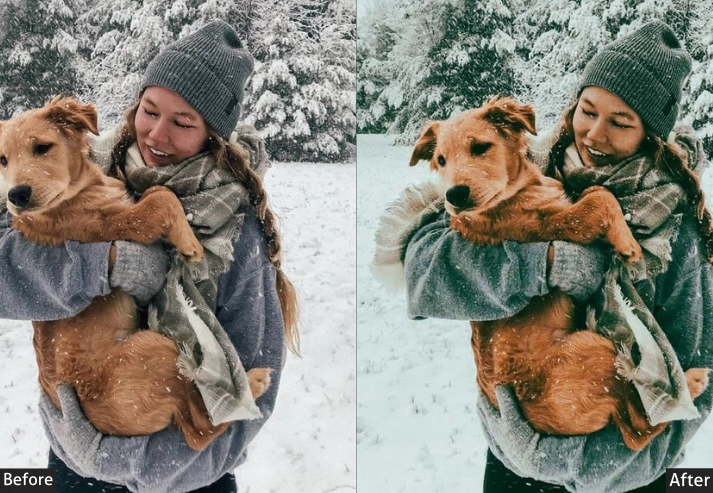
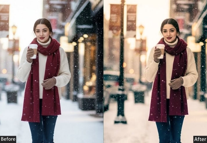
22. Moody Night Lightroom Preset
The Night Moody is built around the challenge of editing low-light photography: it lifts Shadows just enough to restore detail in near-black areas without making the image look artificially bright, while keeping Blacks low to preserve genuine depth. Noise Reduction is applied more aggressively here than in the other presets, as raising Shadows on a high-ISO file makes luminance noise much more visible.
It handles night street photography, moonlit outdoor scenes, and artificial-light environments well. For long-exposure shots of cityscapes or star trails where you want to preserve the full dark-sky atmosphere, reduce the Shadow lift by 50%. The preset’s default Shadow recovery is intended for handheld night shooting, not carefully exposed long exposures where the blacks are meant to stay dark.
Exposure: -10% to -20% | Contrast: +20% to +30% | Highlights: -30% to -40% | Shadows: +30% to +40% | Whites: -10% to -20% | Blacks: -20% to -30% | Temperature: -5% to -10% | Vibrance: -10% to -20% | Clarity: +15% to +25% | Noise Reduction: Luminance +30%, Color +25%.
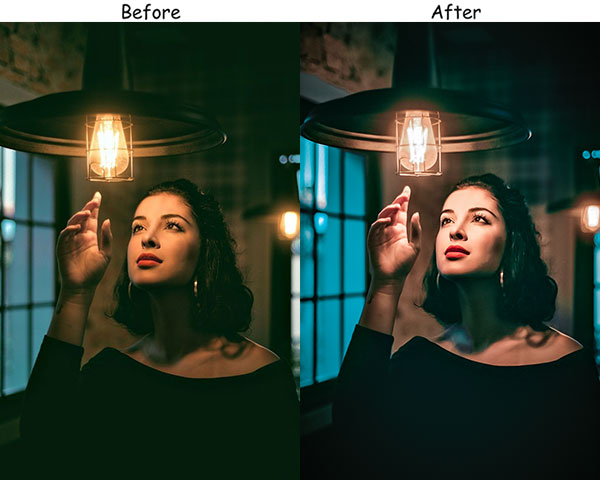
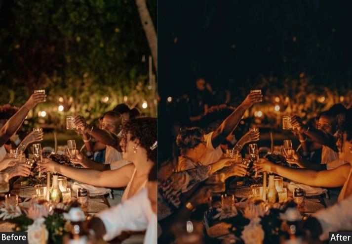
Purpose: night photos with deep, rich tones and vibrant colors.
Best For: Night photography, events, and concerts.
Style: Deep, rich tones with vibrant colors and a dramatic feel.
Use Case: the beauty and drama of nighttime scenes.
23. Moody Photography Preset
This is the “one preset to rule them all”: a universal, moody treatment that looks great across a wide range of photography styles. It’s not deeply specialized in any one direction! Instead, it finds the sweet spot of moody processing that enhances almost everything.
24. Moody Red Preset
Red is the most emotionally charged color in the spectrum, and the Moody Red preset leans hard into that. This is deep crimson, wine-dark, the color of something beautiful and slightly dangerous. It amplifies reds and magentas while desaturating everything else, creating an almost monochromatic tension in which the red elements in your image become the sole focus.
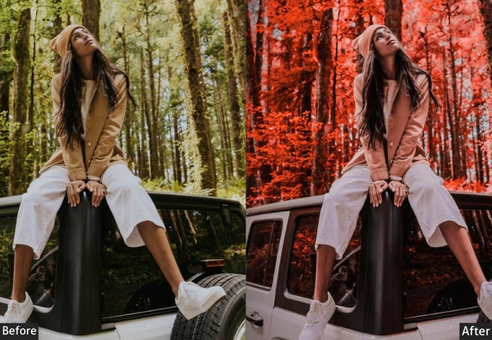
Purpose: bold and passionate look.
Best For: Portraits, urban scenes, and dramatic photography.
Style: Bold and passionate with intensified red tones.
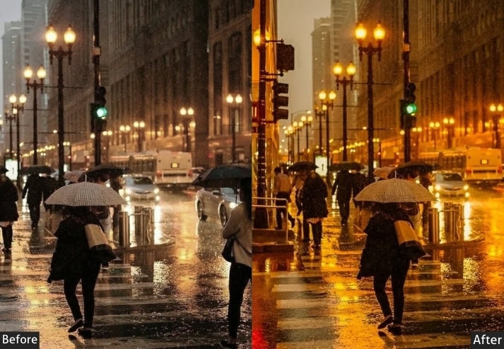
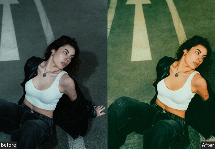
25. Moody Citylight Preset
City lights at night are pure magic! all that warm neon against cold dark skies, the reflections in wet pavement, the blur of passing headlights. The preset is specifically engineered for this scenario: it manages the extreme tonal range of night cityscapes, balances warm artificial lights against cool atmospheric sky, and produces images that look like they belong on the cover of a city-living magazine.
Purpose: urban night scenes with vibrant city lights and deep shadows.
Best For: Cityscapes, night photography, urban scenes.
Style: Vibrant city lights with deep shadows.
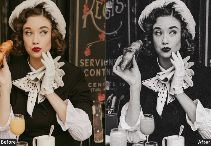
26. Moody Retro Preset
The Moody Retro is different from Vintage! It’s less about film grain and fading and more about the specific color science of photography from the 1970s and 80s: saturated but shifted colors, a slight red/magenta cast in shadows. That wonderfully imperfect quality made that era’s photography so distinctive. It’s nostalgic, warm, and completely charming. A total crowd-pleaser.
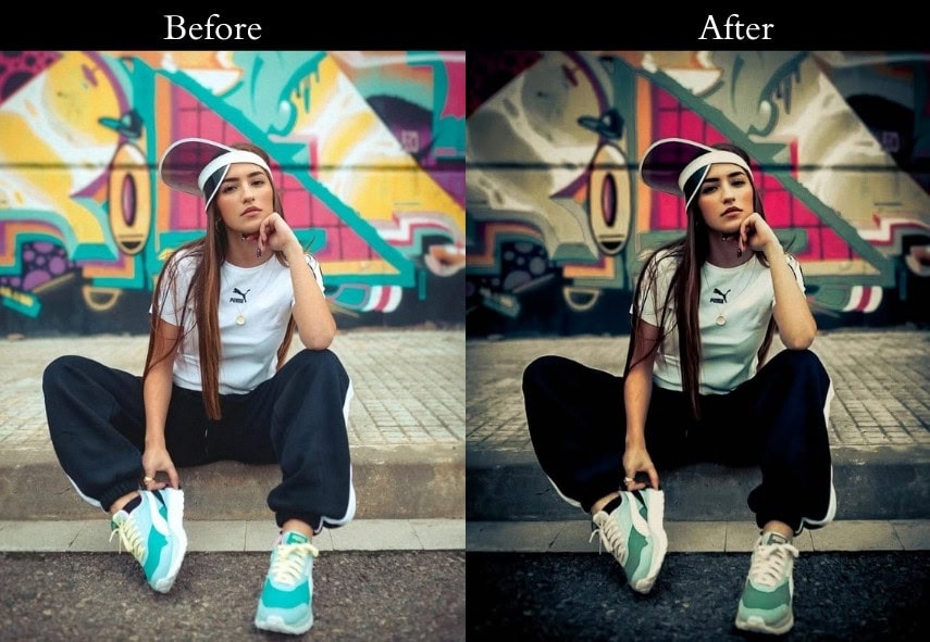
Purpose: a vintage feel with muted colors and soft tones.
Best For: Retro-themed photography, lifestyle images.
Style: Nostalgic and timeless with muted colors.
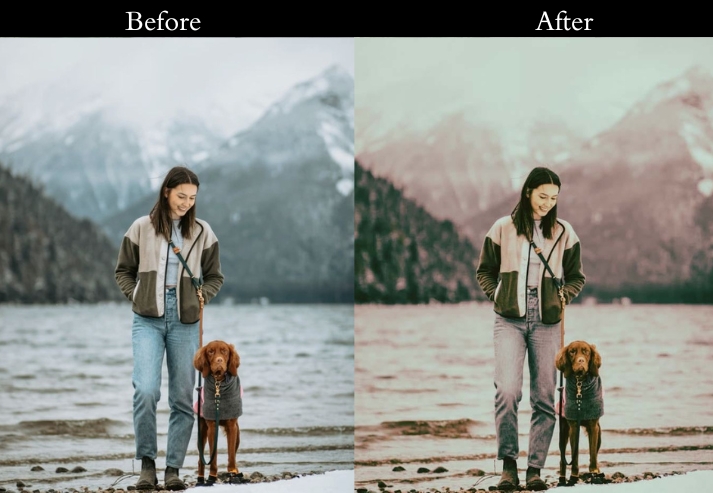
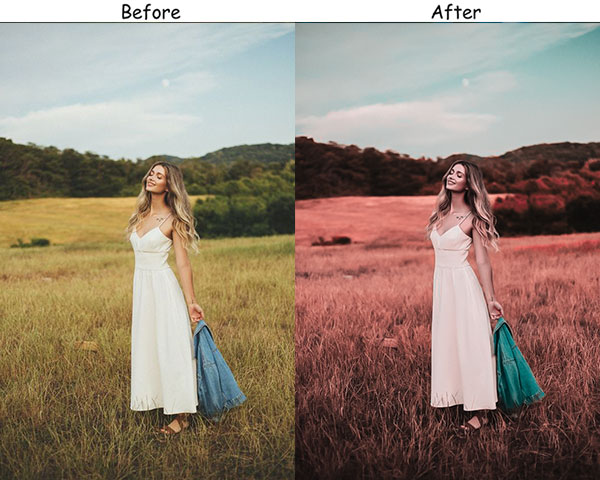
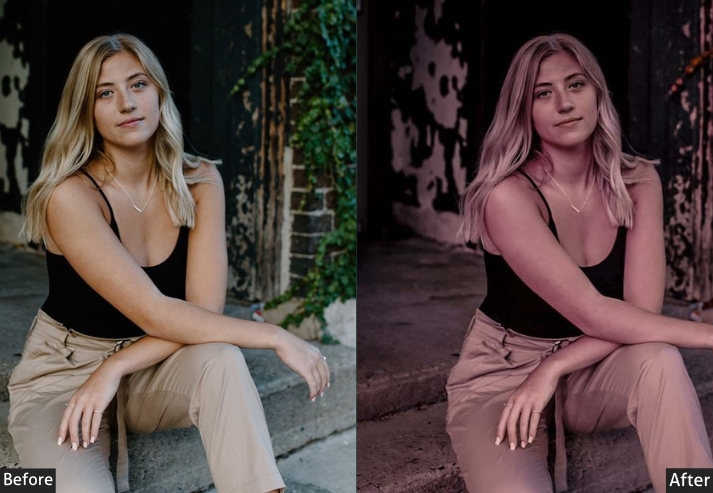
27. Moody Blush Preset
Last but not least… the Moody Blush is proof that the most powerful edits are sometimes the most unexpected. This preset brings together dusty pink-rose tones with proper moody shadow depth, creating something that sits right between romance and melancholy. It’s incredibly popular in portrait photography because it makes everything feel like a beautiful, slightly bittersweet dream.
Exposure: +10% to +20% | Contrast: +10% to +20% | Highlights: -10% to -20% | Shadows: +10% to +20% | Whites: +10% to +20% | Blacks: -10% to -20% | Temperature: +10% to +20% | Vibrance: +10% to +20% | HSL/Color: Increase pinks and reds (Saturation: +20% to +30%).
Purpose: soft, blush tones, romantic and gentle look.
Best For: Portraits, wedding photography.
Style: Soft, romantic tones with blush accents.
Use Case: the emotional warmth in portraits and wedding photos.
Few Words
Photography is about conveying what you feel. With these presets, you’re not editing photos-you’re telling stories, evoking emotions, and creating art that speaks to the soul. Each preset is like a different brushstroke, helping you paint with light, shadow, and texture.
So, go ahead, get creative, and don’t be afraid to push those shadows a little deeper or desaturate those colors enough to feel the vibe. And hey, the beauty of these presets is that they’re all about embracing imperfection and mood. So, make it dark, make it yours.
Let’s spread that moody magic and inspire each other. Until next time, keep creating, keep exploring, and most importantly, keep capturing the world the way you see it. Happy editing, and let’s keep those moody vibes alive!
More Free Presets:
Download Free Street Lightroom Presets
Free Download Cinematic Lightroom Presets
Download Free Urban Lightroom Presets
Download Free Wedding Lightroom Presets
Free Download Automobile Lightroom Presets
Free Portrait Presets Download
Free Instagram Presets Download