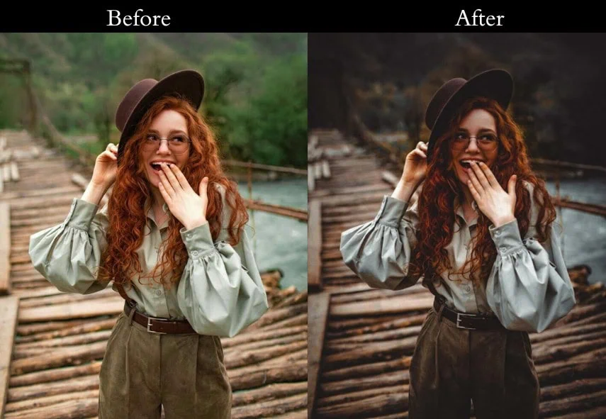
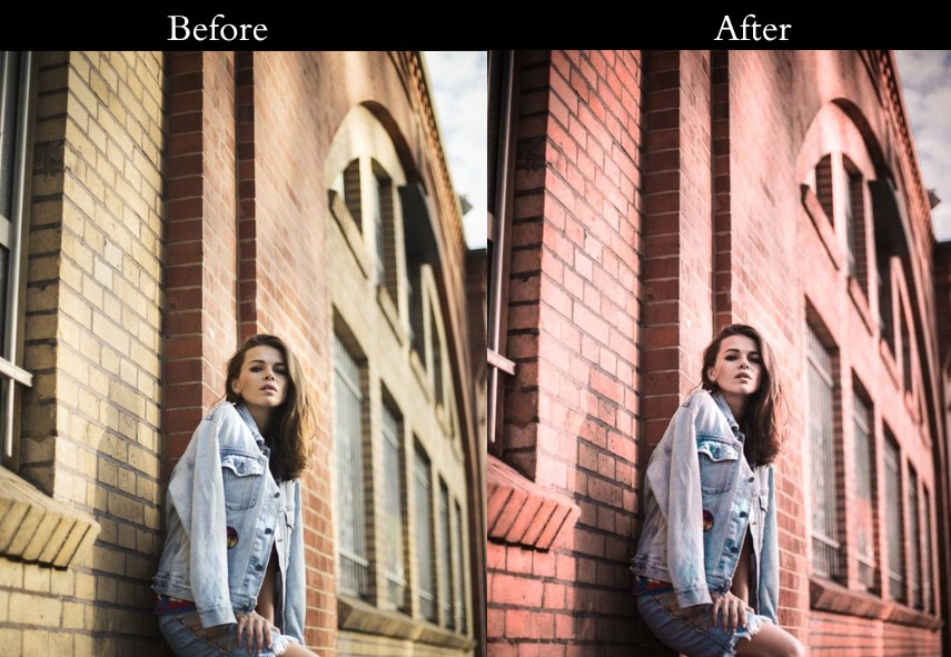
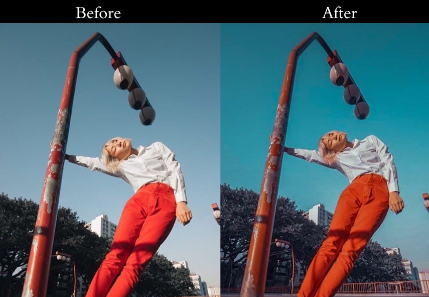
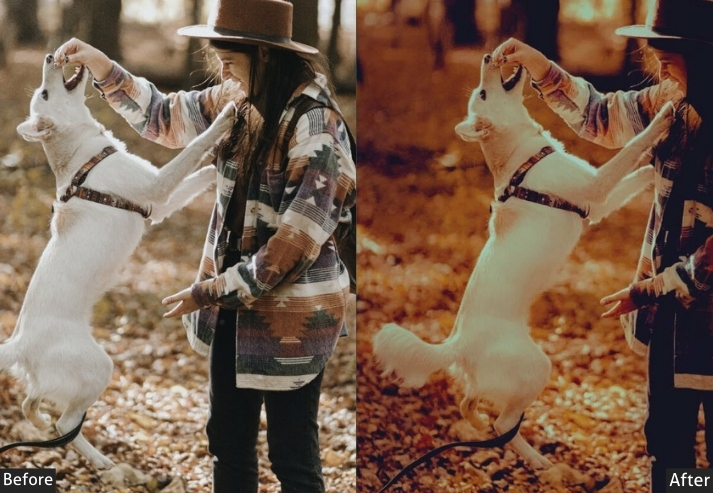
The orange-and-teal color grade is everywhere from Hollywood blockbusters to the most-saved Instagram travel posts. And for good reason: this complementary color pairing creates instant depth, separates your subject from the background, and gives any photo a polished, cinematic quality that takes hours to achieve manually.
In this guide, I’ve hand-tested and curated Orange Teal Presets that work on both Lightroom Mobile and Lightroom Classic/CC. Whether you’re editing portraits, street scenes, golden-hour landscapes, or travel shots, there’s a preset here that will transform your photo with one click. Each preset includes the exact HSL, tone curve, and light panel settings so you can fine-tune results to match your photo’s lighting conditions. Let’s get into it.
Pauline Jackson
No complicated workflows, no overdone effects, just clean, reliable adjustments that fix light, tone, and color fast so photographers can move on with their work.
60 orange teal Lightroom presets free download
Orange and teal sit opposite each other on the color wheel, making them complementary colors. This natural contrast grabs attention, adds depth, and makes images feel balanced and dynamic. The orange tones warm up skin, giving it a healthy, vibrant glow. Meanwhile, teal cools the background, creating a clear separation between the subject and their surroundings, adding focus and interest. This color pairing is a staple in blockbuster films, lending a polished, professional vibe to photos. It’s an easy way to give your images an artistic, movie-like quality that feels elevated. So why late? It’s show time!
- Pauline Jackson
- 1. Classic Orange & Teal
- 2. Moody Orange & Teal
- 3. Bright Orange & Teal
- 4. Vintage Orange & Teal
- 5. Cinematic Orange & Teal
- 6. Portrait Orange & Teal
- 7. Nature Orange & Teal
- 8. Sunset Orange & Teal
- 9. High Contrast Orange & Teal
- 10. Low Contrast Orange & Teal
- 11. Warm Orange & Teal
- 12. Matte Orange & Teal
- 13. Dark Orange & Teal Tint
- 14. Split Tone Orange & Teal
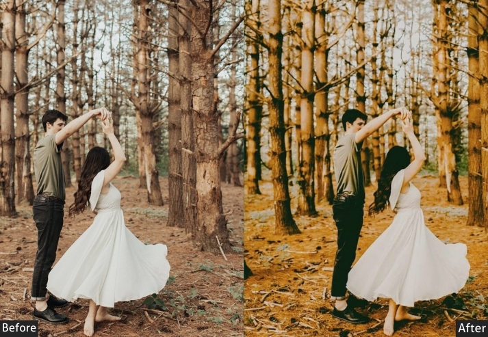
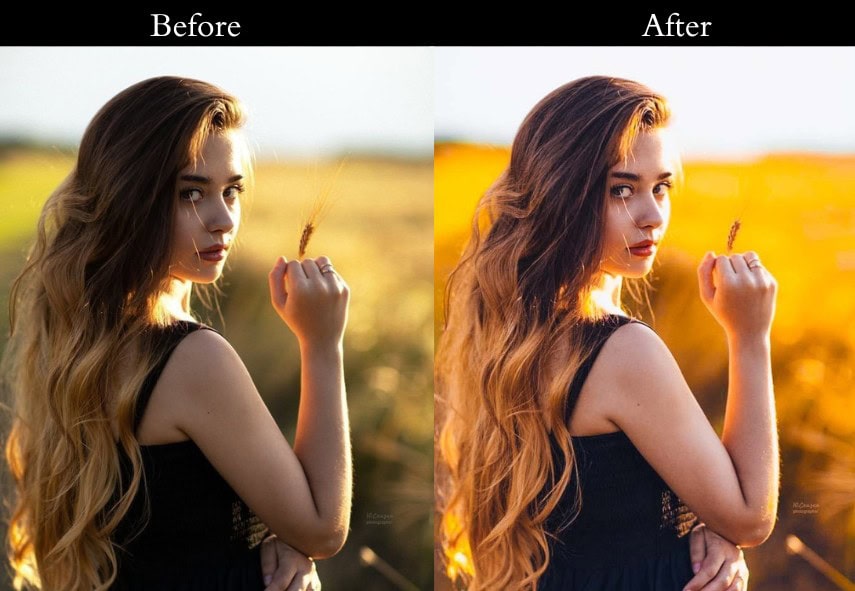
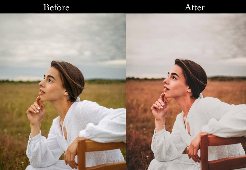
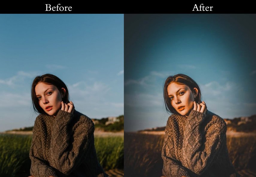
1. Classic Orange & Teal
The Classic one is the foundation of the entire collection and the most versatile one to download first. It strikes a precise balance between warm amber skin tones and cool teal backgrounds, replicating the color science used in professional film color grading without the complexity.
What makes this one work on almost every photo is the restrained contrast. Rather than aggressively crushing blacks (which breaks down in poorly lit shots), it uses a gentle S-curve that preserves detail in both highlights and shadows.

Light: Exposure +10, Contrast +15, Highlights -20, Shadows +20, Whites +10, Blacks -10. Color: Vibrance +15, Saturation +5 | HSL: Orange +20, Yellow +20, Aqua +15, Blue +15 | Temp +5. Effects: Vignette -10. Detail: Sharpening +10, Noise Reduction +5.
- Purpose: A timeless, cinematic boost.
- Best For: travel pics, family outings, or your dog looking heroic.
- Usage: a decent mix of warm and cool tones.
- Style: Cinematic, balanced, effortlessly cool.
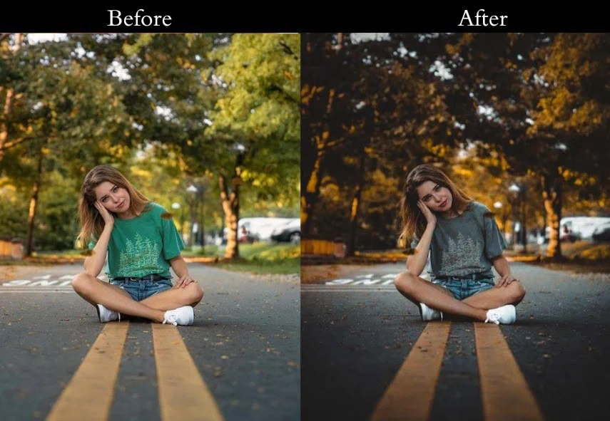
2. Moody Orange & Teal
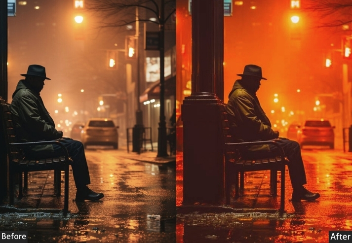
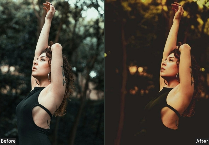
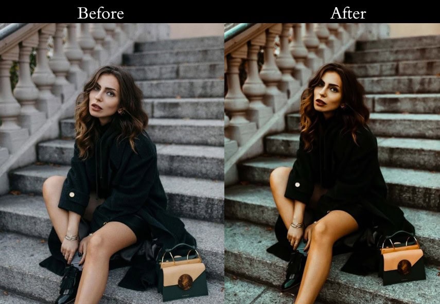
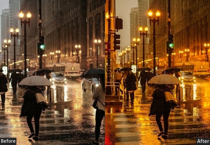
The Moody preset is built for photographers who want more tension in their images. Unlike the Classic version, this one deliberately deepens shadows and pulls highlights back, creating that film noir atmosphere you see in crime-drama cinematography.
The key differentiator here is the shadow handling. Instead of lifting shadows to reveal detail, it intentionally withholds it, letting dark areas stay dark and drawing the viewer’s eye to the mid-tones where the orange-teal contrast lives. It transforms a standard city night shot into something that feels as if it were pulled from a thriller sequence.
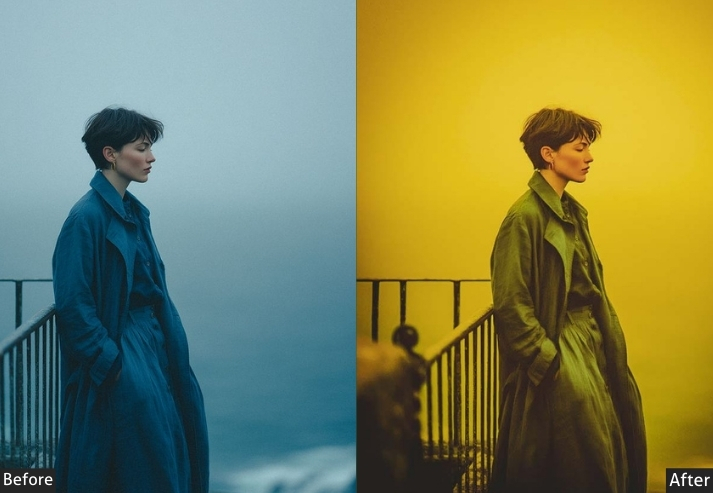
Light: Exposure -5, Contrast +25, Highlights -30, Shadows -20, Blacks -15. Color: Vibrance +10, Saturation -5 | HSL: Orange +25, Aqua +25, all others -10. Effects: Vignette -20 Detail: Sharpening +15, Noise Reduction +10.
- Purpose: A layer of intrigue and intensity.
- Best For: Stormy landscapes, moody portraits, or urban night shots.
- Usage: darker photos begging for some drama.
- Style: Dark, mysterious, film-noir vibes.
3. Bright Orange & Teal
If the Moody preset is a rainy Tuesday, the Bright Orange & Teal is a Saturday afternoon at the beach. It’s engineered specifically for well-lit outdoor shots, the kind where harsh midday sun usually blows out your highlights or flattens your colors.
This preset compensates by aggressively recovering highlights while lifting shadows, creating an even, luminous exposure that still shines with color. The green HSL boost is a subtle trick: adding +10 to the green channel stops foliage from looking muddy when both the orange and teal channels are elevated.
Light: Exposure +20, Contrast +10, Highlights -10, Shadows +30, Whites +15, Blacks +5. Color: Vibrance +20, Saturation +10 | HSL: Orange +30, Aqua +30, Green +10. Effects: Vignette -5 Detail: Sharpening +5, Noise Reduction +5.
- Purpose: To spread cheer and brightness.
- Best For: Beach days, summer adventures, or outdoor fun.
- Usage: Hit it up on well-lit shots with lots of natural light.
- Style: Light, airy, happy-go-lucky.
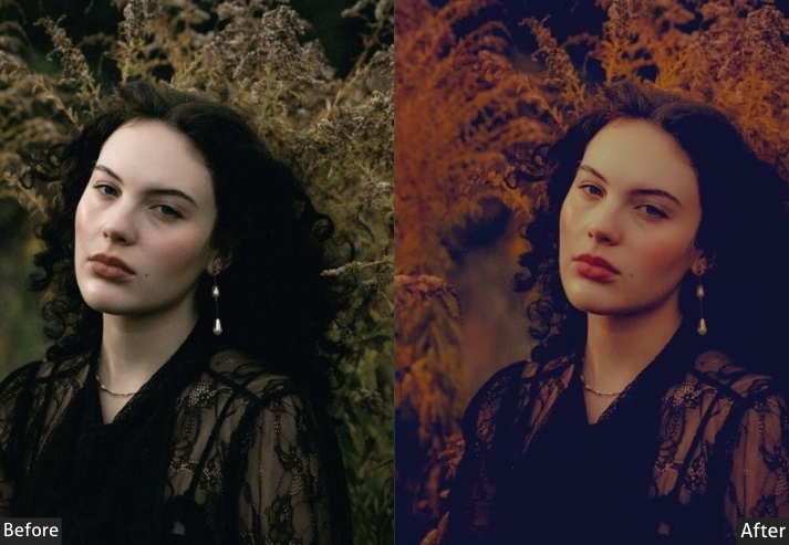
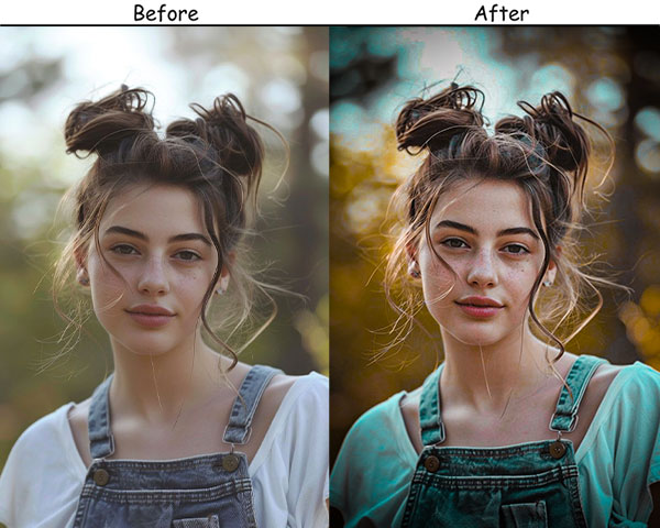
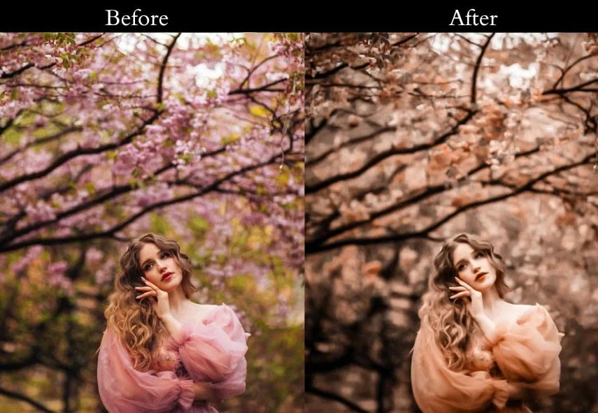
4. Vintage Orange & Teal
The Vintage preset does something most orange-teal presets don’t: it deliberately softens the color contrast rather than amplifying it. By desaturating all HSL channels by -10% first and then selectively boosting only orange and teal, it creates that distinctive faded-film look vivid in the right channels, muted everywhere else.
The film grain at +20 is intentional and measured. Below +15, it disappears; above +25, it becomes distracting. At +20, it adds a tactile, organic quality that makes digital photos feel like they were shot on Kodak Portra 400.
Light: Exposure +5, Contrast -10, Highlights -15, Shadows +15, Whites -10, Blacks +10. Color: Vibrance -10, Saturation -15 | HSL: All channels -10, then Orange +15, Aqua +15. Effects: Grain +20, Vignette -10. Detail: Sharpening +10, Noise Reduction +15.
- Purpose: A nostalgic, retro twist.
- Best For: Portraits, street shots, or anything with a timeless vibe.
- Usage: A throwback glow.
- Style: Retro, faded, sentimental.
5. Cinematic Orange & Teal
This is the preset for photographers who want their images to feel like a frame extracted from a feature film. The Cinematic Orange & Teal uses an S-curve tone curve combined with lifted shadows (the hallmark of the “matte” look popularized by Hollywood colorists) to widen the apparent dynamic range without clipping.
The result is an image that feels simultaneously high-contrast in the mid-tones and softly restrained in the extremes, punchy but not harsh. Works best on photos with strong compositional structure: leading lines, negative space, or dramatic skies.

Light: Exposure +10, Contrast +20, Highlights -25, Shadows +25, Whites +10, Blacks -10. Color: Vibrance +15, Saturation +10 | HSL: Orange +25, Aqua +25 | Add cinematic S-curve in Tone Curve. Effects: Lift shadow anchor in Tone Curve to ~15 for matte finish. Detail: Sharpening +15, Noise Reduction +10.
- Purpose: To make travel photos breathtaking.
- Best For: Vacation snaps, nature shots, scenic views.
- Usage: Outdoor shots with sky or water.
- Style: Adventurous, vibrant, wanderlust.
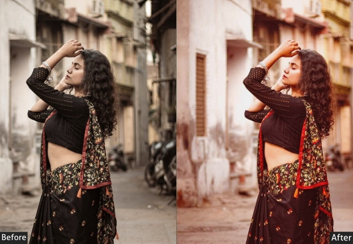
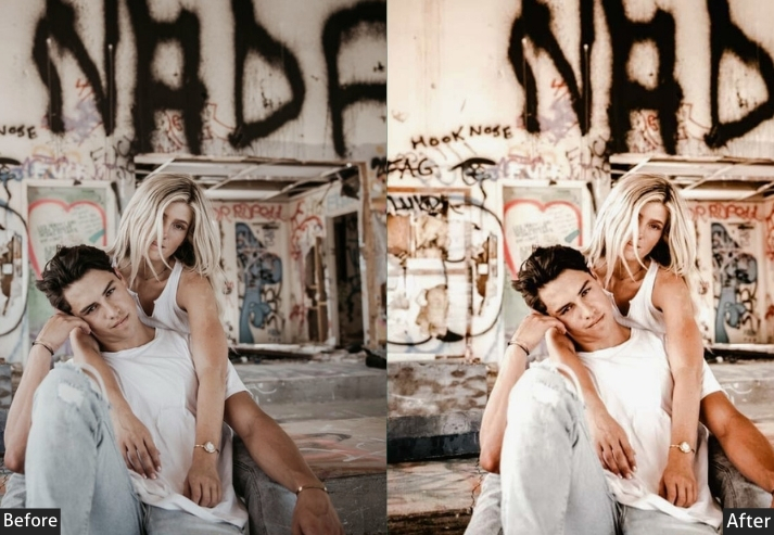
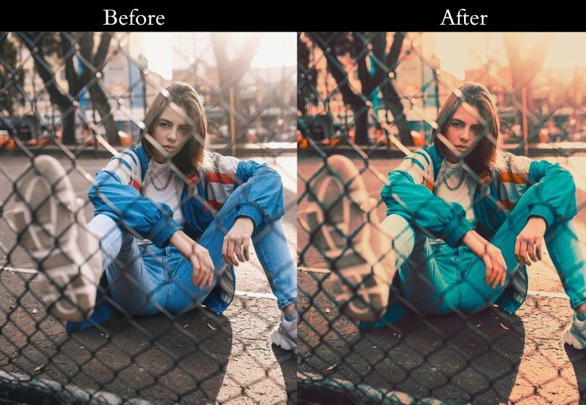
6. Portrait Orange & Teal
Portrait editing with orange-teal is notoriously tricky because skin tones live squarely in the orange HSL range. Boost it too hard and faces look sunburned; push teal aggressively and hair and clothing can look artificial. The Portrait preset navigates this by applying a more restrained orange boost (+10 vs. +20–25 in other presets) and using Vibrance instead of Saturation to protect already warm skin tones from oversaturation.
The Teal at +15 provides enough subject-background separation to make the cinematic look read clearly, without making any natural colors appear synthetic. This is the preset to reach for when people are the primary subject.
Light: Exposure +10, Contrast +10, Highlights -10, Shadows +15, Whites +5, Blacks -5. Color: Vibrance +15, Saturation +5 | HSL: Orange +10 (restrained), Aqua +15. Effects: Vignette -5. Detail: Sharpening +10, Noise Reduction +10.
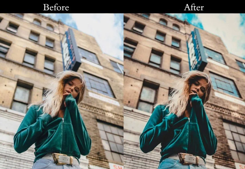
- Purpose: To highlight the beauty of city life.
- Best For: Cityscapes, street photography, modern buildings.
- Usage: Use on urban shots with strong lines or skies.
- Style: Sleek, modern, metropolitan.
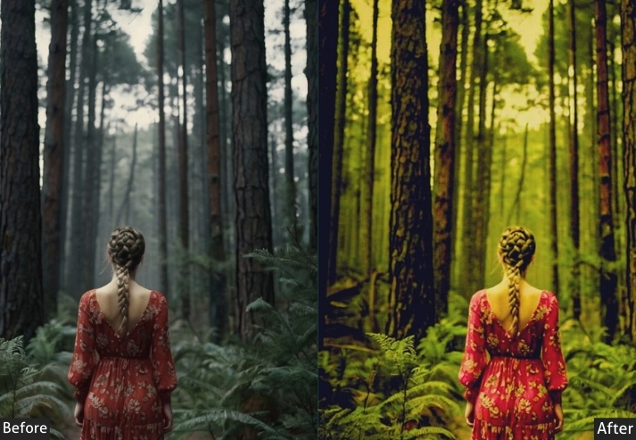
7. Nature Orange & Teal
Nature photography presents a unique challenge for orange-teal editing: green foliage occupies the HSL range between yellow and aqua, which means aggressive preset application can push forests into sickly yellow-green territory. The Nature preset avoids this by adding a deliberate +20 Green HSL boost to keep foliage healthy, while the Blue and Aqua channels handle water and sky.
The result is a nature photo that looks organic, not filtered. The teal reads as sky and water, the orange reads as rock, sand, and warm foliage, and everything in between stays natural and correctly saturated.
Light: Exposure +10, Contrast +15, Highlights -15, Shadows +20, Whites +10, Blacks -5. Color: Vibrance +20, Saturation +10 | HSL: Green +20, Blue +20, Aqua +20, Orange +15. Effects: Vignette -5. Detail: Sharpening +10, Noise Reduction +5.
- Purpose: To make nature shots glow.
- Best For: Forests, mountains, lakes, wildlife.
- Usage: pics with greenery or water.
- Style: Natural, vibrant, earthy.
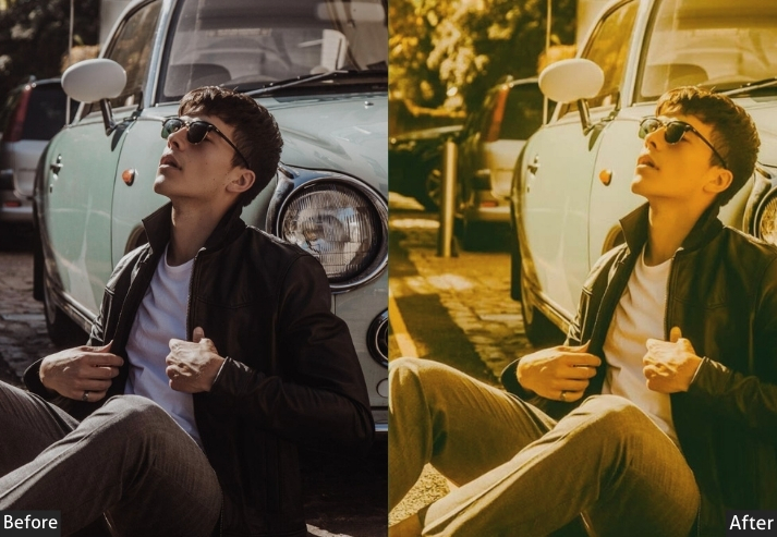
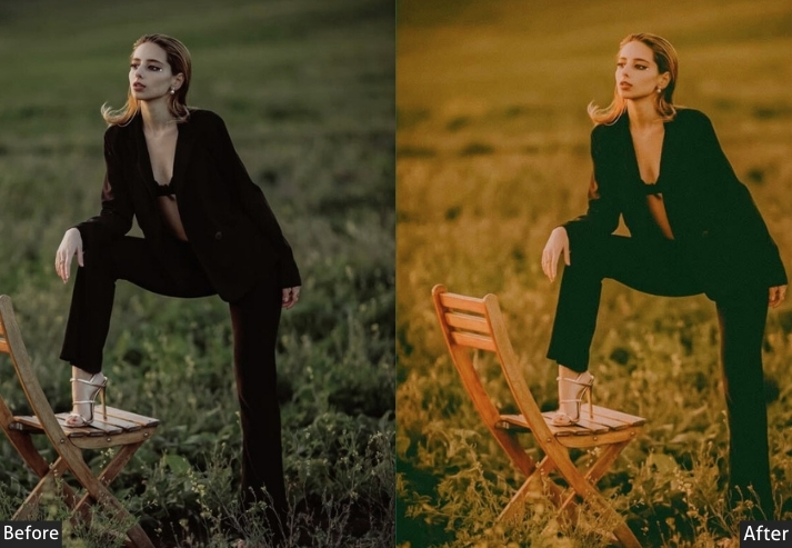
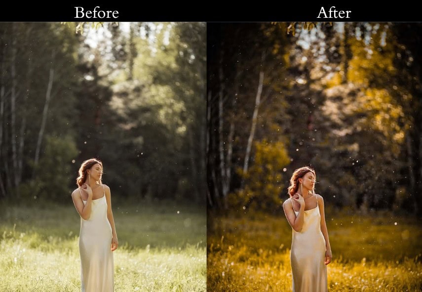
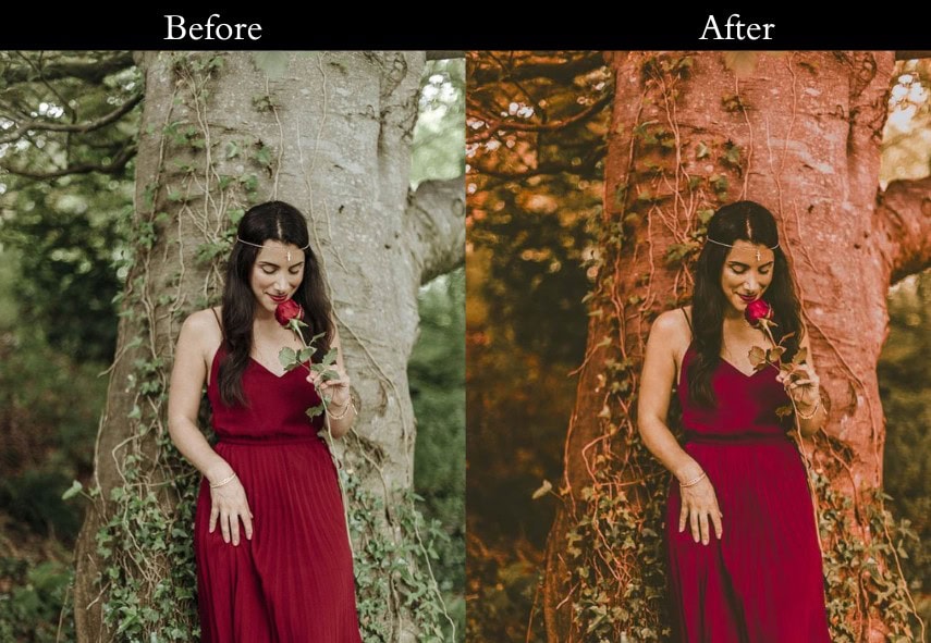
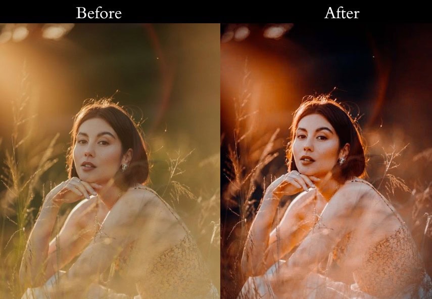
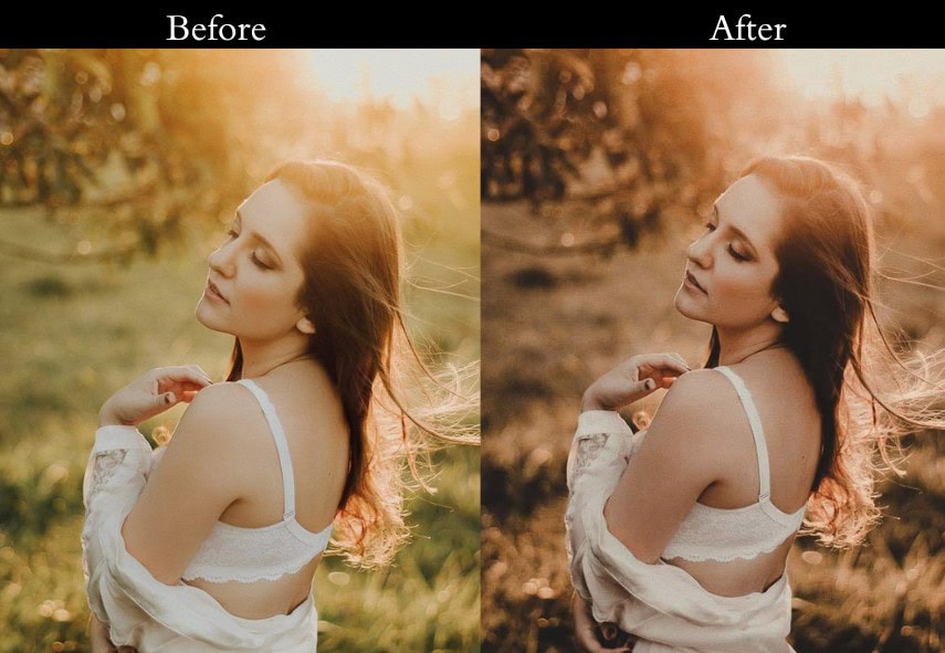
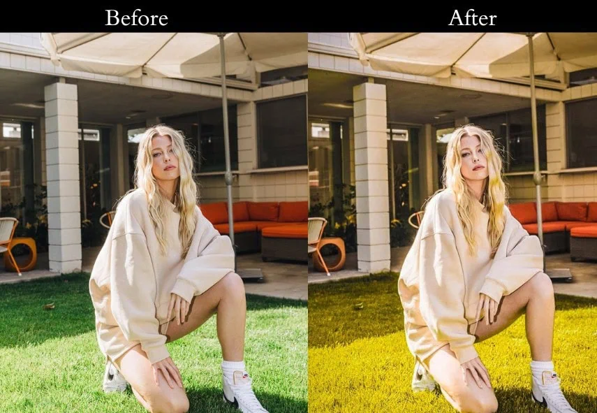
8. Sunset Orange & Teal
Golden hour is already the most flattering light in photography. The Sunset preset simply amplifies what’s already there rather than manufacturing it. By pushing the Orange and Yellow HSL channels hard (+30 each), it intensifies the amber warmth of late-day sun while the Teal boost preserves any blue remaining in the sky or water, preventing the entire frame from going monochromatic orange.
This is the one preset in the collection where Saturation (not just Vibrance) gets a meaningful boost (+15), because golden hour photos typically don’t have the over-saturated skin tone problem that makes high saturation risky in portrait photography.
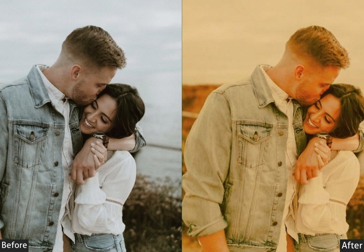

Light: Exposure +15, Contrast +10, Highlights -20, Shadows +25, Whites +15, Blacks -5. Color: Vibrance +20, Saturation +15 | HSL: Orange +30, Yellow +30, Aqua +20. Effects: Vignette -10. Detail: Sharpening +10, Noise Reduction +5.
- Purpose: To make sunsets unforgettable.
- Best For: Golden hour shots, warm-lit scenes.
- Usage: Use on dusk or dawn pics with rich colors.
- Style: Warm, golden, magical.
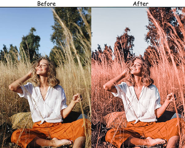
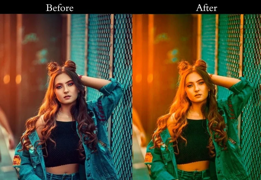
9. High Contrast Orange & Teal
This preset is here to make a statement. It jacks up the contrast, making lights blaze and shadows deepen, your photos will demand attention like a rockstar on stage.
Light Panel: Exposure +10% | Contrast +30% | Highlights -30% | Shadows +30% | Whites +20% | Blacks -20% (punchy look). Color Panel: Vibrance +20% | Saturation +15%. HSL → Saturation: Orange +30% | Teal +30% (vivid color boost). Effects Panel: Vignette -20 (dramatic edges). Detail Panel: Sharpening +20 | Noise Reduction +10 (sharp and clean).
- Purpose: To create bold, eye-catching images.
- Best For: Action shots, sports, dramatic scenes.
- Usage: Use on pics with strong light-shadow play.
- Style: Bold, striking, in-your-face.
10. Low Contrast Orange & Teal
This one is like a warm hug for your photos. It dials down the contrast for a dreamy, pastel-like effect-Romantic vibes or a gentle escape.
Light Panel: Exposure +10% | Contrast -20% | Highlights -10% | Shadows +20% | Whites -10% | Blacks +10% (soft mellow look). Color Panel: Vibrance +15% | Saturation +5%. HSL → Saturation: Orange +15% | Teal +15% (subtle color pop). Effects Panel: Vignette -5 (gentle framing). Detail Panel: Sharpening +5 | Noise Reduction +10 (smooth and clean).
- Purpose: A serene, dreamy look.
- Best For: Weddings, romantic portraits, soft scenes.
- Usage: Apply to pics needing a calming touch.
- Style: Soft, dreamy, peaceful.
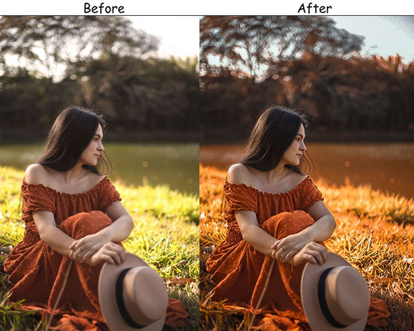
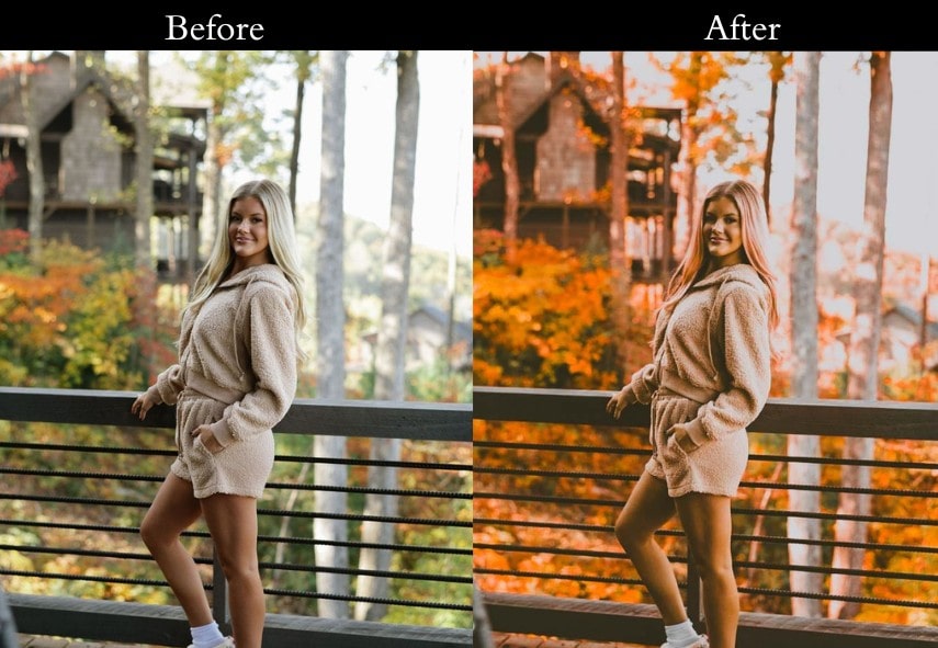
11. Warm Orange & Teal
This leans hard into the orange for a toasty, inviting feel. Your photos will feel like a warm sweater on a crisp day.
Light Panel: Exposure +10% | Contrast +10% | Highlights -15% | Shadows +20% | Whites +10% | Blacks -5% (cozy lifted look). Color Panel: Vibrance +20% | Saturation +10% | Temp +10 (extra warmth). HSL → Saturation: Orange +30% | Teal +10%. Effects Panel: Vignette -10 (snug framing). Detail Panel: Sharpening +10 | Noise Reduction +5 (soft yet clear).
- Purpose: To wrap your photos in warmth.
- Best For: Fall shots, cozy indoors, warm portraits.
- Usage: Use on pics with autumn tones or soft light.
- Style: Warm, cozy, inviting.
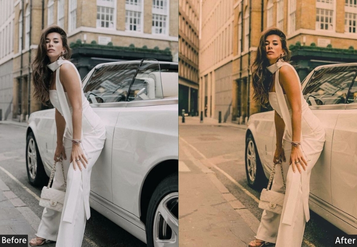
12. Matte Orange & Teal
This preset’s got that trendy matte finish. It’s a social media darling, giving your shots a modern, editorial flair.
Light Panel: Exposure +10% | Contrast +10% | Highlights -30% | Shadows +20% | Whites -20% | Blacks +10% (matte magic). Color Panel: Vibrance +15% | Saturation +5%. HSL → Saturation: Orange +20% | Teal +20%. Tone Curve: lifted shadows for matte finish. Effects Panel: Vignette -10 (subtle frame). Detail Panel: Sharpening +10 | Noise Reduction +10 (smooth and sleek).
- Purpose: A modern, matte look.
- Best For: Fashion, products, and Instagram posts.
- Usage: Use on pics needing a trendy polish.
- Style: Modern, editorial, matte.
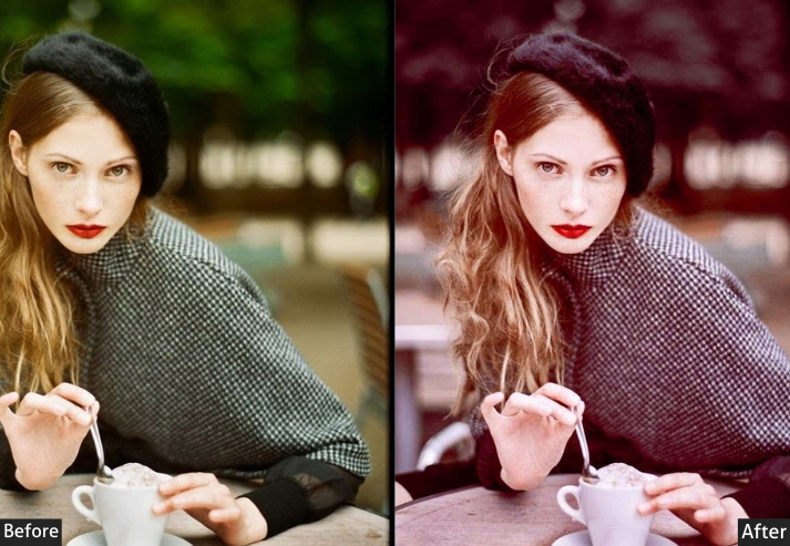
13. Dark Orange & Teal Tint
Ready for something artsy? This preset starts Dark, then sneaks in orange and teal tints for a moody, creative vibe.

Light Panel: Exposure +10% | Contrast +20% | Highlights -20% | Shadows +20% | Whites +5% | Blacks +10% (bold base). Color Panel: Black & White mode enabled. Split Toning: Highlights (Hue 30 | Sat 20 | orange tone) | Shadows (Hue 180 | Sat 20 | teal tone). Effects Panel: Vignette +10 (moody edges). Detail Panel: Sharpening +15 | Noise Reduction +10 (sharp art finish).
- Purpose: An artistic, tinted twist.
- Best For: Creative shots, portraits, and experiments.
- Usage: Try it on pics craving uniqueness.
- Style: Artistic, moody, quirky.
14. Split Tone Orange & Teal
Keep it simple with this classic split-toning trick: orange in the highlights, teal in the shadows. It’s a no-fuss way to nail the Orange & Teal look. Best for beginners or quick edits.
Light Panel: Exposure +10% | Contrast +15% | Highlights -10% | Shadows +20% | Whites +10% | Blacks -10% (balanced base). Color Panel: Split Toning enabled. Highlights (Hue 30 | Sat 30 | orange glow) | Shadows (Hue 180 | Sat 30 | teal tones). Effects Panel: Vignette -10 (clean frame). Detail Panel: Sharpening +10 | Noise Reduction +5 (easy sharp finish).
- Purpose: A straightforward Orange & Teal style.
- Best For: Quick edits, beginners, everyday shots.
- Usage: Use on pics with clear highlights and shadows.
- Style: Classic, simple, reliable.
Last Take
You now have a full collection of Orange Teal presets covering every photography style from cinematic landscapes to flattering portrait edits, golden-hour bursts to moody street photography. Download the ones that match your next shoot and start editing in one click.
If you found these presets useful, sharing this page helps other photographers discover it, and leaving a comment below with a photo you edited using these presets gives us real feedback to keep improving the collection.
More Free Presets:
Moody Lightroom Presets Free Download
Retro Lightroom Presets Free Download
Autumn Lightroom Presets Free Download
Street Lightroom Presets Free Download