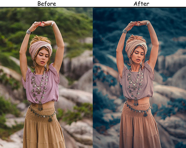
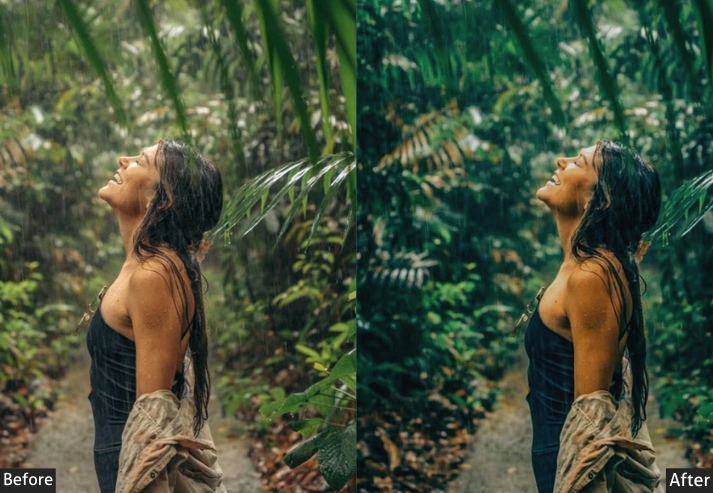
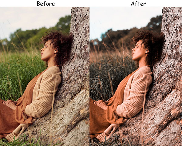
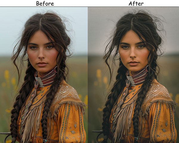
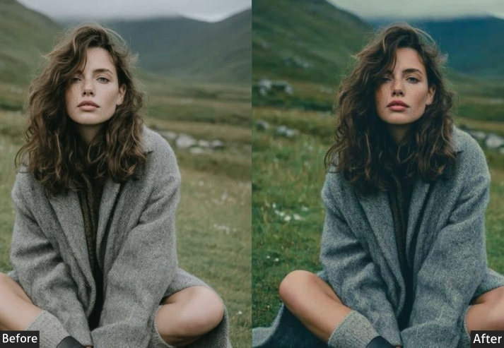
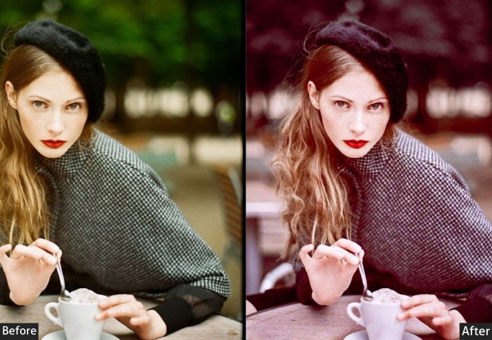
Portrait editing in Lightroom can consume hours of your shoot day, with adjustments to exposure here, tweaks to white balance there, and still leaving you unsatisfied. Presets solve that. A single click applies a tested, fresh look built on the same principles a professional colorist would use: balanced skin tones, controlled highlights, and a consistent mood that holds across an entire session.
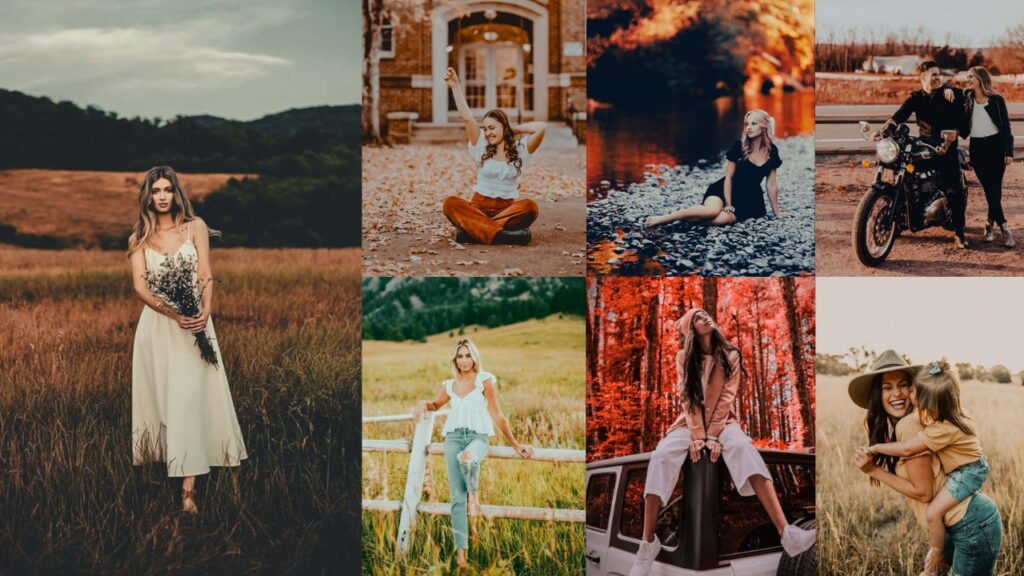
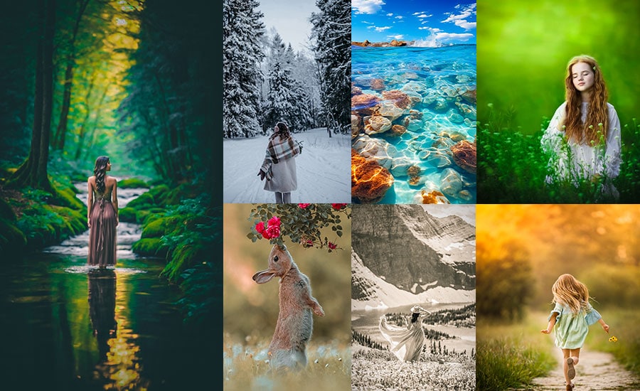
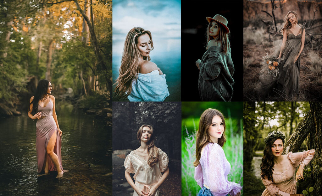
On this page, you’ll find the best portrait presets covering every major style: soft pastel, cinematic, warm and moody, dark and dramatic, vintage film, golden hour, black-and-white, and seasonal looks for every season. Each preset ships as a DNG file (Lightroom Mobile compatible), and the settings are listed so you can build or recreate them manually in Lightroom Classic.
All presets are non-destructive. Apply, adjust, and move on to your original raw file, which is never touched.

Pauline Jackson
I work on developing preset collections, testing Lightroom workflows, and helping photographers simplify their editing process without sacrificing quality.
100 Lightroom Portrait Presets Free Download
The presets below are grouped by style. Each entry includes a description of when to reach for it, the exact Lightroom settings so you can apply or fine-tune manually, and a direct download link. The settings are starting points. Adjust them to match your camera, lens, and lighting conditions.
- Pauline Jackson
- 1. Soft Pastel Portrait Preset
- 2. Cinematic Portrait Preset
- 3. Bright & Airy Portrait Preset
- 4. Matte Portrait Preset
- 5. Vintage Portrait Preset
- 6. Golden Hour Portrait Preset
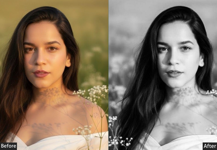
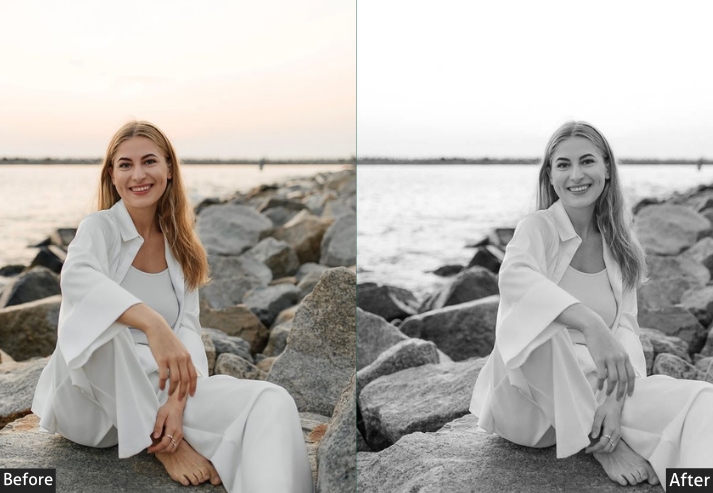
- 7. High Contrast Black & White Preset
- 8. Moody Warm Portrait Preset
- 9. Vibrant Skin Tones Preset
- 10. Editorial Glow Preset
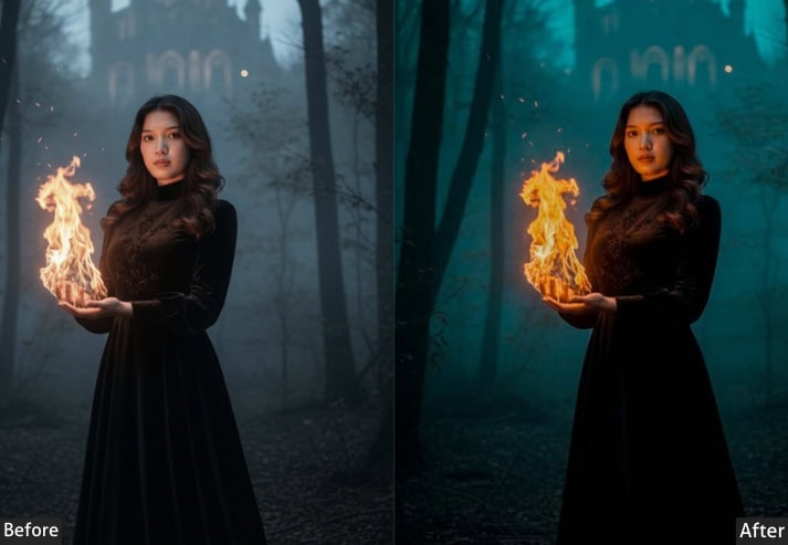
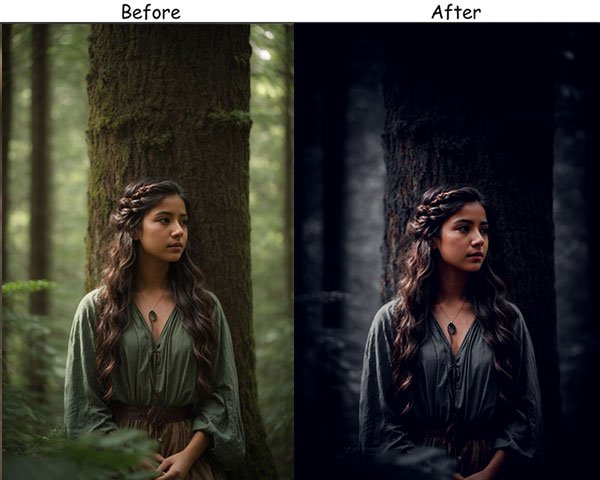
- 11. Dark and Moody Portrait Preset
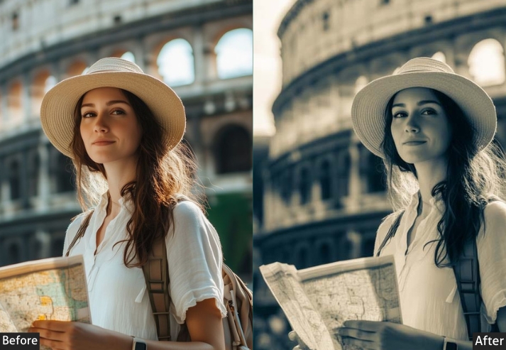
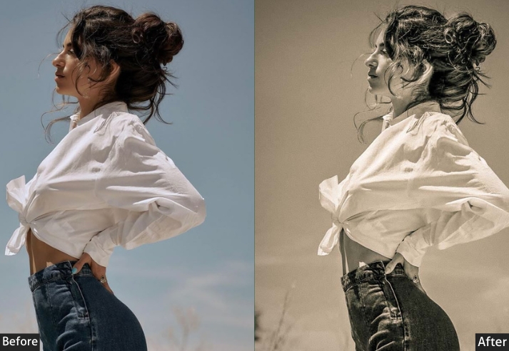
- 12. Sepia Tone Preset
- 13. Soft Glow Preset
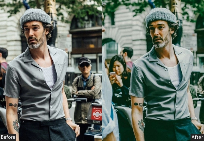
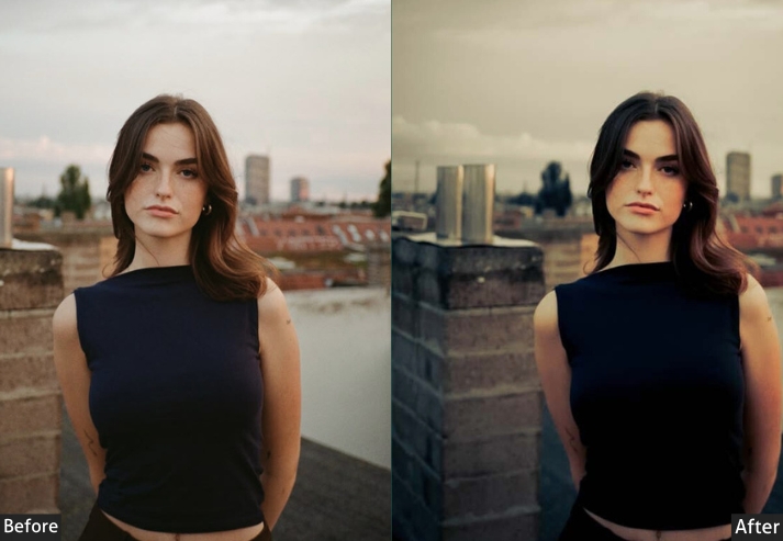
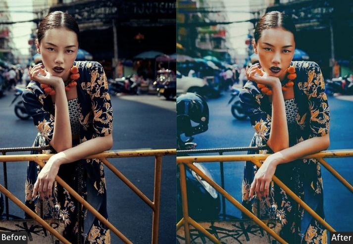
- 14. Urban Grit Portrait Preset
- 15. Film Grain Portrait Preset
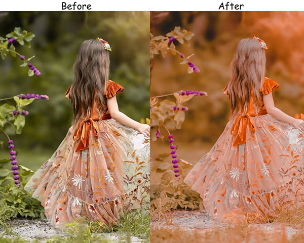
- 16. Autumn Amber Portrait Preset
- 17. Winter Frost Portrait Preset
- 18. Spring Bloom Preset
- 19. Summer Glow Preset
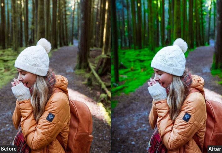
- 20. Emerald Green Preset
- 21. Dark Blue Portrait Preset
- 22. Crimson Red Preset
- 23. Cool Blue Portrait Preset
- 24. Sunshine Yellow Preset
- 25. Minimal Portrait Preset
- 26. Purple Haze Preset
- 27. Tangerine Dream Preset
- 28. Pink Blush Preset
- 29. Teal and Orange Preset
- 30. Lavender Mist Preset
1. Soft Pastel Portrait Preset
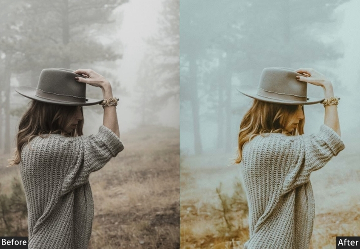
The Soft Pastel preset lifts shadows, warms the midtones, and eases contrast to produce the gently faded look popular in lifestyle and couples photography. Skin tones stay natural while the overall image takes on a quiet, film-like softness. Works best on overcast days or in open shade where the light is already diffused.
Light Panel: Exposure +30 | Contrast −10 | Highlights −20 | Shadows +20 | Whites +10 | Blacks +15.
Color Panel: Temperature +5 | Tint +5 | Vibrance +20 | Saturation −10.
Purpose: soft, whimsical portraits that look like they belong on a romance novel cover.
Best For: Couples, children, or lifestyle photography.
Usage: Use it for a gentle, pastel-toned vibe.
Style: Dreamy, soft, romantic.
2. Cinematic Portrait Preset
Cinematic pulls its inspiration from the color grading used in feature films: crushed blacks, lifted contrast, and a cool-leaning temperature that strips the image of any “snapshot” feel. The effect is immediately dramatic. Subjects look as though they’ve been lit by a gaffer rather than the afternoon sun.
Light Panel: Exposure −10 | Contrast +40 | Highlights −30 | Shadows −20 | Whites +10 | Blacks −30.
Color Panel: Temperature −10 | Tint +5 | Vibrance +25 | Saturation −5.
Purpose: a moody, dramatic vibe like they’re ready to premiere at Cannes.
Best For: Artistic portraits, editorial, or storytelling photography.
Usage: a film-like quality to your photos.
Style: Moody, dramatic, sharp.
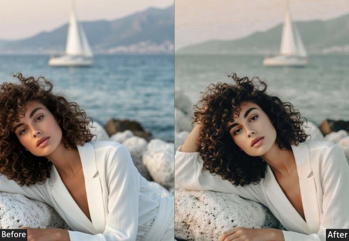
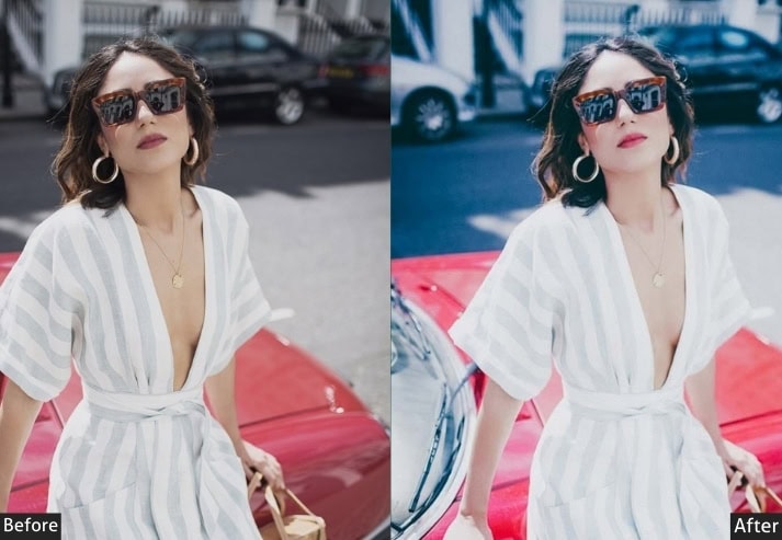
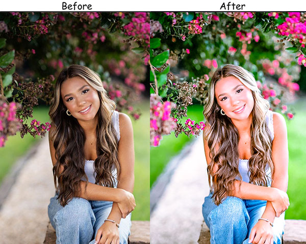
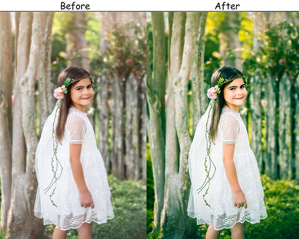
3. Bright & Airy Portrait Preset
Bright & Airy is the default choice for natural-light photographers who shoot families, newborns, and weddings. By lifting exposure, pushing whites, and warming the temperature, it turns flat indoor light or hazy outdoor scenes into something that feels intentionally sun-drenched. The key is the combination of raised Shadows and reduced Contrast, which flattens the tonal curve enough to give that characteristic “blown-out whites” look without actually clipping detail.
Light Panel: Exposure +50 | Contrast −20 | Highlights +40 | Shadows +30 | Whites +20 | Blacks +15.
Color Panel: Temperature +15 | Tint +10 | Vibrance +30 | Saturation +5.
Purpose: Light, happy, and vibrant portraits.
Best For: Weddings, family portraits, and lifestyle photography.
Usage: Anytime you want your images to look like they’re bathed in sunshine.
Style: Bright, airy, uplifting.
4. Matte Portrait Preset
The matte look is built on a single core technique: raising the Blacks slider to prevent true-black tones from appearing in the image. The result is a flat, slightly faded look that’s become a staple in fashion and editorial photography. Pair it with a slightly desaturated palette, and you get an image that feels considered and contemporary rather than over-processed.
Light Panel: Exposure −10 | Contrast −50 | Highlights −30 | Shadows +40 | Whites −20 | Blacks +50.
Color Panel: Temperature +5 | Vibrance +10 | Saturation −10.
Purpose: a cool, flat, and understated look.
Best For: Editorial work, fashion, or street photography.
Usage: When you want your photos to be trendy but not too polished.
Style: Cool, understated, flat.
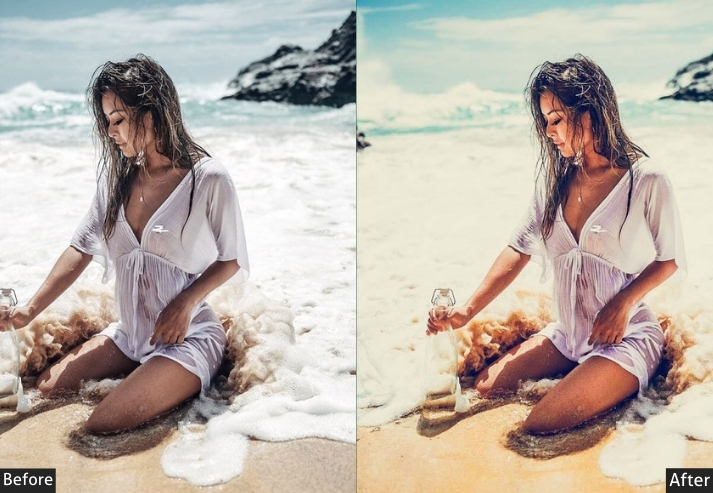
5. Vintage Portrait Preset
This preset reconstructs the look of consumer film stocks from the 1970s and 80s: warm shadows, faded highlights, desaturated greens, and visible grain. Unlike a generic “warm filter”, the preset uses a deliberately low Saturation value combined with a high Temp to push colors toward amber and orange without making them vivid, exactly the way old Kodak film behaved as it aged.
Light Panel: Exposure +20 | Contrast +10 | Highlights −20 | Shadows +20 | Whites −10 | Blacks +10.
Color Panel: Temperature +25 | Tint +5 | Saturation −30.
Effects Panel: Grain +50.
Purpose: timeless, nostalgic look for your portraits.
Best For: Retro-themed shoots, lifestyle photography.
Usage: Whenever you want to evoke a sense of nostalgia or a throwback vibe.
Style: Warm, nostalgic, faded.
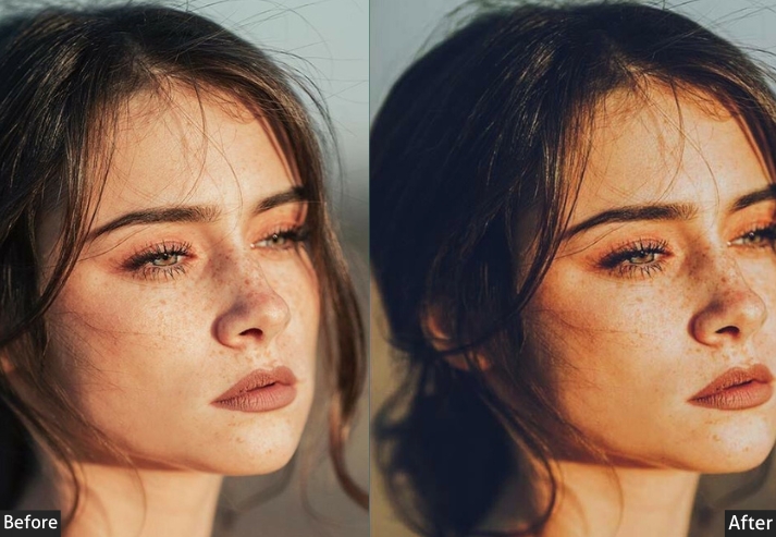
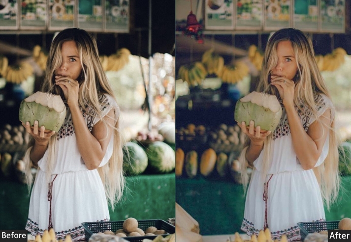
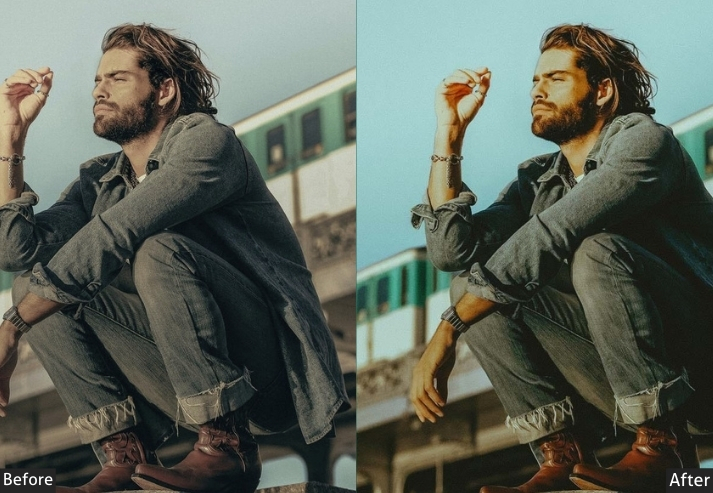
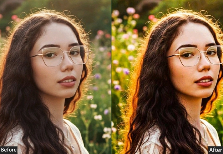
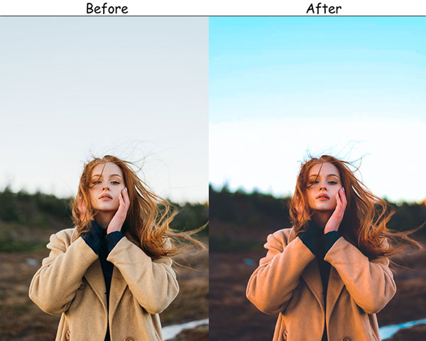
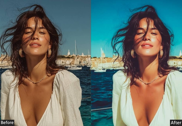
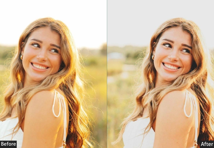
6. Golden Hour Portrait Preset
The Golden Hour aggressively pushes warmth: Temp +30, Vibrance +35 to simulate the quality of late-afternoon sunlight, even when the image was captured at a different time of day. It is especially effective on portraits shot outdoors in the hour before noon, when there is enough directional light to create depth, but the warmth isn’t naturally present. Lifted shadows keep the subject’s face readable, while the boosted blacks add just enough contrast to prevent the image from looking flat.
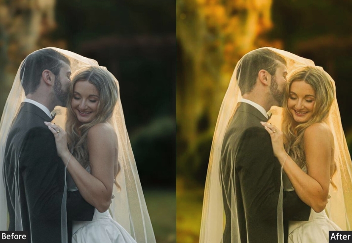
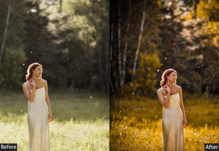
Light Panel: Exposure +40 | Contrast +10 | Highlights −10 | Shadows +30 | Whites +20 | Blacks −10.
Color Panel: Temperature +30 | Tint +10 | Vibrance +35 | Saturation +10.
Purpose: mimic the golden hour’s warm, natural glow even if you’re shooting at noon.
Best For: Outdoor portraits, engagement shoots, or any time you want to create that ethereal, glowing skin effect.
Usage: mood and warmth in your images, especially when natural lighting isn’t perfect.
Style: Warm, sun-drenched, glowing.
When I use this preset, I always picture someone laughing in a field of tall grass, golden light dancing around their face.
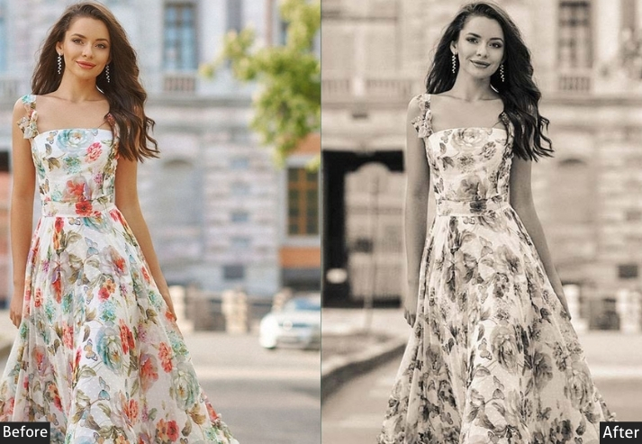
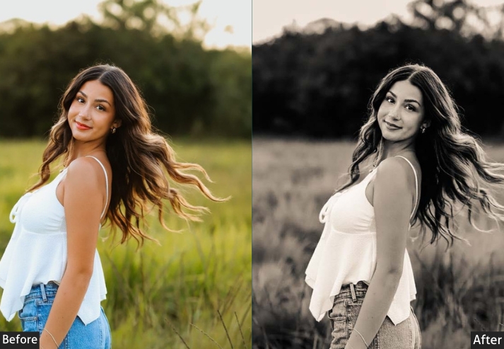
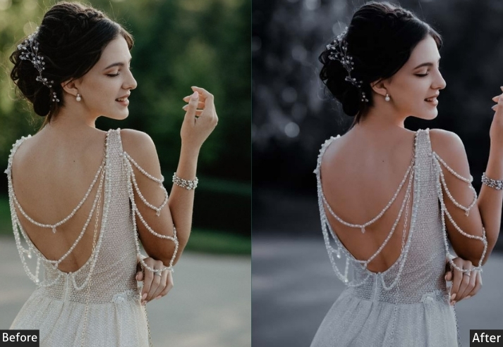
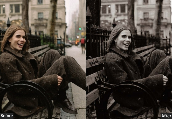
7. High Contrast Black & White Preset
Stripping color from a portrait forces the viewer to engage with the subject’s expression, texture, and the play of light without the distraction of color. This preset takes a heavy hand with contrast (+60) and deep blacks (−40) to produce an image that feels like a classic photojournalism still or a fine-art print. The added Grain and subtle Vignette reinforce the analog character. Use it when you want maximum emotional impact from a single frame.
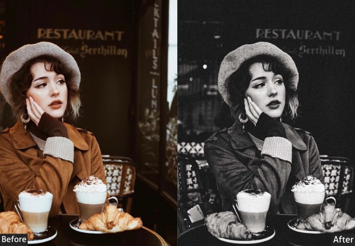
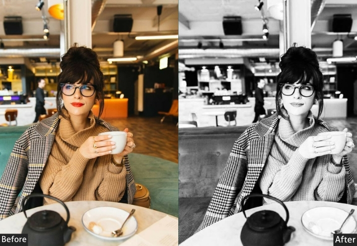
Light Panel: Exposure +20 | Contrast +60 | Highlights −40 | Shadows −30 | Whites +25 | Blacks −40.
Effects Panel: Clarity +40 | Grain +30 | Vignette −15.
Purpose: Stripping away color forces the viewer to focus on texture, expression, and the play of light.
Best For: Fine art portraits, street photography, or anytime you want to evoke strong emotions through texture and light.
Usage: Use it when you want the portrait to speak through shadows and light without the distraction of color.
Style: Bold, high contrast, intense.
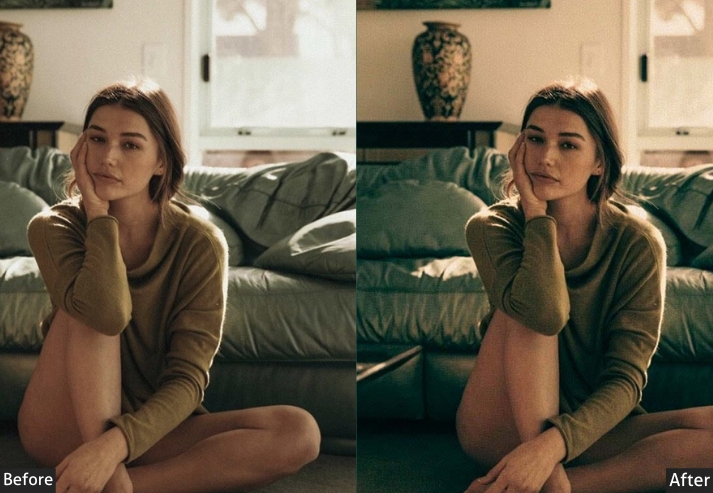
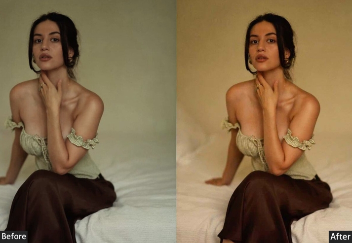
8. Moody Warm Portrait Preset
Moody Warm is the indoor portrait specialist. A high Temp (+40) combined with reduced Whites and deepened Blacks creates a rich, amber-toned image that feels intimate rather than flat. It’s a preset I reach for in late-autumn sessions: candlelit interiors, kitchen-table moments, coffee-shop shoots, anywhere the light source is warm and the scene benefits from depth rather than brightness. The Vibrance boost keeps skin tones from going too orange while still honoring the warmth.
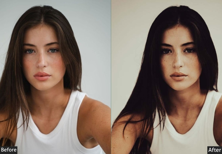
Light Panel: Exposure +10 | Contrast +30 | Highlights −30 | Shadows +20 | Whites −10 | Blacks −20.
Color Panel: Temperature +40 | Tint +5 | Vibrance +25 | Saturation −5.
Purpose: an intimate, earthy feel.
Best For: Indoor portraits, autumn photo shoots, or any time you want to add a sense of coziness to your photos.
Usage: When you want to bring out warm, inviting tones while maintaining a moody, artistic feel.
Style: Warm, cozy, intimate.
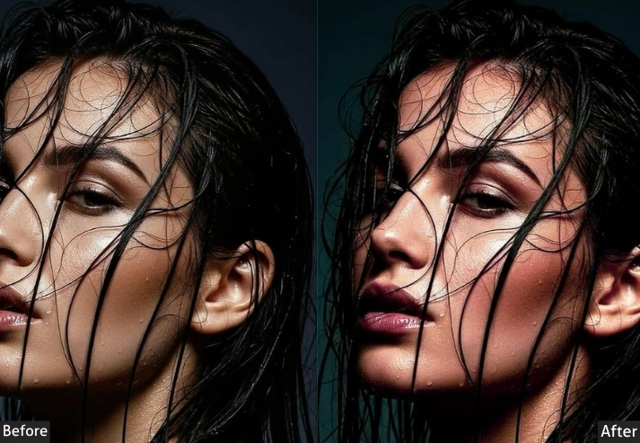
9. Vibrant Skin Tones Preset
This preset’s defining characteristic is an aggressive Vibrance push (+50) paired with a conservative Saturation boost (+10). Vibrance is a smart saturation tool. It amplifies muted, undersaturated tones while protecting already saturated colors, so skin tones get richer without going orange. Combined with a gentle Clarity increase, this results in a portrait that looks polished and retouched without any masking or local adjustments.
Light Panel: Exposure +15 | Contrast +20 | Highlights −15 | Shadows +10 | Whites +15 | Blacks −5.
Color Panel: Temperature +10 | Tint +5 | Vibrance +50 | Saturation +10.
Purpose: make skin tones look natural but radiant, without over-editing or distorting colors.
Best For: Beauty portraits, headshots, or any close-up portrait work.
Usage: Anytime you want to highlight natural skin tones while keeping the colors fresh and vibrant.
Style: Radiant, natural, vibrant.
10. Editorial Glow Preset
The Editorial Glow is built around the Clarity slider set to +20 to sharpen midtone contrast without the harsh edge-sharpening that Sharpening or Texture can introduce. Combined with lifted Whites and a slight Highlights boost, it produces the polished, high-key look associated with fashion magazine covers. The warm Temp offset (+5) keeps skin from looking clinical, while the muted Saturation ensures the colors support the subject rather than compete with them.
Light Panel: Exposure +30 | Contrast +20 | Highlights +10 | Shadows −10 | Whites +25 | Blacks −5.
Color Panel: Temperature +5 | Vibrance +15 | Saturation +5.
Effects Panel: Clarity +20.
Purpose: polished and professional, think magazine covers and editorials.
Best For: Fashion photography, beauty portraits, or high-end lifestyle shots.
Usage: When you want your images to have that sleek, glowing, professional look.
Style: Polished, sleek, glowing.
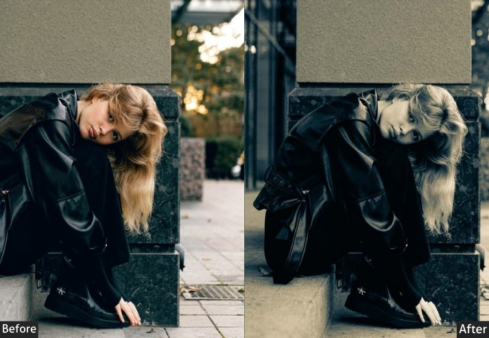
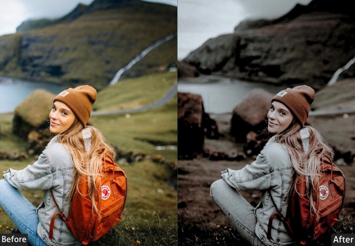
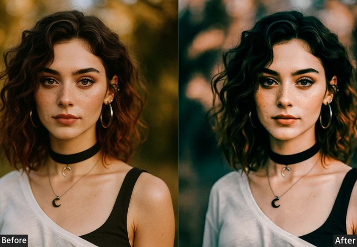
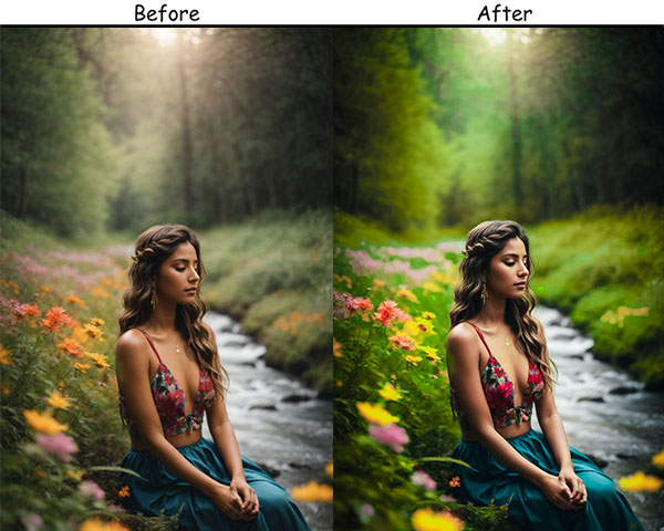
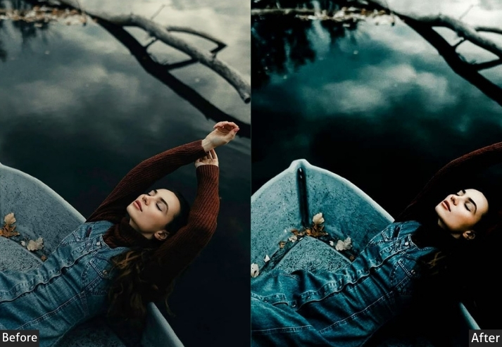
11. Dark and Moody Portrait Preset
Dark and Moody takes the cinematic approach further by underexposing and pulling the shadows down to −50 rather than simply boosting contrast. The result is a portrait in which the subject appears to emerge from near-total darkness, an effect that is almost impossible to recreate in-camera without specialized lighting. The Vignette (−25) reinforces the focal pull, and the Clarity boost (+30) ensures that the lit parts of the image retain fine-texture detail.
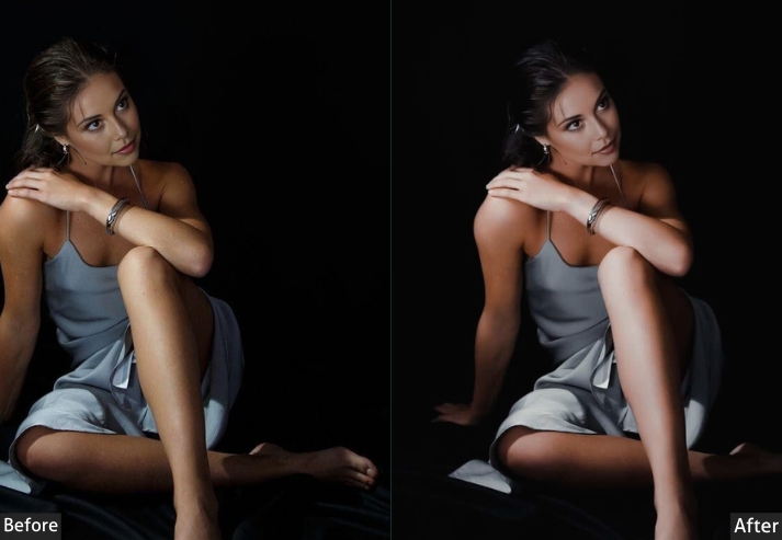
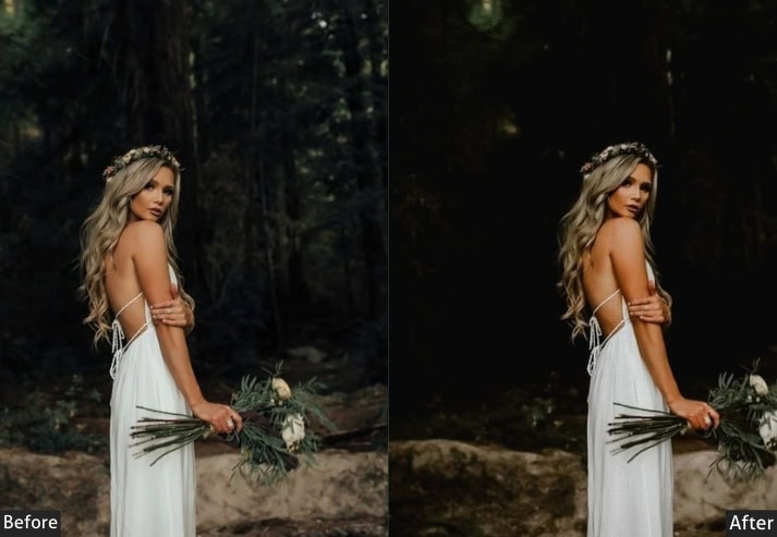
Light Panel: Exposure −20 | Contrast +40 | Highlights −30 | Shadows −50 | Whites +10 | Blacks −50.
Color Panel: Temperature −5 | Tint +10.
Effects Panel: Clarity +30 | Vignette −25.
Purpose: a moody, dramatic feel.
Best For: Artistic portraits, environmental shots, or any scenario where you want to convey emotion through shadow and depth.
Usage: mysterious and moody.
Style: Dark, intense, atmospheric.
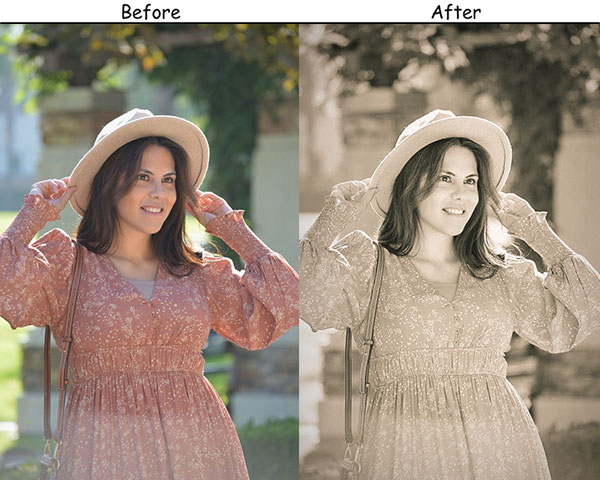
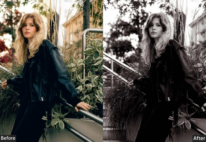
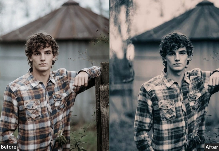
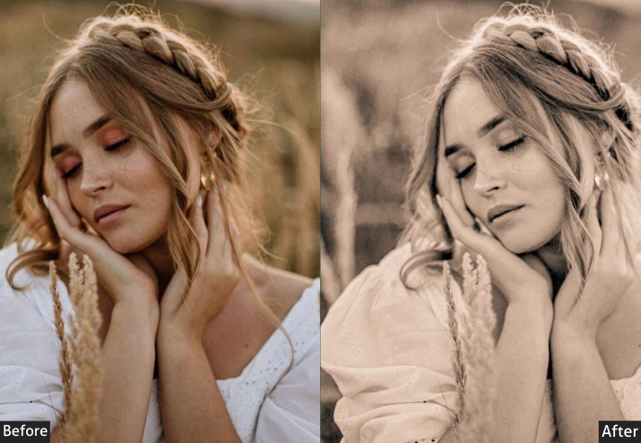
12. Sepia Tone Preset
Sepia is not simply black-and-white with an orange tint. When done correctly, it mimics the chemical toning process used on silver-gelatin prints in the 19th and early 20th centuries. This preset achieves that effect by first desaturating the image (Saturation −50) and then aggressively warming the temperature (+50), so the remaining color information maps to warm amber tones. Grain (+40) and a gentle vignette complete the period feel.
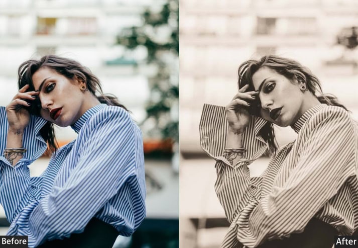
Light Panel: Exposure +15 | Contrast +10 | Highlights −15 | Shadows +20 | Whites +5 | Blacks +15.
Color Panel: Temperature +50 | Saturation −50.
Effects Panel: Grain +40 | Vignette −20.
Purpose: a timeless, nostalgic look that makes your portrait feel like a piece of history.
Best For: Family portraits, historical-themed shoots, or any time you want to create a sense of nostalgia.
Usage: Use this preset when you want your photos to evoke memories and capture a retro aesthetic.
Style: Vintage, nostalgic, warm.
13. Soft Glow Preset
The Soft Glow preset achieves its dreamy quality through a rarely used combination: a reduced Clarity value (−15) and a negative Dehaze value (−20). Normally, Dehaze adds crispness; used in reverse, it intentionally introduces atmospheric haze, softening fine detail and creating the impression of light diffusing through the scene. Highlight recovery keeps facial details intact beneath the glow.
Light Panel: Exposure +35 | Contrast −20 | Highlights +40 | Shadows +10 | Whites +25 | Blacks +10.
Color Panel: Vibrance +20 | Saturation −5.
Effects Panel: Clarity −15 | Dehaze −20.
Purpose: soft, glowing portraits with a dream-like quality.
Best For: Beauty shots, newborn photography, or any time you want to create a soft, ethereal look.
Usage: fresh, glowing feel, especially in soft natural light.
Style: Soft, dreamy, glowing.
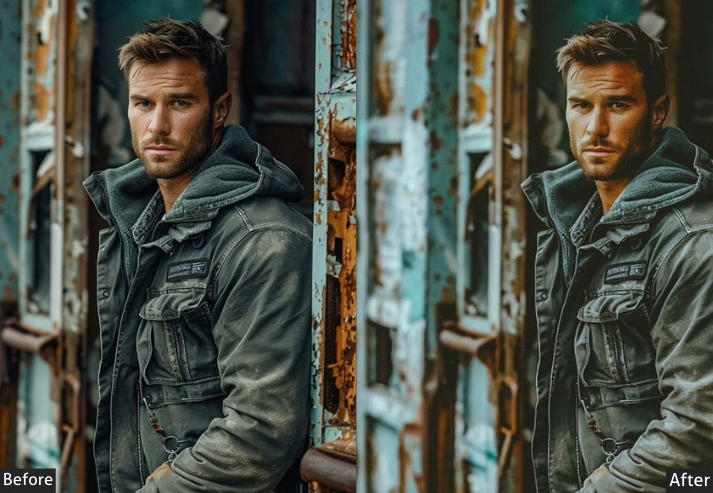
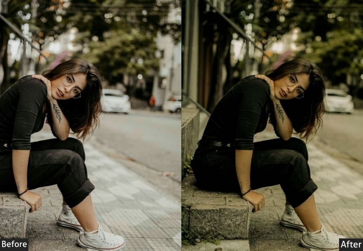
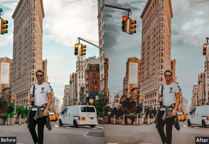
14. Urban Grit Portrait Preset
Street photography and environmental portraiture demand a look that feels authentic to the location. Urban Grit uses Clarity (+50) and Texture (+40) at full force to bring out every surface detail in brick, concrete, and fabric, then crushes the blacks (−40) so the image reads with the same punchy contrast as high-ASA street photography. The desaturated palette (Saturation −10) prevents color from softening the hard-edged feel.
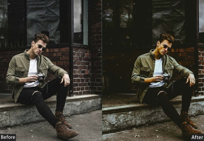
Light Panel: Exposure −10 | Contrast +50 | Highlights −20 | Shadows −30 | Whites +10 | Blacks −40.
Color Panel: Saturation −10.
Effects Panel: Clarity +50 | Texture +40 | Grain +30.
Purpose: a gritty, textured feel to portraits.
Best For: Street photography, urban portraits, or any time you want to capture the real essence of a scene.
Usage: Use it when you want to focus on an image’s details, textures, and grit.
Style: Edgy, textured, raw.
15. Film Grain Portrait Preset
Modern digital cameras produce images that are almost clinically clean, particularly at base ISO. The Film Grain preset reintroduces the organic, slightly noisy quality of analog film by setting Grain Amount to 60, Roughness to 50, and Size to 25 (medium grain). The slight Black lift and reduced Whites keep the tonal range from extending to absolute black or pure white, as actual film does.
Light Panel: Exposure +20 | Contrast +30 | Highlights −10 | Shadows +20 | Whites −10 | Blacks +10.
Color Panel: Temperature +10.
Effects Panel: Grain +60 | Vignette −15.
Purpose: a film-like texture and vibe in your portraits, bringing in nostalgia for the analog days.
Best For: Retro-themed shoots, lifestyle portraits, or anyone looking to add a classic touch to their photos.
Usage: Great when you want your photos to feel like they’ve been shot on film, even if they’re digital.
Style: Vintage, nostalgic, textured.
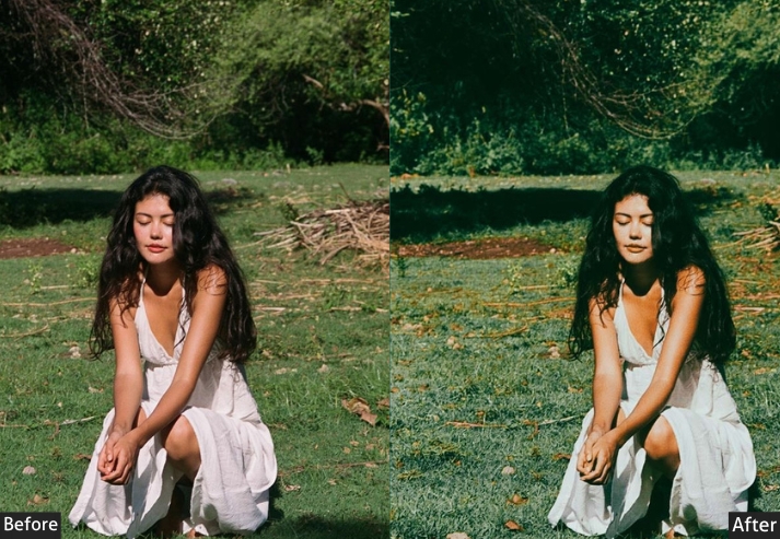
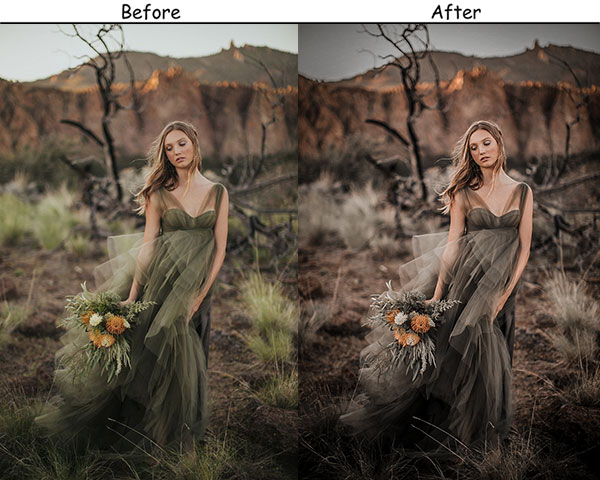
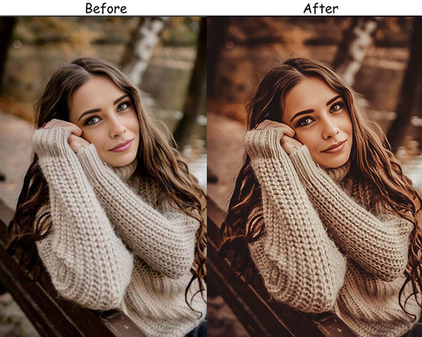
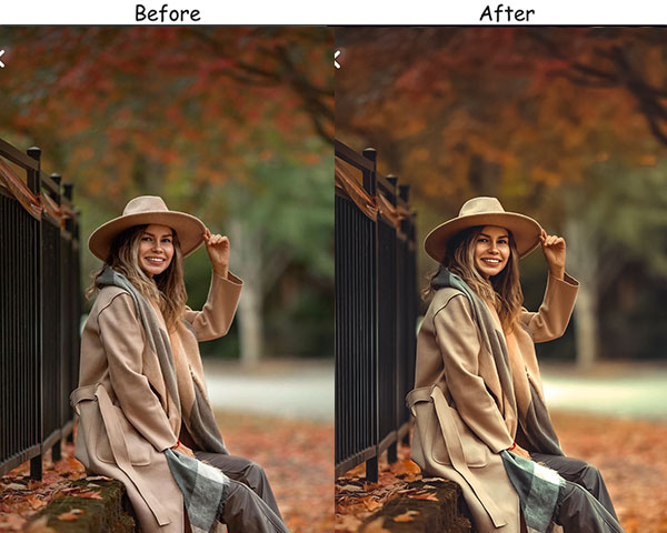
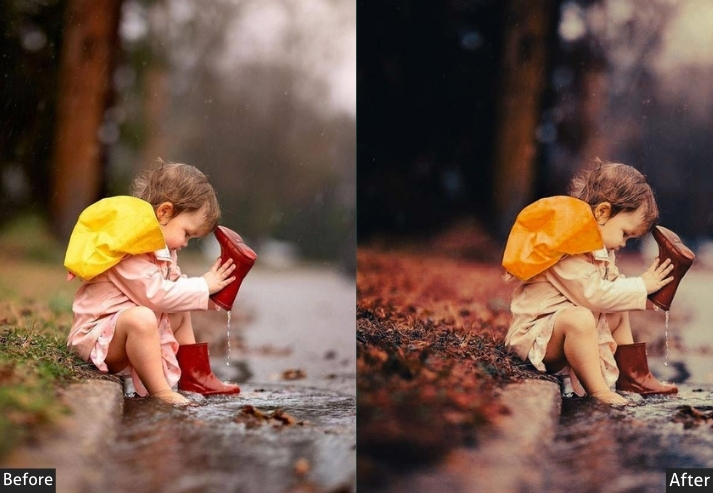
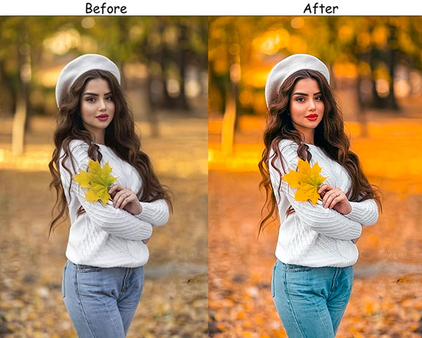
16. Autumn Amber Portrait Preset
Designed specifically for foliage-season shoots, Autumn Amber pushes the Orange and Red Vibrance values hard (+40 Vibrance overall) while warming the base temperature (+30) to align skin tones with the amber-and-gold palette of the surrounding leaves. The Tint push (+10) ensures that, under warm light, skin retains its healthy pink undertone rather than turning fully orange.
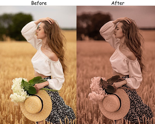
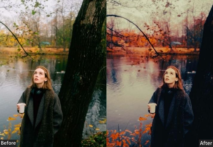
Light Panel: Exposure +25 | Contrast +15 | Highlights −20 | Shadows +20 | Whites +10 | Blacks −10.
Color Panel: Temperature +30 | Tint +10 | Vibrance +40 | Saturation +15.
Purpose: warm, cozy autumn portraits with a focus on rich amber tones and glowing light.
Best For: Outdoor portraits during fall, especially when surrounded by foliage.
Usage: a warm, natural vibe, for autumn-themed shoots.
Style: Warm, cozy, glowing.
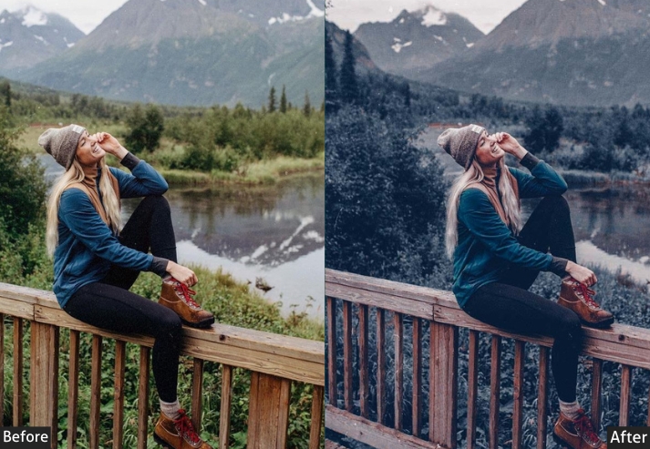
17. Winter Frost Portrait Preset
Winter Frost inverts the logic of most portrait presets by deliberately cooling the temperature (−30) to accentuate blues and cool grays in snow, ice, and winter sky. The Clarity boost (+25) and slight Dehaze (+15) preserve the sharpness of cold-air atmospheric scenes, while the lifted Whites simulate the reflective quality of snow-covered ground. Skin tones are balanced by the Tint offset (+5), which prevents the cool temperature from creating a bluish cast on faces.
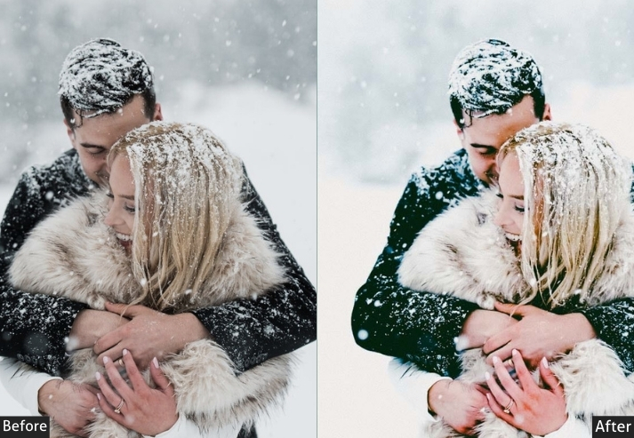
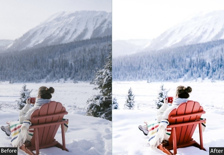
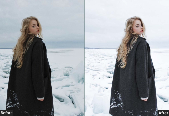
Light Panel: Exposure +15 | Contrast +20 | Highlights −10 | Shadows +10 | Whites +20 | Blacks −15.
Color Panel: Temperature −30 | Tint +5.
Effects Panel: Clarity +25 | Dehaze +15.
Purpose: a cool, crisp wintery feel that evokes frosty mornings and snowy landscapes.
Best For: Winter outdoor portraits, snow scenes, or any cool-toned environment.
Usage: Use this preset to capture the essence of winter with a balance of cool and cozy tones.
Style: Cool, crisp, frosty.
18. Spring Bloom Preset
Spring Bloom is the most color-forward preset in this collection. With Vibrance at +40 and Saturation at +20, it is designed to match the visual intensity of flowers and fresh foliage in full bloom. A warm Temp (+20) and Tint push (+15) enhance the greens and pinks of blossoming backgrounds without letting them overwhelm skin tones. Best used in locations where the environment’s color is as important as the subject.
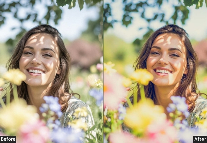
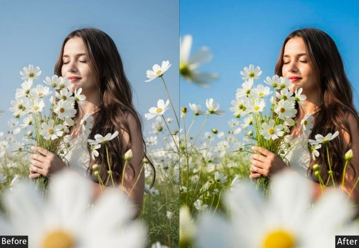
Light Panel: Exposure +30 | Contrast +10 | Highlights −15 | Shadows +25 | Whites +15 | Blacks +10.
Color Panel: Temperature +20 | Tint +15 | Vibrance +40 | Saturation +20.
Purpose: a burst of fresh, vibrant color to portraits.
Best For: Outdoor spring shoots, portraits surrounded by greenery or blossoms.
Usage: a fresh, colorful burst of life, for the spring season.
Style: Fresh, vibrant, blooming.
19. Summer Glow Preset
Summer Glow is the warmest and brightest preset in this collection: Temp +35, Exposure +0.40, Vibrance +50. It is calibrated for the harshest shooting conditions: full midday sun at the beach, outdoor festivals, poolside sessions where everything is overexposed and color-blown. The deepened Blacks (−20) add just enough structure to prevent the image from looking washed out despite the aggressive brightness push.
Light Panel: Exposure +40 | Contrast +20 | Highlights +30 | Shadows −10 | Whites +25 | Blacks −20.
Color Panel: Temperature +35 | Tint +10 | Vibrance +50 | Saturation +25.
Purpose: the essence of summer with bright, warm, and vibrant portraits that feel like they’re full of sunshine.
Best For: Beach shots, outdoor summer parties, or any bright, sunny day.
Usage: bright, bold summer portraits when you want everything to feel sun-kissed and glowing.
Style: Bright, warm, vibrant.
This preset screams “summer vacation” to me.
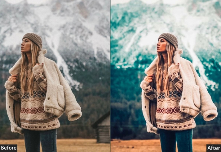
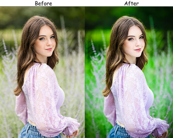
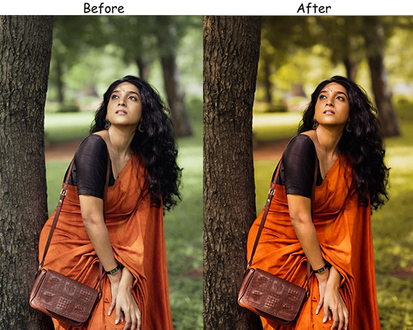
20. Emerald Green Preset
Forest and garden portraits benefit from a preset that actively enhances the surrounding environment rather than fighting it. Emerald Green pushes Green Vibrance and slightly cools the base temperature (−5), so that foliage reads as rich, deep green rather than the yellow-green that warm presets often produce. The +25 Contrast boost adds depth to the image and prevents the greens from looking flat under the overcast conditions common in tree-canopy shooting.
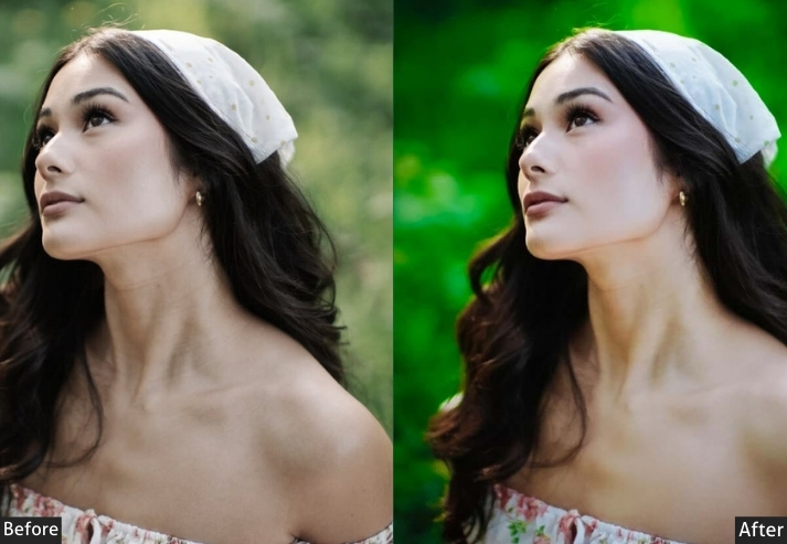
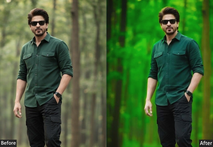
Light Panel: Exposure +15 | Contrast +25 | Highlights −10 | Shadows +15 | Whites +5 | Blacks −10.
Color Panel: Temperature −5 | Tint +5 | Vibrance +30 | Saturation +20.
Purpose: The natural beauty of greens in outdoor portraits.
Best For: Forest, garden, or any nature-focused shoots.
Usage: highlight the greenery’s richness in your shots to create a lush, natural look.
Style: Rich, natural, earthy.
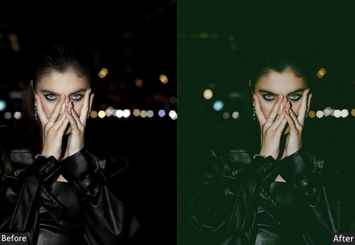
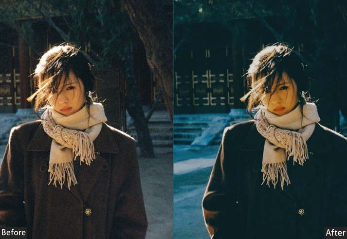
21. Dark Blue Portrait Preset
Dark Blue is designed for portraits shot in artificial light: street lighting, LED interiors, neon-lit environments, or night-time outdoor sessions. By pushing Temp to −40, you shift any neutral or warm artificial light source toward the deep-blue palette associated with twilight and city-at-night photography. Crushed blacks (−40) and a strong contrast push (+30) contain the mood. This is one of the few presets in this collection where the color itself is the primary creative statement.
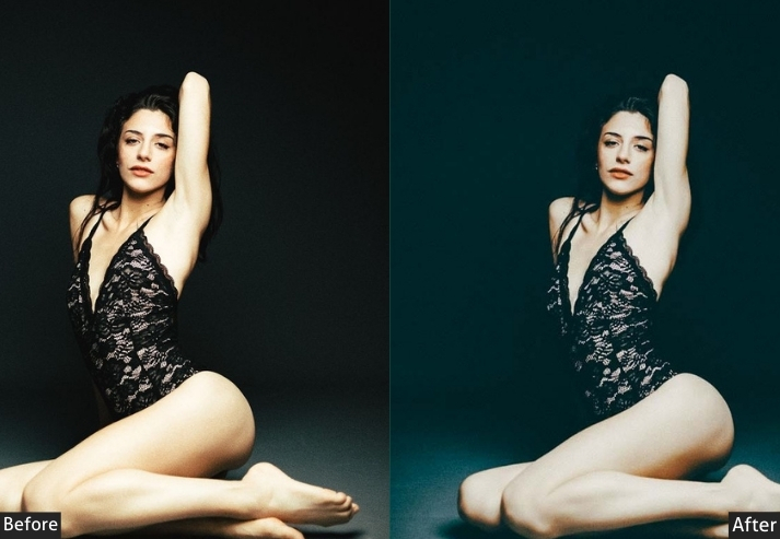
Light Panel: Exposure −15 | Contrast +30 | Highlights −30 | Shadows −20 | Whites +5 | Blacks −40.
Color Panel: Temperature −40 | Tint +10 | Vibrance +15 | Saturation −10.
Purpose: moody, cool-toned portraits.
Best For: Night-time shoots, portraits under artificial light, or any time you want to create a cool, mysterious mood.
Usage: Use it to emphasize blues and cool tones.
Style: Cool, moody, mysterious.
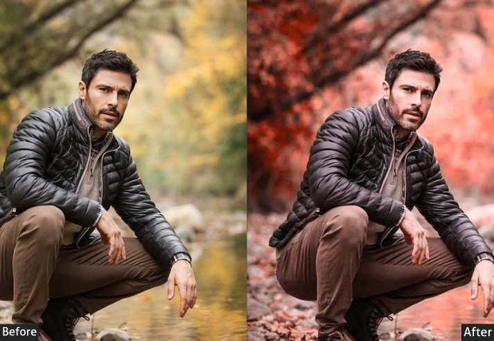
22. Crimson Red Preset
Crimson Red is purpose-built for portraits where red is prominent in the frame: red clothing, red backdrops, floral arrangements, or vibrant editorial sets. It amplifies the orange-red channel in HSL, warms the base temperature, and pushes Vibrance high (+50) to produce a commanding, highly saturated image. Because it is specifically tuned for high-energy, red-dominant scenes, it should be used selectively. Applying it to images where red is not a primary color may produce skin tones that are too heavily tinted.
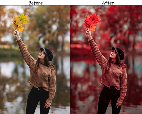
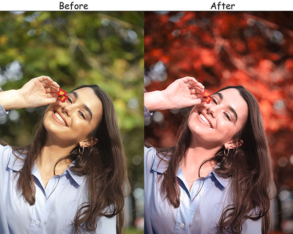
Light Panel: Exposure +20 | Contrast +30 | Highlights −10 | Shadows +15 | Whites +10 | Blacks −20.
Color Panel: Temperature +25 | Tint +10 | Vibrance +50 | Saturation +20.
Purpose: passionate, bold portraits that highlight rich, vibrant reds.
Best For: Fashion shoots, editorial photography, or any moment where red is the star.
Usage: Portraits with red elements like clothing, backgrounds, or accessories, emphasizing the warmth and power of the color.
Style: Bold, passionate, dramatic.
23. Cool Blue Portrait Preset
Blue is calming, serene, and cool. The cool blue enhances those soothing blue tones, creating a peaceful, relaxed vibe in your portraits.
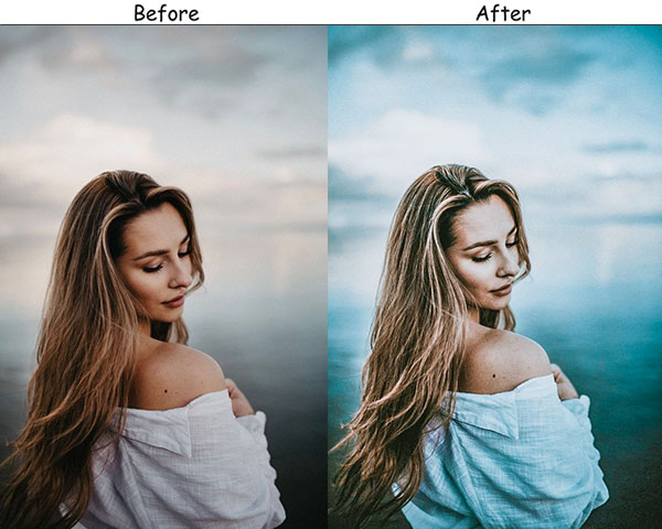
Light Panel: Exposure +10 | Contrast +20 | Highlights −20 | Shadows −10 | Whites +15 | Blacks −25.
Color Panel: Temperature −35 | Tint +5 | Vibrance +30 | Saturation +10.
Purpose: calming, cool portraits with rich blue tones.
Best For: Beach portraits, moody blue-hour shots, or any scenario where you want to play with cool tones.
Usage: Portraits in blue-themed settings, such as near water, the sky, or blue backdrops.
Style: Cool, calming, serene.
24. Sunshine Yellow Preset
Yellow is all about happiness, warmth, and positivity. A yellow vibe brings bright, cheery tones, giving your portraits a sunny, uplifting feel that feels like a warm summer day.
Light Panel: Exposure +40 | Contrast +10 | Highlights +20 | Shadows +10 | Whites +30 | Blacks −10.
Color Panel: Temperature +30 | Tint +5 | Vibrance +50 | Saturation +20.
Purpose: portraits full of warmth and joy, with bright yellow tones that make the image feel sunny and cheerful.
Best For: Summer shoots, outdoor portraits with abundant natural light, or any scenario that calls for a happy, vibrant mood.
Usage: bringing out the warmth and joy in your portraits, especially with sunny backgrounds or yellow tones in clothing and scenery.
Style: Bright, warm, cheerful.
25. Minimal Portrait Preset
Less is more! This preset focuses on clean, balanced tones, removing harsh contrasts and keeping everything soft and natural. Transform the subject to shine without too much color manipulation or visual noise.
Light Panel: Exposure +15 | Contrast +10 | Highlights −10 | Shadows +10 | Whites +5 | Blacks +5.
Color Panel: Temperature +5 | Tint +5 | Vibrance +10 | Saturation −5.
Effects Panel: Clarity +10 | Grain 0.
Purpose: natural, minimalistic portraits that are clean, polished, and elegant.
Best For: Headshots, clean studio portraits, or any time you want a soft, polished, and minimal look without too much color or contrast manipulation.
Style: Clean, understated, elegant.
26. Purple Haze Preset
Purple is mysterious, creative, and unique. This one enhances deep purples and lavender tones, adding a touch of magic and mystique to your portraits.
Light Panel: Exposure +10 | Contrast +15 | Highlights −20 | Shadows −15 | Whites +5 | Blacks −25.
Color Panel: Temperature −5 | Tint +30 | Vibrance +20 | Saturation +15.
Purpose: dreamy, mysterious portraits with deep purple hues that feel creative and unique.
Best For: Artistic shoots, fantasy-themed portraits, or anytime you want to add a touch of magic to your images.
Usage: Portraits with purple elements like lighting, backdrops, or clothing.
Style: Dreamy, mysterious, magical.
27. Tangerine Dream Preset
Orange is warm, energetic, and vibrant. Brings out rich orange tones, creating a vivid, glowing atmosphere that feels warm and alive.
Light Panel: Exposure +35 | Contrast +15 | Highlights +20 | Shadows +10 | Whites +25 | Blacks −15.
Color Panel: Temperature +30 | Tint +5 | Vibrance +50 | Saturation +20.
Purpose: warm, glowing portraits that highlight rich orange tones.
Best For: Sunset portraits, beach photoshoots, or any scene where warmth and energy are key.
Usage: Outdoor portraits in warm lighting, particularly during golden hour, when you want to enhance the scene’s natural warmth.
Style: Warm, energetic, glowing.
28. Pink Blush Preset
Pink is soft, playful, and romantic. This preset brings out delicate pinks and rose tones, creating a gentle, dreamy atmosphere for romantic or whimsical portraits.
Light Panel: Exposure +25 | Contrast +10 | Highlights +15 | Shadows +20 | Whites +10 | Blacks +5.
Color Panel: Temperature +10 | Tint +20 | Vibrance +30 | Saturation +15.
Purpose: soft, romantic portraits with delicate pink tones.
Best For: Wedding photos, baby portraits, or any time you want to emphasize soft, romantic tones.
Usage: Portraits with soft lighting and pastel-colored elements.
Style: Soft, romantic, playful.
29. Teal and Orange Preset
The teal-and-orange color scheme is a classic, cinematic combination that creates a striking contrast. Teal-orange emphasizes deep teal shadows and warm orange highlights, giving your portraits a bold, dramatic look.
Light Panel: Exposure +10 | Contrast +40 | Highlights +20 | Shadows −20 | Whites +10 | Blacks −30.
Color Panel: Temperature +25 | Tint −15 | Vibrance +50 | Saturation +10.
Purpose: bold, cinematic portraits with a strong contrast between warm and cool tones.
Best For: Cinematic portraits, urban photography, or any scene that calls for a striking color contrast.
Usage: dynamic, stylized portraits with a cinematic feel, particularly in urban or industrial settings.
Style: Cinematic, bold, stylized.
Create a larger-than-life, Hollywood-inspired look in your portraits!
30. Lavender Mist Preset
Lavender represents calmness, creativity, and a touch of magic. So the preset enhances soft purples and lilac tones, creating a dreamy, ethereal feel that’s best for whimsical, artistic portraits.

Light Panel: Exposure +20 | Contrast +15 | Highlights −10 | Shadows +10 | Whites +5 | Blacks −15.
Color Panel: Temperature −10 | Tint +25 | Vibrance +40 | Saturation +10.
Purpose: soft, dreamy portraits with beautiful lavender tones.
Best For: Artistic shoots, spring portraits, or any time you want to capture a soft, ethereal look.
Usage: Portraits with soft lighting and pastel tones, where you want to add a whimsical, creative vibe.
Style: Dreamy, ethereal, creative.
Last Words
A preset is most effective when it matches the lighting in which your image was shot and provides a starting point that requires only minor fine-tuning. The presets above cover the most common portrait lighting scenarios. The goal is always to reduce editing time while increasing consistency across a session, not to apply a single look to every image regardless of context.
If you find a preset you like but the skin tones aren’t quite right, the fastest fix is almost always in the HSL panel (the Orange and Red channels for most skin tones) or the Tint slider (push toward magenta to neutralize green casts, toward green to neutralize magenta casts).
See: Lightroom Presets Installing Guide Step By Step
More Presets For You:
Street Lightroom Presets Free Download
Urban Lightroom Presets Free Download