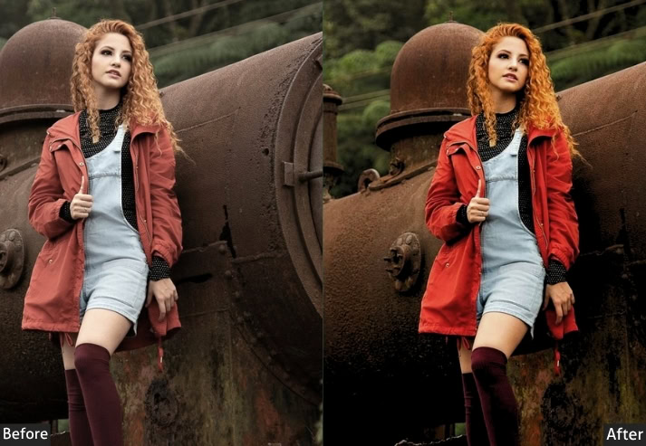
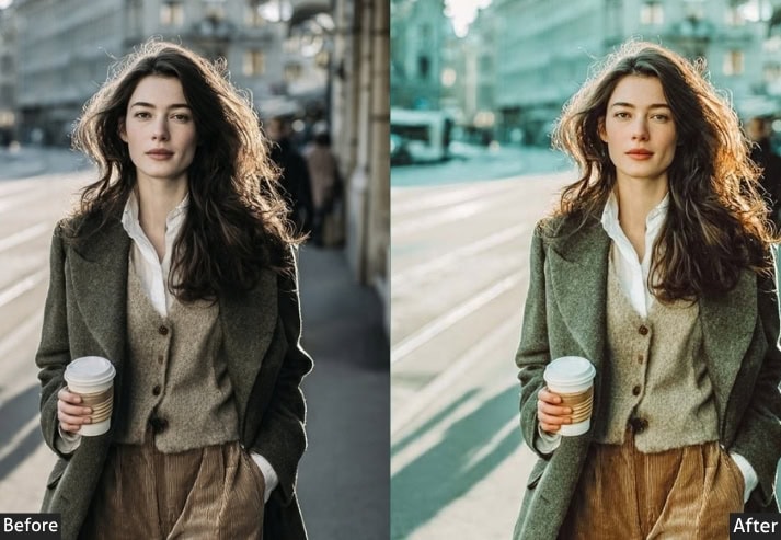
If you’ve ever scrolled through Instagram or Pinterest and thought, “How does their feed look SO Aesthetic?” chances are, presets are a big part of that answer. Lightroom presets are one-click editing configurations that apply a specific set of adjustments to your photo all at once. They control everything: the warmth of your light, the depth of your shadows, how your skin tones render.
Aesthetic” presets, specifically, are designed to give photos a distinct mood or visual identity rather than just making them look “corrected.” They’re used by influencers, wedding photographers, travel bloggers, brand photographers, and really anyone who wants their visuals to feel intentional and consistent.
This guide breaks down every major type of aesthetic preset, explains what makes each one unique, and gives you the actual editing settings with real tool percentages so you can recreate or customize any of these looks yourself. Let’s go!
Check: Lightroom Presets Import & Usage Guidelines.

Pauline Jackson
I’ve been editing photos in Lightroom for over eight years, and honestly? Presets changed everything for me. Not because they do the work for me, but because they gave me a starting point to develop my own eye.
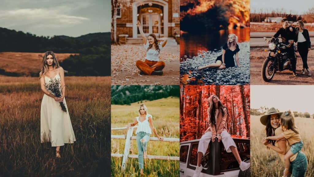
50 Aesthetic Lightroom Presets Free Download For Your Photography
You don’t need expensive tools or years of editing experience to achieve that soft, cinematic vibe anymore. With the right presets, you can transform dull, flat images into eye-catching visuals in just one click. Just download, apply, and watch your images come to life.
Aesthetic Preset Settings at a Glance:
| Preset Name | Temperature | Exposure | Blacks | Clarity | Grain | Vibe |
|---|---|---|---|---|---|---|
| Dark & Moody | Cool −5 to −10 | −0.50 to −0.80 | −40 to −60 | +5 to +15 | Heavy | Dramatic |
| Bright & Airy | Warm +5 to +15 | +0.50 to +0.90 | +10 to +20 | −10 to −20 | Minimal | Cheerful |
| Film / Analog | Warm +10 to +25 | −0.10 to +0.20 | +15 to +30 | −5 to +5 | Heavy | Nostalgic |
| Matte / Faded | Neutral-Warm | 0 to +0.30 | +25 to +45 | −15 to −30 | Light | Editorial |
| Cinematic | Warm +5 to +15 | −0.10 to −0.30 | −15 to −30 | +5 to +15 | Medium | Story |
| Black & White | N/A (Mono) | −0.10 to +0.20 | −30 to −50 | +15 to +30 | Heavy | Timeless |
| Urban / Street | Cool −5 to −15 | −0.20 to −0.40 | −35 to −55 | +20 to +35 | Heavy | Raw |
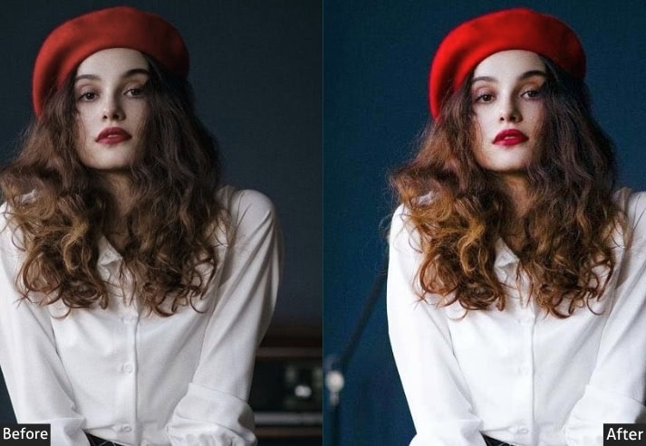
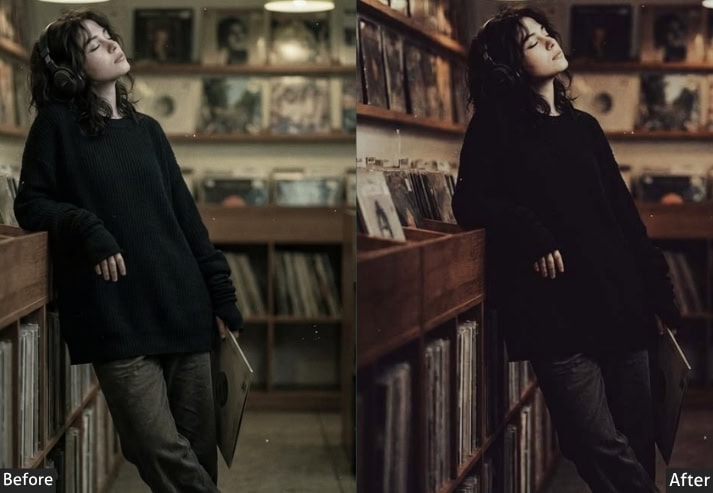
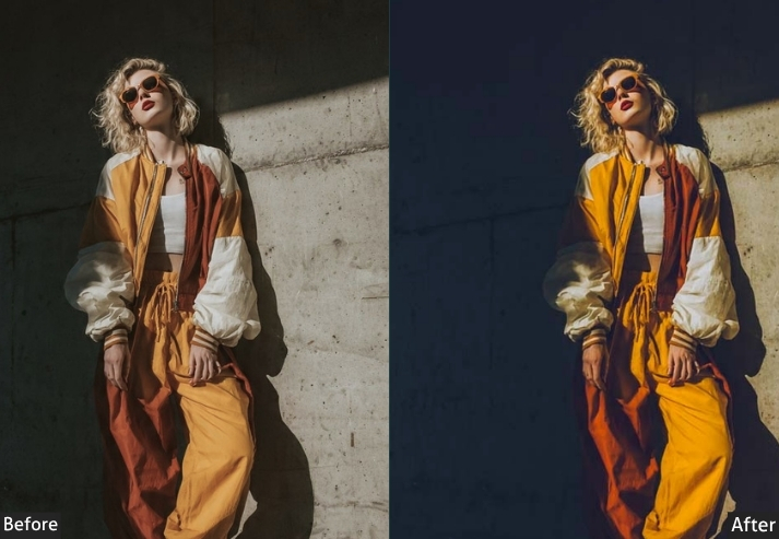
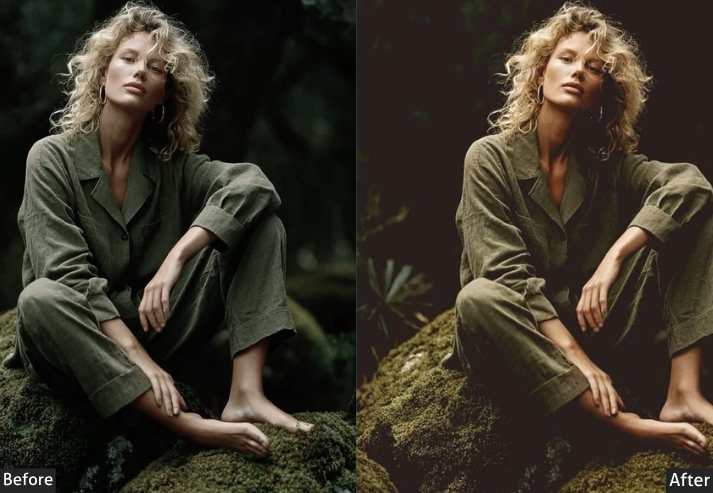
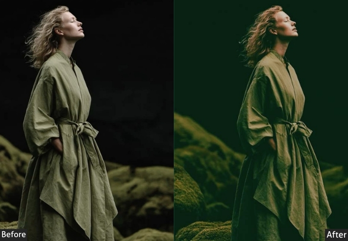
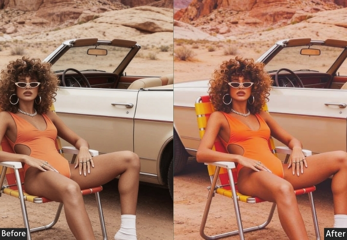
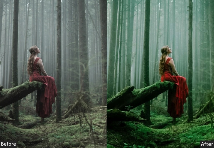
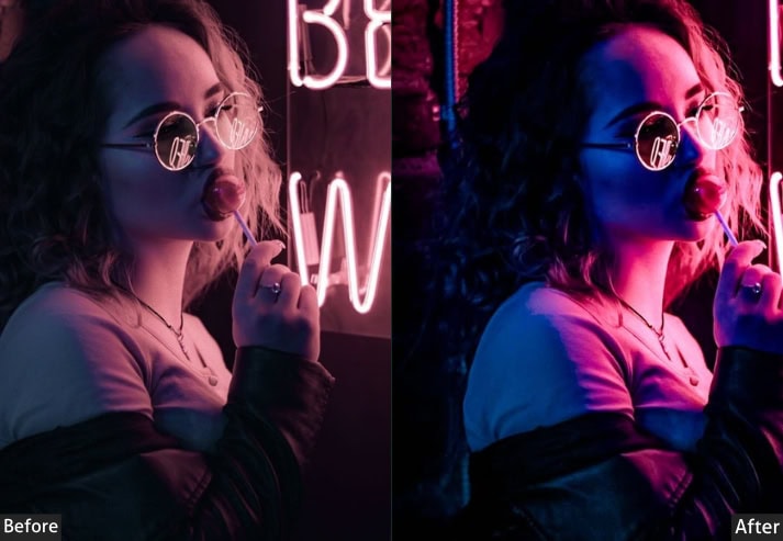
1. Moody Dark Preset
The Vibe: Dramatic. Intense. Like the photo has a secret.
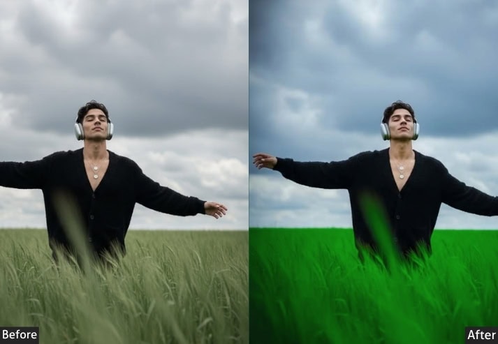
Moody dark presets are probably the most beloved aesthetic in photography circles right now. And for good reason, they turn even an ordinary shot into something that feels cinematic and emotionally charged. The look is built on deep, rich shadows, slightly desaturated colors, and a blue or green undertone that sits underneath everything. If your photo makes someone feel something without them knowing why, it’s probably wearing a moody dark preset.
These presets work brilliantly on indoor shots, stormy landscapes, moody portraits, and anything where you want to lean into drama rather than away from it. The key with moody editing is restraint. It’s about creating depth and atmosphere.
Light Panel: Exposure −0.50 | Contrast +25 | Highlights −40 | Shadows +10 | Whites −20 | Blacks −30.
Color Panel: Temp 4800K (cooler, pull toward blue) | Tint +5 | Vibrance −10 | Saturation −8.
HSL / Color Mix: Red Hue +5 | Red Saturation −15 | Red Luminance −10 | Orange Hue +8 | Orange Saturation −20 | Orange Luminance −15 | Blue Hue −10 | Blue Saturation +20 | Blue Luminance −20 | Aqua Hue −5 | Aqua Saturation +15.
Tone Curve: Lights −10 | Darks −20 (pull down for deep shadows) | Shadows Point +8 (slight faded base).
Effects Panel: Clarity +12 | Dehaze +8 | Vignette −25 (Midpoint 50, Feather 75).
Detail Panel: Sharpening +35 (Radius 1.0, Detail 25, Masking 60) | Luminance NR +20.
Color Grading: Shadows H220/S20 (blue tone) | Midtones H190/S8 (teal) | Highlights H40/S5 (warm gold).
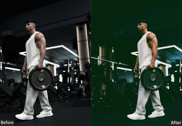
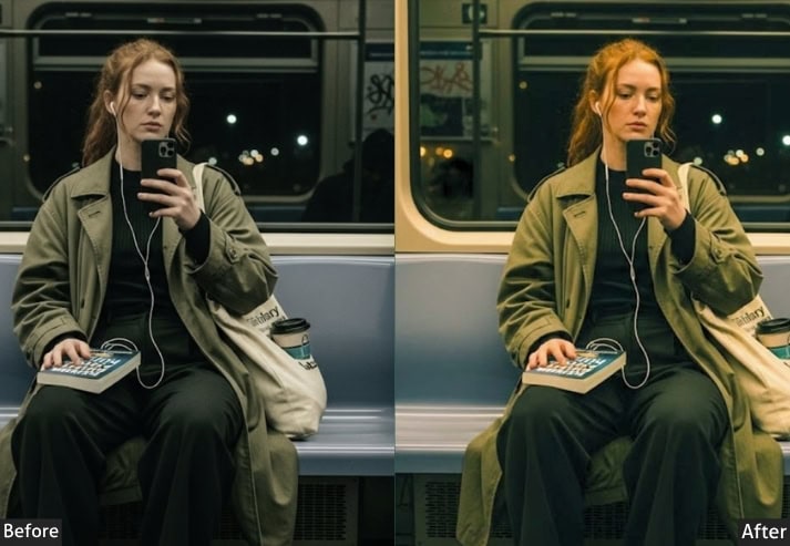
Purpose: Creates an emotionally heavy, dramatic atmosphere that pulls viewers into the scene.
Best For: Portrait photography, dark florals, urban/street photography, moody landscape, boudoir, and editorial fashion.
Usage: Instagram feeds and editorial content where you want consistent, bold visual storytelling.
Style: Dark, brooding, cinematic, with rich shadows and muted midtones.
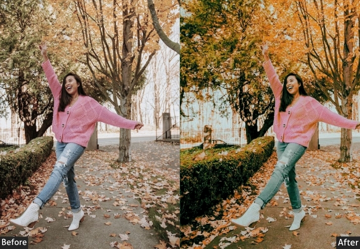
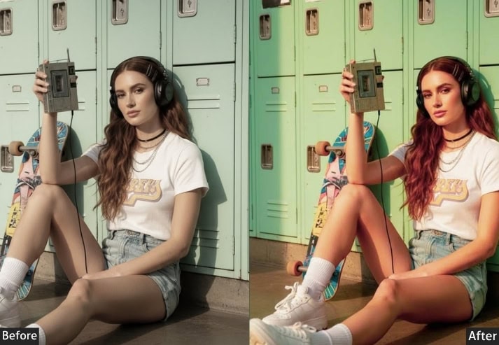
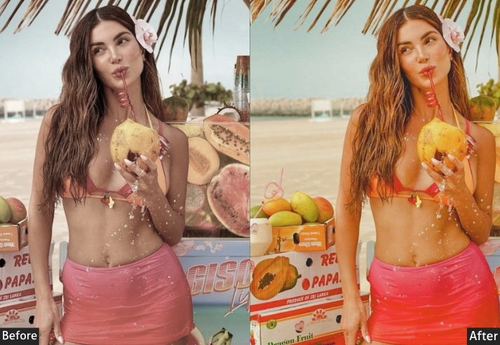
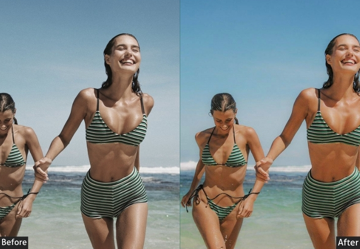
2. Bright & Airy Preset
The Vibe: Sunlit, soft, like you’re living inside a dream.
If moody is the night owl, bright and airy is the golden morning. This is the aesthetic that makes you feel warm just by looking at it: soft whites, lifted shadows, barely-there colors, and that beautiful, hazy glow that makes it look like light is literally leaking into the frame. It’s wildly popular among lifestyle, family, and newborn/maternity photographers.
Light Panel: Exposure +0.60 | Contrast −20 | Highlights −30 | Shadows +40 | Whites +25 | Blacks +15.
Color Panel: Temp 5600K (slightly warm) | Tint +3 | Vibrance +10 | Saturation −5.
HSL / Color Mix: Orange Hue +8 | Orange Saturation −10 | Orange Luminance +20 | Yellow Hue +10 | Yellow Saturation −15 | Yellow Luminance +15 | Green Saturation −20 | Green Luminance +10 | Blue Saturation −25 | Blue Luminance +30 | Aqua Luminance +25.
Tone Curve: Highlights +15 | Lights +10 | Darks +20 (lift shadows significantly) | Shadows +25.
Effects Panel: Clarity −8 (softens texture, essential for airy feel) | Vignette −10 (Midpoint 60, Feather 80).
Detail Panel: Sharpening +20 (Radius 0.8, Masking 70) | Luminance NR +15.
Color Grading: Shadows H30/S12 (warm peach) | Highlights H50/S6 (soft white-cream) (Hue ~50, Saturation 6).
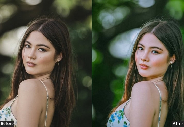
Purpose: light-filled, optimistic, and emotionally warm image that feels approachable and lifestyle-forward.
Best For: Newborn/maternity photography, lifestyle, weddings, family sessions, flat lays, food photography.
Usage: personal brands, parenting blogs, wedding galleries, and Pinterest-friendly content.
Style: Light, warm, soft, clean whites, lifted shadows, minimal contrast.
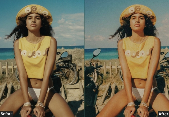
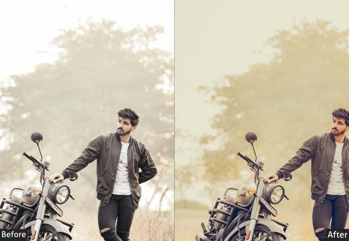
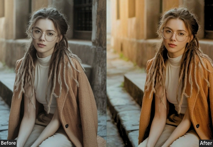
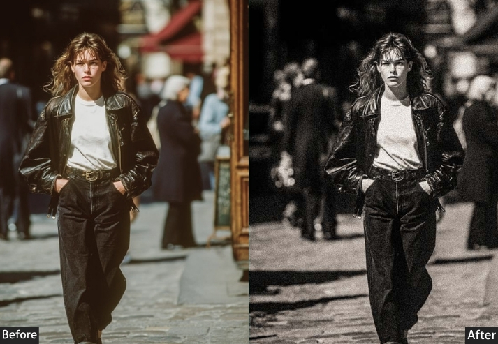
3. Film / Vintage Preset
The Vibe: Like someone found your photo in a shoebox from 1987.
There’s something undeniably nostalgic about film presets, and that nostalgia is exactly the point. These presets mimic the look of analog film stocks. the slightly faded blacks, the grain, the muted colors that were never quite “accurate,” and that warm or cool color cast depending on whether you’re going Kodak or Fuji. It feels handmade and human in a way that hyper-sharp digital photos just can’t match.
Film presets are having a massive moment right now, largely because Gen Z and millennials alike are craving that analog warmth in a world full of sterile perfection. The editing approach involves fading the shadows, introducing film grain, pulling back contrast in a specific way, and carefully shifting individual color channels to match the behavior of real film stock.
Light Panel: Exposure −0.20 | Contrast −15 | Highlights −25 | Shadows +30 (key for faded, film-like blacks) | Whites −10 | Blacks +20 (lift above pure black — crucial).
Color Panel: Temp 5200K | Tint +8 | Vibrance −15 | Saturation −12.
HSL / Color Mix: Red Hue +10 | Red Saturation −20 | Orange Hue +15 | Orange Saturation −15 | Orange Luminance +10 | Yellow Hue −8 | Yellow Saturation −20 | Green Hue +10 | Green Saturation −25 | Blue Hue −15 | Blue Saturation −10 | Blue Luminance −5.
Tone Curve: Shadows +25 (fade blacks like real film) | Darks +10 | Lights −5 | Highlights −10.
Effects Panel: Clarity −5 | Grain +35 (Size 30, Roughness 50) | Vignette −15 (Midpoint 45, Feather 70, Roundness −20).
Detail Panel: Sharpening +15 (Radius 0.8, Masking 80) | Luminance NR +10.
Color Grading: Shadows H160/S15 (green-teal) | Midtones H35/S5 (slight orange) | Highlights H45/S8 (warm cream) Hue ~45, Saturation 8).
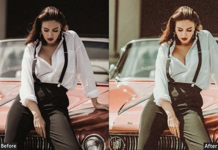
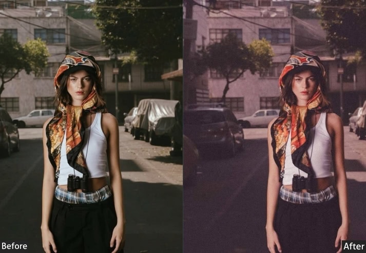
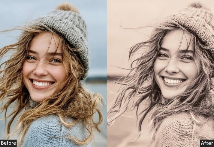
Purpose: Replicates the organic, imperfect character of analog film photography.
Best For: Street photography, travel photography, casual/documentary portraiture, journalistic style.
Usage: Extremely popular on Instagram and photo zines with a retro editorial look.
Style: Faded blacks, warm or cool film cast, natural grain, slightly muted and nostalgic.
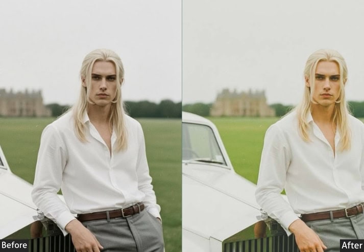
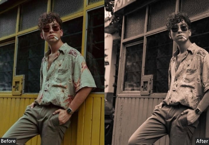
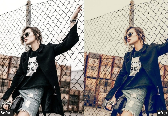
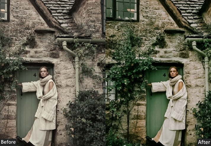
4. Matte / Faded Preset
The Vibe: Effortlessly cool, like a photo taken by someone who doesn’t try too hard.
Matte presets are defined by that characteristic “lifted” look in the shadows. The blacks never go fully black, which gives the whole image a soft, slightly faded quality. It’s the editing equivalent of vintage denim: lived-in, cool without being obvious about it. Matte aesthetics became hugely popular through VSCO’s A-series presets, and they remain a staple for anyone going for an editorial or fashion-forward look.
What makes matte editing tick is the shadow lift. You’re essentially crushing the bottom of the tone curve up, so the darkest part of your image isn’t true black. Pair this with reduced contrast, muted colors, and sometimes a slight warm or cool color cast, and you’ve got a look that feels effortlessly stylish.
Light Panel: Exposure −0.10 | Contrast −25 | Highlights −15 | Shadows +20 | Whites −15 | Blacks +35 (foundation of matte look — lift blacks).
Color Panel: Temp 5000K | Tint +3 | Vibrance −18 | Saturation −12.
HSL / Color Mix: Red Saturation −15 | Red Luminance +5 | Orange Saturation −10 | Orange Luminance +8 | Yellow Saturation −20 | Green Saturation −25 | Blue Saturation −15 | Blue Luminance +10.
Tone Curve: Shadows +30 (critical matte effect) | Darks +15 | Lights −5 | Highlights −10.
Effects Panel: Clarity −5 | Grain +20 (Size 25, Roughness 40) | Vignette −12 (Midpoint 55, Feather 75).
Detail Panel: Sharpening +20 (Radius 0.9, Masking 65) | Luminance NR +20.
Color Grading: Shadows H30/S10 (warm brown) | Highlights H210/S5 (cool white) (Hue ~210, Saturation 5).
Purpose: Achieves a fashion-editorial, effortlessly stylish image quality through lifted shadows and reduced contrast.
Best For: Fashion photography, editorial portraits, street style, product photography.
Usage: works on color and black-and-white images alike.
Style: Faded, muted, slightly flat, artistic, editorial.
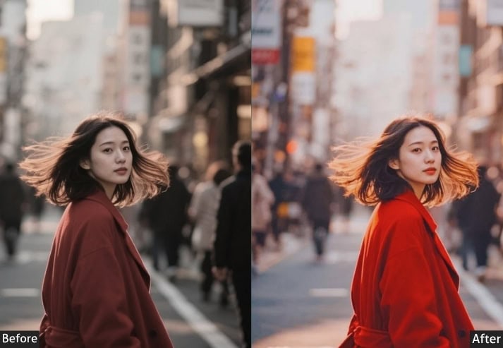
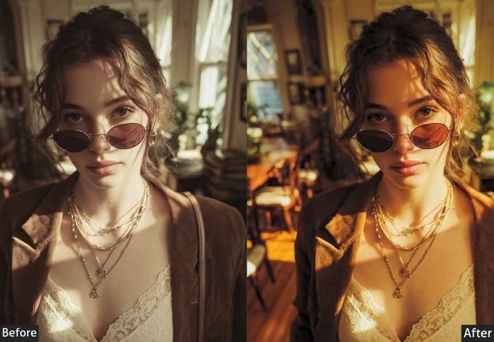
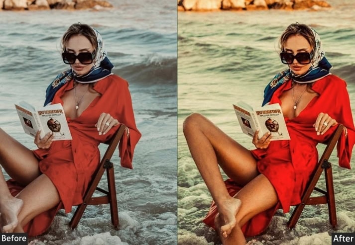
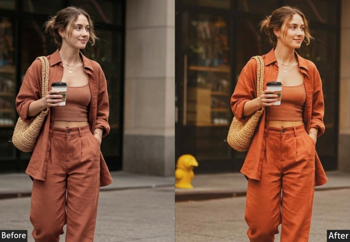
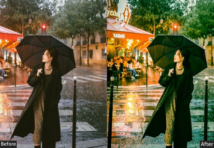
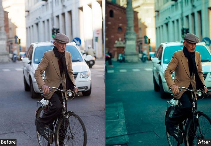
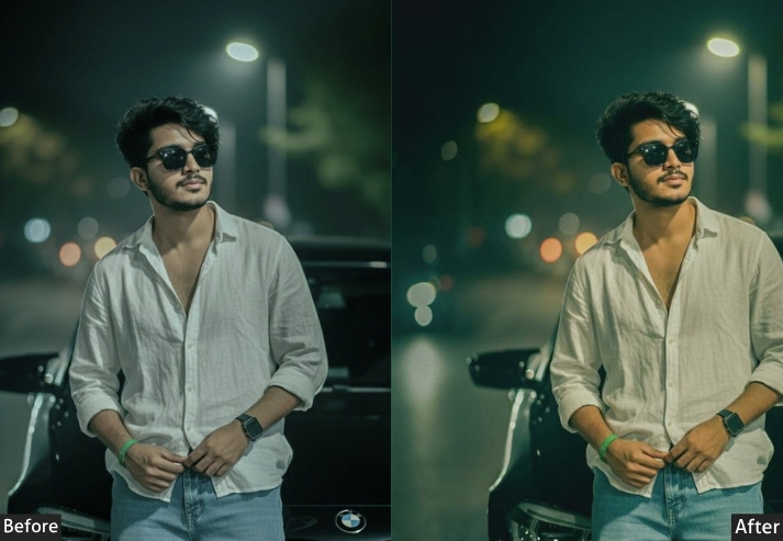
5. Cinematic Preset
The Vibe: Your life, but make it a Nolan film.
Cinematic presets borrow heavily from the color grading techniques used in film and television. The look is characterized by horizontal crop ratios, strong teal-in-shadow color grading, controlled contrast that doesn’t lose detail in the darks, and a certain “letterboxed” quality that makes you feel like you’re watching a story rather than looking at a photo. The colors feel intentional and dialed, not natural, but beautifully considered.
Good cinematic presets don’t try to make everything look the same. Instead, they apply a consistent color science, usually cool shadows, warm midtones, and slightly faded highlights, that translates across wildly different subject matter. The key is that everything feels like it’s in service of a narrative.
Light Panel: Exposure −0.15 | Contrast +30 | Highlights −35 | Shadows +15 | Whites −10 | Blacks −20.
Color Panel: Temp 5200K (neutral-to-cool) | Tint +5 | Vibrance +5 | Saturation −5.
HSL / Color Mix: Orange Hue +8 | Orange Saturation −10 | Orange Luminance +5 | Red Hue +5 | Red Saturation −15 | Aqua Hue −10 | Aqua Saturation +20 | Blue Hue −15 | Blue Saturation +25 | Blue Luminance −15 | Green Saturation −15.
Tone Curve: Highlights −15 | Lights −5 | Darks +5 | Shadows +20 (slight lift, not matte but not crushing).
Effects Panel: Clarity +20 | Dehaze +5 | Vignette −20 (Midpoint 45, Feather 65).
Detail Panel: Sharpening +35 (Radius 1.0, Detail 35, Masking 50) | Luminance NR +15.
Color Grading: Shadows H195/S28 (deep teal) | Midtones H35/S6 (hint of warmth) | Highlights H40/S8 (slightly warm)(Hue ~40, Saturation 8).
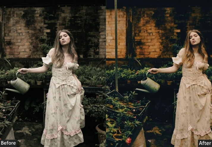
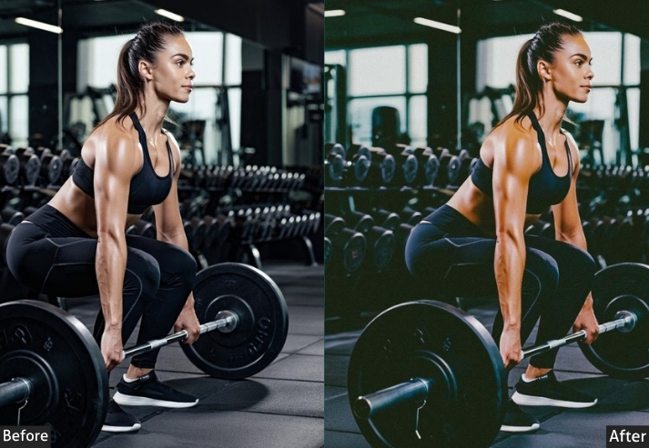
Purpose: Applies film and television-style color grading to photographs for a narrative, story-driven aesthetic.
Best For: Storytelling portraits, editorial photography, behind-the-scenes, environmental portraits, and architecture.
Usage: editorial, commercial, and film-adjacent work.
Style: Narrative, dramatic, film-like, teal-and-warm, considered.
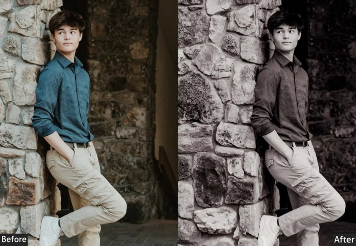
6. Black & White Preset
The Vibe: Timeless. Like a photograph that belongs in a gallery.
Black-and-white photography isn’t just “removing color.” That misconception is responsible for many flat, lifeless B&W photos. Real dramatic B&W editing is about contrast, tonal separation, and using the individual color channels to control how different parts of the image render in grayscale.
Light Panel: Exposure −0.20 | Contrast +40 | Highlights −30 | Shadows −20 | Whites +20 | Blacks −40.
Color Panel: Saturation −100 (full desaturation — HSL controls tonal contrast).
HSL / B&W Mix: Red Luminance +40 | Orange Luminance +30 | Yellow Luminance +20 | Green Luminance −10 | Aqua Luminance −20 | Blue Luminance −40 | Purple Luminance −30.
Tone Curve: Highlights −10 | Lights +5 | Darks −15 | Shadows −25 (deep, rich blacks).
Effects Panel: Clarity +25 (adds texture and edge definition) | Grain +30 (Size 28, Roughness 45) | Vignette −30 (Midpoint 40, Feather 70).
Detail Panel: Sharpening +50 (Radius 1.2, Detail 40, Masking 40) | Luminance NR +20.
Color Grading: Shadows H215/S8 (cool steel) | Highlights H40/S5 (warm cream) (Hue ~40, Saturation 5).
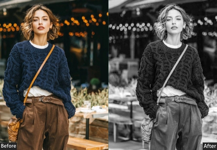
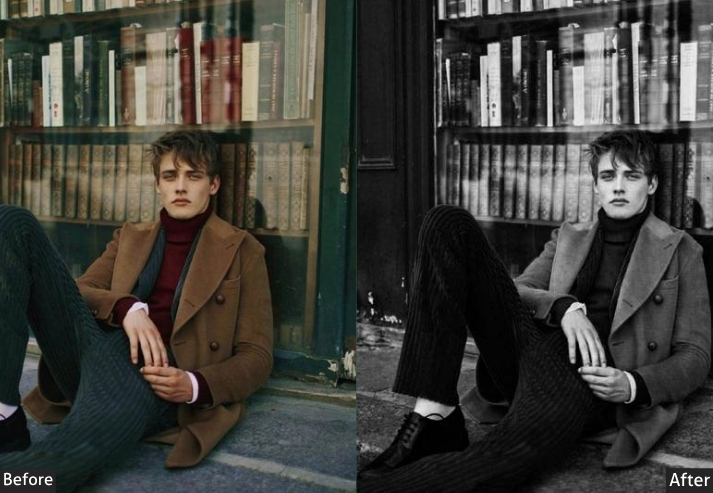
Purpose: Creates emotionally powerful monochrome images with strong tonal contrast and photographic impact.
Best For: Portraiture, street photography, documentary/photojournalism, fine art, architecture.
Usage: fine art prints, editorial features, and galleries.
Style: High contrast, dramatic, timeless, emotionally resonant.
7. Urban / Street Photography Preset
The Vibe: Raw, gritty, real.
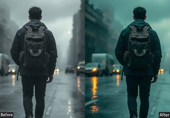
Street presets live in the space between beauty and documentation. The colors are real but raw: concrete grays, harsh artificial light, steel blues, and the warm-sickly cast of fluorescent lighting at night.
The editing goal is to make the photo feel immediate, as if it were pulled from a contact sheet rather than processed to perfection. Strong contrast, carefully managed shadows, and that essential graininess all work together.
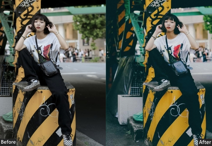
Light Panel: Exposure −0.10 | Contrast +40 | Highlights −20 | Shadows −10 | Whites +15 | Blacks −35.
Color Panel: Temp 4800K (slightly cool) | Tint +3 | Vibrance −15 | Saturation −20.
HSL / Color Mix: Orange Saturation −15 | Red Saturation −10 | Yellow Saturation −20 | Green Saturation −15 | Blue Saturation +10 | Blue Luminance −15 | Aqua Saturation +5.
Tone Curve: Highlights −5 | Lights +5 | Darks −15 | Shadows −25 (keep shadows deep, no lift).
Effects Panel: Clarity +30 (adds strong urban texture) | Grain +45 (Size 35, Roughness 60) | Vignette −25 (Midpoint 38, Feather 60).
Detail Panel: Sharpening +50 (Radius 1.2, Detail 50, Masking 35) | Luminance NR +10 (retain some noise).
Color Grading: Shadows H215/S12 (cool steel gray) | Midtones neutral/slightly cool | Highlights H38/S8 (sodium-lamp amber) (Hue ~38, Saturation 8) - for night shots.
Purpose: Enhances the raw, documentary quality of street photography without over-polishing it.
Best For: Street photography, photojournalism, urban documentary, candid portraits.
Usage: Editorial publications, documentary projects, street photography communities, and exhibitions.
Style: Gritty, high-contrast, desaturated, raw, textured, real.
Final Thoughts
Photography editing is a craft, and presets are your tools, not your crutch. The photographers with the most distinctive visual identities aren’t the ones who found the perfect preset and stopped learning. They’re the ones who used presets as a jumping-off point, gradually came to understand why each adjustment worked the way it did, and built something uniquely theirs.
Start with one preset from this guide. Apply it to ten photos. Adjust. Notice what changes. Then adjust some more. The difference between a good edit and a great one is almost always in those last few small tweaks that make the image feel as if it were made specifically for that moment rather than processed on an assembly line.
And if you ever want to stop second-guessing your edits and start trusting them. know your gear, know your light, and know your style. Everything else is just fine-tuning.
More Free Presets For you:
60 Free Indoor Lightroom Presets Download
50 Free Beach Lightroom Presets Download
100 Free Instagram Lightroom Presets Download
100 Free Portrait Lightroom Presets Download
150 Free Cinematic Lightroom Presets Download