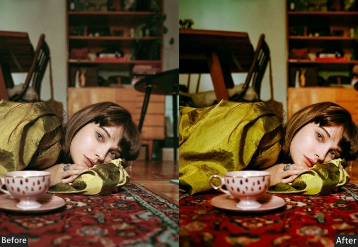
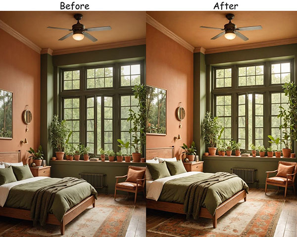
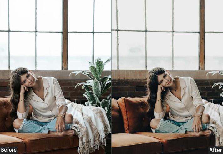
If you’ve ever snapped a photo indoors and wondered why it looks nothing like the cozy, beautiful scene in front of you, you’re not alone. Indoor photography is tricky: flat overhead lighting flattens colors, warm bulbs cast ugly orange casts, and even the coziest rooms can look cold and dull on camera. That’s exactly why these presets exist.
Each one is purpose-built for indoor shooting conditions, tuned for dim rooms, artificial light, mixed color temperatures, and everything in between. Whether you want bright and airy morning light, a warm candlelit glow, cinematic moody shadows, or clean minimal tones, there’s a preset here for it. All are available as XMP files (Lightroom desktop) and DNG files (Lightroom mobile).

Pauline Jackson
My focus is on color accuracy, natural skin tones, balanced contrast, and clean tonal structure so photographers can maintain a recognizable style across their entire portfolio without spending hours adjusting sliders.
60 Indoor Lightroom Presets Free Download
The beauty of presets is that they’re like a toolkit for your creativity, turning everyday scenes into memories that tell a story, evoke a mood, and resonate with your personality. Let’s turn those cozy indoor vibes into pure magic. Here are all 20 styles, with breakdowns of settings and real-life tips for each.
| Preset Style | Best For | Mood |
|---|---|---|
| Bright & Airy | Morning light, sunlit rooms | Fresh, clean |
| Warm & Cozy | Evening, candlelit shots | Warm, inviting |
| Moody | Low-light, dramatic scenes | Dark, cinematic |
| Natural Light | Sunlit rooms, lifestyle shots | Organic, polished |
| Vintage | Nostalgic, retro interiors | Faded, timeless |
| Soft & Minimal | White rooms, minimalist decor | Calm, zen |
| Black & White | Textures, shadows, portraits | Dramatic, classic |
| Pastel | Soft decor, Sunday mornings | Dreamy, whimsical |
| Muted & Earthy | Plants, wood, linen textures | Grounded, natural |
| High Contrast | Bold decor, strong light | Punchy, vivid |
| Film-Inspired | Eclectic interiors, thrifted decor | Grainy, nostalgic |
| Soft Glam | Styled shots, elegant corners | Polished, sparkly |
| Cool Tones | Office, kitchen, modern spaces | Sleek, professional |
| Soft Blush | Romantic, feminine interiors | Warm, delicate |
| Dark | Moody interiors, night shots | Mysterious, deep |
| Holiday Glow | Festive decor, candlelit tables | Warm, celebratory |
| Boho Chic | Plant-filled, textured rooms | Earthy, relaxed |
| Monochrome Warm | Portraits, emotional scenes | Timeless, intimate |
| Green | Plant lovers, garden rooms | Lush, grounded |
| Colorful | Bold decor, art studios | Fun, vibrant |
- Pauline Jackson
- 1. Bright & Airy Indoor Presets
- 2. Warm & Cozy Indoor Presets
- 3. Moody Indoor Presets
- 4. Natural Light Indoor Presets
- 5. Vintage Indoor Presets
- 6. Soft & Minimal Indoor Presets
- 7. Black & White Indoor Presets
- 8. Pastel Indoor Presets
- 9. Muted & Earthy Indoor Presets
- 10. High Contrast Indoor Presets
- 11. Film-Inspired Indoor Presets
- 12. Soft Glam Indoor Presets
- 13. Cool Tones Indoor Presets
- 14. Soft Blush Indoor Presets
- 15. Dark Indoor Presets
- 16. Holiday Glow Indoor Presets
- 17. Boho Chic Indoor Presets
- 18. Monochrome Warm Indoor Presets
- 19. Green Indoor Presets
- 20. Colorful Indoor Presets
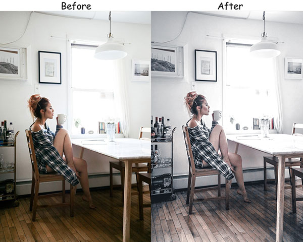
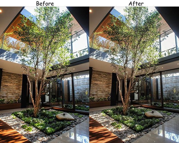
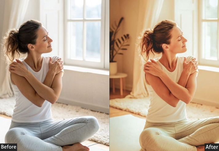
1. Bright & Airy Indoor Presets
These are my go-to presets when I want to capture the feeling of a fresh morning: sunlight spilling into the room, the kind of brightness that makes even a plain wall look dreamy.
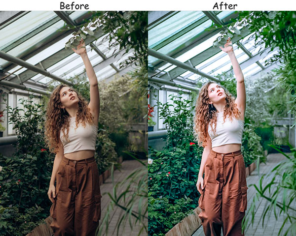
Light Panel: Exposure +20 | Highlights −30.
Color Panel: Temperature +10 | Vibrance +10.
Effects Panel: Clarity −5 | Dehaze −5.
Real-Life Use: airy, light-filled images with a calm, breathable atmosphere and soft natural tones.
Keep your composition simple with these presets.
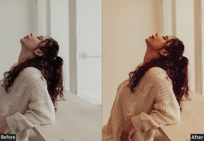
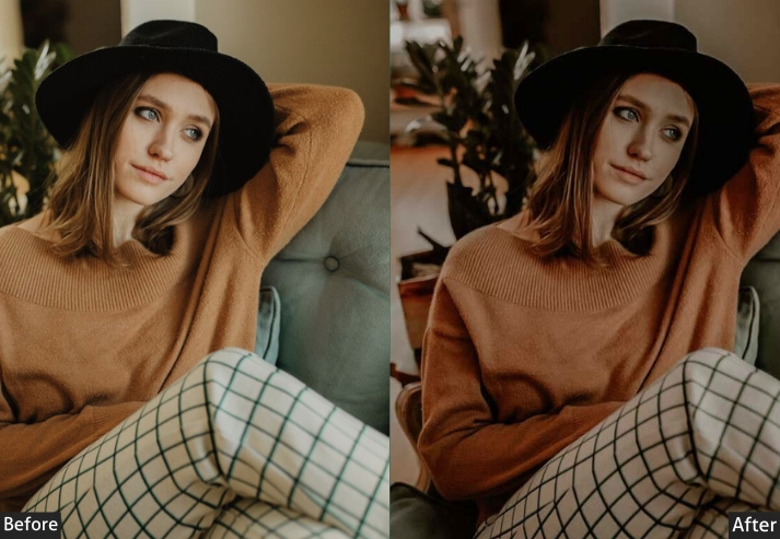
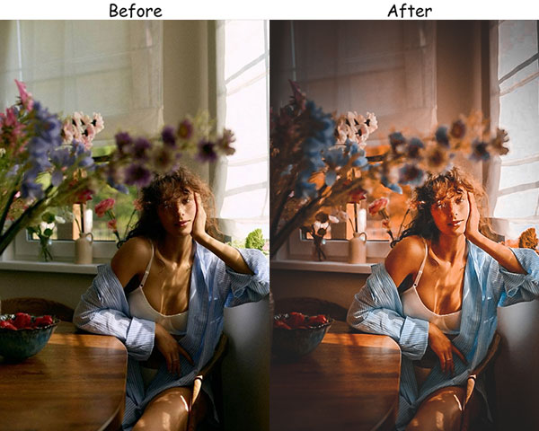
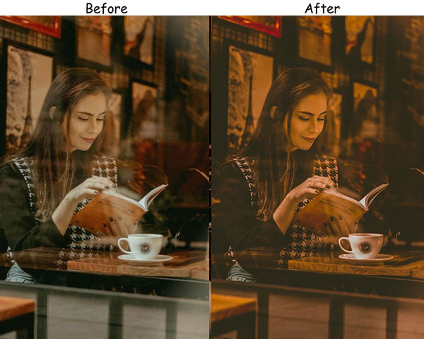
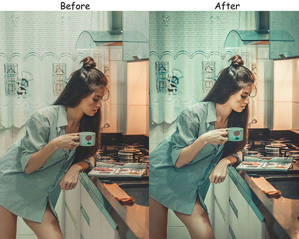
2. Warm & Cozy Indoor Presets
Curled up with a book, a candle burning nearby, that’s exactly the feeling this style captures. It adds a gentle, golden warmth that makes even the gloomiest days feel like home.
Light Panel: Contrast +10 | Shadows +10.
Color Panel: Temperature +20 | Tint +10.
Effects Panel: Texture +10 | Clarity +5.
Real-Life Use: fall or winter shots, any time you want to feel enveloped by warmth and comfort.
Try this preset on evening shots, especially with warm, indoor lighting.
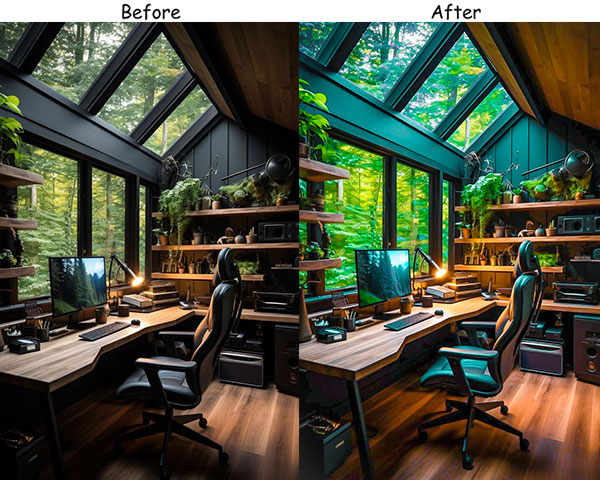
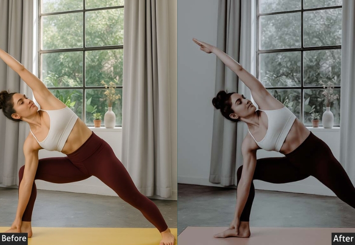
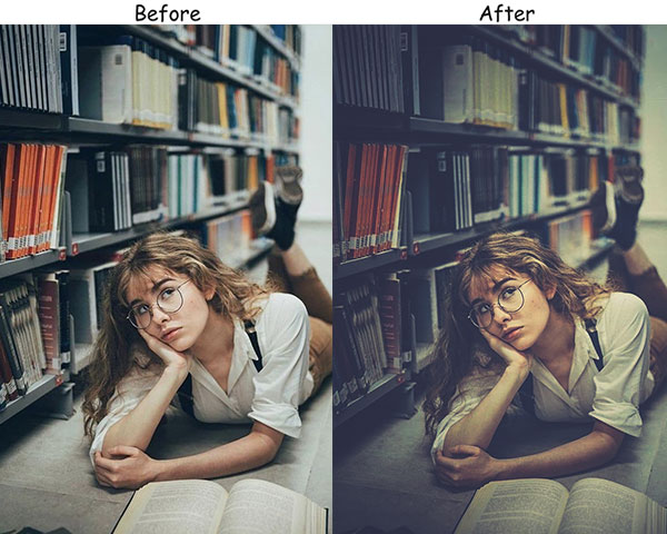
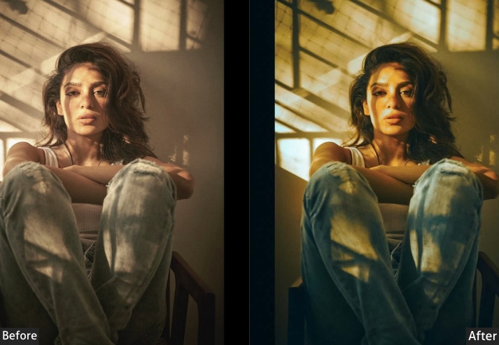
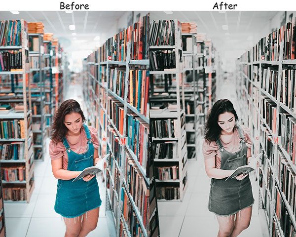
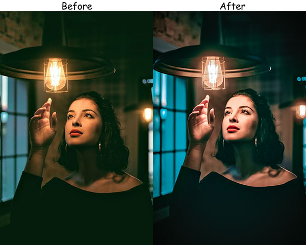
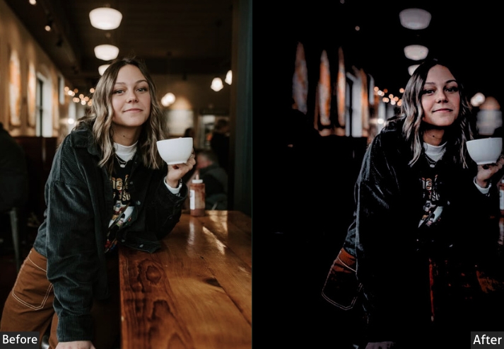
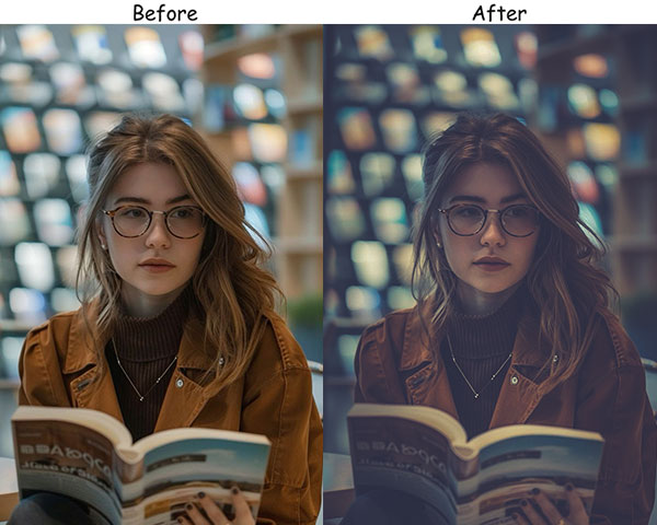
3. Moody Indoor Presets
Moody presets are like the silent, brooding friend of your editing toolkit, and I’m obsessed with them. They add depth, make shadows look intentional, and turn any ordinary scene into something cinematic. Rainy days and quiet, introspective moments were made for these.
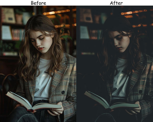
Light Panel: Exposure −10 | Contrast +25.
Color Panel: Temperature −5 | Saturation −10.
Effects Panel: Clarity +20 | Dehaze +10.
Real-Life Use: low-light rooms, evening photos, or any time you want to add a little drama to the scene.
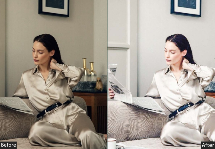
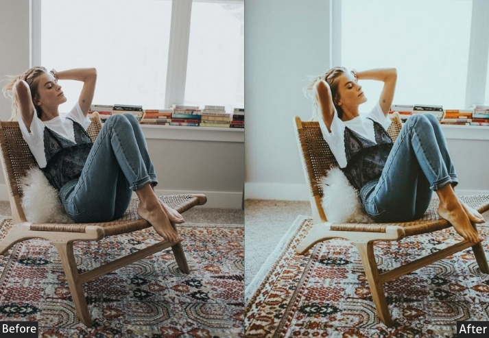
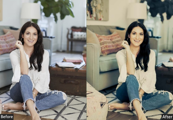
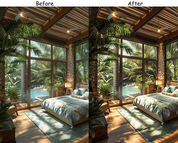
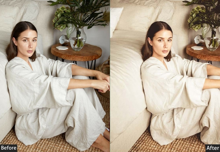
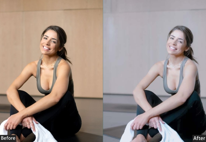
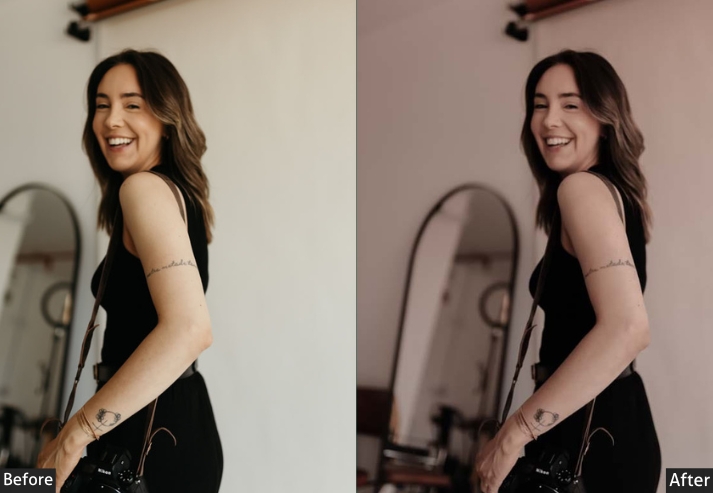
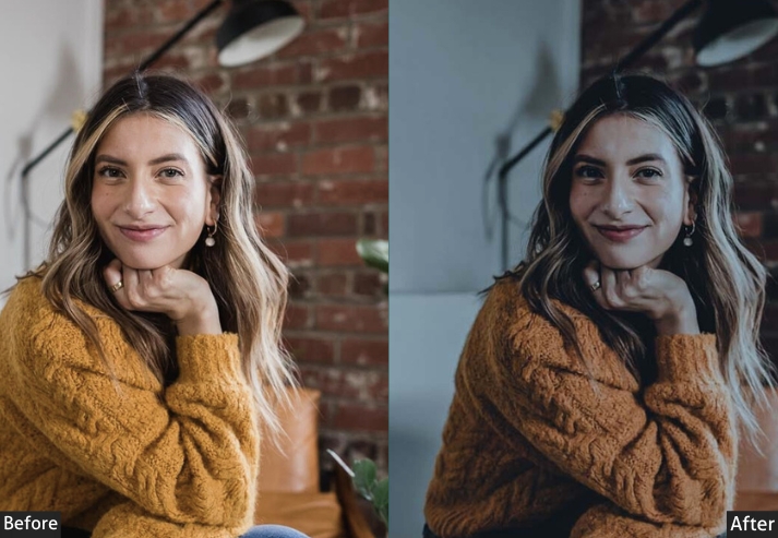
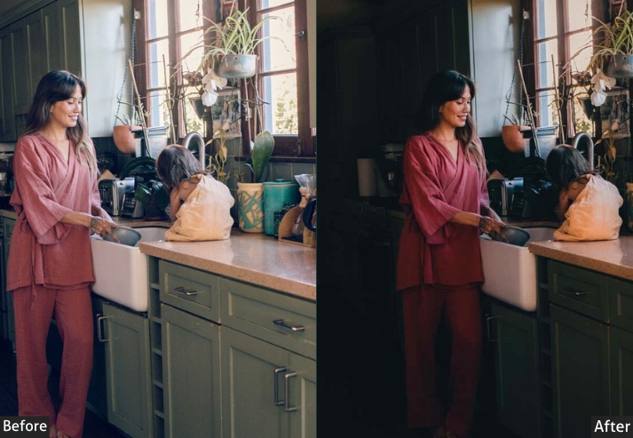
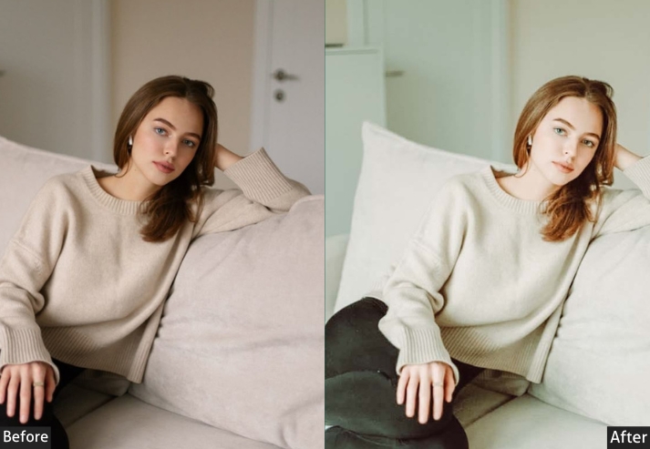
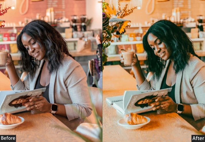
4. Natural Light Indoor Presets
This preset creates the perfect balance, nothing too bold, nothing too soft. The “no-makeup makeup” look for your photos, where things feel real but polished. My go-to for organic, sunlit results without an over-edited look.
I like using it for those times when I don’t want my photos to look “over-edited” but still want them to have a polished feel.
Light Panel: Exposure +10 | Highlights −10.
Color Panel: Temperature +5 | Tint −5.
Effects Panel: Texture +10 | Clarity +8.
Real-Life Use: soft morning glow or a sunlit room, where everything looks the way it feels.
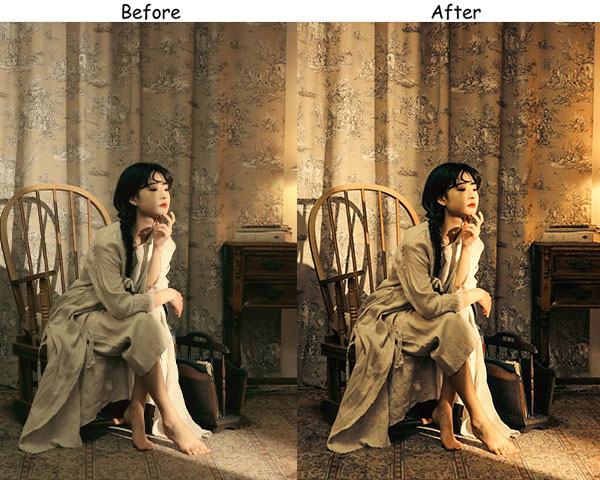
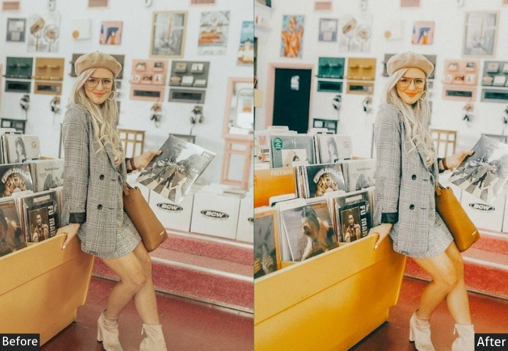
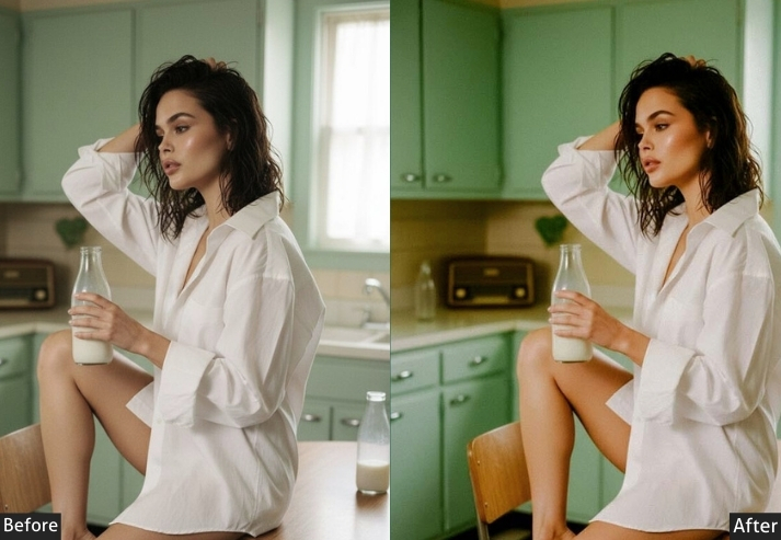
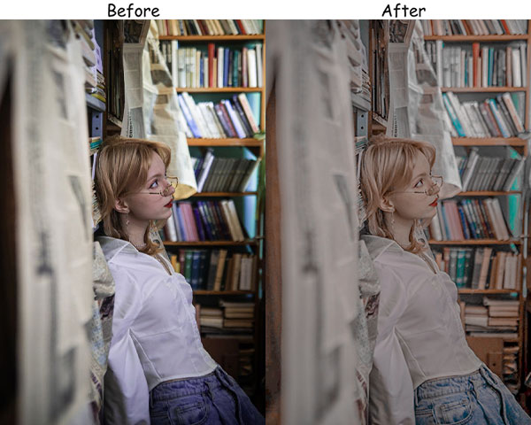
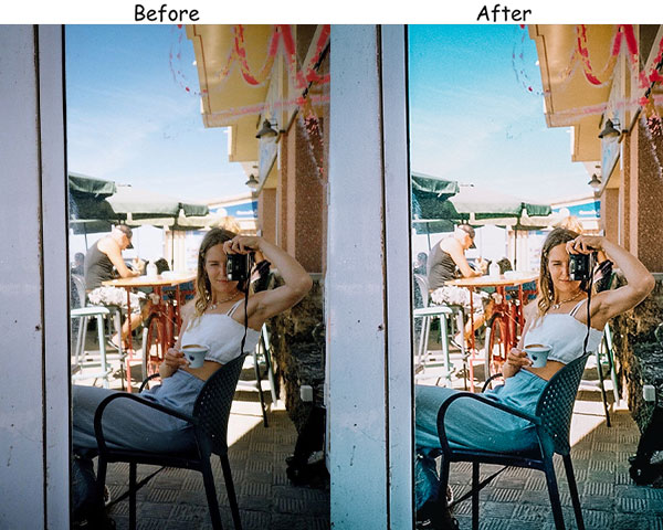
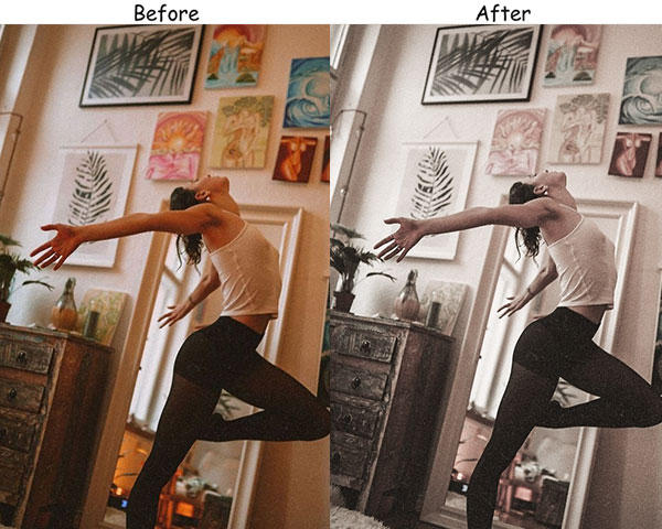
5. Vintage Indoor Presets
Vintage adds that dreamy, timeless feel, turning everyday photos into nostalgic memories: old-school photo albums, soft tones, and a gentle fade that screams “classic.” There’s something special about warm, slightly faded tones that feel both nostalgic and modern.
There’s something special about the warm, slightly faded tones that make photos feel nostalgic yet modern.
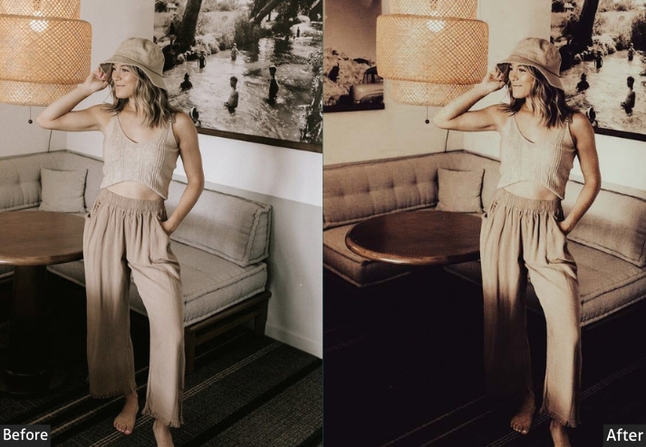
Light Panel: Contrast −15 | Highlights −10.
Color Panel: Temperature +10 | Tint +5.
Effects Panel: Grain +20 | Clarity −5.
Detail Panel: Noise Reduction +10.
Real-Life Use: retro vibes, cozy home scene feels like a memory.
Try it in dim, cozy lighting or with objects that have a bit of history or character, like old furniture or thrifted decor.
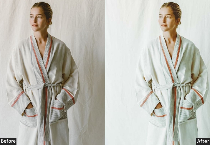
6. Soft & Minimal Indoor Presets
If you adore minimalist aesthetics, these presets are an absolute dream. All about making things look gentle, clean, and peaceful, suitable for those calming, zen moments. A delicate flower on a windowsill, a clean white room, these let the details shine.
Light Panel: Exposure +5 | Contrast −5.
Color Panel: Temperature +2 | Tint −2 | Saturation −10.
Effects Panel: Clarity −15 | Dehaze −5.
Real-Life Use: calm spaces, white-on-white decor, or any time you want a soft, minimalist aesthetic.
Use this preset in spaces with minimal clutter to achieve that serene, simple look.
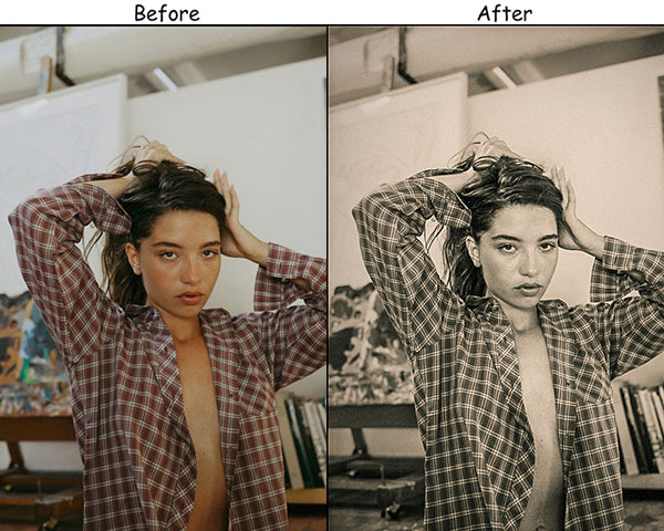
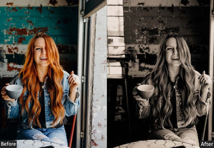
7. Black & White Indoor Presets
Nothing beats the drama and timeless elegance of black and white. These transform even the simplest scene into something iconic, especially powerful with textures like a soft knit blanket or an old leather chair, or when you want to focus purely on shapes, shadows, and light.
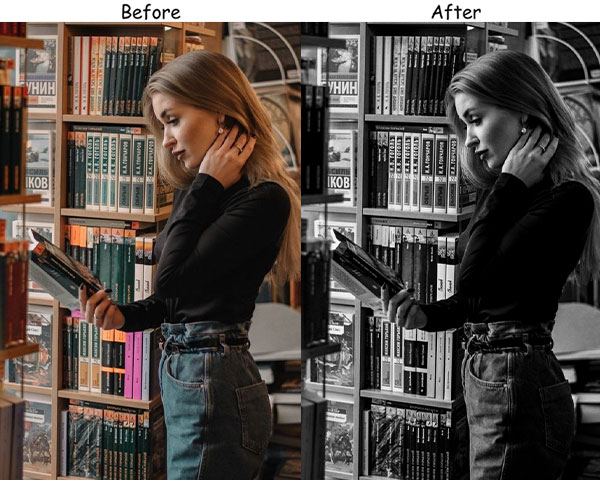
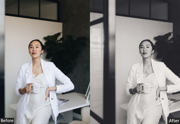

Light Panel: Contrast +30 | Shadows −10.
Color Panel: Convert to Grayscale | Tone adjustments via individual color channels for contrast control.
Effects Panel: Texture +10 | Clarity +15.
Detail Panel: Sharpening +30.
Real-Life Use: mood, elegance, or any scene where light and shadows take center stage. Try this with interior decor, portraits, or anything that highlights textures and forms.
8. Pastel Indoor Presets
Pastel presets are just magical, adding soft, muted tones that make every scene feel whimsical. Almost nostalgic. I find myself using them when I want a playful, relaxed vibe, like a slow Sunday morning or that “pretty in pink” aesthetic.
Light Panel: Exposure +10 | Contrast −10.
Color Panel: Saturation −20 | Temperature +5.
Effects Panel: Grain +10 | Clarity −10.
Detail Panel: Noise Reduction kept low (minimal smoothing for preserved pastel texture).
Real-Life Use: gentle, whimsical scenes, pastel decor, flowers, or everyday moments with a dreamy vibe.
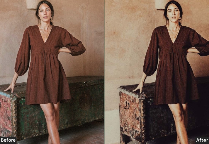
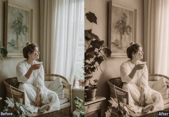
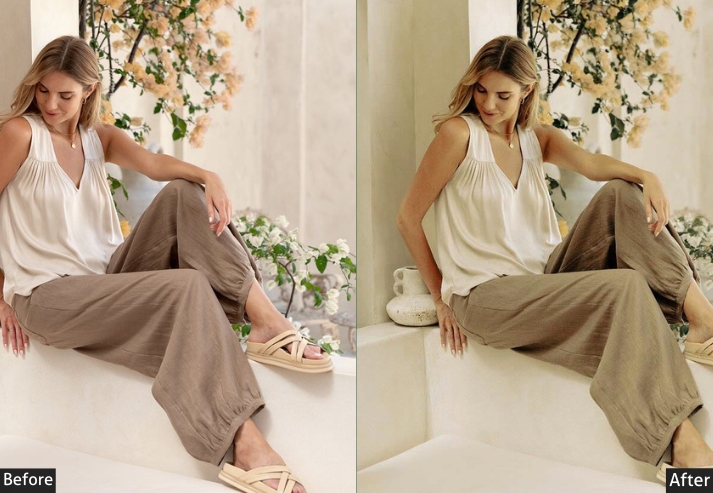
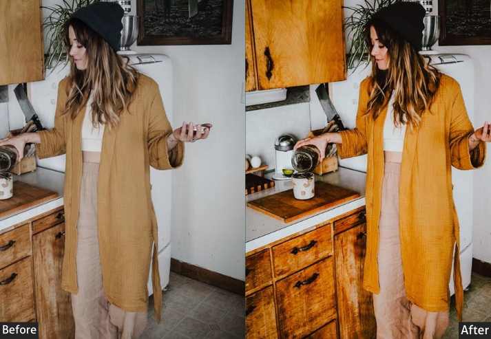
9. Muted & Earthy Indoor Presets
A fan of neutral tones? These presets are like a walk in the forest for your photos. They bring out beautiful, subtle earth tones perfect for cozy, minimal interiors and spaces with a natural vibe: indoor plants, wood textures, linen.
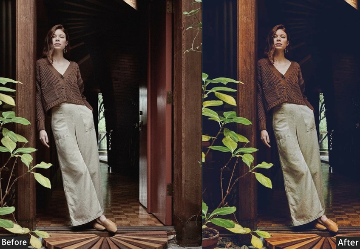
Light Panel: Exposure −5 | Contrast −10.
Color Panel: Saturation −15 | Temperature +5.
Effects Panel: Clarity +5.
Detail Panel: Noise Reduction +5.
Real-Life Use: earthy decor, plants, and natural textures like wood or linen.
Try using it on photos with lots of neutral colors or natural elements.
10. High Contrast Indoor Presets
If you want bold, eye-catching photos with a serious punch, high-contrast presets are your new best friend. These make colors shine and shadows rich, creating a powerful, dynamic look.
Light Panel: Contrast +40 | Blacks −10.
Color Panel: Vibrance +20 | Saturation +10.
Effects Panel: Clarity +20 | Dehaze +10.
Detail Panel: Sharpening +25.
Real-Life Use: bold, bright decor, patterns, or scenes under strong lighting.
11. Film-Inspired Indoor Presets
Film presets bring the nostalgic charm of old-school photography into your modern shots. Subtle grain and soft tones make everything look as if it were shot on vintage film, with an authentic storytelling feel.
Light Panel: Contrast −15 | Highlights −10.
Color Panel: Temperature +5 | Tint +5.
Effects Panel: Grain +20 | Clarity −10.
Detail Panel: Noise Reduction +5.
Real-Life Use: eclectic interiors, thrifted finds, or any moment you want to give a creative edge.
Play with shadows and interesting angles when using cinematic presets to really bring out that artsy feel.
12. Soft Glam Indoor Presets
Sometimes you want a touch of elegance and sparkle. Soft Glam adds that glamour while keeping things subtle and classy, a polished, elevated look without going over the top.
Light Panel: Exposure +10 | Highlights +10.
Color Panel: Temperature +5.
Effects Panel: Texture +10 | Clarity +5.
Detail Panel: Sharpening +10.
Real-Life Use: polished, elegant feel to decor, styled shots, or any cozy corner you want to make shine.
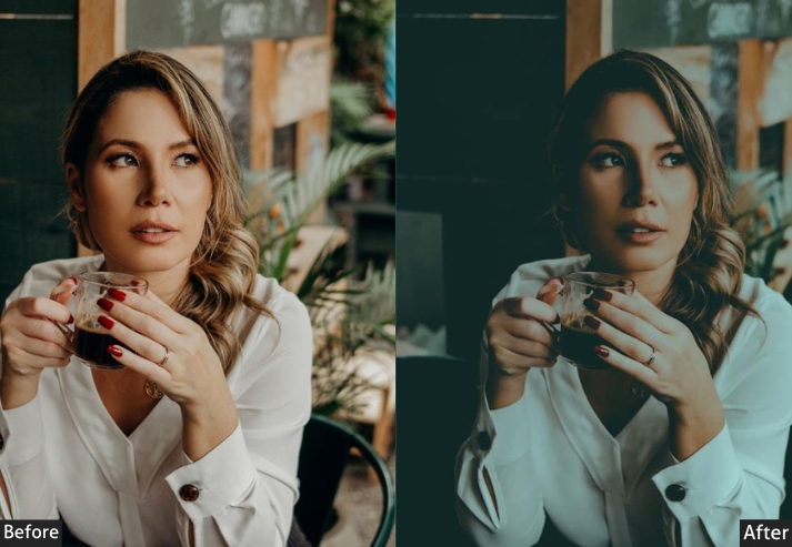
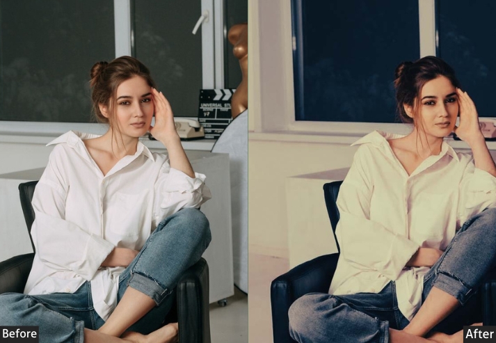
13. Cool Tones Indoor Presets
Cool tones give everything a sleek, calm feel and are best for evoking modernity and elegance.
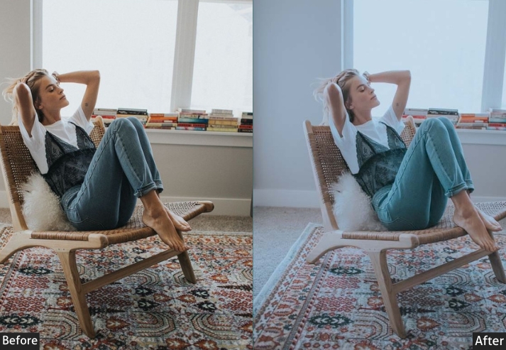
Light Panel: Highlights −15 | Shadows +15.
Color Panel: Temperature −15 | Saturation −10.
Effects Panel: Clarity +5.
Detail Panel: Sharpening +15.
Real-Life Use: modern, sleek interiors and cool-colored decor.
Try in rooms with lots of white, gray, and blue.
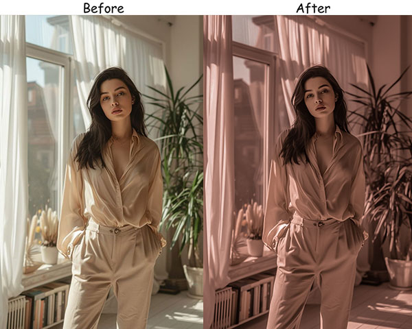
14. Soft Blush Indoor Presets
A fan of warm, pinkish hues and a touch of whimsy? Soft Blush presets are for you. Suitable for anything romantic or delicate, pretty notebooks, floral arrangements, and feminine interiors. Soft, welcoming, and utterly dreamy.
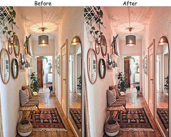
Light Panel: Exposure +10 | Shadows +10.
Color Panel: Temperature +10 | Tint +15.
Effects Panel: Clarity −10.
Detail Panel: Noise Reduction +10.
Real-Life Use: warmth to soft decor, feminine interiors, and any scene that could use a bit of romantic charm.
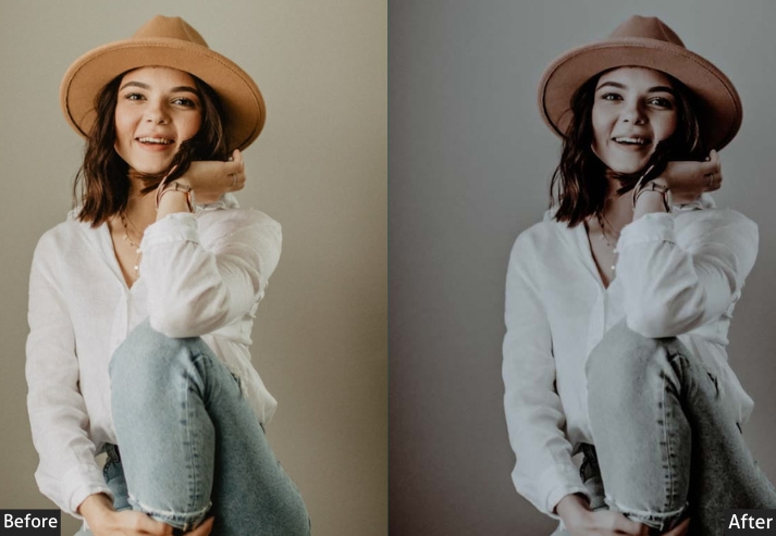
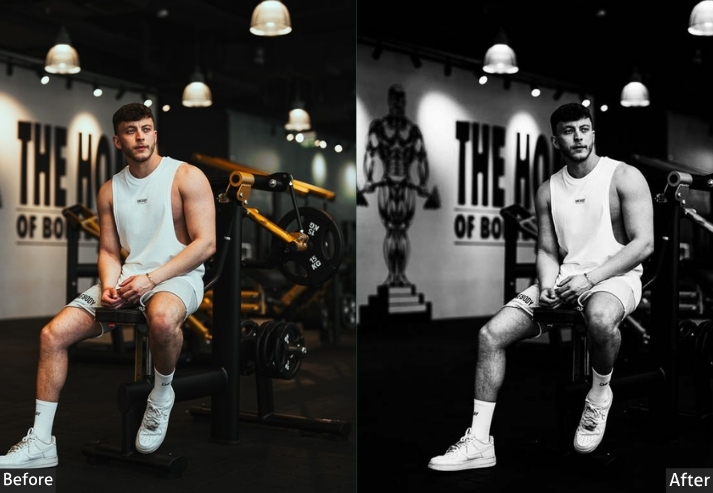
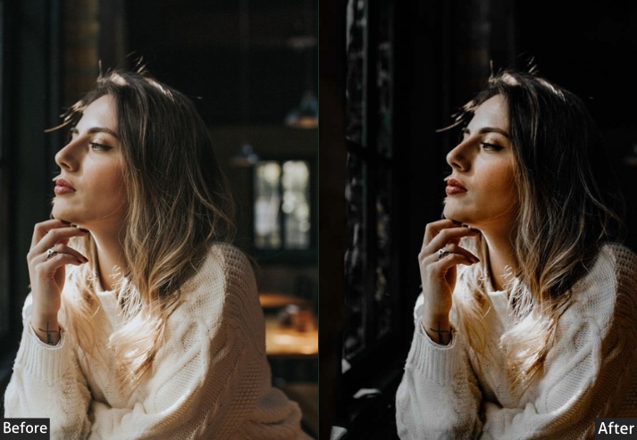
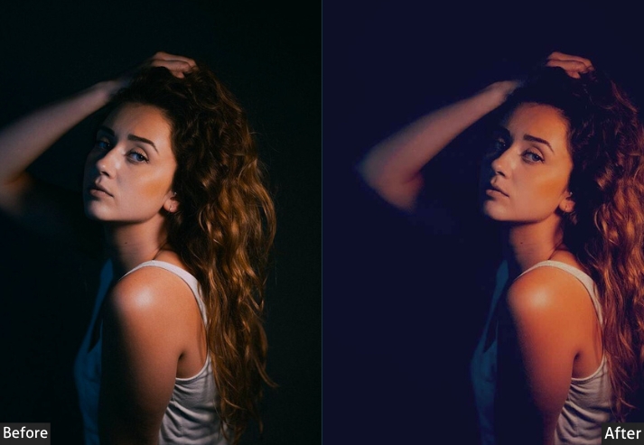
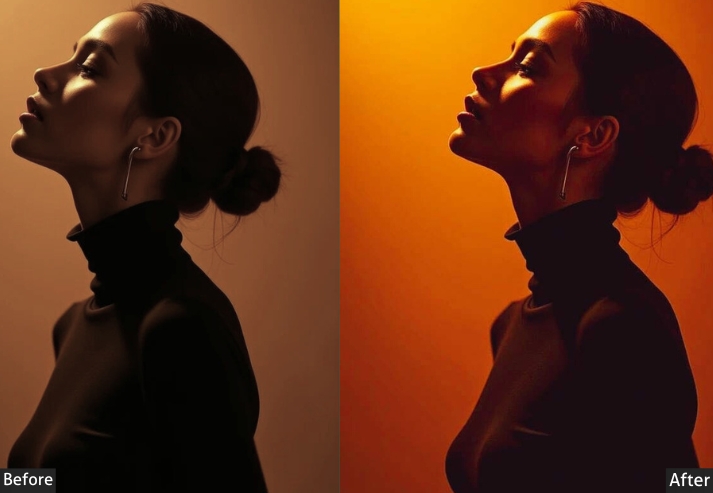
15. Dark Indoor Presets
For those who love a touch of mystery and sophistication, Dark presets are where it’s at. They give photos a dramatic, cinematic feel for moody interiors or create an atmosphere that draws you in.
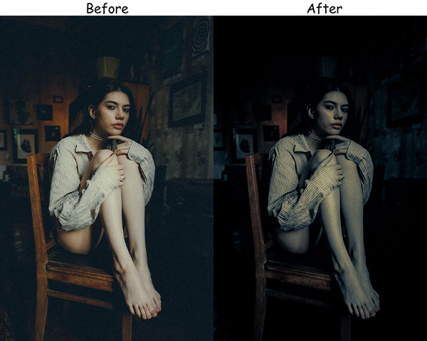
Light Panel: Exposure −20 | Contrast +30.
Color Panel: Temperature −5 | Saturation −15.
Effects Panel: Clarity +15 | Dehaze +10.
Detail Panel: Sharpening +20.
Real-Life Use: low-light interiors, shadows, and enhancing dark, cozy spaces.
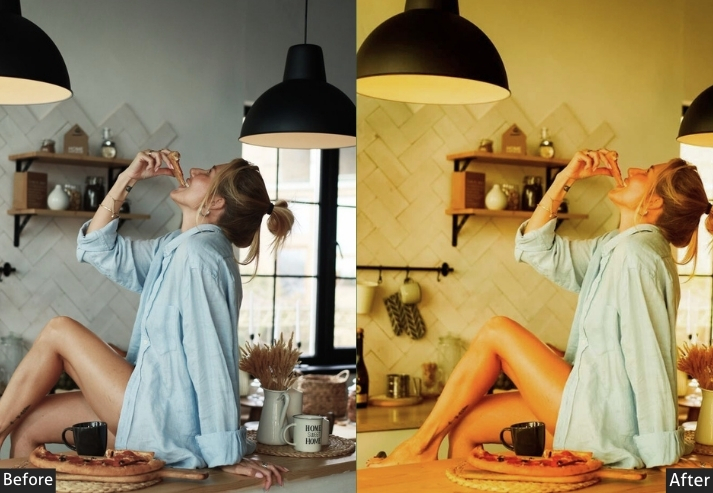
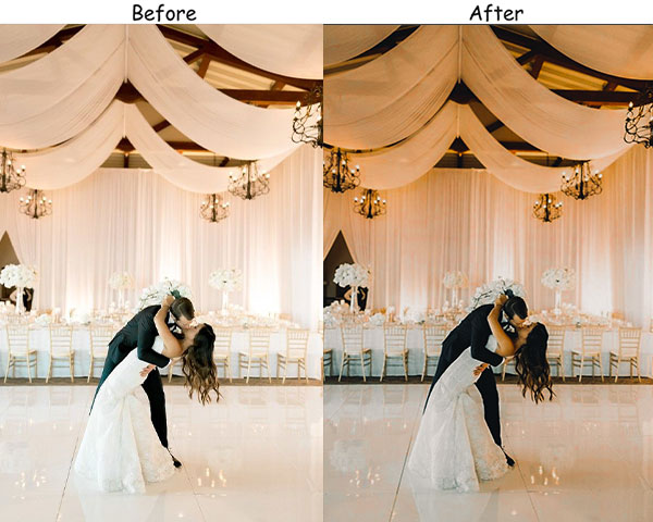
16. Holiday Glow Indoor Presets
This one is for the holiday season or any time you want that cozy, celebratory atmosphere. They bring out warm, rich colors that feel like they’re straight from a holiday movie. Every moment feels like a special occasion.
Light Panel: Exposure +15 | Shadows −10.
Color Panel: Temperature +20 | Vibrance +15.
Effects Panel: Texture +5 | Clarity +5.
Detail Panel: Noise Reduction +10.
Real-Life Use: holiday decor, cozy evenings by the fireplace, festive family moments.
Use on photos with lots of lights or warm colors (like reds, golds, and greens) to enhance the cozy, holiday feel.
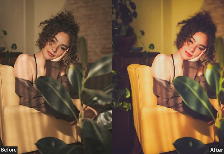
17. Boho Chic Indoor Presets
Boho presets bring out warm, earthy tones that make boho spaces feel cozy and inviting, like stepping into a sunlit room filled with comfortable pillows and plants. Effortlessly relaxed, never try-hard.
Light Panel: Exposure +5 | Shadows +10.
Color Panel: Temperature +15 | Saturation −10.
Effects Panel: Grain +15 | Clarity −5.
Detail Panel: Noise Reduction +5.
Real-Life Use: boho interiors, plant-filled corners, and textured decor shots.
18. Monochrome Warm Indoor Presets
With the simplicity of black and white and a touch of warmth, Monochrome Warm presets add that extra bit of character. Timeless, full of emotion. I often reach for these when shooting portraits or scenes that carry a lot of feeling.
Light Panel: Contrast +20 | Shadows +10.
Color Panel: Convert to Black & White | Warm undertone adjustments applied via luminance mix.
Effects Panel: Texture +5 | Clarity +10.
Detail Panel: Sharpening +15.
Real-Life Use: intimate moments, cozy interiors, or any scene that could use a touch of warmth and nostalgia.
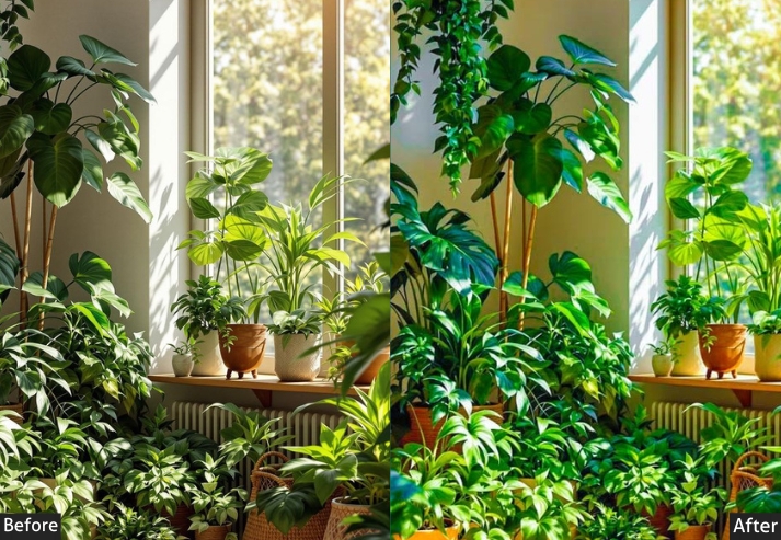
19. Green Indoor Presets
Green brings the outdoors in, amplifying the calming, earthy vibes of plants and nature-inspired decor. A lush, grounded feeling like a mini escape into nature.
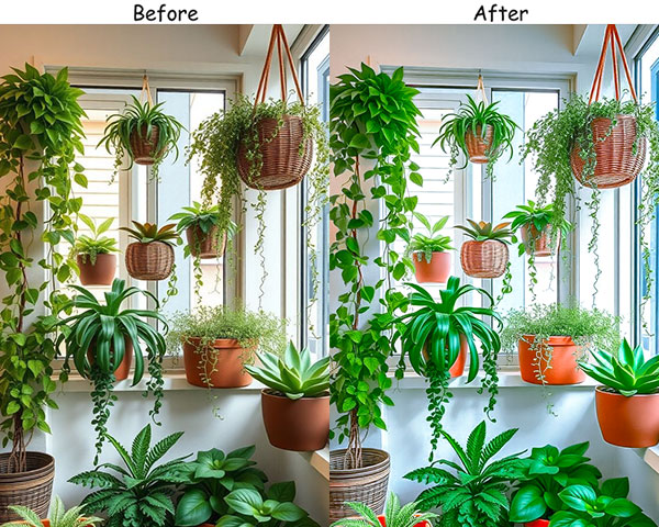
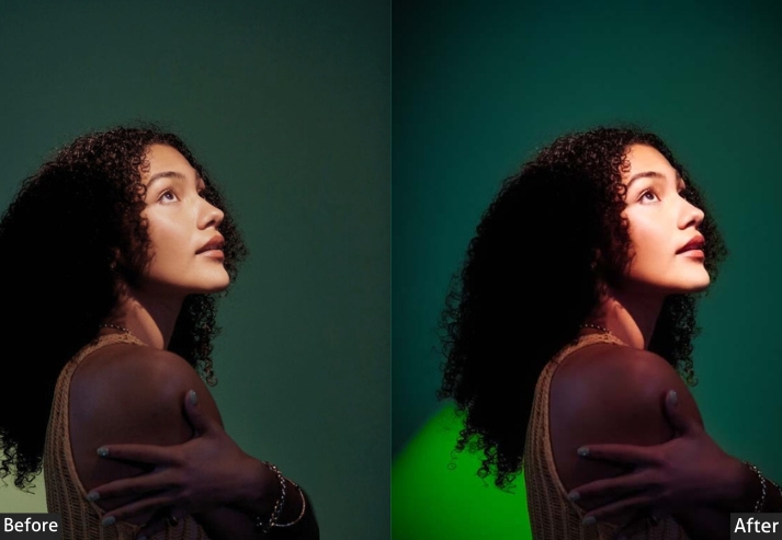
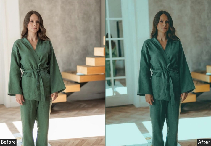
Light Panel: Exposure +10 | Highlights −10.
Color Panel: Green +20 | Yellow +10.
Effects Panel: Texture +10 | Clarity +5.
Detail Panel: Noise Reduction +10.
Real-Life Use: plant lovers, garden-themed rooms, and spaces with lots of green decor.
Use naturally lit rooms or spaces with plants for the best results.
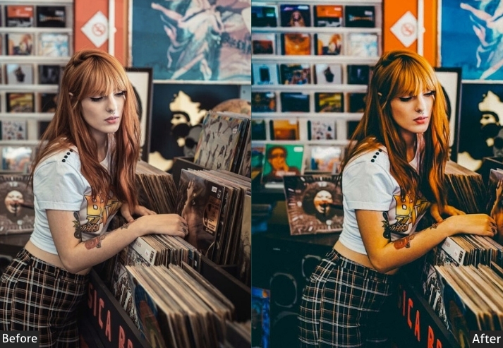
20. Colorful Indoor Presets
Colors are all about fun, energy, and personality! These presets increase saturation and vibrancy, making each color bold and eye-catching. Let them shine in spaces with rich decor, colorful walls, or creative setups.
Light Panel: Exposure +10 | Contrast +15.
Color Panel: Vibrance +25 | Saturation +15.
Effects Panel: Clarity +10.
Detail Panel: Sharpening +15.
Real-Life Use: Fantastic for spaces with lots of color-playrooms, art studios, vibrant kitchens, or any room with bold design elements.
Last Words
No more battling bad lighting or wondering why your indoor photos don’t match the vibe IRL. These indoor presets, available in both DNG and XMP, cover every style from bright and airy to dark and cinematic, so you’re ready for any interior, any light, any mood.
Each preset is a starting point, not a final destination. Play around, explore, and let them inspire you to see your indoor spaces from fresh perspectives. With these presets, you can create wow moments, and that’s a flex you deserve.
Happy editing, and may your photos always capture the magic of your space!
More Presets:
Real Estate Lightroom Presets Free Download
Wedding Lightroom Presets Free Download
Concert Photography Presets Free Download
Moody Lightroom Presets Free Download
Instagram Lightroom Presets Free Download