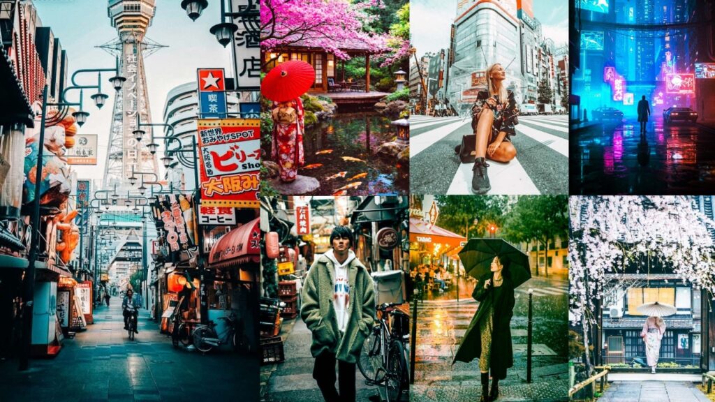
Hey there, photographers! I almost didn’t book that trip to Japan. The flights felt expensive, the planning felt overwhelming, and honestly? I wasn’t sure my photos would ever do it justice anyway. Like, what’s the point of standing in front of the most photogenic country on Earth if your edits come out looking like every other flat, forgettable travel photo flooding your Instagram feed?
Then I went. And within about 48 hours, I was completely, hopelessly, embarrassingly obsessed. Cherry blossoms are raining down in slow motion. Neon signs reflected in wet Shibuya pavement. A torii gate was glowing gold at the exact moment the sun touched the horizon. A Zen garden so quiet you could hear your own heartbeat. I shot over 3,000 photos in two weeks and came home with approximately zero regrets and one very serious editing problem: none of my usual presets were doing these photos any justice whatsoever.
Japan doesn’t play by the same rules as other destinations. The light is different. The colors are different. The mood is different. Using your standard “moody preset” on a sakura photo is like putting ketchup on sushi. Technically possible. Deeply wrong.
So I went down a rabbit hole. A long, obsessive, deeply caffeinated rabbit hole. I researched every major Japanese photography style, tested dozens of editing combinations, and rebuilt my entire approach from scratch. And what came out the other side is this guide.
80+ complete Lightroom preset styles!!! Every major mood, season, and scene Japan throws at you. Full panel-by-panel editing breakdowns with exact values. No vague advice… actual numbers, actual tools, and actual techniques that professional travel photographers use.

Pauline Jackson
I focus on building presets that fix the basics quickly: light, color, and contrast, so photos feel clean and usable right away. From there, it’s just small adjustments, not starting over.
80 Japan Lightroom Presets Free Download
Every photographer who has ever been to Japan comes home changed in some small way. Something about the place gets into you. The precision. The beauty in tiny things. The way an ordinary Tuesday afternoon in Kyoto somehow looks like a painting that took someone a year to create. Your camera saw all of that. Your RAW files are holding all of that. They’re waiting for an edit that’s worthy of what actually happened.
Generic presets are built for generic travel. And Japan is the least generic place on the planet. That’s why Japan Presets exist. That’s why they matter. And that’s why, once you start editing your Japan photos with tools that actually understand what you’re working with, you’ll never go back to slapping your old travel preset on them. Your photos will finally look like what Japan actually felt like. That’s been the whole point all along. Let’s make a beautiful journey! 🌸
- Pauline Jackson
- 1. Tokyo Neon / Cyberpunk Preset
- 2. Japanese Film (Fujifilm Simulation) Preset
- 3. Cherry Blossom (Sakura) Preset
- 4. Autumn (Momiji) Foliage Preset
- 5. Rainy Day / Misty Preset
- 6. Summer Matsuri Festival Preset
- 7. Japanese Winter / Snow Preset
- 8. Moody Japan Preset
- 9. Kyoto Traditional / Vintage Preset
- 10. Japanese Golden Hour Preset
1. Tokyo Neon / Cyberpunk Preset
You didn’t stay out until 2 am in Shinjuku for nothing. Tokyo at night is basically a living anime background, and this preset fully commits to that energy. Deep blacks, electric neon saturation, and a moody teal-orange push that screams, “I have no regrets, and also I need a convenience store onigiri right now.” This one is unapologetically cinematic and dramatic, and that’s exactly the point.
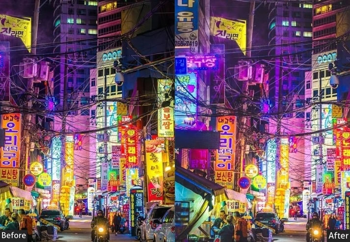
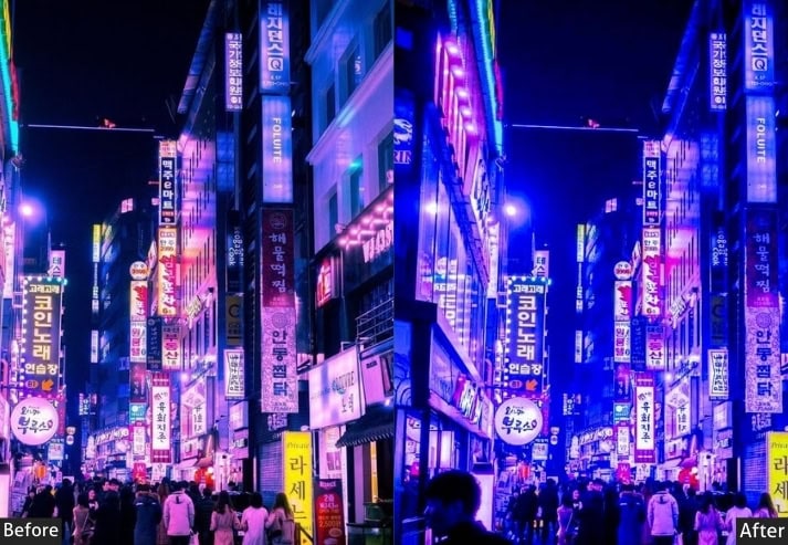
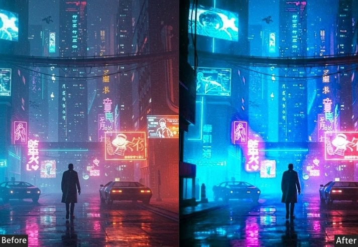
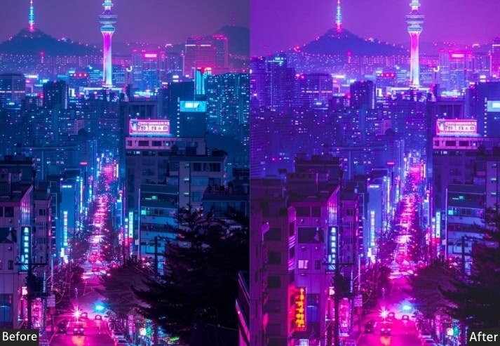
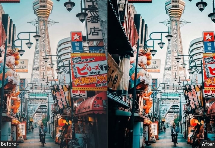
Light Panel: Exposure -0.50 | Contrast +45 | Highlights -60 | Shadows -20 | Whites +15 | Blacks -50.
Color Panel: Temperature -20 | Tint +5 | Vibrance +40 | Saturation +15 | Orange Hue +10 | Aqua Hue -15 | Purple Hue +20 | Orange Sat +40 | Aqua Sat +50 | Blue Sat +35 | Purple Sat +45 | Red Sat +30 | Orange Lum +15 | Aqua Lum +20 | Blue Lum -10.
Effects Panel: Texture +20 | Clarity +30 | Dehaze +15 | Vignette -35 | Grain +25.
Tone Curve: Highlights -15 | Lights +5 | Darks -20 | Shadows -25 (strong S-curve, high contrast).
Detail Panel: Sharpening +55 | Masking +40 | Noise Reduction +30.
Purpose: Turn neon signs, wet pavement reflections, and city lights into vivid, high-contrast drama with real cinematic depth.
Best For: Shibuya crossing at night, Shinjuku Golden Gai, Akihabara electronics district, rainy night street reflections.
Usage: Best on RAW files from ISO 1600–6400 night shots. Reduce vibrance by 10 for a subtler result. Use a radial filter directly on neon signs to push them even further.
Style: Cyberpunk, Moody, High Contrast, Neon, Urban.
💡 Pro tip: Setting the grain to 25 adds cinematic texture, making it feel like a film still. Push to 40 for a grittier, more editorial feel on dark street scenes.
2. Japanese Film (Fujifilm Simulation) Preset
There’s something almost painfully beautiful about old Japanese film photographs. A little faded, slightly warm, with that gorgeous grain that makes every image feel like a memory rather than just a picture. This preset simulates the legendary Fujifilm Provia/Classic Chrome look, analog soul preserved in a digital file. If photos could smell like old Tokyo camera shops and aged tatami, this would be it.
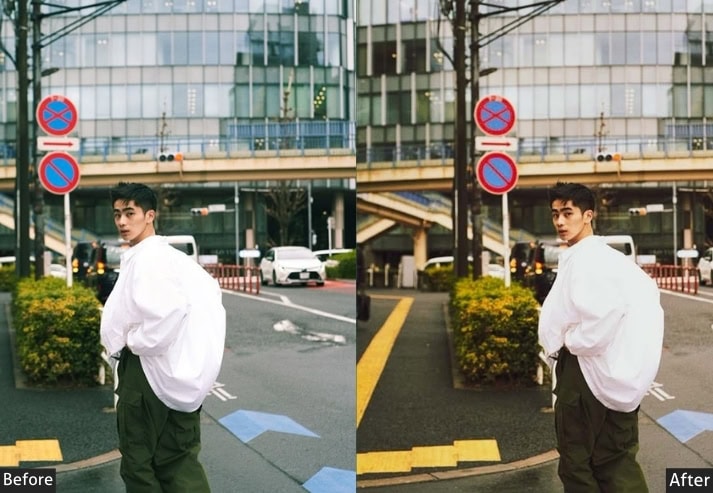
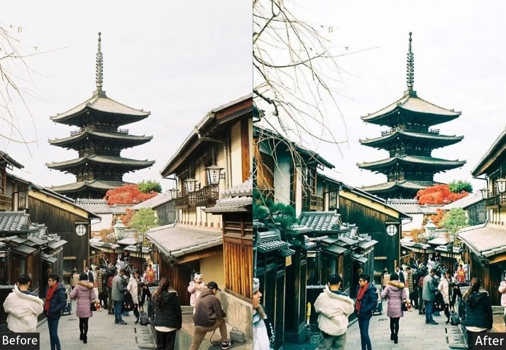
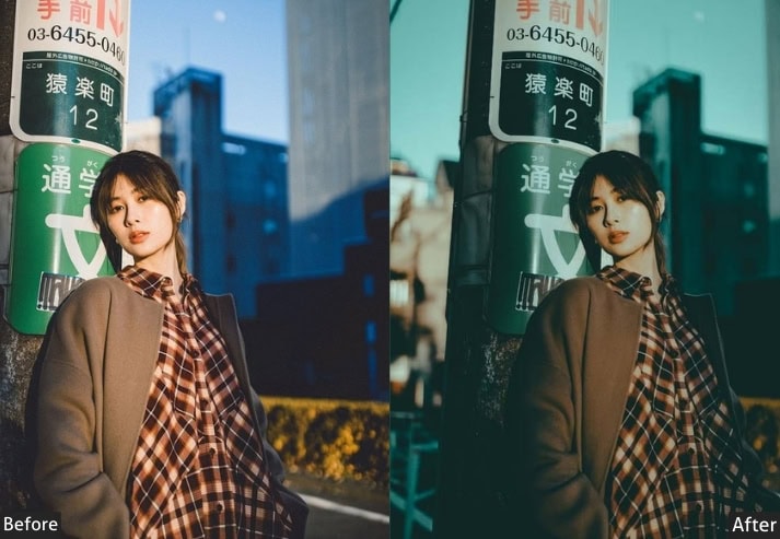
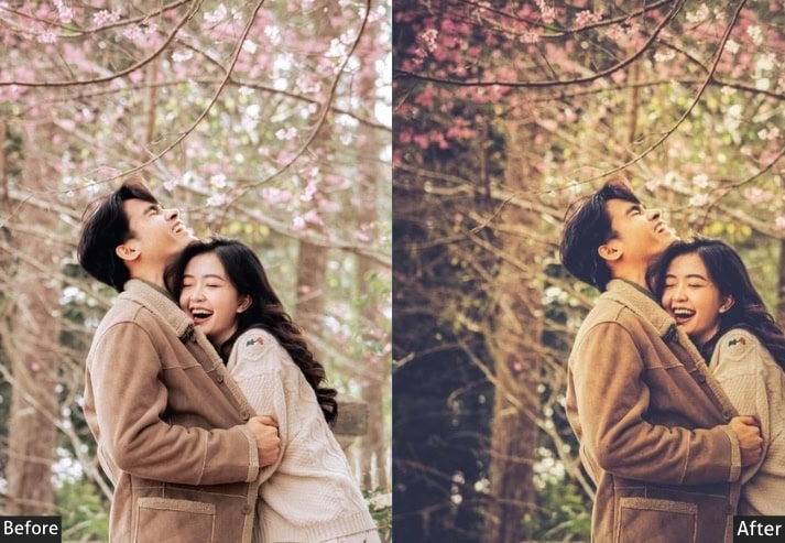
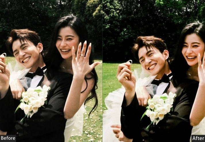
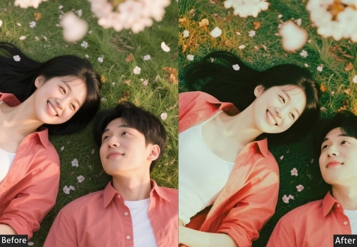
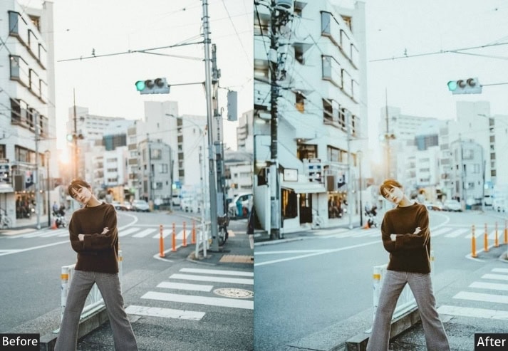
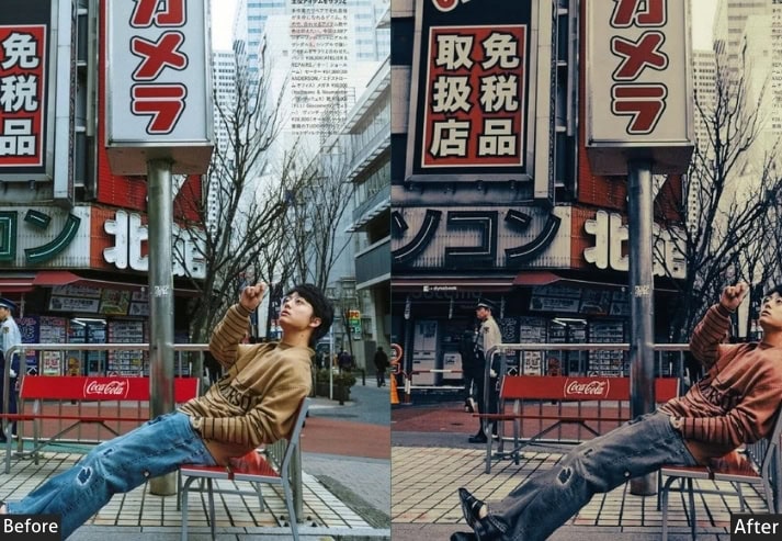
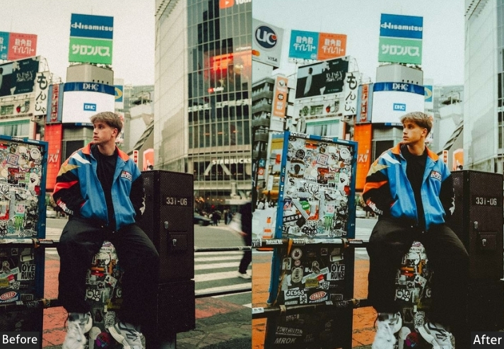
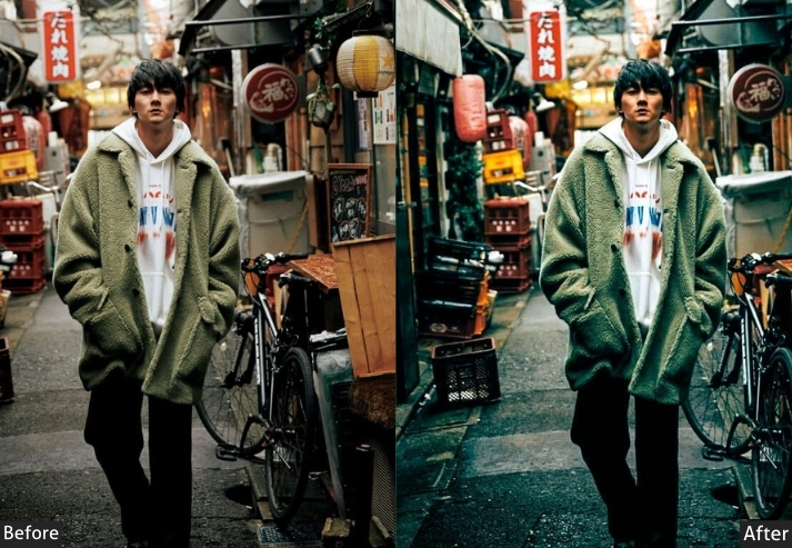
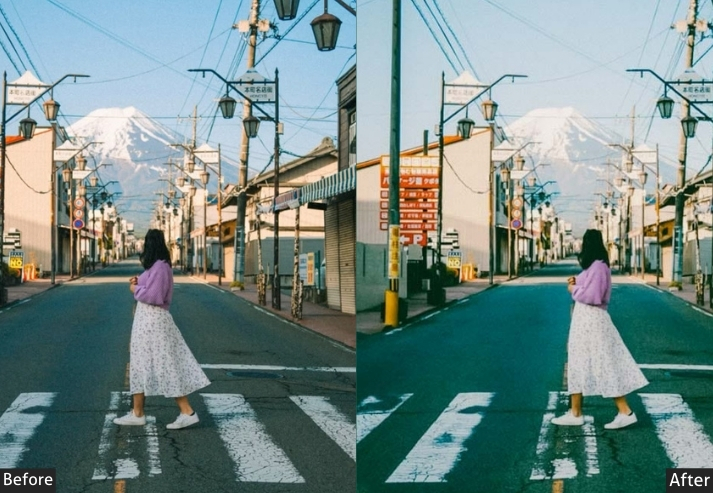
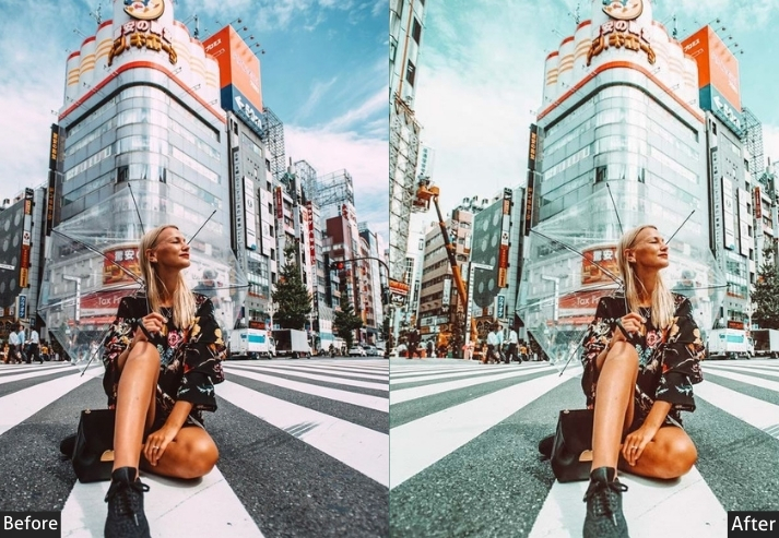
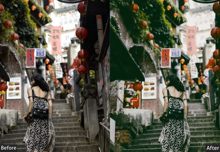
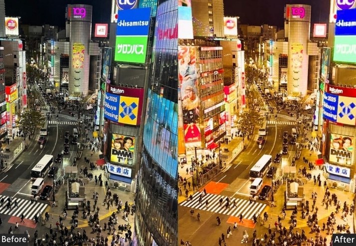
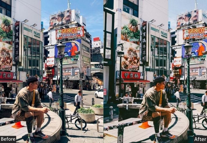
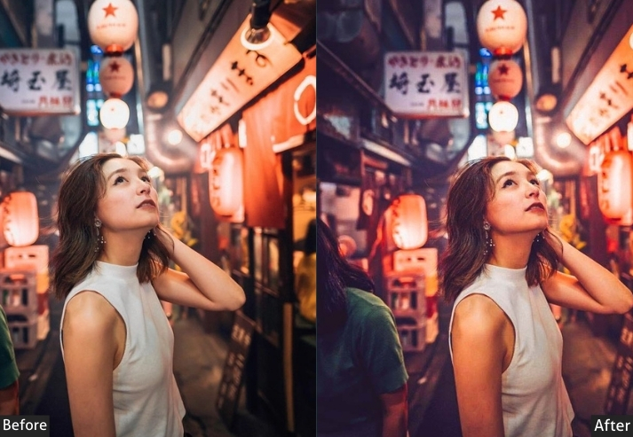
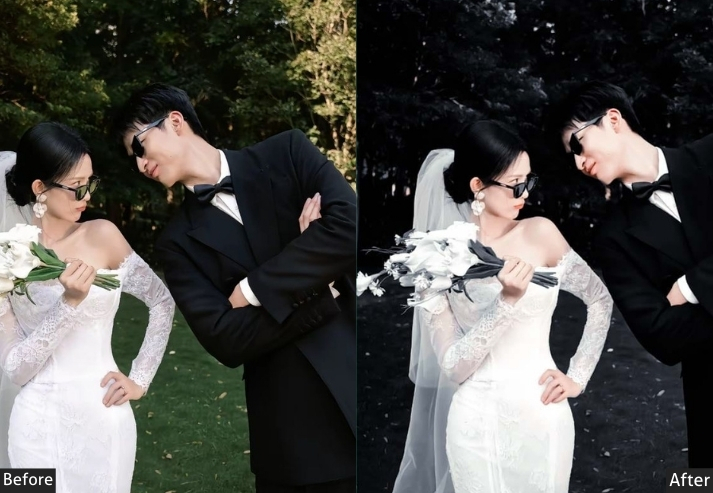
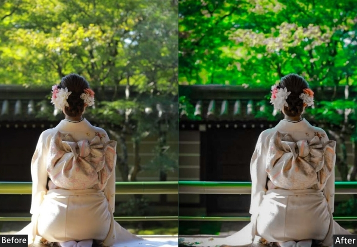
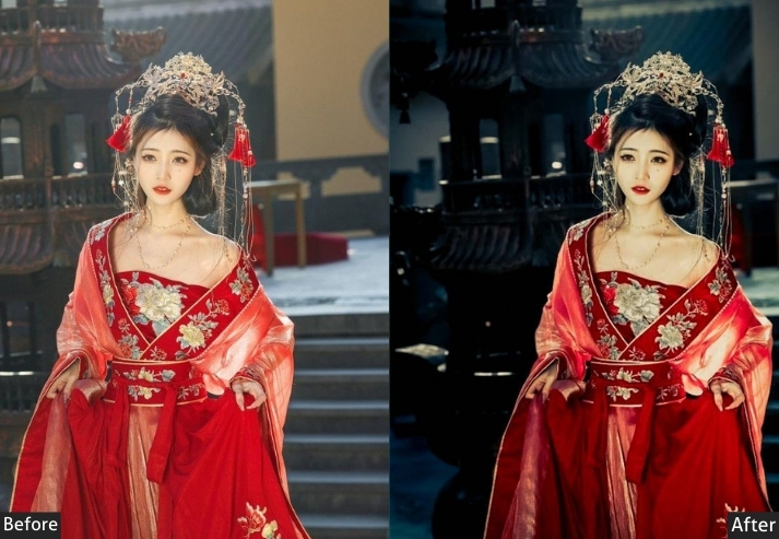
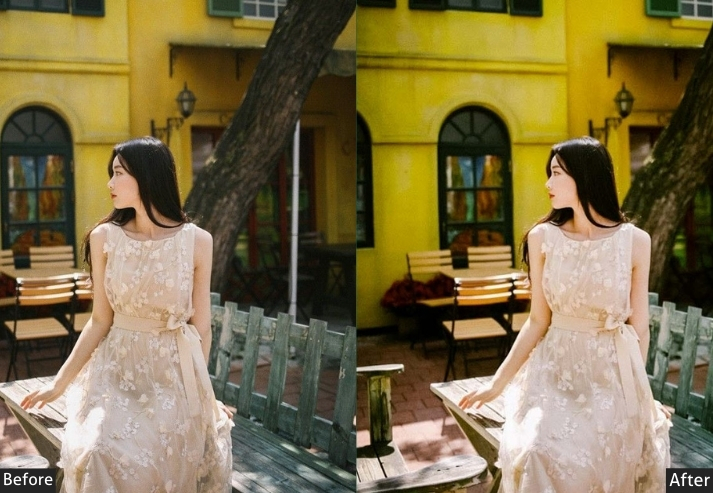
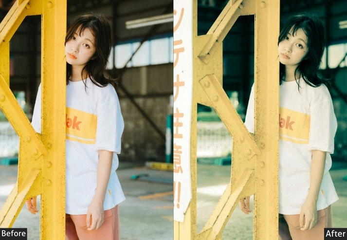
Light Panel: Exposure +0.15 | Contrast +10 | Highlights -25 | Shadows +20 | Whites -5 | Blacks +15.
Color Panel: Temperature +18 | Tint +6 | Vibrance -15 | Saturation -10 | Red Hue +5 | Orange Hue -8 | Yellow Hue +10 | Green Hue -15 | Red Saturation -10 | Orange Saturation +15 | Green Saturation -20 | Blue Saturation -15.
Effects Panel: Grain Amount +45 | Grain Size +35 | Grain Roughness +50 | Vignette -20 | Clarity -8.
Tone Curve: Shadow Anchor Lift +18 | Darks +10 | Lights -5 | Highlights -12.
Detail Panel: Sharpening +25 | Masking +60 | Luminance NR +10.
Purpose: A timeless, nostalgic Japanese atmosphere that feels lived-in.
Best For: Street photography in old Kyoto neighborhoods, traditional market portraits, vintage shop scenes, and everyday-life documentation.
Usage: Works beautifully at 90% opacity. Reduce the grain to 25 for a cleaner look. Best in neutral-to-warm ambient light.
Style: Film Emulation, Nostalgic, Warm Fade, Analog, Timeless.
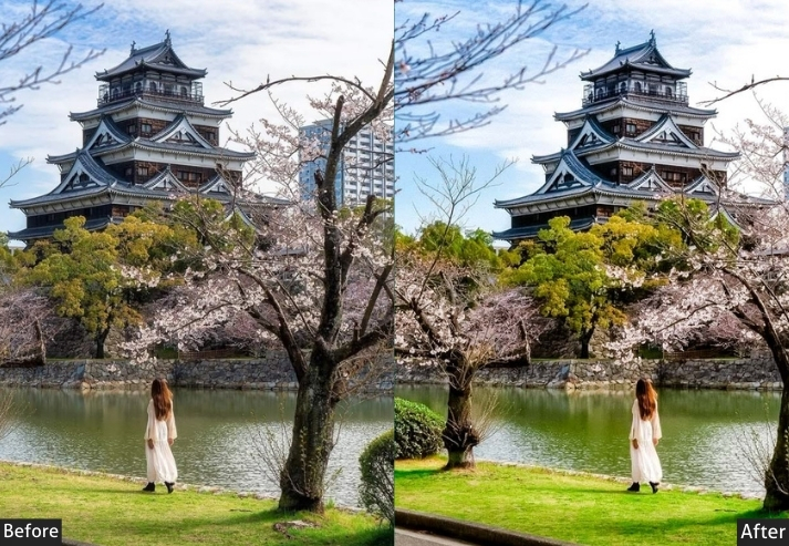
3. Cherry Blossom (Sakura) Preset
You’re standing under a tunnel of blooming sakura trees in Ueno Park, petals drifting down like pink confetti, and you want your photo to feel exactly as magical as that moment. That’s what this preset is built for. It lifts the pinks into a soft, glowing warmth, keeps the light airy and breathable, and strips away any harshness that might make your dreamy blossom scene feel like a regular Tuesday photo.
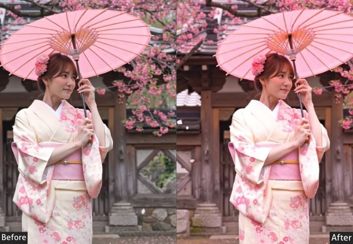
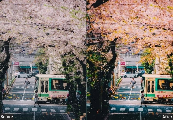
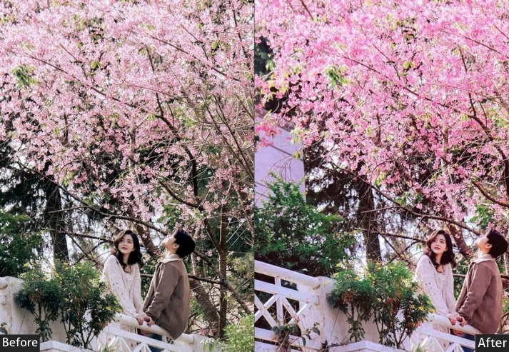
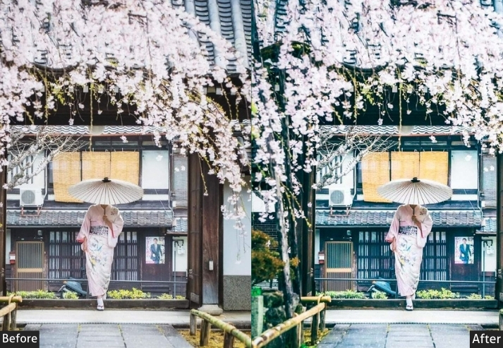
Light Panel: Exposure +0.30 | Contrast -15 | Highlights -40 | Shadows +35 | Whites +10 | Blacks -10.
Color Panel: Temperature +12 | Tint +8 | Vibrance +20 | Saturation -5 | Red Hue +10 | Pink/Magenta Hue +15 | Orange Hue -5 | Red Saturation +25 | Pink Saturation +30 | Green Saturation -10 | Blue Saturation +5 | Red Luminance +20 | Pink Luminance +25 | Green Luminance +10.
Effects Panel: Texture -10 | Clarity -15 | Dehaze +5 | Vignette -15.
Detail Panel: Sharpening +30 | Noise Reduction +20 | Luminance NR +15.
Tone Curve: Lights +10 | Darks +5 | Highlights -8.
Purpose: To honor the delicate, ephemeral beauty of the sakura season with a dreamy, airy edit that feels emotional rather than just pretty.
Best For: Ueno Park, Maruyama Park, hanami picnic scenes, portraits under blossom trees, and spring travel content.
Usage: Works best in soft overcast daylight. If shooting in harsh noon sun, reduce vibrance by 5.
Style: Romantic, Airy, Soft Pink, Spring Glow, Dreamy.
4. Autumn (Momiji) Foliage Preset
Koyo season in Japan hits photographers like a freight train full of maple leaves. The trees go from green to orange to deep crimson seemingly overnight, and every single person with a camera completely loses their mind about it, rightfully so. This preset is all about maximizing those warm tones while keeping the edit feeling genuinely rich rather than “I accidentally cranked the saturation, and my photo looks like a Cheeto.” 🍂
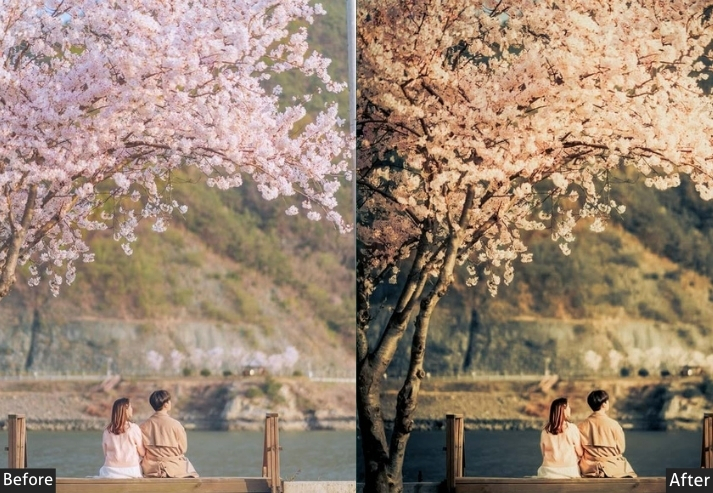
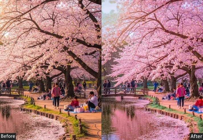
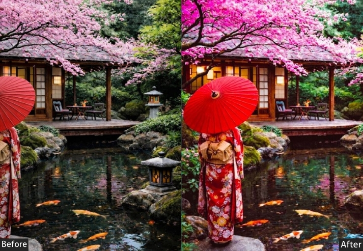
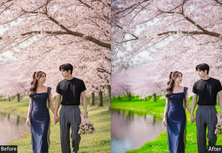
Light Panel: Exposure +0.20 | Contrast +25 | Highlights -35 | Shadows +15 | Whites +5 | Blacks -25.
Color Panel: Temperature +25 | Tint +5 | Vibrance +30 | Saturation +10 | Orange Hue -10 | Yellow Hue -15 | Red Hue -8 | Green Hue +20 | Orange Saturation +45 | Red Saturation +35 | Yellow Saturation +30 | Green Saturation +20 | Orange Luminance +10 | Red Luminance -5 | Yellow Luminance +15.
Effects Panel: Texture +20 | Clarity +15 | Dehaze +10 | Vignette -20.
Tone Curve: Red Channel +10 | Green Channel +5 | Blue Channel -8.
Purpose: Maximize the natural richness of autumn foliage while adding depth and contrast for dramatic, magazine-quality koyo imagery.
Best For: Nikko National Park, Tofukuji Temple in Kyoto, Arashiyama in the fall, Mt. Fuji with an autumn foreground.
Usage: If certain leaf colors look artificial, reduce their specific saturation in HSL by 5–10%.
Style: Warm & Rich, High Saturation, Fiery Tones, Dramatic, Nature.
5. Rainy Day / Misty Preset
Rain in Japan hits different. Soft mist drifting through Arashiyama bamboo, reflective puddles on the streets of Shinjuku at 6 pm, umbrellas dotting wet cobblestone paths to shrines, rainy-day Japan has a melancholy beauty that’s almost unfair. This preset leans into cool, desaturated blues, lifting the atmosphere to create a brooding, mysterious quality. Very “noir novel set in Tokyo.”
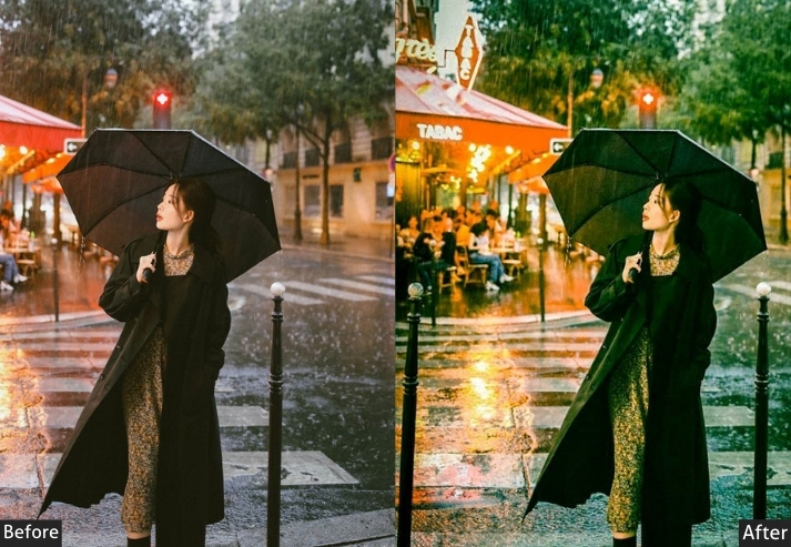
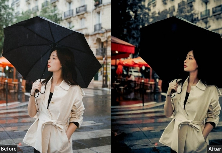
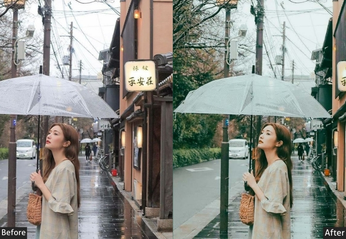
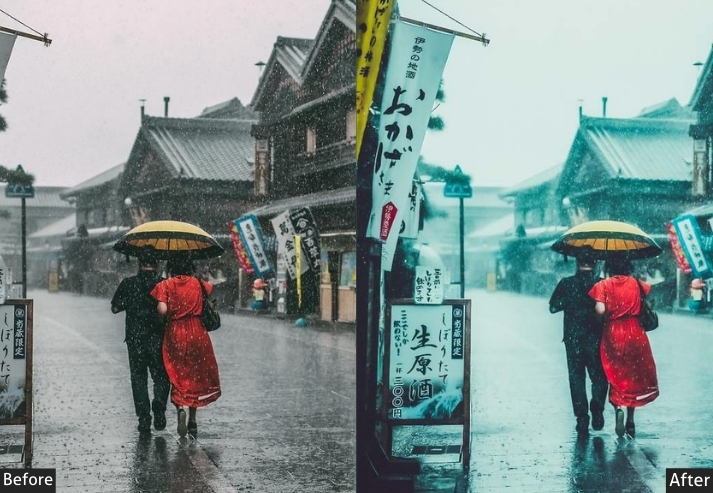
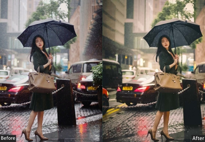
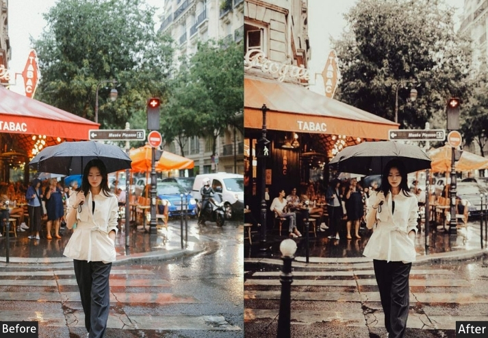
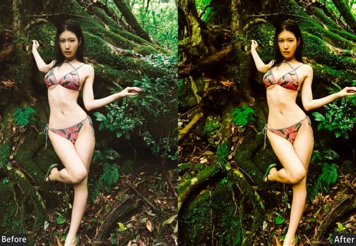
Light Panel: Exposure -0.30 | Contrast +15 | Highlights -40 | Shadows +20 | Whites -20 | Blacks -15.
Color Panel: Temperature -25 | Tint -8 | Vibrance -20 | Saturation -15 | Blue Saturation +15 | Aqua Saturation +10 | Orange Saturation -20 | Yellow Saturation -15 | Red Saturation -10 | Blue Luminance +10 | Aqua Luminance +8 | Orange Luminance -5.
Effects Panel: Texture +15 | Clarity +8 | Dehaze -15 | Vignette -20 | Grain +20.
Tone Curve: Blue Channel +12 | Green Channel +3 | Red Channel -5 | Shadow Lift +12.
Detail Panel: Sharpening +40 | Luminance NR +20 | Color NR +25.
Purpose: Create an atmospheric, melancholic mood that celebrates the unique beauty of rainy-day Japan, misty mountains, wet streets, and reflective surfaces.
Best For: Arashiyama in the rain, Tokyo streets during the tsuyu rainy season, mountain ryokan views on overcast days, shrine paths in the morning fog.
Usage: Use at 80–100%. Reduce cool temperature shift by 10 for lighter, hazier fog effects.
Style: Moody Blue, Misty, Atmospheric, Cool Tones, Melancholy.
6. Summer Matsuri Festival Preset
Paper lanterns everywhere, colorful yukata, festival food stalls glowing in the summer heat, the boom of taiko drums you feel in your chest. Japanese summer festivals are a sensory explosion, and this preset fully matches that energy. High saturation, punchy contrast, warm, and vivid. Because a festival photo should feel like being there, and being there should feel absolutely electric. ⛩️🎆
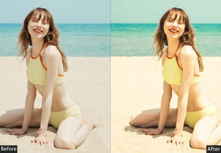
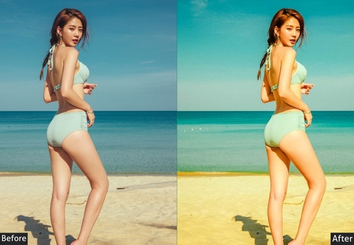
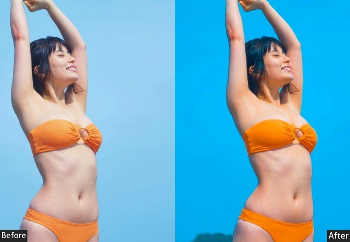
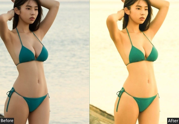
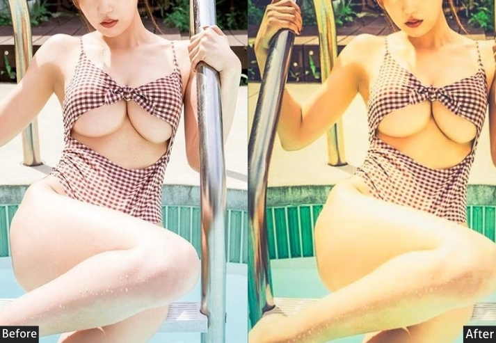
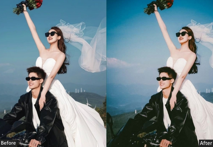
Light Panel: Exposure +0.15 | Contrast +35 | Highlights -30 | Shadows +10 | Whites +10 | Blacks -35.
Color Panel: Temperature +30 | Tint +12 | Vibrance +45 | Saturation +20 | Red Saturation +40 | Orange Saturation +35 | Yellow Saturation +30 | Blue Saturation +25 | Purple Saturation +20 | Red Luminance +5 | Orange Luminance +10 | Yellow Luminance +8.
Effects Panel: Texture +10 | Clarity +20 | Vignette -15 | Grain +10.
Tone Curve: Red Channel +12 | Blue Channel -10 | Darks -10 | Highlights -8.
Detail Panel: Sharpening +50 | Masking +30.
Purpose: Bold colors, warm lantern glow, vivid costumes, and the contagious joy of matsuri culture.
Best For: Gion Matsuri in Kyoto, Awa Odori festival, hanabi fireworks festivals, bon odori dancing, summer yukata portraits, and festival food stalls.
Usage: Reduce vibrance by 15 for portrait-heavy shots to keep skin tones natural.
Style: Vibrant, Bold, Festive, Warm Punch, Cultural Celebration.
7. Japanese Winter / Snow Preset
Japan in winter is a completely different country. Snow-covered Hokkaido farmhouses, steam rising from outdoor onsen against a grey sky, pine branches drooping under fresh white powder. It’s achingly beautiful in the most quiet, contemplative way. This preset leans into crisp cool blues and pure whites, with just the tiniest warmth in the midtones to keep skin tones and wood textures from going clinical and cold.
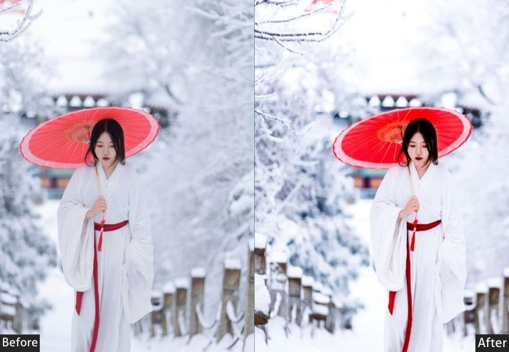
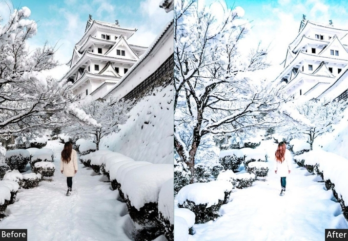
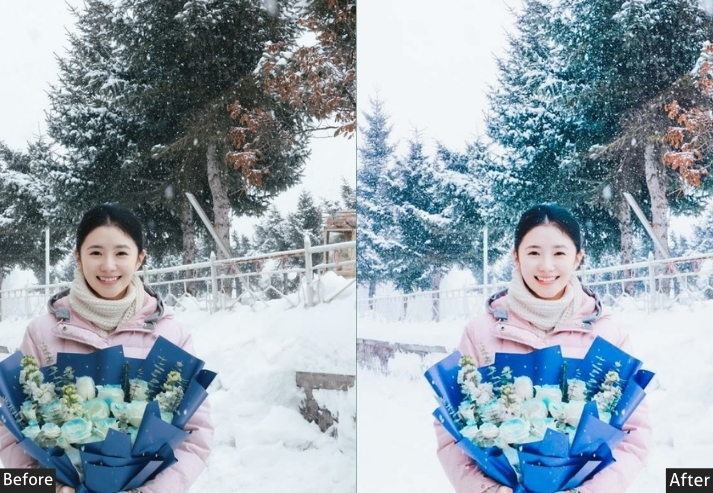
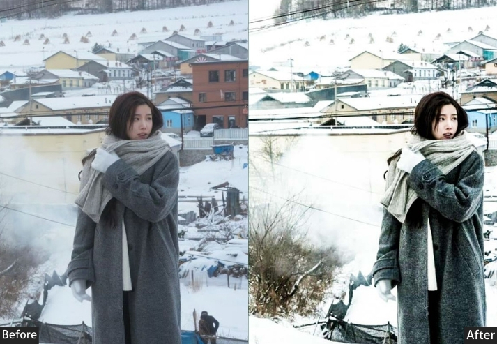
Light Panel: Exposure +0.40 | Contrast -10 | Highlights -55 | Shadows +35 | Whites +5 | Blacks +5.
Color Panel: Temperature -18 | Tint +5 | Vibrance -10 | Saturation -8 | Blue Hue +10 | Aqua Hue +8 | Orange Hue +5 | Blue Saturation +20 | Aqua Saturation +15 | Orange Saturation -5 | Red Saturation -10 | Blue Luminance +15 | Aqua Luminance +10 | Orange Luminance +5.
Effects Panel: Texture +5 | Clarity -5 | Dehaze +8 | Vignette -10 | Grain +10.
Tone Curve: Highlights -20 | Lights +5 | Shadow Lift +15 | Blue Channel +8.
Detail Panel: Sharpening +45 | Masking +40 | Luminance NR +25 | Color NR +20.
Purpose: preserving snow detail, enhancing cool blue tones, and maintaining soft highlights without blowing out.
Best For: Hokkaido winter landscapes, Shirakawa-go snow farmhouses, Mt. Fuji in snow, winter onsen steam scenes, Zao Fox Village.
Usage: Always pull highlights down hard (-55) first on any snow scene before doing anything else. Warm the midtones slightly if skin tones look too cool.
Style: Cool & Clean, Winter White, Silent, Crisp Blue, Pure.
8. Moody Japan Preset
Moody grade is the most cinematic color treatment in photography, and Japan’s natural palette of warm wood, skin tones, and autumn leaves against cool shadows, temple stone, and blue sky is essentially purpose-built for it. This preset creates a Hollywood blockbuster look where every frame could be a movie poster. Used with taste? Absolutely stunning. 🎬
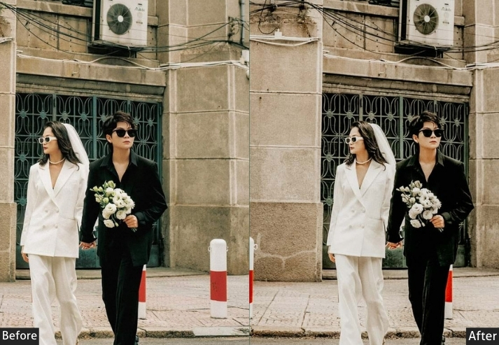
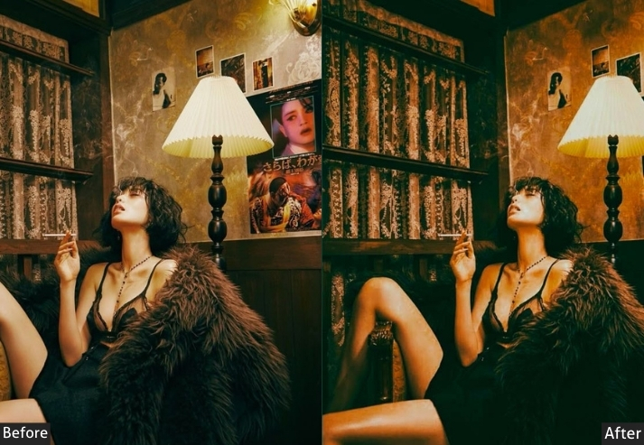
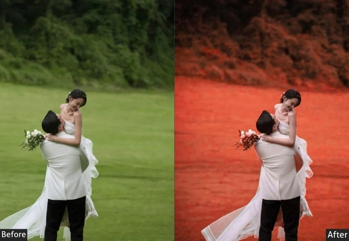
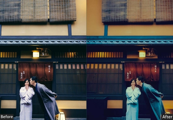
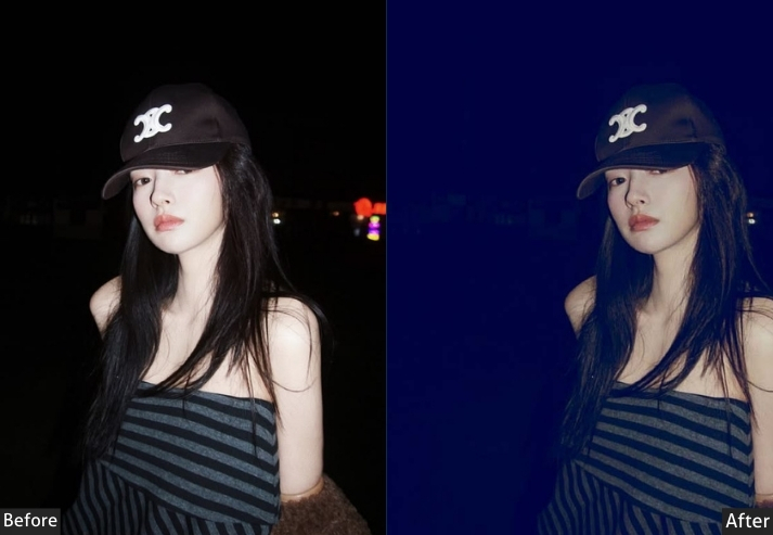
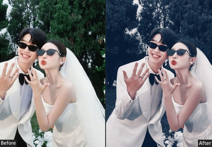
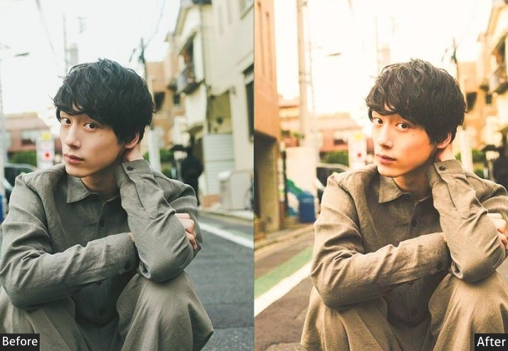
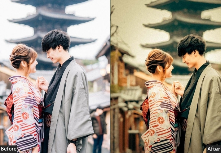
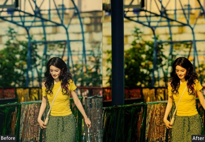
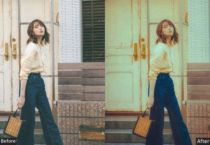
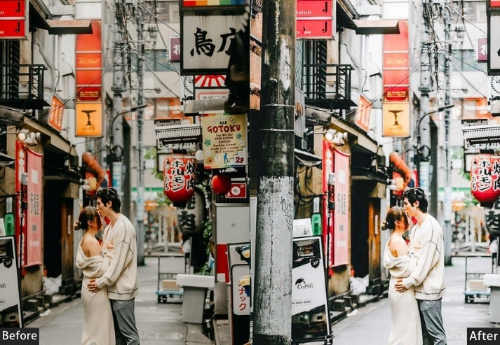
LIGHT PANEL: Exposure +0.10 | Contrast +30 | Highlights -35 | Shadows +15 | Whites -10 | Blacks -25.
COLOR PANEL: Temperature 0 | Tint +3 | Vibrance +15 | Saturation +5.
HSL / COLOR MIX: Orange Hue +8 | Yellow Hue +20 | Aqua Hue -15 | Blue Hue +10 | Green Hue -20 | Orange Saturation +30 | Aqua/Teal Saturation +35 | Blue Saturation +20 | Green Saturation -25 | Yellow Saturation -10.
COLOR GRADING (SPLIT TONING): Shadows Hue 195° Sat +25 | Highlights Hue 35° Sat +20.
EFFECTS PANEL: Texture +15 | Clarity +20 | Dehaze +10 | Vignette -20.
TONE CURVE: Red Channel +10 | Blue Channel Shadow Lift +15 | Blue Channel Highlights -8 | Gentle S-curve.
DETAIL PANEL: Sharpening +50 | Masking +35 | Noise Reduction +15.
Purpose: highlight split grade that gives Japan travel photography an epic, film-quality visual identity.
Best For: Temple architecture, cityscapes, portraits against architectural backgrounds, and any Japan travel photo that benefits from drama.
Usage: Fine-tune the balance between shadow teal and highlight orange in the Color Grading panel.
Style: Cinematic, Moody, Epic, Film Grade, Dramatic Contrast.
9. Kyoto Traditional / Vintage Preset
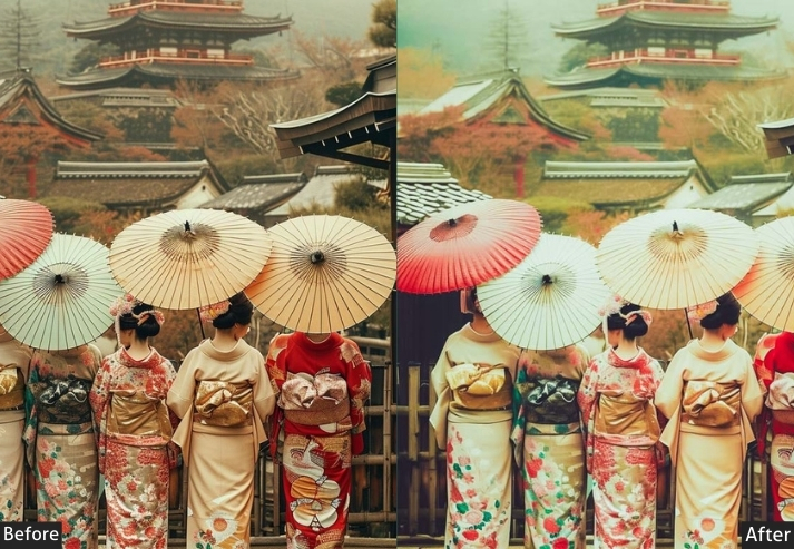
Kyoto is Japan’s soul: ancient temples, geisha districts, bamboo lanes, and thousand-year-old traditions walking alongside the modern world in the most elegant collision imaginable. This preset gives your photos a warm, slightly faded vintage quality, like they were taken on Kodachrome 64 in 1968 by a traveler who knew they were somewhere special. It honors old Kyoto with dignified, refined elegance.
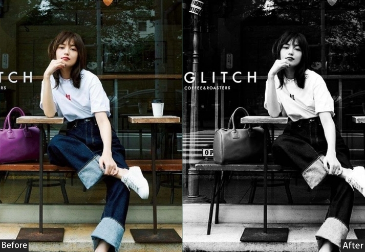
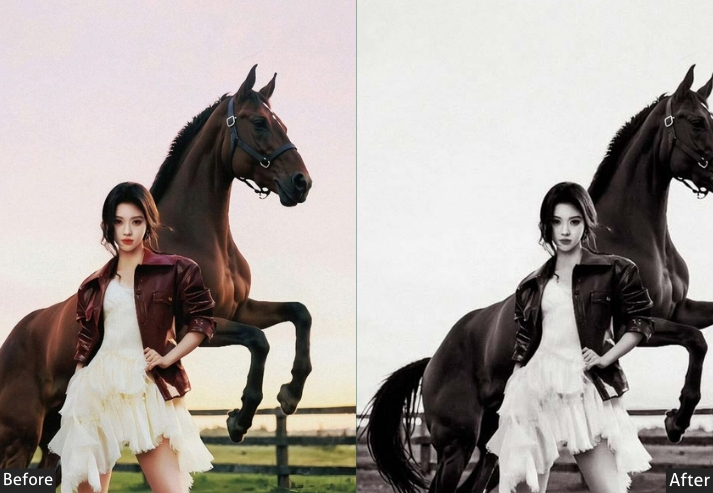
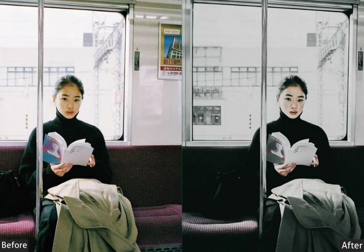
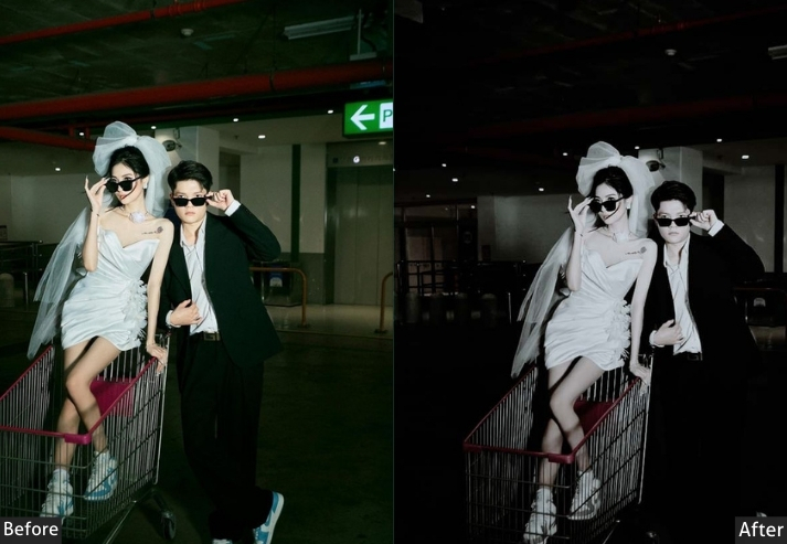
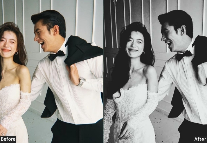
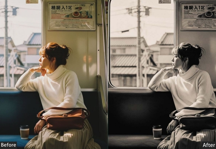
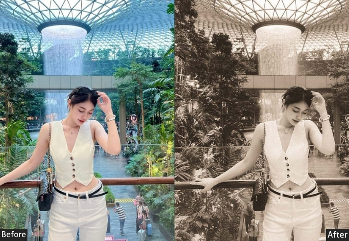
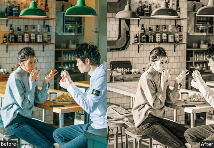
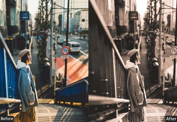
Light panel: Exposure +0.10 | Contrast +5 | Highlights -20 | Shadows +25 | Whites -15 | Blacks +5 | Color panel: Temperature +20 | Tint +10 | Vibrance -20 | Saturation -12 | Hsl / color mix: Orange hue -8 | Red hue +5 | Yellow hue -5 | Green hue +10 | Orange saturation -10 | Red saturation +10 | Blue saturation -15 | Aqua saturation -10 | Effects panel: Grain amount +30 | Grain size +40 | Vignette -25 | Midpoint +30 | Feather +80 | Tone curve: Shadow lift +15 | Darks +8 | Highlights -10 | Red channel +8 | Detail panel: Sharpening +30 | Masking +55 | Luminance noise reduction +12.
Purpose: Transport viewers to classic Kyoto through warm, refined, slightly faded vintage tones that evoke the beauty of Japan’s cultural heartland.
Best For: Gion district streets, Kinkakuji and Fushimi Inari temples, the bamboo forest in Arashiyama, kaiseki restaurant interiors, and kimono portraits.
Usage: Best at 85–95% opacity. Reduce the grain to 15 for a modern magazine feel. Soften vignette feathering to 90+ for a barely-there frame.
Style: Vintage, Warm Tones, Heritage, Travel Magazine, Soft Classic.
10. Japanese Golden Hour Preset
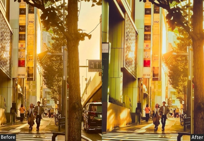
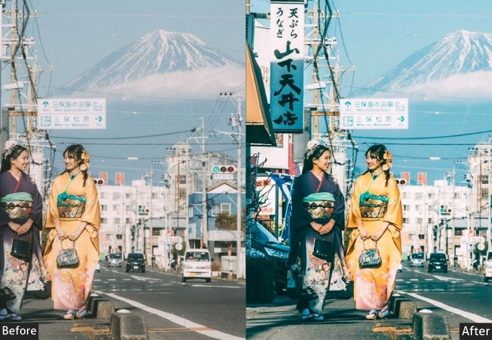
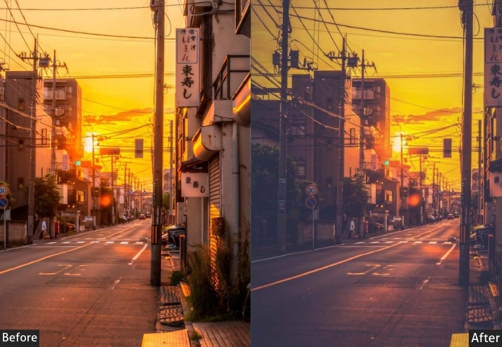
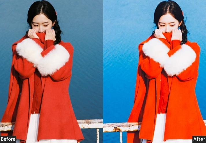
That 20-minute window just before sunset when Japan looks like a Miyazaki painting: Mt. Fuji silhouettes, pagoda rooftops catching the last honey-gold light, torii gates glowing like they’re on fire. Genuinely one of the most stunning photography experiences on the planet. This preset is built to maximize that honeyed warmth while recovering sky details so you get the full scene rather than a silhouette with a blown-out background.
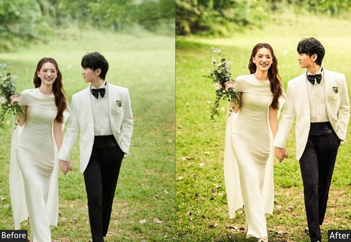
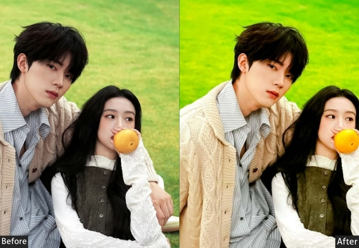
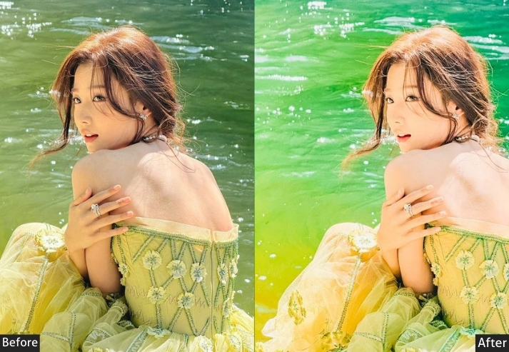
Light panel: Exposure +0.25 | Contrast +20 | Highlights -50 | Shadows +30 | Whites -15 | Blacks -20.
Color panel: Temperature +35 | Tint +8 | Vibrance +25 | Saturation +8.
Hsl / color mix: Orange hue -12 | Yellow hue -10 | Blue hue +15 | Orange saturation +35 | Yellow saturation +25 | Blue saturation +20 | Red saturation +15 | Orange luminance +8 | Yellow luminance +12 | Blue luminance -8.
Effects panel: Texture +10 | Clarity +5 | Dehaze +12 | Vignette -10.
Tone curve: Red channel +15 | Blue channel -12 | Highlights -12 | Lights +8.
Detail panel: Sharpening 40 | Masking 45.
Purpose: Amplify and preserve the iconic warm amber-gold light of sunset hours against Japan’s signature landscapes and architectural silhouettes.
Best For: Mt. Fuji at dusk, Fushimi Inari torii gates in evening light, Hiroshima Peace Park sunset, seaside fishing villages, traditional inn gardens.
Usage: Apply a graduated filter to the sky to prevent overexposure in bright areas. Add HSL blue saturation if the sky looks dull.
Style: Warm Gold, Scenic, Romantic Dusk, Landscape, Cinematic Warmth.
Last Words
If you’ve made it this far, first of all, genuinely, thank you. That means you actually care about your craft, and that alone puts you ahead of 90% of people who just use a filter on and call it a day. But here’s the thing I really want you to take away from all of this: Japan deserves your best edit.
Not because it’s trendy, not because it performs well on Instagram, but because when you’re actually standing under those cherry blossoms or watching neon signs blur in the rain, or hearing that 3 am silence in a Kyoto alley, something happens to you. Something shifts. And the whole point of editing isn’t to make a photo look good. It’s to make someone who wasn’t there feel what you felt when you were. That’s it. That’s the whole job.
So take these presets, bend them until they break, combine them in ways I haven’t thought of, and build something that looks nothing like what I described because the best edit is always the one that tells your story, not a formula. And hey, if you use any of these in your photos from Japan, I genuinely want to see them. Drop them in the comments, tag me, send them in a message. There are few things more satisfying than watching someone take a set of numbers on a screen and turn them into something that makes a stranger stop scrolling and just… stare for a second. That’s the magic. Go make it. 📷
Oh, and one last thing… if you haven’t booked that Japan trip yet? Book it. You won’t regret it. Your camera definitely won’t. And when you land back home with 3,000 photos and a very serious editing problem? Well. You know where to find me.
More Free Presets For You:
60 Korean Lightroom Presets Free Download
50 Free iPhone Photography Lightroom Presets Download
50 Free Landscape Photography Lightroom Presets Download
30 Kodak Portra Lightroom Presets
60 Event Photography Lightroom Presets