Have you ever scrolled through someone’s Korean photography feed and just… stopped? Like, mid-thumb, full stop, phone tilted slightly because surely the angle will reveal the secret? That soft, dreamy, “I woke up in a Seoul café and life is genuinely perfect” quality. That film-grain warmth. That glass-skin glow. That moody cinematic depth that makes a photo of a street corner look like a scene from an award-winning Netflix series. You KNOW the look. You’ve saved approximately 847 reference photos trying to recreate it. And every single time you sit down in Lightroom, something is just… slightly off.
Yeah. We’ve all been there. And no, it’s not your camera. It’s not your lens. It’s not even your location. It’s the edit. Specifically, it’s the Korean edit. Korean photography has developed its own distinct visual language. It’s not just “bright and airy” or “moody and dark.” It’s an entire spectrum of aesthetics. each one tied to a specific mood, a specific Seoul neighborhood, a specific feeling that Korean visual culture has been refining for years across K-dramas, Kpop concept shoots, indie film photography, beauty campaigns, and street culture. And they all live in Lightroom, waiting for you. That’s exactly why I put this guide together.

Pauline Jackson
My goal is to simplify photo editing by sharing practical tips, preset recommendations, and creative techniques that help photographers achieve professional-looking results in less time.
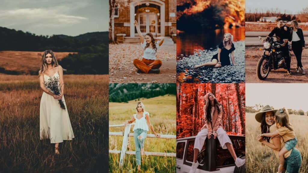
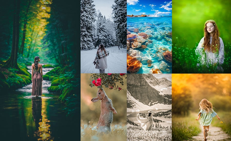
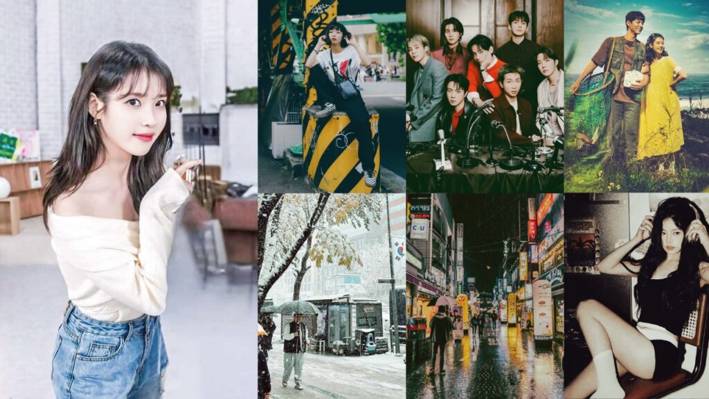
60 Korean Lightroom Presets Free Download
Inside, you’re getting Korean culture-based presets broken down like your most detail-obsessed photographer friend finally sat down and spilled every single secret. We’re talking exact slider numbers across every Lightroom panel: Light, Color, Tone Curve, HSL, Effects, Detail, Color Grading… for every single preset type. Plus a clear breakdown of when to use each one, what it does to your image, and exactly what kind of photography it was built for.
Grab a coffee, open up Lightroom, and let’s finally solve the mystery of why Korean photography looks the way it does. and, more importantly, how to make yours look like that too. Let’s get into it. 👇
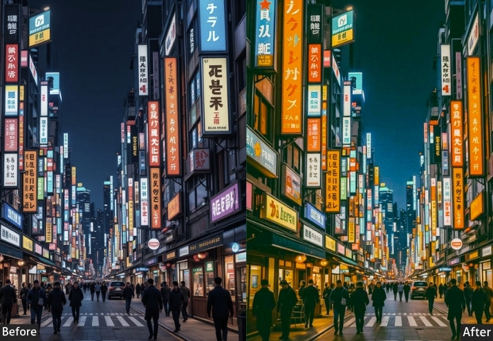
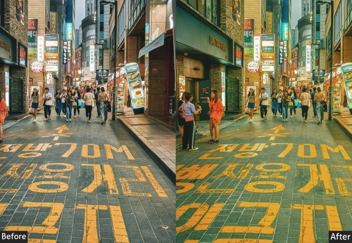
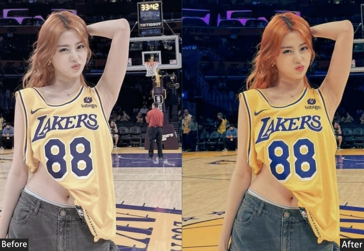
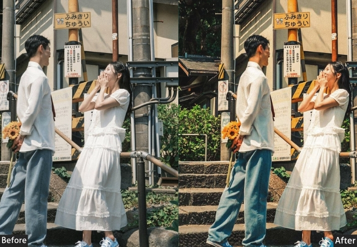
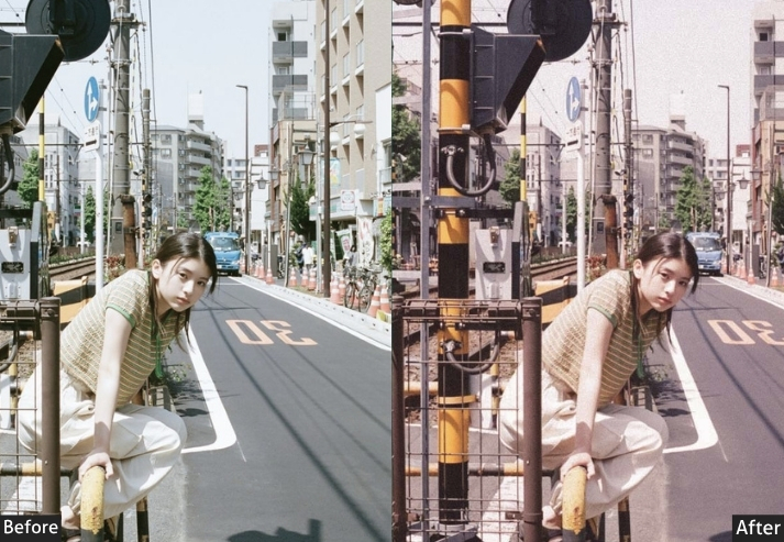
1. KOREAN STREET & CITY VIEW
“Not a single filter – just Seoul being Seoul, and somehow that needs to be preserved perfectly”.
This is a documentary on Korea. Not styled, not cinematic, not dreamy – just accurate, honest, and beautiful. Street & City View is built for the photographer who wants to capture Korea as it actually is: the chaos of Myeongdong at noon, the organized energy of the subway at rush hour, the layered visual complexity of a street view in Dongdaemun. It enhances without transforming. Colors are slightly boosted to match real-life vibrancy, contrast brings out architectural details, and the overall palette stays truthful. When you look at these photos in 20 years, you’ll know exactly what Seoul looked like. That’s the whole point.
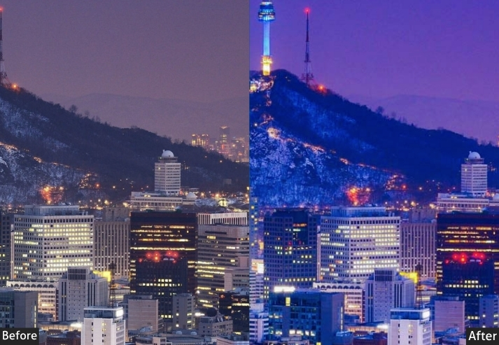
Light panel: Exposure +0.15 | Contrast +20 | Highlights -22 | Shadows +15 | Whites +12 | Blacks -12 | Color panel: Temp +5 | Tint +3 | Vibrance +20 | Saturation 0 | Tone curve: Highlights -8 | Lights +8 | Darks 0 | Shadows +5 | Gentle S-curve | Hsl / color mix: Reds Hue +3 | Sat +8 | Lum +5 | Oranges Hue +5 | Sat +5 | Lum +8 | Yellows Hue +5 | Sat +8 | Lum +5 | Greens Hue +8 | Sat +12 | Lum +3 | Aquas Hue +5 | Sat +10 | Lum 0 | Blues Hue +8 | Sat +15 | Lum 0 | Purples Hue 0 | Sat 0 | Lum 0 | Magentas Hue 0 | Sat 0 | Lum 0 | Effects panel: Texture +18 | Clarity +15 | Dehaze +10 | Vignette -8 | Grain Amount +6 | Grain Size +10 | Detail panel: Sharpening +35 | Radius 1.3 | Masking +35 | Luminance Noise Reduction +15 | Color Noise Reduction +15 | Color grading: Shadows Hue 210° Sat +6 | Midtones Hue 35° Sat +5 | Highlights Hue 40° Sat +4.
Purpose: Documents Korean street life and urban environments with accuracy and visual clarity – boosting vibrancy just enough to match what the eye actually sees.
Best For: Documentary street photography, Korean urban architecture, travel journalism, subway and public space photography.
Usage: Works in any daylight condition. Excellent for mixed lighting environments where other presets would shift colors awkwardly. Raise Sharpening further for signage-heavy compositions.
Style: Natural, accurate, and rich without being artificial.
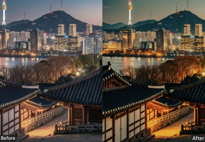
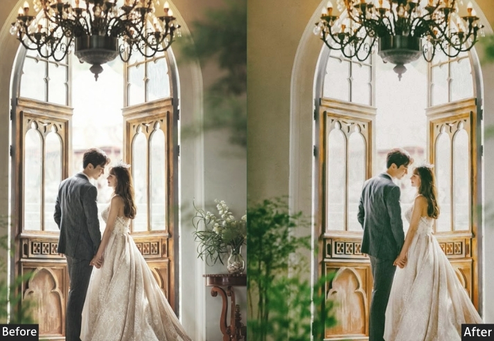
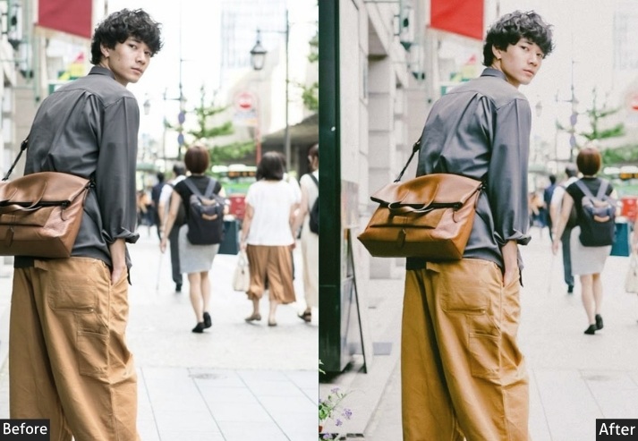
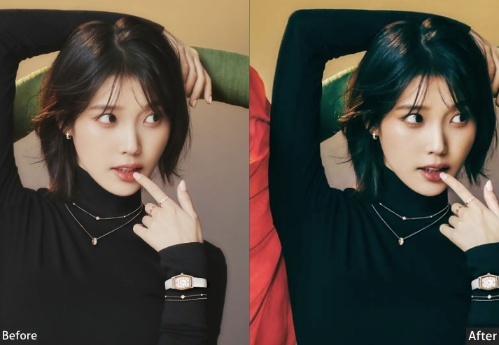
2. KOREAN CINEMATIC
“Bong Joon-ho called – he wants his color grade back”.
This one wears a turtleneck and has opinions about film theory. Cinematic is the teal-orange Hollywood grade meets Korean visual storytelling – deep, deliberate, and dramatic. Split toning pushes cool teal into the shadows and warm amber into the highlights, creating the depth you see in prestige cinema. Contrast is punchy, blacks are rich, and there’s a cinematic heaviness to every frame. One look and viewers assume you have a professional colorist in your pocket. You don’t. You just have this preset.
Light panel: Exposure -0.20 | Contrast +35 | Highlights -15 | Shadows -20 | Whites +15 | Blacks -25 | Color panel: Temp +12 | Tint -5 | Vibrance -10 | Saturation -8 | Tone curve: Highlights -10 | Lights +8 | Darks -15 | Shadows -20 | Classic deep S-curve | Hsl / color mix: Reds Hue +5 | Sat -8 | Lum 0 | Oranges Hue +8 | Sat -5 | Lum +10 | Yellows Hue +5 | Sat -10 | Lum +5 | Greens Hue +15 | Sat -20 | Lum -5 | Aquas Hue +10 | Sat +15 | Lum -5 | Blues Hue +15 | Sat +20 | Lum -10 | Purples Hue 0 | Sat -10 | Lum 0 | Magentas Hue 0 | Sat -12 | Lum 0 | Effects panel: Texture +15 | Clarity +20 | Dehaze +5 | Vignette -28 | Grain Amount +12 | Grain Size +18 | Grain Roughness +20 | Detail panel: Sharpening +25 | Radius 1.2 | Masking +55 | Luminance Noise Reduction +15 | Color Noise Reduction +20 | Color grading: Shadows Hue 200° Sat +22 | Midtones Hue 195° Sat +8 | Highlights Hue 45° Sat +18.
Purpose: Delivers that prestigious Korean cinema look: teal-orange split toning that makes any photo feel like a movie still with depth and intention.
Best For: Dramatic portraits, urban storytelling, editorial photography, moody landscapes, film-inspired visual content, and YouTube thumbnail energy.
Usage: Shoot flat (low-contrast) in-camera for best results. Works beautifully with strong directional lighting.
Style: Teal shadows, warm amber highlights, punchy contrast, rich blacks.
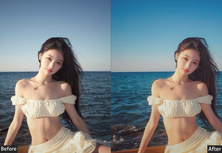
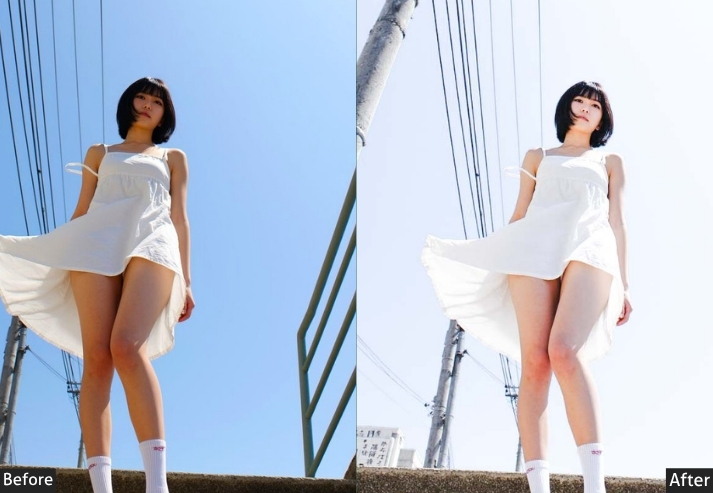
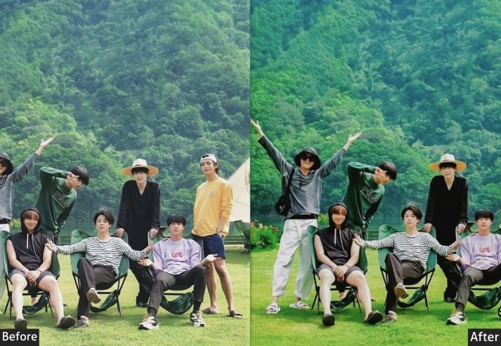
3. KOREAN AIRY & BRIGHT (SUMMER)
This preset is the linen dress on a breezy spring day in Jeju. It floods your images with light, not in a “oops I overexposed” way, but in a “I woke up in a Pinterest board” way. White walls, sheer curtains, morning coffee on a marble table. Everything glows. The trick is in lifting whites and shadows simultaneously while pulling highlights back just enough to avoid blowing out. Skin tones stay clean and warm-neutral, never yellow. Korean skincare brands, lifestyle bloggers, and brunch content creators all live and die by this one.
Light panel: Exposure +0.75 | Contrast -25 | Highlights -35 | Shadows +45 | Whites +40 | Blacks +30 | Color panel: Temp -15 | Tint +5 | Vibrance -12 | Saturation -8 | Tone curve: Highlights -15 | Lights +10 | Darks +30 | Shadows +35 | Bottom lift (airy matte base) | Hsl / color mix: Reds Hue +3 | Sat -12 | Lum +15 | Oranges Hue +5 | Sat -18 | Lum +20 | Yellows Hue +5 | Sat -20 | Lum +15 | Greens Hue +5 | Sat -22 | Lum +10 | Aquas Hue 0 | Sat -25 | Lum +15 | Blues Hue +10 | Sat -30 | Lum +20 | Purples Hue 0 | Sat -15 | Lum +8 | Magentas Hue +5 | Sat -18 | Lum +10 | Effects panel: Texture -10 | Clarity -18 | Dehaze -12 | Vignette -8 | Grain 0 | Detail panel: Sharpening +18 | Radius 1.0 | Masking 65 | Luminance Noise Reduction +20 | Color Noise Reduction +15 | Color grading: Shadows Hue 210° Sat +5 | Highlights Hue 30° Sat +3.
Purpose: Maximum brightness and airiness. Makes photos feel flooded with natural light and absolutely pristine.
Best For: Skincare and beauty campaigns, café content, fashion flatlays, lifestyle blogging, and indoor natural light portraits near windows.
Usage: Only apply to well-lit photos. Dark shots will look washed out and sad. Ideal for morning and overcast light.
Style: Super bright, near-white backgrounds, cool, clean skin tones.
4. KOREAN MOODY & DARK
“The introvert of presets. Deep, mysterious, zero small talk.”
Not every Korean photo needs to smile for the camera. Moody Dark is the brooding poet of the preset world: rich blacks, crushed shadows, cool desaturated tones, and an overall weight that feels like a statement rather than a filter. It draws from Korean indie music aesthetics, melancholy photobooks, and those beautifully lonely architectural shots that make you stop scrolling. Fog, bare trees, empty corridors, rainy nights, someone staring at the city from a high-rise, all of it was made for this. Fashion photographers and fine art shooters absolutely live here.
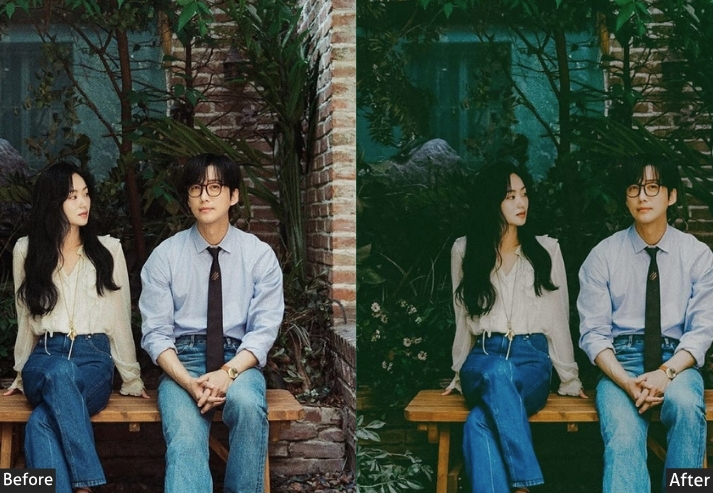
Light panel: Exposure -0.50 | Contrast +40 | Highlights -30 | Shadows -45 | Whites -20 | Blacks -55 | Color panel: Temp -20 | Tint -8 | Vibrance -30 | Saturation -25 | Tone curve: Highlights -15 | Lights -8 | Darks -25 | Shadows -40 | Hsl / color mix: Reds Hue 0 | Sat -20 | Lum -10 | Oranges Hue 0 | Sat -25 | Lum -5 | Yellows Hue +5 | Sat -30 | Lum 0 | Greens Hue +10 | Sat -35 | Lum -5 | Aquas Hue +5 | Sat -20 | Lum -5 | Blues Hue +10 | Sat -10 | Lum -8 | Purples Hue 0 | Sat -15 | Lum 0 | Magentas Hue 0 | Sat -20 | Lum 0 | Effects panel: Texture +15 | Clarity +10 | Dehaze +5 | Vignette -45 | Grain Amount +18 | Grain Size +20 | Grain Roughness +28 | Detail panel: Sharpening +22 | Radius 1.1 | Masking +50 | Luminance Noise Reduction +35 | Color Noise Reduction +25 | Color grading: Shadows Hue 220° Sat +18 | Midtones Hue 210° Sat +8 | Highlights Hue 30° Sat +5.
Purpose: Strips away comfort and brightness to reveal something raw, heavy, and emotionally complex.
Best For: Fine art portraiture, autumn/winter scenes, Korean indie aesthetic, fashion editorials, album cover photography, and architectural moods.
Usage: Use on photos with existing natural drama. Works beautifully on foggy, overcast, or backlit scenes.
Style: Crushed blacks. Desaturated, cool tones. Heavy vignette. Brooding.
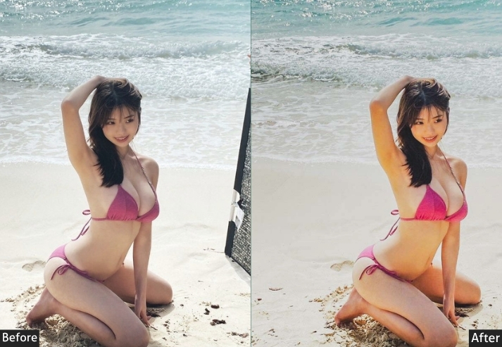
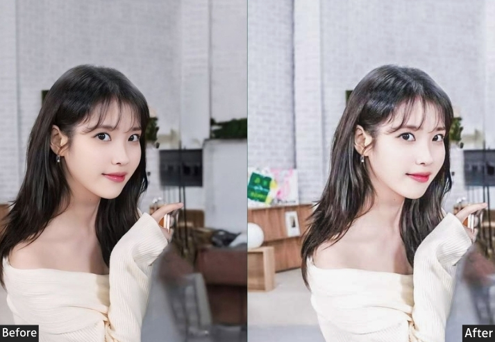
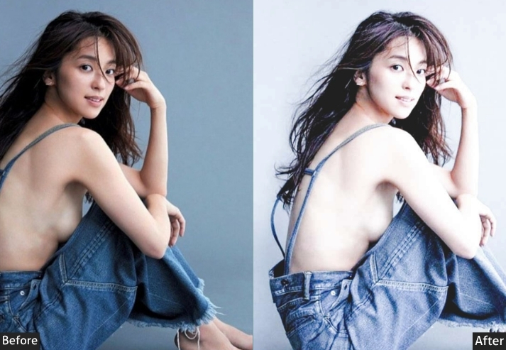
5. KOREAN SKIN GLOW
“Glass skin, but make it a Lightroom preset”.
If K-beauty had a photographer on retainer, they’d use this preset exclusively. Skin Glow is laser-focused on one thing: making skin luminous, radiant, and dewy, as if the subject just completed a 12-step skincare routine and stepped into perfect soft-box lighting. It lifts midtones specifically to brighten skin luminosity, pulls negative clarity to smooth surface texture without losing the rest of the image’s sharpness, and gently warms oranges and pinks to that signature glow frequency. It’s the “glass skin” preset. Full stop. Makeup artists, beauty brands, and portrait photographers should have this bookmarked forever.
Light panel: Exposure +0.40 | Contrast -15 | Highlights -20 | Shadows +30 | Whites +15 | Blacks +20.
Color panel: Temp +18 | Tint +8 | Vibrance -10 | Saturation -5.
Tone curve: Highlights -5 | Lights +15 | Darks +20 | Shadows +15 | Midtone lift emphasized.
Hsl / color mix: Reds Hue +5 | Sat -20 | Lum +15 | Oranges Hue +8 | Sat -10 | Lum +20 | Yellows Hue +5 | Sat -15 | Lum +12 | Magentas Hue +8 | Sat -20 | Lum +10 | Greens Hue 0 | Sat 0 | Lum 0 | Aquas Hue 0 | Sat 0 | Lum 0 | Blues Hue 0 | Sat 0 | Lum 0 | Purples Hue 0 | Sat 0 | Lum 0.
Effects panel: Texture -20 | Clarity -25 | Dehaze -5 | Vignette -10 | Grain 0.
Detail panel: Sharpening +20 | Radius 0.8 | Masking 80 | Luminance Noise Reduction +18 | Color Noise Reduction +15.
Color grading: Shadows Hue 25° Sat +8 | Midtones Hue 28° Sat +6 | Highlights Hue 20° Sat +10.
Purpose: Maximizes skin luminosity and creates the K-beauty glass skin glow. Warm, soft, dewy, and radiantly human.
Best For: K-beauty content, makeup photography, portrait blogging, skincare brand campaigns, headshots, and beauty editorials.
Usage: Apply globally, then use the Adjustment Brush to bring texture back to eyes, hair, and fabric, so only the skin stays cloud-soft.
Style: Warm, glowing, soft skin. Low texture. High luminosity.
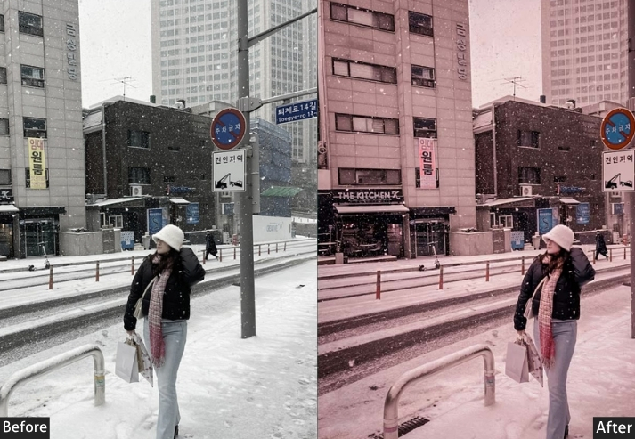
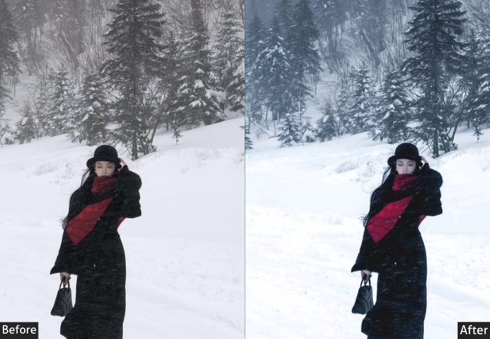
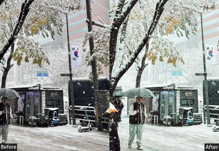
6. KOREAN WINTER COOL
“Seoul in January: icy blue, quiet streets, and that held-breath stillness”.
Korean winters are genuinely beautiful in a melancholy, cinematic way. 🥶 Snow on temple rooftops. Frost traces café windows. The muted palette of a grey January morning that somehow feels peaceful rather than bleak. Winter Cool captures that exact atmosphere – cool, clean, and quiet. Blues and silvers dominate. Colors are deliberately muted into a near-monochrome. It’s particularly stunning for snow photography and winter fashion, where the subject shines against an otherwise subdued world. Still and deliberate. Like a photo that knows exactly when to be silent.
Light panel: Exposure +0.35 | Contrast -18 | Highlights -12 | Shadows +20 | Whites +15 | Blacks +15.
Color panel: Temp -30 | Tint -5 | Vibrance -25 | Saturation -18.
Tone curve: Highlights -5 | Lights +8 | Darks +15 | Shadows +12.
Hsl / color mix: Reds Hue 0 | Sat -25 | Lum +10 | Oranges Hue 0 | Sat -30 | Lum +15 | Yellows Hue +5 | Sat -30 | Lum +10 | Greens Hue +8 | Sat -25 | Lum +8 | Aquas Hue +10 | Sat +15 | Lum +12 | Blues Hue +15 | Sat +20 | Lum +10 | Purples Hue +5 | Sat -10 | Lum +5 | Magentas Hue 0 | Sat -20 | Lum +5.
Effects panel: Texture -5 | Clarity -10 | Dehaze 0 | Vignette -15 | Grain Amount +8 | Grain Size +14.
Detail panel: Sharpening +18 | Radius +1.0 | Masking +60 | Luminance Noise Reduction +20 | Color Noise Reduction +18.
Color grading: Shadows Hue 210° Sat +15 | Midtones Hue 205° Sat +8 | Highlights Hue 200° Sat +5.
Purpose: Channels the quiet stillness and icy beauty of Korean winter. Cool, silvery, and hushed in the best possible way.
Best For: Winter fashion photography, snow scenes, foggy mornings, architectural shots in grey light, and minimalist editorial work.
Usage: Works in any cool or overcast condition.
Style: Icy blues and silvers. Near-monochromatic softness. Still and contemplative.
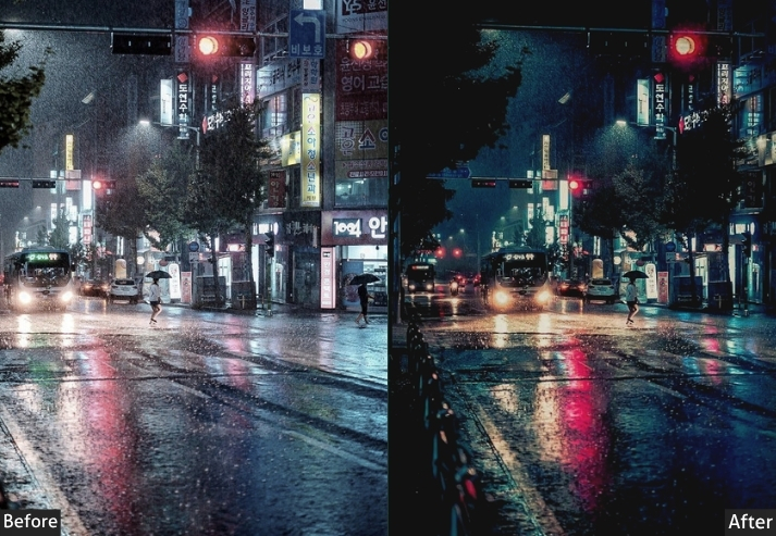
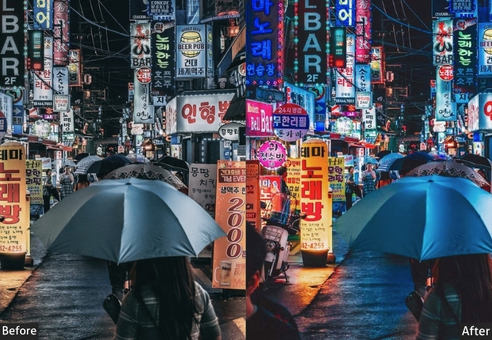
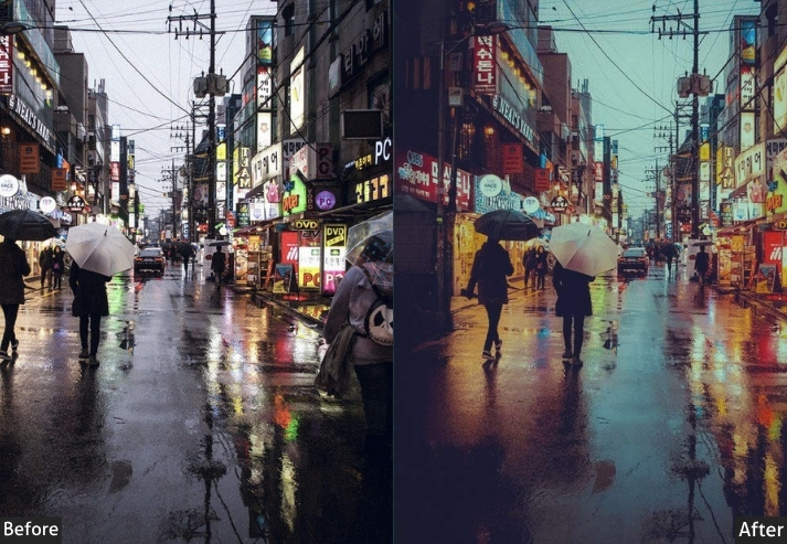
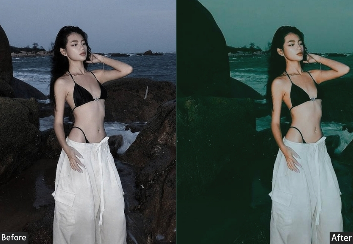
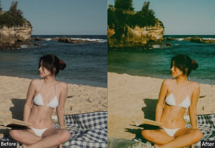
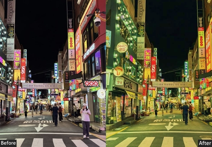
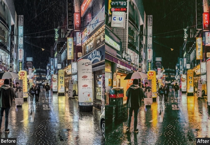
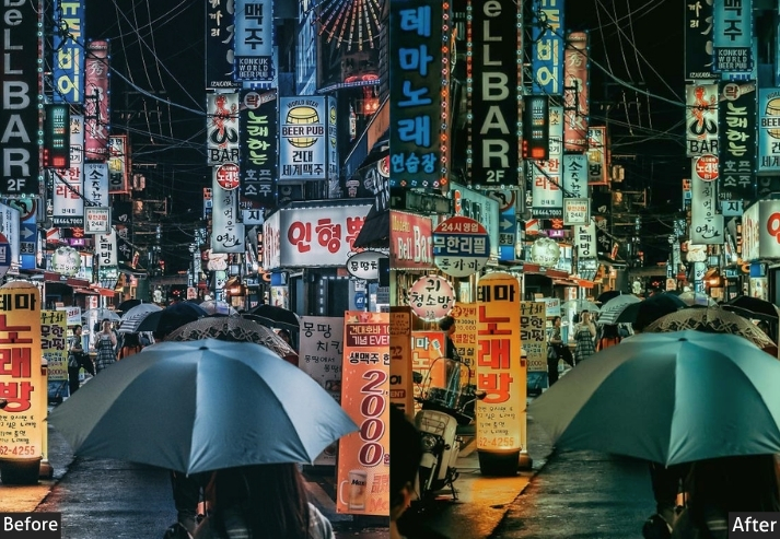
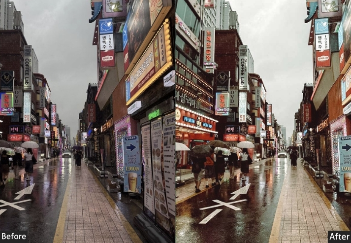
7. KOREAN MONSOON
“Rain on a Seoul window: wet streets, grey skies, and unexpected peace”.
Nobody talks about how gorgeous the Korean monsoon season actually is from a photography perspective. Everything is wet and reflective. Umbrellas dot the streets like moving color accents. Overcast skies act as the world’s largest softbox. And the green – oh, the green gets SO green after the rain. The Monsoon preset leans into all of this with a cool, desaturated, slightly blue-green palette that makes rainy images feel cinematic and contemplative rather than gloomy. It’s moody but hopeful. Reflective surfaces become mirrors. Grey skies become intentional. Rain is finally getting the editorial treatment it deserves.
Light panel: Exposure +0.15 | Contrast +8 | Highlights -25 | Shadows +20 | Whites +5 | Blacks +10.
Color panel: Temp -22 | Tint -8 | Vibrance -15 | Saturation -12.
Tone curve: Highlights -12 | Lights +5 | Darks +12 | Shadows +8.
Hsl / color mix: Reds Hue 0 | Sat -20 | Lum +8 | Oranges Hue 0 | Sat -25 | Lum +10 | Yellows Hue +5 | Sat -20 | Lum +8 | Greens Hue +12 | Sat +15 | Lum +5 | Aquas Hue +8 | Sat +20 | Lum 0 | Blues Hue +12 | Sat +15 | Lum -5 | Purples Hue +5 | Sat -10 | Lum 0 | Magentas Hue 0 | Sat -15 | Lum +5.
Effects panel: Texture +5 | Clarity +8 | Dehaze +12 | Vignette -20 | Grain Amount +15 | Grain Size +18 | Grain Roughness +22.
Detail panel: Sharpening +20 | Radius 1.0 | Masking +55 | Luminance Noise Reduction +28 | Color Noise Reduction +22.
Color grading: Shadows Hue 195° Sat +18 | Midtones Hue 200° Sat +10 | Highlights Hue 195° Sat +8.
Purpose: Makes rainy, overcast, and wet-weather photography feel atmospheric and intentional rather than accidental and disappointing.
Best For: Monsoon season photography, rainy street shots, reflective puddle compositions, and overcast landscape scenes.
Usage: Use Dehaze to cut through atmospheric moisture. Boost Luminance Noise Reduction since dark rainy scenes produce more digital noise. Works beautifully with neon/shop-light reflections on wet pavement.
Style: Cool blue-green tones. Atmospheric grey. Reflective surfaces sing. Greens intensify after rain. Melancholy but cinematic.
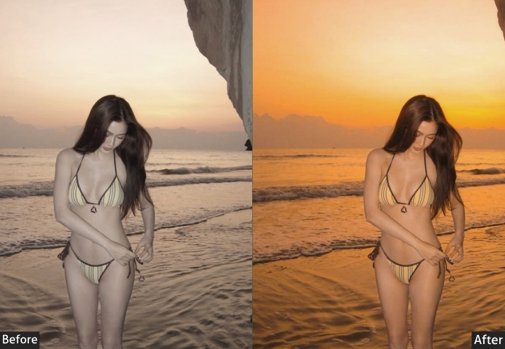
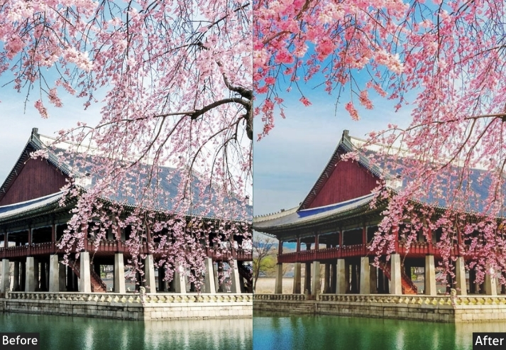
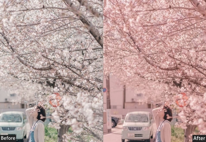
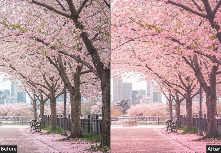
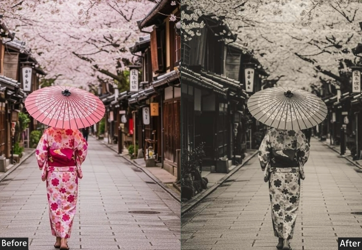
8. KOREAN CHERRY BLOSSOM
“Jinhae called: 4 million people showed up with cameras, and nobody regrets it”.
Cherry blossom season in Korea is not a soft suggestion: it’s a national event. Millions of people descend on Jinhae, Gyeongju, and Seoul’s Yeouido for about two glorious weeks, where everything turns pink. This preset is built entirely around making that pink look absolutely transcendent. It brightens the entire image with a warm-pink bias, pulls highlights down to save blown-out blossom petals (a REAL problem in cherry blossom photography), and gives skin tones a peachy warmth that looks perfect against that rosy backdrop. It also slightly lifts the blues and skies to maximize the pink-against-blue contrast everyone is chasing.
Light panel: Exposure +0.45 | Contrast -20 | Highlights -45 | Shadows +30 | Whites -15 | Blacks +25.
Color panel: Temp -8 | Tint +20 | Vibrance +10 | Saturation -5.
Tone curve: Highlights -20 | Lights +8 | Darks +20 | Shadows +18.
Hsl / color mix: Reds Hue +15 | Sat +15 | Lum +15 | Oranges Hue +8 | Sat -15 | Lum +18 | Yellows Hue +5 | Sat -18 | Lum +12 | Greens Hue +10 | Sat -20 | Lum +8 | Aquas Hue +5 | Sat -15 | Lum +10 | Blues Hue +12 | Sat +15 | Lum +12 | Purples Hue +10 | Sat +10 | Lum +10 | Magenta Hue +15 | Sat +20 | Lum +15.
Effects panel: Texture -8 | Clarity -15 | Dehaze -8 | Vignette -12 | Grain Amount +8 | Grain Size +12.
Detail panel: Sharpening +18 | Radius 0.9 | Masking +65 | Luminance Noise Reduction +18 | Color Noise Reduction +15.
Color grading: Shadows Hue 310° Sat +15 | Midtones Hue 320° Sat +10 | Highlights Hue 340° Sat +12.
Purpose: Maximizes the beauty of cherry blossom photography by protecting petal detail, amplifying pink tones, and creating a dreamy spring atmosphere.
Best For: Cherry blossom season photography, spring portraits, flower photography, Jinhae/Yeouido content, spring fashion shoots, and K-tourism content.
Usage: Pull Highlights WAY down before applying – blossom petals blow out aggressively in bright light. Shoot slightly underexposed in-camera, and let the preset breathe life back into it.
Style: Pink-dominant. Dreamy, soft, and warmly bright. Blue skies pop. Skin glows warm-peachy.
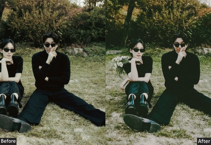
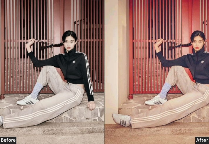
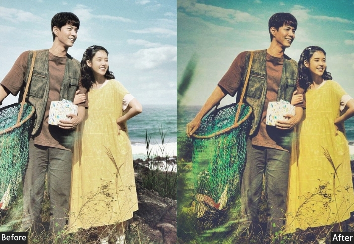
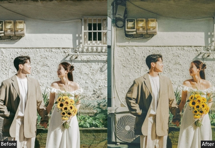
9. VINTAGE KOREAN
“Not Film. Not Matte. This is the one that actually looks like your grandparents’ photo albums, and somehow that’s the coolest thing possible”.
There’s a difference between “vintage” and “film.” Korean Film chases analog photography. This Vintage preset goes for an older look: it mimics the faded, warm, slightly deteriorated look of photos from the 70s and 80s. Think photo albums with plastic pages, slightly yellow-tinged paper, and colors that have gently oxidized over decades. There’s a red channel lift, a yellow color cast in the shadows, faded greens, and a softness like time itself has been editing your photos. It’s nostalgic in a way that bypasses cool and goes straight to emotional.
Light panel: Exposure +0.10 | Contrast -20 | Highlights -15 | Shadows +30 | Whites -20 | Blacks +35.
Color panel: Temp +40 | Tint +15 | Vibrance -25 | Saturation -20.
Tone curve: Highlights -15 | Lights +5 | Darks +20 | Shadows +35.
Hsl / color mix: Reds Hue +12 | Sat -15 | Lum +18 | Oranges Hue +15 | Sat +10 | Lum +20 | Yellows Hue +15 | Sat +15 | Lum +10 | Greens Hue +20 | Sat -35 | Lum +5 | Aquas Hue +10 | Sat -30 | Lum +8 | Blues Hue +10 | Sat -35 | Lum +12 | Purples Hue +5 | Sat -25 | Lum +8 | Magentas Hue +8 | Sat -20 | Lum +8.
Effects panel: Texture +5 | Clarity -12 | Dehaze -8 | Vignette -25 | Grain Amount +38 | Grain Size +28 | Grain Roughness +40.
Detail panel: Sharpening +10 | Radius +1.0 | Masking +70 | Luminance Noise Reduction +25 | Color Noise Reduction +25.
Color grading: Shadows Hue 42° Sat +25 | Midtones Hue 40° Sat +15 | Highlights Hue 50° Sat +12.
Purpose: Recreates the look of genuinely aged Korean photography from the 70s and 80s: warm yellows, faded colors, and that emotional, time-worn softness.
Best For: Nostalgic family portraits, storytelling photography, documentary-style work, hanok or traditional Korean settings, heritage content, and anyone going for maximum emotional resonance.
Usage: Works on any subject but truly sings in traditional or heritage environments. The more grain, the better here.
Style: Yellowed highlights. Faded blues and greens. Lifted blacks throughout. Heavy grain. Looks like it was printed, put in an album, and found in a box 40 years later.
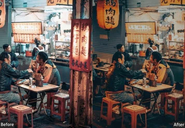
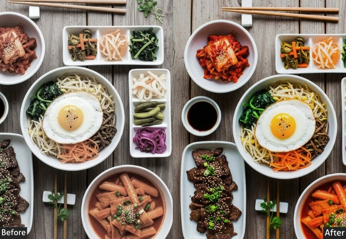
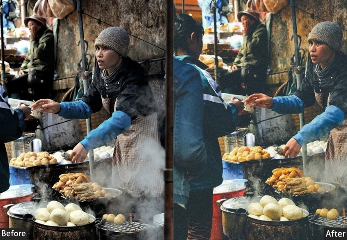
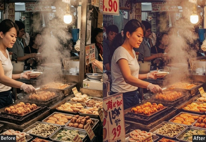
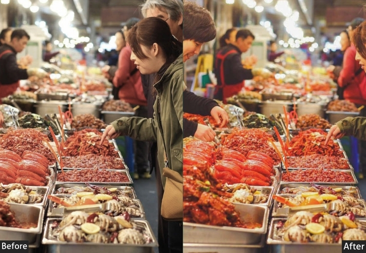
10. KOREAN FOOD
“Your tteokbokki deserves better than the lighting in that restaurant”.
Korean food is genuinely one of the most visually stunning cuisines on the planet: the reds of gochujang, the jewel tones of banchan, the perfect gloss on a dolsot bibimbap, the steam curling off a sundubu jjigae. The Food preset was engineered to make ALL of it look absolutely incredible. Warm, rich, slightly enhanced saturation on reds and oranges (the primary colors of Korean food), improved texture clarity to make you taste the crunch through the screen, and a gentle vignette that pulls your eyes straight to the food like a culinary spotlight. Mukbang creators and food bloggers, this one’s for you.
Light panel: Exposure +0.25 | Contrast +20 | Highlights -25 | Shadows +20 | Whites +10 | Blacks -10.
Color panel: Temp +25 | Tint +8 | Vibrance +20 | Saturation +10.
Tone curve: Highlights -10 | Lights +12 | Darks +5 | Shadows -5.
Hsl / color mix: Reds Hue +5 | Sat +30 | Lum +5 | Oranges Hue +10 | Sat +25 | Lum +10 | Yellows Hue +8 | Sat +20 | Lum +8 | Greens Hue +10 | Sat +15 | Lum +5 | Aquas Hue 0 | Sat -10 | Lum 0 | Blues Hue 0 | Sat -15 | Lum +5 | Purples Hue 0 | Sat -10 | Lum 0 | Magentas Hue +5 | Sat +10 | Lum +5.
Effects panel: Texture +22 | Clarity +18 | Dehaze +5 | Vignette -20 | Grain Amount +8 | Grain Size +12.
Detail panel: Sharpening +30 | Radius 1.2 | Masking +40 | Luminance Noise Reduction +12 | Color Noise Reduction +15.
Color grading: Shadows Hue 35° Sat +20 | Midtones Hue 38° Sat +12 | Highlights Hue 42° Sat +10.
Purpose: Makes Korean food look as incredible as it tastes. Enhances the visually appetizing, color-triggering hues (reds, oranges, golds) while adding the textural clarity that brings food photography to life.
Best For: Mukbang content, food blogging, Korean restaurant photography, recipe development shoots, street food documentation, and anyone who takes pictures before eating.
Usage: Shoot from above or at a 45° angle for the best food photography. Use a reflector or white bounce to fill in shadows under the dish.
Style: Warm, rich, textured. Reds pop. Gold’s glow. Every grain of sesame and curl of steam rendered beautifully.
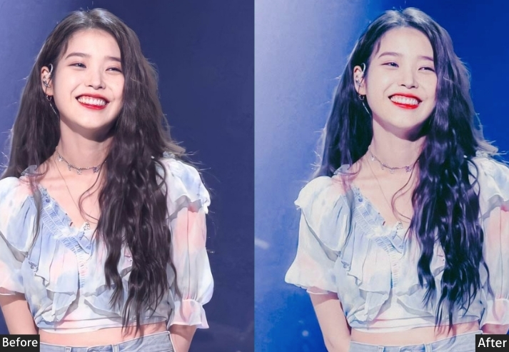
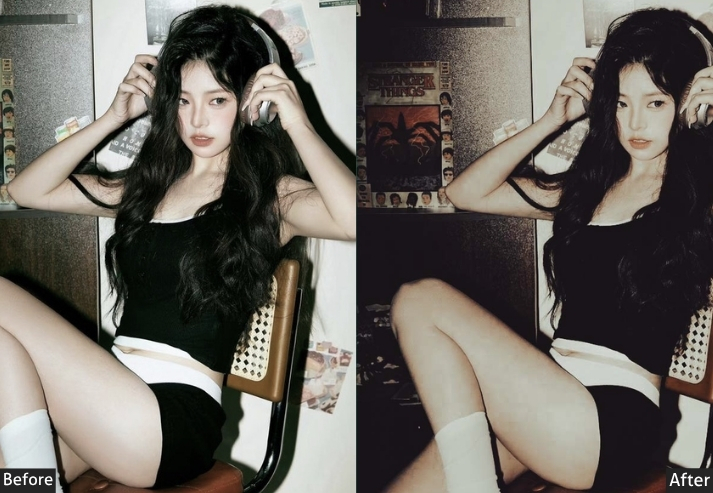
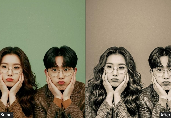
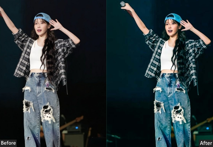
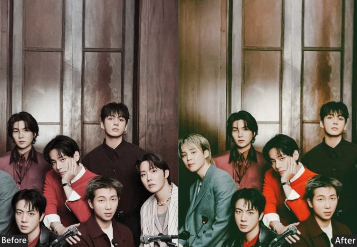
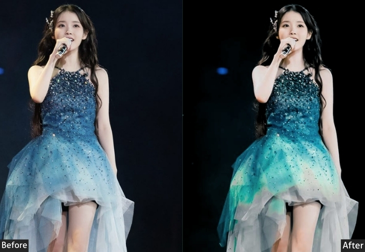
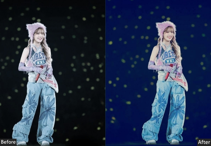
11. KPOP & KDRAMA
“Main character energy – always in soft focus on a staircase somewhere with a playlist”.
You know exactly what this looks like before I even explain it. The dreamy, high-key, slightly unreal quality of K-drama promotional photography. Skin that seems to glow from an otherworldly light source. Soft backgrounds. That signature Korean entertainment industry color palette – pinks, lavenders, and blues in careful harmony. And K-pop? Concept photography has basically created its own visual language: high saturation on statement colors, clean white highlights, and an artificiality that’s deliberately beautiful. This preset splits the difference between both worlds – drama-soft AND idol-vivid, depending on where you push it.
Light panel: Exposure +0.55 | Contrast -18 | Highlights -25 | Shadows +35 | Whites +20 | Blacks +30.
Color panel: Temp -8 | Tint +18 | Vibrance +15 | Saturation 0.
Tone curve: Highlights -12 | Lights +15 | Darks +25 | Shadows +20.
Hsl / color mix: Reds Hue +15 | Sat +10 | Lum +20 | Oranges Hue +8 | Sat -15 | Lum +25 | Yellows Hue +5 | Sat -20 | Lum +15 | Greens Hue +15 | Sat -25 | Lum +10 | Aquas Hue +8 | Sat -15 | Lum +12 | Blues Hue +20 | Sat +15 | Lum +15 | Purples Hue +15 | Sat +20 | Lum +15 | Magentas Hue +15 | Sat +25 | Lum +15.
Effects panel: Texture -15 | Clarity -20 | Dehaze -8 | Vignette -12 | Grain 0.
Detail panel: Sharpening +15 | Radius 0.8 | Masking +75 | Luminance Noise Reduction +22 | Color Noise Reduction +18.
Color grading: Shadows Hue 270° Sat +20 | Midtones Hue 290° Sat +12 | Highlights Hue 310° Sat +15.
Purpose: Captures the high-production, otherworldly color aesthetic of K-pop concept photography and K-drama promotional imagery. Fantasy-grade, aspirational, and unapologetically pretty.
Best For: Fan photography, idol-inspired portraits, K-drama aesthetic content, entertainment photography, studio portrait work, and anyone whose life goal is to look like a Netflix thumbnail.
Usage: Works best in controlled light (studio or soft window). Pair with minimal background for maximum idol energy. The preset is strong: reduce Tint if the pink push feels overpowering on your subject.
Style: Pinks, lavenders, and periwinkles. Glowing skin. Soft, dreamy, high-luminosity.
Last Words
The numbers in this guide are starting points – carefully researched, tested, and built around the specific visual DNA of Korean photography aesthetics. But your photos were taken in your light, in your location, with your subject, through your lens. So use these settings. Trust them as a foundation. But also trust yourself to know when something needs one more nudge, one more tweak, one more “actually, the shadows feel off” correction. That instinct is the thing no preset can give you, and it’s the thing that makes your photography yours, even when you’re drawing from someone else’s aesthetic language. 📷
If you found this guide genuinely useful, share it with a photographer friend who’s been asking you, “Wait, how do you edit like that?” because this is the answer you were looking for. Bookmark it for your next Lightroom session. And if you actually try any of these presets on your photos? I would genuinely love to see what you create with them. Now close this tab, open Lightroom, and go make something that stops people mid-scroll. You’ve got the recipe. Time to cook. 🍜✨
More Free Presets For You:
80 Japan Lightroom Presets Free Download
30 Kodak Portra Lightroom Presets Free Download