you take a photo on your iPhone, it looks incredible in the actual scene. The light is perfect. The moment is real. You feel it. Then you look at the camera roll, and it’s just… fine. Flat. Forgettable. The kind of photo you scroll past without stopping.
That gap between what your eyes saw and what your camera saved? That’s not a hardware problem. Your iPhone is shooting in ProRAW with computational photography that would’ve made professional photographers weep a decade ago. The gap is an editing problem, and specifically, it’s a preset problem!
The right preset doesn’t just “fix” a photo. It gives it a mood. A soul. It tells the viewer how to feel before they’ve even registered what they’re looking at. That’s why some iPhone photographers have feeds that look like they cost $10,000 to shoot, and others with the exact same phone have feeds that look like a camera roll dump. The difference isn’t talent. It’s not even a skill. It’s knowing which preset to reach for and why.
And that’s the thing most preset guides completely skip. They’ll hand you a list of preset names and maybe a before/after photo, then wish you luck. No settings. No reasoning. No explanation of what “moody” actually means in terms of sliders.
This guide doesn’t do that. What you’re about to get: every major type of iPhone preset that photographers, creators, and editors actually use and search for, broken down with their full editing logic, exact Lightroom tool settings (Light, Color, Effects, Detail, Tone Curve, Color Grading), the purpose behind each adjustment, and honest guidance on when each style works and when it doesn’t. We’re going deep. Let’s do this properly.
Pauline Jackson
I build presets that serve as a reliable first edit: fixing exposure issues, stabilizing color, and laying a clean foundation so photographers don’t have to make the same adjustments on every photo.
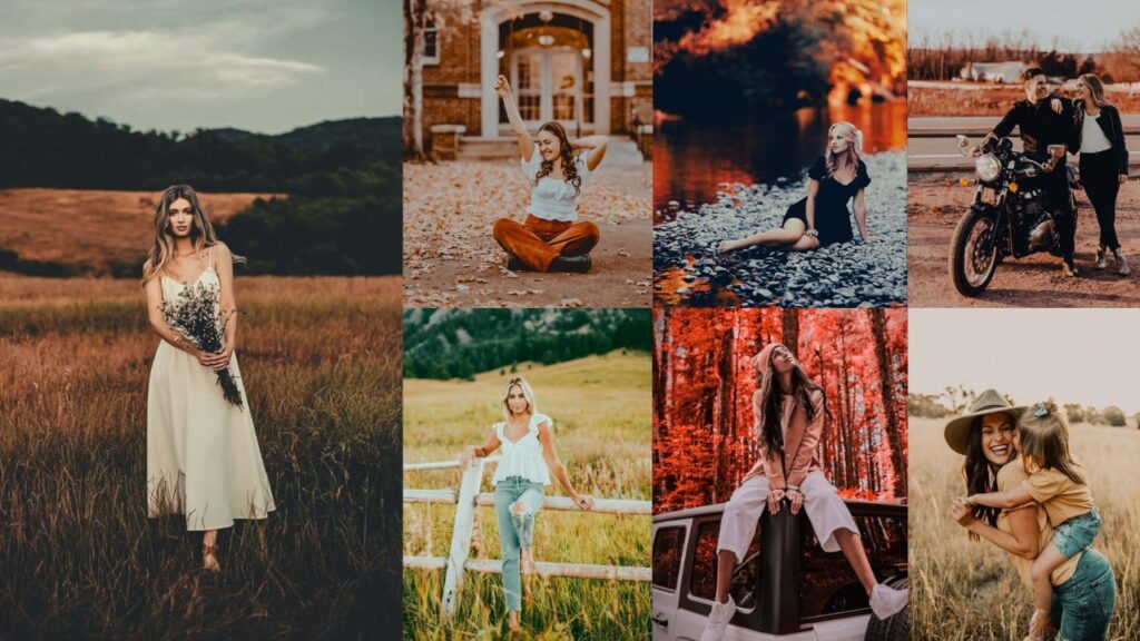
50 Free iPhone Photography Lightroom Presets Download
Think of these presets as a filter with a PhD. An Instagram filter slaps a single generic overlay on your photo and calls it a day. A preset is a precisely engineered package of adjustments: Exposure, Shadows, Highlights, individual color channel manipulation, grain calibration, vignetting, and color grading split between shadows and highlights. all working in concert to create one cool look.
Here are all the types, every single one people search for, obsess over, and use to build visual identities worth following.
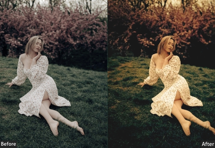
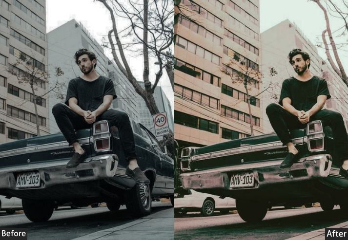
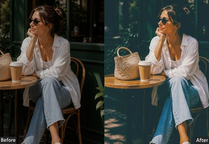
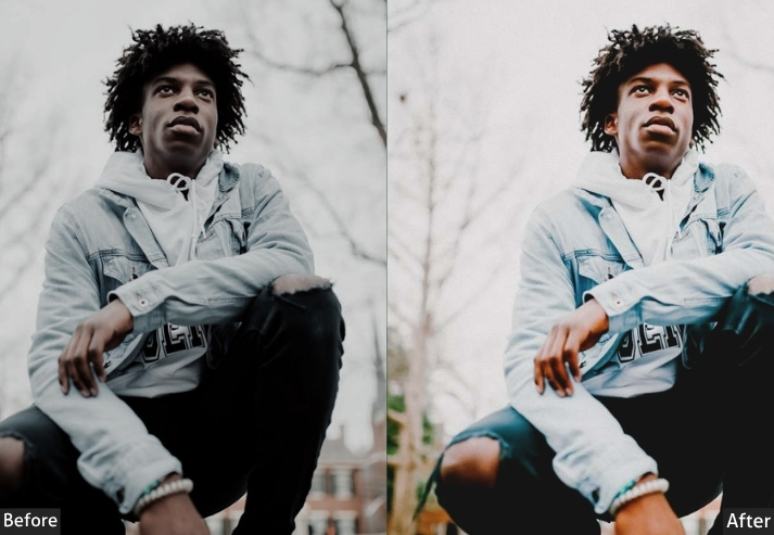
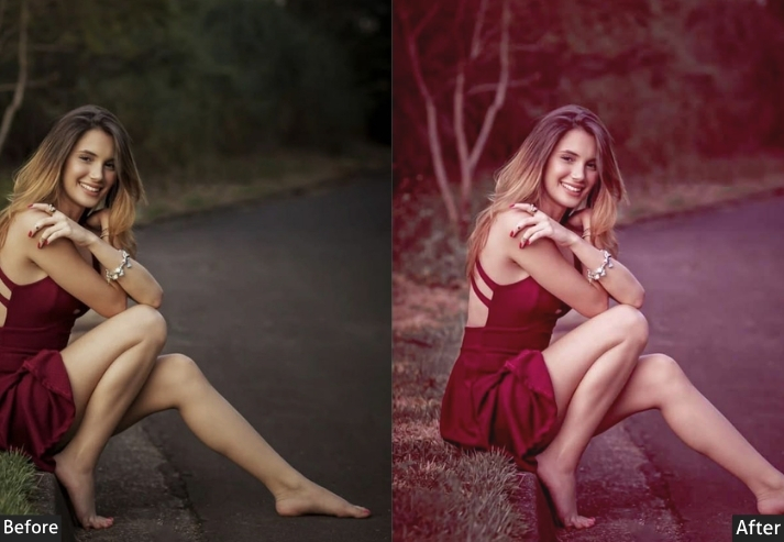
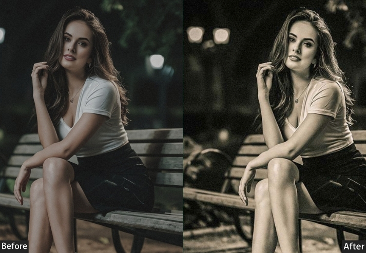
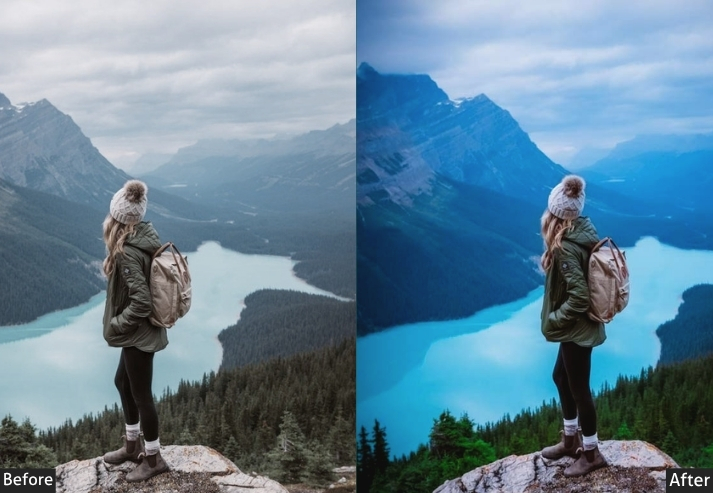
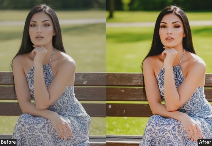
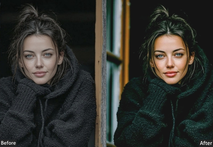
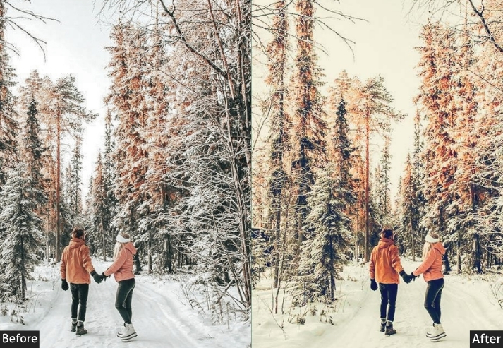
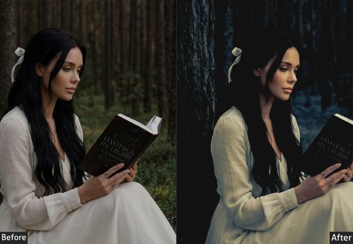
1. Moody Dark iPhone Preset
This preset is all about pulling down the brightness, crushing the shadows, and letting deep blues and teals do the heavy lifting. It transforms flat daylight photos into something that genuinely has atmosphere.
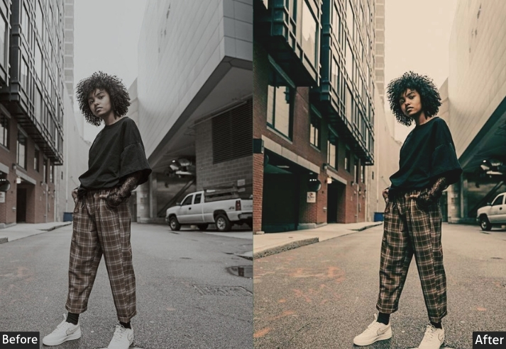
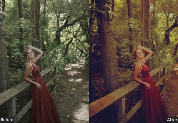
Light Panel: Exposure -0.50 | Contrast +25 | Highlights -40 | Shadows -30 | Whites -20 | Blacks -40. Color Panel: Temp -10 (cooler) | Tint +5 | Vibrance -15 | Saturation -10. Color Mix: Blues → Hue -10 | Saturation +20 | Luminance -30 | Greens → Hue +10 | Saturation -20 | Luminance -15. Tone Curve: Highlights -25 | Shadows -15 | Subtle S-Curve with slightly lifted midtones. Effects Panel: Vignette -25 | Grain Amount +15 | Size 25 | Roughness 50. Detail Panel: Sharpening +40 | Masking 70 | Noise Reduction +20. Color Grading: Shadows Hue 230° / Sat +20 (blue tint) | Midtones Hue 190° / Sat +10 (teal tint) | Highlights Slight Amber Warmth (+5).
Purpose: Creates dramatic, cinematic photographs with emotional depth.
Best For: Street photography, portraits at golden hour, rainy/overcast days, urban scenes, and interior shots.
Usage: A consistent moody brand aesthetic on Instagram or portfolio.
Style: Dark, cinematic, editorial, emotional.
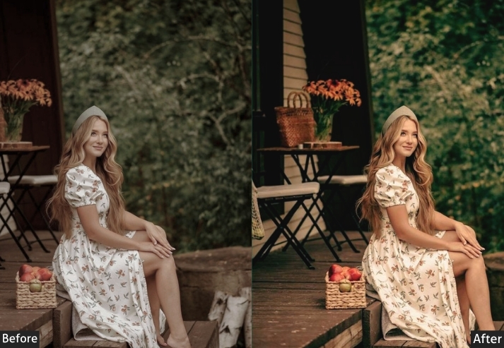
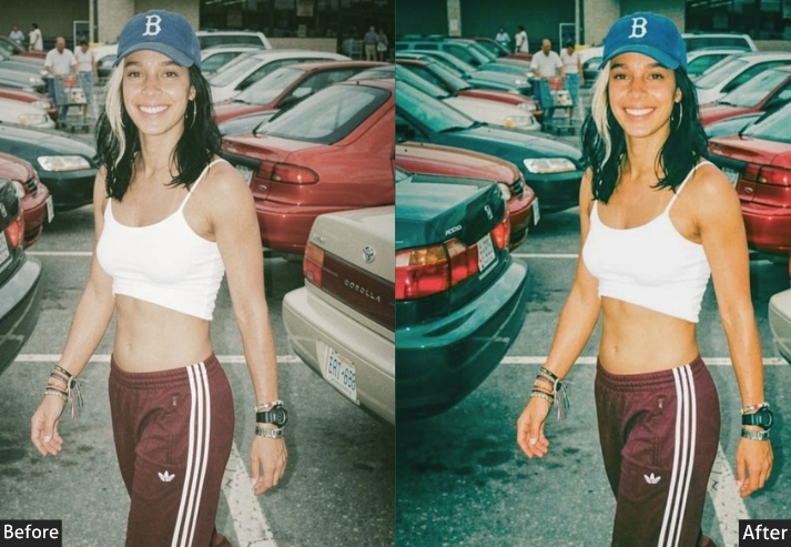
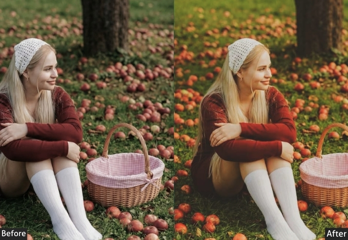
2. Film iPhone Preset
The magic here is in the imperfection. Film presets intentionally introduce “flaws,” faded blacks, color cast, and grain that paradoxically make photos feel more authentic and artistic than any technically “perfect” digital image.
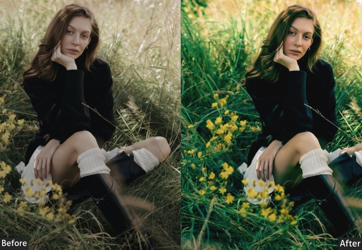
Light Panel: Exposure +0.20 | Contrast +10 | Highlights -25 | Shadows +25 (faded film lift) | Whites -15 | Blacks +20 (lifted blacks). Color Panel: Temp +15 (Kodak Gold warmth) | Tint +8 (film-style green shift) | Vibrance -20 | Saturation -15. Color Mix: Reds → Hue +10 | Saturation -10 | Greens → Hue -15 | Saturation +10 | Luminance -10 | Blues → Hue +10 | Saturation -20. Tone Curve: Lift black point significantly (bottom-left anchor ≈ 30/255) | Subtle S-Curve with compressed contrast. Effects Panel: Grain Amount +40 to +55 | Grain Size 35 | Grain Roughness 65 | Vignette -15 to -20. Detail Panel: Sharpening +20 (soft film look) | Noise Reduction 0. Color Grading: Shadows Hue 80° / Sat +15 (green-yellow tint) | Midtones Hue 35° / Sat +8 (warm orange-yellow) | Highlights Hue 40° / Sat +10 (creamy warmth).
Purpose: Simulates the characteristics of film photography for an authentic, nostalgic, organic feel.
Best For: Portraits, street photography, lifestyle shoots, travel photos, any situation where you want warmth and texture.
Usage: a romantic, nostalgic feel, anyone wanting photos that look like they belong on a film roll.
Style: Nostalgic, warm, grainy, textured, authentic, timeless.
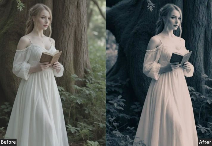
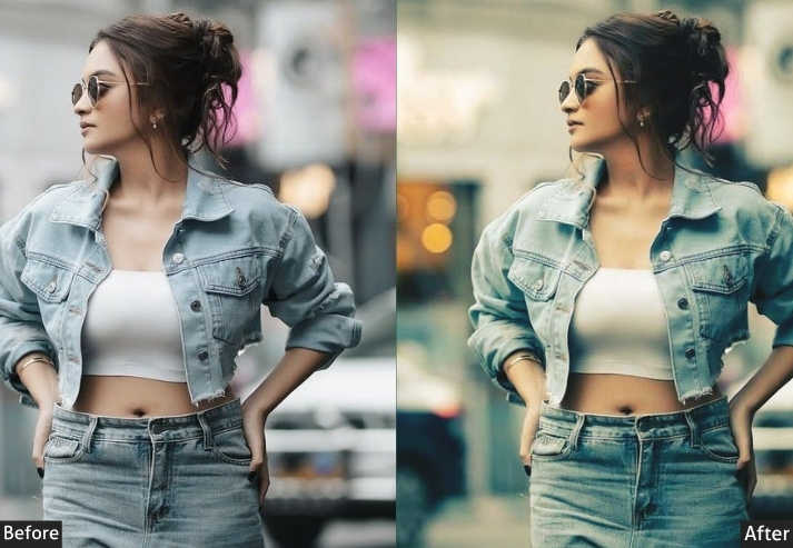
3. Matte/Faded iPhone Preset
Here’s one for the creatives who are tired of everything looking hyper-edited and over-saturated. The matte preset pulls back, it lifts those blacks, knocks out the deep contrast, and gives photos a softer, more washed-out quality. It’s subtle but distinctive, and once you’ve seen it, you recognize it immediately in professional photography.
Light Panel: Exposure +0.15 | Contrast -30 | Highlights -20 | Shadows +35 | Whites -20 | Blacks +35 (strong matte fade). Color Panel: Temp +5 | Tint 0 | Vibrance -25 | Saturation -20. Color Mix: All color channels → Saturation -10. Tone Curve: Lift black point significantly (bottom-left anchor ≈ 40–50/255) | Flat highlights with minimal peak contrast. Effects Panel: Vignette -15 | Grain Amount +20 | Grain Size 30. Detail Panel: Sharpening +35 | Noise Reduction +20. Color Grading: Shadows Hue 210° / Sat +12 (cool blue-gray) | Highlights Hue 30° / Sat +5 (subtle warmth).
Purpose: A soft, faded, desaturated matte look that reduces harsh contrast.
Best For: Fashion photography, editorial content, Instagram aesthetics with a muted, minimalist palette, architecture, and fine-art portraits.
Usage: Loved by fashion bloggers, artistic photographers, and anyone building an aesthetic feed with a sophisticated, understated look.
Style: Soft, faded, matte, minimalist, sophisticated, editorial.
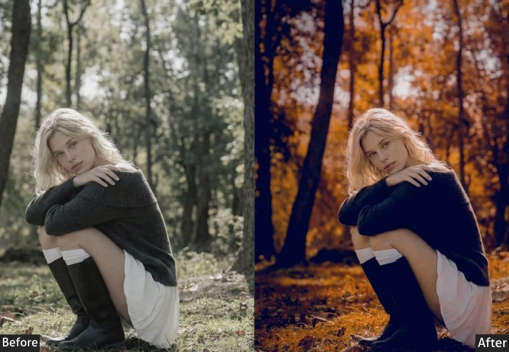
4. Vintage / Retro iPhone Preset
Vintage presets go further back. We’re talking 60s and 70s color science: those iconic faded reds, warm yellows, slightly green-cast shadows, and that overall “found photo from grandma’s attic” quality. It’s retro without being kitschy, nostalgic without being tacky.
Think of it as a time machine. Your iPhone shot from today gets transported to a completely different era.
Light Panel: Exposure -0.15 | Contrast +15 | Highlights -30 | Shadows +20 | Whites -15 | Blacks +25. Color Panel: Temp +20 (aged-photo warmth) | Tint +12 (vintage green cast) | Vibrance -30 | Saturation -20. Color Mix: Reds → Hue +15 | Saturation -20 | Luminance +5 | Yellows → Hue +10 | Saturation -15 | Luminance +10 | Blues → Saturation -30 | Luminance +10 | Greens → Hue -20 | Saturation -15. Tone Curve: Lift shadow point significantly | Compress highlights by lowering the top-right anchor | Overall faded, low-contrast curve. Effects Panel: Vignette -25 | Grain Amount +35 | Grain Size 40 | Grain Roughness 70 (coarse vintage grain). Detail Panel: Sharpening +15 (soft rendering) | Noise Reduction +10. Color Grading: Shadows Hue 75° / Sat +20 (warm yellow-green) | Midtones Hue 45° / Sat +15 (yellow-amber) | Highlights Hue 40° / Sat +10 (warm cream).
Purpose: Recreates the aged, faded color characteristics of 1960s–1980s photography.
Best For: Portraits, family photos, street photography, fashion, any content wanting a nostalgic, artistic feel.
Usage: Lifestyle photographers, brand photographers wanting a “heritage” aesthetic, photographers who want their work to stand out.
Style: Retro, warm, faded, nostalgic, aged, artistic.
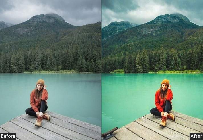
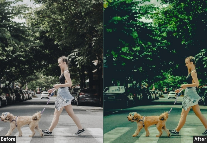
5. HD / HDR Preset
This is the preset that makes people ask, “Wait, how did you take that?” It cranks up the local contrast, recovers every possible bit of detail in highlights and shadows, punches the colors, and creates images that feel almost hyper-real, like reality turned up to 110%. Dramatic HDR presets are bold, unapologetic, and genuinely impressive when applied to the right subject.
Warning: not for the faint-hearted. Don’t use this on soft portraits unless you want to win the “most texture in a face” award.
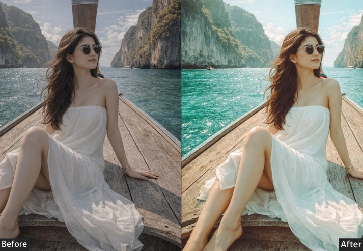
Light Panel: Exposure +0.10 | Contrast +40 | Highlights -80 (maximum recovery) | Shadows +70 (deep lift) | Whites +30 | Blacks -40. Color Panel: Temp +8 | Tint 0 | Vibrance +35 | Saturation +20 | Color Mix (all channels) Saturation +10–15. Tone Curve: Strong S-Curve | Hard contrast pull | Blacks kept grounded (no lift). Effects Panel: Vignette -25 | Clarity +30 (HDR punch) | Texture +25. Detail Panel: Sharpening +65 | Masking 70 | Noise Reduction +15. Color Grading: Shadows Hue 210° / Sat +10 (cool tone) | Highlights Hue 40° / Sat +10 (warm tone).
Purpose: Maximizes dynamic range, local contrast, and color to create dramatic, highly detailed images.
Best For: Landscape photography, architecture, cityscapes, real estate photography, dramatic skies, and clouds.
Usage: Landscape and travel photographers, real estate photographers, architectural photographers.
Style: Dramatic, bold, high-detail, hyper-real, powerful.
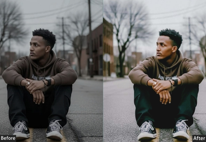
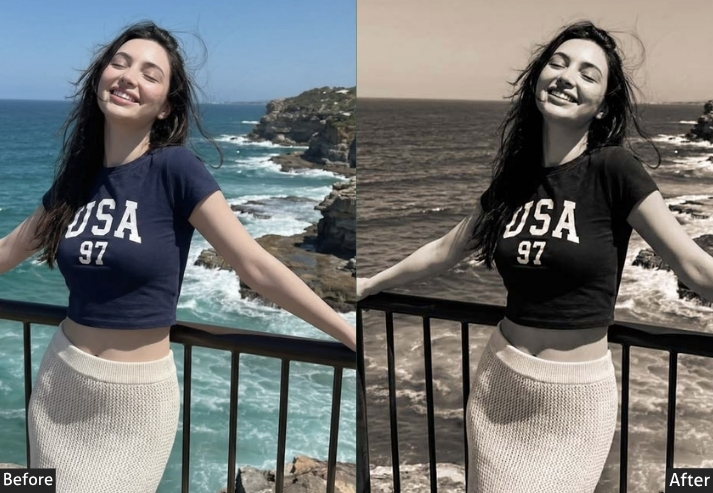
6. Black & White / Monochrome iPhone Preset
Black-and-white photography is one of those things that never goes out of style and honestly, never will. When done right, a black-and-white preset strips away all color distractions and lets you feel the photo. The contrast, the shadows, the textures, everything becomes more intense. This isn’t just “remove saturation.” A great B&W preset uses channel mixing to control exactly how each color tone converts to gray, creating images with real depth and dimension.
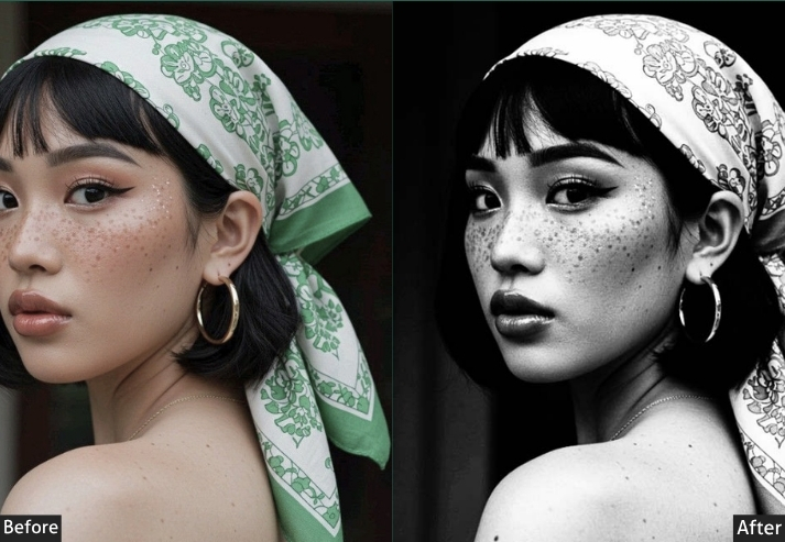
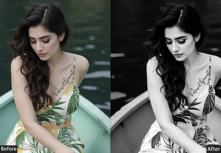
Color Panel: Saturation -100 (B&W mode) | B&W Mix: Reds +15 | Oranges +20 | Yellows +10 | Greens -20 | Aquas -15 | Blues -30 | Purples -10 | Magentas 0. Light Panel: Exposure 0 | Contrast +35 | Highlights -20 | Shadows -20 | Whites +20 | Blacks -30. Tone Curve: Strong S-Curve | Highlights lifted | Shadows crushed (classic high-contrast B&W). Effects Panel: Grain Amount +30–45 | Grain Size 30 | Grain Roughness 60 | Vignette -20 to -35. Detail Panel: Sharpening +60 | Masking 50 | Noise Reduction +10. Color Grading: Optional split tone → Shadows cool blue | Highlights warm cream (or neutral).
Purpose: powerful, expressive black and white images.
Best For: Portrait photography, street photography, documentary-style photos, architectural photography, and fine art.
Usage: Professional photographers, photojournalists, anyone wanting a timeless and emotionally powerful aesthetic.
Style: Timeless, dramatic, classic, emotional, high-contrast OR soft/romantic depending on settings.
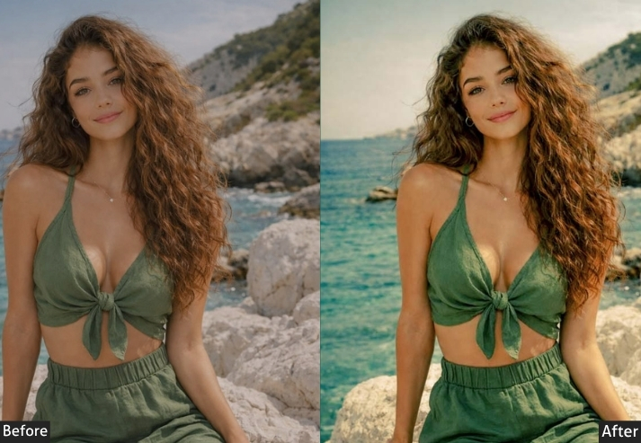
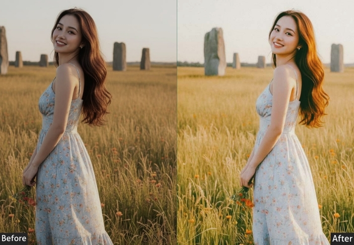
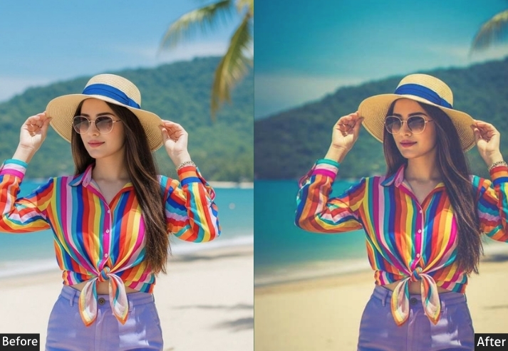
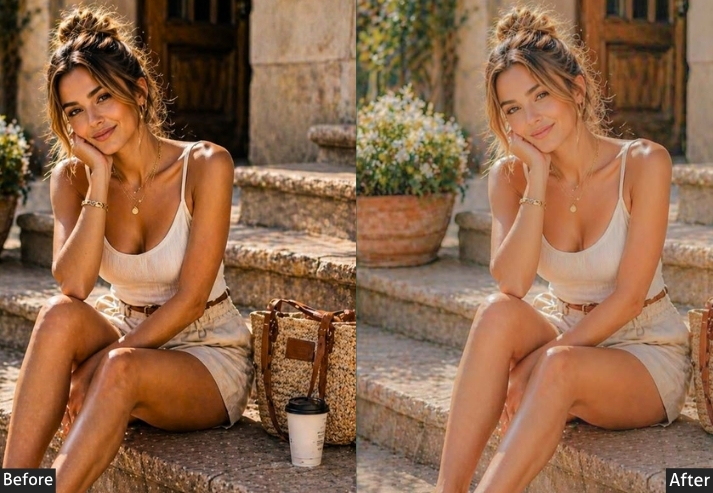
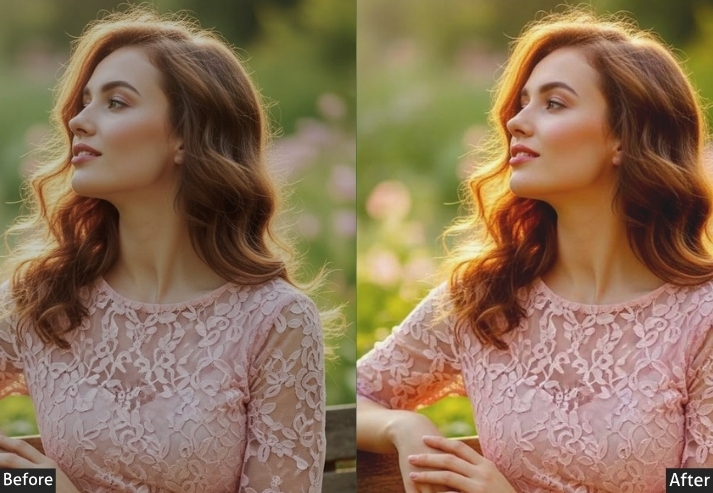
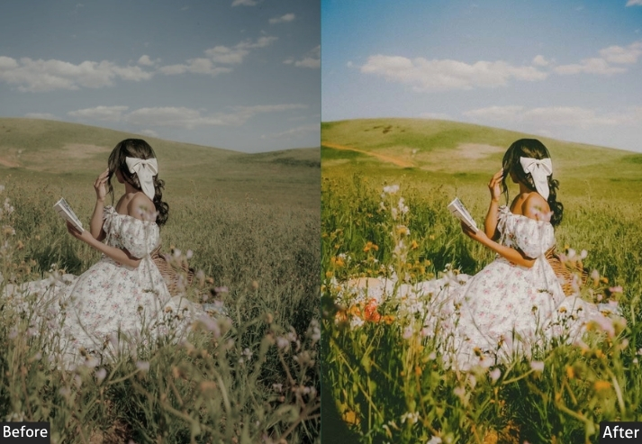
7. Golden Hour / Warm Sunset Preset
Golden hour is the holy grail of photography, and if you’ve ever shot during it, you know that magic doesn’t always survive the move to your phone’s camera roll. This preset brings that magic back or even creates it when you weren’t lucky enough to catch the actual golden hour. It cranks the warmth, boosts the oranges and yellows, and gives every photo that syrupy, glowing quality that makes people stop scrolling.
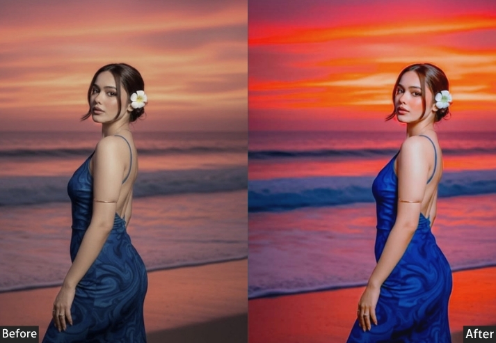
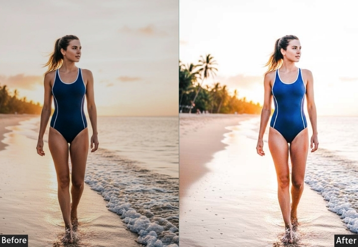
Light Panel: Exposure +0.30 | Contrast +15 | Highlights -35 | Shadows +20 | Whites +15 | Blacks -10. Color Panel: Temp +30 (strong warmth) | Tint +5 | Vibrance +25 | Saturation +10 | Oranges Hue -10 / Sat +30 / Lum +15 | Yellows Hue -5 / Sat +25 / Lum +10 | Reds Hue +5 / Sat +20 / Lum +5. Tone Curve: Gentle S-Curve | Slight lift in midtones | Mild shadow compression | Slight highlight lift. Effects Panel: Vignette -10 | Grain +10. Detail Panel: Sharpening +45 | Masking 60. Color Grading: Shadows Hue 25° / Sat +20 (deep amber) | Midtones Hue 40° / Sat +15 (warm gold) | Highlights Hue 50° / Sat +10 (bright warm glow).
Purpose: Recreates or enhances the warm glow of sunset/golden hour lighting.
Best For: Outdoor portraits, beach photography, landscape shots, couples photography, travel photography in warm destinations.
Usage: Incredibly popular for outdoor wedding photography, travel influencers, and beach/lifestyle photographers.
Style: Warm, golden, glowing, romantic, dreamy.
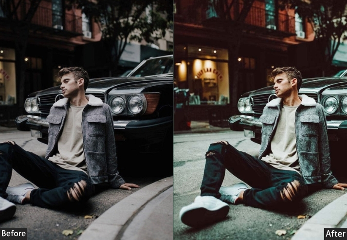
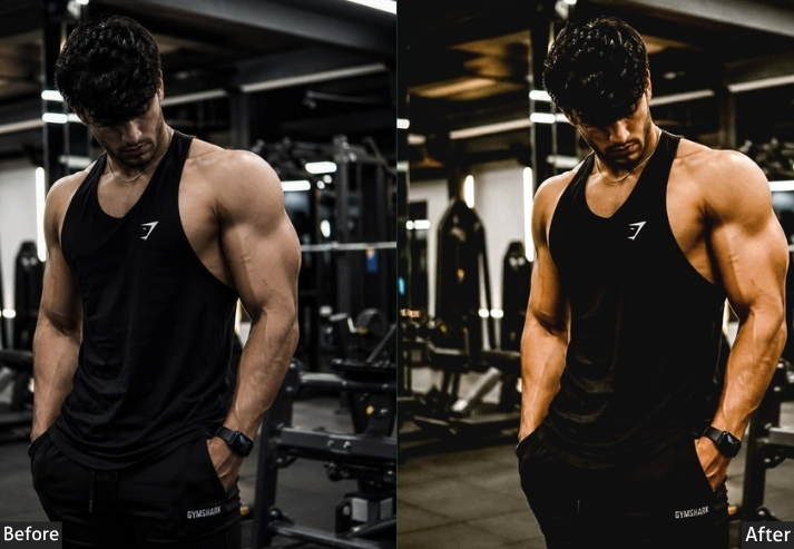
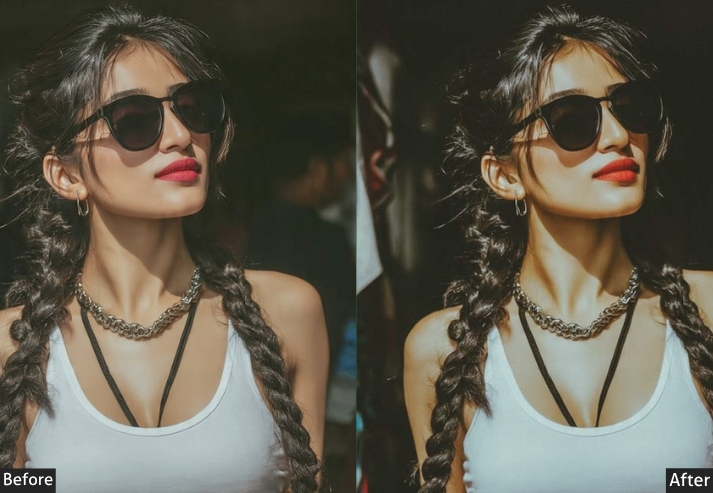
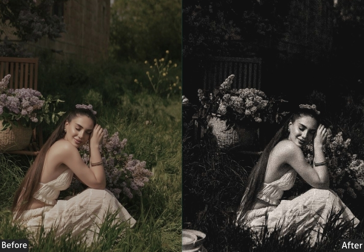
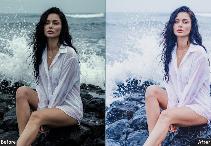
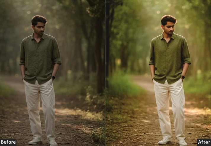
8. Dark / Night iPhone Preset
Designed specifically for portraits, this preset is all about flattering skin tones while keeping things moody and dramatic. It’s different from a general moody preset. Because it’s calibrated to protect and enhance skin, no harsh shadows on faces, no weird color casts on the complexion, while still delivering that editorial portrait quality that makes people look like they’re on a magazine cover.
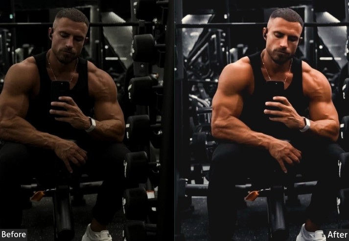
Light Panel: Exposure -0.30 | Contrast +20 | Highlights -30 | Shadows -15 | Whites -10 | Blacks -30. Color Panel: Temp +5 (subtle warmth) | Tint +3 | Vibrance +10 | Saturation -5 | Reds Hue +5 / Sat +15 / Lum +10 | Oranges Hue -5 / Sat +20 / Lum +5 | Blues Sat +20 / Lum -20 | Greens Lum -15. Tone Curve: Gentle S-Curve | Midtones protected and slightly lifted | Shadows pulled down for depth. Effects Panel: Vignette -20 | Grain +12. Detail Panel: Sharpening +35 | Masking 75 (protect smooth skin) | Noise Reduction +20. Color Grading: Shadows Hue 220° / Sat +20 (deep cool blue) | Midtones Hue 30° / Sat +5 (warm neutral) | Highlights Hue 35° / Sat +8 (warm cream).
Purpose: Creates dramatic, editorial-quality portrait edits while flattering all skin tones.
Best For: Portrait photography, headshots, fashion photography, couples photography.
Usage: Portrait photographers, fashion photographers, social media creators wanting high-end portrait edits.
Style: Moody, editorial, dramatic, flattering, professional.
Final Words
After going through all of these, you might be tempted to try them all at once. A different preset for every photo. Variety! Options! Maximum creative expression! Don’t do that.
Here’s what separates photographers with feeds from photographers with camera rolls: they picked one visual language and learned it deeply. They understand why their moody preset works on a rainy street in Tokyo but falls flat on a beach in Bali. They know when to dial the grain back 10 points because the light already has texture. They’ve applied the same preset to 200 photos, and they can tell when something’s slightly off. That’s not an obsession. That’s mastery. And mastery is what gets people to hit Follow.
So here’s your actual action plan after reading this: pick two presets from this list: one warm, one cool (or one moody, one bright). Apply them to your last 20 photos. Notice what works and what needs tweaking. Save your custom-adjusted versions as new presets with your own names. That’s it. That’s the whole secret that photography educators sell for $200 courses.
The other thing nobody tells you about Lightroom presets? The editing process teaches you to see differently. After six months of consistently adjusting color temperatures and shadow details, you’ll start noticing light before you shoot. You’ll position yourself differently because you’re already thinking about how the shadows will behave in post. The tool changes the eye. And better eyes make better photos even before you open Lightroom.
Your iPhone is already a remarkable camera. The presets in this guide are your editing vocabulary. Now go build a sentence worth reading.
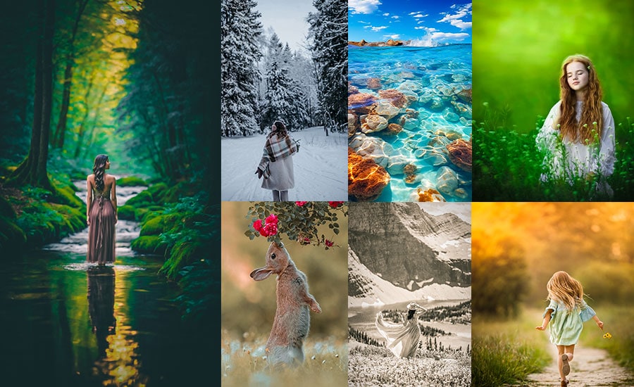
More Free Presets For You:
50 Aesthetic Lightroom Presets Free Download
50 Outdoor Lightroom Presets Free Download
50 Cinematic Lightroom Presets Free Download
50 Moody Lightroom Presets Free Download