Lightroom presets are one-click editing profiles that apply a specific combination of exposure, color, tone, and detail settings to your photo. When people search for 4K Lightroom presets, they’re looking for presets that perform well on high-resolution files: images shot on 45MP+ cameras, drone footage, or any RAW file where fine detail and pixel-level sharpness matter.
Here’s what changes at high resolution: aggressive Clarity or Sharpening values that look fine on a 12MP JPEG can introduce halos and artifacts at 4K or 8K resolution. Noise Reduction that works beautifully on a compressed file can soften the micro-detail that makes a 4K image worth shooting in the first place. The presets on this page have been calibrated with those trade-offs in mind.
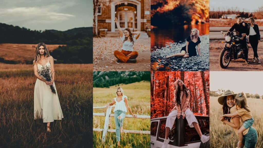
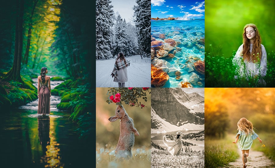
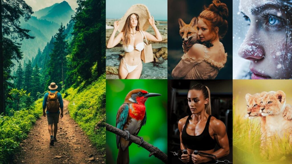
Below you’ll find 9 preset styles: each with a full breakdown of slider values, the purpose behind every adjustment, and free download links. Whether you’re editing wildlife, weddings, cityscapes, or drone footage, there’s a starting point for your workflow here.
I’m talking about different preset styles that are literally breaking the internet right now. And I’m not just gonna throw names at you like some boring dictionary. Oh no, no, no! I’m breaking down:
- ✨ What each preset ACTUALLY does.
- 🎯 The EXACT editing process with real percentages.
- 💡 When to use them.
- 🚀 The PURPOSE behind each style.
By the end of this guide, you’ll understand them so well that you could create your own signature style. You’re about to become that photographer whose style everyone tries to copy.
Your photography glow-up starts… RIGHT. NOW.

Pauline Jackson
I design presets that help you achieve a professional look across all your photos.
4k Lightroom Presets Free Download
Each preset style below includes a free download link, exact Lightroom slider values, and guidance on the best photo types to use it with. All files are available in DNG and XMP format, compatible with Lightroom Classic, Lightroom CC, and Lightroom Mobile.
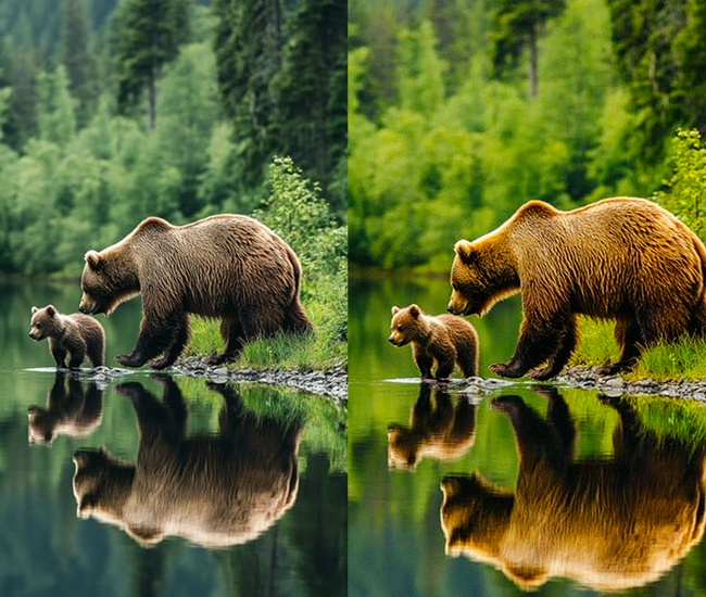
1. Natural/True-to-Life Presets
Natural presets enhance your photos without making it obvious they have been edited. They correct exposure, refine contrast, and bring out accurate colors. all while keeping the image faithful to how the scene actually looked. At 4K resolution, these presets are especially valuable for real estate, product, and documentary work where color accuracy is non-negotiable.
- Light Panel: Exposure (-0.1 to +0.3 for balance), Contrast (+5 to +15), Highlights (-10 to -20), Shadows (+10 to +20), Whites (+5 to +10), Blacks (-5 to -10).
- Color Panel: Temperature (neutral adjustments, ±5), Vibrance (+5 to +15), Saturation (0 to +5).
- Tone Curve: Very gentle S-curve maintaining natural contrast.
- HSL/Color: Subtle adjustments – skin tones perfected (orange +5 to +10), greens naturalized, sky blues enhanced slightly (+5).
- Split Toning: Minimal or none, maybe subtle warmth in highlights (2-5 sat).
- Effects: Clarity (0 to +10), Sharpening (moderate).
- Detail: Noise reduction as needed, natural sharpening (+30 to +50).
Purpose: Professional enhancement while maintaining photographic authenticity.
Best For: Real estate, product photography, documentary, journalism, weddings.
Usage: Any situation requiring accurate color representation.
Style: Clean, professional, realistic, trustworthy, balanced.
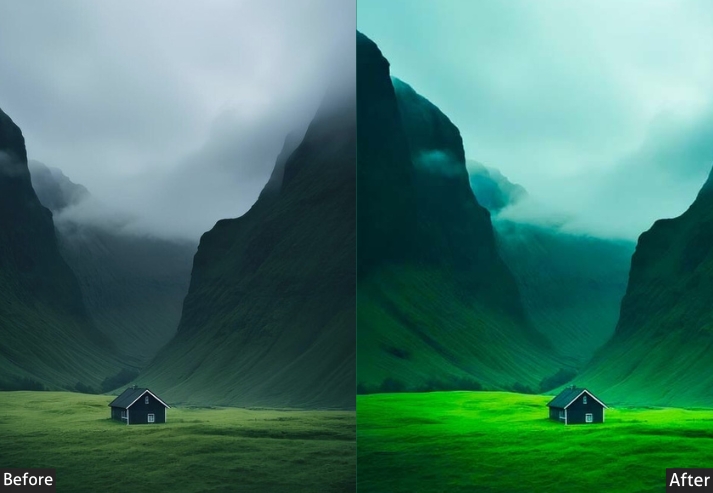
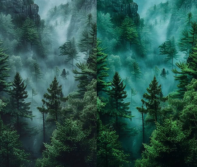
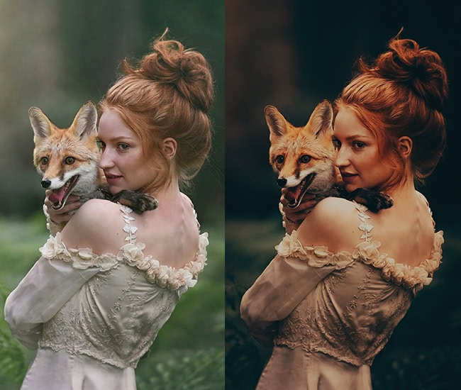
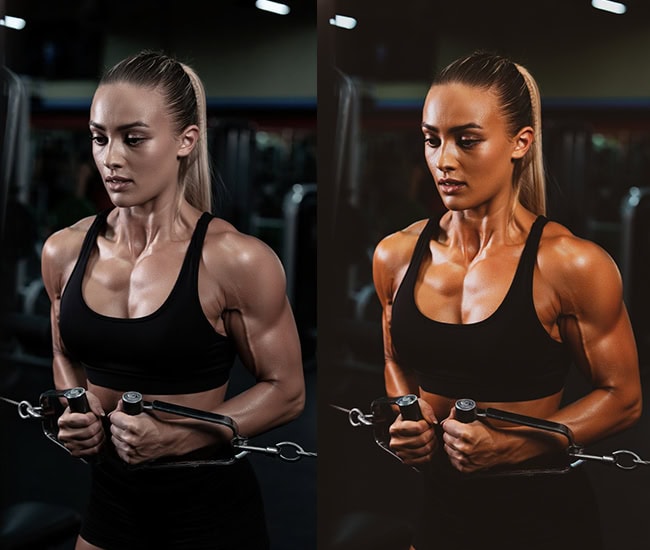
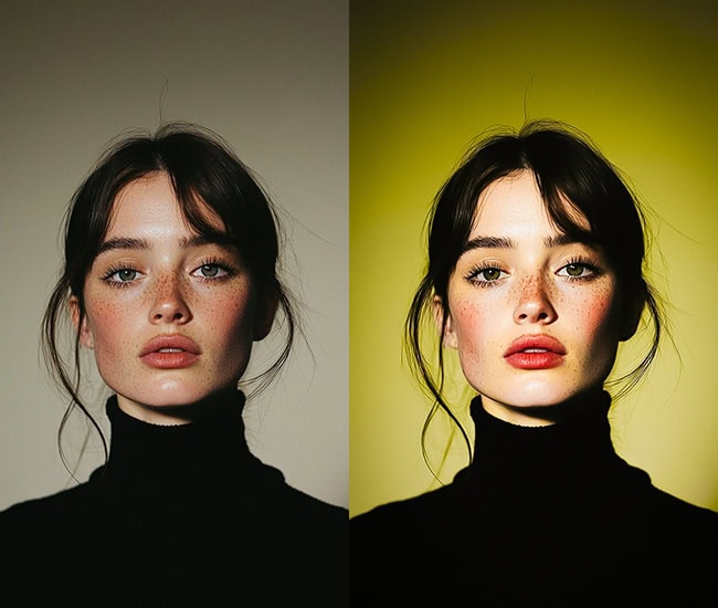
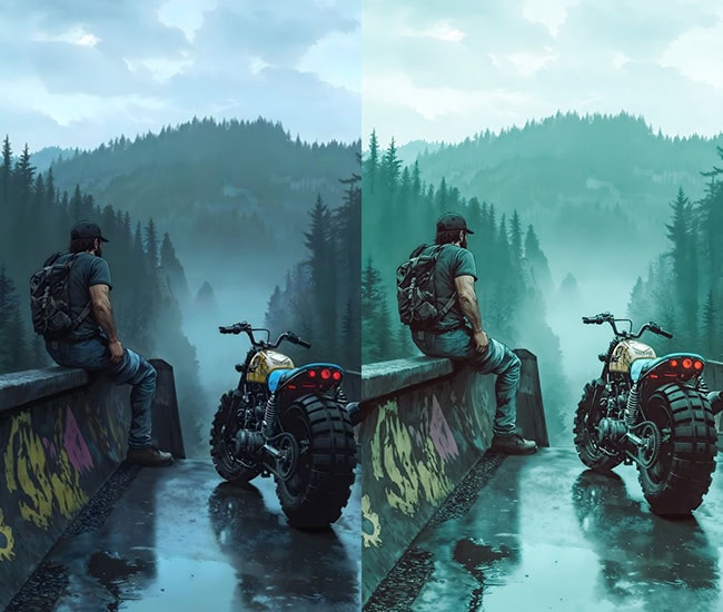
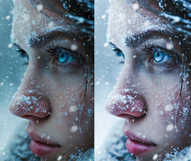
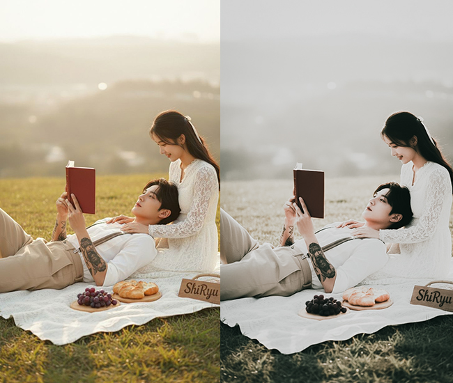
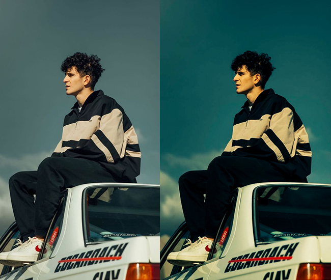
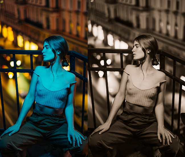
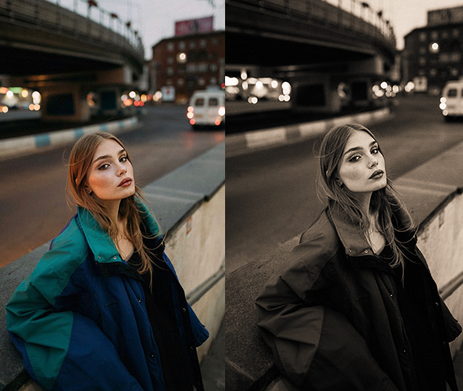
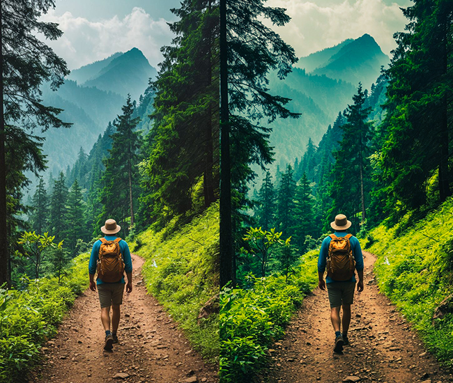
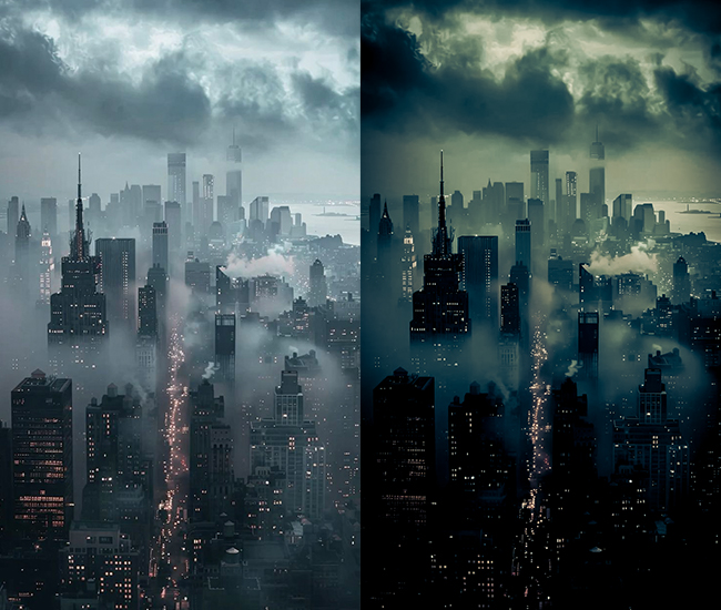
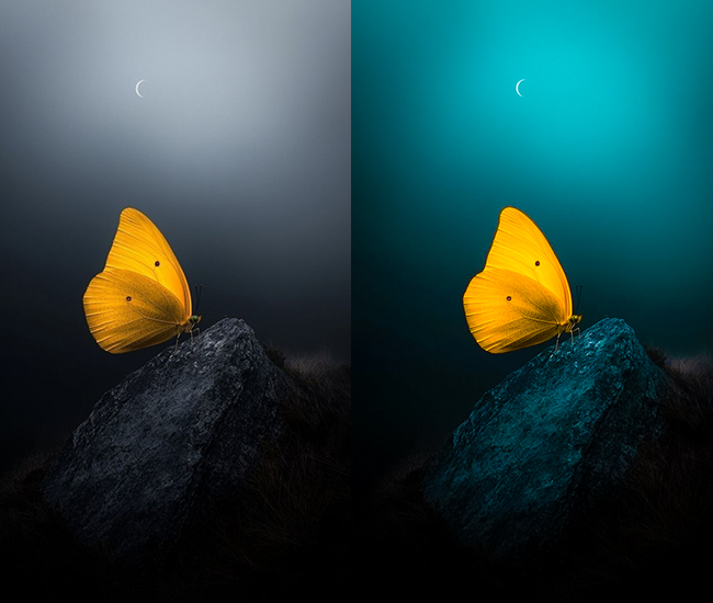
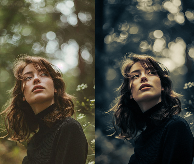
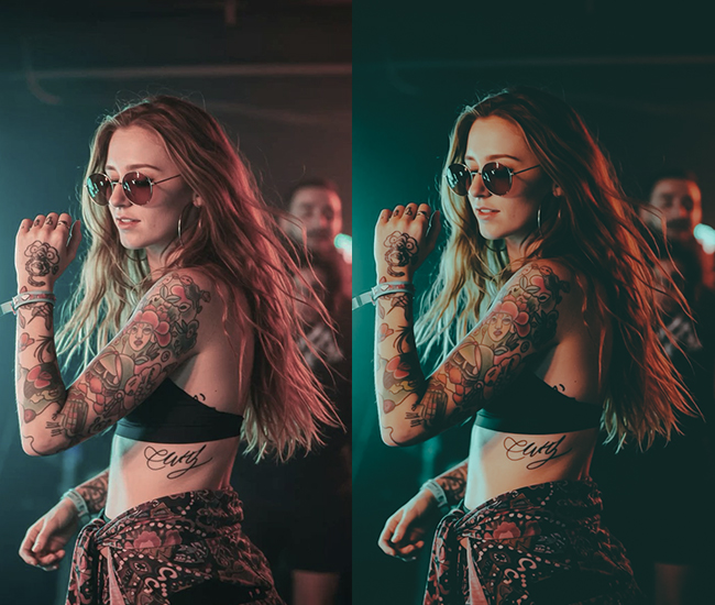
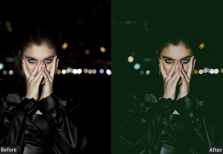
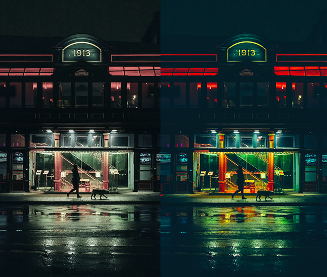
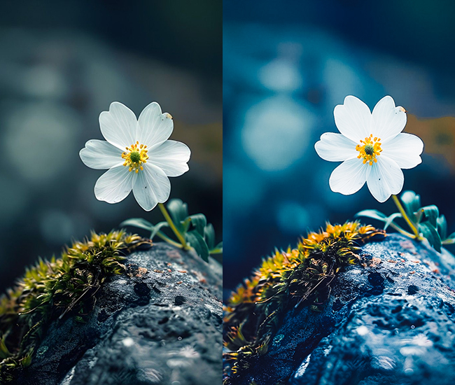
2. Moody & Dark Presets
Moody presets build atmosphere through contrast and color restraint. Crushed blacks, lifted shadows, muted tones, and a cinematic color grade create depth and emotional weight. On 4K files, the lifted shadows in moody edits can reveal excellent detail in dark areas that would be lost on lower-resolution images, making this style especially rewarding with high-resolution sensors.
- Light Panel: Exposure (-0.3 to -0.7), Contrast (+15 to +25), Highlights (-20 to -40), Shadows (+10 to +20), Whites (-10), Blacks (-30 to -50).
- Color Panel: Temperature (-5 to -10 for cooler tones), Vibrance (-10 to -15), Saturation (-5 to -10).
- Tone Curve: Pull down highlights, crush those blacks with a lifted shadows curve.
- HSL/Color: Blues shifted to teal (-15 to -25 hue), desaturate oranges (-20), boost blue saturation (+10).
- Split Toning: Shadows get blue/teal tints (+210-220 hue, 15-25 saturation).
- Effects: Grain (+20 to +35), Vignette (-15 to -25).
- Detail: Sharpening (+40 to +50).
Purpose: atmospheric depth and emotional weight.
Best For: Portraits, street photography, urban landscapes, storytelling shots.
Usage: Indoor shoots, golden hour, overcast days, anywhere you want drama.
Style: Cinematic, mysterious, introspective, magazine-editorial vibes.
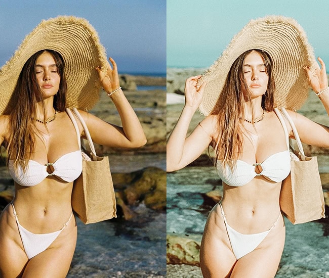
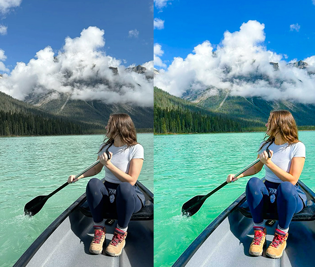
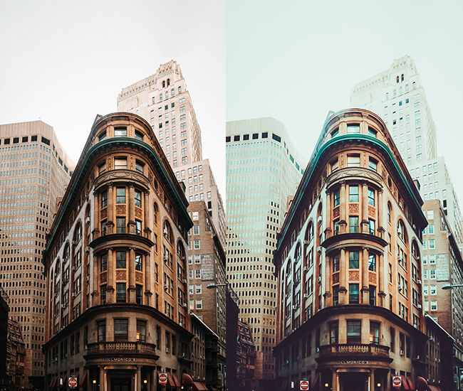
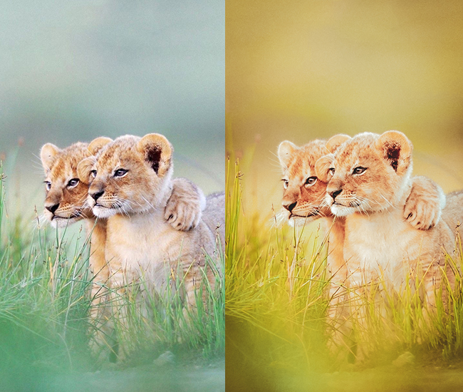
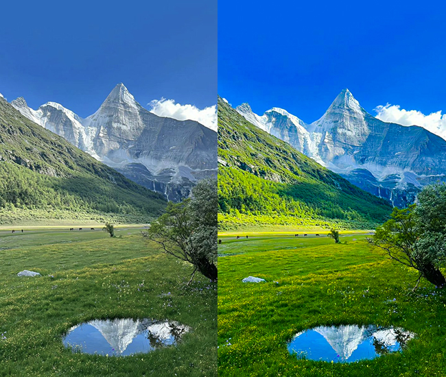
3. Bright & Airy Presets
Bright-airy presets define the “clean light” aesthetic that is dominant in wedding photography, lifestyle blogs, and Scandinavian-inspired interiors. The signature look: lifted blacks, reduced contrast, warm peachy highlights, and slightly desaturated colors creates an open, glowing feel. On 4K files, keep an eye on the Whites slider: pushing it above +40 on a high-resolution RAW can introduce blown highlights that are hard to recover.
- Light Panel: Exposure (+0.3 to +0.8), Contrast (-10 to -20), Highlights (+20 to +40), Shadows (+30 to +50), Whites (+20 to +40), Blacks (+15 to +30).
- Color Panel: Temperature (+5 to +15 for warmth), Tint (+3 to +8 for magenta), Vibrance (-5 to +5), Saturation (-10 to 0).
- Tone Curve: Lifted blacks creating that signature “faded” look, slight S-curve.
- HSL/Color: Boost orange luminance (+20 to +30), yellows brighter (+15), desaturate blues slightly (-10).
- Split Toning: Highlights get warm peachy tones (+35-45 hue, 8-15 saturation).
- Calibration: Blue primary shifted (+10 to +15).
- Effects: Dehaze (-5 to -15), Clarity (-5 to -15).
Purpose: Evoking lightness, joy, and ethereal beauty.
Best For: Weddings, lifestyle blogs, baby photos, fashion, product photography.
Usage: Natural light settings, outdoor shoots, bright interiors.
Style: Romantic, clean, minimalist, Instagram-perfect aesthetic.
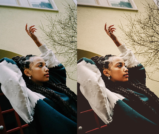
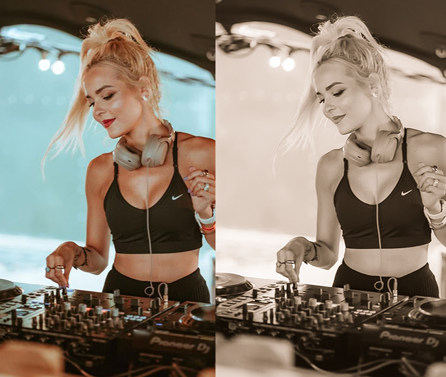
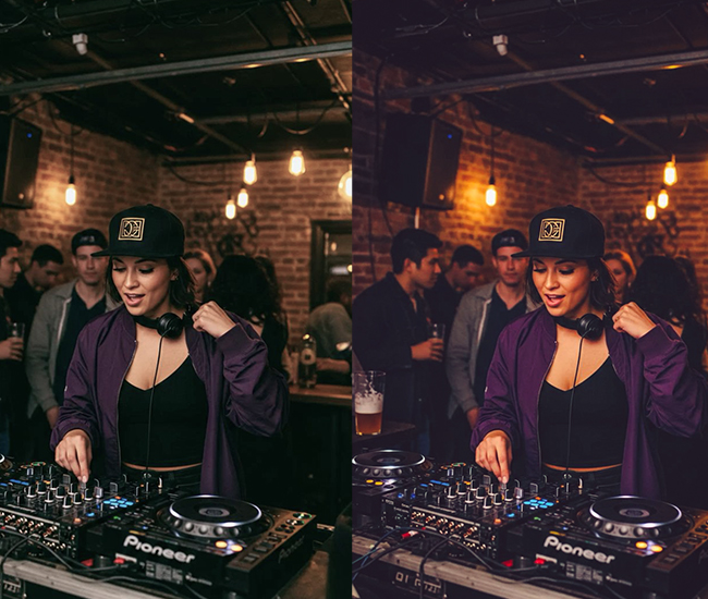
4. Vintage/Film Presets
Vintage presets emulate the color science and tonal characteristics of analog film: Kodak Portra, Fuji Provia, or expired stock. Lifted blacks create the signature “faded” base, while temperature and HSL shifts push the palette toward warm yellows or cool teals, depending on the era being referenced. The added grain in these presets is intentional: at 4K resolution, you can add cinematic grain without sacrificing structural detail in your subject.
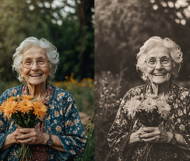
- Light Panel: Exposure (+0.1 to +0.3), Contrast (-5 to +10), Highlights (-5 to -15), Shadows (+15 to +25), Blacks (+20 to +35).
- Color Panel: Temperature varies (warm for 70s, cool for 60s), Vibrance (-15 to -25), Saturation (-20 to -30).
- Tone Curve: Lifted blacks (major faded look), pulled down highlights, creates a characteristic S-curve or faded straight line.
- HSL/Color: Shift reds toward orange (+10 to +20), yellows warmer, blues toward cyan (-10).
- Split Toning: Shadows get yellow/orange (+40-55 hue, 10-20 sat), Highlights get subtle blue (+200 hue, 5-10 sat).
- Effects: Grain (+35 to +60), Vignette (-10 to -20), Dehaze (-10).
- Calibration: Red primary (+10 to +20), Blue primary (-5 to -15).
Purpose: analog film aesthetics and nostalgic feelings.
Best For: Travel photos, street photography, portraits, documentary-style work.
Usage: Any scenario where you want that timeless, throwback vibe.
Style: Nostalgic, warm, authentic, Kodak/Fuji film emulation.
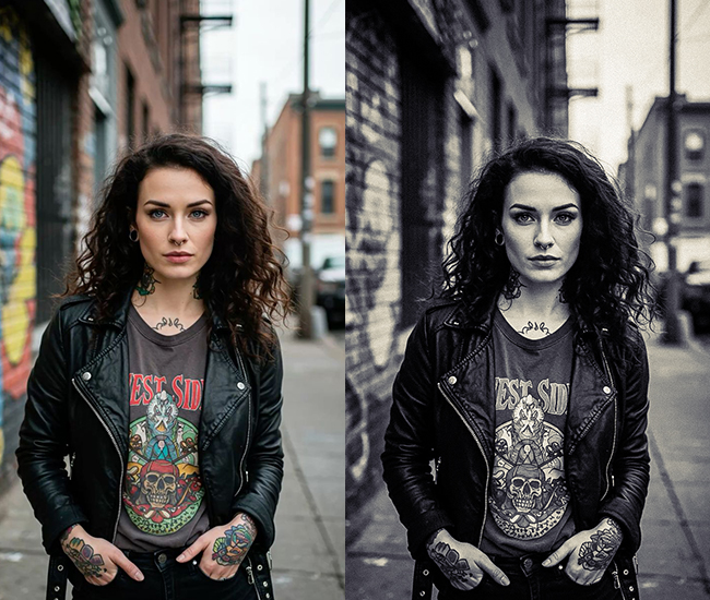
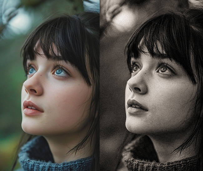
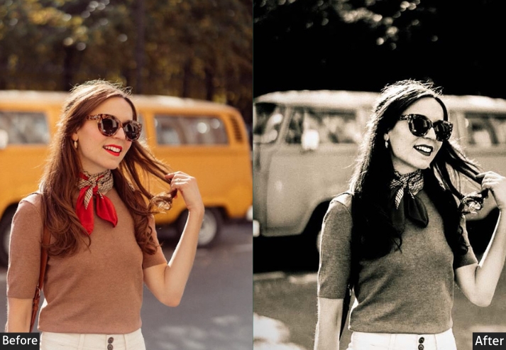
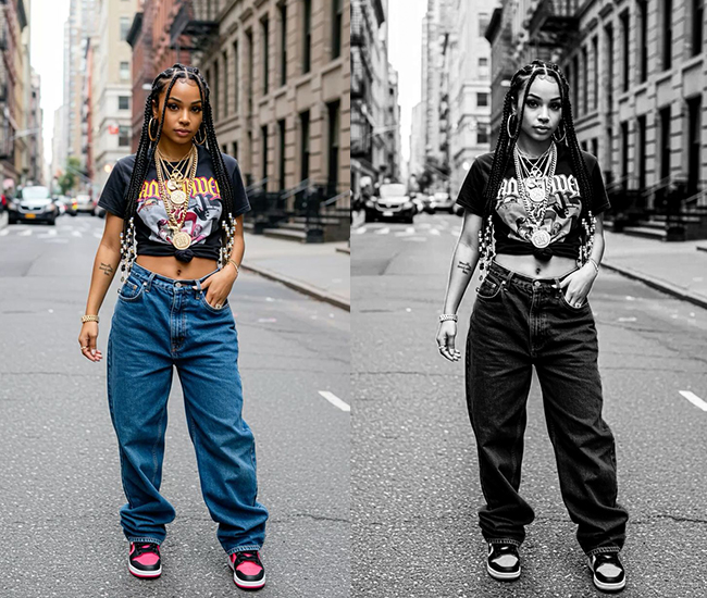
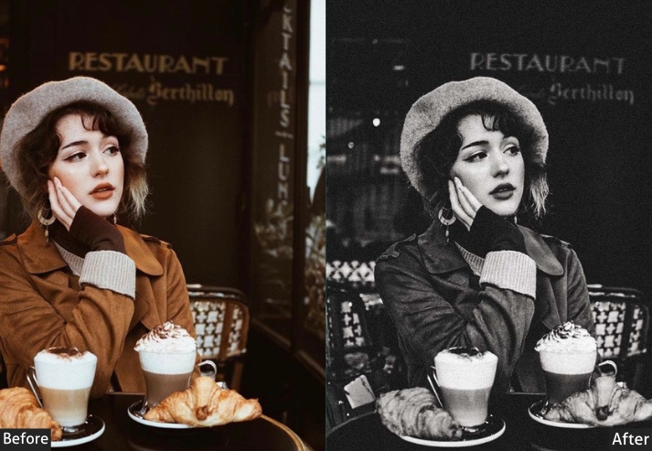
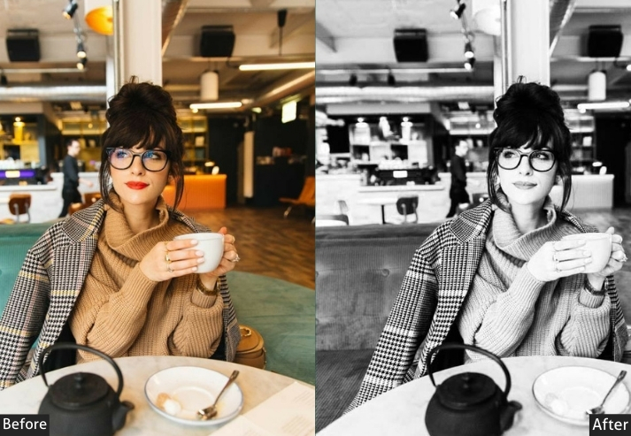
5. Black & White/Monochrome Presets
A strong black-and-white conversion is not simply desaturation. It’s about sculpting tonal relationships to direct the viewer’s eye. The B&W Mix panel controls how each color channel converts to grey, letting you independently brighten or darken skies, skin tones, and foliage. At 4K resolution, the tonal detail available in a well-exposed monochrome image is extraordinary. aggressive sharpening values (+50–80), which would be too much at 12MP, reveal stunning micro-contrast at full resolution.
- Basic Panel: Convert to B&W (Treatment), Exposure (adjust as needed), Contrast (+20 to +50).
- Light Panel: Highlights (-20 to +20), Shadows (-10 to +30), Whites (+15 to +30), Blacks (-30 to -50).
- Tone Curve: Custom B&W curve – strong S-curve for drama or gentle for softer looks.
- B&W Mix: Reds (-20 to +30), Oranges (+10 to +40), Yellows (+20 to +50), Greens (-10 to +20), Blues (-20 to +20) – this shapes skin tones and skies.
- Split Toning: Shadows (warm sepia or cool blue), Highlights (subtle opposite).
- Effects: Grain (+15 to +40), Vignette (-10 to -25), Clarity (+15 to +40), Dehaze (+5 to +15).
- Detail: Sharpening (+50 to +80).
Purpose: form, texture, and emotional depth without color distraction.
Best For: Portraits, street photography, architecture, fine art, and documentary.
Usage: High-contrast scenes, textures, emotional subjects, timeless documentation.
Style: Classic, dramatic, timeless, artistic, photojournalistic.
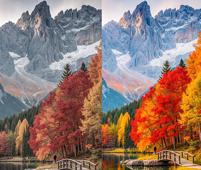
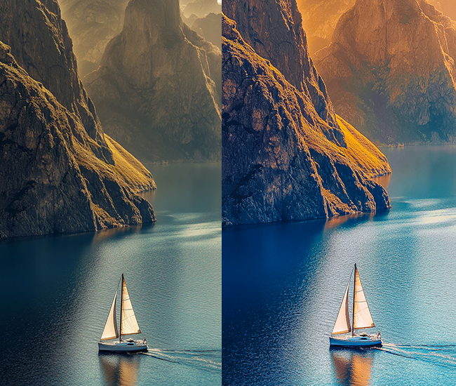
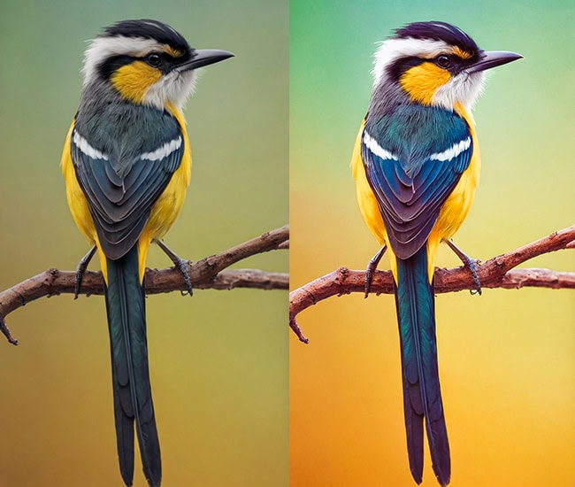
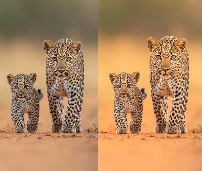
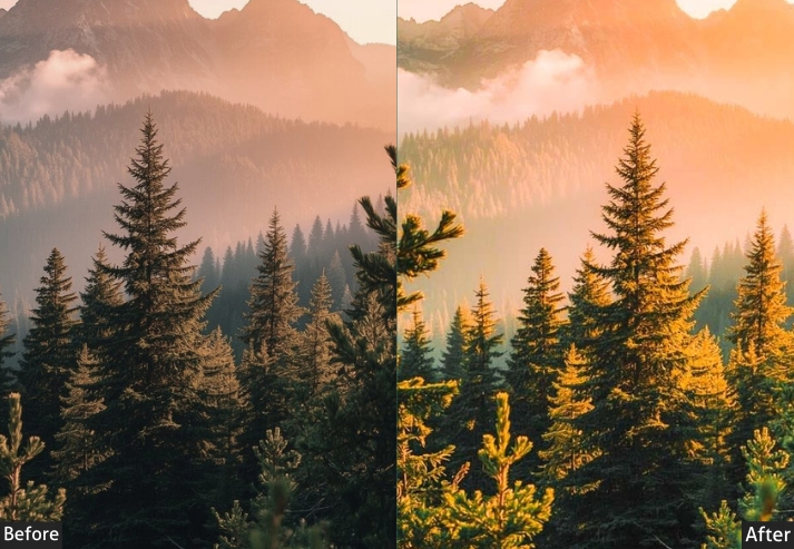
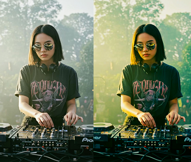
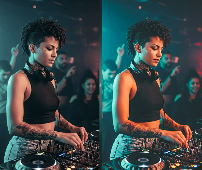
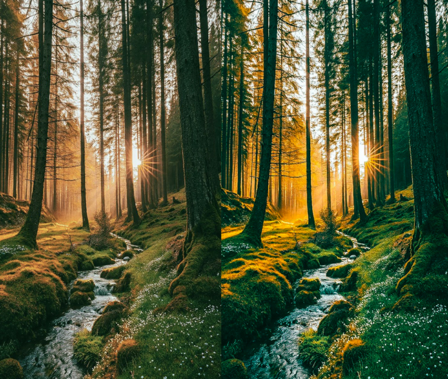
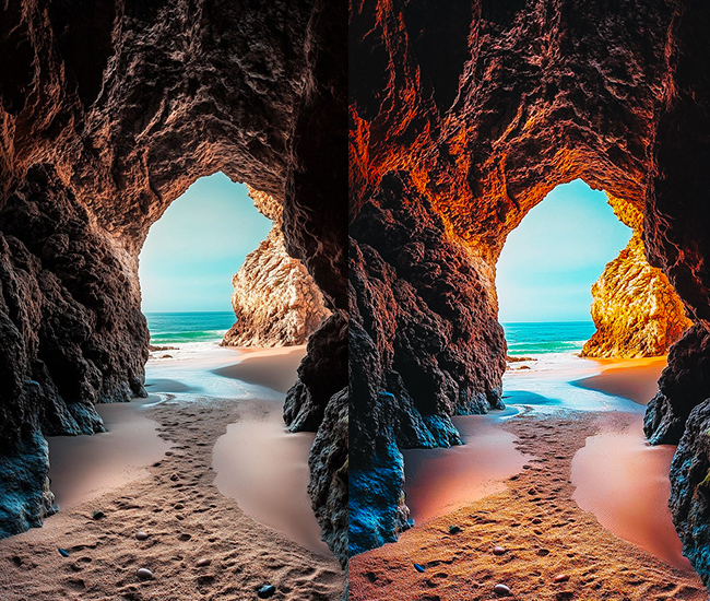
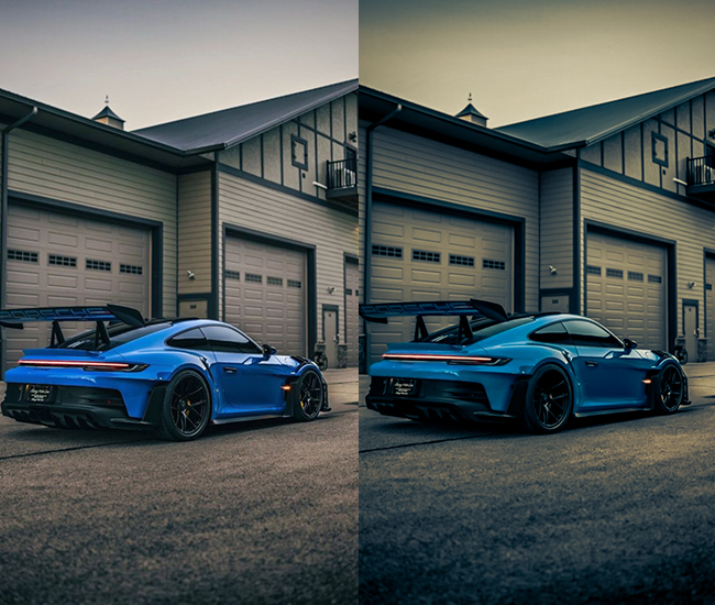
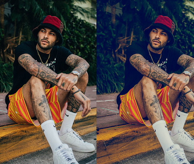
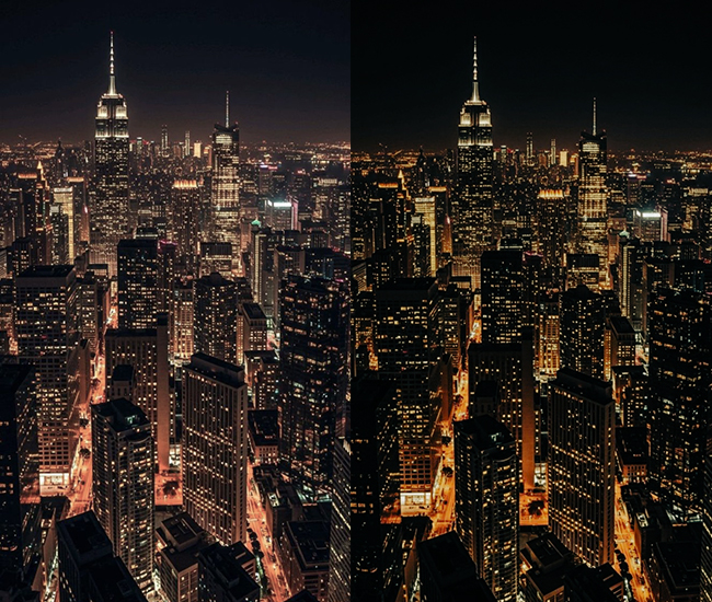
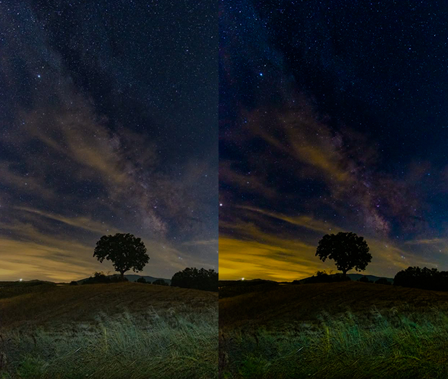
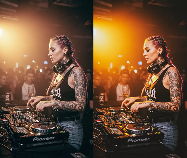
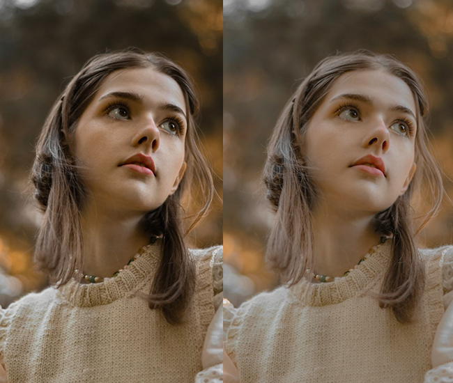
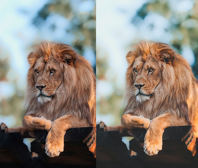
6. Warm & Golden Presets
Golden hour replicates the quality of late-afternoon directional light: warm amber tones, rich orange luminance, and soft contrast. These presets are particularly versatile because the warmth works equally well on portraits, landscapes, food, and lifestyle. On 4K files from large sensors, the orange and yellow HSL adjustments render with exceptional depth and avoid the oversaturated look that can appear on smaller files.
- Light Panel: Exposure (+0.2 to +0.5), Contrast (+10 to +20), Highlights (-5 to +15), Shadows (+10 to +25), Whites (+5 to +15).
- Color Panel: Temperature (+15 to +35 – cranking the warmth!), Tint (-2 to +5), Vibrance (+10 to +20), Saturation (+5 to +15).
- Tone Curve: Gentle S-curve, slightly lifted blacks.
- HSL/Color: Boost orange saturation (+20 to +30) and luminance (+10 to +20), enhance yellow warmth, shift reds toward orange (+5 to +10).
- Split Toning: Highlights get golden orange (35-50 hue, 15-30 sat), Shadows get complementary warmth.
- Effects: Dehaze (-5 to +10), Vignette (-5 to -15).
- Calibration: Red primary (+5 to +15).
Purpose: warmth and creating inviting, cozy atmospheres.
Best For: Portraits, food photography, sunset/sunrise shots, autumn scenes.
Usage: Golden hour enhancement, adding warmth to flat lighting, lifestyle content.
Style: Inviting, romantic, warm, Instagram-cozy, hygge aesthetics.
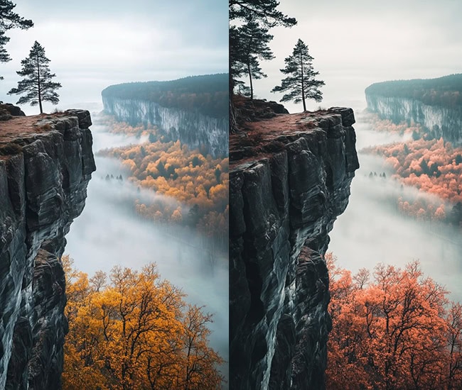
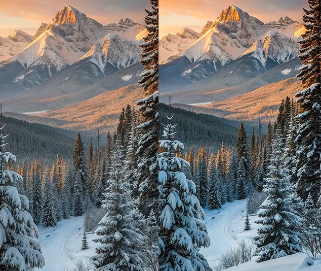
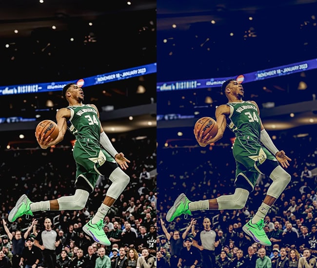
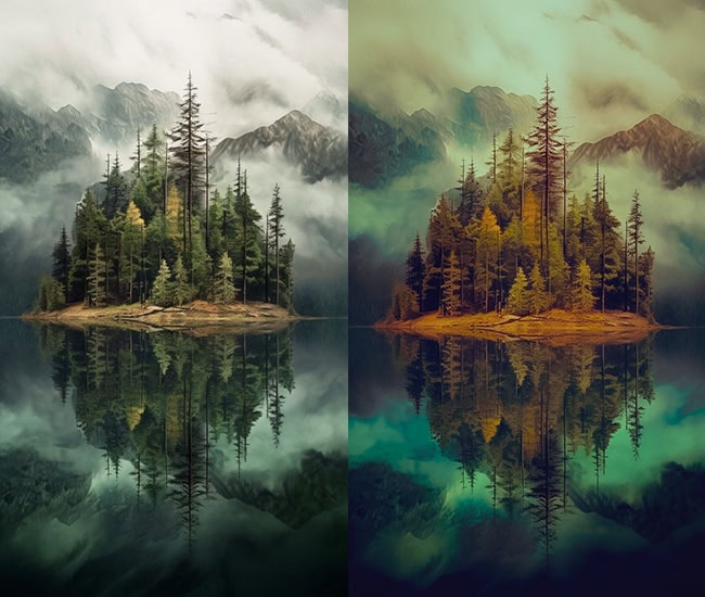
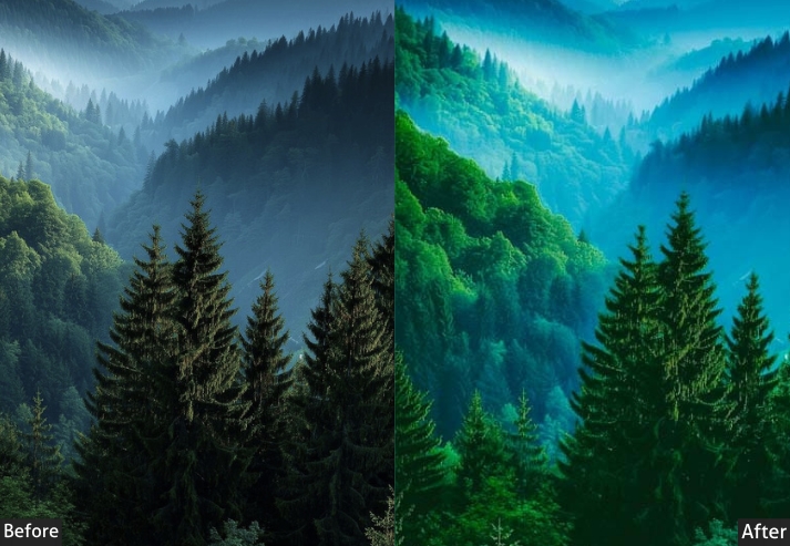
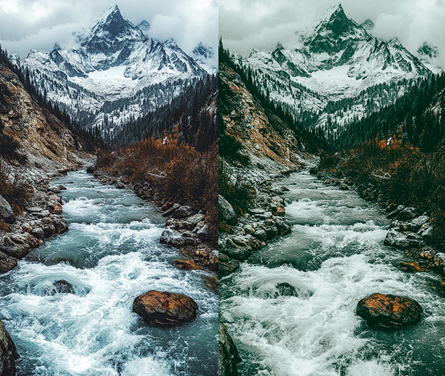
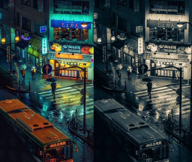
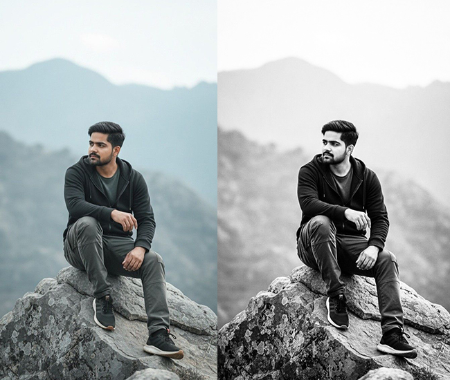
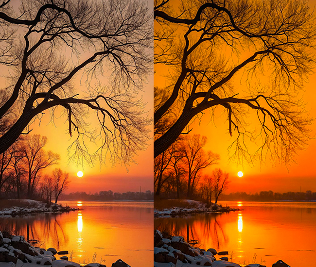
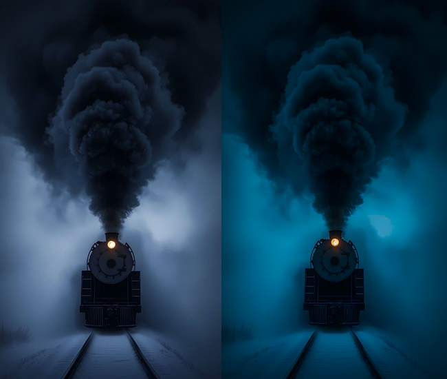
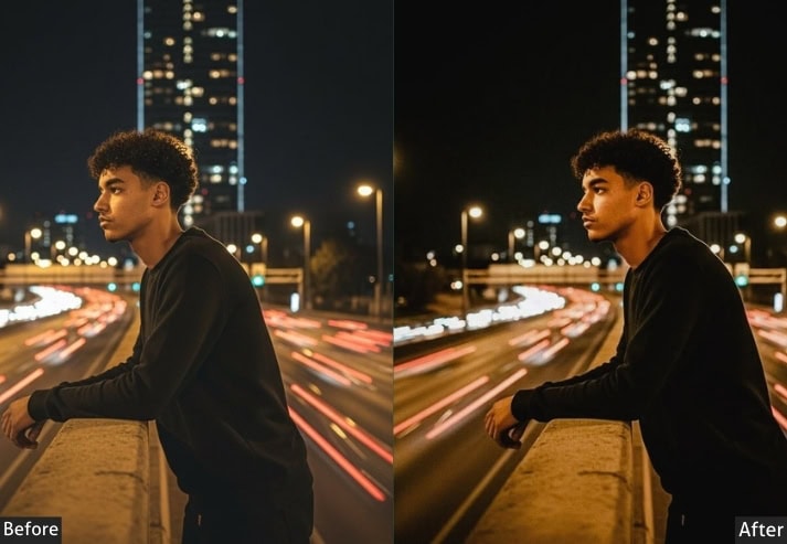
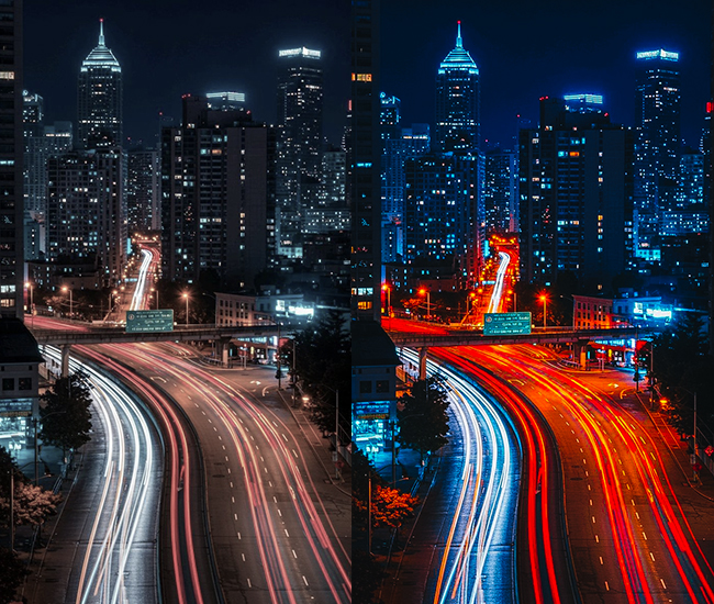
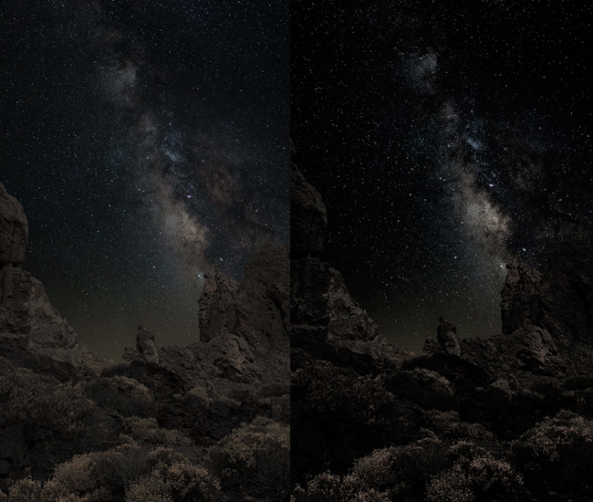
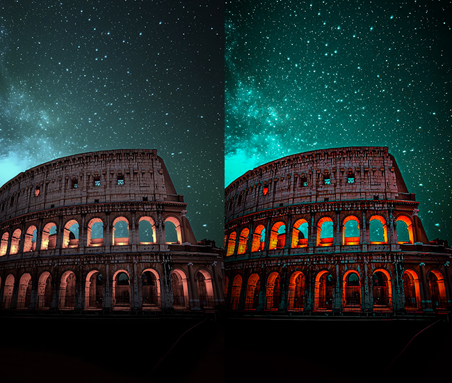
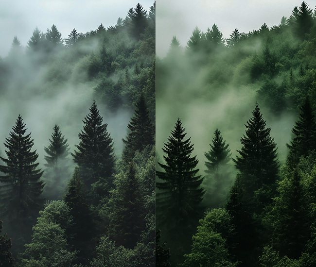
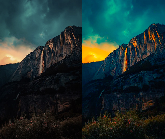
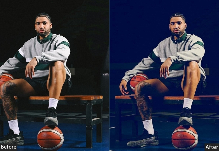
7. Dark 4k Presets
Dark landscape presets are built for drama: stormy skies, deep forest shadows, and turbulent coastlines benefit from aggressive contrast, deep blacks, and Dehaze values that cut through atmospheric haze. These are some of the most technically demanding presets to apply at 4K. Aggressive Clarity and Dehaze applied to a 50MP landscape file require careful noise-reduction management to avoid grittiness in gradient areas such as the sky.
- Light Panel: Exposure (-0.3 to -0.7), Contrast (+25 to +40), Highlights (-30 to -50), Shadows (+15 to +30), Whites (-15 to -25), Blacks (-40 to -60).
- Color Panel: Temperature (-5 to -15 for cooler, dramatic tones), Vibrance (0 to +15), Saturation (-5 to +10).
- Tone Curve: Deep blacks maintained, controlled highlights, dramatic S-curve.
- HSL/Color: Blues deeper and saturated (+20), greens darkened (-15 luminance) and teal-shifted, boost drama in skies.
- Split Toning: Cool tones in shadows (blues/teals, 200-220 hue, 10-20 sat).
- Effects: Clarity (+15 to +30), Dehaze (+20 to +40), Grain (+15 to +30), Vignette (-20 to -35).
- Detail: Aggressive sharpening (+60 to +80).
- Lens Corrections: Sometimes, keep vignetting for drama.
Purpose: dramatic atmosphere in outdoor scenes.
Best For: Landscape photography, seascapes, mountain photography, storm chasing.
Usage: Overcast days, dramatic weather, moody natural environments.
Style: Epic, dramatic, National Geographic-worthy, intense.
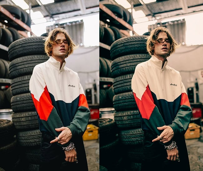
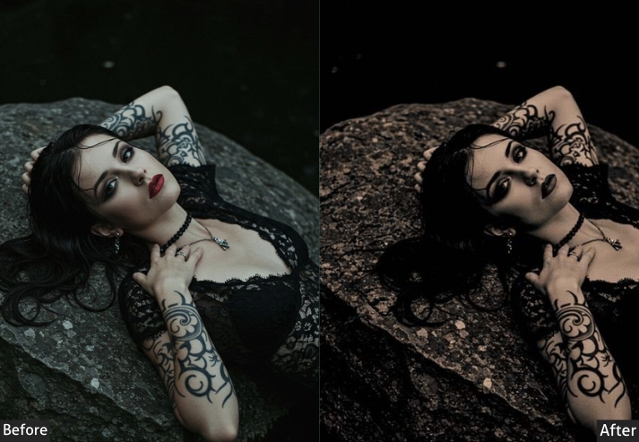
8. Matte 4k Presets
The matte look is defined by one key move: lifting the black point so that the darkest shadows in your image never reach true black. The result is a flat, milky, low-contrast base that looks sophisticated and distinctly contemporary. It’s widely used in fashion editorials, lifestyle content, and fine art portraiture. At 4K, the lifted blacks preserve texture in shadow areas that would crush to black at lower dynamic range, making the matte look particularly rewarding on high-resolution portrait files.
- Light Panel: Exposure (+0.2 to +0.4), Contrast (-15 to -25), Highlights (-10 to +10), Shadows (+25 to +40), Blacks (+40 to +70 – this is KEY!).
- Color Panel: Temperature (neutral), Vibrance (-10 to -20), Saturation (-15 to -25).
- Tone Curve: Dramatically lifted blacks, creating a flat base, compressed highlights.
- HSL/Color: Desaturate across the board, mute greens (-15), soften oranges (-10).
- Split Toning: Often minimal, sometimes subtle warmth in highlights.
- Effects: Dehaze (-10 to -20), Clarity (-10 to -20).
- Calibration: Subtle shifts for color harmony.
Purpose: soft, artistic, low-contrast aesthetic.
Best For: Fashion editorials, lifestyle, portraits, and fine art photography.
Usage: Works everywhere but shines in controlled lighting environments.
Style: Editorial, artistic, contemporary, effortlessly cool.
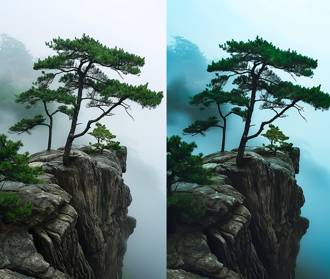
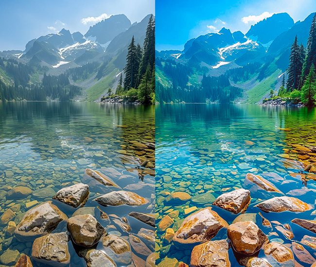
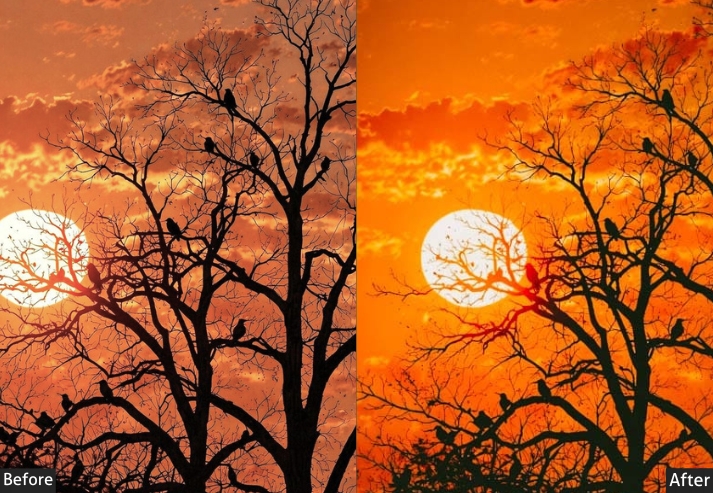
9. HDR/High Dynamic Range Presets
Modern HDR is not the over-processed, painterly look of early-2010s photography. It’s about maximizing the tonal information visible in a single RAW file. Aggressive Highlight recovery (−50 to −80) and Shadow lifting (+50 to +80) bring detail to both ends of the tonal range simultaneously. At 4K, this approach is genuinely transformative: a Sony or Nikon high-resolution file contains significantly more highlight and shadow data than a JPEG, and HDR presets are designed to bring it out.
- Light Panel: Exposure (balanced, -0.2 to +0.3), Contrast (-10 to +20), Highlights (-50 to -80 – aggressive!), Shadows (+50 to +80 – extreme lift!), Whites (-15 to +15), Blacks (-10 to +10).
- Tone Curve: Compressed with lifted blacks and pulled highlights, flatter curve overall.
- Color Panel: Vibrance (+15 to +35), Saturation (+10 to +20).
- HSL/Color: Boost saturation across multiple colors (+10 to +25 each).
- Effects: Clarity (+20 to +50), Dehaze (+15 to +40), Texture (+10 to +30).
- Detail: Sharpening (+60 to +90), Noise reduction (needed due to shadow lifting).
- Vignette: Sometimes added for focus (-10 to -20).
Purpose: Maximizing visible detail across all tonal ranges.
Best For: Landscapes, real estate, architecture, travel photography.
Usage: High-contrast scenes, sunsets, interiors with windows, challenging lighting.
Style: Detail-rich, dramatic, sometimes surreal, impactful.
How to Get the Most from These Presets on 4K Files
Applying these presets to a 4K or 8K RAW file is a starting point, not a final edit. Every camera sensor, lens, and lighting condition produces a different result. Here’s the workflow that produces the most consistent results:
- Apply the preset first, then correct exposure and white balance for your specific file. Most presets assume a well-exposed base.
- Check at 1:1 zoom before exporting Clarity and Dehaze values that look good at fit-in-window can introduce halos or noise artifacts at full resolution.
- Adjust Sharpening per file. High-megapixel files from mirrorless cameras often need less sharpening than suggested. The sensor is already resolving fine detail.
- Save your adjustments as a new preset once you’ve dialed in a preset to your specific camera. That becomes your personal 4K starting point.
The preset styles covered here: Natural, Moody, Bright & Airy, Vintage, B&W, Warm, Dark Landscape, Matte, and HDR represent the major editing directions in contemporary photography. Mastering two or three that fit your subject matter will give you a consistent, recognizable style faster than randomly rotating through dozens of presets.
Few Words
If you actually read through all these preset styles, give yourself a pat on the back! Seriously, go ahead. I’ll wait. You just consumed more photography knowledge than most people learn in their first year of shooting.
There is no magic preset that fixes everything. Plot twist, right?
The REAL magic? It’s understanding what each tool does and when to use it. And congrats!!! You now know more about Lightroom presets than 90% of people posting on Instagram. No cap!
You now know that moody presets aren’t just “make it dark,” bright & airy isn’t just “crank the exposure,” and vintage isn’t just slapping a random filter and hoping for the best. You understand the SCIENCE behind the art. You know which sliders to push, which colors to shift, and most importantly, you know the WHY.
So what happens now?
- Stop preset hopping like a caffeinated kangaroo! Pick 2-3 styles that match YOUR vibe and master them. Your photography will thank you.
- Experiment! Use this guide as your starting point, but don’t be afraid to break the rules. Some of the best edits I’ve ever done were “mistakes” that turned into happy accidents.
- Create your signature style. Mix and match elements from different presets. Maybe you love the teal shadows from Cyberpunk, paired with the warm highlights of golden hour? DO IT! Photography police aren’t real (I checked).
- Practice, practice, practice. Take the same photo and try 5 different preset styles on it. Watch how dramatically it changes the mood. Mind = blown. 🤯
- Most importantly: HAVE FUN! If editing feels like homework, you’re doing it wrong. These are tools to help you tell stories, capture memories, and create art. Don’t stress you out!
Now stop reading and go make some magic happen!
Drop your favorite preset style in the comments! Are you Team Moody, Team Bright & Airy, or are you a wild card who mixes everything? Let’s talk!
More Free Presets For You: Free Download
Cinematic Lightroom Presets Free Download
Wedding Lightroom Presets Free Download
Nature Lightroom Presets Free Download
Sports Lightroom Presets Free Download
Concert Photography Lightroom Presets Free Download
Automobile Lightroom Presets Free Download
Drone Photography Lightroom Presets Free Download