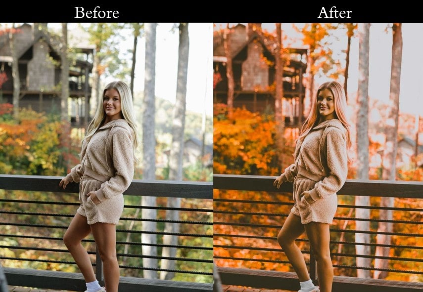
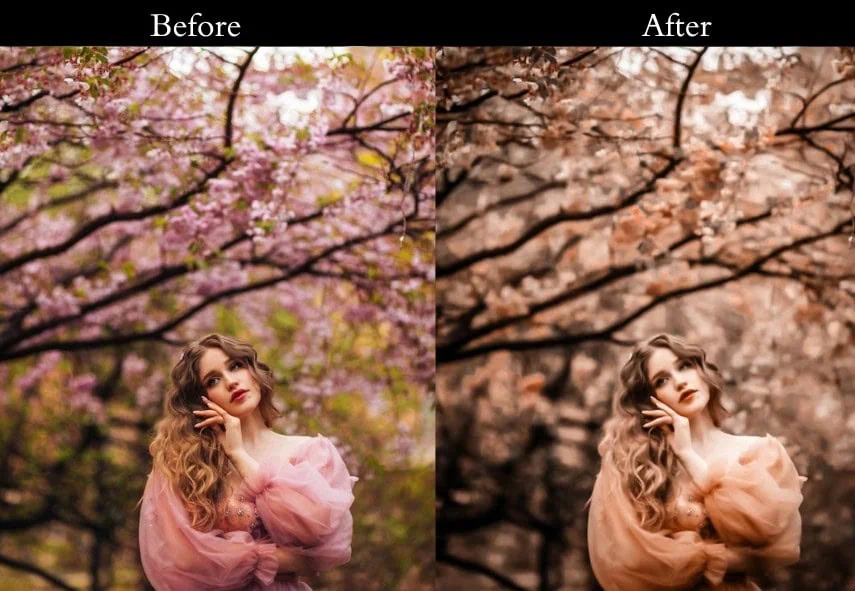
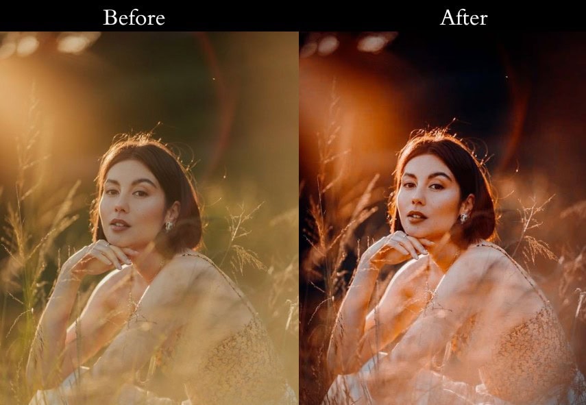
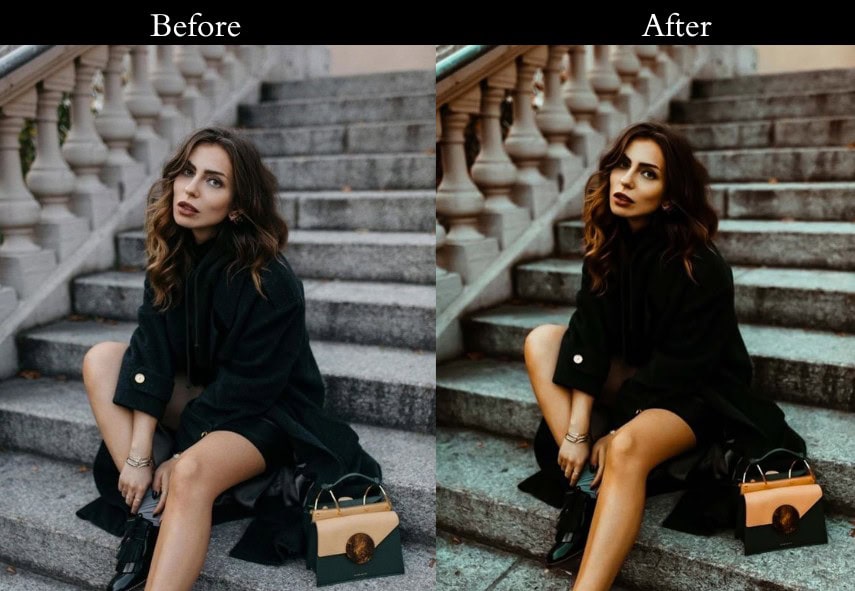
Hey there, photo enthusiasts! If you’ve been scrolling through Instagram or flipping through magazines lately, you’ve probably spotted that Orange & Teal color combo taking over the scene. It’s like the avocado toast of photo editing—trendy, eye-catching, and oh-so-satisfying. But with a sea of presets out there, how do you find the perfect one for your shots? No stress—I’ve got you covered!
In this post, we’re exploring 25 unique Orange & Teal LR Presets that’ll bring your photos to life. So take your favorite Photos, and let’s Play some editing fun!
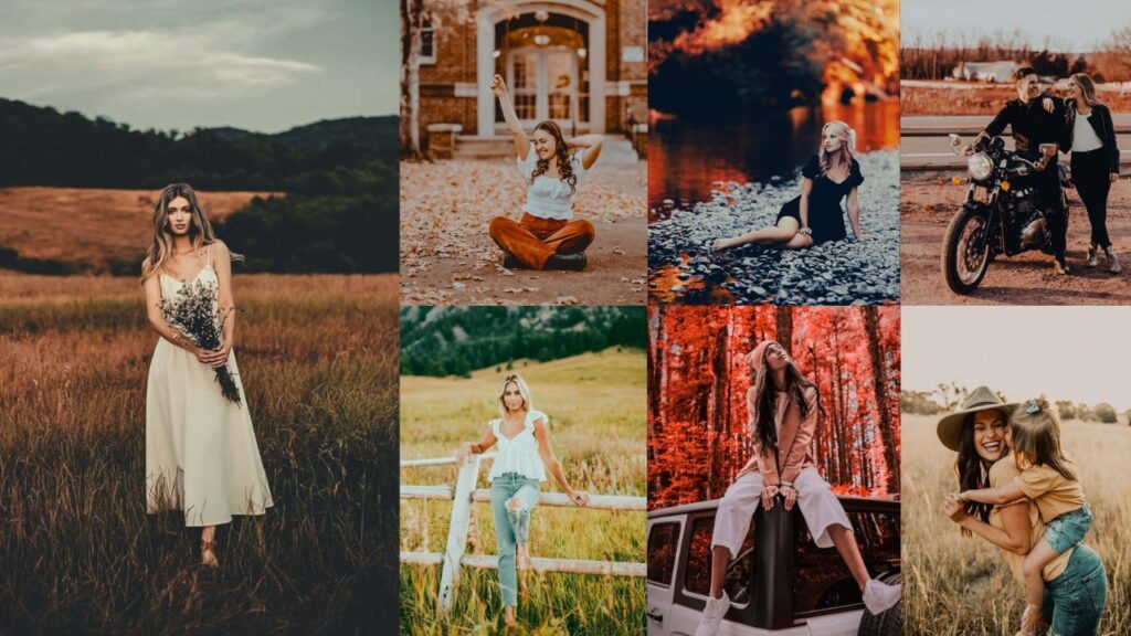
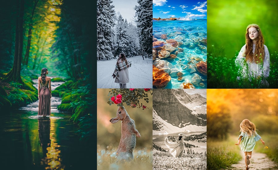
25 orange teal lightroom presets free download
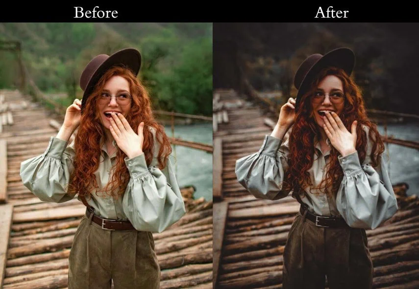
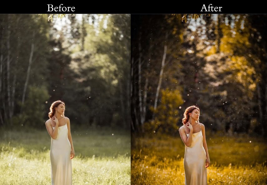
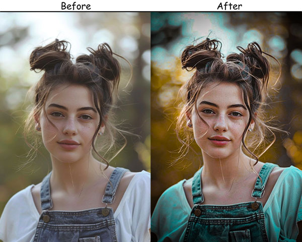
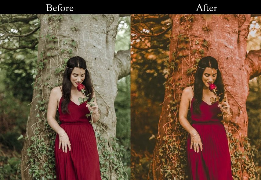
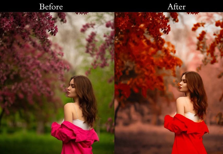
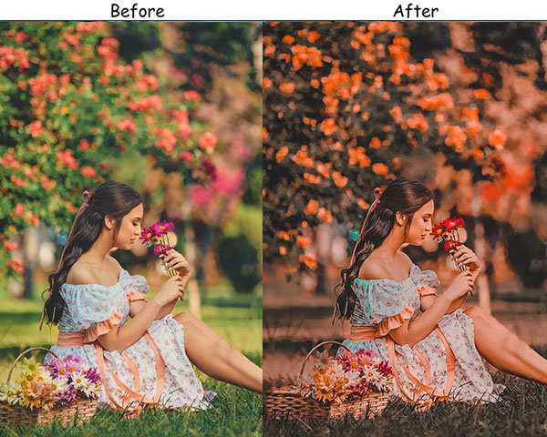
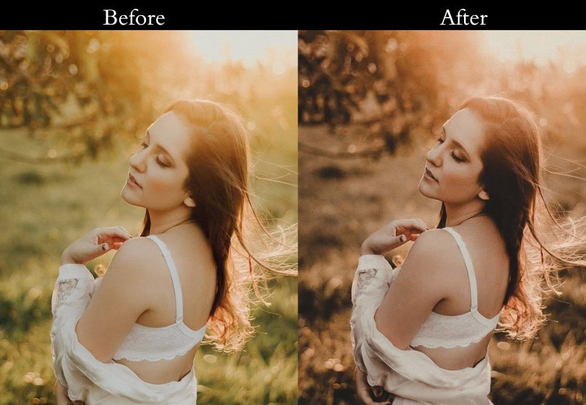
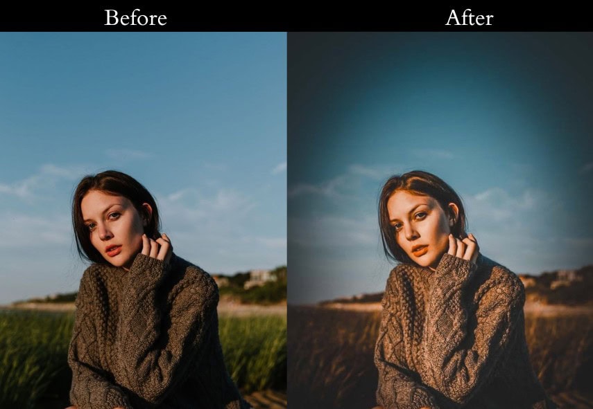
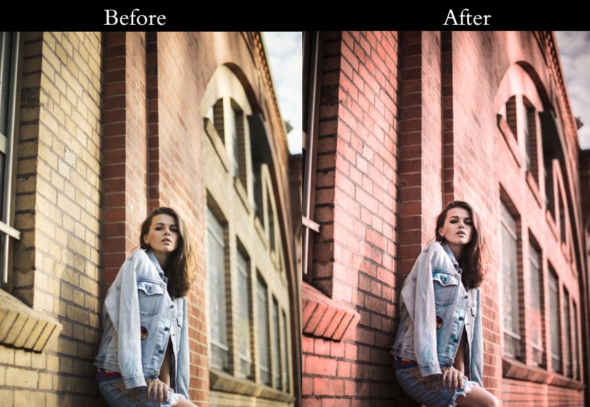
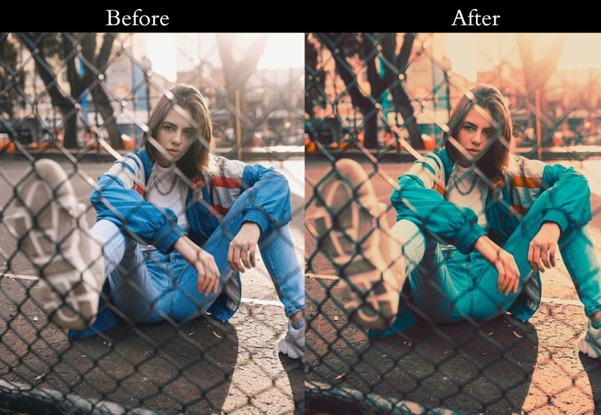
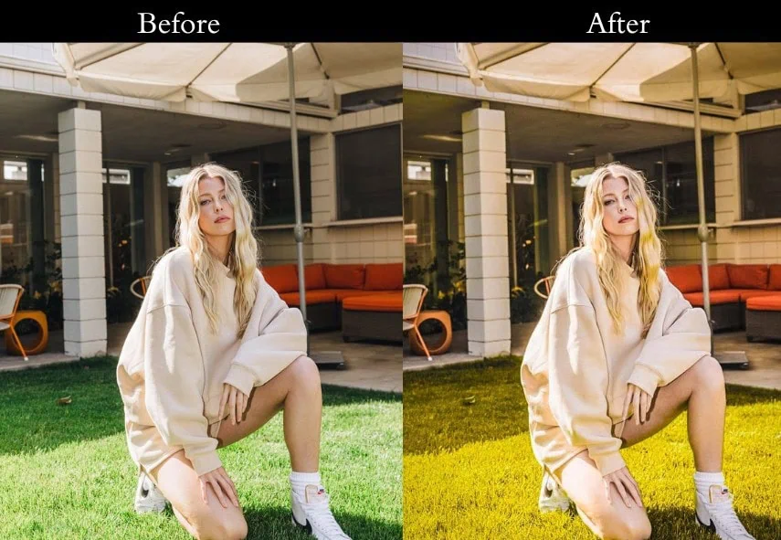
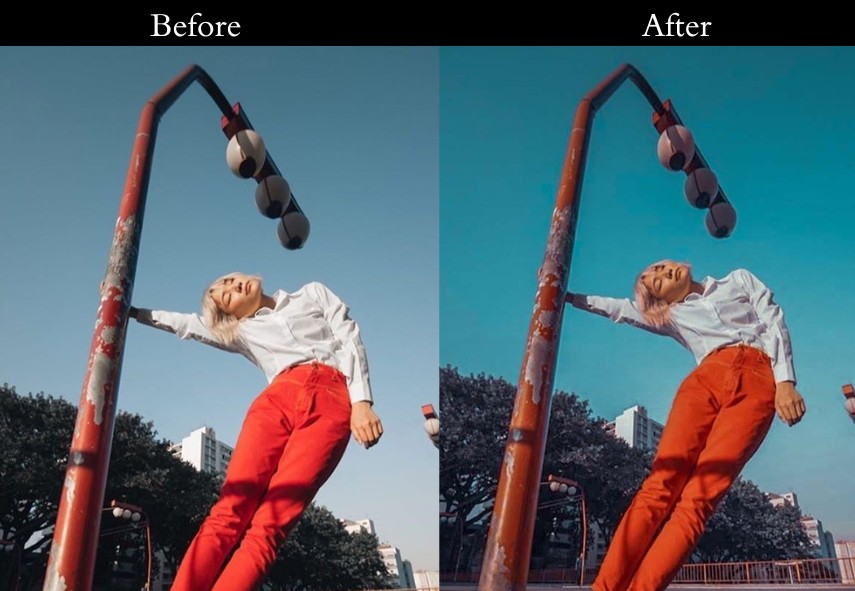
Orange and teal sit opposite each other on the color wheel, making them complementary colors. This natural contrast grabs attention, adds depth, and makes images feel balanced and dynamic. The orange tones warm up skin, giving it a healthy, vibrant glow. Meanwhile, teal cools down the background, creating a clear separation between the subject and their surroundings, which adds focus and interest. This color pairing is a staple in blockbuster films, lending a polished, professional vibe to photos. It’s an easy way to give your images an artistic, movie-like quality that feels elevated. So why late? It’s show time!
1. Classic Orange & Teal
Imagine this preset as the trusty old friend who’s always there to make your photos look effortlessly cool. It’s the OG of the Orange & Teal family, striking a Great balance between warm oranges and cool teals for that cinematic glow. Whether it’s a casual snapshot or a scenic landscape, this preset says, “Hey, I’ve got you covered!”

- Editing Process:
- Light: Exposure +10%, Contrast +15%, Highlights -20%, Shadows +20%, Whites +10%, Blacks -10%—just enough punch without overcooking it.
- Color: Vibrance +15%, Saturation +5%. In HSL, nudge Orange and Yellow up by +20%, Teal and Blue by +15%. Temperature +5 for a cozy vibe.
- Effects: Vignette -10 to keep the focus where it belongs.
- Detail: Sharpening +10, Noise Reduction +5—smooth but crisp, like a well-made latte.
- Purpose: To give your photos a timeless, cinematic boost.
- Best For: Everyday shots—think travel pics, family outings, or your dog looking heroic.
- Usage: Slap it on any photo with a decent mix of warm and cool tones.
- Style: Cinematic, balanced, effortlessly cool.
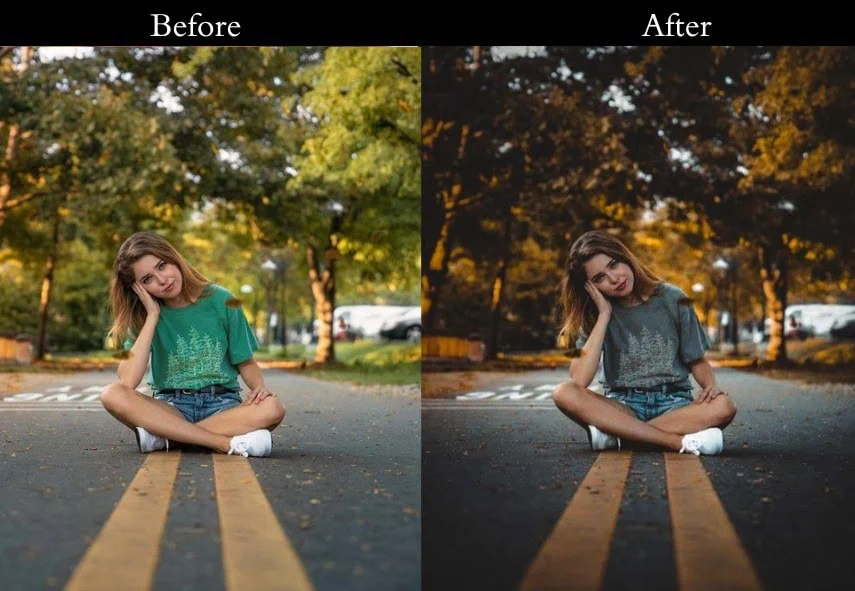
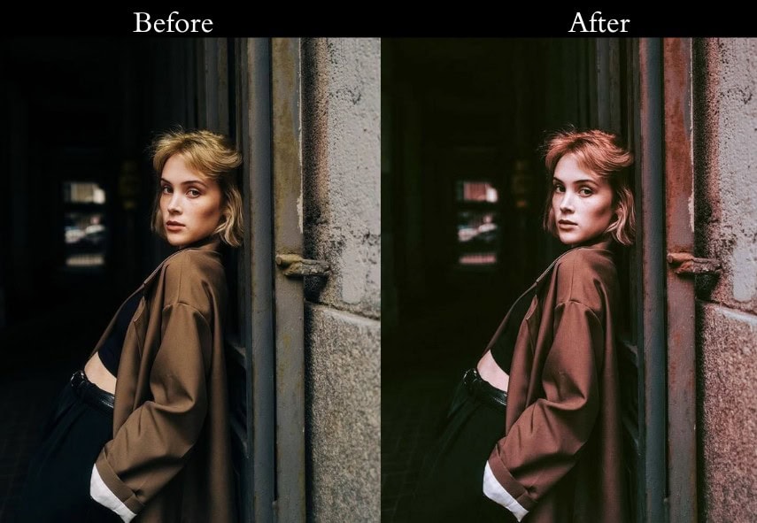
2. Moody Orange & Teal
This one’s for the brooding artists out there—think dark alleys, stormy skies, or that intense stare your cat gives you. It cranks up the shadows and wraps your photo in a mysterious orange-teal cloak. It’s like your image just stepped out of a gritty film noir, ready to tell a story.
- Editing Process:
- Light: Exposure -5%, Contrast +25%, Highlights -30%, Shadows -20%, Blacks -15%—deep and dramatic, baby!
- Color: Vibrance +10%, Saturation -5%. HSL: Orange and Teal +25%, other colors toned down for focus.
- Effects: Vignette -20 to pull you into the mood.
- Detail: Sharpening +15, Noise Reduction +10—sharp yet shadowy.
- Purpose: To add a layer of intrigue and intensity.
- Best For: Stormy landscapes, moody portraits, or urban night shots.
- Usage: Works best on darker photos begging for some drama.
- Style: Dark, mysterious, film-noir vibes.
3. Bright Orange & Teal
a sunny day where everything feels light and breezy—that’s this preset in a nutshell. It lifts your shadows and pumps up the brightness, making your beach pics or summer selfies scream “good vibes only.” It’s like a burst of sunshine in your editing toolkit!
- Editing Process:
- Light: Exposure +20%, Contrast +10%, Highlights -10%, Shadows +30%, Whites +15%, Blacks +5%—bright but balanced.
- Color: Vibrance +20%, Saturation +10%. HSL: Orange and Teal +30%, Green +10% for that fresh pop.
- Effects: Vignette -5, keeping it subtle.
- Detail: Sharpening +5, Noise Reduction +5—soft and sunny.
- Purpose: To spread cheer and brightness.
- Best For: Beach days, summer adventures, or outdoor fun.
- Usage: Hit it up on well-lit shots with lots of natural light.
- Style: Light, airy, happy-go-lucky.
4. Vintage Orange & Teal
Let’s take a trip down memory lane with this retro gem. It fades your colors and sprinkles in some grain, turning your modern snaps into nostalgic treasures—like finding an old Polaroid in your attic.
- Editing Process:
- Light: Exposure +5%, Contrast -10%, Highlights -15%, Shadows +15%, Whites -10%, Blacks +10%—soft and faded.
- Color: Vibrance -10%, Saturation -15%. HSL: Desaturate all by -10%, then Orange and Teal +15%.
- Effects: Grain +20, Vignette -10—old-school feels!
- Detail: Sharpening +10, Noise Reduction +15—smoothly vintage.
- Purpose: To give your photos a nostalgic, retro twist.
- Best For: Portraits, street shots, or anything with a timeless vibe.
- Usage: Try it on pics that deserve a throwback glow.
- Style: Retro, faded, sentimental.
5. Cinematic Orange & Teal
Ever wanted your photos to look like they’re ready for the silver screen? This preset’s your ticket. It widens the dynamic range and adds a subtle matte finish, making every shot feel like a frame from your favorite movie—epic and unforgettable.
- Editing Process:
- Light: Exposure +10%, Contrast +20%, Highlights -25%, Shadows +25%, Whites +10%, Blacks -10%—dynamic and bold.
- Color: Vibrance +15%, Saturation +10%. HSL: Orange and Teal +25%, plus a cinematic S-curve in Tone Curve.
- Effects: Lift shadows in Tone Curve for that matte magic.
- Detail: Sharpening +15, Noise Reduction +10—crisp and pro.
- Purpose: To turn your photos into cinematic stories.
- Best For: Landscapes, cityscapes, or dramatic moments.
- Usage: Use on shots with killer composition and lighting.
- Style: Cinematic, epic, storytelling.
6. Travel Orange & Teal
Grab your backpack—this preset’s all about making your travel memories pop! It boosts skies and landscapes, turning your vacation pics into postcard-worthy art. From mountain peaks to ocean waves, it’s your go-to for wanderlust vibes.

- Editing Process:
- Light: Exposure +15%, Contrast +15%, Highlights -15%, Shadows +20%, Whites +10%, Blacks -5%—vibrant yet natural.
- Color: Vibrance +20%, Saturation +10%. HSL: Blue and Teal for skies, Orange for sunsets.
- Effects: Vignette -5—keep it clean.
- Detail: Sharpening +10, Noise Reduction +5—crisp adventures.
- Purpose: To make travel photos breathtaking.
- Best For: Vacation snaps, nature shots, scenic views.
- Usage: Perfect for outdoor shots with sky or water.
- Style: Adventurous, vibrant, wanderlust.
7. Portrait Orange & Teal
Portraits can be tricky with bold colors, but this preset’s got your back. It keeps skin tones natural while adding that orange-teal flair—think warm glows and cool backgrounds that make your subject shine. It’s like a flattering filter from a pro photoshoot!
- Editing Process:
- Light: Exposure +10%, Contrast +10%, Highlights -10%, Shadows +15%, Whites +5%, Blacks -5%—soft and flattering.
- Color: Vibrance +15%, Saturation +5%. HSL: Orange +10% for skin, Teal +15% for depth.
- Effects: Vignette -5—focus on the face.
- Detail: Sharpening +10, Noise Reduction +10—smooth skin, sharp eyes.
- Purpose: To enhance portraits with natural beauty.
- Best For: People pics, fashion shots, close-ups.
- Usage: Ideal for photos where faces steal the show.
- Style: Flattering, natural, warm.
8. Urban Orange & Teal
City slickers, this one’s for you! It sharpens up architecture and street scenes, giving urban shots a sleek, modern edge. Think skyscrapers glowing orange against a teal sky—capturing the pulse of the city.
- Editing Process:
- Light: Exposure +10%, Contrast +20%, Highlights -20%, Shadows +20%, Whites +10%, Blacks -10%—bold and structured.
- Color: Vibrance +15%, Saturation +10%. HSL: Orange for buildings, Teal for skies.
- Effects: Vignette -10—urban focus.
- Detail: Sharpening +15, Noise Reduction +10—crisp lines.
- Purpose: To highlight the beauty of city life.
- Best For: Cityscapes, street photography, modern buildings.
- Usage: Use on urban shots with strong lines or skies.
- Style: Sleek, modern, metropolitan.
9. Nature Orange & Teal
Calling all tree-huggers! This preset pumps up greens and blues, making forests, lakes, and mountains look downright magical. It’s like Mother Nature hired you as her personal editor—your outdoor shots will thank you.
- Editing Process:
- Light: Exposure +10%, Contrast +15%, Highlights -15%, Shadows +20%, Whites +10%, Blacks -5%—lush and lively.
- Color: Vibrance +20%, Saturation +10%. HSL: Green and Blue +20%, Orange +15% for earth tones.
- Effects: Vignette -5—nature in focus.
- Detail: Sharpening +10, Noise Reduction +5—crisp leaves, smooth water.
- Purpose: To make nature shots glow.
- Best For: Forests, mountains, lakes, wildlife.
- Usage: Perfect for pics with greenery or water.
- Style: Natural, vibrant, earthy.
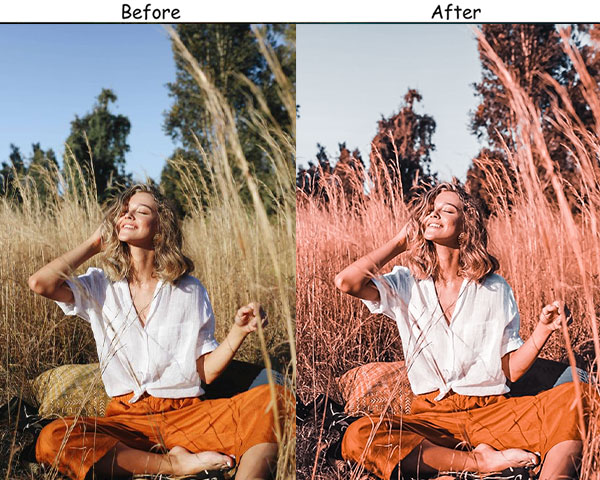
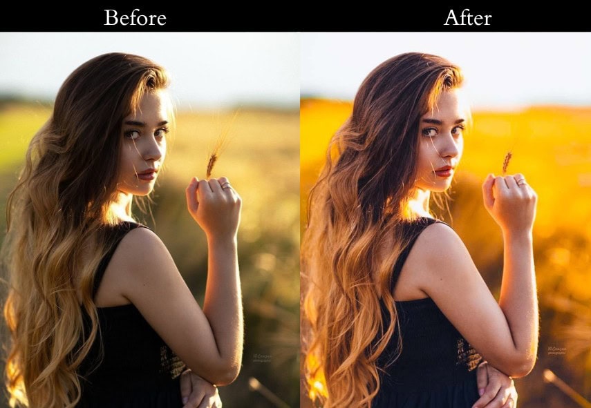
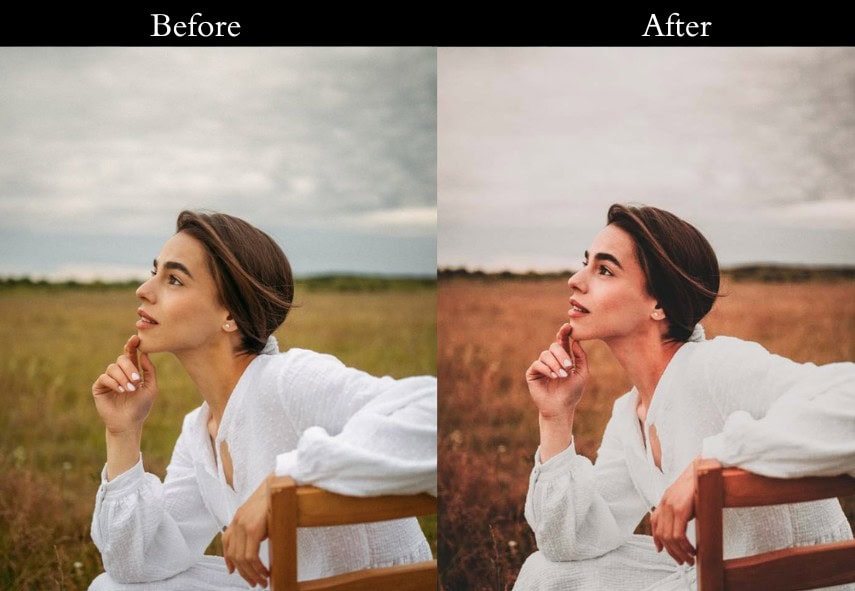
10. Sunset Orange & Teal
Golden hour lovers, rejoice! This preset turns your sunsets into pure fire—amplifying warm oranges while keeping teal skies crisp. It’s like bottling that magical dusk light and splashing it across your photos.

- Editing Process:
- Light: Exposure +15%, Contrast +10%, Highlights -20%, Shadows +25%, Whites +15%, Blacks -10%—warm and dreamy.
- Color: Vibrance +25%, Saturation +15%. HSL: Orange and Red +25%, Teal +15%.
- Effects: Vignette -10—sunset spotlight.
- Detail: Sharpening +10, Noise Reduction +5—soft glow, sharp horizon.
- Purpose: To make sunsets unforgettable.
- Best For: Golden hour shots, warm-lit scenes.
- Usage: Use on dusk or dawn pics with rich colors.
- Style: Warm, golden, magical.
11. Minimalist Orange & Teal
Less is more with this subtle stunner. It adds just a whisper of orange and teal, keeping things clean and understated—Good for when you want style without the drama. Think of it as the “chill cousin” of the preset family.
- Editing Process:
- Light: Exposure +5%, Contrast +5%, Highlights -5%, Shadows +10%, Whites +5%, Blacks -5%—gentle lift.
- Color: Vibrance +10%, Saturation +5%. HSL: Orange and Teal +10%—light touch.
- Effects: No Vignette—keep it pure.
- Detail: Sharpening +5, Noise Reduction +5—crisp and calm.
- Purpose: To add a hint of color with elegance.
- Best For: Minimalist shots, product pics, simple vibes.
- Usage: Try it on clean, uncluttered images.
- Style: Subtle, clean, minimalist.
12. High Contrast Orange & Teal
Bold and brash, this preset is here to make a statement. It jacks up the contrast, making lights blaze and shadows deepen—your photos will demand attention like a rockstar on stage. Perfect for when subtle just won’t cut it!
- Editing Process:
- Light: Exposure +10%, Contrast +30%, Highlights -30%, Shadows +30%, Whites +20%, Blacks -20%—punchy!
- Color: Vibrance +20%, Saturation +15%. HSL: Orange and Teal +30%—vivid vibes.
- Effects: Vignette -20—dramatic edges.
- Detail: Sharpening +20, Noise Reduction +10—sharp and loud.
- Purpose: To create bold, eye-catching images.
- Best For: Action shots, sports, dramatic scenes.
- Usage: Use on pics with strong light-shadow play.
- Style: Bold, striking, in-your-face.
13. Low Contrast Orange & Teal
Soft and soothing, this preset is like a warm hug for your photos. It dials down the contrast for a dreamy, pastel-like effect—Romantic vibes or a gentle escape. It’s the calm amidst the editing storm.
- Editing Process:
- Light: Exposure +10%, Contrast -20%, Highlights -10%, Shadows +20%, Whites -10%, Blacks +10%—mellow magic.
- Color: Vibrance +15%, Saturation +5%. HSL: Orange and Teal +15%—soft pops.
- Effects: Vignette -5—gentle frame.
- Detail: Sharpening +5, Noise Reduction +10—smooth as silk.
- Purpose: To craft a serene, dreamy look.
- Best For: Weddings, romantic portraits, soft scenes.
- Usage: Apply to pics needing a calming touch.
- Style: Soft, dreamy, peaceful.
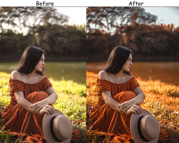
14. Warm Orange & Teal
Cozy up with this preset—it leans hard into the orange for a toasty, inviting feel. Your photos will feel like a warm sweater on a crisp day.
- Editing Process:
- Light: Exposure +10%, Contrast +10%, Highlights -15%, Shadows +20%, Whites +10%, Blacks -5%—cozy lift.
- Color: Vibrance +20%, Saturation +10%. HSL: Orange +30%, Teal +10%. Temperature +10—extra warmth!
- Effects: Vignette -10—snug frame.
- Detail: Sharpening +10, Noise Reduction +5—soft yet clear.
- Purpose: To wrap your photos in warmth.
- Best For: Fall shots, cozy indoors, warm portraits.
- Usage: Use on pics with autumn tones or soft light.
- Style: Warm, cozy, inviting.
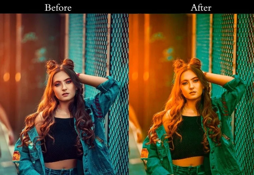
15. Cool Orange & Teal
Chill out with this refreshing twist—it’s all about the teal, giving your shots a crisp, icy edge. Orange plays backup, keeping things balanced.
- Editing Process:
- Light: Exposure +10%, Contrast +15%, Highlights -20%, Shadows +20%, Whites +10%, Blacks -10%—crisp lift.
- Color: Vibrance +15%, Saturation +10%. HSL: Teal +30%, Orange +10%. Temperature -5—cool it down!
- Effects: Vignette -10—frosty focus.
- Detail: Sharpening +10, Noise Reduction +10—clean and cool.
- Purpose: To give photos a fresh, cool vibe.
- Best For: Winter scenes, underwater shots, blue tones.
- Usage: Try it on pics with cool lighting or water.
- Style: Cool, crisp, refreshing.
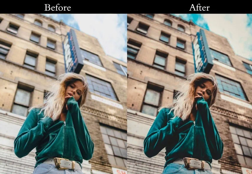
16. Matte Orange & Teal
This preset’s got that trendy matte finish—think velvety smooth with muted highlights. It’s a social media darling, giving your shots a modern, editorial flair. Orange and teal still shine, but with a soft, polished twist.
- Editing Process:
- Light: Exposure +10%, Contrast +10%, Highlights -30%, Shadows +20%, Whites -20%, Blacks +10%—matte magic.
- Color: Vibrance +15%, Saturation +5%. HSL: Orange and Teal +20%. Tone Curve shadow lift for matte.
- Effects: Vignette -10—subtle frame.
- Detail: Sharpening +10, Noise Reduction +10—smooth and sleek.
- Purpose: To craft a modern, matte look.
- Best For: Fashion, products, Instagram posts.
- Usage: Use on pics needing a trendy polish.
- Style: Modern, editorial, matte.
17. HDR Orange & Teal
Want every detail to shine? This preset mimics high dynamic range, pulling out shadows and highlights like a pro. It’s your secret weapon for landscapes or architecture—think crisp, detailed shots that wow.
- Editing Process:
- Light: Exposure +15%, Contrast +20%, Highlights -40%, Shadows +40%, Whites +20%, Blacks -20%—full range!
- Color: Vibrance +20%, Saturation +15%. HSL: Orange and Teal +25%—vivid yet real.
- Effects: Vignette -5—keep it natural.
- Detail: Sharpening +20, Noise Reduction +10—details galore.
- Purpose: To boost detail across the board.
- Best For: Landscapes, architecture, high-contrast shots.
- Usage: Use on pics with lots of light and dark.
- Style: Detailed, dynamic, vivid.
18. Dark Orange & Teal Tint
Ready for something artsy? This preset starts Dark, then sneaks in orange and teal tints for a moody, creative vibe.

- Editing Process:
- Light: Exposure +10%, Contrast +20%, Highlights -20%, Shadows +20%, Whites +5%, Blacks +10%—bold base.
- Color: Go Black & White, then Split Toning: Highlights Orange (Hue 30, Sat 20), Shadows Teal (Hue 180, Sat 20).
- Effects: Vignette +10—moody edges.
- Detail: Sharpening +15, Noise Reduction +10—sharp art.
- Purpose: To create an artistic, tinted twist.
- Best For: Creative shots, portraits, experiments.
- Usage: Try it on pics craving uniqueness.
- Style: Artistic, moody, quirky.
19. Split Tone Orange & Teal
Keep it simple with this classic split-toning trick—orange in the highlights, teal in the shadows. It’s a no-fuss way to nail the Orange & Teal look, Best for beginners or quick edits. Think of it as your trusty sidekick!
- Editing Process:
- Light: Exposure +10%, Contrast +15%, Highlights -10%, Shadows +20%, Whites +10%, Blacks -10%—balanced base.
- Color: Split Toning: Highlights Orange (Hue 30, Sat 30), Shadows Teal (Hue 180, Sat 30).
- Effects: Vignette -10—clean frame.
- Detail: Sharpening +10, Noise Reduction +5—easy and sharp.
- Purpose: To deliver a straightforward Orange & Teal style.
- Best For: Quick edits, beginners, everyday shots.
- Usage: Use on pics with clear highlights and shadows.
- Style: Classic, simple, reliable.
20. Custom Orange & Teal
This one’s for the tinkerers—you start with a solid base, then tweak to your heart’s content. It’s like a blank canvas with Orange & Teal paint, letting you play artist and craft your own vibe.
- Editing Process:
- Light: Exposure +10%, Contrast +10%, Highlights -10%, Shadows +10%, Whites +5%, Blacks -5%—flexible start.
- Color: Vibrance +10%, Saturation +5%. HSL: Orange and Teal +15%—adjust as you like!
- Effects: Vignette -5 to -15—your call.
- Detail: Sharpening +10, Noise Reduction +5—tweak away.
- Purpose: To kickstart your custom Orange & Teal journey.
- Best For: Experimenters, creative souls, personal projects.
- Usage: Use it as a base, then go wild!
- Style: Custom, flexible, uniquely you.
Last Take
And that’s a wrap—25 awesome Presets for you to experiment with! Think of presets as your creative launchpad; tweak them to fit your style and make your photos totally your own. Photography is all about playing around and finding your vibe, so don’t hold back—break the rules and see what happens! Loved this post? Got questions? Drop me a comment below—I’d love to chat! Oh, and if you give these presets a spin, tag me in your pics; I’m dying to see your masterpieces. Until next time, happy editing!
More Free Presets:
Moody Lightroom Presets Free Download
Retro Lightroom Presets Free Download
Autumn Lightroom Presets Free Download
Street Lightroom Presets Free Download