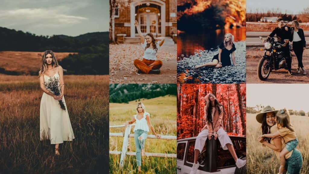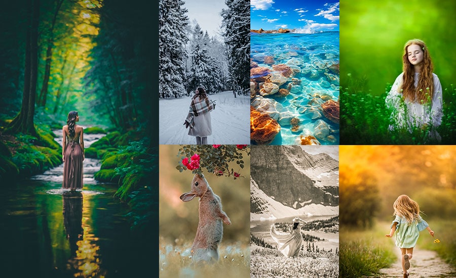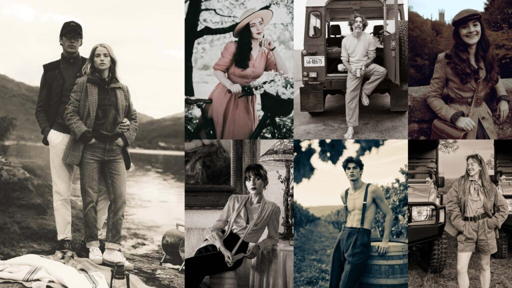
Every great photo has a secret. Most of the time, that secret is a preset.
You’ve seen those Instagram feeds where every photo looks impossibly perfect: warm golden skin tones, dreamy shadows, colors that feel like a memory rather than a photograph. That’s not talent. That’s not a $3,000 camera. That’s a Classic Lightroom Preset doing exactly what it was designed to do.
These aren’t generic one-size-fits-all filters. Each preset was crafted around a specific mood and shooting style:
- 🖤 Moody & Dark: cinematic shadows for urban and portrait photography.
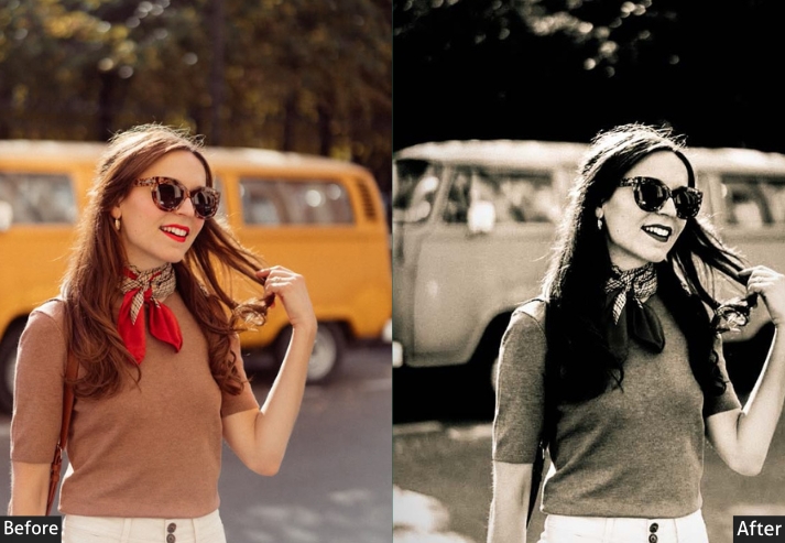
- 🎞️ Film & Vintage: analog warmth with grain, lifted blacks, and faded contrast.
- ☀️ Clean & Bright: airy, lifestyle-ready edits that pop on Instagram.
- ⚫ Black & White: high-contrast, timeless conversions with fine-tuned B&W mix.
- 📷 Vintage Classic: faded, teal-shadow, warm-highlight Instagram aesthetic.
- 🌅 Golden Hour: that bottled-sunlight look without the 5 AM alarm.
- 🌑 Dark Dramatic: editorial-grade depth for fashion and food photography.
Each section below includes a live preview image, a detailed breakdown of settings so you understand why each adjustment works, and a direct download button.
Scroll down, find your vibe, and download. Your best edits are one click away.
Pauline Jackson
I pay close attention to the small details that shape a strong edit: smooth skin tones, balanced highlights, clean contrast, natural shadows, and color grading that enhances mood without distracting from the subject.
50 Classic Lightroom Presets Free Download
I’ve rounded up 50 incredible Classic vibe presets that people are absolutely obsessed with right now. We’re talking everything from moody and dramatic to bright and airy, vintage film vibes to ultra-modern cinematic looks. Whether you’re shooting weddings, landscapes, portraits, your lunch, or your cat’s fifth birthday party, there’s something here for you.
Each preset comes with:
- ✨ A clear description of what it does.
- 🎯 When and why you’d use it.
- 💡 Pro tips to make it work even better.
- 🎨 The vibe it creates.
- Pauline Jackson
- 1. Moody & Dark Presets
- 2. Film & Vintage Presets (Nostalgia in a Slider)
- 3. Clean & Bright Presets (The Instagram Darling)
- 4. Black & White Classic Presets (Timeless Never Goes Out of Style)
- 5. Vintage Classic Presets (The Influencer Starter Pack)
- 6. Golden Hour (Sepia) Presets
- 7. Dark & Moody Classic Presets (Look Brooding)
1. Moody & Dark Presets
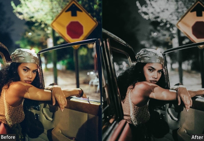
These presets are for urban photography, dramatic portraits, and concert shots. They crush the blacks, cool the shadows with a blue-teal grade, and add strong contrast, creating that cinematic “I meant to do this” atmosphere.
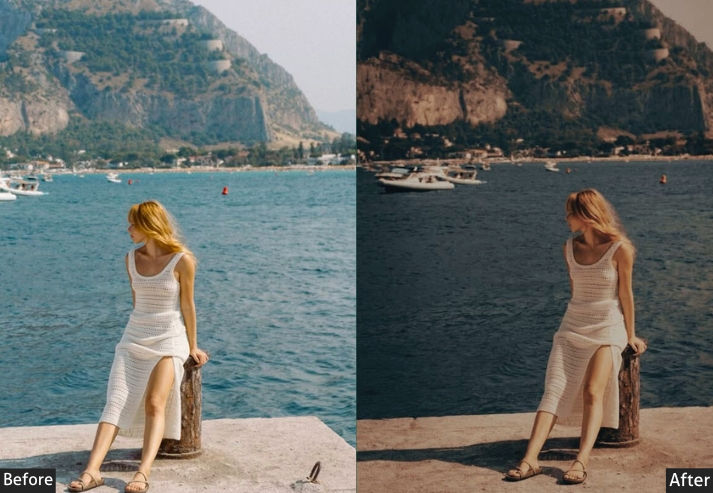
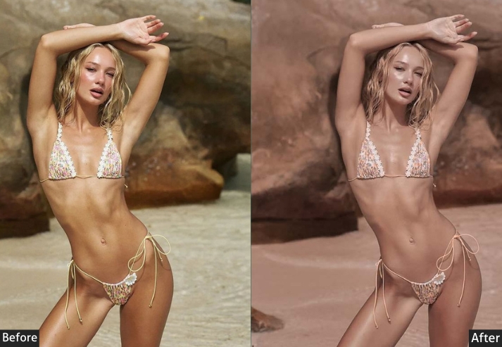
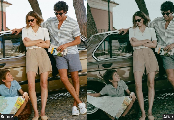
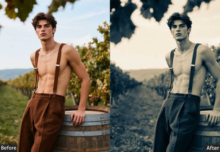
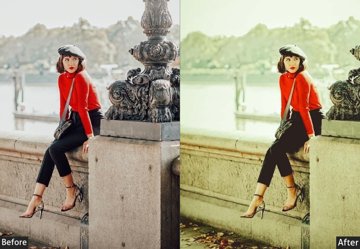
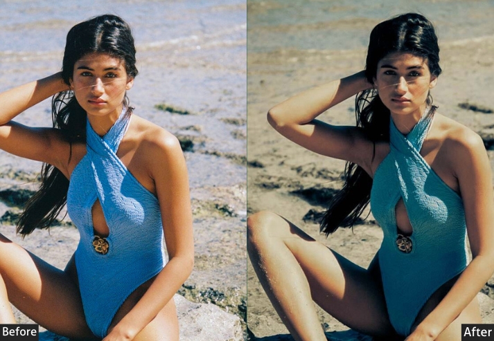
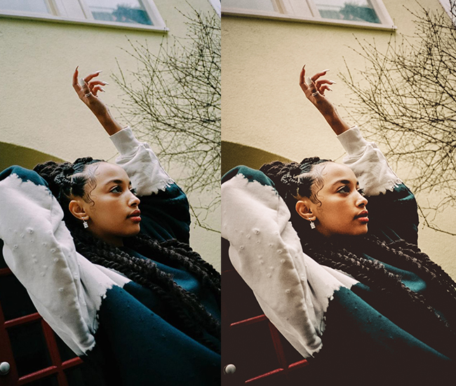
Light Panel: Exposure -0.3 to -0.7 (dimming things down) | Contrast +15 to +25 (dramatic contrast) | Highlights -30 to -50 (crushing bright spots) | Shadows -20 to -40 (embrace darker shadows) | Whites -15 to -25 | Blacks -30 to -50 (deep blacks). Color Panel: Temp -5 to -15 (cooler vibes) | Tint +5 to +10 | Vibrance -10 to -20 (muted look) | Saturation -5 to -15. Tone Curve: Pull down blacks for lifted faded black look | Create S-curve for extra contrast. Effects Panel: Clarity +10 to +20 (texture and grit) | Dehaze +10 to +15 | Vignette -15 to -30 (darkened corners for focus). Color Grading: Shadows blue/teal tones (Hue 200-220 | Sat 20-30) | Highlights warm orange (Hue 30-40 | Sat 10-15).
Purpose: atmospheric, cinematic photos.
Best For: Urban photography, portraits with attitude, concert shots, rainy day scenes.
Usage: Instagram feed that screams “I’m an artist” without actually saying it.
Style: Moody, cinematic, mysterious, low-key lighting, desaturated but not lifeless.
2. Film & Vintage Presets (Nostalgia in a Slider)
These film presets simulate the look of classic analog photography: lifted blacks, faded contrast, grain texture, and warm color shifts that mimic Kodak and Fuji film stocks. They are especially popular for wedding photography, travel, and lifestyle content.
Remember when film cameras produced photos with that warmth and imperfection? No? Well, these presets do. They’re like a time machine back to when people printed photos and put them in albums instead of drowning in cloud storage.
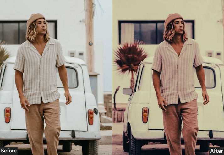
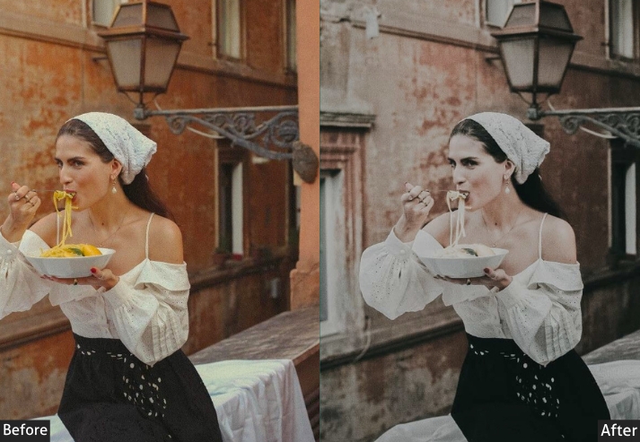
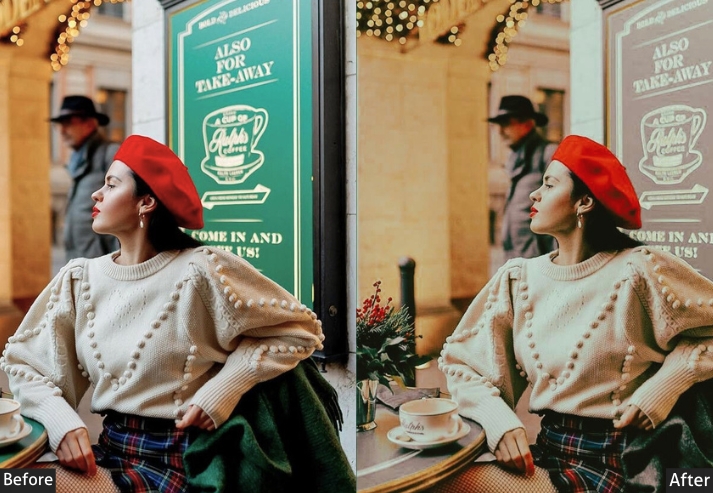
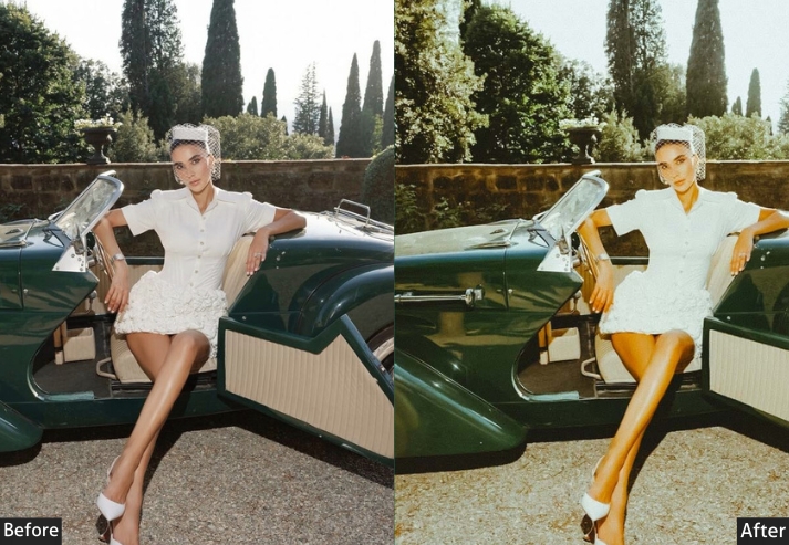
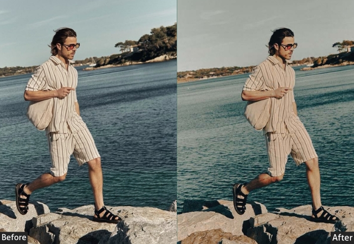
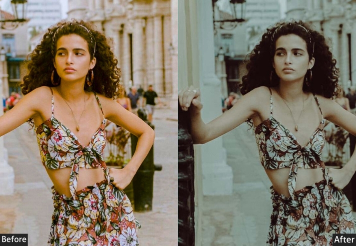
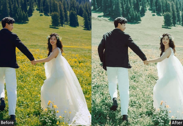
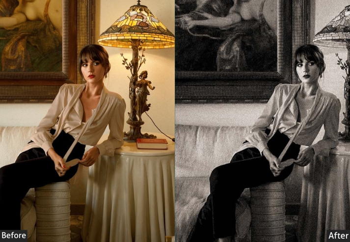
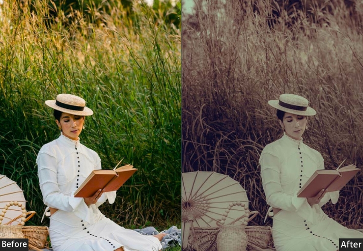
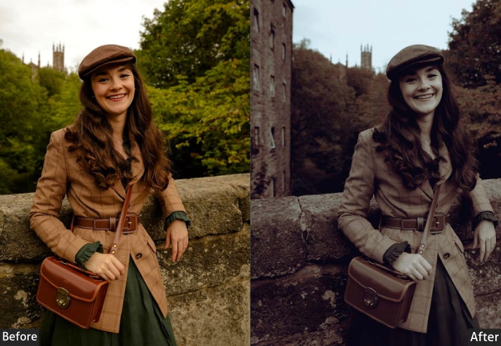
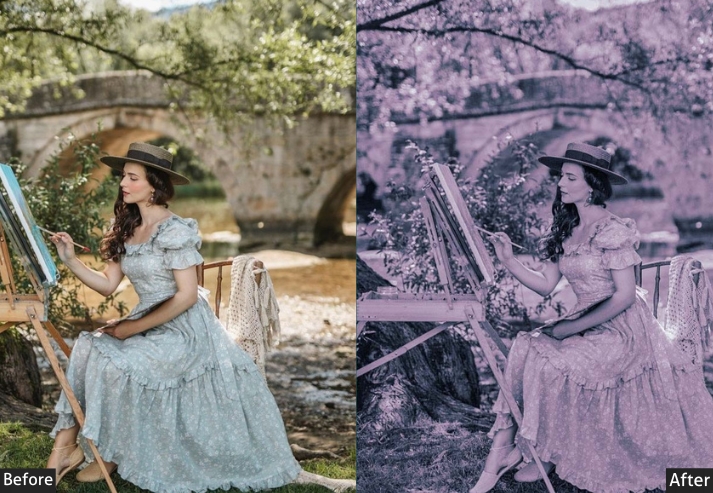
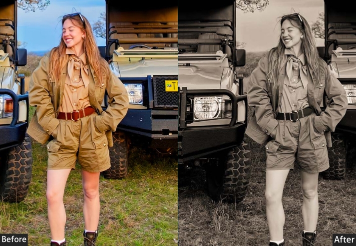
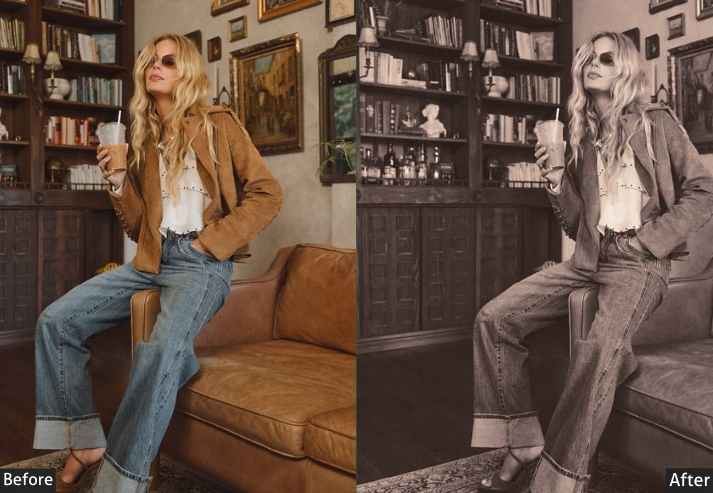
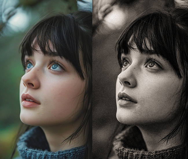
Light Panel: Exposure +0.2 to +0.5 (slightly overexposed film look) | Contrast -10 to -20 (softer, less digital) | Highlights +10 to +20 (let highlights bloom) | Shadows +20 to +40 (lifted shadows are key) | Whites +10 to +15 | Blacks +20 to +40 (faded film blacks). Color Panel: Temp +5 to +15 (warmth) | Vibrance -15 to -25 | Saturation -10 to -20 (muted vintage colors). Tone Curve: Lift blacks significantly (faded film look) | Slight S-curve in midtones | Pull down highlights slightly. Effects Panel: Clarity -5 to -15 (softness) | Dehaze -10 to -20 (hazy dreamy quality) | Grain +30 to +60 (essential film grain) | Vignette -5 to -15 (subtle darkening). Color Grading: Shadows warm tones (Hue 40-50 | Sat 15-25) | Midtones slight yellow/green (Hue 50-70 | Sat 10-15) | Highlights orange/red tones (Hue 20-35 | Sat 15-20). Detail Panel: Sharpening -10 to -20 (less sharp for film-like softness).
Purpose: make your digital photos look like they were shot on your grandpa’s Nikon F3.
Best For: Wedding photos, travel photography, portraits, lifestyle shots.
Usage: When you want that “found this in an attic box” aesthetic without the actual decades passing.
Style: Warm, faded, nostalgic, soft contrast, grainy texture, lifted blacks.
3. Clean & Bright Presets (The Instagram Darling)
Clean and bright presets are the go-to for lifestyle bloggers, product photographers, and family portrait sessions. They lift shadows aggressively, keep colors fresh and vibrant, and produce that airy Scandinavian aesthetic that performs extremely well on Instagram and Pinterest. If Marie Kondo made a preset, this would be it.
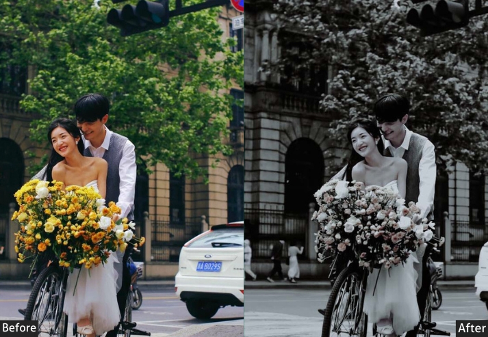
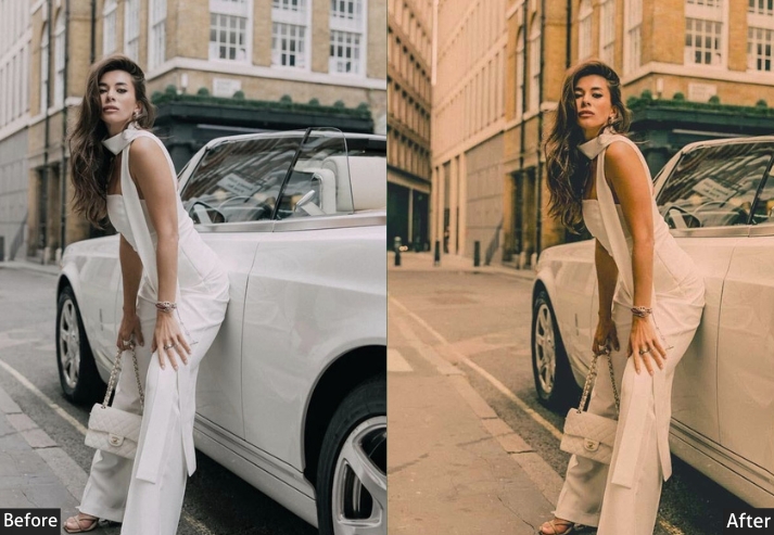
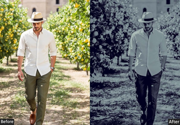
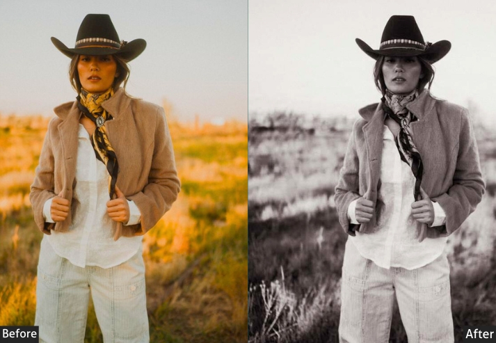
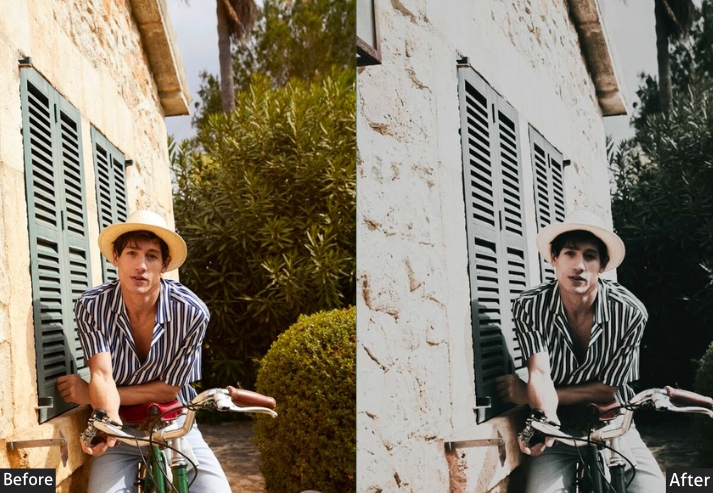
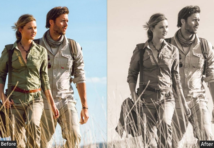
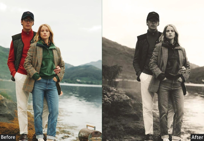
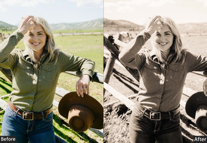
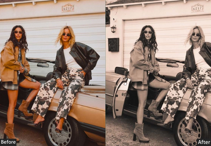
Light Panel: Exposure +0.3 to +0.8 (bright and airy look) | Contrast -5 to -15 (soft contrast) | Highlights -10 to -30 (protect bright areas) | Shadows +40 to +70 (strong shadow lift) | Whites +20 to +40 (extra brightness) | Blacks +15 to +30 (soft faded blacks). Color Panel: Temp +5 to +10 (slightly warm) | Vibrance +10 to +25 (colors pop) | Saturation +5 to +15. Effects Panel: Clarity +5 to +15 (crisp but soft) | Dehaze +5 to +10 | Vignette 0 to -5 (minimal darkening). Color Grading: Balanced natural tones | Midtones slight warm tint (Sat 5-10). HSL → Saturation: Orange +10 to +20 (skin tones) | Blue +15 to +25 (pop skies) | Yellow +10 to +15. HSL → Luminance: Green +10 to +20 (bright foliage). Detail Panel: Sharpening +40 to +60 (crisp details).
Purpose: a Scandinavian design magazine.
Best For: Lifestyle blogs, product photography, minimalist content, family photos.
Usage: When you want your photos to look professionally clean without looking overly processed.
Style: Bright, airy, clean, minimal shadows, slightly warm, crisp details.
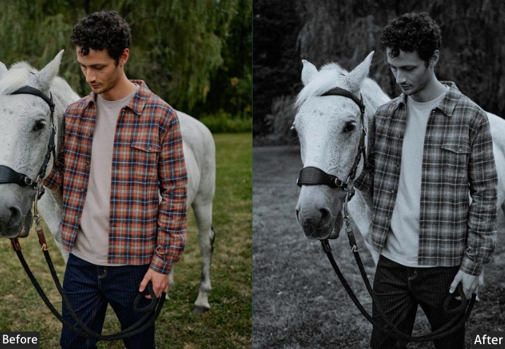
4. Black & White Classic Presets (Timeless Never Goes Out of Style)
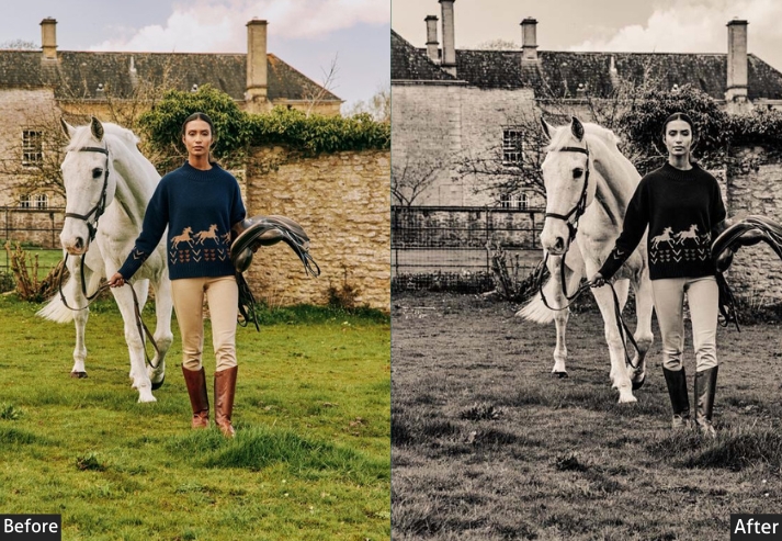
Black-and-white conversion is one of the most-searched Lightroom techniques because it strips away color distractions and lets emotion, light, and composition do all the talking. These presets cover the full spectrum from high-contrast drama to soft, airy B&W. They include fine-tuned B&W Mix adjustments for different subject types: skin tones, skies, and foliage all respond differently when the color is removed.
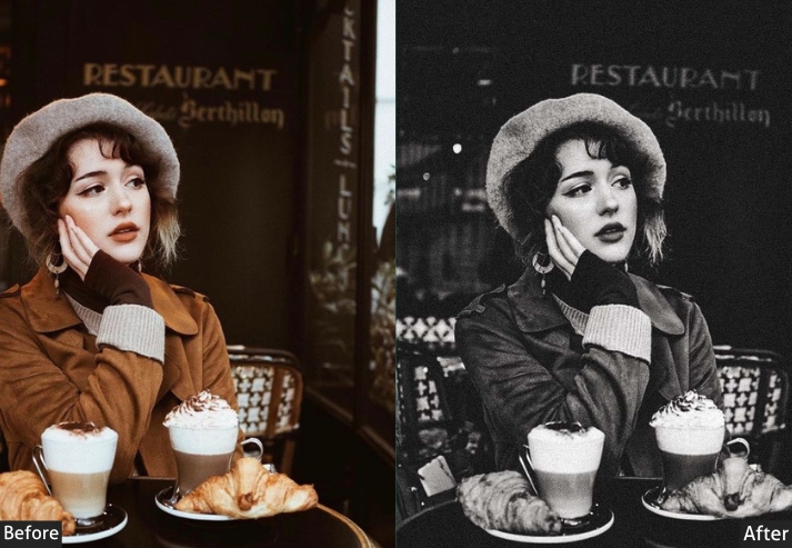
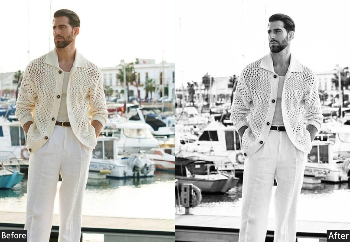
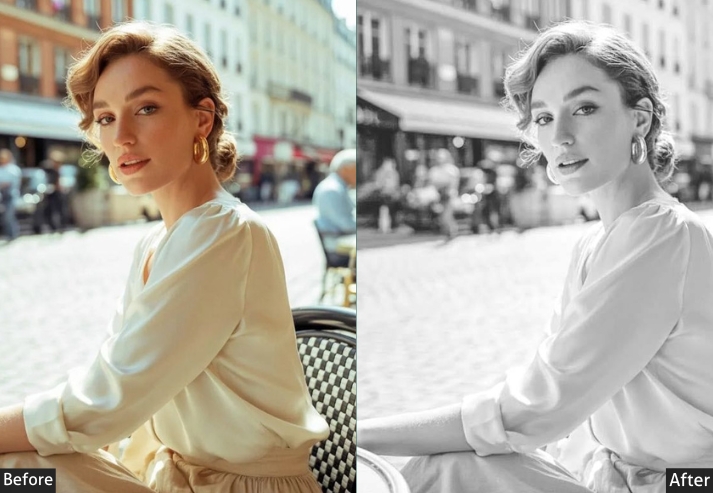
Light Panel: Exposure +0.2 to +0.5 (adjust for mood) | Contrast +20 to +40 (contrast is everything in B&W) | Highlights -20 to -40 | Shadows -10 to +20 (varies by style) | Whites +15 to +30 | Blacks -20 to -40. Tone Curve: Classic S-curve for contrast | Adjust for high-key or low-key look. B&W Mix: Red +20 to +40 (brightens skin tones) | Orange +30 to +50 (great for skin) | Yellow +20 to +40 (brightens foliage) | Blue -20 to -40 (dramatic dark skies) | Aqua -10 to -30. Effects Panel: Clarity +15 to +35 (adds punch) | Dehaze +10 to +25 | Grain +15 to +40 (film feel) | Vignette -10 to -25. Detail Panel: Sharpening +40 to +70 (B&W handles extra sharpening). Color Grading: Shadows slight blue (Hue 200-220 | Sat 5-15) | Highlights slight warm tones (Hue 30-40 | Sat 5-15).
Purpose: timeless images that focus on form, light, and emotion.
Best For: Street photography, portraits, architecture, documentary work, dramatic landscapes.
Usage: When color is a distraction, and you want pure, emotional impact.
Style: Classic, timeless, high-contrast, or low-contrast.
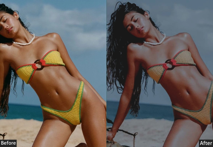
5. Vintage Classic Presets (The Influencer Starter Pack)
Vintage classic combines faded film aesthetics with modern Instagram-ready tones. The signature look: lifted blacks (never true black), desaturated colors, teal shadows, and warm highlights. This style is dominant in lifestyle Instagram feeds and works especially well for a consistent grid aesthetic.
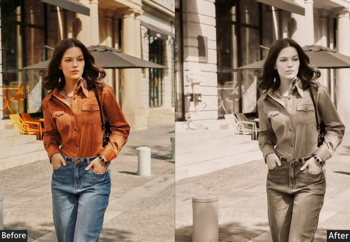
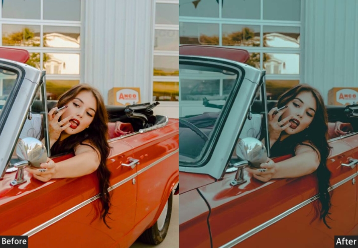
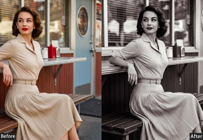
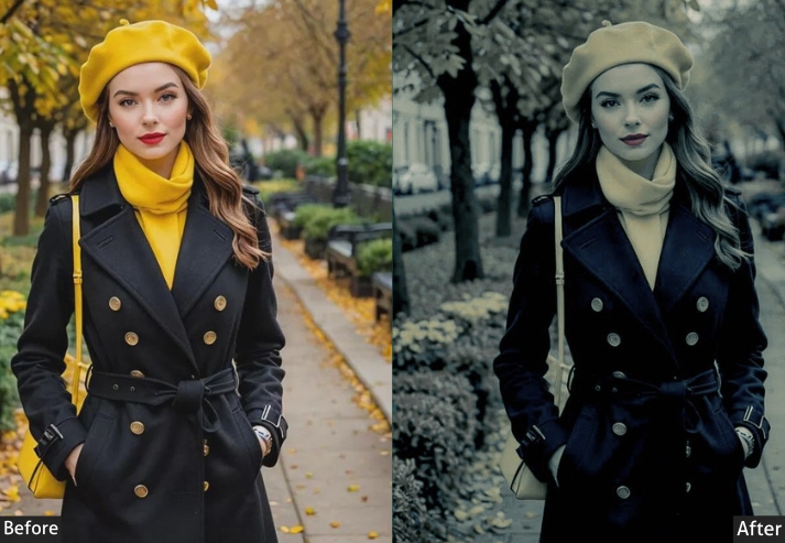
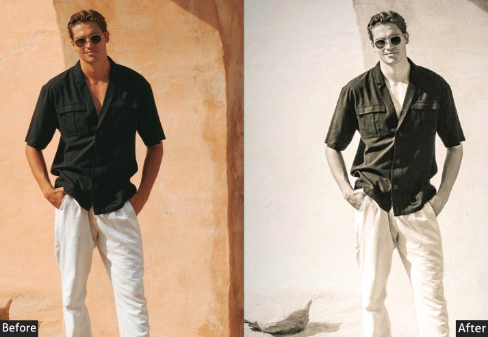
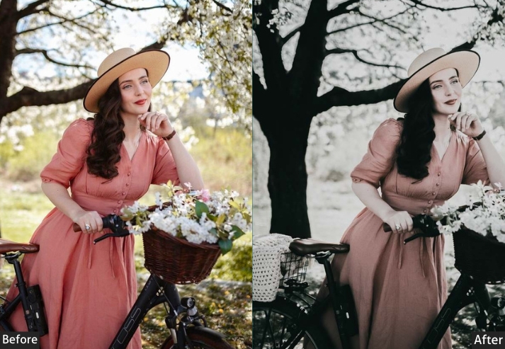
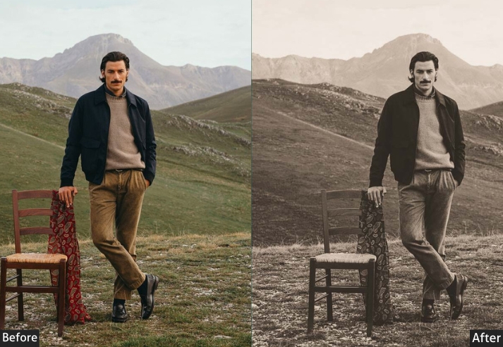
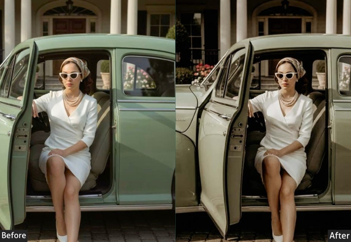
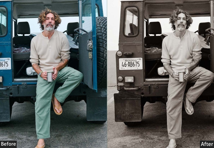
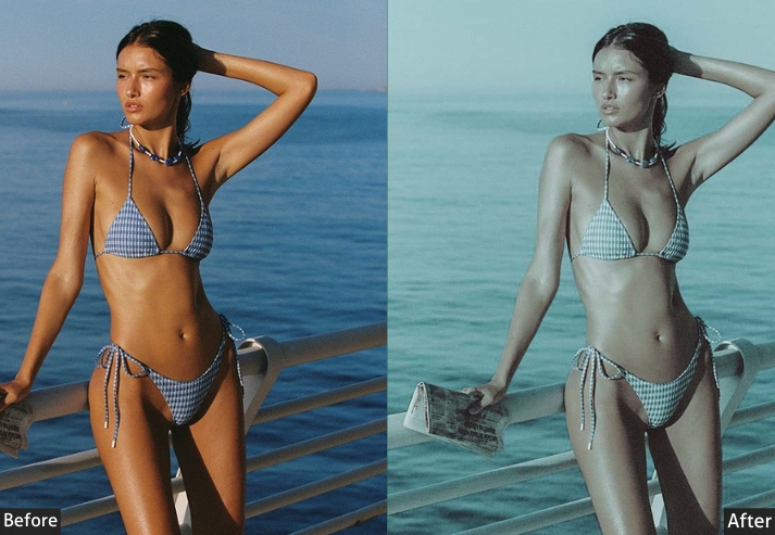
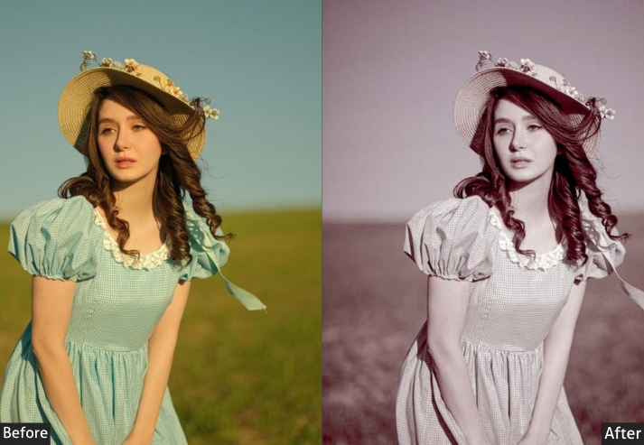
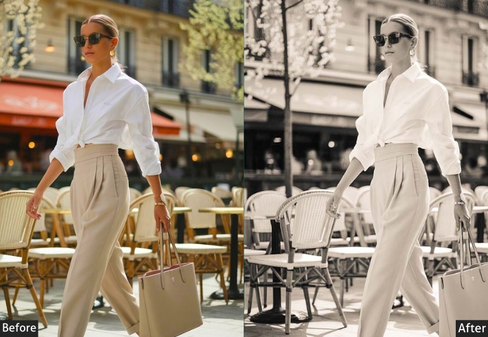
Light Panel: Exposure +0.3 to +0.5 | Contrast -15 to -25 | Highlights +15 to +30 | Shadows +30 to +50 | Whites +10 to +20 | Blacks +35 to +55 (major lifting). Tone Curve: Lift blacks substantially (faded look) | Slightly compressed highlights | Flatten overall curve for washed-out vibe. Color Panel: Temp +8 to +18 | Vibrance -15 to -30 | Saturation -10 to -25. HSL → Saturation: Overall desaturation of most colors | Orange +5 to +15 (retain skin tones) | Blue -20 to -40. Color Grading: Shadows teal/blue tones (Hue 180-210 | Sat 20-35) | Highlights warm peach/yellow (Hue 40-55 | Sat 15-25). Effects Panel: Clarity -10 to -20 | Dehaze -10 to -20 | Grain +20 to +40 | Vignette -15 to -25.
Purpose: trendy, washed-out Instagram aesthetic.
Best For: Lifestyle content, fashion, daily life documentation, and creating organized Instagram feeds.
Usage: When you want your photos to have that “I’m an influencer even if I have 47 followers” vibe.
Style: Faded, washed-out, lifted blacks, low contrast, trendy, and contemporary.
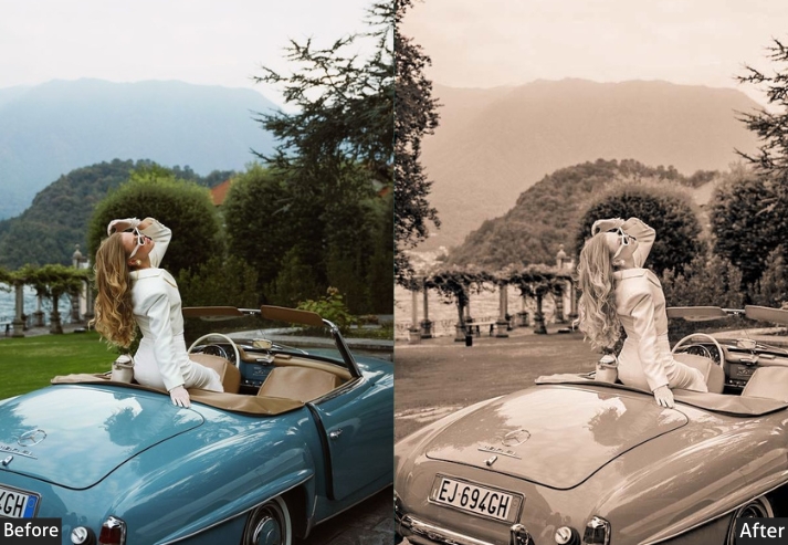
6. Golden Hour (Sepia) Presets
Golden hour presets bottle up that magical window when everything looks like it’s been dipped in honey without requiring you to actually be outside at 6 AM. These 3 presets warm the temperature, saturate the oranges and yellows, and add a soft glow that makes portraits look sun-kissed regardless of when the photo was taken.
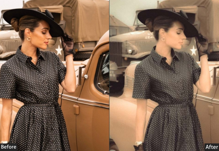
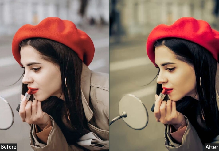
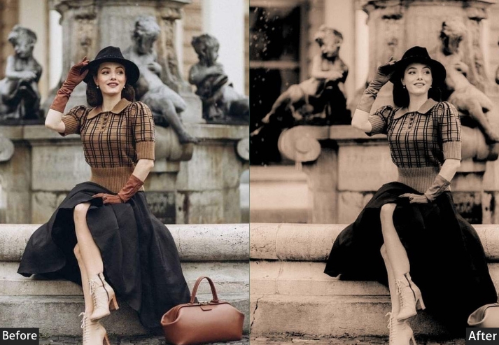
Light Panel: Exposure +0.3 to +0.6 (embrace the glow) | Contrast +10 to +20 | Highlights +10 to +25 (glowing highlights) | Shadows +10 to +30 (retain detail) | Whites +15 to +25 | Blacks -10 to -20. Color Panel: Temp +20 to +40 (strong warmth) | Tint +5 to +15 (magenta tones) | Vibrance +15 to +30 | Saturation +10 to +20. HSL → Saturation: Orange +30 to +50 | Yellow +20 to +40 | Red +15 to +30 | Blue -10 to -20 (mute cool tones). HSL → Luminance: Orange +10 to +20. Color Grading: Shadows warm purple/magenta (Hue 320-340 | Sat 20-35) | Midtones orange (Hue 30-45 | Sat 20-30) | Highlights yellow/orange (Hue 45-60 | Sat 25-40). Effects Panel: Clarity +5 to +15 | Dehaze -5 to -15 (atmospheric haze) | Vignette -10 to -20.
Purpose: make any time of day look like golden hour.
Best For: Portraits, travel photos, beach shots, and outdoor events.
Usage: When you want that Instagram-perfect warm glow that makes everyone look sun-kissed.
Style: Warm, glowing orange/yellow tones; soft, romantic, dreamy atmosphere.
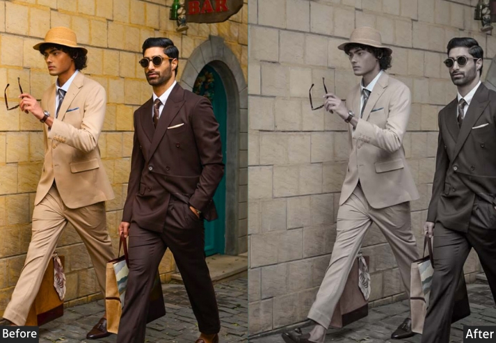
7. Dark & Moody Classic Presets (Look Brooding)
These dark and moody presets are built for editorial photography: strong contrast, textured clarity, rich color grading in the shadows, and deep vignetting. They’re popular with food photographers, fashion editorial shooters, and anyone producing content for magazine-quality output. Who said photography has to be bright and cheery? These presets make your photo look like it has deep thoughts about the meaning of life.
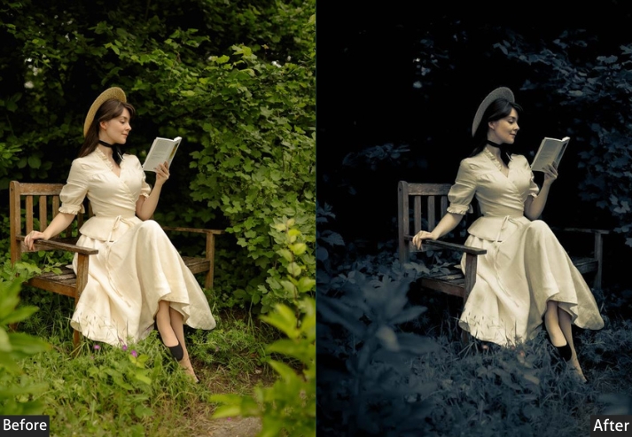
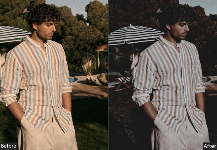
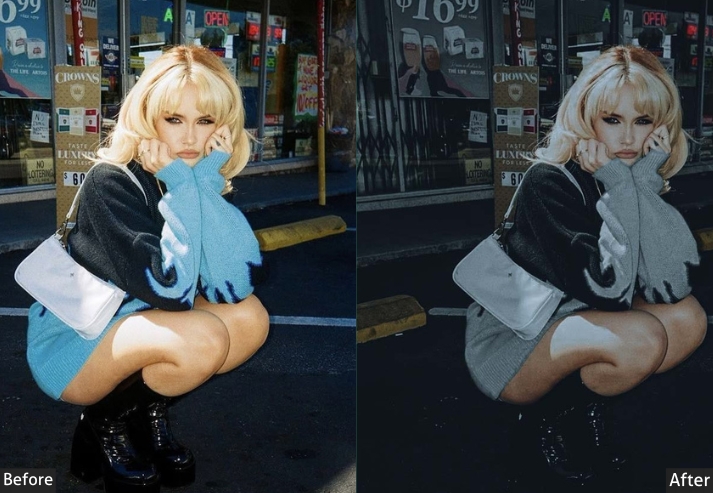
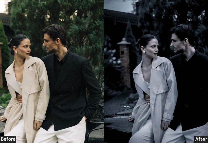
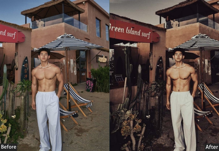
Light Panel: Exposure -0.2 to -0.5 (darker mood) | Contrast +25 to +40 | Highlights -30 to -50 (controlled brightness) | Shadows -25 to -40 (deep shadows) | Whites -10 to -20 | Blacks -35 to -55. Color Panel: Temp +5 to +15 (warm but not overly orange) | Vibrance +10 to +25 | Saturation +5 to +15. HSL → Saturation: Orange +20 to +35 (warm tones) | Red +15 to +30 | Yellow +10 to +25 | Green -5 to +10 (adjust to taste) | Blue slight desaturation. Color Grading: Shadows deep blue/teal (Hue 200-220 | Sat 25-40) | Midtones warm (Hue 30-45 | Sat 15-25) | Highlights warm yellow/orange (Hue 40-55 | Sat 20-30). Effects Panel: Clarity +15 to +30 (strong texture) | Dehaze +15 to +25 | Texture +10 to +25 (tactile look) | Vignette -20 to -35 (draw focus to subject). Detail Panel: Sharpening +40 to +60 (enhanced detail).
Purpose: make your photography look editorial.
Best For: blogs, photography, anything culinary that’s fancy.
Usage: When you want your photos to look like they belong in a magazine, not just Facebook.
Style: Dark, moody, dramatic lighting, rich colors, textured, and editorial quality.
Last Words
If you made it through all the presets, you deserve a medal. Or at least a cookie. Second, your mind is probably spinning with creative possibilities, and I am here for that energy! And when someone slides into your DMs asking, “What preset is that?” you can smile knowingly and say, “Oh, just something I tweaked…” Wink wink.
Happy editing! May your highlights never be blown out and your shadows always retain detail. Now stop reading and go make something beautiful!
More Free Presets For You:
Kodak Portra Lightroom Presets Free Download
Black And White Lightroom Presets Free Download
Vintage Lightroom Presets Download Free
Fujifilm Lightroom Presets Free Download