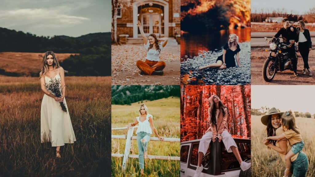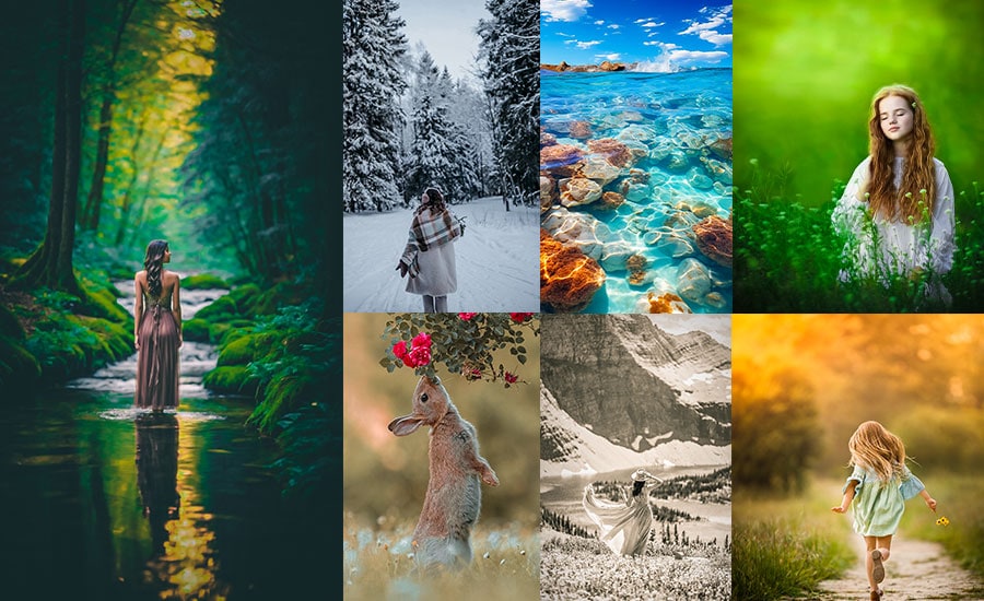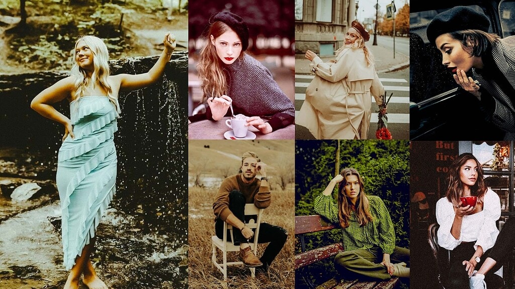
Kodak Portra is a family of professional color negative films introduced by Kodak in 1998, specifically engineered for portrait photography. Unlike consumer films, Portra was designed to render human skin naturally across all complexions: warm without going orange, detailed without looking harsh. It was briefly discontinued but brought back due to overwhelming demand, which says everything about how much photographers love it.
Shot since the 1990s by professional photographers worldwide, it produces warm, buttery skin tones, lifted shadows, and a fine organic grain that digital cameras simply cannot replicate. These presets reverse-engineer every major Portra variant from the versatile Portra 400 Classic to the gritty Portra 800 and the whisper-soft Portra 160, so you can apply that analog magic to any digital photo in one click.
There are three main variants, each with a distinct personality:
| Film Stock | ISO | Grain | Best For | Personality |
|---|---|---|---|---|
| Portra 160 | 160 | Ultra fine | Studio, window light | Soft, dreamy, delicate |
| Portra 400 | 400 | Fine | Everything – the all-rounder | Warm, lifted, organic |
| Portra 800 | 800 | Chunky, character-filled | Low light, concerts, events | Gritty, cinematic, moody |
Understanding these differences will help you choose the right preset for each photo throughout this guide.
Below you’ll find exact Lightroom slider settings, real-world use cases, and pro tips for each preset, drawn from 8+ years of hands-on experience in film and digital editing. Let’s get into it.

Pauline Jackson
I believe great editing shouldn’t be complicated. I develop Lightroom presets that help photographers and creators spend less time editing and more time capturing the moments that matter.
50 Kodak Portra Lightroom Presets Free Download
Portra was literally engineered for portrait photography. Kodak spent decades perfecting how it renders human skin: warm, natural, flattering across every complexion. No other film stock renders skin quite like Portra, and that alone is why photographers obsess over it. So naturally, everyone wants to replicate it digitally. Let’s create the analog magic!
1. Kodak Portra 400 Classic Film
The Kodak Portra 400 Classic is the foundation preset. The one that most closely emulates how real Portra 400 negative film renders a scene when scanned on a Frontier or Noritsu scanner. The three defining characteristics are: a +200K temperature warm push that shifts daylight toward golden, lifted shadows (+35) that replicate the way negative film holds shadow detail, and faded blacks (+20) that create the characteristic matte base fog of film. Together, these create what photographers call the “Portra glow” images that feel three-dimensional and warm without looking over-edited.
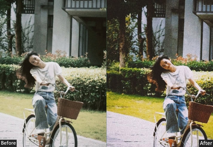
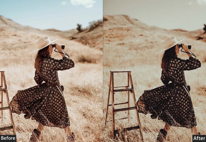
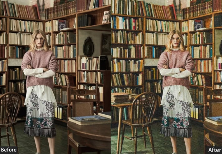
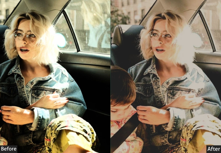
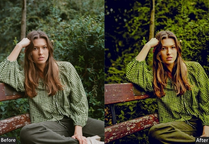
Light Panel: Exposure +0.45 | Contrast -15 | Highlights -30 | Shadows +35 | Whites +15 | Blacks +20
Color Panel: Temperature +200K warmer | Tint +8 (pink/magenta) | Vibrance +12 | Saturation -8
HSL / Color Mix: Red Hue +5 | Orange Saturation -10 | Orange Luminance +15 | Yellow Hue +8 | Blue Hue +10
Tone Curve: Highlights Point -10 (gentle lift) | Shadows Point +15 (faded blacks) | Darks Point +8
Effects Panel: Grain Amount +28 | Grain Size +32 | Grain Roughness +45 | Vignette -12
Detail Panel: Sharpening +35 | Luminance Noise Reduction +15 | Color Noise Reduction +25
Color Grading: Shadows Hue 200° Sat +12 | Highlights Hue 35° Sat +8
Purpose: Faithfully replicate the organic warmth, lifted blacks, and skin-friendly rendering of real Kodak Portra 400 film stock in a digital workflow.
Best For: Portraits · Lifestyle · Wedding · Street Photography · Everyday Shots · Golden Hour
Usage Tips: Start here when you’re not sure which Portra preset to use. This is the 80% solution. Fine-tune exposure +/- 0.2 based on your specific shot.
Style: Warm · Organic · Soft Contrast · Slightly Faded · Film Authentic.
⚡ Pro Tip: If skin tones look too orange, reduce Orange Saturation by an additional −5 to −8. This is the most common micro-adjustment needed when shooting with high-saturation camera profiles (common on Sony and Fujifilm bodies). For environmental portraits, push Clarity to +8. It adds depth to background textures without disturbing the signature film softness on skin.
2. Portra Moody Presets
Portra Moody takes the warm skin-tone foundation of Portra 400 and dramatically crushes the shadows (−40 to −60), mutes green saturation (−20), and shifts greens toward olive (−10 hue). The result is a striking contrast between warm, golden subjects and cool, earthy backgrounds, the look you see in editorial fashion and autumn lifestyle photography. This commands attention.
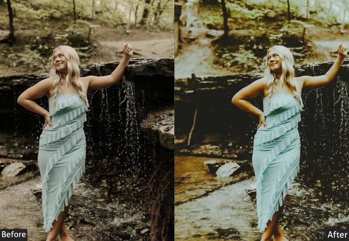
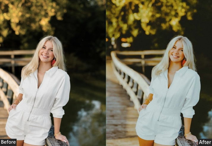
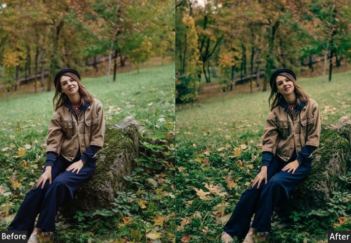
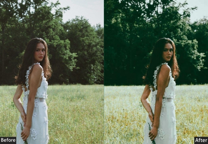
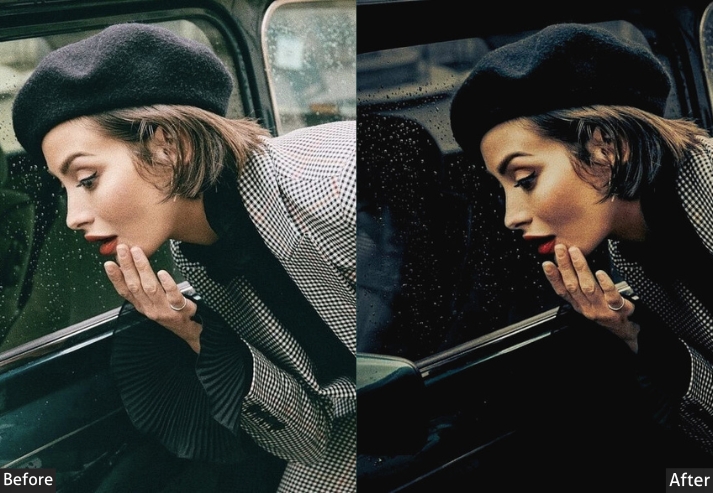
Light Panel: Exposure -0.20 to -0.40 | Shadows -40 to -60 (crushed) | Blacks -15 | Tone Curve: deep left-side drop (shadow-heavy curve.
Color Panel: Oranges +5 saturation (warm skin tones) | Reds +5 saturation | Greens Saturation -20 | Greens Hue -10 (olive shift) | Blues desaturated + darkened.
Effects Panel: Grain +30 (medium texture) | Radial Filter +0.3 Exposure on subject | Dehaze +5
Detail Panel: Sharpening 45 | High Masking (edge-only sharpening, protect shadows.
| Purpose | Best when a strong light source hits your subject, while the background falls into shadow. It’s all about the contrast between the warm subject and the cool darkness. |
| Best For | Fall portraits, golden hour sessions with backlight, cozy indoor shots, “sad girl autumn” vibes, couples in fields at sunset. |
| Usage | Best when a strong light source hits your subject, while the background falls into shadow. |
| Style | Dramatic, Earthy, Atmospheric, Deep, and slightly Melancholic. |
3. Portra 160 – Soft & Dreamy
Portra 160 was engineered for controlled lighting conditions where fine grain and accurate color reproduction matter above everything else. This preset faithfully replicates those characteristics: almost no visible grain (+12 amount), drastically reduced contrast (−25), and a subtle +100K temperature push that warms without saturating. The shadow lift (+45) and whites boost (+20) together create that signature “luminous” quality that makes newborn, maternity, and fine-art photographers choose Portra 160 over everything else.
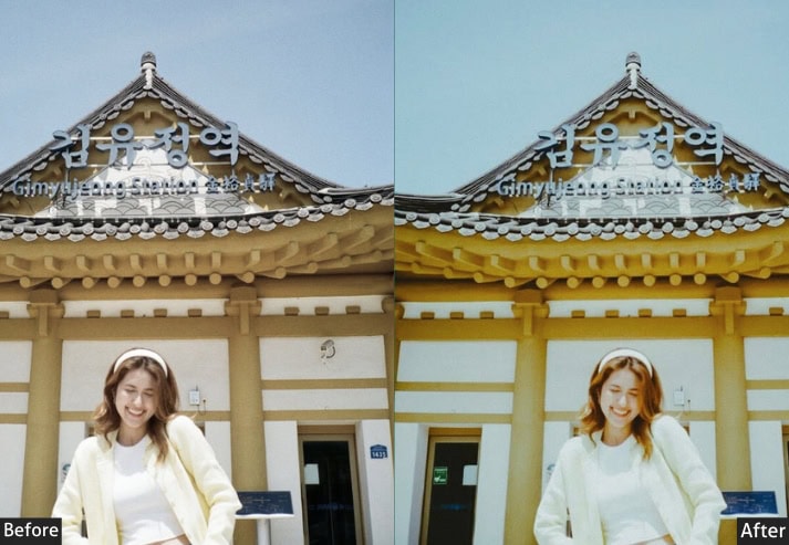
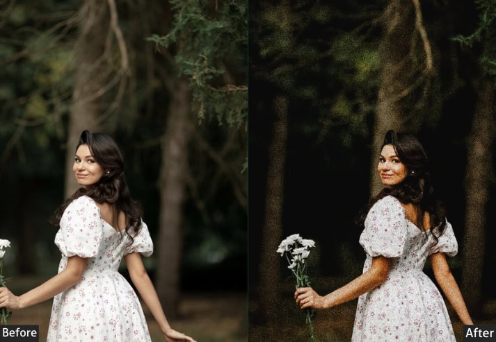
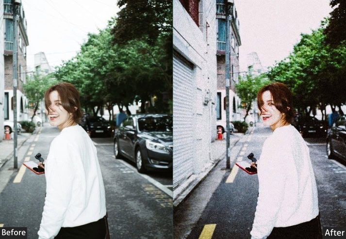
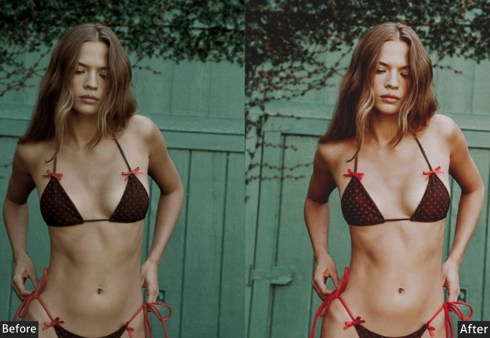
Light Panel: Exposure +0.60 | Contrast -25 | Highlights -45 | Shadows +45 | Whites +20 | Blacks +30.
Color Panel: Temperature +100K warmer | Tint +4 (light pink) | Vibrance +6 | Saturation -12
HSL / Color Mix: Red Hue +8 | Pink Saturation -5 | Green Hue +12 (lime shift) | Green Luminance +10 | Aqua Saturation -15.
Tone Curve: Subtle S-curve | Shadow Lift +20 | Highlight Pull -8.
Effects Panel: Grain Amount +12 | Grain Size +22 | Vignette -8 | Dehaze 0.
Color Grading: Shadows Hue 210° Sat +8 | Midtones Hue 30° Sat +5 | Highlights Hue 50° (soft gold.
Purpose: Simulate Kodak Portra 160’s exceptionally fine grain, muted palette, and luminous softness. Built for scenes where delicacy is the message: love, newborns, soft morning light, botanical photography.
Best For: Newborn / Family · Floral / Nature · Boudoir · Fine Art · Engagement Sessions · Overcast Outdoors.
Usage Tips: This preset absolutely shines on overcast days and soft window light. If your image was shot in harsh sunlight, pull the Highlights down by an extra -20.
Style: Airy · Muted · Fine-grained · Luminous · Delicate · Romantic.
⚡ Pro Tip: This preset shines brightest under an overcast sky or soft window light. In harsh sunlight, pull Highlights down an additional −20. Pair with a Radial Filter on the face (Exposure +0.2, Clarity −10) for a gentle, Rembrandt-style focus on the subject.
4. Portra 800 – Grain & Grit
In real life, Portra 800 was the go-to film for concert photographers, photojournalists, and anyone shooting in bars, basements, or dimly lit reception halls. This preset captures that energy: heavy, character-filled grain (+55 amount, +48 size), a blue-green cast in the shadows (pushed via the Blue channel tone curve trick at +12 in shadows), and an orange-teal split that feels genuinely cinematic.
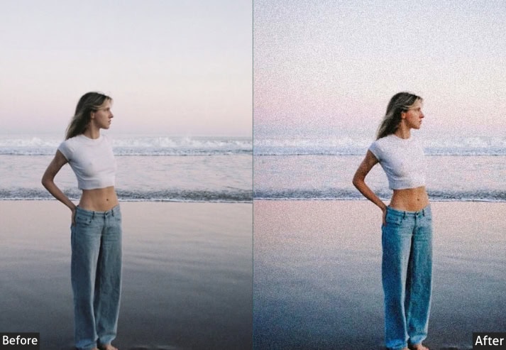
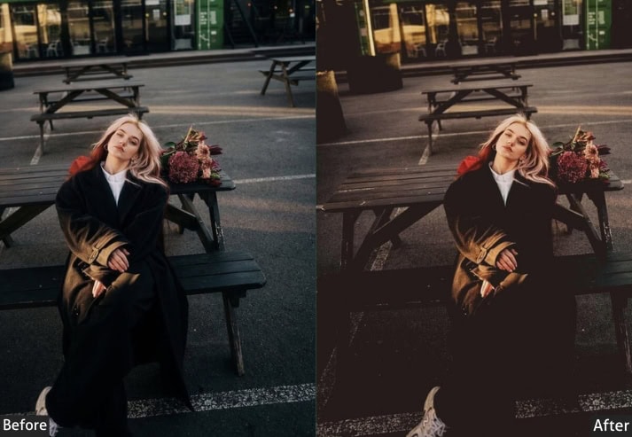
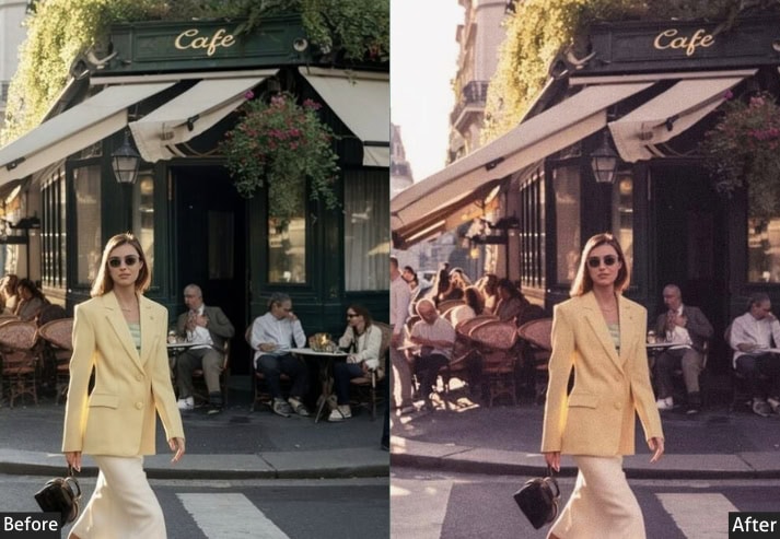
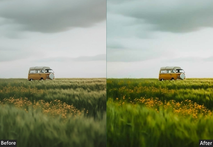
Light Panel: Exposure +0.20 | Contrast +10 | Highlights -20 | Shadows +20 | Whites +5 | Blacks -15.
Color Panel: Temperature +150K warmer | Tint -5 (toward green) | Vibrance +18 | Saturation -5.
HSL / Color Mix: Orange Saturation +15 | Blue Hue +15 (teal shift) | Blue Luminance -10 | Aqua Saturation +10.
Tone Curve: Shadow Lift +10 | Highlights Point -15 | Blue Channel Shadows +12 (blue-shadow effect).
Effects Panel: Grain Amount +55 | Grain Size +48 | Grain Roughness +65 | Vignette -20.
Detail Panel: Sharpening +25 | Luminance Noise Reduction +20 | Color Noise Reduction +30.
Color Grading: Shadows Hue 215° Sat +20 | Highlights Hue 30° Sat +15.
Purpose: Recreate the pushed-film look of Portra 800: heavy characterful grain, orange/teal contrast split, and that distinctive low-light gritty quality that makes photos feel genuinely shot on film at high ISOs.
Best For: Night Portraits · Concerts / Events · Street at Night · Indoor Parties · Documentary.
Usage Tips: This preset performs best on photos shot at ISO 800–3200. For very dark shots, bump Shadows up by +10 from the base settings.
Style: Gritty · Contrasty · Blue-Shadow Tones · Heavy Grain · Cinematic Energy.
⚡ Pro Tip: The heavy grain is intentional. fight the urge to reduce it. For very dark shots, raise Shadows by +10 from the base settings. For concert photography, add a Linear Gradient to the upper third at +0.15 Exposure to make the stage lighting stand out against the dark crowd.
5. Portra Warm Fade
The defining move of the Warm Fade preset is a +400K temperature push combined with a massive shadow lift (+50) and a blacks lift (+40). Together, these create a warm, faded matte that makes deep tones look amber rather than black, exactly what you see on aged Kodak prints from the 1980s. The Saturation pull (−18) and reduced Vibrance (+5) ensure the warmth feels nostalgic rather than oversaturated.
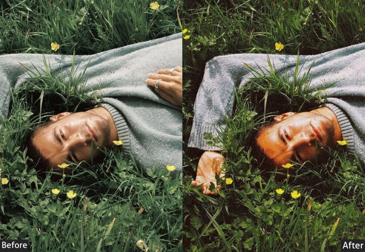
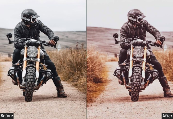
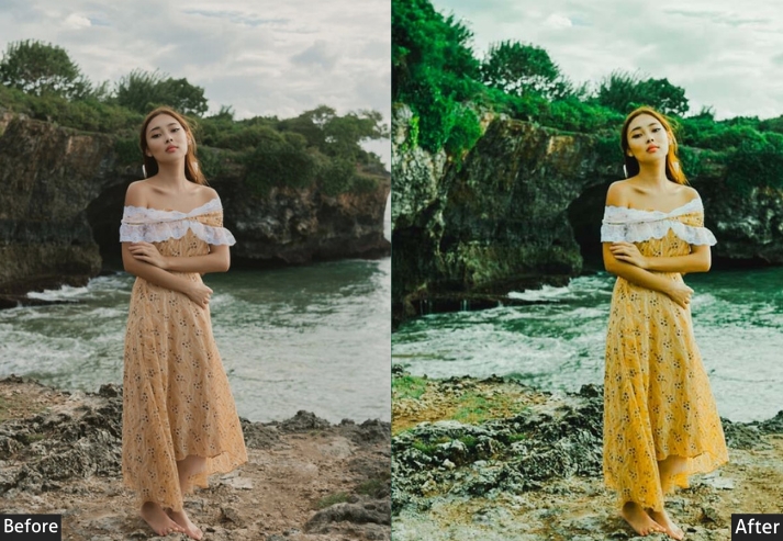
Light Panel: Exposure +0.30 | Contrast -30 | Highlights -25 | Shadows +50 | Whites +10 | Blacks +40.
Color Panel: Temperature +400K warmer | Tint +10 (pink/magenta) | Vibrance +5 | Saturation -18.
HSL / Color Mix: Yellow Hue +15 | Orange Luminance +20 | Green Saturation -20 | Blue Saturation -25 | Aqua Hue +10.
Tone Curve: Shadows anchor lift +25 (fade effect) | Darks +12 | Lights -5 | Red Channel Shadows +8.
Effects Panel: Grain Amount +22 | Grain Size +28 | Vignette -15 | Vignette Midpoint +65.
Color Grading: Shadows Hue 35° Sat +20 | Highlights Hue 45° Sat +12.
Purpose: Create that time-capsule feeling: warm amber tones, faded contrast, and lifted shadows that make photos feel like beautiful, sun-kissed memories from a disposable camera you found in a drawer.
Best For: Travel Photos · Lifestyle · Instagram Feed · Boho Weddings · Autumn Shoots · Desert Landscapes.
Usage Tips: Great for naturally lit daytime photos. Be careful with cool-toned scenes (overcast sky, blue water) as the warmth can look unnatural. In those cases, reduce the Temp push by half. Works like a charm on autumn foliage!
Style: Warm Honey · Faded Matte · Amber-Washed · Nostalgic · Retro-Modern.
⚡ Pro Tip: Be careful with cool-toned scenes (overcast sky, blue water). The aggressive temperature push can look unnatural. Reduce the Temp by half for those situations. For autumn foliage, this preset is unmatched. apply to the entire session with identical settings for magazine-level feed consistency.
6. Portra Golden Hour Glow
This preset amplifies and stylizes the magic-hour quality in outdoor photos, making warm sunlight richer and shadows more romantically tinted. The signature move is the Color Grading split: Shadows at 310° (purple-rose) and Highlights at 38° (golden amber). This orange-purple complementary split is exactly what cinematographers use in high-budget productions to make outdoor scenes feel epic. Combined with a +600K temperature push and boosted Orange and Red saturation, this preset makes already beautiful light look impossibly good.
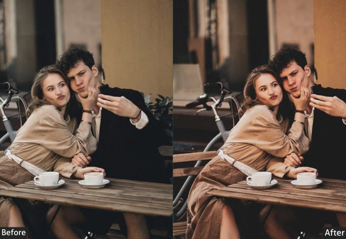
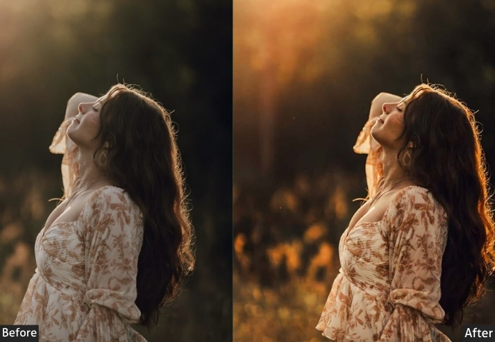
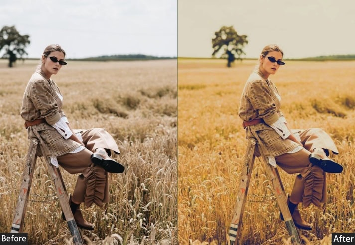
Light Panel: Exposure +0.50 | Contrast +5 | Highlights -40 | Shadows +25 | Whites +25 | Blacks -5.
Color Panel: Temperature +600K warmer | Tint +15 (magenta) | Vibrance +28 | Saturation +5.
HSL / Color Mix: Red Saturation +20 | Orange Saturation +25 | Yellow Saturation +15 | Purple Saturation +10 | Blue Hue +8 | Magenta Hue +12.
Tone Curve: Highlights -12 | Lights +8 | Red Channel Highlights +10 | Blue Channel Shadows -8.
Effects Panel: Grain Amount +20 | Grain Size +25 | Vignette -18 | Dehaze -5.
Color Grading: Shadows Hue 310° Sat +25 | Highlights Hue 38° Sat +22.
Purpose: Amplify and stylize the magic-hour quality in outdoor photos, making warm sunlight richer, shadows more romantically colored, and the overall palette feel like an actual golden-hour shoot, even when it wasn’t quite one.
Best For: Sunset Portraits · Elopements · Beach Shoots · Outdoor Fashion · Travel · Summer Sessions.
Usage Tips: This preset thrives on photos taken outdoors between 4–7 pm. It’s generous with saturation, so if an image already had strong colors, pull Vibrance back by -8. The magenta-shadow/gold-highlight split is the signature move – protect it!
Style: Rich Golden · Magenta Shadows · Cinematic Warmth · Romantic · High Saturation.
⚡ Pro Tip: If skin tones become oversaturated after applying, use the Targeted Adjustment Tool in HSL to select the skin and raise Orange Luminance by +5. This slightly brightens skin without touching the saturated background, preserving the golden-hour effect where it matters most.
7. Portra Matte Cinematic
This is the sophisticated, deliberate preset. The Matte Cinematic look is built on three pillars: a shadow floor lift of +30 in the tone curve (the “matte” foundation), a globally desaturated palette (−20 Saturation, −10 Saturation across all HSL channels), and a teal-orange Color Grading split borrowed directly from Hollywood color-grading pipelines. It’s restrained where everything else is expressive, and that restraint is exactly what makes it feel cinematic rather than filtered.
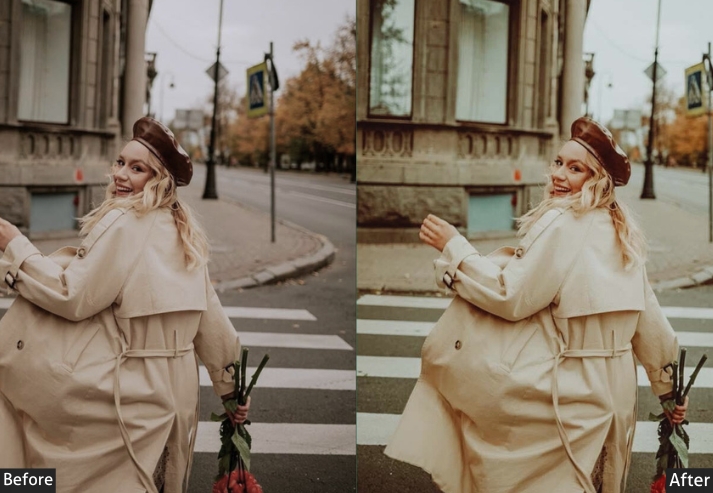
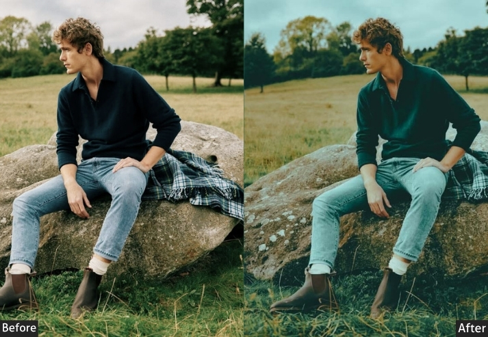
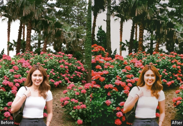
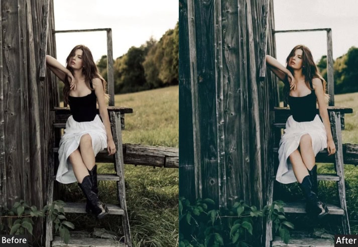
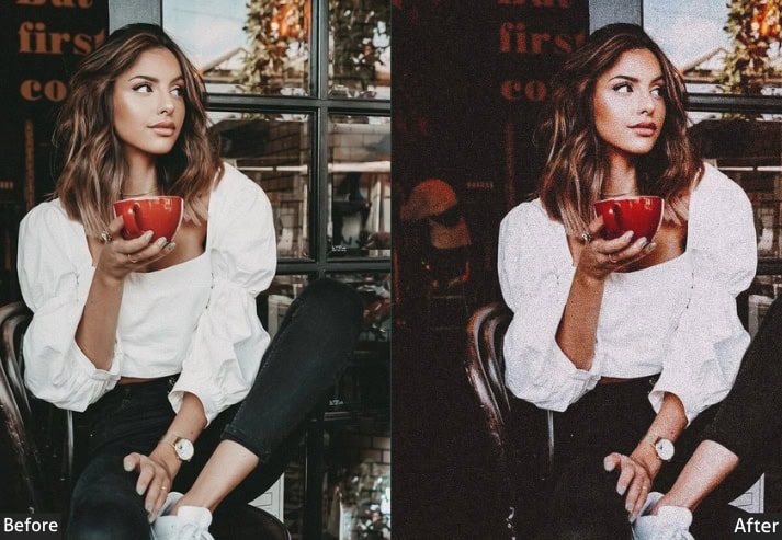
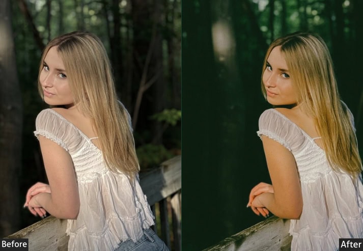
Light Panel: Exposure +0.15 | Contrast -35 | Highlights -50 | Shadows +40 | Whites -10 | Blacks +35.
Color Panel: Temperature +250K warmer | Tint +5 | Vibrance -5 | Saturation -20.
HSL / Color Mix: All Saturation channels -10 | Orange Luminance +10 | Green Saturation -30 | Blue Saturation -20.
Tone Curve: Shadow Floor Lift +30 (matte look) | Highlights Ceiling -10 | Midtones -5 | Green Channel +5.
Effects Panel: Grain Amount +35 | Grain Size +40 | Grain Roughness +55 | Vignette -25 | Vignette Roundness -30.
Color Grading: Shadows Hue 195° Sat +15 | Highlights Hue 42° Sat +10 | Balance -15.
Purpose: Create a deliberate, desaturated matte finish with heavy shadow lift that mimics the way high-end film cinematographers process footage: constrained, intentional color palettes that elevate storytelling over spectacle.
Best For: Editorial · Cinematic Portraits · Storytelling Photography · Documentary · Moody Landscapes · Fine Art.
Usage Tips: Clarity at 0 is ideal here: any higher and you break the matte softness. The slightly rectangular vignette evokes an anamorphic film look. Don’t fight it! Works beautifully on both colorful and near-monochrome compositions.
Style: Matte · Teal-Orange Cinematic · Decontrasted · Intentional · Film-Still Quality.
⚡ Pro Tip: Keep Clarity at 0, raising it breaks the matte softness this preset depends on. The slightly rectangular vignette setting (Roundness at −30) evokes an anamorphic lens look. don’t fight it. This preset works on both colorful and near-monochrome compositions.
8. Portra Airy & Bright
Not every photo needs to be moody. The Airy & Bright preset strips back heaviness while keeping the organic Portra warmth and skin-tone quality. The large Exposure push (+0.70) is balanced by pulling Highlights way down (−55) and lifting Shadows significantly (+55), which creates that “bright but not blown” quality you see in lifestyle blogging and product photography. Orange Luminance at +20 ensures skin stays naturally bright rather than chalky.
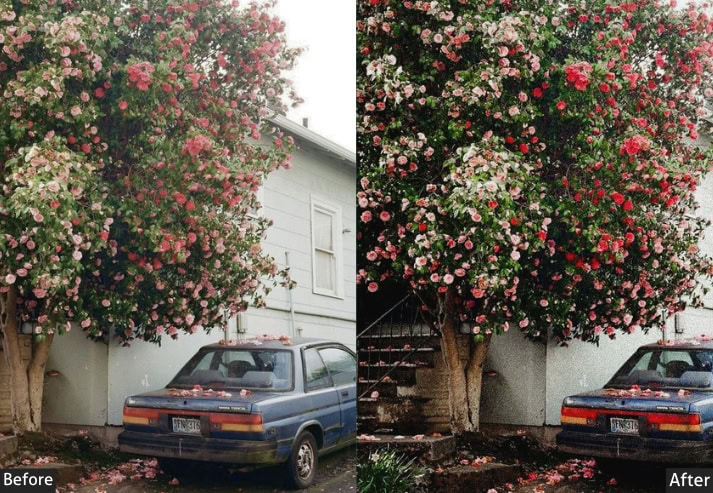
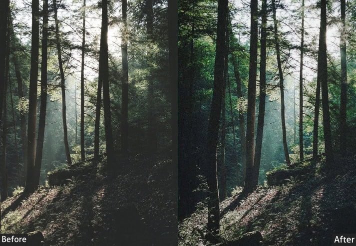
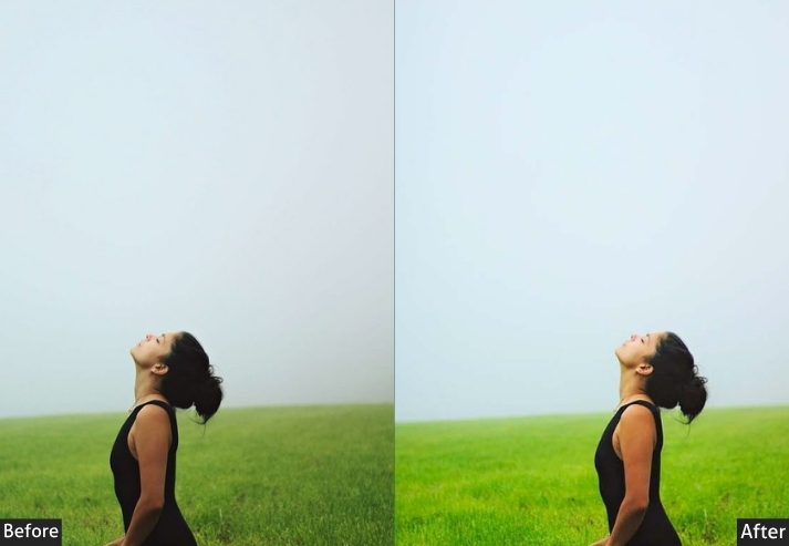
Light Panel: Exposure +0.70 | Contrast -20 | Highlights -55 | Shadows +55 | Whites +30 | Blacks +25.
Color Panel: Temperature +50K warmer | Tint +3 | Vibrance +8 | Saturation -10.
HSL / Color Mix: Orange Luminance +20 | Yellow Luminance +15 | Blue Hue +5 | Aqua Saturation -10 | Green Luminance +10.
Tone Curve: Gentle S-Curve | Lights Point +10 | Shadow Lift +18.
Effects Panel: Grain Amount +14 | Grain Size +20 | Vignette -5 | Clarity -5.
Detail Panel: Sharpening +40 | Masking +60 | Luminance Noise Reduction +10.
Purpose: Maximize brightness and airiness while preserving the Portra film signature so your photos feel energetic and clean rather than heavy or over-edited. A neutral-warm preset that works on basically everything.
Best For: Lifestyle Blogging · Product Photography · Bright Interiors · Baby Photos · Spring / Summer Shoots · Social Media Content.
Usage Tips: Be cautious with already-overexposed images. This significantly pushes Exposure, so start with a well-metered base. Pairs amazingly with white or neutral backgrounds.
Style: Clean · Bright · Light Matte · Fresh · Minimal Film Look.
⚡ Pro Tip: Be cautious with already overexposed images. This preset significantly increases Exposure. For product photography, raise Clarity to +10 and Texture to +15 after applying to get crisp edge definition on packaging while keeping the warm, clean background.
9. Portra Vintage Nostalgia
The most technically complex preset in this collection. Vintage Nostalgia simulates aged Kodak slide film through three simultaneous mechanisms: color channel hue shifts (Reds pushed toward orange, Blues toward teal, Greens toward yellow-green) that mimic the way chemical dyes fade differently over decades; a heavy shadow floor lift of +35 in the tone curve that replicates base fog on old negatives; and heavy, rough grain (+45 amount, +70 roughness) that looks genuinely analog rather than digitally added. The result truly looks like it was shot on a 1978 roll of Kodachrome found in a shoebox.
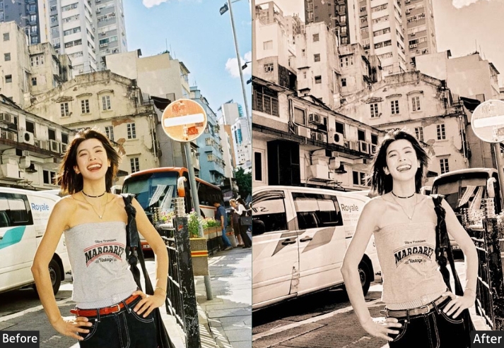
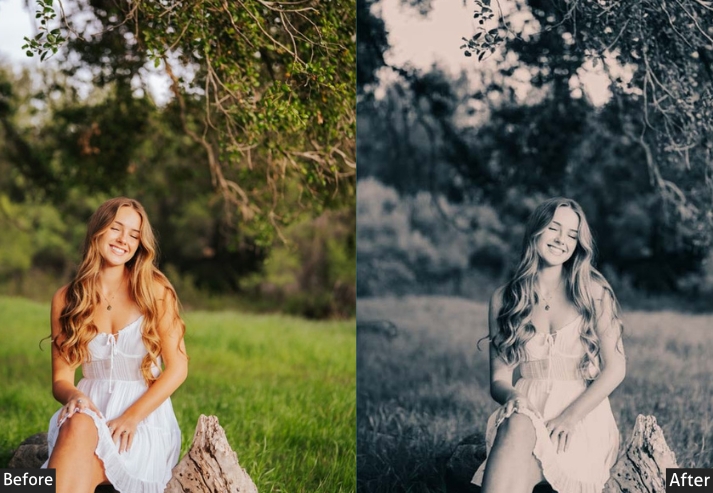
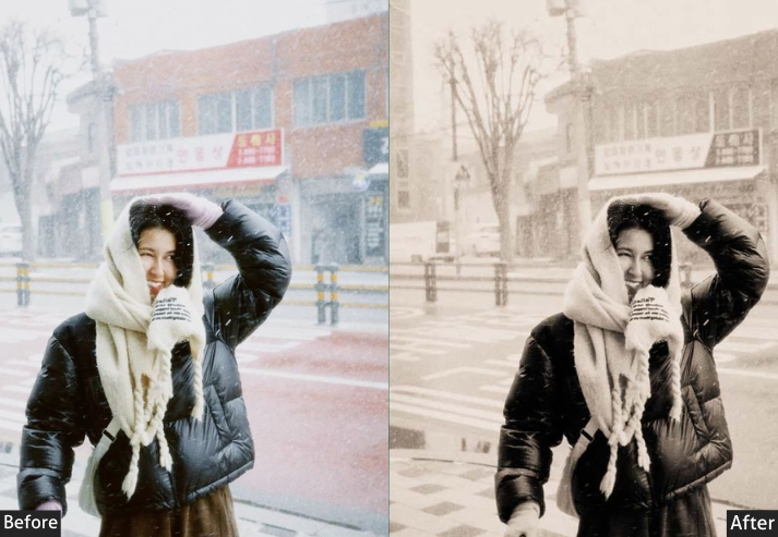
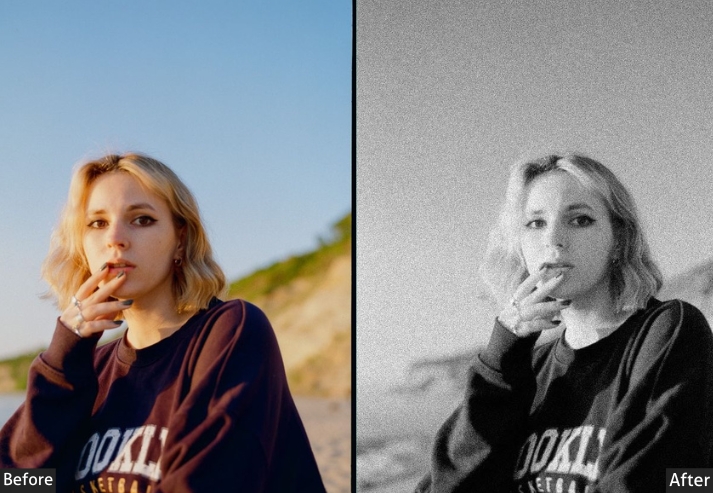
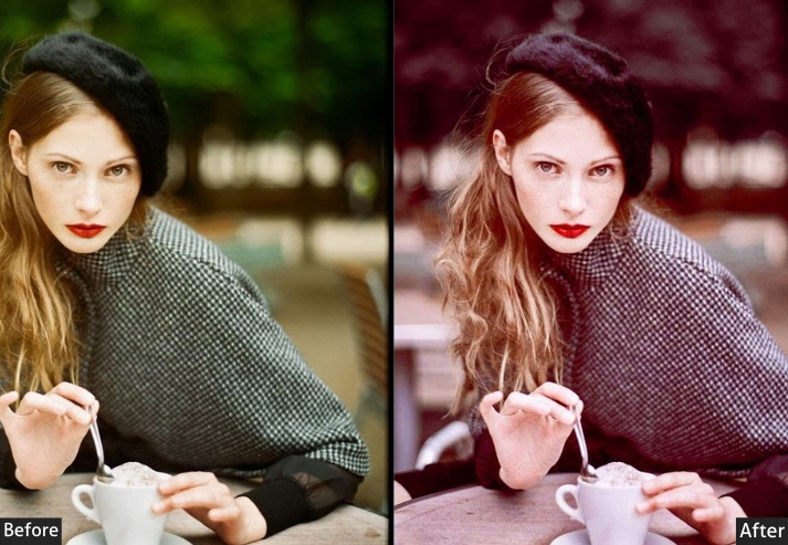
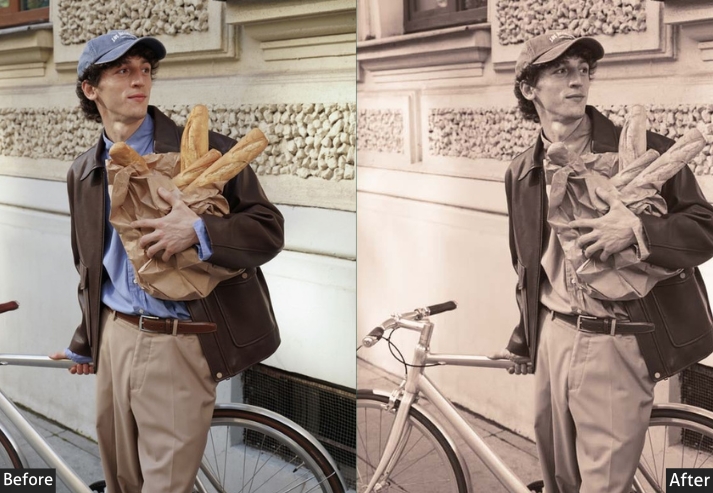
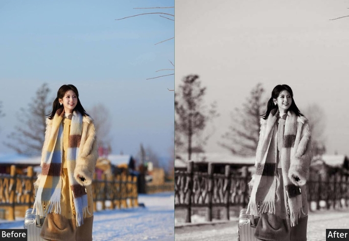
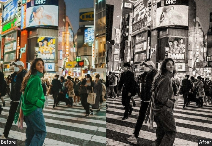
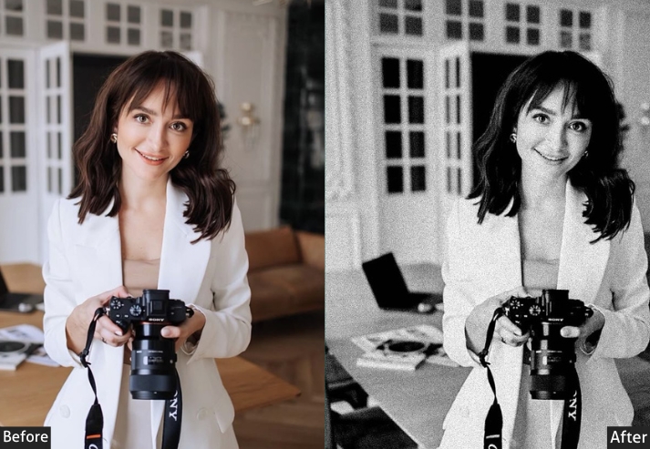
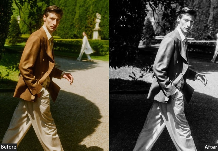
Light Panel: Exposure +0.10 | Contrast -20 | Highlights -20 | Shadows +45 | Whites -15 | Blacks +45.
Color Panel: Temperature +350K warmer | Tint +12 (magenta) | Vibrance -10 | Saturation -22.
HSL / Color Mix: Red Hue +12 | Orange Hue +8 | Yellow Hue +10 | Green Hue +20 | Blue Hue +18 | Purple Saturation -20 | Aqua Saturation -15.
Tone Curve: Shadow Floor Lift +35 (film base fog) | Highlight Ceiling -8 | Red Channel +12 | Blue Channel Highlights -10 | Green Channel Midtones +5.
Effects Panel: Grain Amount +45 | Grain Size +42 | Grain Roughness +70 | Vignette -22 | Vignette Feather +70.
Color Grading: Shadows Hue 30° Sat +22 | Midtones Hue 320° Sat +8 | Highlights Hue 40° Sat +15.
Purpose: Recreate the look of aged Kodak slide film – shifted color channels mimicking dye fading, heavy shadow fog resembling base fogging, and overall desaturation that gives photos that wonderfully imperfect, time-worn quality.
Best For: Anniversary Photos · Family Memory Albums · Travel Journals · Bohemian Weddings · Artistic Portraits · Summer Reunions.
Usage Tips: The Blacks +45 is the key “film base fog” ingredient. Don’t reduce it much, or you lose the vintage effect. This preset actually looks better on slightly imperfect, casually composed photos.
Style: Faded Vintage · Base-Fog Warmth · Shifted Dye Colors · Nostalgic · Time-Worn.
⚡ Pro Tip: Do not reduce the Blacks (+45). It’s the key “film base fog” ingredient. This preset actually improves with slightly imperfect or casually composed photos. Pair with a film-border overlay after export for results that are genuinely indistinguishable from real scanned film.
Last Words
Film photography, whether analog or emulated through Lightroom presets, has always been about a certain kind of imperfection. The best Kodak Portra film emulation presets aren’t the most technically accurate ones. They’re the ones that make you feel something. The ones that make you linger on a photograph.
Don’t chase perfect settings. Chase feeling. That’s where all the great photos live.
If you try any of these presets, share your results in the comments below. Before/after comparisons are especially welcome.
More Free Presets For You:
Fujifilm Lightroom Presets Free Download
Retro Lightroom Presets Free Download
Classic Lightroom Presets Free Download
Black And White Lightroom Presets Free Download