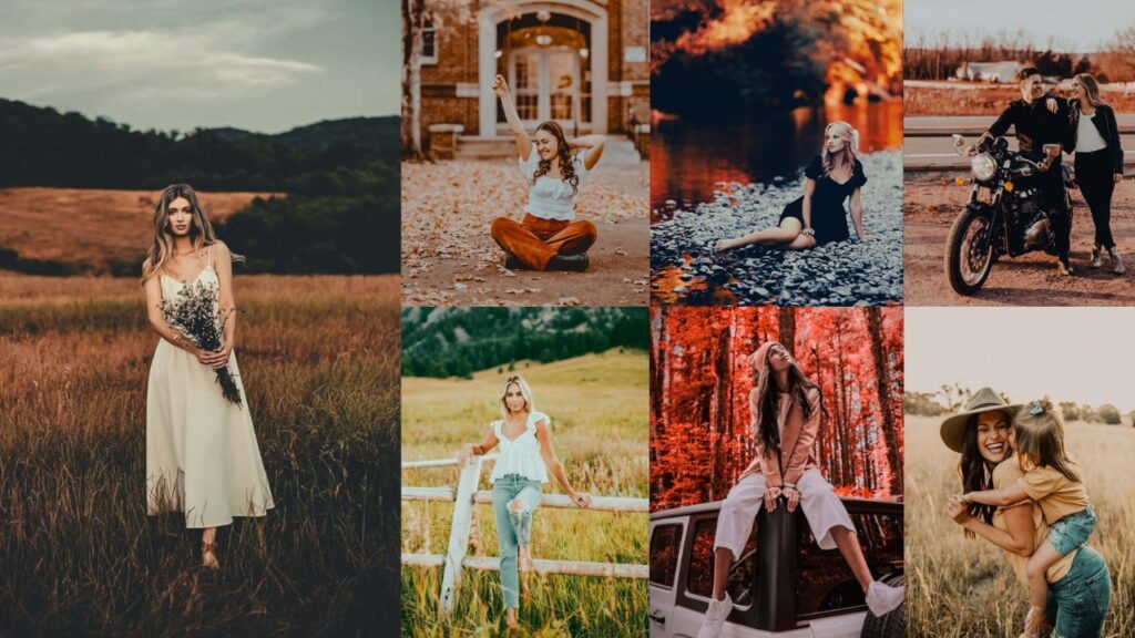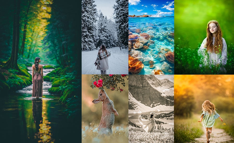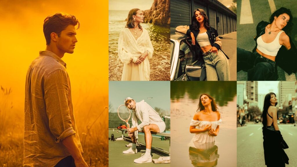
Warm presets are one-click editing profiles that shift your photo’s color temperature toward golden, amber, orange, and honey tones, replicating the look of golden hour sunlight, candlelight, or cozy indoor lighting. They work by adjusting a combination of White Balance (Temperature & Tint), HSL sliders, Tone Curve, and Split Toning simultaneously.
There’s a reason warm-toned photos perform better on Instagram and Pinterest: warm colors (reds, oranges, yellows) trigger the brain’s release of serotonin and dopamine. They make viewers feel comfortable, nostalgic, and connected, which means more saves, shares, and profile visits for you.
- 📸 Portraits: Warm presets make skin glow and look healthy and sun-kissed.
- 🌄 Landscapes: Enhance golden hour light and autumn colors.
- 💒 Weddings: Add romantic, timeless warmth to ceremony and reception shots.
- ☕ Lifestyle & Food: Create a cozy, inviting atmosphere.
I’m talking about transforming your flat, lifeless photos into images that make people stop scrolling. You know, the kind that gets comments like “OMG, where is this?!” or “You need to teach me your editing secrets!”
✅ I AM going to:
- Break down the EXACT slider movements for each preset type.
- Explain when to use each style.
- Share real stories and screw-ups from my own editing journey.
- Make you laugh while you learn.
Whether you’re:
- 📸 A beginner who just figured out what ISO means.
- 🎨 An enthusiast is tired of your photos looking flat and boring.
- 💼 A pro looking to speed up your workflow.
- 🌟 An Insta-obsessed creative chasing that aesthetic.
…this guide is about to become your new best friend!
Pauline Jackson
I create presets that fix lighting, balance colors, and improve tones in seconds so photographers can spend less time editing and more time shooting. My goal is to deliver clean, natural results that work across different styles, cameras, and lighting conditions.
50 Warm Lightroom Presets Free Download
Warm colors trigger the release of serotonin and dopamine (the happy chemicals!). When people see warm-toned photos, they literally feel:
- More comfortable.
- More trusting.
- More nostalgic.
- More connected.
- More likely to engage (hello, likes and shares!).
🎨 Color Theory Magic
- Warm colors (reds, oranges, yellows) visually advance toward us.
- They grab attention faster than cool colors.
- They create emotional intimacy.
- They make subjects feel closer and more personal.
In this guide, you’ll get:
- downloadable in XMP & DNG.
- Exact Lightroom slider settings for every preset style.
- A quick-reference table to find the right preset for your photo.
- Tips on when and how to use each style.
Let’s get those photos GLOWING!
| Preset Name | Best Photo Type | Mood / Style | Skin Tone Friendly? |
|---|---|---|---|
| Moody Autumn Embrace | Landscapes, fall scenes | Rich, earthy, dimensional | Yes |
| Sun Warm Blush | Romantic portraits, weddings | Soft, ethereal, rosy | Yes (fair skin) |
| Caramel Matte | Fashion, editorial | Cinematic, matte, sophisticated | Yes |
| Dark Warm | Urban, nighttime, artistic | Moody, dramatic, dark | Dark-skin tones best |
| Classic Warm | Everything – all-purpose | Timeless, balanced, flattering | All skin tones |
| Cinnamon Spice | Autumn, food, cozy lifestyle | Cozy, spiced, nostalgic | Yes (warm skin tones) |
| Honey Light Portraits | Portraits, headshots, families | Professional, honey glow | Best for portraits |
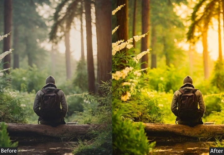
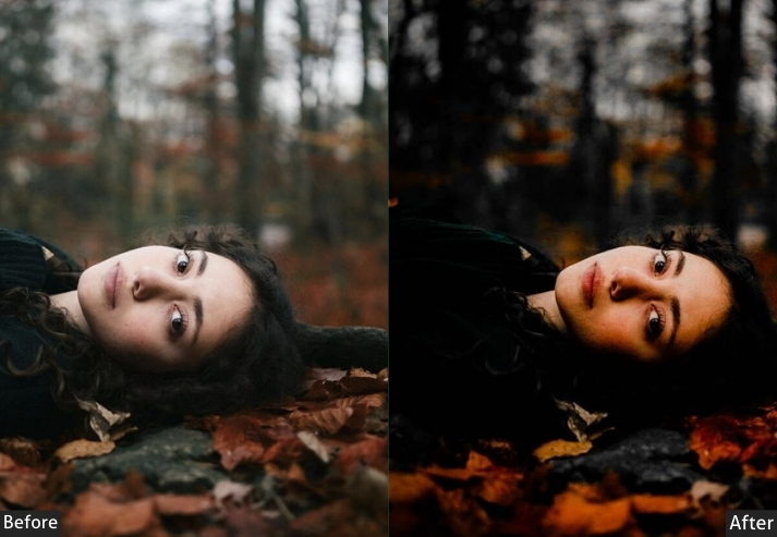
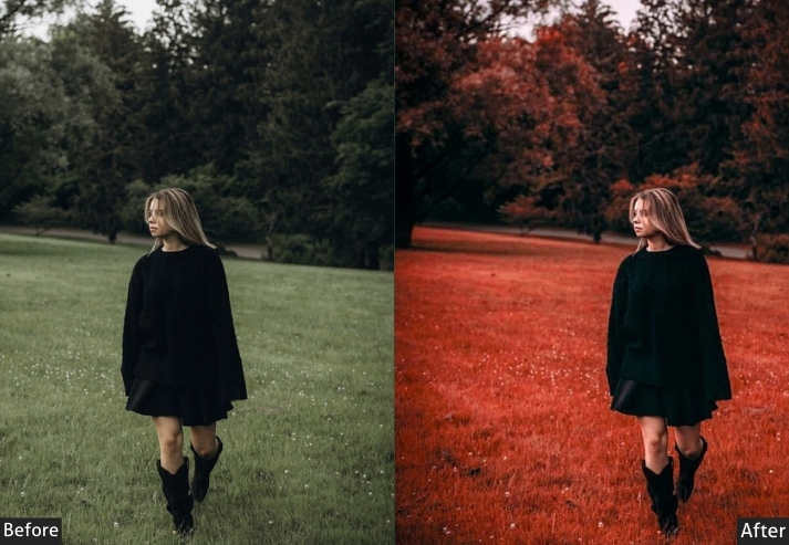
1. Moody Autumn Embrace
Fall is that one friend who shows up looking effortlessly gorgeous. This preset captures all those rich browns, burnt oranges, and deep golden tones that make autumn the photographer’s favorite season. Even summer photos get a cozy sweater vibe with this bad boy!
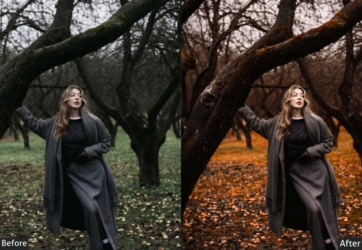
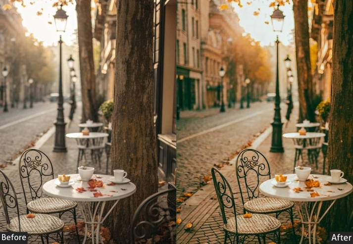
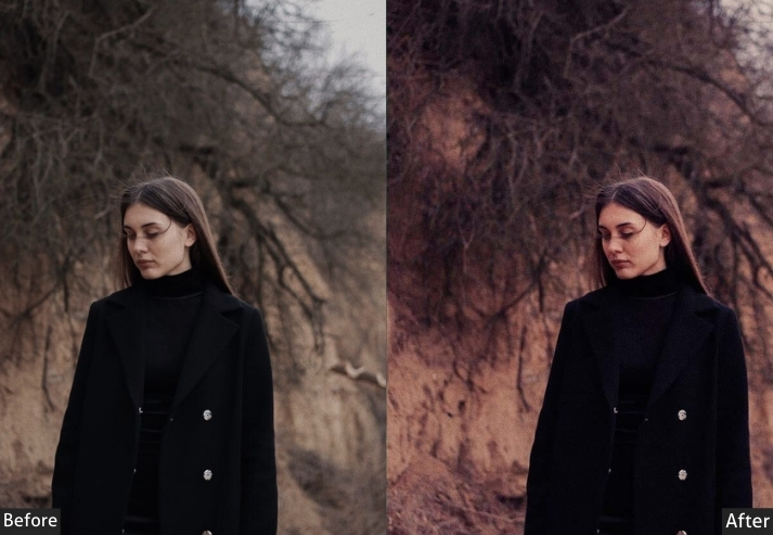
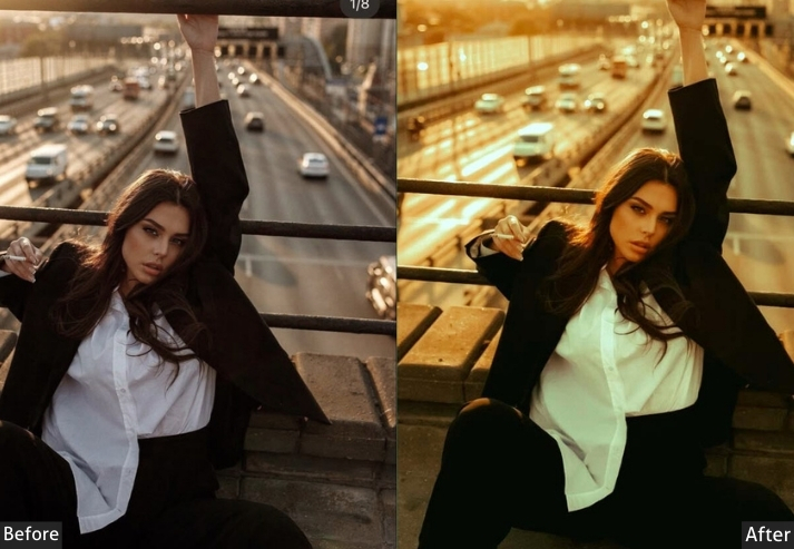
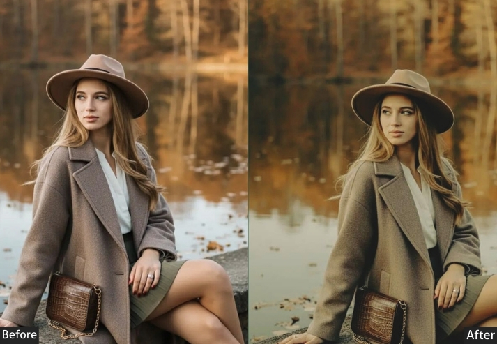
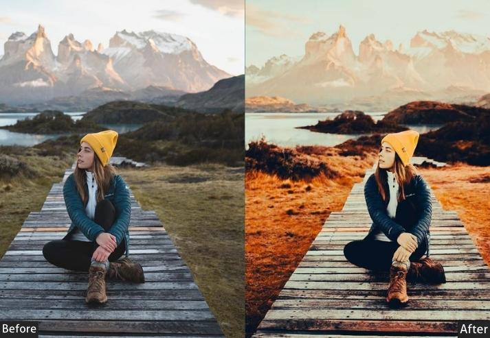
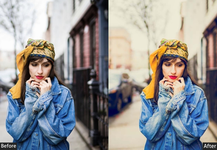
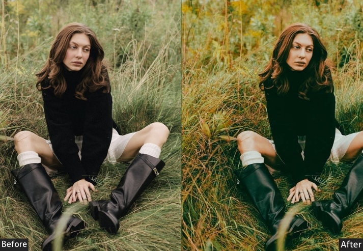
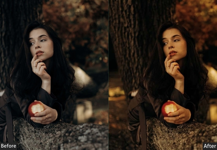
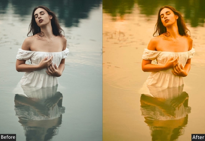
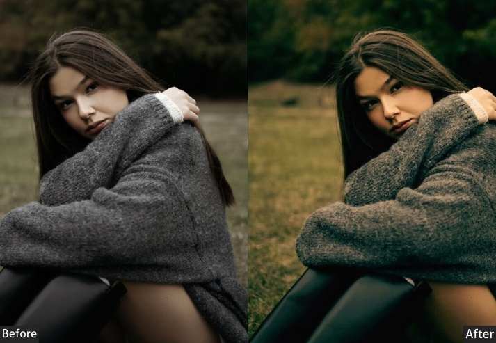
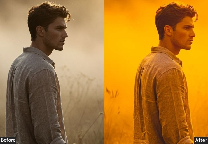
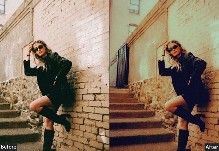
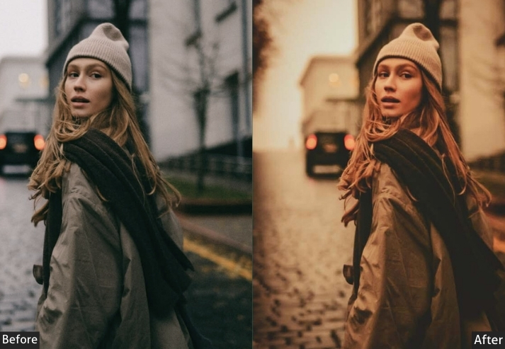
Light Panel: Exposure +0.1 to +0.3 | Highlights -25 | Shadows +35 to +45 | Whites +5 | Blacks -20 to -30. Color Panel: Temp +10 to +20 | Tint -3 | Vibrance +10 | Saturation +5. HSL → Hue: Oranges +15 | Yellows +20 | Greens +15 (towards yellow). HSL → Saturation: Oranges +35 | Yellows +25 | Reds +20. HSL → Luminance: Oranges +5 | Yellows -5. Tone Curve: Matte shadows (lifted blacks) | slight contrast boost in midtones. Effects Panel: Clarity +5 to +10 | Texture +10 | Vignette -25. Calibration: Red Primary Hue +10 | Green Primary Hue +10.
Purpose: Warm autumn tones and depth in fall scenes.
Best For: Autumn landscapes, forest photography, seasonal portraits.
Usage: Fall campaigns, nature photography, cozy lifestyle content.
Style: Rich, earthy, dimensional warmth.
2. Sun Warm Blush
You know that soft pink-orange glow right before the sun fully rises? When the world looks like it’s blushing? That’s this preset! It’s gentler than Golden Hour, more delicate, like the photography equivalent of a whispered “good morning/Evening.” Suitable for when you want warmth but not that in-your-face sunset drama.
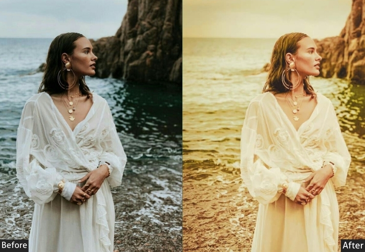
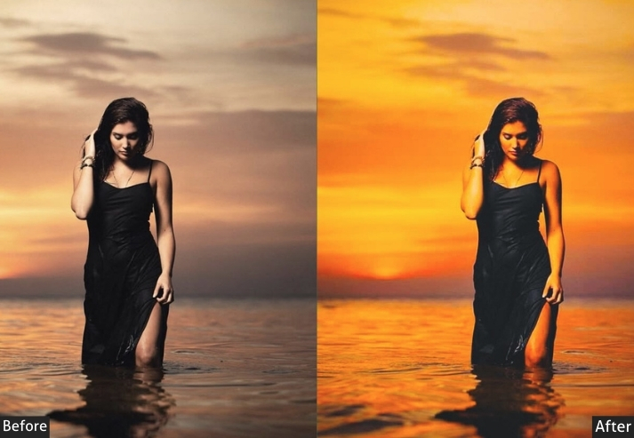
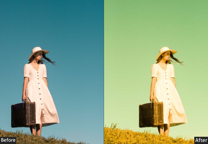
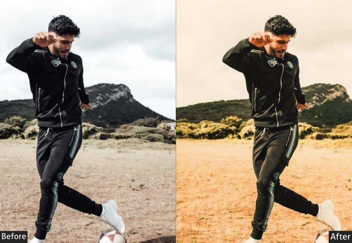
Light Panel: Exposure +0.4 to +0.6 | Highlights -10 to -20 | Shadows +40 to +50 | Whites +15 | Blacks +5 to +10. Color Panel: Temp +20 to +30 | Tint +10 to +15 | Vibrance +15 | Saturation 0. HSL → Hue: Oranges -15 (towards pink). HSL → Saturation: Oranges +15 | Magentas +20 | Yellows +10. HSL → Luminance: Oranges +15 | Magentas +10 | Yellows +10. Tone Curve: Very lifted blacks for airy feel | gentle contrast. Split Toning: Highlights (Hue 20 | Sat 20) | Shadows (Hue 320 | Sat 10). Effects Panel: Clarity -10 | Dehaze -10 | Vignette -10.
Purpose: soft, rosy dawn light with ethereal qualities.
Best For: Romantic portraits, morning scenes, delicate lifestyle photography.
Usage: Wedding photography, newborn photos, feminine content.
Style: Soft, ethereal, romantically warm.
3. Caramel Matte
If presets were desserts, this would be crème brûlée-smooth, rich, and oh-so-indulgent! The matte finish removes that harsh contrast, while warm caramel tones make everything look deliciously cinematic. I’m not saying it’ll make people hungry, but… it might.
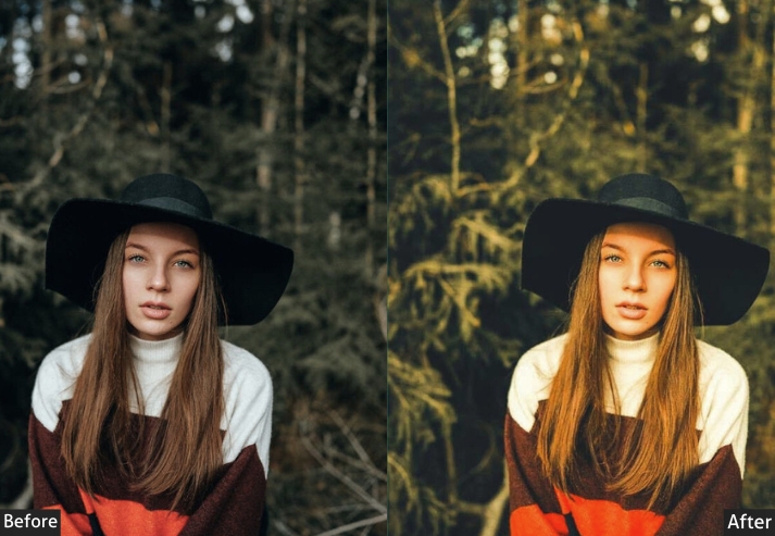
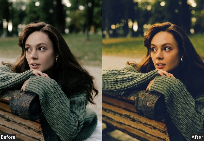
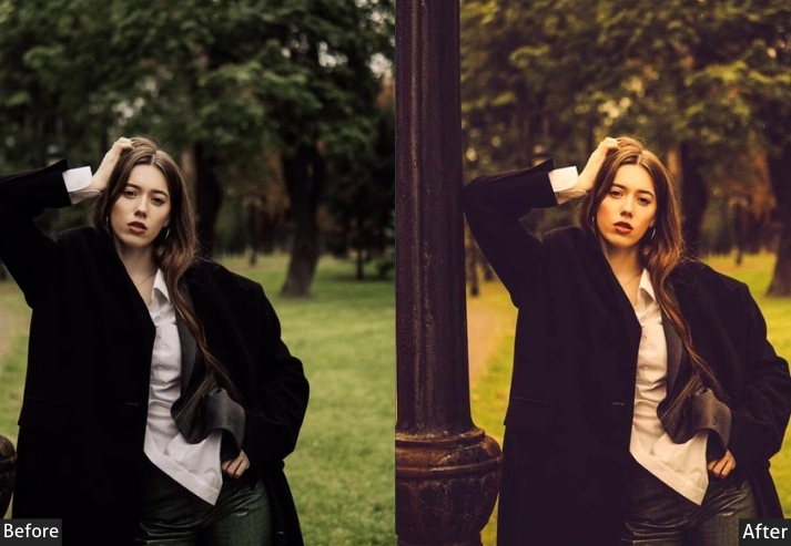
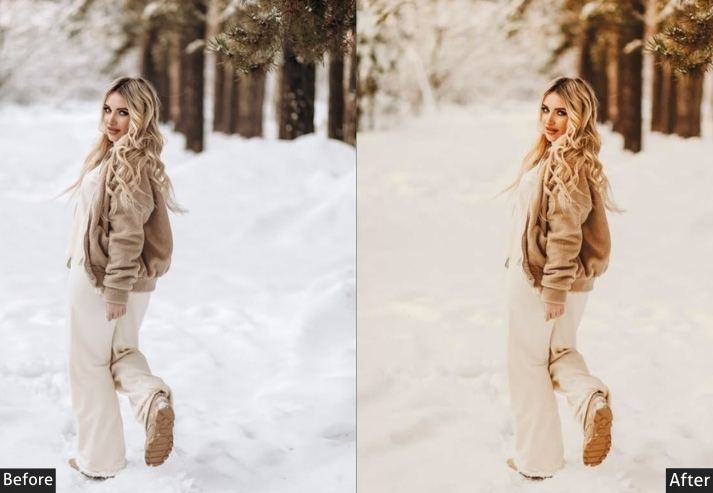
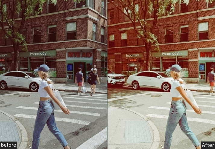
Light Panel: Exposure +0.3 | Highlights -15 | Shadows +30 | Whites -10 | Blacks +20 to +30. Color Panel: Temp +15 to +20 | Tint +5 | Vibrance +5 | Saturation -5 to -10. HSL → Hue: Oranges +10. HSL → Saturation: Oranges +15 | Yellows +10. HSL → Luminance: All colors adjusted for matte consistency | Oranges +10. Tone Curve: Significantly lifted black point for matte effect | flattened S-curve. Split Toning: Highlights (Hue 35 | Sat 20) | Shadows (Hue 35 | Sat 10). Effects Panel: Clarity 0 to -5 | Vignette -20. Calibration: Slight adjustments to prevent muddy blacks.
Purpose: A smooth, matte finish with warm caramel-toned colors.
Best For: Editorial photography, fashion shoots, artistic portraits.
Usage: Magazine-style imagery, creative projects, mood boards.
Style: Cinematic, matte, sophisticated warmth.
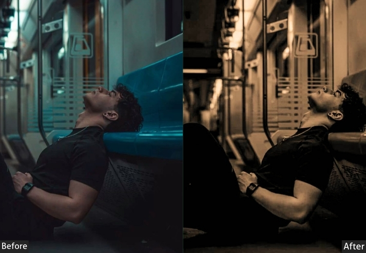
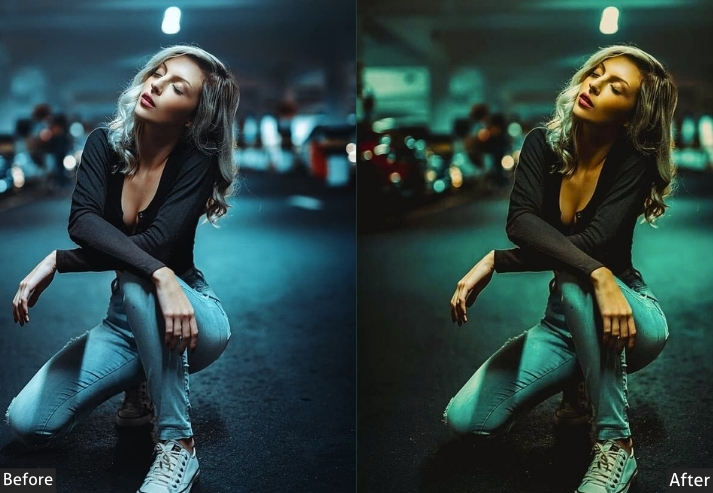
4. Dark Warm
This preset is for when you want warmth, but you also want drama, like your photo just walked off the set of a moody thriller. It’s brooding, sophisticated, and it makes everything look expensive.
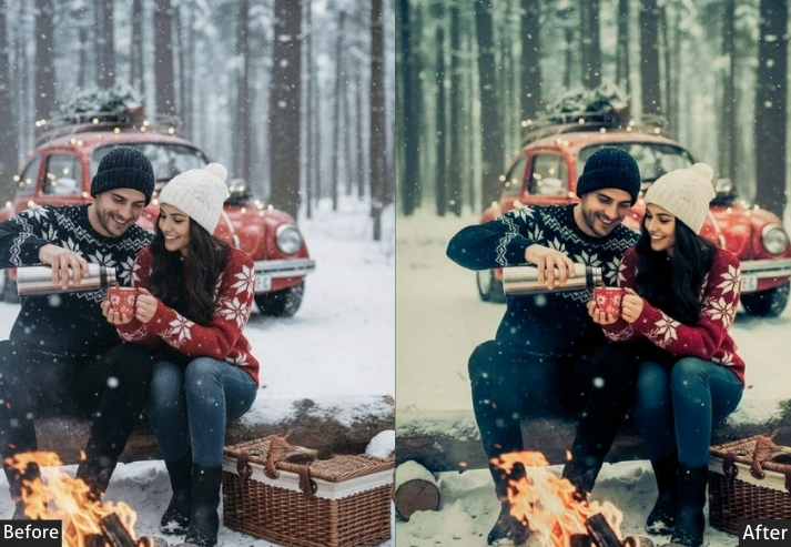
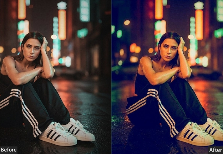
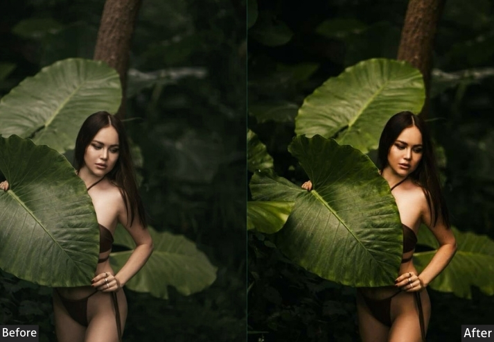
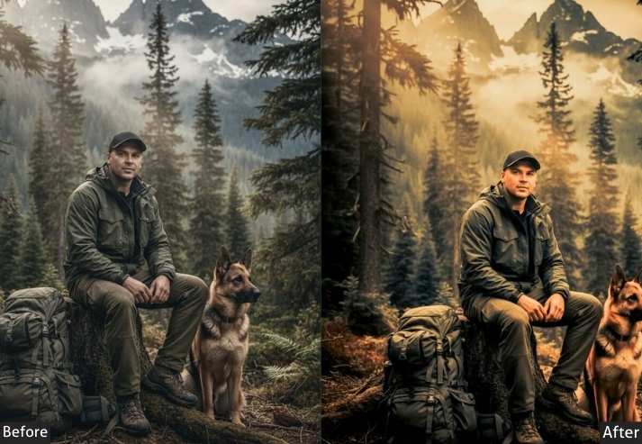
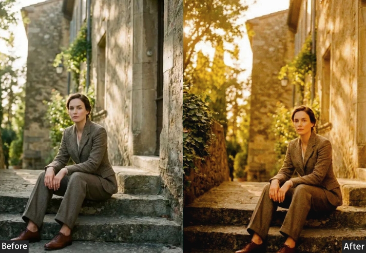
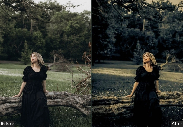
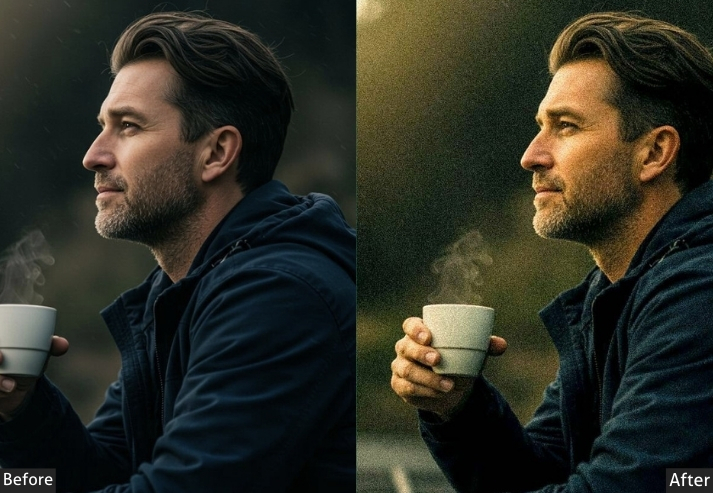
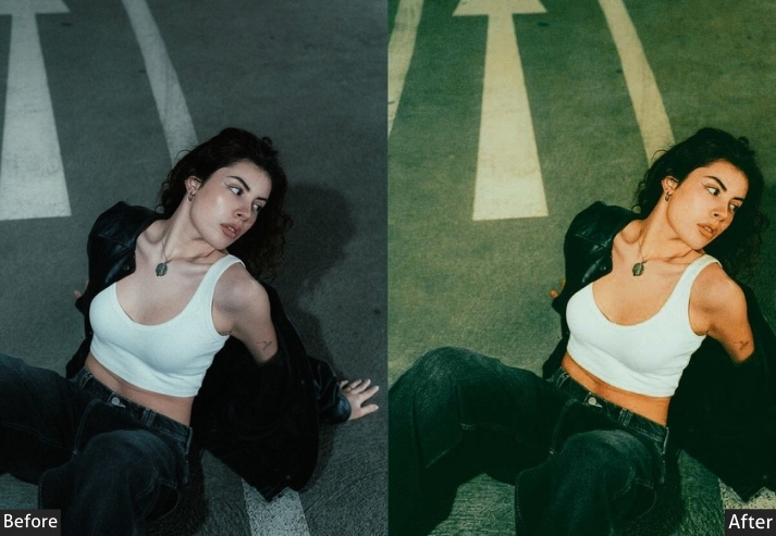
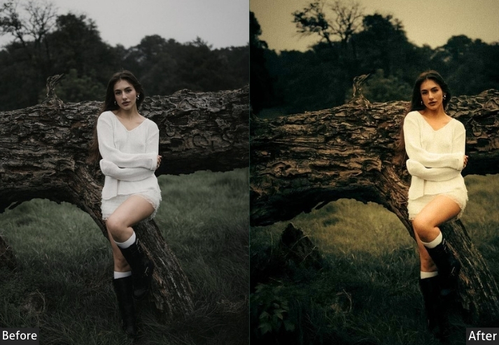
Light Panel: Exposure -0.2 to -0.5 | Highlights -40 to -50 | Shadows +5 to +15 | Whites -15 to -25 | Blacks -40 to -60. Color Panel: Temp +15 to +25 | Tint -3 to +2 | Vibrance +10 to +15 | Saturation +5 to +10. HSL → Hue: Oranges +10 | Yellows +10. HSL → Saturation: Oranges +25 | Reds +20 | Yellows +15 | Blues -25. HSL → Luminance: Oranges -10 | Reds -15 | Yellows -10 | Blues -20. Tone Curve: Deep crushed blacks with controlled highlights (dramatic cinema curve). Split Toning: Highlights (Hue 35 | Sat 25-30) | Shadows (Hue 25 | Sat 15-20). Effects Panel: Clarity +10 to +20 | Texture +15 | Dehaze +5 to +10 | Vignette -35 to -45 | Grain +15 to +25. Calibration: Red Primary Hue +10 | Red Primary Saturation +10 | Blue Primary Saturation -20. Detail Panel: Sharpening +60 to +70 | Masking ~80.
Purpose: atmospheric, moody warmth with deep shadows and rich contrast.
Best For: Moody portraits, nighttime photography, dramatic storytelling, urban scenes, artistic expression.
Usage: Editorial work, musician portraits, bar/restaurant photography, cinematic storytelling, noir-inspired content, and Instagram dark aesthetic.
Style: Mysterious, cinematic, richly atmospheric with controlled warmth.
5. Classic Warm
If presets were people at a party, Classic Warm would be that friend everyone loves-reliable, approachable, never overdoing it, just consistently good vibes! This is your bread-and-butter warm preset that works on basically everything without making you look like you went overboard with the editing. It’s like the perfect cup of coffee: nothing fancy, but man, it hits the spot every single time. When in doubt, Classic Warm it out!
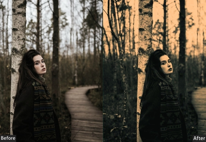
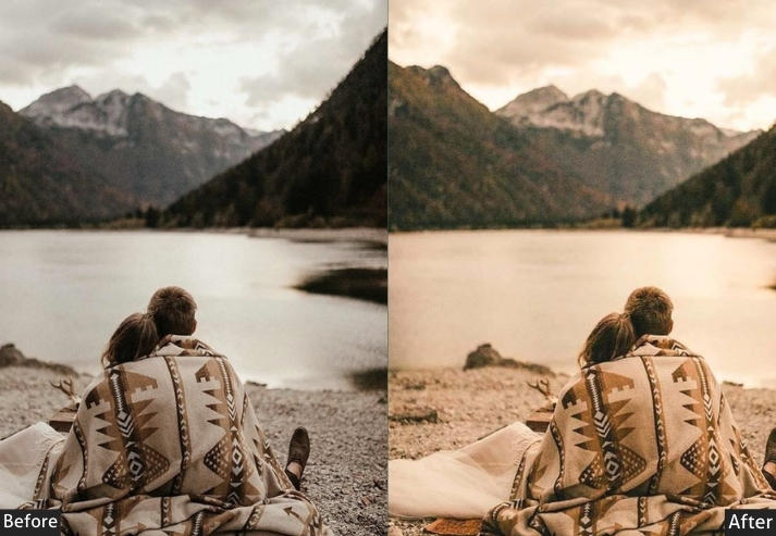
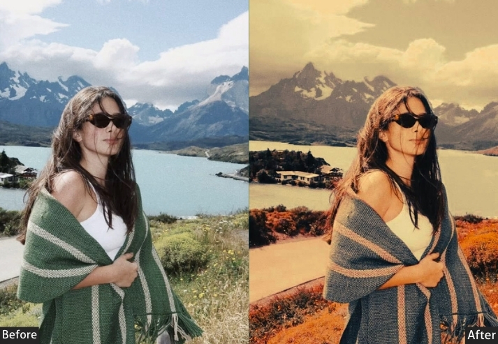
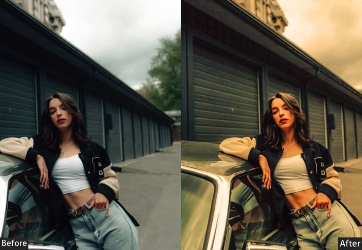
Light Panel: Exposure +0.2 to +0.4 | Highlights -15 to -20 | Shadows +20 to +30 | Whites +10 | Blacks -10 to -15. Color Panel: Temp +12 to +18 | Tint +2 to +5 | Vibrance +12 to +18 | Saturation +5 to +8. HSL → Hue: Oranges +5 | Yellows +5. HSL → Saturation: Oranges +20 | Yellows +15 | Reds +10 | Blues -10. HSL → Luminance: Oranges +5 | Yellows +5 | Blues +5. Tone Curve: Gentle S-curve (balanced, timeless, minimal drama). Split Toning: Highlights (Hue 40 | Sat 12-15) | Shadows (Hue 35 | Sat 8-10). Effects Panel: Clarity +5 to +10 | Texture 0 to +5 | Dehaze 0 to +5 | Vignette -15 to -20. Calibration: Red Primary Hue +5 | Green Primary Hue +5. Detail Panel: Sharpening +40 to +50 (masking 50-60) | Luminance Noise Reduction +10.
Purpose: Deliver universally flattering warmth.
Best For: Everyday photography, family portraits, general lifestyle, wedding photography, real estate, and professional headshots.
Usage: Client work where you can’t risk being too experimental; photo books; family albums; versatile social media content; anything that needs to appeal to a broad audience.
Style: Timeless, balanced, universally appealing warmth with professional polish.
6. Cinnamon Spice
This preset is like wrapping your photos in a warm blanket and handing them a pumpkin spice latte. It emphasizes the warm reddish-brown tones that make everything feel instantly more comforting and nostalgic.
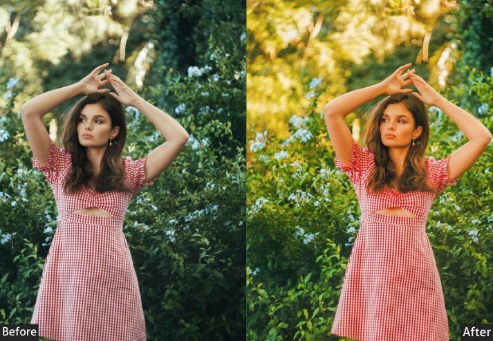
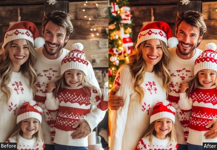
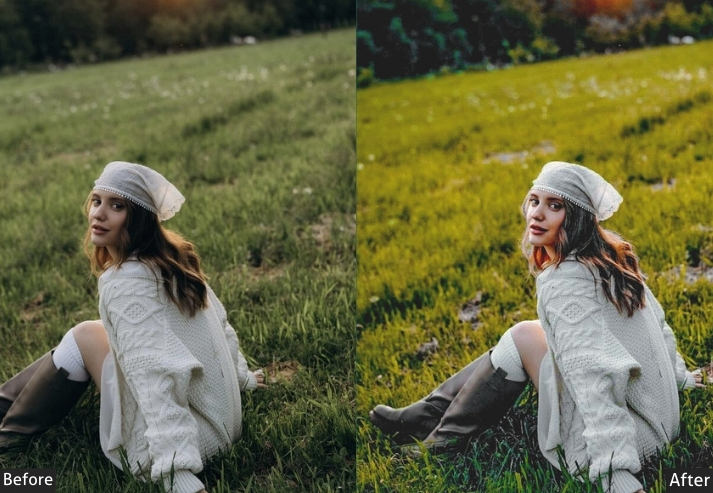
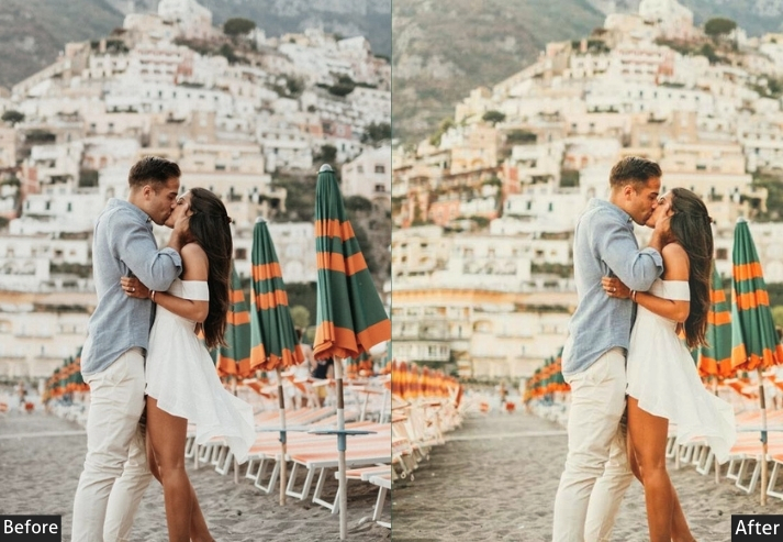
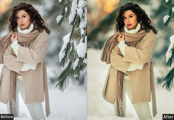
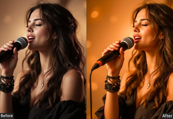
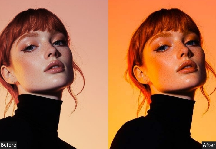
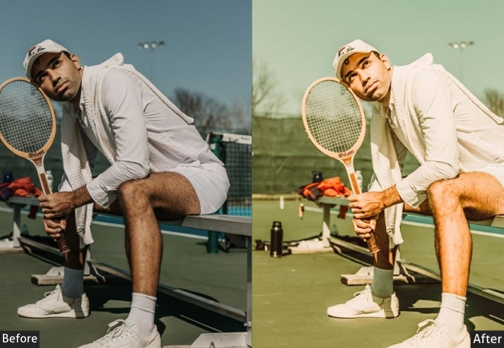
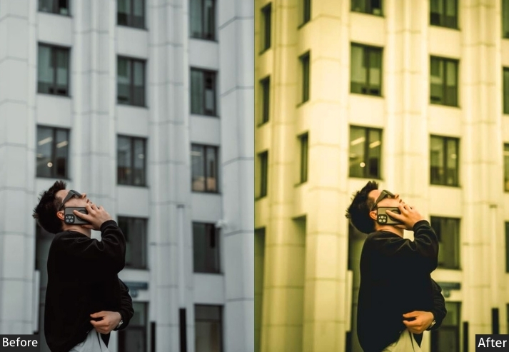
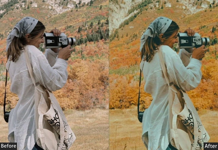
Light Panel: Exposure +0.2 | Highlights -25 | Shadows +35 | Whites +5 | Blacks -20 to -25. Color Panel: Temp +15 to +22 | Tint -3 to 0 | Vibrance +12 | Saturation +8. HSL → Hue: Oranges +20 (towards red) | Reds +10 | Yellows +20. HSL → Saturation: Oranges +30 | Reds +25 | Yellows +20. HSL → Luminance: Oranges +5 | Reds 0. Tone Curve: Rich midtones with deep warm shadows. Split Toning: Highlights (Hue 25 | Sat 18) | Shadows (Hue 15 | Sat 15). Effects Panel: Clarity +8 | Texture +10 | Grain +15 | Vignette -20.
Purpose: Emphasize reddish-brown warm tones for a cozy, spiced aesthetic.
Best For: Autumn photography, cozy lifestyle, food photography.
Usage: Fall content, comfort food blogs, seasonal campaigns.
Style: Cozy, spiced, warmly nostalgic.
7. Honey Light Portraits
This one’s my secret weapon for client portraits! It adds a gorgeous, honey-colored warmth that makes everyone look like they just got back from the best vacation of their lives. It’s subtle enough to feel natural but impactful enough that clients go “WOW, is that really me?!”
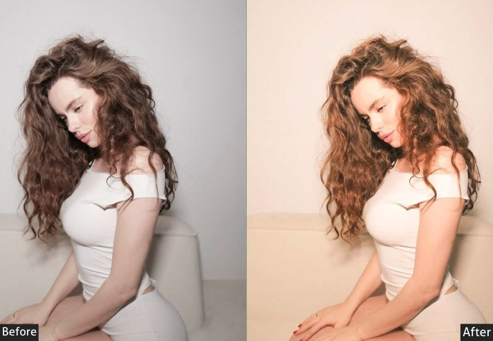
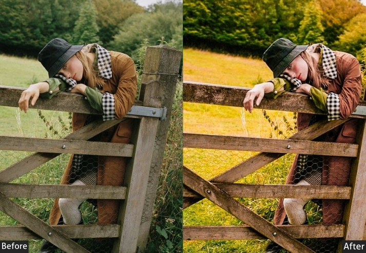
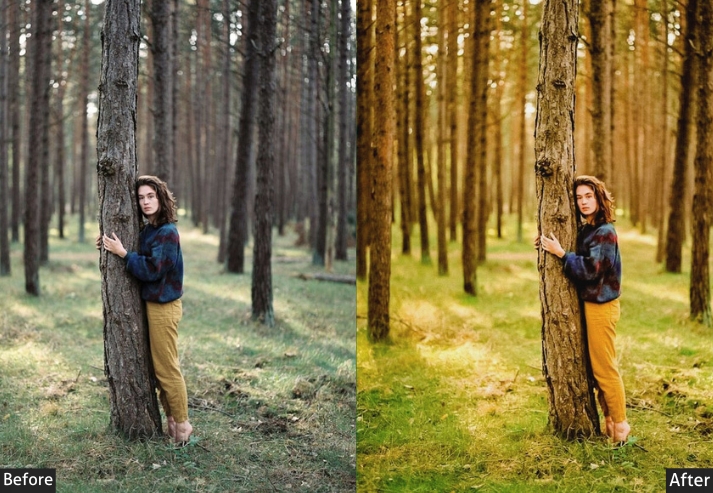
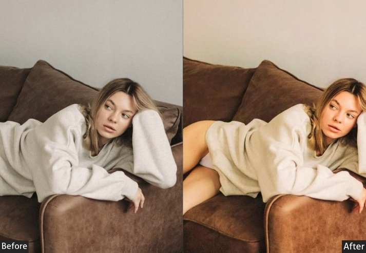
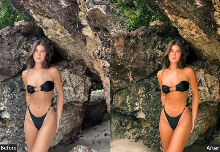
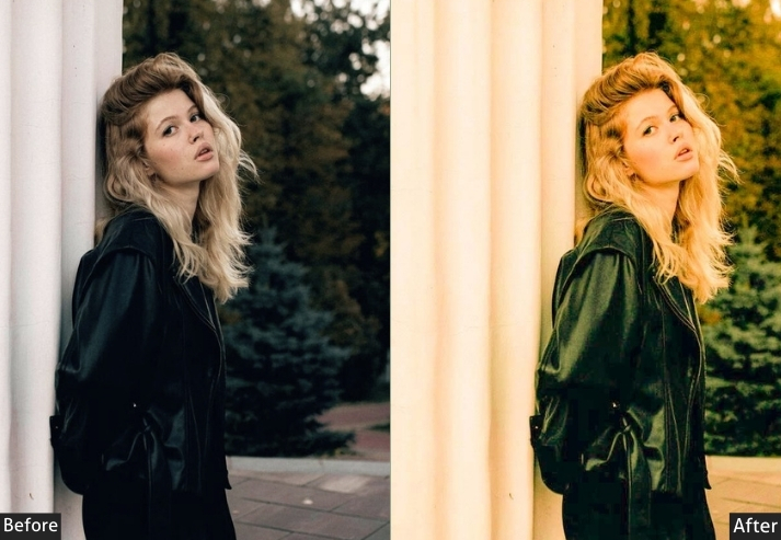
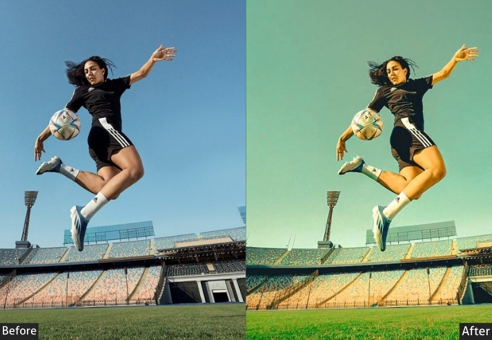
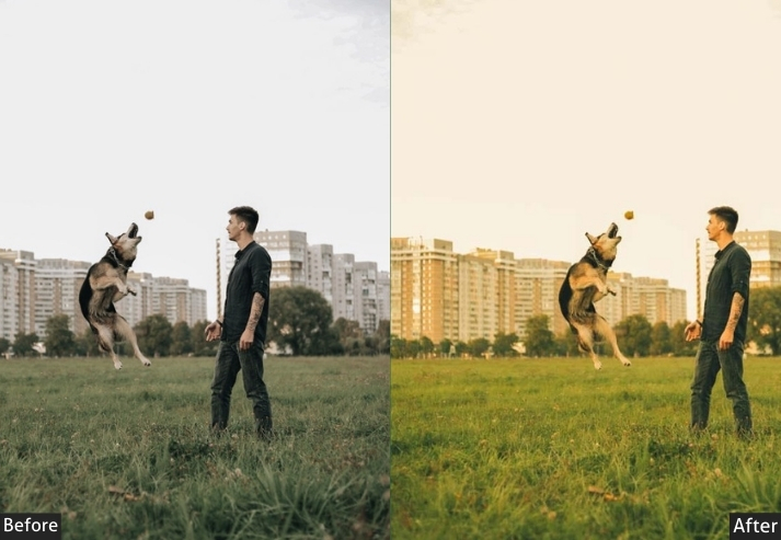
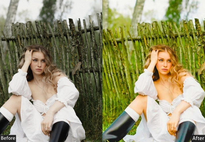
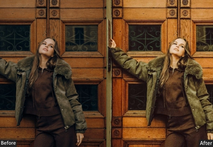
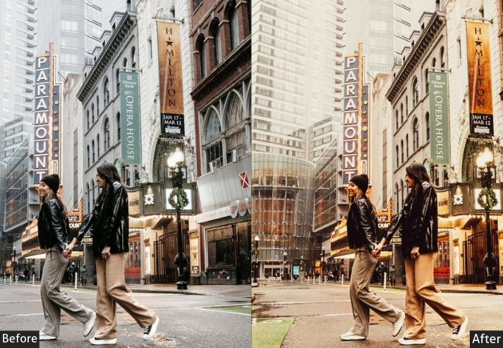
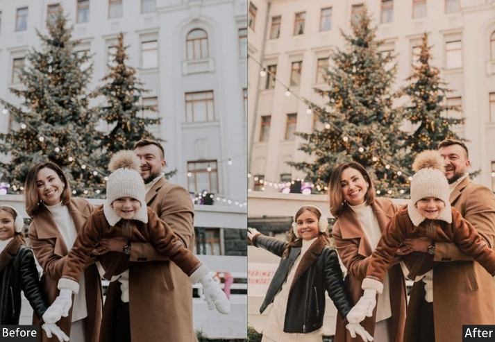
Light Panel: Exposure +0.3 to +0.5 | Highlights -20 | Shadows +30 to +40 | Whites +10 | Blacks -10. Color Panel: Temp +12 to +18 | Tint +3 | Vibrance +12 | Saturation +5. HSL → Hue: Oranges -5 | Yellows +5. HSL → Saturation: Oranges +20 | Yellows +15 | Reds +5. HSL → Luminance: Oranges +10 | Yellows +5 | Reds +5. Tone Curve: Gentle S-curve with slightly lifted shadows. Split Toning: Highlights (Hue 45 | Sat 10) | Shadows (Hue 40 | Sat 5). Effects Panel: Clarity 0 | Texture -5 | Sharpening +50 (masking +70). Detail Panel: Luminance Noise Reduction +10.
Purpose: honey-toned warmth specifically optimized for portraits.
Best For: Professional portraits, family photos, engagement sessions.
Usage: Client work, personal branding photos, portfolio pieces.
Style: Professional, warmly flattering, polished.
Final Words
You now have the keys to the warm preset kingdom. You know the recipes. You understand the why behind the sliders.
The only thing left? Actually DOING IT!
So close this tab (after bookmarking, remember?), open Lightroom, and start creating images that make people feel something. Make photos that stop the scroll. Create art that makes YOU proud!
The photographers whose work stops you mid-scroll aren’t necessarily more talented than you. They’ve found their editing style, and they’re consistent with it. These presets are your shortcut to finding yours.
Your photos are about to get SO. MUCH. WARMER. And honestly? I’m excited for you! 🎉
Now go make something beautiful! The world needs more warm, gorgeous, feeling-filled photos, and YOU’RE about to deliver!
Happy editing, you absolute legend!
More Free Presets For You:
Summer Lightroom Presets Free Download
Moody Lightroom Presets Free Download