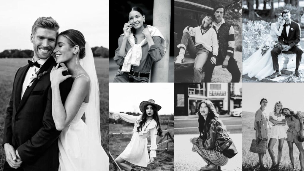
Color carries information, but it can also carry noise. When you remove it, the viewer’s eye has nowhere to hide. It travels directly to the light, the shadows, the texture of skin, the geometry of a building, the expression on a face.
Black-and-white photography doesn’t simplify an image. It clarifies it. The technical choices that matter in B&W editing: tonal range, contrast structure, midtone separation, and shadow depth are the same ones that separate a competent edit from a memorable one.
In monochrome, every tonal decision is visible. There are no colors to mask a weak exposure or a flat composition. This is what makes B&W both demanding and rewarding.
The presets below are a starting point. Each one establishes a tonal foundation; your specific exposure, light conditions, and subject will determine the final 20% of the edit.

Pauline Jackson
My focus is on practical results: clean tones, balanced light, and natural colors so photographers can apply a preset, make small tweaks if needed, and move on with confidence.
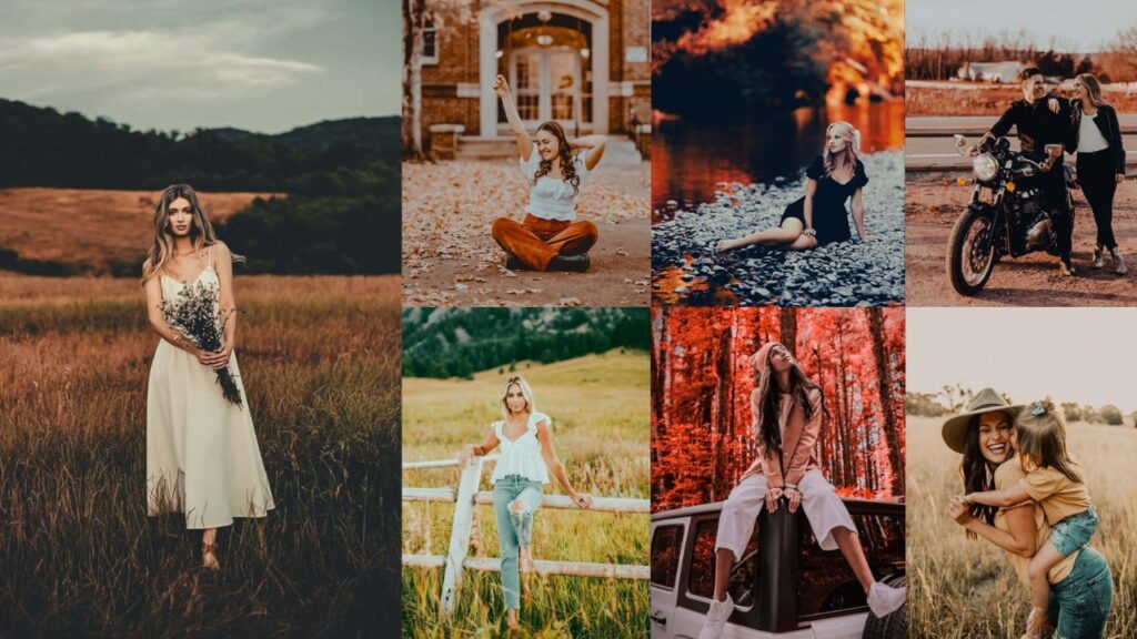
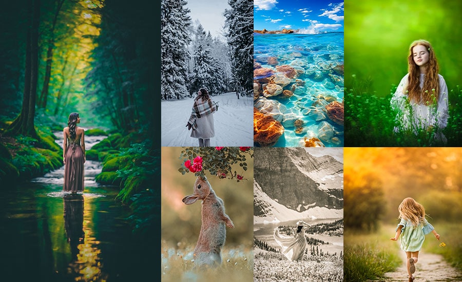
30 Black And White Lightroom Presets Free Download
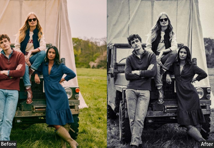
The collection is organized by style, from clean, balanced conversions to high-contrast drama, matte finishes, vintage film emulation, Film Noir, and moody atmospheres. Every entry includes the exact Lightroom slider values so you can apply the look manually or fine-tune it after applying the preset.
In monochrome, every photo becomes a story…
I’ll break down the whys with some real-talk reasons, sprinkled with pro insights, so you can see why these presets are the unsung heroes of your Lightroom toolkit. Once you go B&W, your pics might never want to go back!
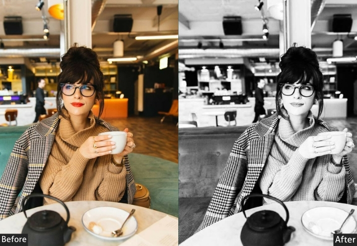
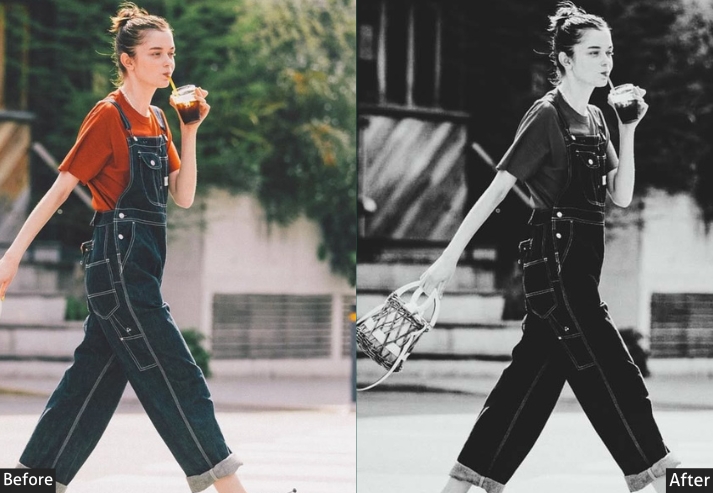
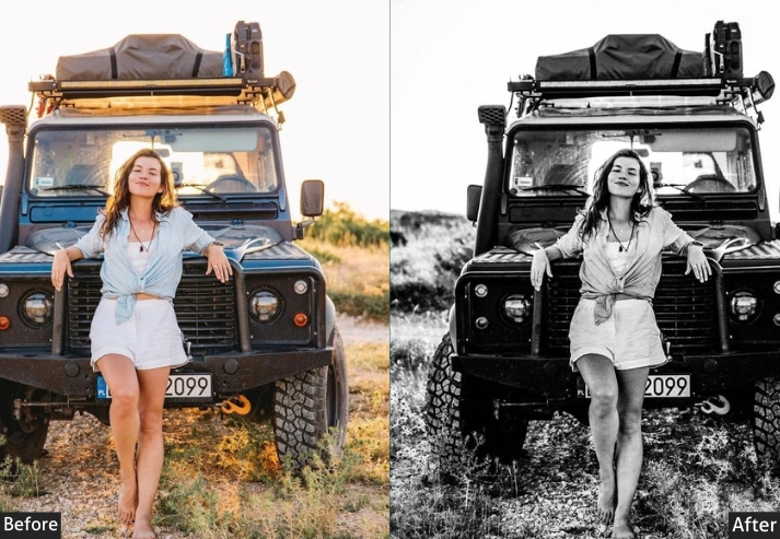
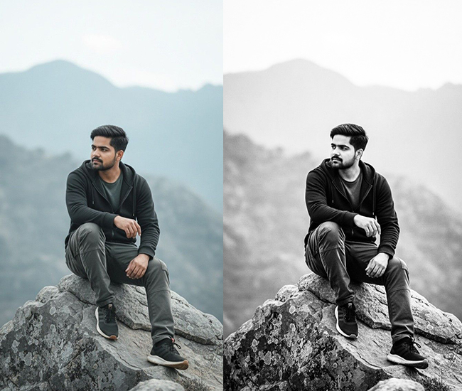
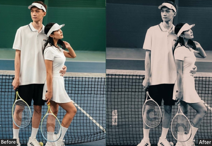
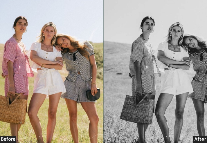
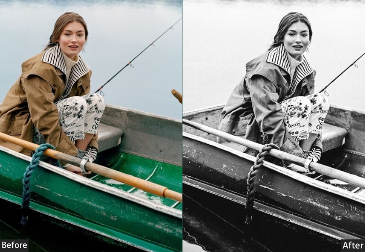
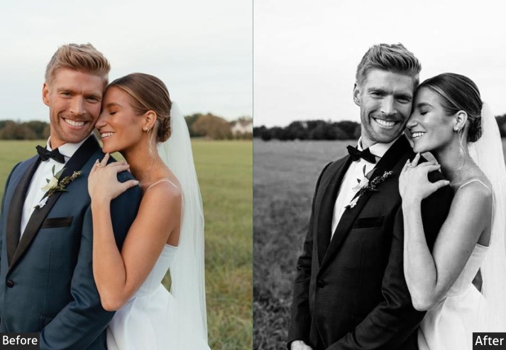
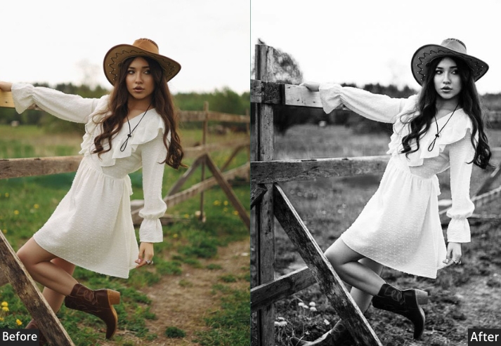
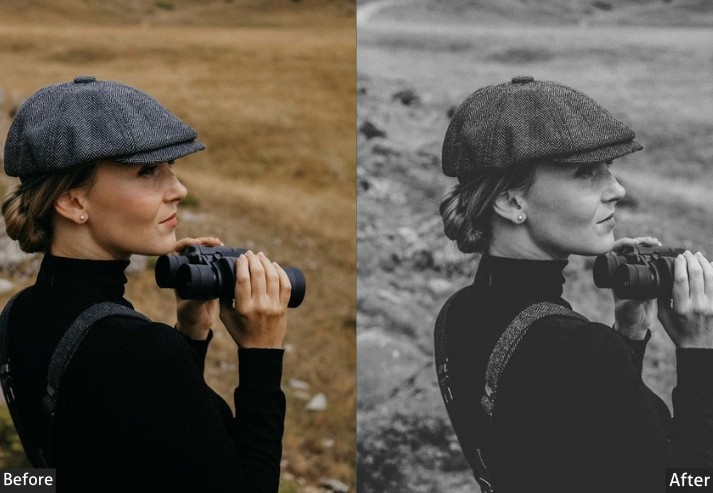
1. Classic/Standard B&W
The Classic B&W preset produces a neutral, balanced monochrome conversion that preserves the photo’s original tonal structure without pushing contrast or applying stylistic effects. It’s the most versatile starting point in the collection, usable across portrait, street, landscape, and editorial photography.
This preset applies precise desaturation, a gentle S-curve, and a modest Clarity lift. Skin tones are protected through targeted Red and Blue channel adjustments in the B&W Mix, which keeps faces from going muddy while allowing skies to darken naturally.
Basic Panel: Treatment → Black & White. Light Panel: Exposure +10 | Contrast +20 | Highlights -15 | Shadows +25 | Whites +10 | Blacks -10. Color Panel: Saturation -100 | B&W Mixer: Reds +20 | Blues -10. Effects Panel: Clarity +15 | Dehaze +10 | Vignette -20. Detail Panel: Sharpening Amount +30 | Radius 1.0 | Detail 25 | Luminance Noise Reduction +20. Tone Curve: Slight S-Curve | Midtones +10 | Shadows -5.
Purpose: A straightforward, neutral monochrome conversion that preserves the photo’s original essence without over-dramatizing.
Best For: family portraits or casual street scenes where you want authenticity over flair.
Usage: tweak exposure if your shot’s underexposed.
Style: Clean and versatile, evoking traditional darkroom prints with even tones that feel nostalgic yet modern.
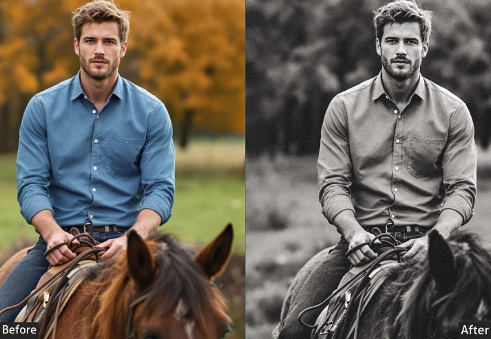
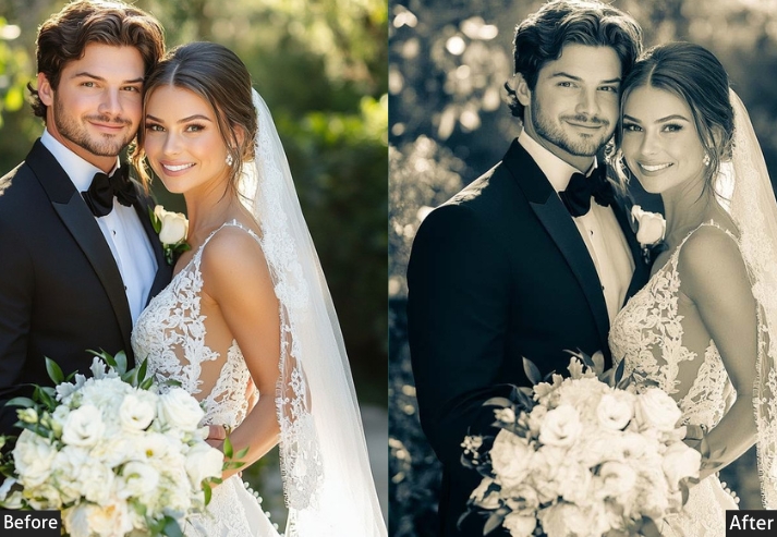
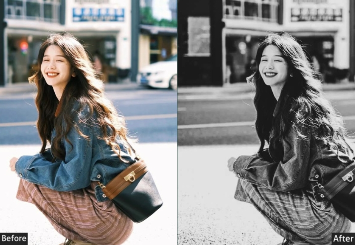
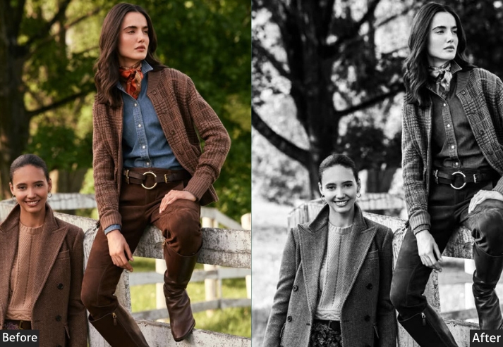
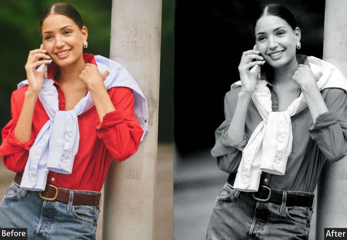
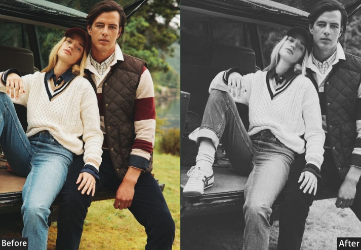
2. High Contrast/Dramatic B&W
The High Contrast B&W preset pushes the tonal range to its extremes: deep blacks, crisp whites, and a strong S-curve in the tone curve. The result is a graphic, high-impact look that works well when your subject has strong directional light, bold shapes, or architectural geometry.
The B&W Mix is adjusted to brighten skin tones through the Orange channel (+30) while darkening foliage and environmental greens (−20), helping subjects stand out clearly against natural backgrounds.
This is one of the more aggressive presets in the collection. It works best on correctly exposed RAW files with at least moderate contrast in the original. Avoid applying it to flat, overcast shots without first adding light manually in post.
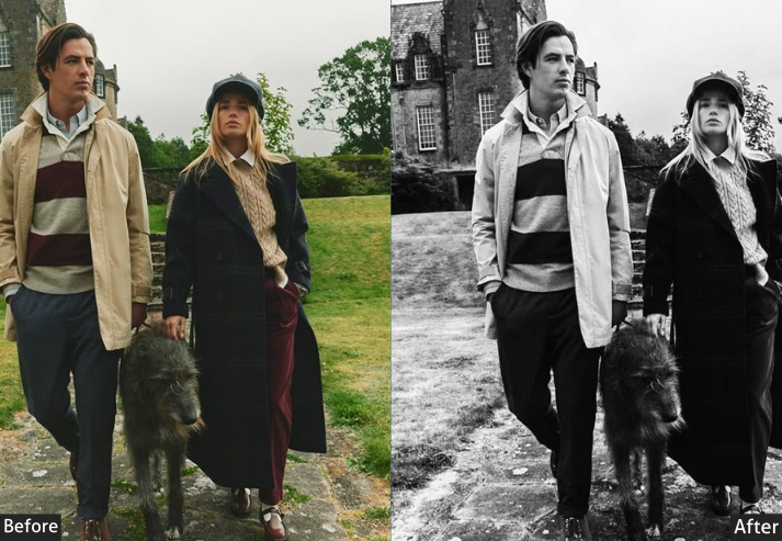
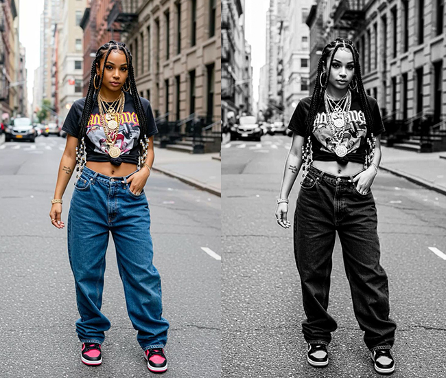
Basic Panel: Treatment → Black & White. Light Panel: Exposure +5 | Contrast +50 | Highlights -30 | Shadows +40 | Whites +30 | Blacks -40. Color Panel: Saturation -100 | B&W Mixer: Oranges +30 (skin pop) | Greens -20 (darker foliage). Effects Panel: Clarity +40 (edgy textures) | Dehaze +20 (enhanced mood) | Vignette -30 (focused attention). Detail Panel: Sharpening Amount +50 | Radius 1.5 | Detail 40 | Luminance Noise Reduction +15. Tone Curve: Strong S-Curve | Highlights +20 | Shadows -20 | Midtones 0.
Purpose: emotional intensity and visual interest in compositions.
Best For: Action shots, architecture, or moody portraits.
Usage: If your photo ends up looking like a comic book villain, you’ve nailed it.
Style: Bold and theatrical, reminiscent of graphic novels or film stills, with stark divisions that add tension and storytelling punch.
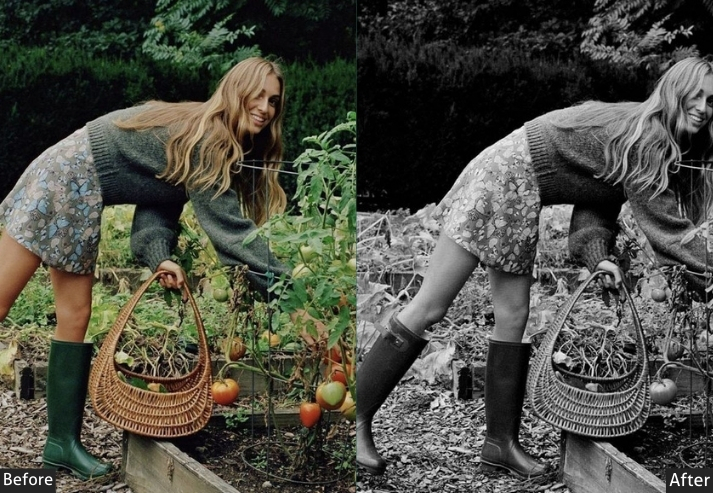
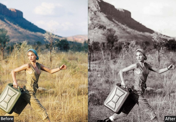
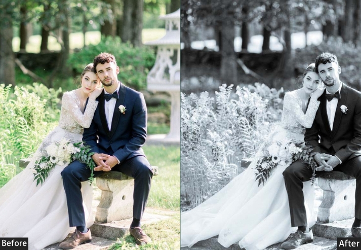
3. Low Contrast/Faded/Matte B&W
The Low Contrast / Matte preset compresses the tonal range, lifts shadows, reduces highlights, and pulls blacks toward grey. The result is a flat, film-like appearance with soft transitions between tones rather than strong separations.
This look works well for subjects where softness supports the mood: romantic portraits, misty landscapes, and overcast street scenes. The reduced Clarity (−20) and slight negative Dehaze (−15) intentionally introduce a gentle haze that feels organic rather than processed.
Basic Panel: Treatment → Black & White. Light Panel: Exposure +15 | Contrast -30 | Highlights -40 | Shadows +50 | Whites -20 | Blacks +20. Color Panel: Saturation -100 | B&W Mixer: Yellows +15 | Purples -10. Effects Panel: Clarity -20 (dreamy softness) | Dehaze -15 (hazy look) | Vignette -10 (gentle borders). Detail Panel: Sharpening Amount +20 | Radius 0.8 | Detail 20 | Luminance Noise Reduction +30. Tone Curve: Flattened Curve | Midtones -10 | Shadows +15 (matte fade).
Purpose: a gentle, understated look that evokes emotion through subtlety.
Best For: Romantic portraits, foggy landscapes, or vintage-inspired still lifes.
Usage: layer with grain for extra nostalgia.
Style: Ethereal and nostalgic, like faded polaroids or soft-focus cinema, prioritizing mood over detail for a heartfelt, introspective feel.
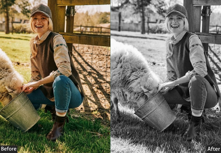
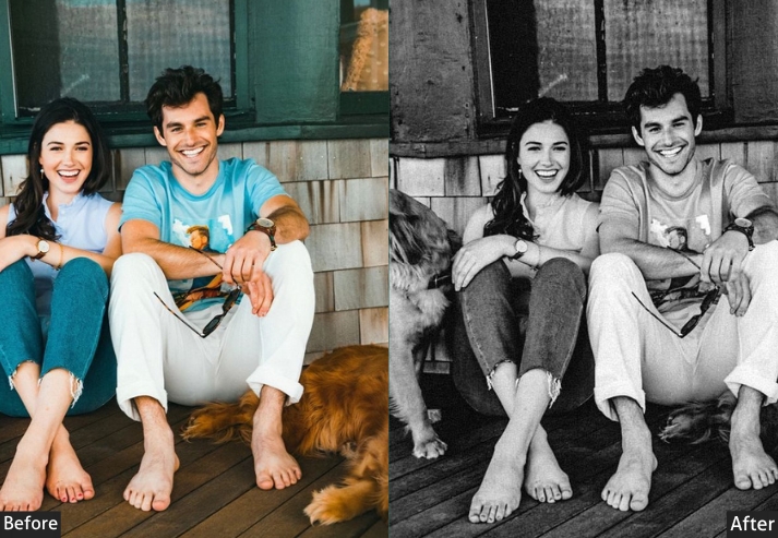
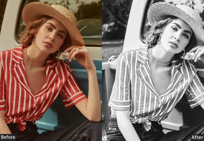
4. Vintage Emulation B&W
The Vintage Emulation preset is built around the tonal characteristics of classic analog film stocks, specifically the mid-range contrast, slight highlight roll-off, and organic grain texture associated with films like Kodak Tri-X 400 and Ilford HP5.
The key elements here are the Grain settings (Amount 40, Size 25, Roughness 50) and a low Noise Reduction value (+10), which intentionally preserves digital noise as part of the aesthetic. The tone curve uses a gentle roll-off rather than a hard S-curve, producing softer highlight transitions typical of film.
Unlike digital sharpening, which creates micro-contrast, the grain in this preset adds texture at a coarser scale, so it behaves differently from the High Contrast preset even when contrast values are similar.
Basic Panel: Treatment → Black & White. Light Panel: Exposure +8 (era-appropriate glow) | Contrast +25 | Highlights -25 | Shadows +30 | Whites +15 | Blacks -15. Color Panel: Saturation -100 | B&W Mixer: Blacks +25 (film-like response) | Reds +25 (warmth emulation). Effects Panel: Clarity +20 | Dehaze +5 | Grain Amount +40 | Grain Size 25 | Grain Roughness 50 (authentic film texture). Detail Panel: Sharpening Amount +35 | Radius 1.2 | Detail 30 | Luminance Noise Reduction +10 (preserve grit). Tone Curve: Gentle Roll-Off | Highlights -10 | Shadows +10 (vintage film curve).
Purpose: replicate analog film aesthetics, infusing digital images with historical character and texture.
Best For: Street photography, documentaries, or retro portraits.
Usage: Works wonders on high-ISO shots. Adjust the grain if it’s too “noisy neighbor” loud.
Style: Retro and textured, echoing classic films like Kodak Tri-X, with grain and subtle imperfections for an authentic, storytelling nostalgia.
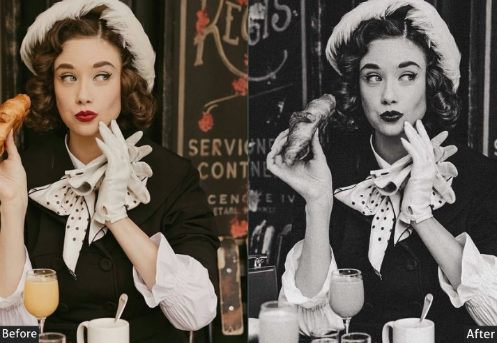
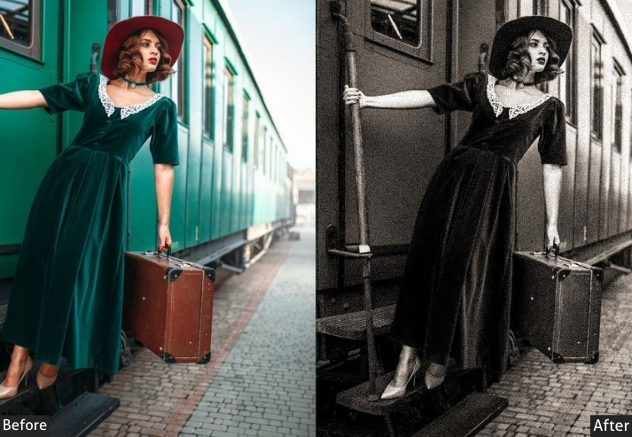
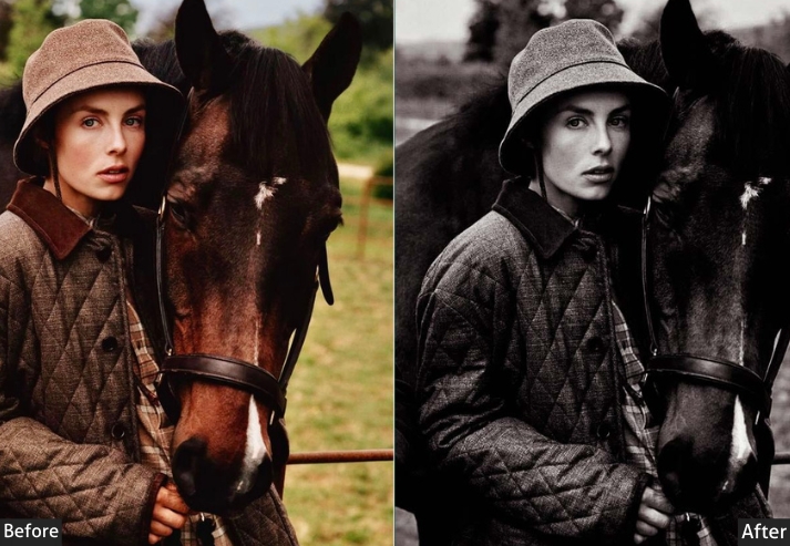
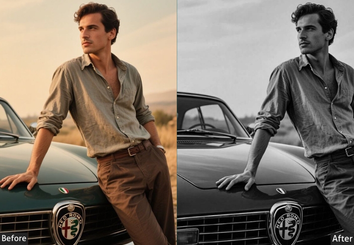
5. Film Noir/Hollywood B&W
The Film Noir preset draws from the visual language of 1940s and 1950s Hollywood cinematography, specifically the chiaroscuro lighting, deep shadow pools, and high-key face illumination associated with directors like Carol Reed and Billy Wilder.
Technically, it achieves this through a combination of deeply crushed blacks (−50), elevated midtones (+15 on the tone curve), and a strong vignette (−40) that frames the subject as if lit by a single overhead source. The Blue channel in the B&W Mix is pulled down (−30) to darken ambient tones, while the Yellow channel is lifted (+30) to brighten skin and architectural warm tones.
This preset is sensitive to the original exposure. It works best on images with a defined light source, such as a window light, studio light, or strong directional sunlight. Applied to a flat, overcast shot, it will simply produce a dark, featureless image.
Basic Panel: Treatment → Black & White. Light Panel: Exposure -5 (moody atmosphere) | Contrast +45 | Highlights -35 | Shadows +35 | Whites +25 | Blacks -50 (inky blacks). Color Panel: Saturation -100 | B&W Mixer: Blues -30 (dramatic skies) | Yellows +30 (brighter skin tones). Effects Panel: Clarity +35 | Dehaze +25 | Vignette -40 (noir framing). Detail Panel: Sharpening Amount +45 | Radius 1.4 | Detail 35 | Noise Reduction +15. Tone Curve: Shadows -25 (crushed blacks) | Midtones +15 (cinematic punch).
Purpose: mystery and drama inspired by 1940s cinema.
Best For: Narrative portraits, night scenes, or fashion shoots.
Usage: Best on low-light RAW. If it’s too dark, lighten shadows so your subjects don’t vanish like a plot twist!
Style: Mysterious and cinematic, with high drama and chiaroscuro effects for a suspenseful, golden-age Hollywood allure.
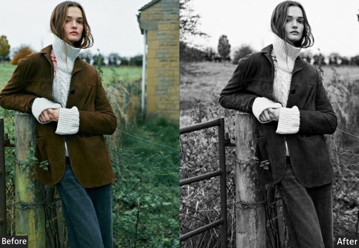
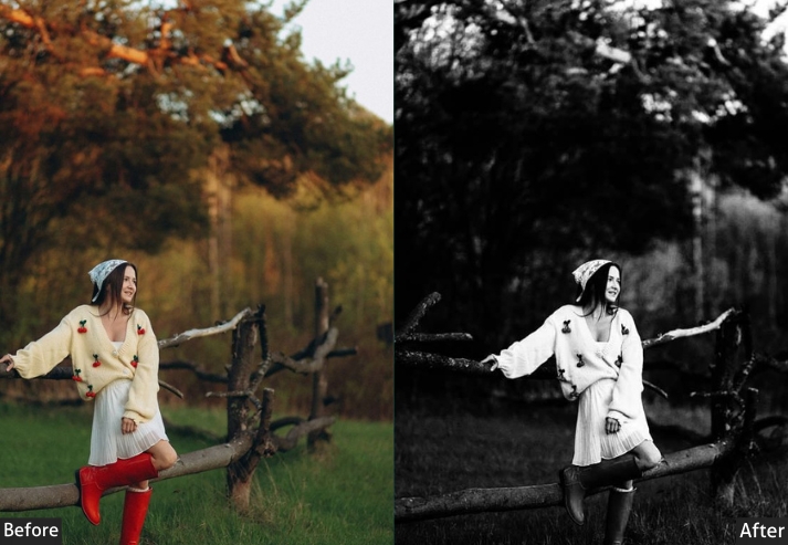
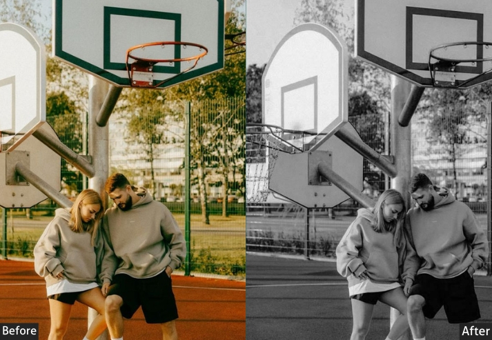
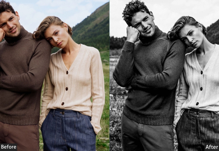
6. Moody Black & White
This preset is designed for images where atmosphere takes priority over technical clarity. It works by darkening the overall exposure slightly (−10), deepening shadows (−35 Blacks), and applying a compressed tone curve that pulls both midtones and shadows downward, creating a sense of weight and restraint in the image.
Where the Film Noir preset produces drama through stark contrast, this produces it through restrained tonal compression. Blues are lifted slightly in the B&W Mix (+25) to give atmospheric tones more presence, while Greens are reduced (−15) to prevent environmental elements from competing with the subject.
This preset pairs well with overcast natural light and works particularly well on images shot in the shade, in fog, or in interior environments with diffused window light.
Basic Panel: Treatment → Black & White. Light Panel: Exposure -10 | Contrast +35 | Highlights -40 | Shadows +30 | Whites -15 | Blacks -35. Color Panel: Saturation -100 | B&W Mixer: Blues +25 | Greens -15. Effects Panel: Clarity +30 | Dehaze +15 | Vignette -35. Detail Panel: Sharpening Amount +40 | Radius 1.2 | Detail 35 | Luminance Noise Reduction +25. Tone Curve: Subtle inverted S-Curve | Shadows -15 | Midtones -10 | Highlights 0.
Purpose: An emotional, atmospheric depth that highlights introspection and subtle drama.
Best For: Evocative landscapes, introspective portraits, or urban night scenes.
Usage: lift shadows a smidge to avoid scaring off the sunshine lovers.
Style: Atmospheric and emotive, blending subtle contrasts with hazy tones for a cinematic.
7. Matte Black & White
This one produces a non-reflective, compressed tonal finish, the black-and-white equivalent of matte paper in traditional darkroom printing. Highlights are significantly reduced (−50), blacks are lifted (+15), and the Clarity is pulled negative (−15) to remove the micro-contrast that gives images a sharp, digital appearance.
The result is a smooth, contemporary monochrome look that sits well in editorial, lifestyle, and fine art contexts. It differs from the Low Contrast preset in that the compression is more deliberate and the finish is less hazy. It reads as a stylistic choice rather than a film simulation.
Basic Panel: Treatment → Black & White. Light Panel: Exposure +5 | Contrast -25 | Highlights -50 | Shadows +45 | Whites -25 | Blacks +15. Color Panel: Saturation -100 | B&W Mixer: Yellows +20 | Magentas -10. Effects Panel: Clarity -15 | Dehaze -10 | Vignette -20. Detail Panel: Sharpening Amount +25 | Radius 0.9 | Detail 20 | Luminance Noise Reduction +35. Tone Curve: Flattened Curve | Midtones -15 | Shadows +10.
Purpose: a non-reflective, subdued finish that emphasizes texture and form over gloss.
Best For: Product shots, fine art prints, or lifestyle imagery, such as coffee-table books or subtle fashion editorials where elegance shines through simplicity.
Usage: Ideal for high-contrast originals. If it flattens too much, bump clarity positively for a hint of bite.
Style: a contemporary, gallery-ready minimalism that’s invitingly calm.
Last Words
These presets cover the full range of black-and-white editing styles from neutral and clean to high-contrast, atmospheric, film-inspired, and matte. Use the settings tables as a starting point and adjust based on your specific exposure and light conditions.
The most important adjustment in any B&W edit is the B&W Mix panel. Spend two minutes learning how each channel affects different subjects (see the reference table above), and the quality of your monochrome edits will improve significantly with or without presets.
Drop a comment below with your fave preset or share your before-and-afters. I’d love to geek out with you. Happy editing! Your extraordinary creation awaits!
More Free Presets For You:
Kodak Portra Lightroom Presets Free Download
Classic Lightroom Presets Free Download
Dark Lightroom Presets Free Download