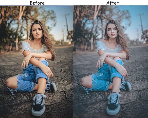
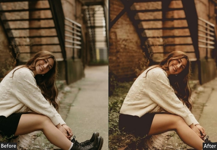
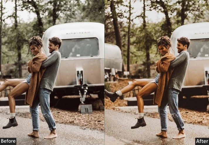
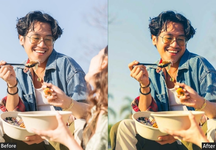
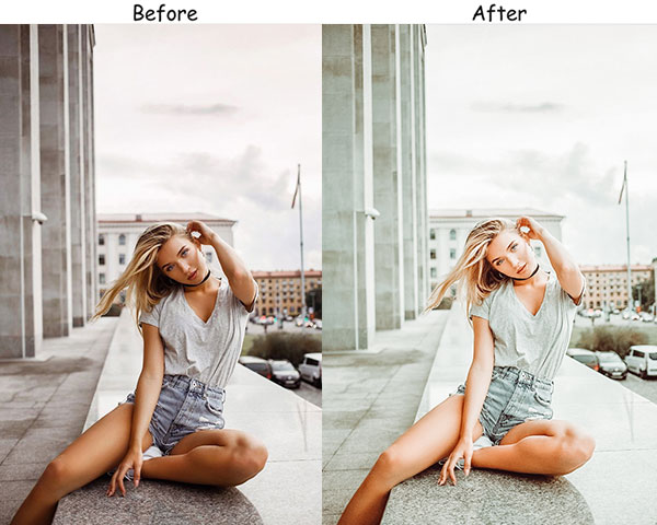
Every scroll-stopping Instagram photo has a secret weapon: a Lightroom preset. These one-click editing settings transform flat, average shots into polished, feed-worthy images consistently without spending hours tweaking sliders. This collection of Instagram presets gives you 18 distinct styles (moody, bright & airy, cinematic, vintage, golden hour, and more), available as DNG files for Lightroom Mobile (iPhone & Android) and XMP files for Lightroom Classic on desktop.
Whether you’re building an aesthetic grid, editing travel photos, or shooting portraits, there’s a preset here for every mood and audience. All downloads are 100% free – no sign-up required.
→ New to presets? Jump to the installation guide first.
Pauline Jackson
I’ve worked with a wide range of photography styles, including portraits, weddings, travel, lifestyle, sports, cinematic, and moody photography. My goal is always to create presets that enhance natural lighting, improve colors, refine skin tones, and give every image a polished, professional look in just a few clicks.
Why Instagram Lightroom Presets Beat Built-In Filters
Instagram’s built-in filters apply a generic, one-size-fits-all overlay that compresses image quality, limits your control, and makes your photos look like everyone else’s. Lightroom presets work differently:
| Feature | Instagram Filters | These Lightroom Presets |
|---|---|---|
| Image quality | Compressed / degraded | ✅ Full resolution preserved |
| RAW file support | JPEG only | ✅ RAW, JPEG, HEIF, TIFF, PNG |
| Customizable | Barely | ✅ Fully adjustable sliders |
| Batch editing | One photo at a time | ✅ Edit hundreds at once |
| Consistent across lighting | Inconsistent results | ✅ Adapts to any photo |
| Professional look | Generic / overdone | ✅ Curated by professionals |
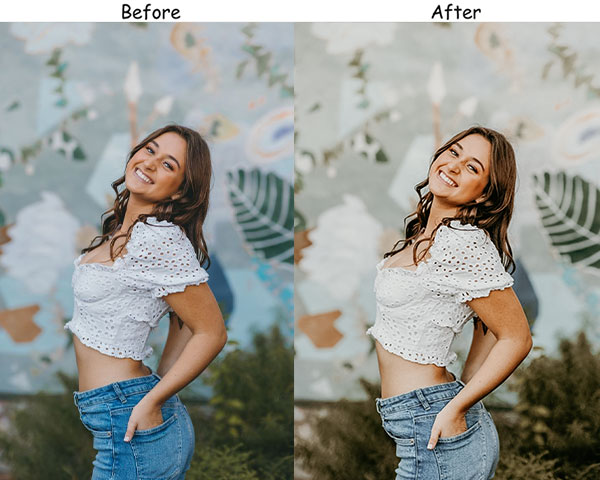
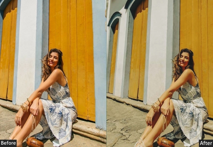
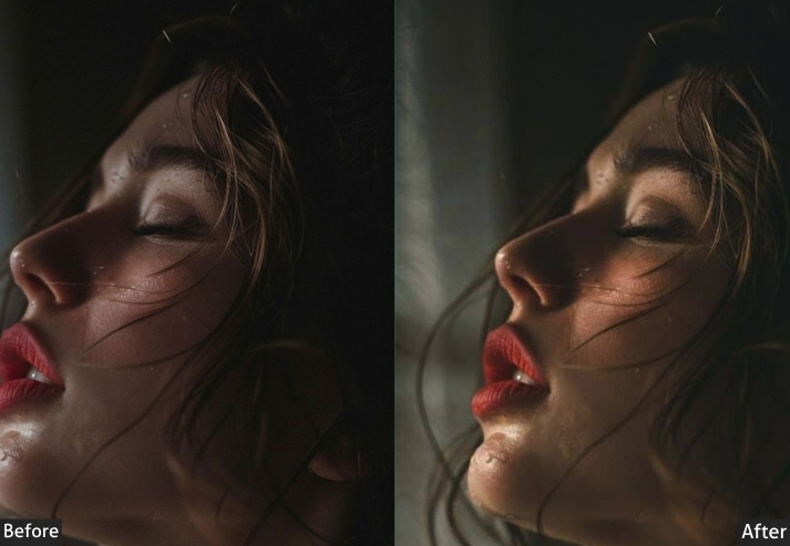
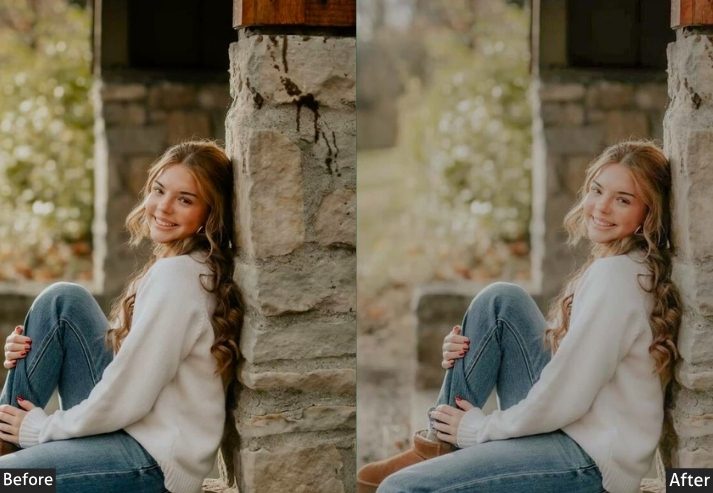
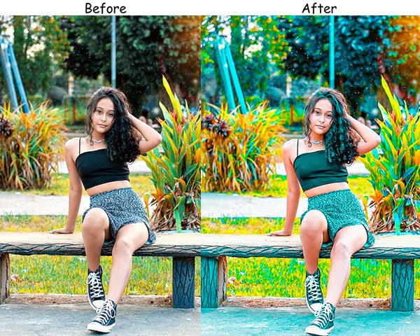
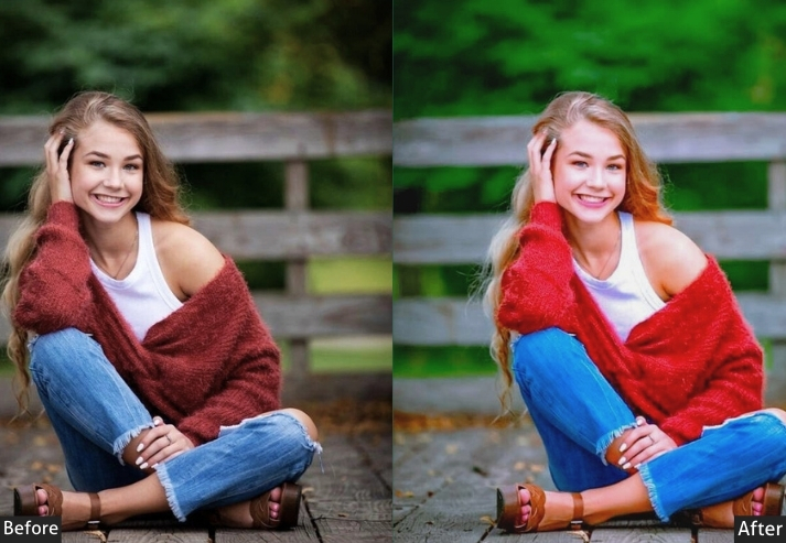
100 Instagram Lightroom Presets Free Download
Presets save you time by providing instant edits tailored to your aesthetic. They make your content look polished and high-quality, making your feed stand out to followers and potential brand collaborations. Here are many presets (mood, type, vibe, color, etc.) that appeal to specific audiences and moods, making your feed more relatable and engaging across content types. Let’s create magic!
- Pauline Jackson
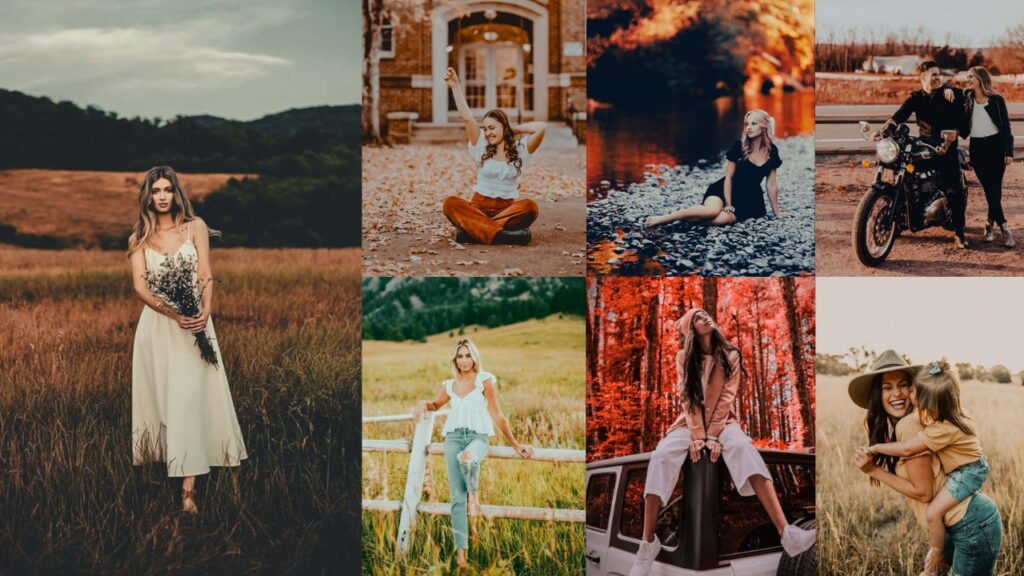
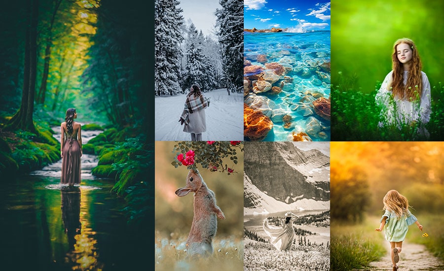
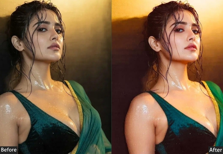
- 1. Moody Instagram Presets
- 2. Bright & Airy Insta Presets
- 3. Vintage Film Presets
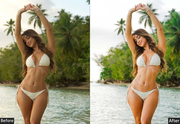
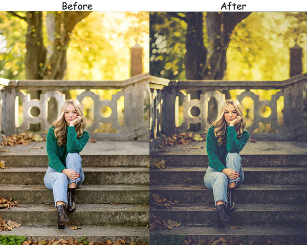
- 4. Golden Hour Instagram Presets
- 5. Minimalist Insta Presets
- 6. Dark & Gritty Presets
- 7. Pastel Dream Presets
- 8. Cinematic Insta Presets
- 9. Desaturated Urban Presets
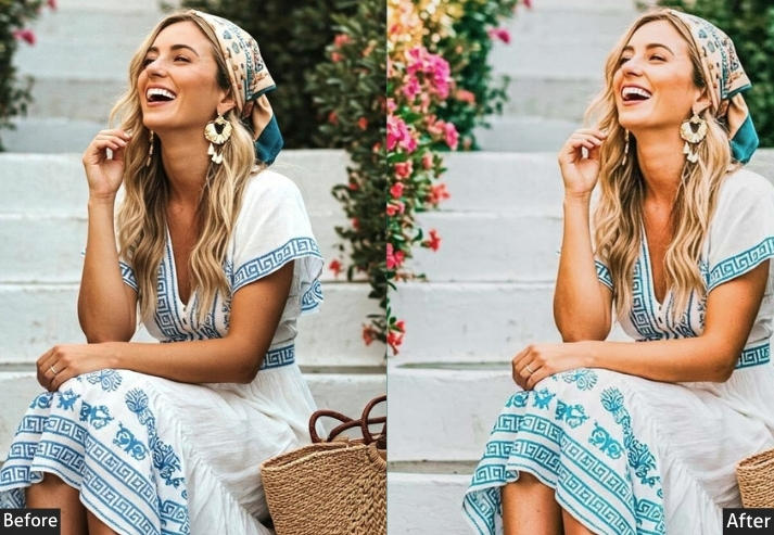
- 10. Boho Instagram Presets
- 11. Black & White Presets
- 12. Travel Adventure Presets
- 13. Matte Finish Presets
- 14. Vibrant Color Presets
- 15. Romantic Vibe Presets
- 16. High Contrast Presets
- 17. Autumn Presets
- 18. Tropical Vibes Presets
- 19. Grunge Presets
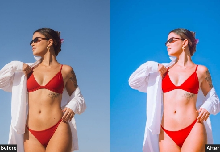
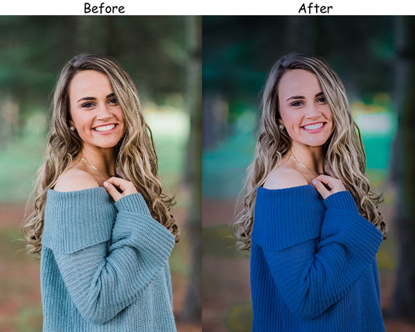
- 20. Blue Vibe Presets
- 21. Dark Academia Presets
- 22. Crisp Winter Presets
- 23. Red Instagram Presets
- 24. Green Instagram Presets
- 25. Yellow Instagram Presets
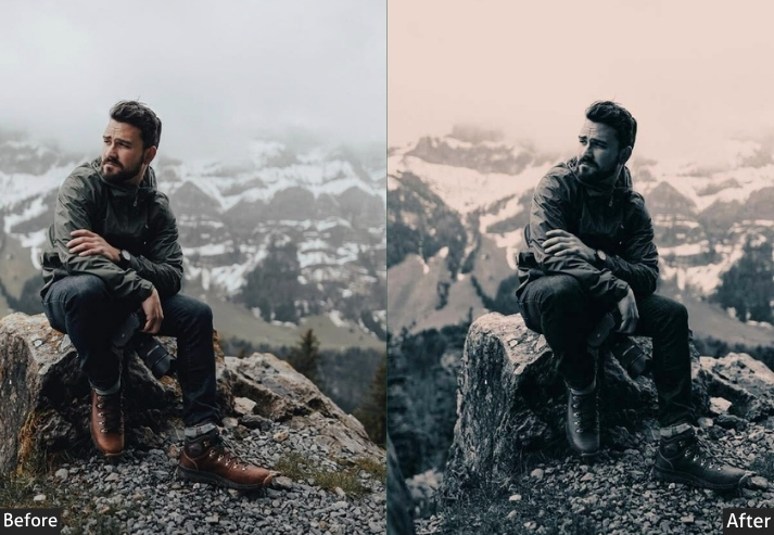
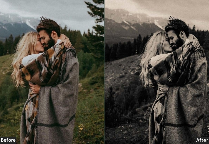
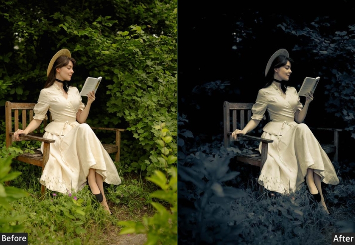
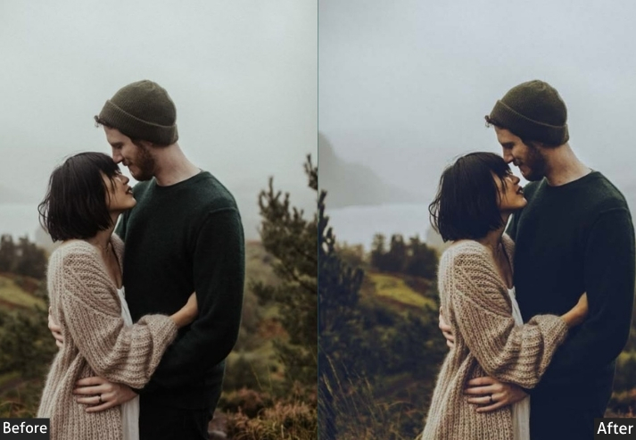
1. Moody Instagram Presets
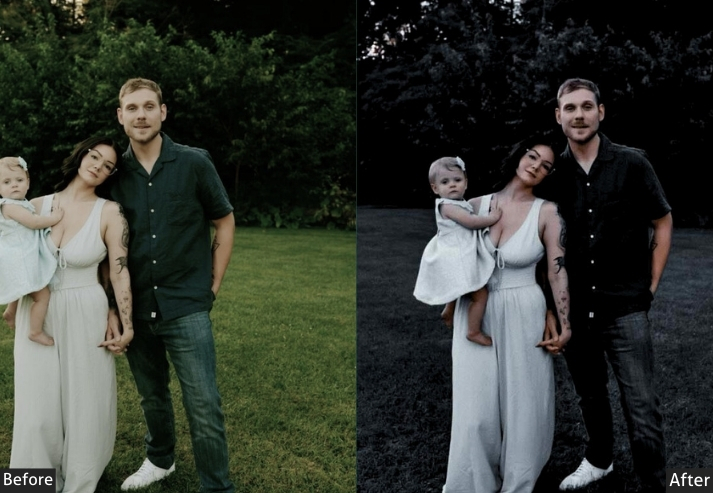
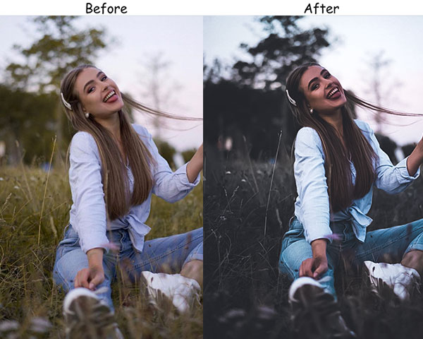
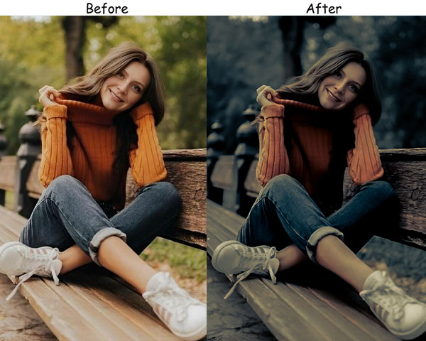
Moody presets draw out emotional depth and mystery by emphasizing darker tones and subtle contrast. They create an atmosphere that’s introspective and intense, connecting with your audience on a deeper level and making posts more memorable.
Light Panel: Exposure −15 | Highlights −20 | Shadows +10.
HSL / Color Mix: Blue Saturation −40 | Orange Saturation +20.
Effects Panel: Vignette −10.
Detail Panel: Sharpening +15.
Purpose: connected and thoughtful.
Best For: Moody portraits, nature landscapes, or editorial photography.
Style: Deep, emotive, and contemplative.
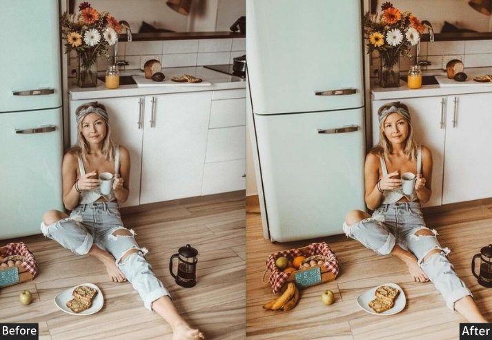
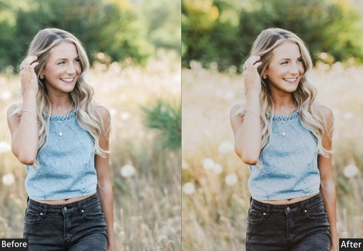
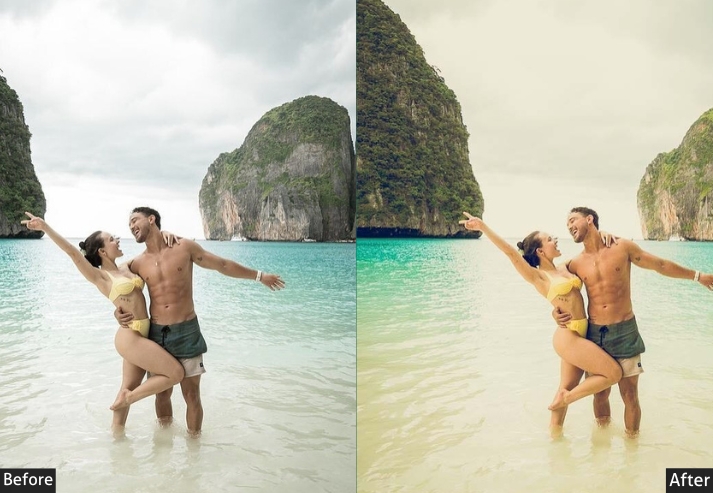
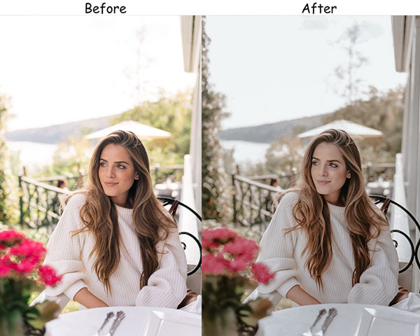
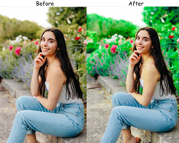
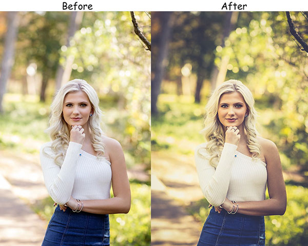
2. Bright & Airy Insta Presets
Bright and airy presets are among the most popular on Instagram because they exude a clean, fresh, and welcoming vibe. They enhance natural light and create an uplifting atmosphere, making photos feel approachable and polished.
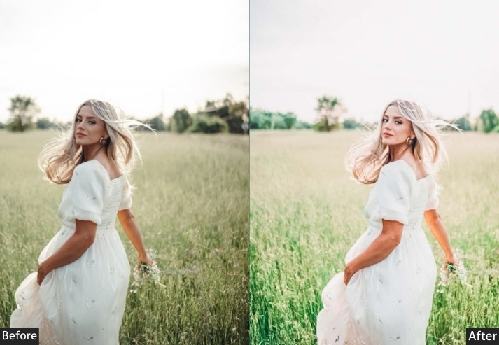
Light Panel: Exposure +20 | Highlights +30.
Color Panel: Saturation −10.
HSL / Color Mix: Yellow Saturation +15 | Orange Saturation +15.
Effects Panel: Clarity +10.
Detail Panel: Noise Reduction +5.
Purpose: joyful and polished.
Best For: Interior shots, weddings, lifestyle content.
Style: Crisp, soft, and cheerful.
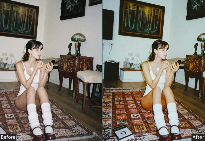
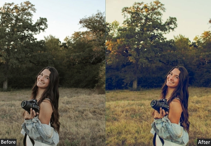
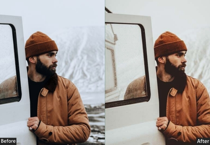
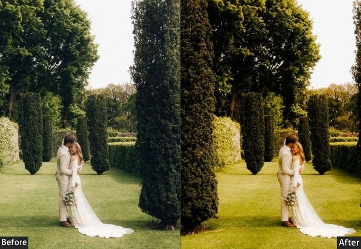
3. Vintage Film Presets
If you’re after a retro, nostalgic aesthetic, this will take you there. With faded colors, added grain, and a subtle green tint, these presets give your photos that timeless, cinematic quality reminiscent of analog film. They’re suitable for setting your feed apart from the over-filtered, oversaturated look that’s everywhere on Instagram.
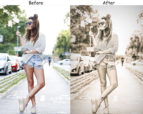
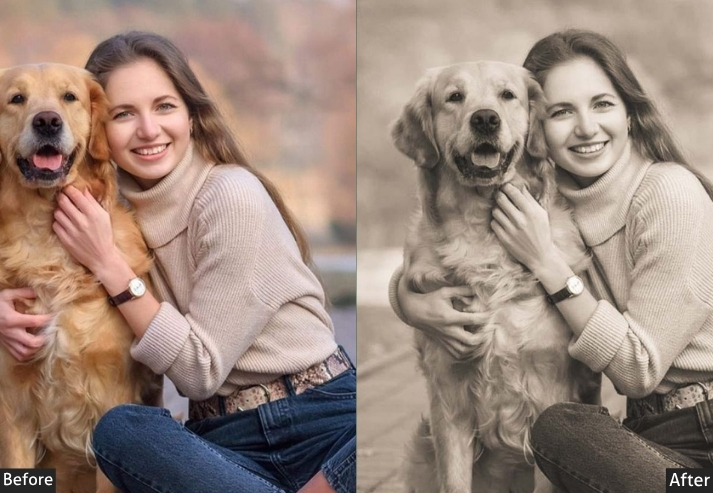
Light Panel: Contrast −15 | Highlights −20.
Color Panel: Saturation −25 | Green Tint +15.
Effects Panel: Grain +25 | Clarity −10.
Detail Panel: Sharpening +5.
Purpose: vintage film photography.
Best For: Travel photography, urban landscapes, or any image that tells a nostalgic story.
Style: Faded, grainy, and timeless look with modern flair.
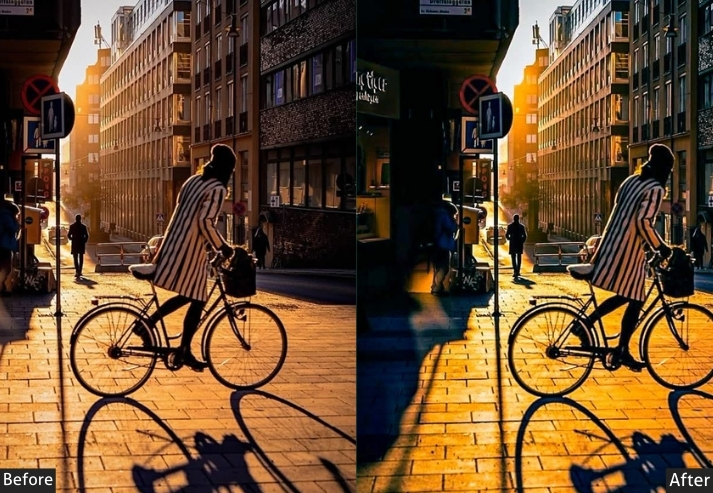
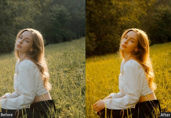
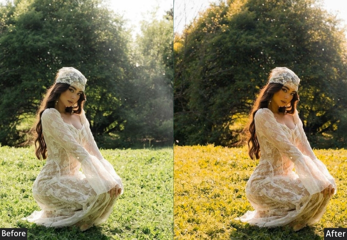
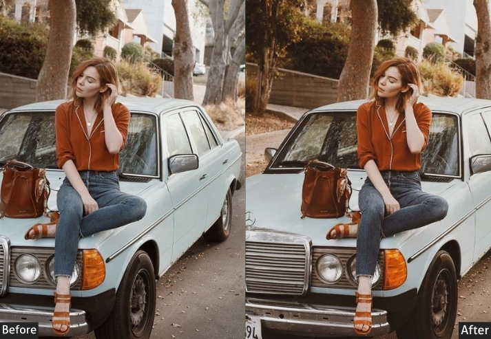
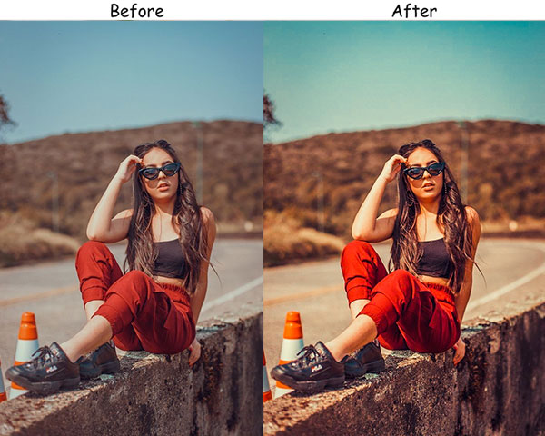
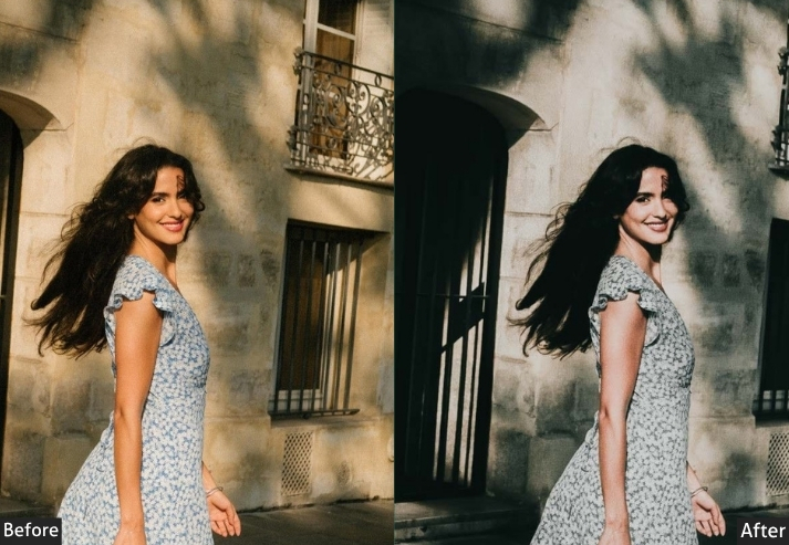
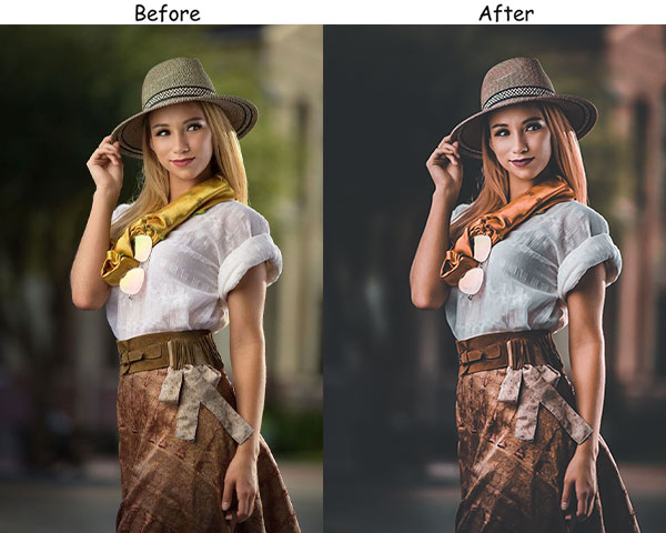
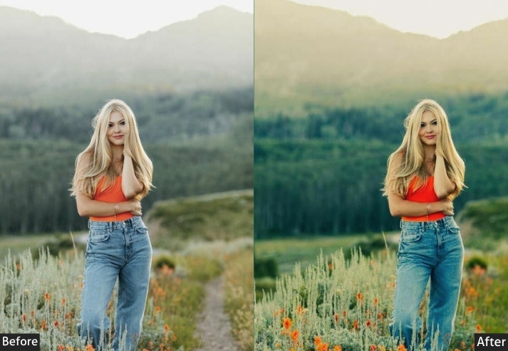
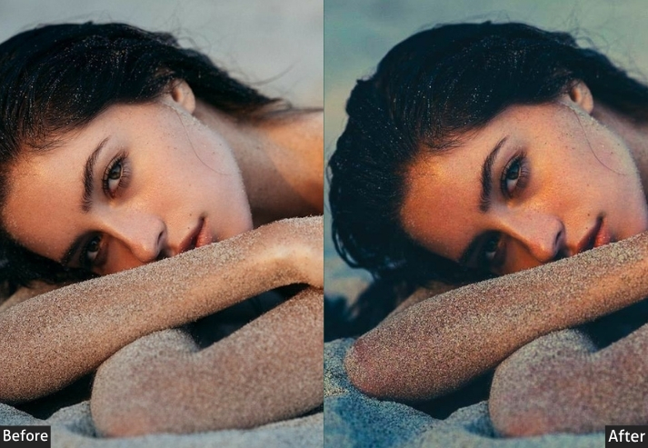
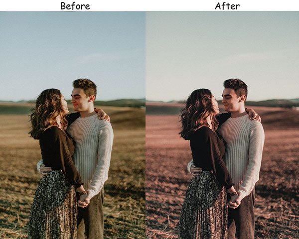
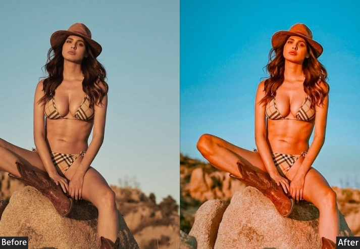
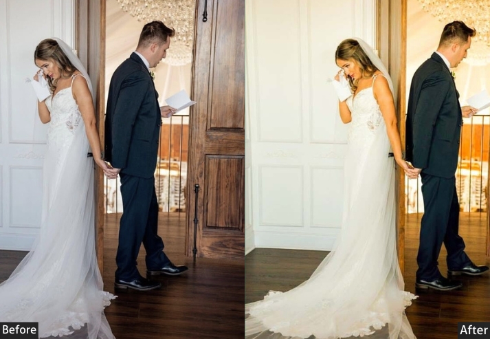
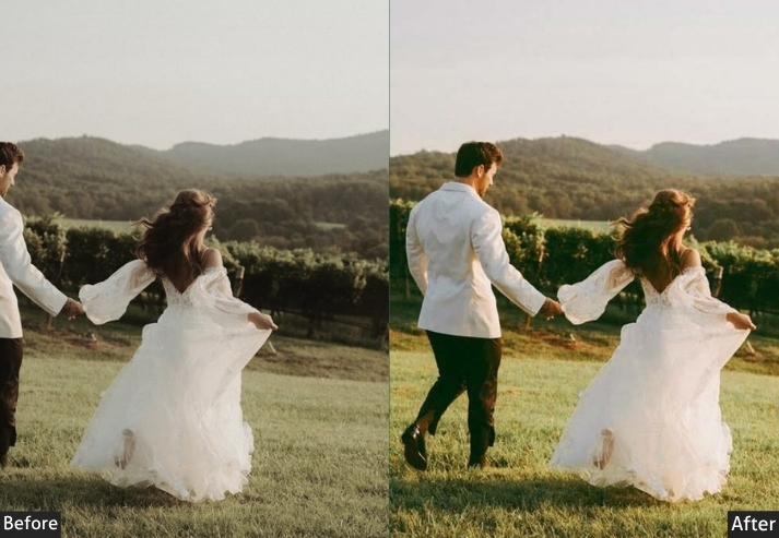
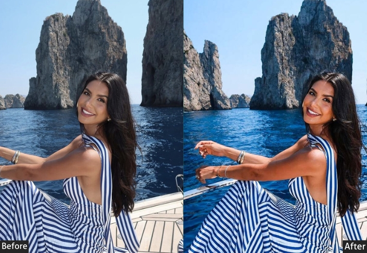
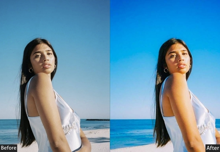
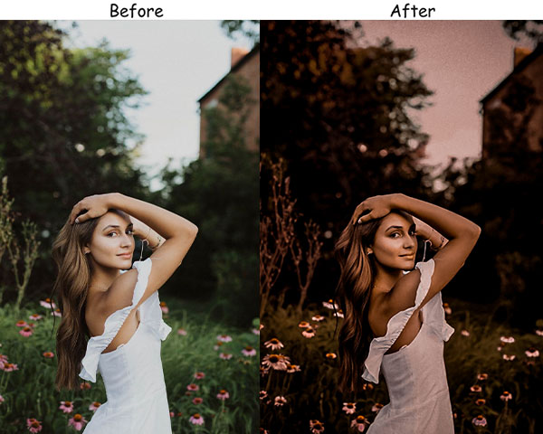
4. Golden Hour Instagram Presets
Golden hour mimics that magical late-afternoon sunlight: warm, soft, and flattering no matter when you actually took your photo. They bathe images in warm tones, creating a dreamy, sun-kissed glow that flatters all skin tones and makes landscapes look breathtaking.
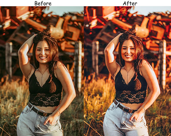
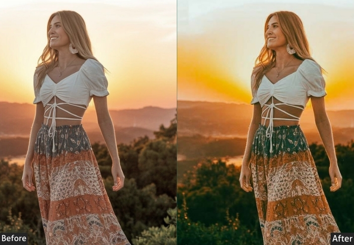
Light Panel: Exposure +10 | Highlights +20.
HSL / Color Mix: Orange Saturation +25 | Yellow Saturation +25.
Effects Panel: Dehaze +15.
Detail Panel: Sharpening +10.
Purpose: warm, glowing images with the look of golden hour, even if the sun isn’t cooperating.
Best For: Portraits, outdoor events, and landscapes where you want to add a dreamy warmth.
Style: Warm, radiant, and glowing.
5. Minimalist Insta Presets
Minimalism is all about simplicity and clarity. These presets strip away distractions, reduce saturation, and rely on sharp contrasts to make the subject the unambiguous focal point. The result is a sophisticated, high-end aesthetic that appeals to brands and followers who appreciate a curated, clutter-free feed.
Light Panel: Exposure +20 | Shadows −10.
Color Panel: Saturation −25.
HSL / Color Mix: Orange Saturation +5 | Blue Saturation +5.
Effects Panel: Texture +10.
Detail Panel: Sharpening +15 | Noise Reduction +10.
Purpose: highlighting clean lines and simple compositions, with a professional edge.
Best For: Product photography, flat lays, and architectural shots.
Style: Simple, refined, and modern.
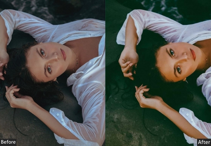
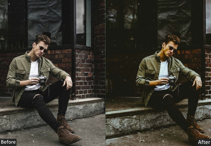
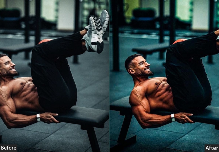
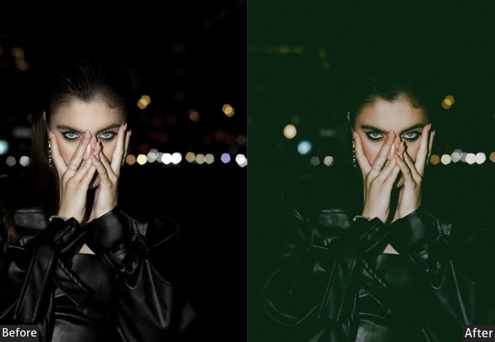
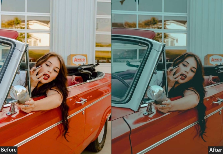
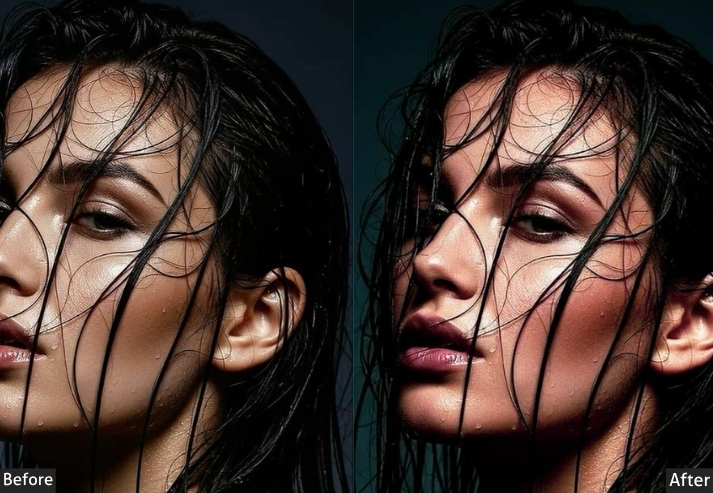
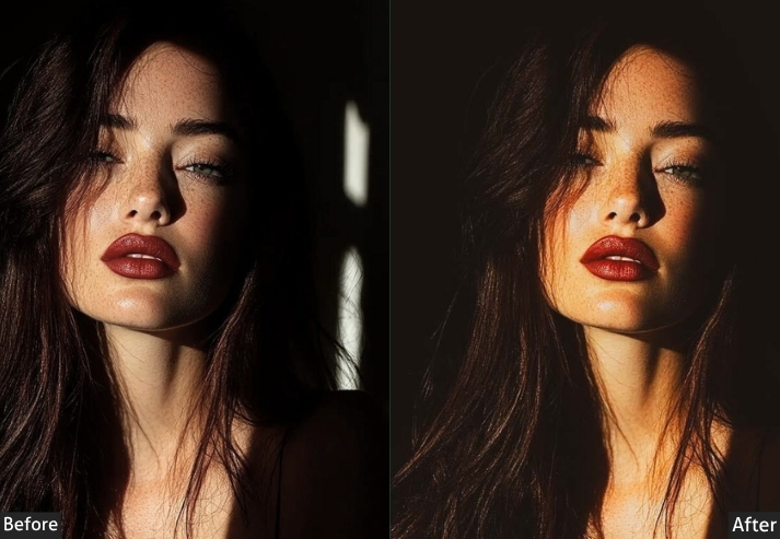
6. Dark & Gritty Presets
This brings out raw intensity. They emphasize deep shadows, strong contrast, and muted colors, turning urban or street photography into powerful statement pieces. If your content has an edgy, no-nonsense tone, these will match it perfectly.
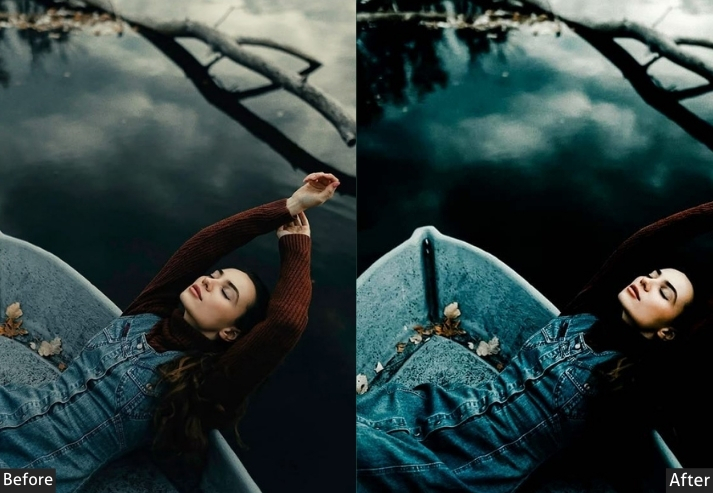
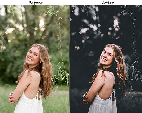
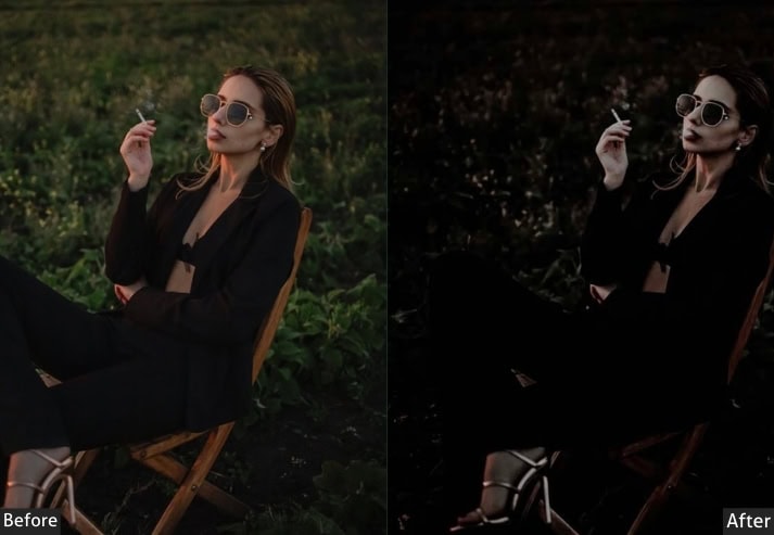
Light Panel: Exposure −30 | Highlights −25.
Color Panel: Saturation −40.
HSL / Color Mix: Red Saturation +20 | Orange Saturation +20.
Effects Panel: Clarity +30 | Texture +25.
Detail Panel: Sharpening +30.
Purpose: bold, raw statements with striking contrasts.
Best For: Street photography, urban landscapes, or any image that calls for a tough, impactful aesthetic.
Style: Bold and edgy.
7. Pastel Dream Presets
Soft, dreamy, and pastel-toned, these presets bring out delicate colors and give your images a whimsical, light-as-air quality. They’re the go-to choice when you want your feed to look like it’s floating in a daydream. Hugely popular for fashion, beauty, and lifestyle niches.
Light Panel: Exposure +10 | Shadows +15.
HSL / Color Mix: Pink Saturation +20 | Peach Saturation +20.
Color Panel: Saturation −20.
Effects Panel: Dehaze −10.
Detail Panel: Sharpening +5.
Purpose: soft, pastel-toned images that are light and whimsical.
Best For: Fashion, lifestyle, and creative shoots.
Style: Ethereal, pastel, and romantic.
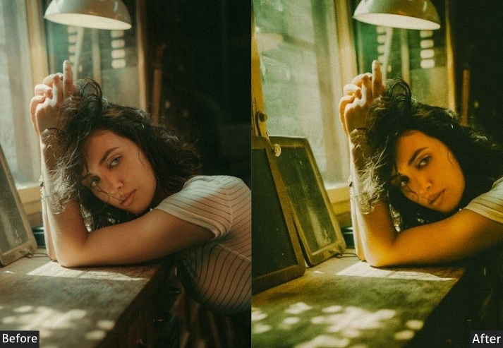
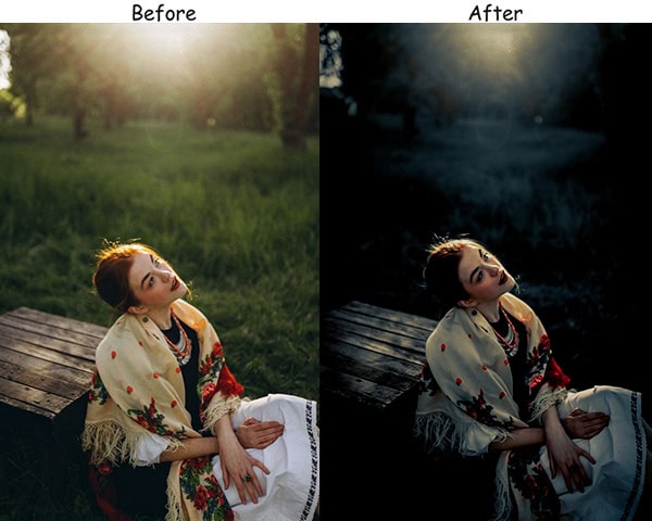
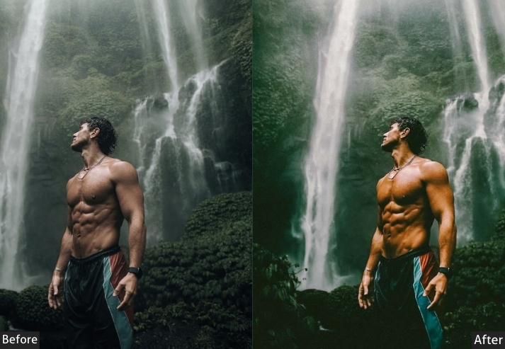
8. Cinematic Insta Presets
Cinematic presets make your photos look like stills pulled directly from a Hollywood movie scene: rich colors, deep shadows, and a sense of visual storytelling built into every shot. They give your images a professional, polished quality that feels intentional and narrative-driven.
Light Panel: Contrast +25 | Shadows −20 | Exposure 0.
Color Panel: Blue Saturation +20 | Teal Saturation +20 | Warm tones −10.
Effects Panel: Dehaze +15 | Vignette −10.
Detail Panel: Sharpening +15.
Purpose: cinematic look, making them feel as if they belong on the big screen.
Best For: Story-driven shots, travel photography, or editorial work.
Style: Bold, polished, and dramatic.
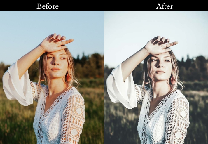
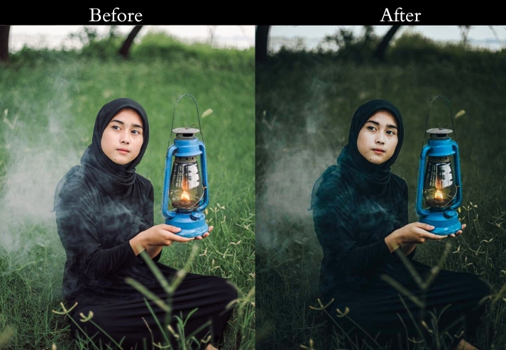
9. Desaturated Urban Presets
Urban photography is about capturing the grit and raw beauty of city life. Desaturated urban photography reduces color intensity to highlight texture, structure, and mood, helping the viewer focus on the lines, shapes, and emotions that make cityscapes unique.
Light Panel: Contrast +20 | Exposure −10.
Color Panel: Saturation −30.
HSL / Color Mix: Blue Saturation +15 | Gray emphasis +15.
Effects Panel: Texture +20 | Clarity +25.
Detail Panel: Sharpening +25.
Purpose: the mood and texture shine.
Best For: Street photography, architectural shots, or any urban scenes.
Style: Minimal, gritty, and focused on structure.
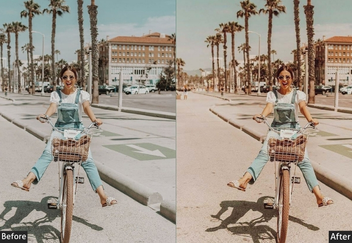
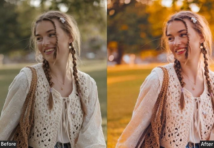
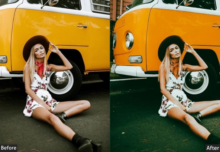
10. Boho Instagram Presets
Boho is a favorite for lifestyle bloggers who love a free-spirited, earthy vibe. Warm tones, soft contrast, and a slightly vintage feel bring out the organic beauty of natural light, creating an inviting, cozy atmosphere for relaxed storytelling and product showcasing.
Light Panel: Exposure +10 | Shadows +15.
HSL / Color Mix: Orange Saturation +20 | Brown Saturation +20 | Green Saturation −10.
Effects Panel: Clarity +10 | Vignette −5.
Detail Panel: Sharpening +10 | Noise Reduction +5.
Purpose: a warm, earthy tone that feels effortless and stylish.
Best For: Lifestyle blogs, fashion shoots, or any outdoor photos.
Style: Warm, relaxed, and organic.
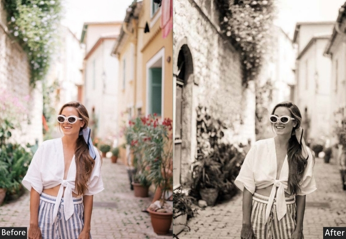
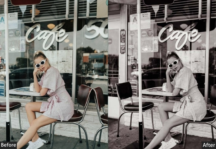
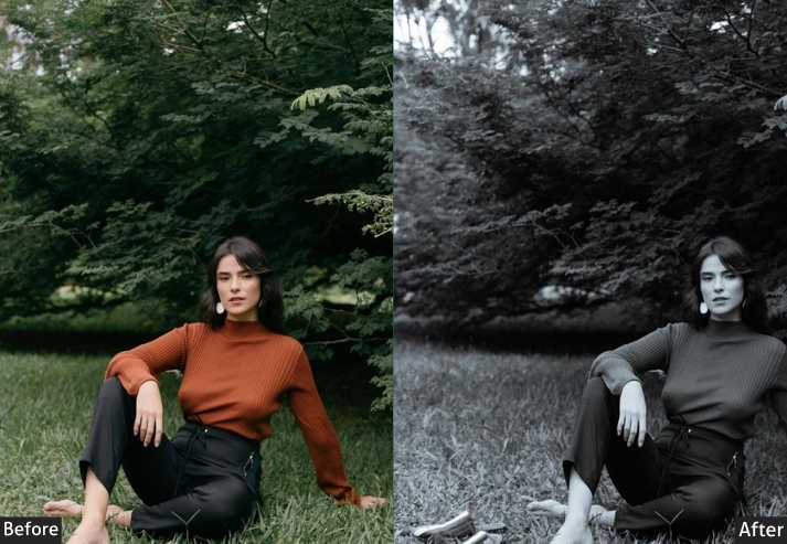
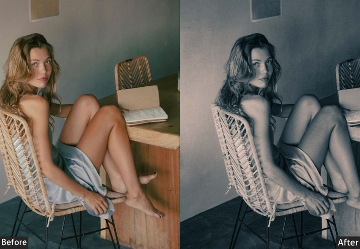
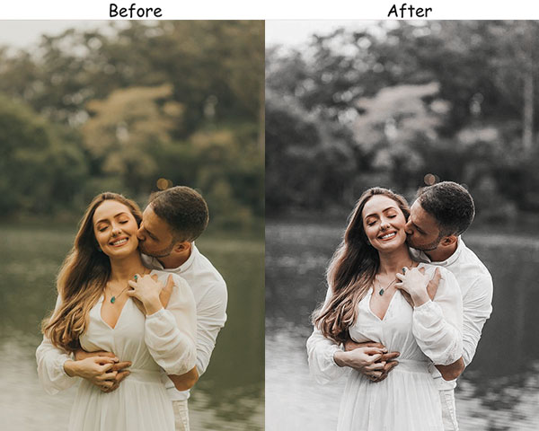
11. Black & White Presets
Black-and-white photography never goes out of style. These presets strip away color, focusing instead on contrast, texture, and emotion. They’re powerful tools for turning everyday photos into striking, timeless images that highlight composition and form, creating a strong emotional connection with your audience.
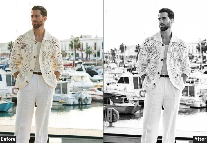
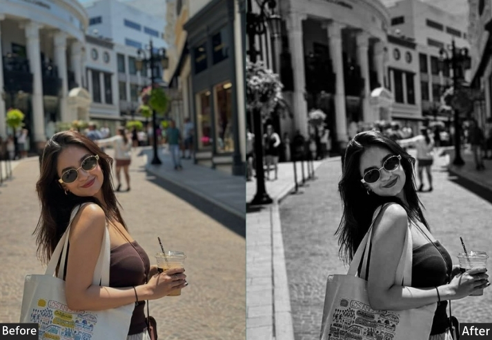
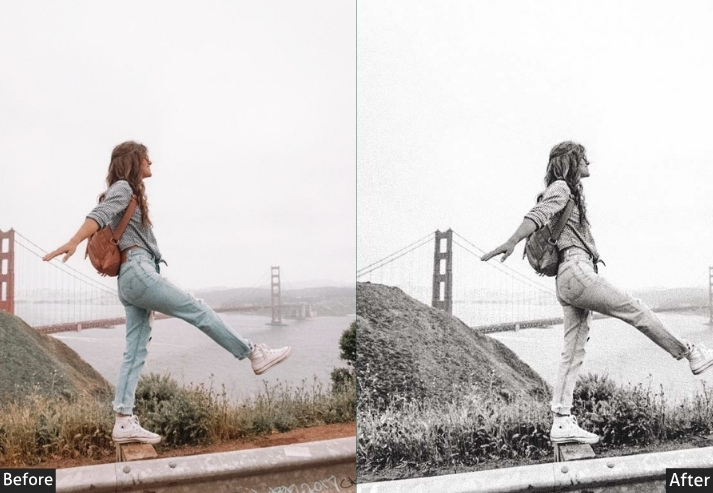
Light Panel: Contrast +35 | Shadows −20 | Exposure 0.
HSL / Color Mix: Red +15 | Orange +15 | Blue −10.
Effects Panel: Texture +20 | Clarity +25.
Detail Panel: Sharpening +30.
Purpose: composition, texture, and emotion without the distraction of color.
Best For: Portraits, landscapes, or architectural shots.
Style: Bold, timeless, and emotional.
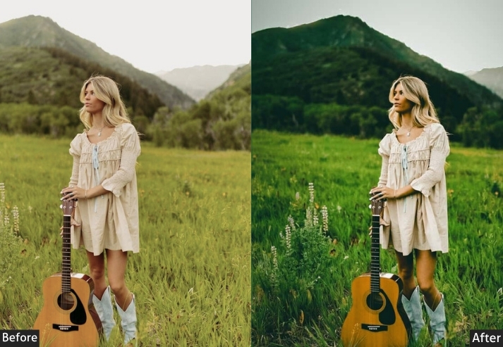
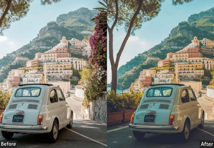
12. Travel Adventure Presets
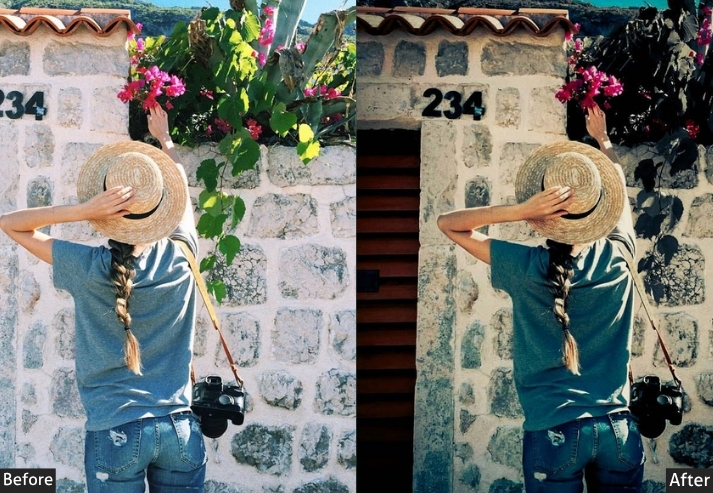
Travel presets are designed to make your destination photos look epic. They bring out vibrant colors, enhance clarity, and make landscapes and cityscapes shine. Every destination looks as breathtaking as possible, perfect for growing a travel account and attracting brand partnerships.
Light Panel: Exposure +15 | Highlights +20.
Color Panel: Vibrance +20 | Saturation +10.
HSL / Color Mix: Blue +20 | Green +20 | Orange +20.
Effects Panel: Clarity +15 | Dehaze +10.
Detail Panel: Sharpening +15.
Purpose: travel photos into epic, vibrant images.
Best For: Travel blogs, landscape photography, or any shots from your adventures around the world.
Style: Bright, vibrant, and clear.
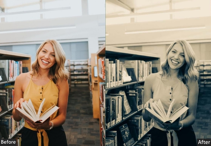
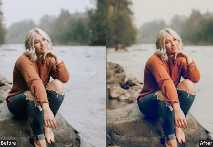
13. Matte Finish Presets
This gives your photos a soft, muted look by reducing the harshness of shadows and highlights. The result is smooth, delicate, and sophisticated, a subtle artistic touch that positions you as a serious content creator, attractive to brand collaborations.
Light Panel: Contrast −15 | Highlights −20.
Color Panel: Saturation −10.
HSL / Color Mix: Red −15 | Blue −15.
Effects Panel: Clarity +5 | Grain +10.
Detail Panel: Sharpening +10.
Purpose: soft, muted images with a professional, polished look.
Best For: Portraits, lifestyle photography.
Style: Soft, smooth, and muted.
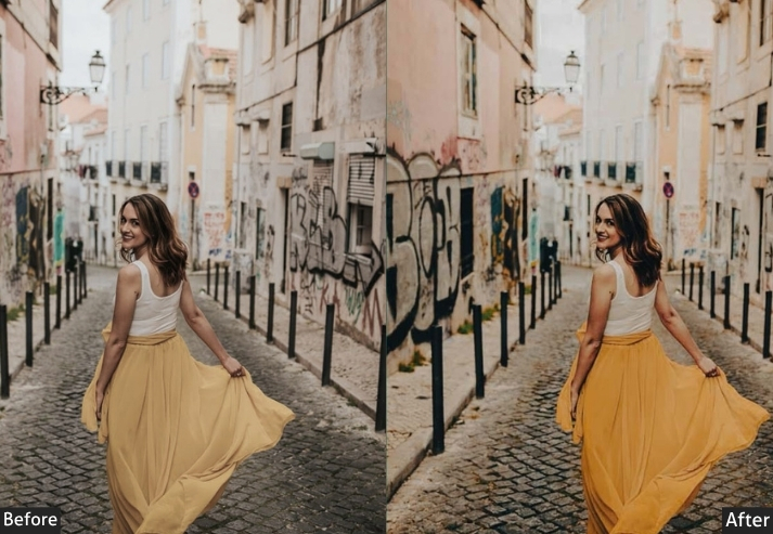
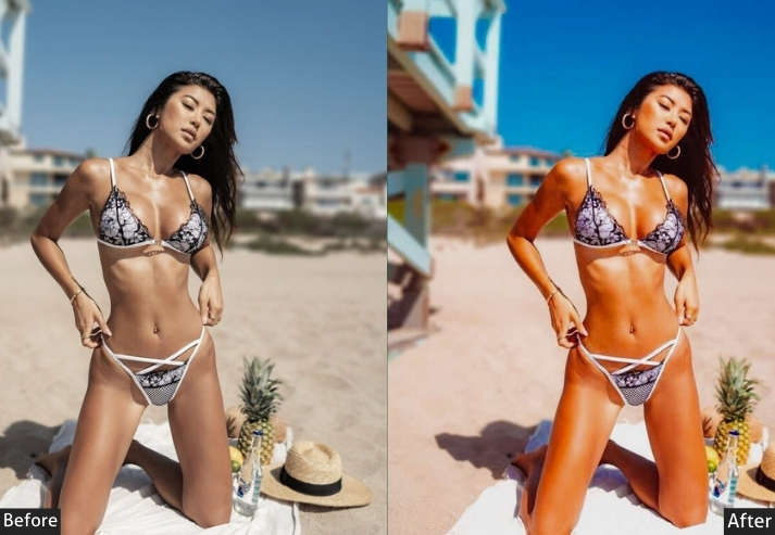
14. Vibrant Color Presets
Vibrant colors make photos explode off the screen, turning ordinary photos into attention-grabbing images. They enhance every hue where color is the star, from food to fashion. Followers feel the energy you create, boosting engagement and loyalty.
Light Panel: Exposure 0 | Highlights +10.
Color Panel: Vibrance +25 | Saturation +25.
Effects Panel: Clarity +15.
Detail Panel: Sharpening +15.
Purpose: bold, high-energy photos where colors are the focus.
Best For: Fashion, food, or product photography.
Style: Bright, bold, and eye-catching.
15. Romantic Vibe Presets
Romantic vibe presets transform bright, intense colors into soft, muted pastels, giving your photos a gentle, fairy-tale-like quality. These are your go-to for creating a feed that feels light, airy, and subtly dreamy.
Light Panel: Exposure +15 | Highlights +20.
Color Panel: Saturation −20.
HSL / Color Mix: Pink +15 | Peach +15.
Effects Panel: Dehaze −15.
Detail Panel: Sharpening +5 | Noise Reduction +15.
Purpose: soft, delicate images with a pastel color palette.
Best For: Lifestyle shots, fashion photography.
Style: Dreamy, romantic, and soft.
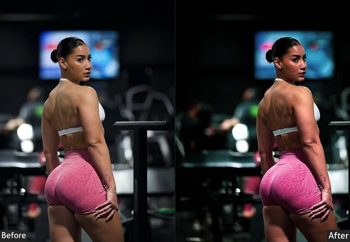
16. High Contrast Presets
Most Instagram users browse on mobile, where high-contrast images punch through the scroll far better than soft ones. These are bold and striking, emphasizing the contrast between light and dark and giving your photos a sharp, edgy look that stands out in any feed.
Light Panel: Contrast +40 | Exposure −10.
Color Panel: Vibrance +15 | Saturation 0.
Effects Panel: Clarity +25.
Detail Panel: Sharpening +30.
Purpose: drama and boldness.
Best For: Street photography, portraiture.
Style: Bold, edgy, and intense.
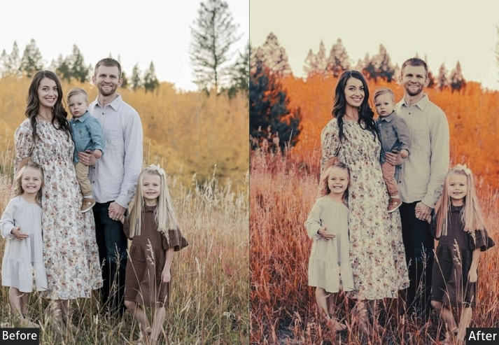
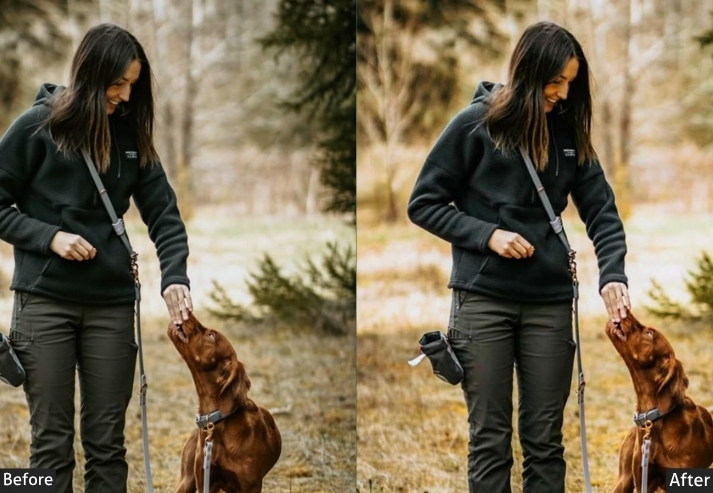
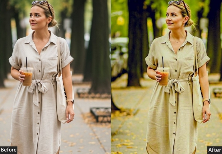
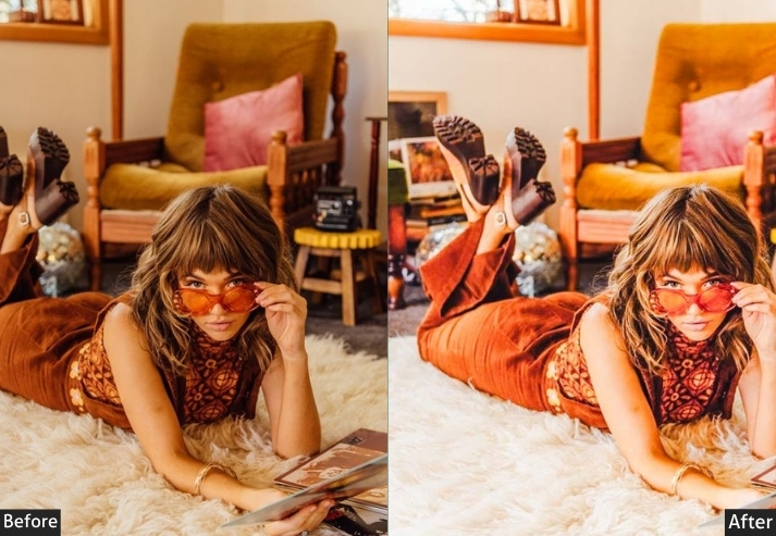
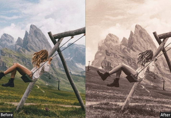
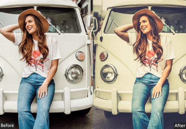
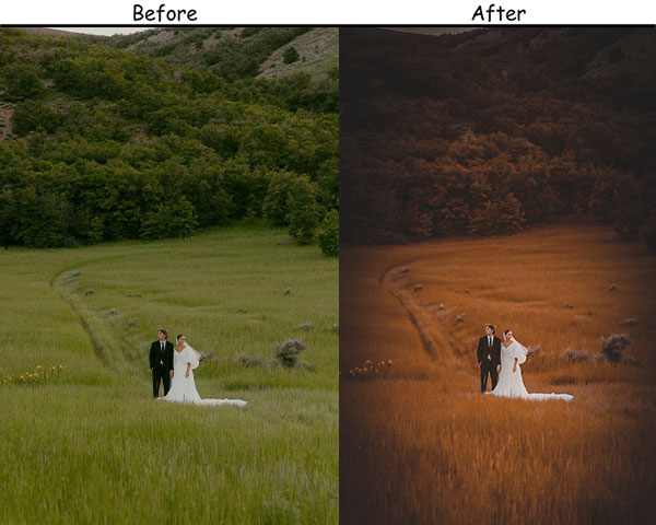
17. Autumn Presets
Autumn brings out the warm, cozy vibes of fall. With rich oranges, deep reds, and golden browns, they create an inviting seasonal feel that transforms everyday shots into golden-afternoon masterpieces.
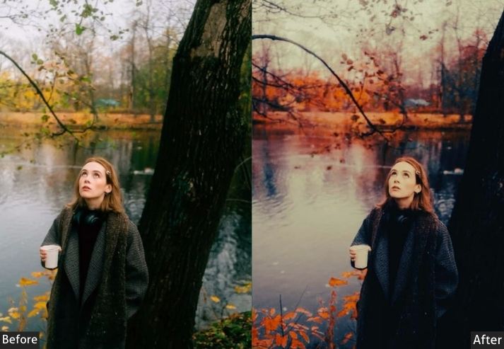
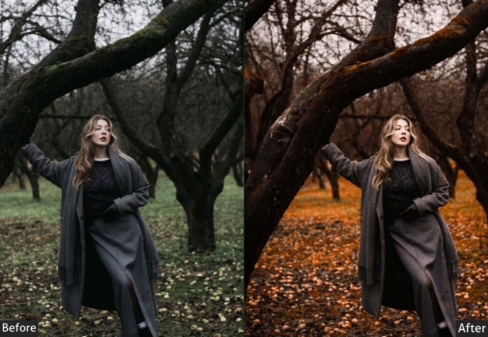
Light Panel: Warmth +20 | Highlights +10.
Color Panel: Orange +25 | Yellow +25 | Red +25 | Blue −15.
Effects Panel: Vignette −5.
Detail Panel: Sharpening +10.
Purpose: rich, warm tones of autumn.
Best For: Landscape shots, outdoor portraits, or fall-inspired content.
Style: Warm, cozy, and seasonal.
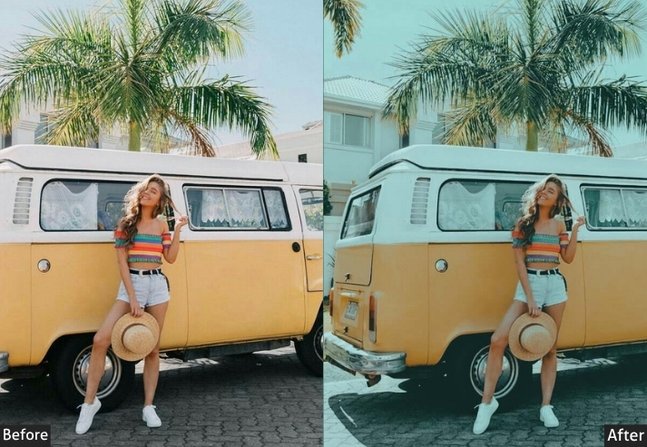
18. Tropical Vibes Presets
Tropical vibes turn your photos into bright, sunny, beachy escapes. They enhance vibrant greens and blues so that palm trees, ocean waves, and sunsets absolutely shine, giving your feed a high-energy, saturated look that transports your audience straight to paradise.
Light Panel: Exposure +15 | Warmth +10.
Color Panel: Blue +25 | Green +25 | Orange +10.
Effects Panel: Dehaze +10.
Detail Panel: Sharpening +15.
Purpose: vibrant, saturated colors for beach or tropical photos.
Best For: Vacation photos, beach scenes, or tropical travel adventures.
Style: Bright, lively, and sun-soaked.
19. Grunge Presets
Grunge focuses on the unpolished side of photography. With darker tones, muted colors, and strong textures, it creates gritty, alternative aesthetics. You can use it in street photography or urban settings to emphasize the scene’s unfiltered feel.
Light Panel: Exposure −10 | Highlights −25.
Color Panel: Saturation −30.
HSL / Color Mix: Green +15 | Blue +15.
Effects Panel: Texture +20 | Clarity +25.
Detail Panel: Sharpening +30.
Purpose: dark, textured aesthetic.
Best For: Street photography, industrial or urban landscapes, or grunge-inspired content.
Style: Gritty, raw, and edgy.
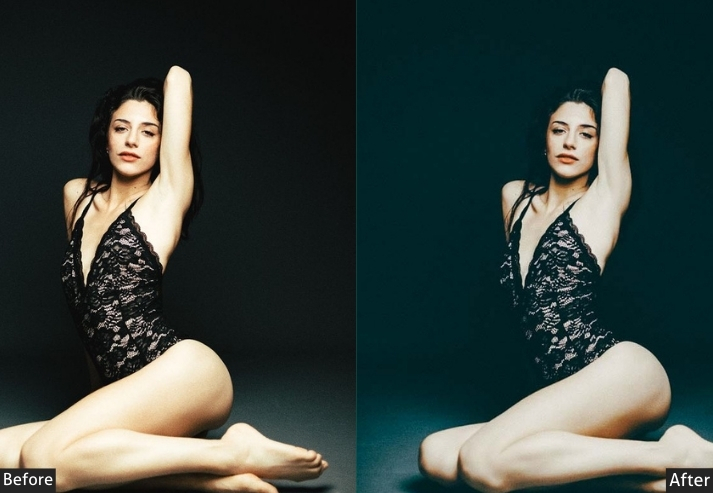
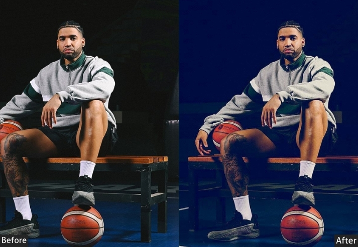
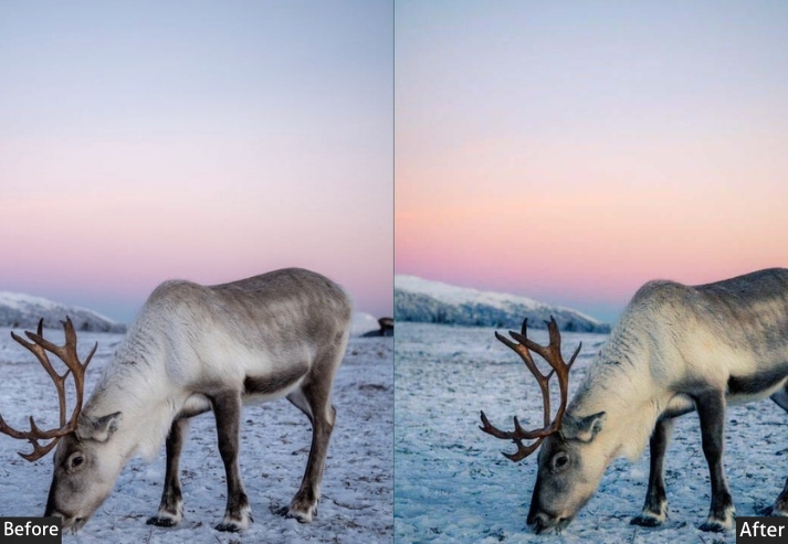
20. Blue Vibe Presets
Blue captures the magic of that brief moment before sunrise or after sunset when the world is bathed in a cool, blue glow. Enhance the deep blues and soft pinks that are characteristic of this time of day, and give your photos a tranquil, serene quality. Easily adapt your photos to fit various niches, all while maintaining an aesthetic across different types of content.
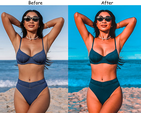
Light Panel: Exposure −10 | Shadows +15.
Color Panel: Blue +25 | Pink +10 | Purple +10.
Effects Panel: Dehaze +10.
Detail Panel: Sharpening +10.
Purpose: The cool, soft colors of the blue hour create serene, moody images.
Best For: Early-morning or twilight landscapes, cityscapes, or portrait shots that call for a calm, cool atmosphere.
Style: Tranquil, serene, and atmospheric.
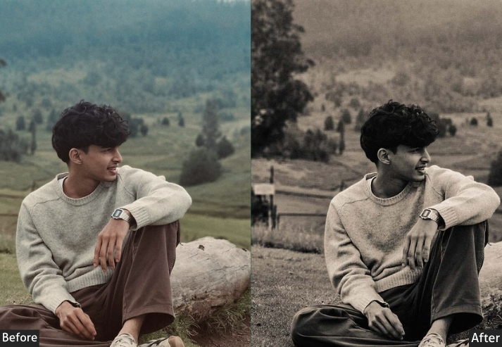
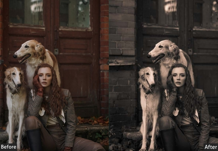
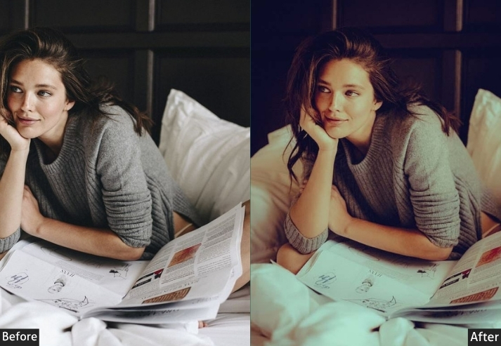
21. Dark Academia Presets
Dark academia presets are inspired by the rich, moody tones of old libraries, gothic architecture, and classic literature. They feature deep browns, dark greens, and muted golds, giving your photos a vintage, scholarly feel. If you are looking to create a mysterious, intellectual aesthetic, grab it. A well-curated, visually appealing feed attracts more followers. People are more likely to follow you if your content looks polished and professional.
Light Panel: Exposure −10 | Contrast +20.
Color Panel: Brown +20 | Gold +20 | Cool tones −10.
Effects Panel: Vignette −15.
Detail Panel: Sharpening +15 | Texture +10.
Purpose: a moody, intellectual atmosphere with rich, vintage-inspired tones.
Best For: Bookstagram, academic shots, gothic architecture, or moody portraits.
Style: Dark, mysterious, and vintage.
22. Crisp Winter Presets
Now focus on bringing out the cool, clean tones of winter scenes! Winter presets emphasize whites, soft blues, and icy tones, giving your photos a frosty, pristine appearance.
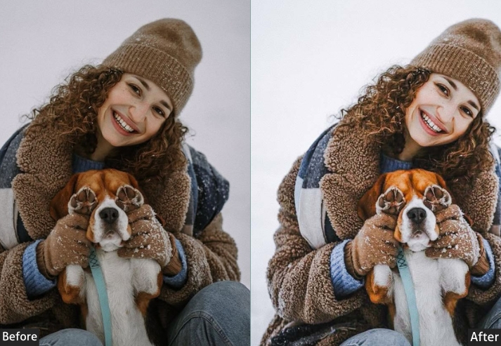
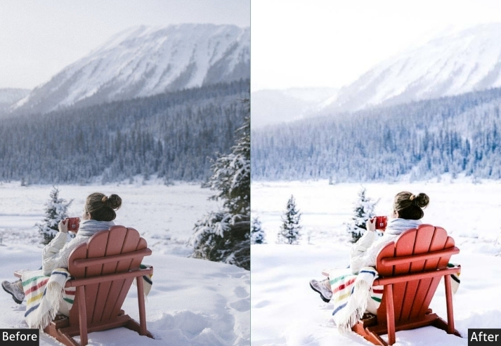
Light Panel: Exposure +20 | Highlights +15.
Color Panel: Blue +15 | Yellow −10.
Effects Panel: Dehaze +10.
Detail Panel: Sharpening +20.
23. Red Instagram Presets
Red is a powerful and emotionally charged color. So this one is bold, passionate, and intense. This brings out the warmth, fire, and energy of red-toned images, making strong visual statements. Followers can instantly identify your content, even without seeing your username, which strengthens your brand and helps build follower loyalty.
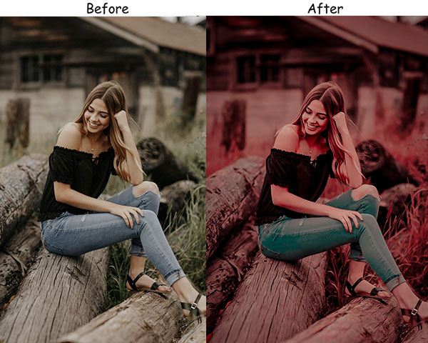
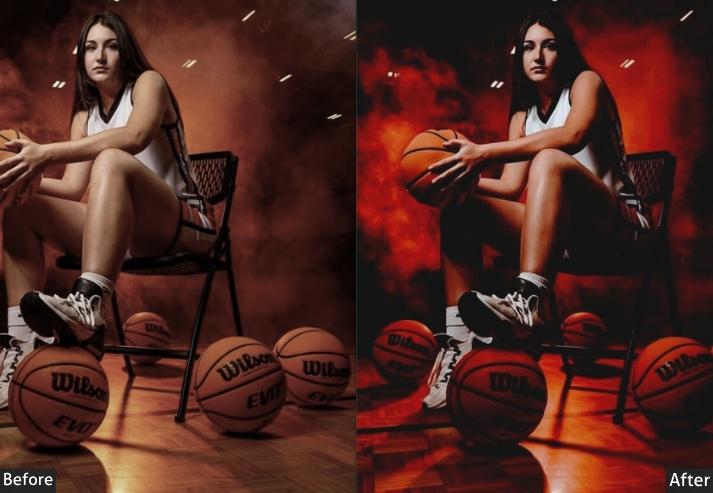
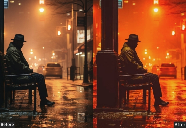
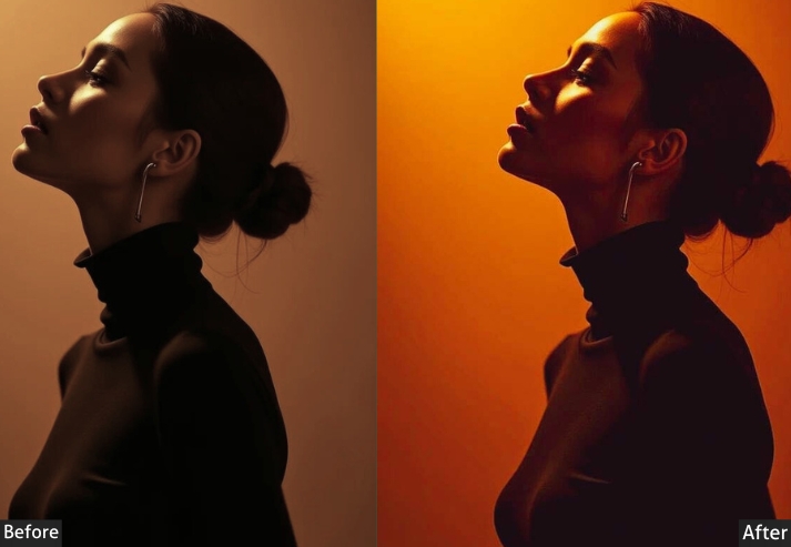
Light Panel: Contrast +20 | Exposure 0.
Color Panel: Red +30 | Orange +30 | Blue −10.
Effects Panel: Clarity +15.
Detail Panel: Sharpening +10.
Purpose: boldness and passion in your feed.
Usage: fashion photography, food photos, or editorial shots.
Style: Vibrant, fiery, and intense.
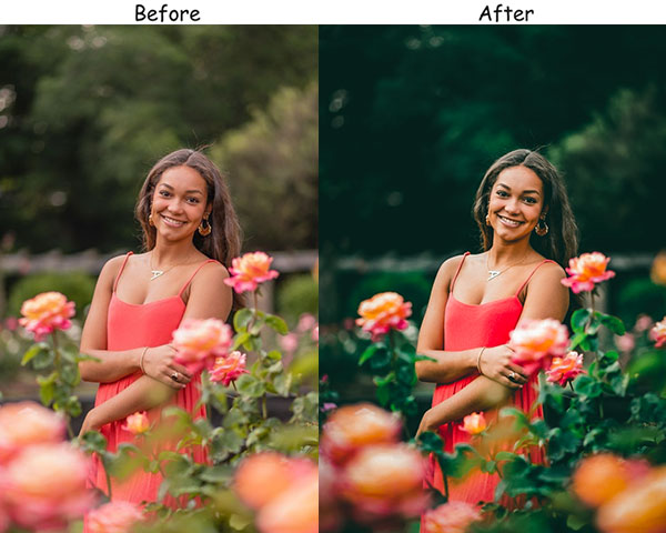
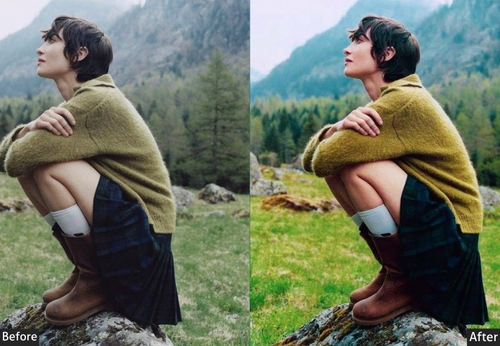
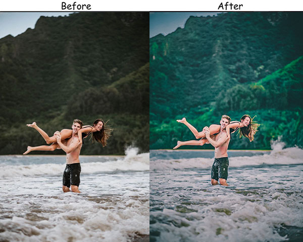
24. Green Instagram Presets
Green represents growth, nature, and tranquility. Now bring out the richness of natural landscapes or any scenes dominated by earthy tones. Calming greens are visually striking, making users stop scrolling and interact with your post.
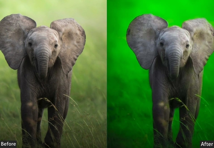
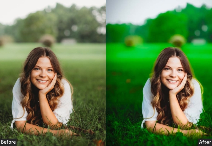
Light Panel: Exposure +10 | Shadows +10.
Color Panel: Green +25 | Red −10 | Magenta −10.
Effects Panel: Texture +20.
Detail Panel: Sharpening +15.
Purpose: a lush, natural aesthetic, enhancing the richness and vibrancy of greens in your photos.
Usage: nature photography, hiking shots, garden scenes.
Style: Fresh, earthy, and calm.
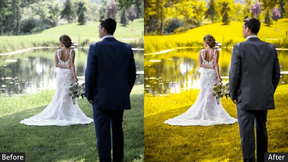
25. Yellow Instagram Presets
Yellow is cheerful, bright, and full of energy. This brings out the sunshine in your photos, adding a warm, happy glow to any scene. They are great for uplifting your feed, making your images feel sunny and inviting. When your photos connect emotionally, followers are more likely to engage and share your content, leading to greater reach and follower growth.
Light Panel: Exposure +15 | Warmth +20.
Color Panel: Yellow +30 | Orange +30 | Blue −15.
Effects Panel: Dehaze +10.
Detail Panel: Sharpening +10.
Purpose: brightest and happiest tones.
Usage: sunny outdoor scenes, warm-toned product photography, or lifestyle content.
Style: Bright, uplifting, and cheerful.
Last Words
Finally, the little magic trick you didn’t know you needed, but now you can’t live without. Seriously, they make editing so much fun and so easy, you’ll wonder why you ever posted without them. Plus, who doesn’t want their feed to look like it was curated by a professional photographer?
You can still tweak and personalize them until they’re exactly how you like them. It’s your vibe, your rules. So go ahead, experiment, have fun, and watch your Instagram followers who won’t know what hit them. Don’t forget to share the love. If you find a preset that’s working wonders for your feed, drop a comment below. Sharing is caring, right? 😉
More Free presets for You:
iPhone Lightroom Presets Free Download
Lightroom Portrait Presets Free Download
Street Lightroom Presets Free Download