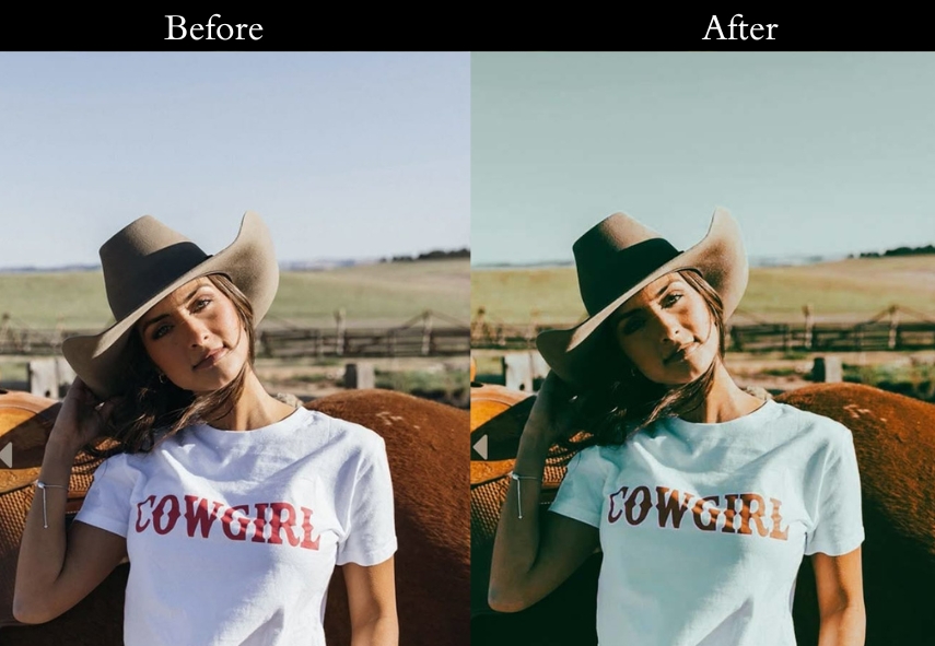
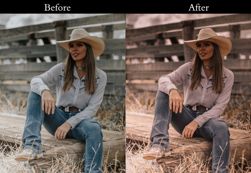
Vintage presets are the fastest way to give your photos that timeless, film-inspired look without spending hours manually adjusting sliders. Whether you want deep sepia tones, soft pastel fades, grainy black-and-white film, or warm golden-hour glows, this free collection covers every vintage style.
In this guide, you’ll find the best classic presets organized by style, the exact Lightroom settings for each look, a step-by-step installation guide, and answers to common questions. All presets are compatible with Lightroom Classic, Lightroom CC, and Lightroom Mobile.

Pauline Jackson
I specialize in designing Lightroom presets that enhance photos without over-editing or losing their original feel.
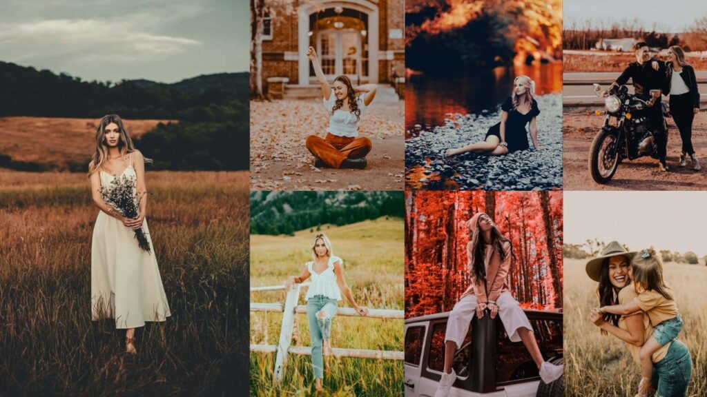
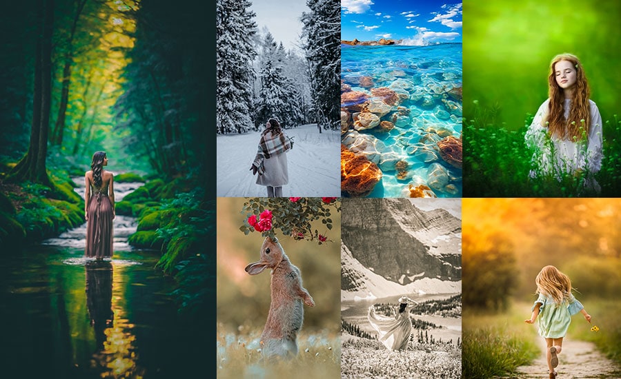
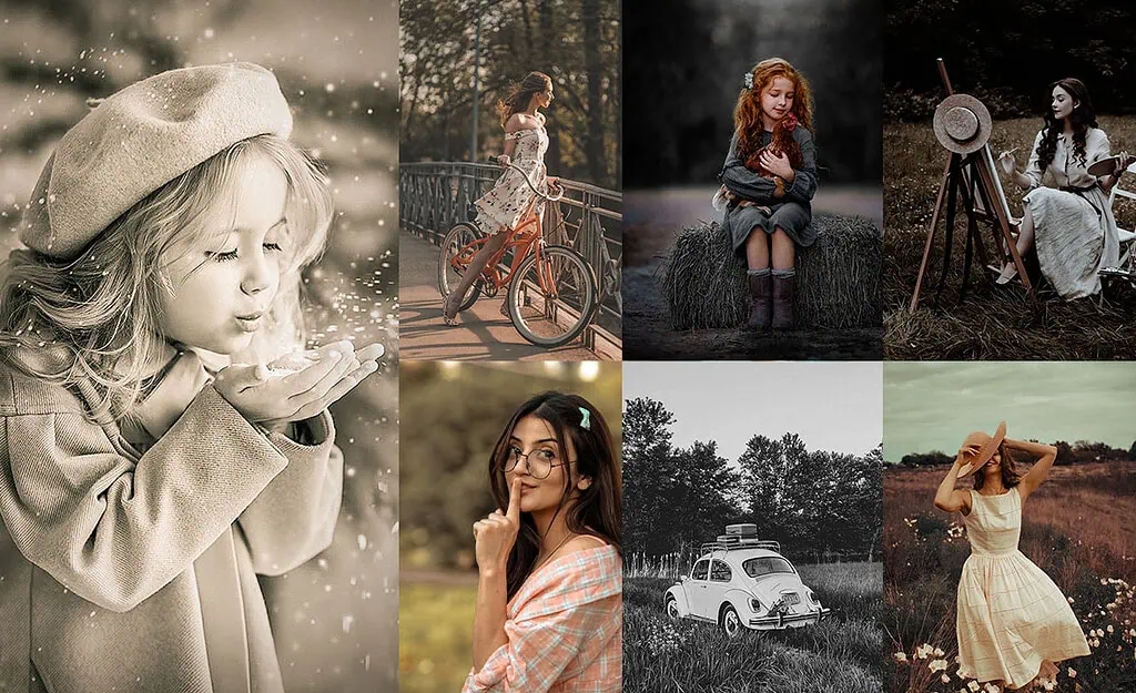
100 Free Vintage Lightroom Presets Download
Each preset below includes a description of its visual style, the recommended Lightroom slider settings to recreate it manually, and a free download link. The styles range from dark and moody to soft pastel and golden warm, making this collection suitable for portraits, landscapes, street photography, travel, and social media editing.
- Pauline Jackson
- 1. Dark Vintage Presets
- 2. Vintage Film Presets
- 3. Classic Vintage Presets
- 4. Pastel Vintage Presets
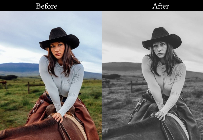
- 5. Vintage Black and White Presets
- 6. Vintage VSCO Presets
- 7. Warm Vintage Presets
- 8. Vintage Fade Presets
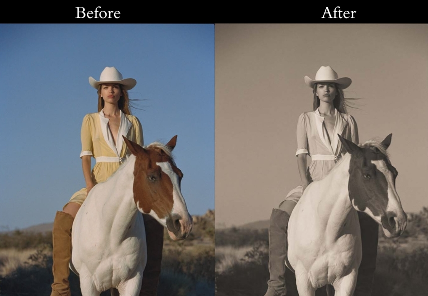
- 9. Sepia Tone Vintage Presets
- 10. Retro Vibes Vintage Presets
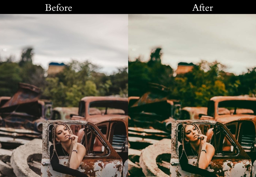
- 11. Rustic Vintage Presets
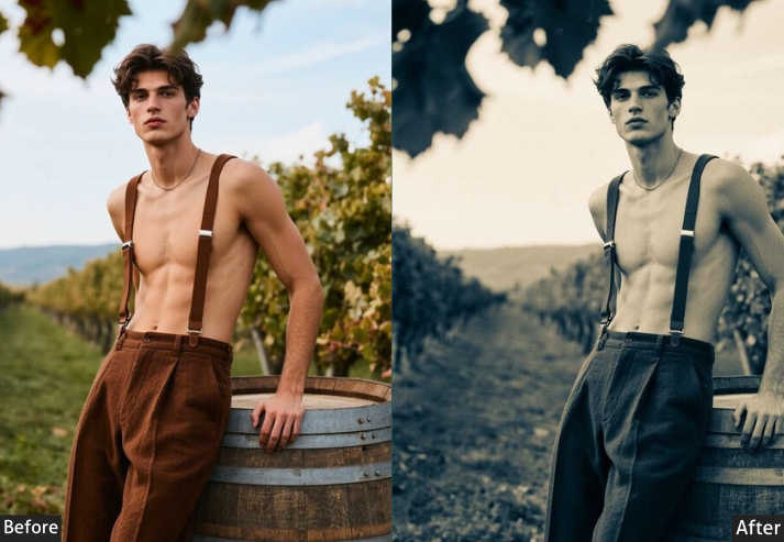
- 12. Monochrome Vintage
- 13. Redish/Dusty Rose Vintage Presets
- 14. Rustic Sepia Vintage Presets
- 15. Faded Memories Preset
- 16. 80s Vintage
- 17. 90s Vintage
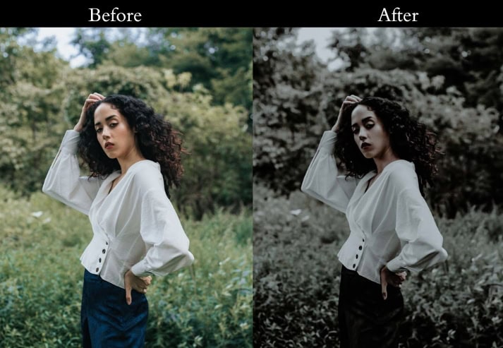
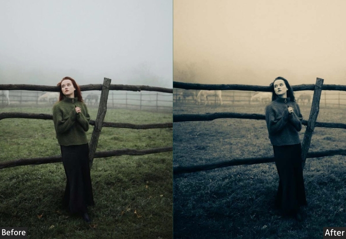
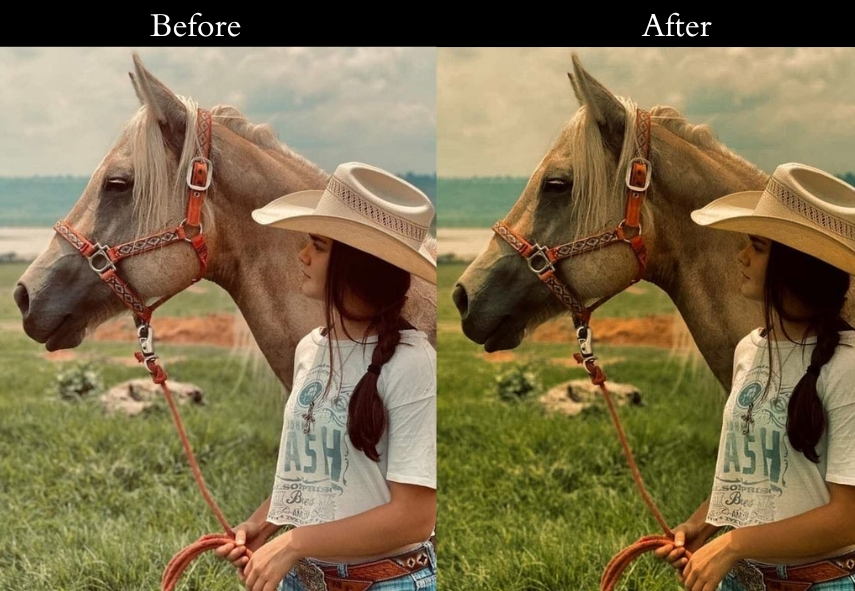
- 18. Ash Vintage
- 19. Bali Vintage
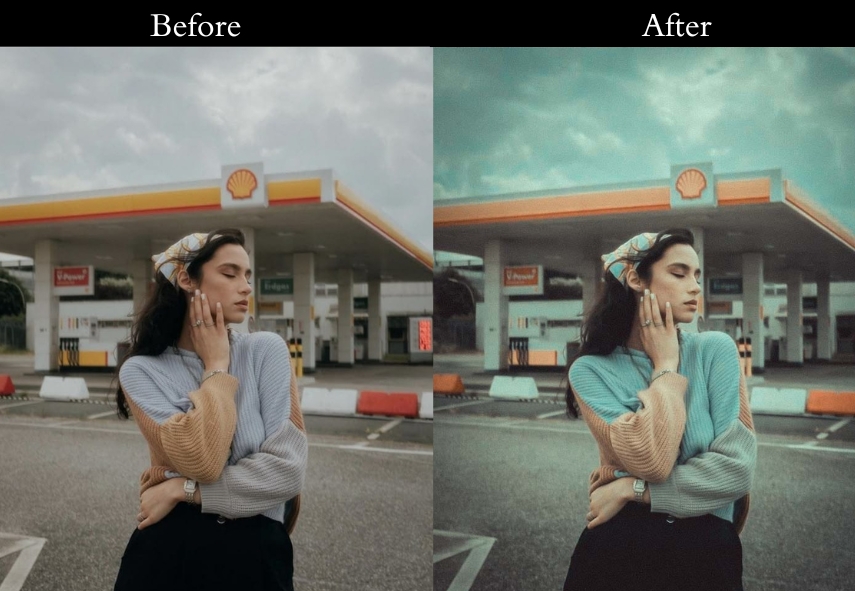
- 20. Blue Vintage
- 21. Brown Vintage
- 22. Dramatic Vintage
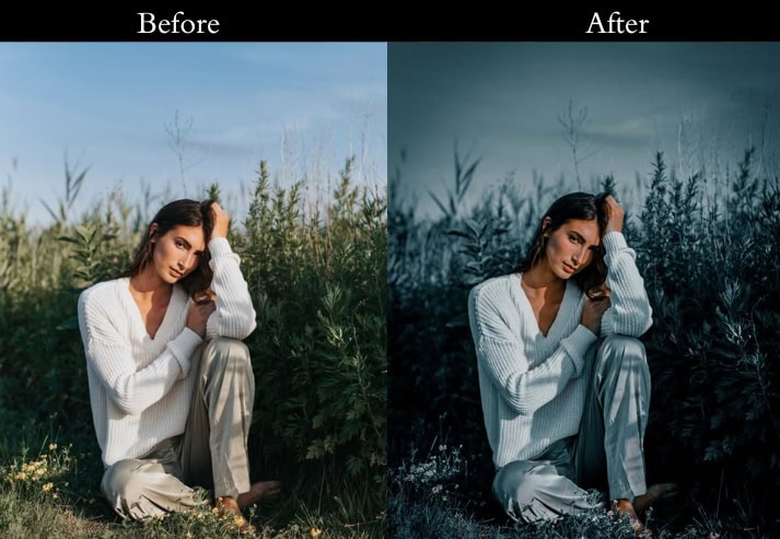
- 23. Cold Vintage
- 24. Dark Blue Vintage
- 25. Dark Knight Vintage
- 26. Night Vintage
- 27. Evening Vintage
- 28. Greeny Blue Vintage
- 29. Gold Vintage
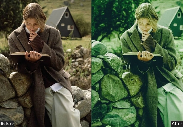
- 30. Green Vintage
- 31. Light Blue Vintage
- 32. Matte B&W Vintage
- 33. Memory Vintage
- 34. Navy Blue Vintage
- 35. Old Film Vintage
- 36. Red Pastel Vintage
- 37. Purple Vintage
- 38. Light Red Vintage
- 39. Retro Light Vintage
- 40. Sepia Dark Vintage
- 41. Sepia Matte Vintage
- 42. Sepia Soft Vintage
- 43. Warm Dark Vintage
- 44. HDR Vintage
- 45. Serum Vintage
- Lightroom Classic (Desktop)
- Lightroom Mobile (iOS & Android)
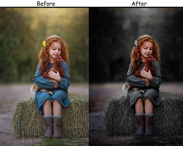
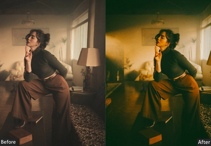
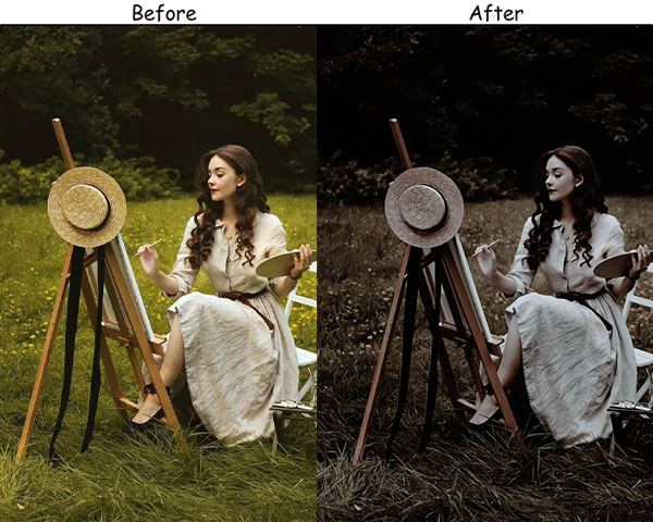
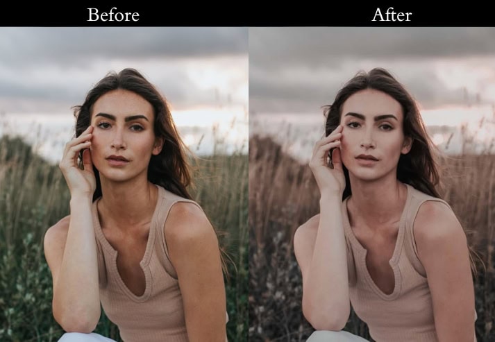
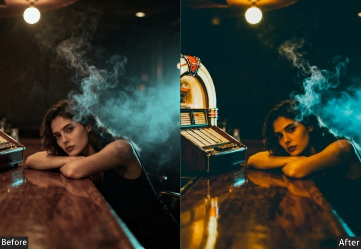
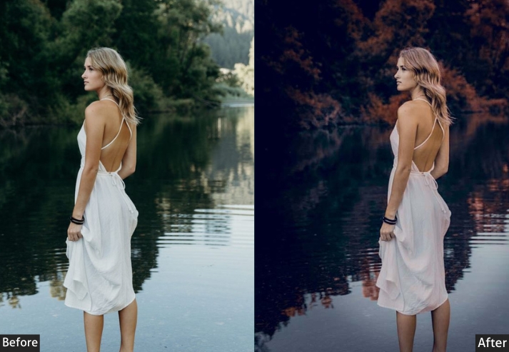
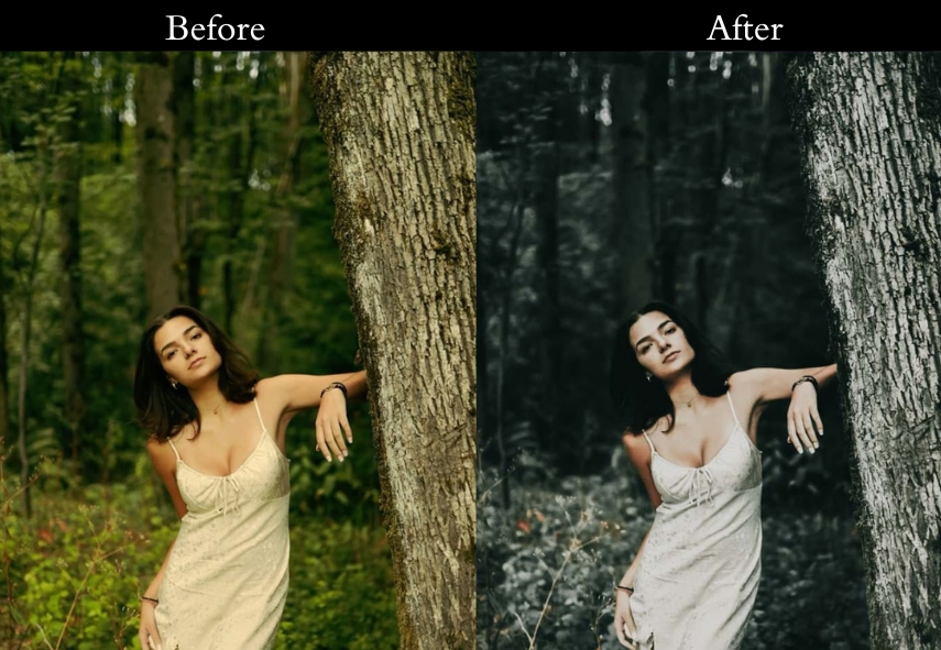
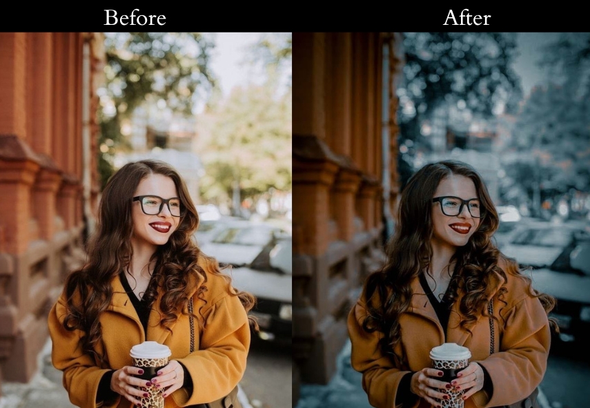
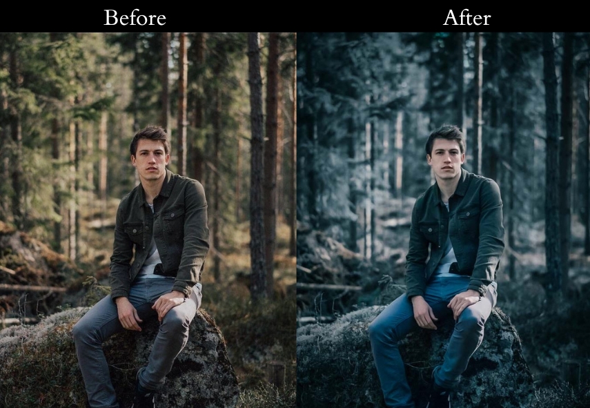
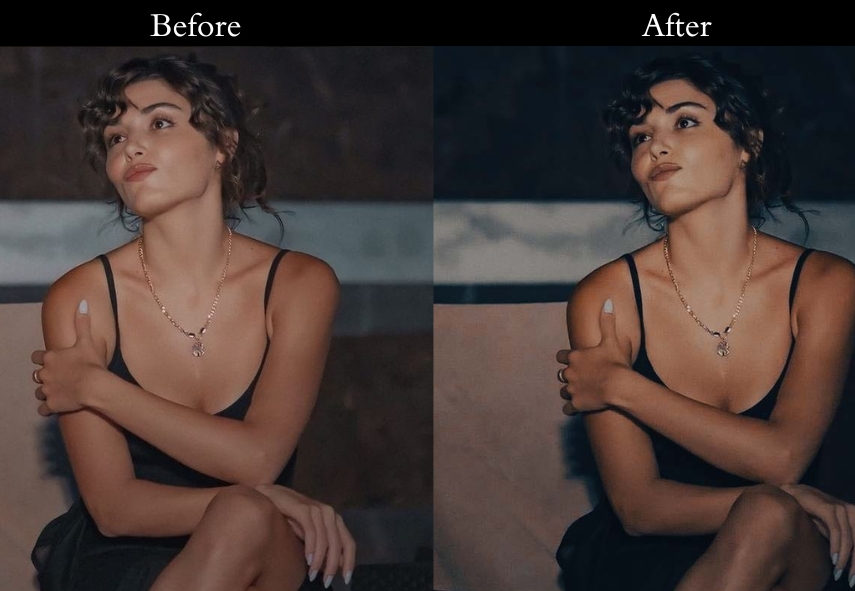
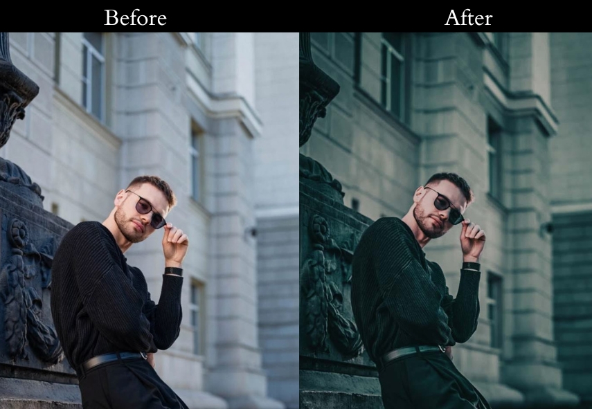
1. Dark Vintage Presets
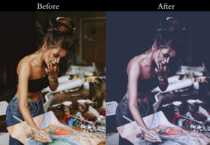
Dark-Vintage presets deepen shadows, crush blacks, and add a warm-but-brooding tone that transforms everyday shots into cinematic, story-driven images. The low exposure and elevated contrast create a sense of depth and mystery.
Light Panel: Exposure −0.15 to −0.30 | Contrast +30 to +40 | Highlights −25 to −35 | Shadows +10 to +20 | Blacks −20 to −30.
Color Panel: Temp +10 to +15.
Effects Panel: Grain +30 to +40.
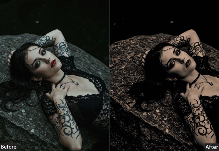
Purpose: Transform ordinary scenes into stories filled with suspense, where every detail hints at something more.
Best For: Portraits shrouded in emotion, landscapes under stormy skies, and any scene that thrives on depth.
Usage: Apply when the mood calls for intensity, and the usual brightness just won’t do.
Style: Deep, enigmatic, and quietly powerful.
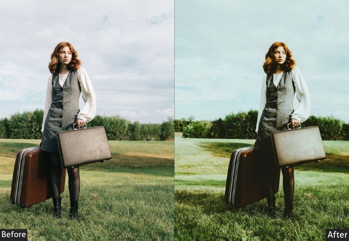
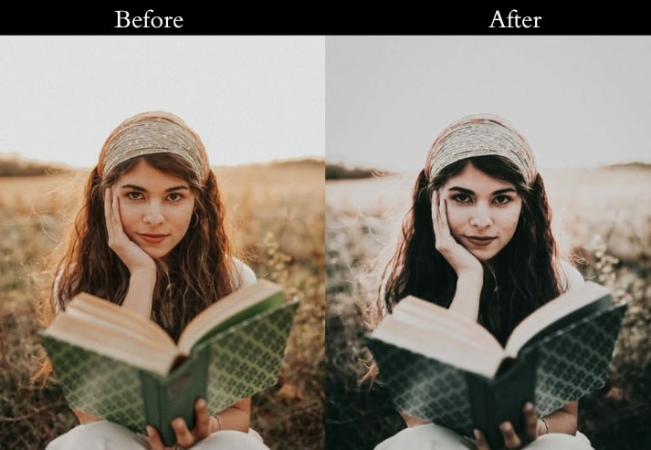
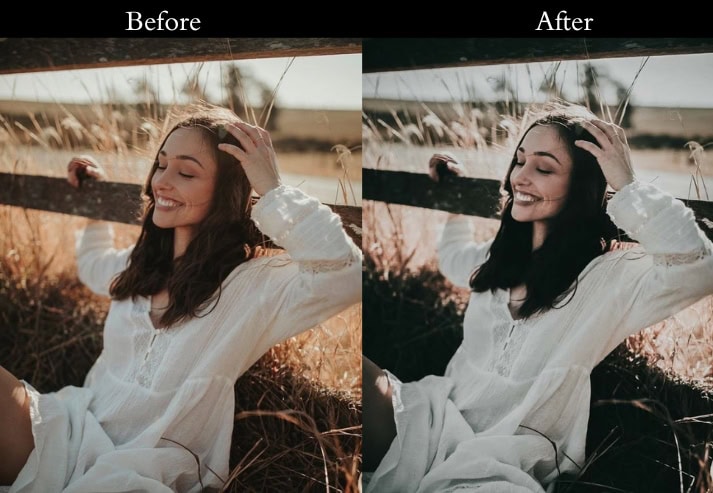
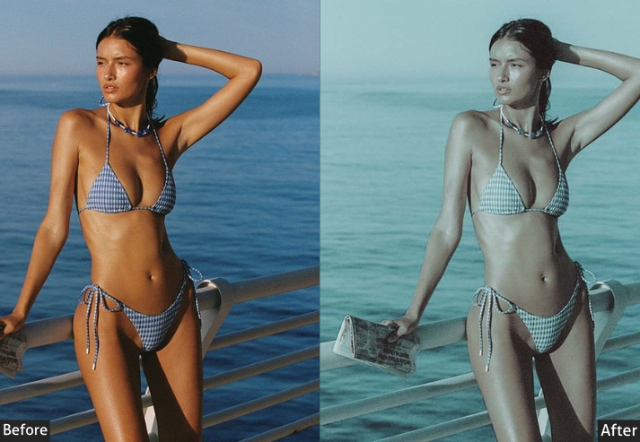
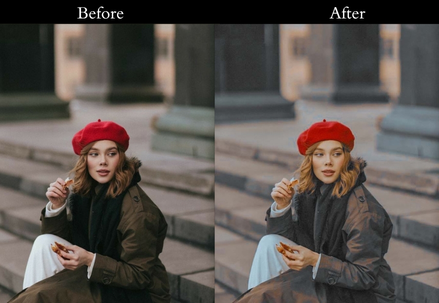
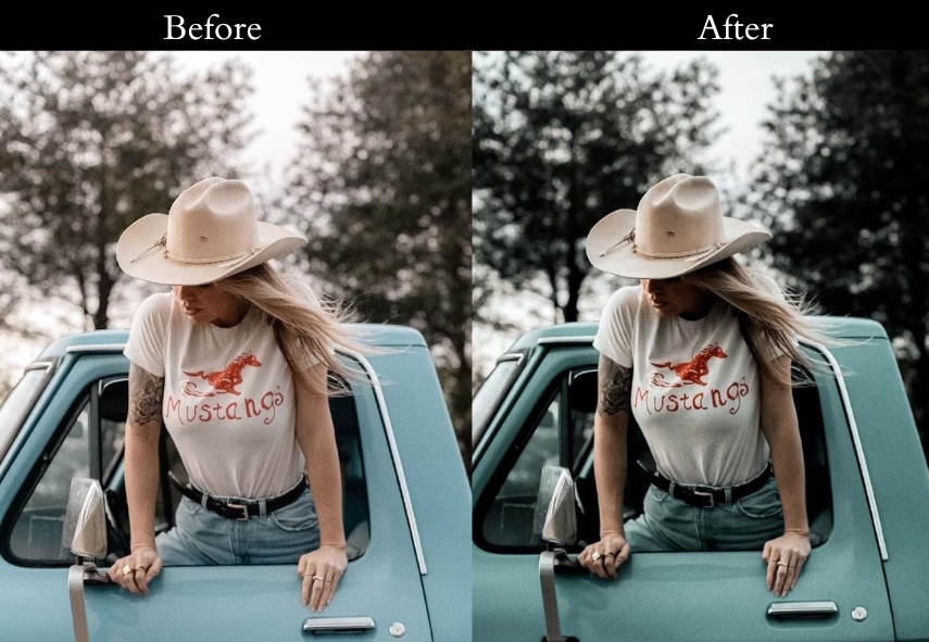
2. Vintage Film Presets
Vintage Film replicates the color science of analog film: muted saturation, gentle grain, lifted shadows, and slightly faded highlights. The result is an image that looks like it was shot on a 35mm roll, not overly edited, just warm and naturally imperfect in the best way.
Light Panel: Exposure +0.20 to +0.30 | Contrast +20 to +30 | Highlights −15 to −25 | Shadows +10 to +20.
Color Panel: Saturation −10 to −15.
Effects Panel: Grain +25 to +35.
Purpose: the nostalgia of film.
Best For: Shots that tell stories, whether they’re everyday scenes or grand adventures.
Usage: carry the weight of a memory, not just a moment.
Style: Subtle, textured, and cinematic.
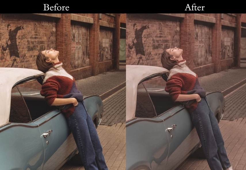
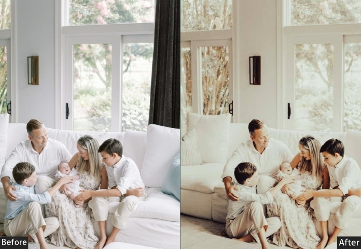
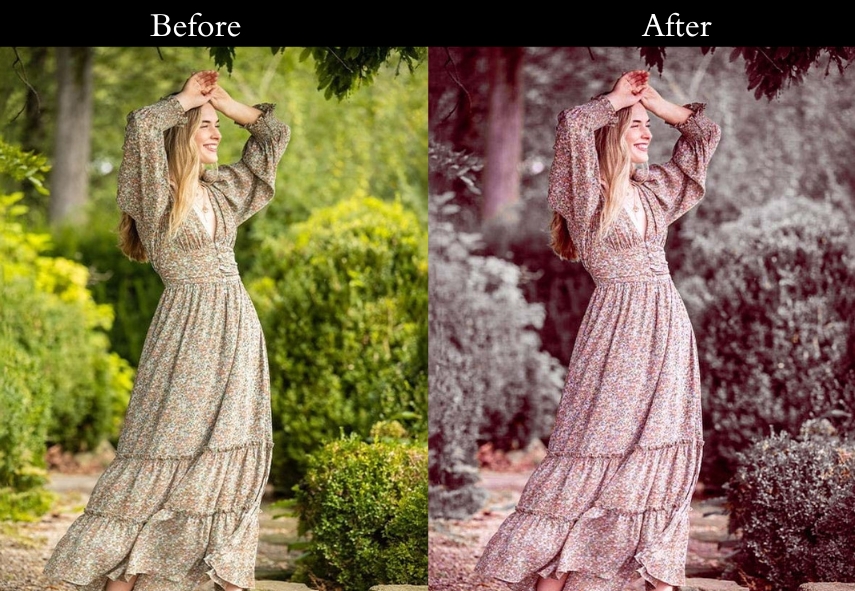
3. Classic Vintage Presets
Classic Vintage creates a quiet, enduring beauty with softened colors and gentle contrast, like stepping back to an era when photos were considered pieces of art. The subtle grain and lifted shadows give images a handcrafted, timeless feel.
Light Panel: Exposure +0.15 to +0.25 | Contrast +15 to +25 | Highlights −10 to −20 | Shadows +20 to +30.
Color Panel: Saturation −5 to −10.
Effects Panel: Grain +20 to +30.
Purpose: timeless aesthetic.
Best For: Portraits, still life, and any scene that benefits from a classic, understated elegance.
Usage: When you want your photos to feel like they’ve been part of your life for years.
Style: Soft, balanced, and enduring.
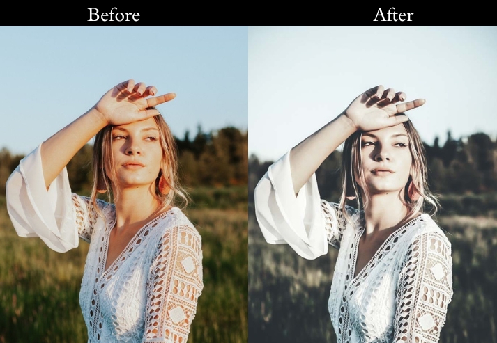
4. Pastel Vintage Presets
Pastel Vintage lifts shadows, reduces saturation, and softens contrast to produce an airy, dreamy aesthetic with muted pinks, lavenders, and creams. It’s ideal for photographers who shoot bright, lifestyle content and want a consistent, solid Instagram feed.
Light Panel: Exposure +0.10 to +0.20 | Contrast −5 to −10 | Highlights −15 to −25 | Shadows +15 to +25.
Color Panel: Saturation −10 to −15.
Effects Panel: Grain +10 to +20.
Purpose: turning everyday moments into something that feels light and ethereal.
Best For: Portraits, nature scenes, and any moment that benefits from a lighter touch.
Usage: a sense of calm and peace.
Style: Light, airy, and delicately dreamlike.
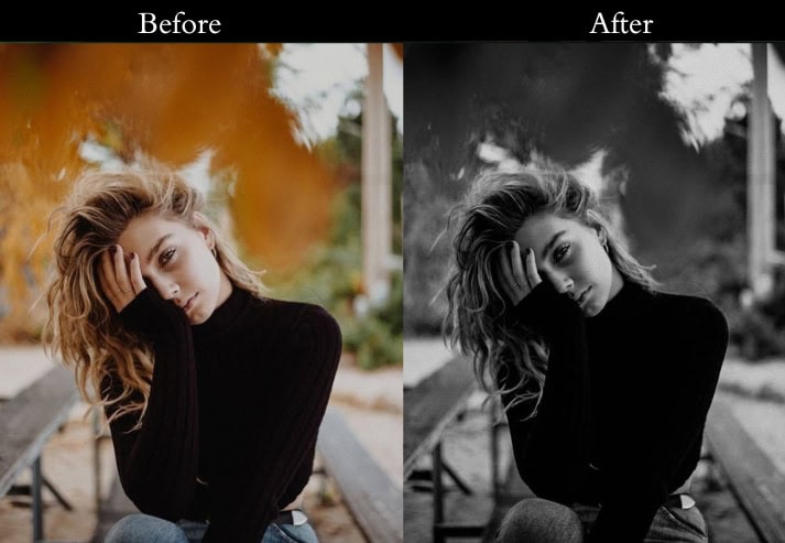
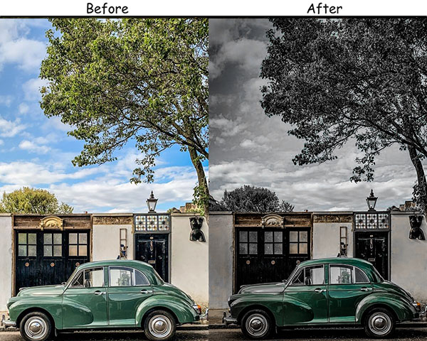
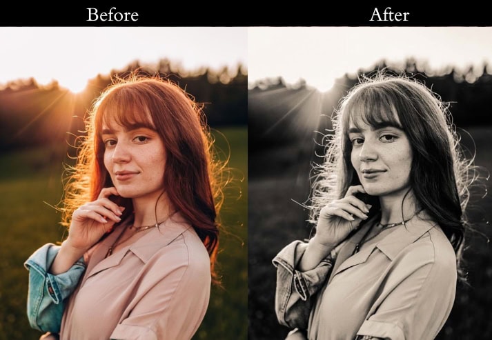
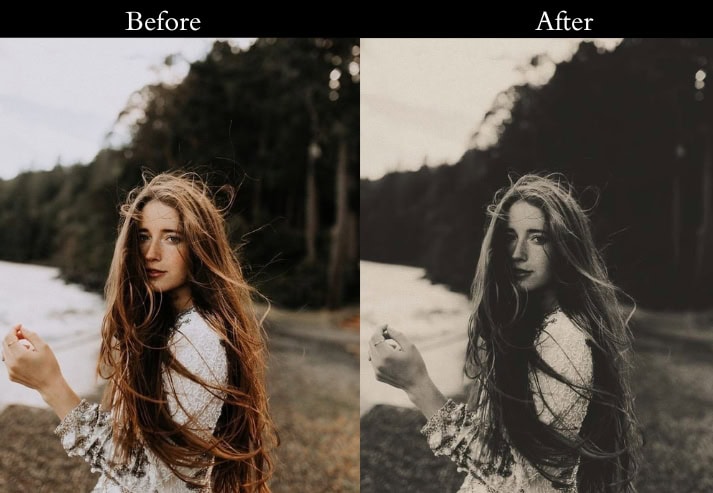
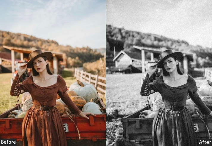
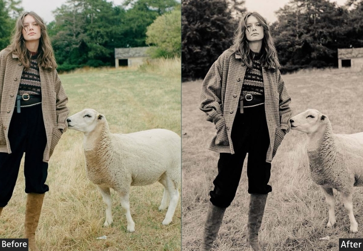
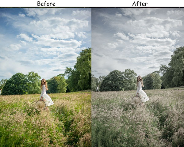
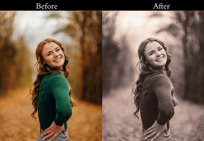
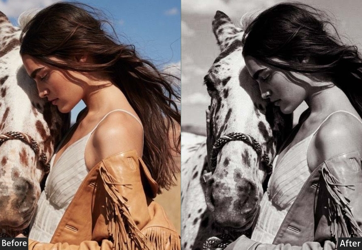
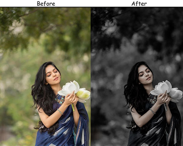
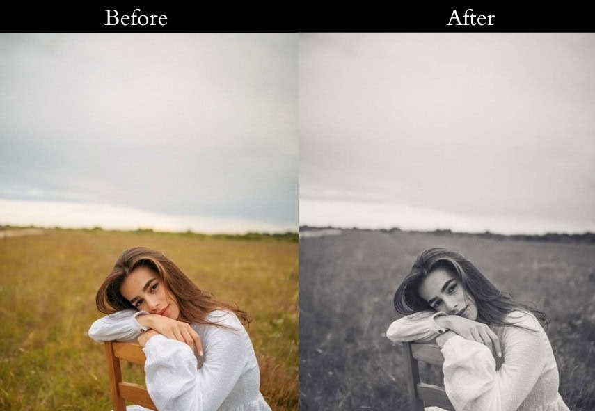
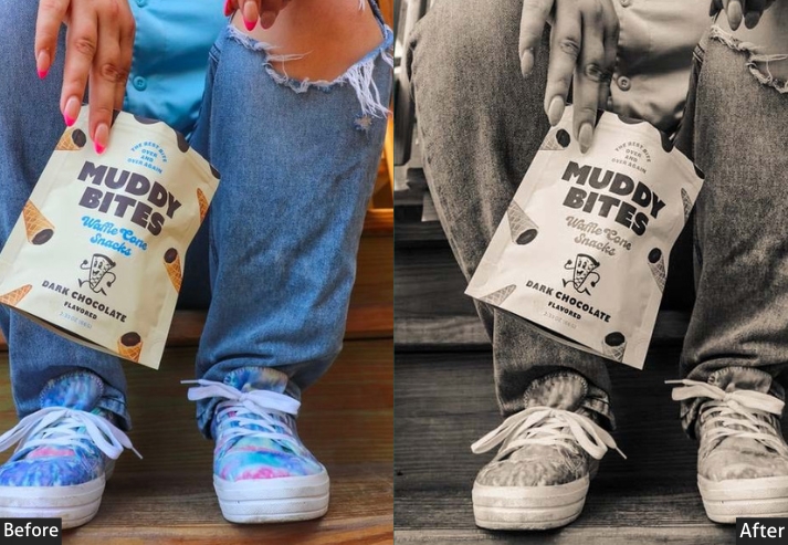
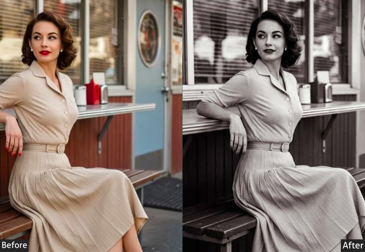
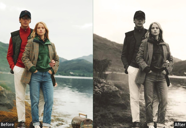
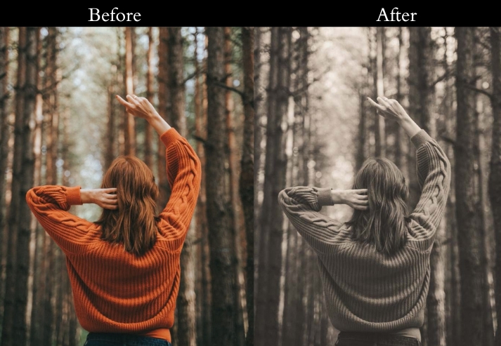
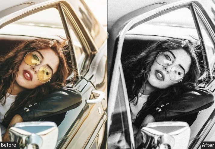
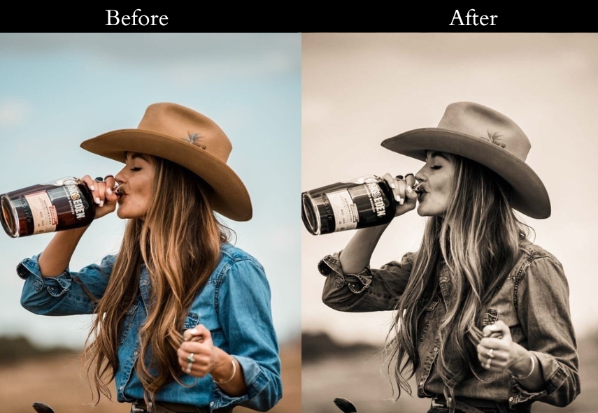
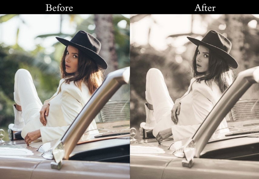
5. Vintage Black and White Presets
Stripping color away forces the viewer to focus on light, texture, and composition. These B&W presets add deep blacks, lifted whites, and fine grain to create images that feel authentically vintage rather than just desaturated.
Light Panel: Exposure +0.25 to +0.35 | Contrast +35 to +45 | Highlights −20 to −30 | Shadows +10 to +20 | Blacks −15 to −25.
Effects Panel: Clarity +20 to +30 | Grain +25 to +35.
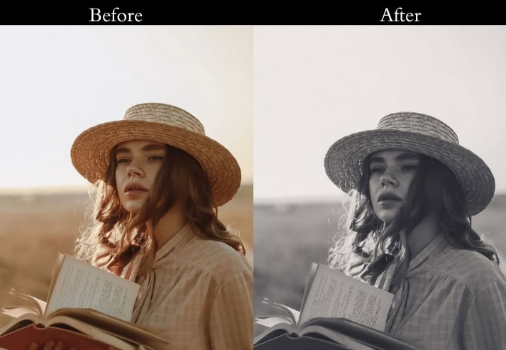
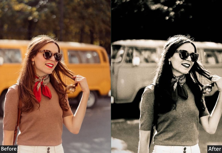
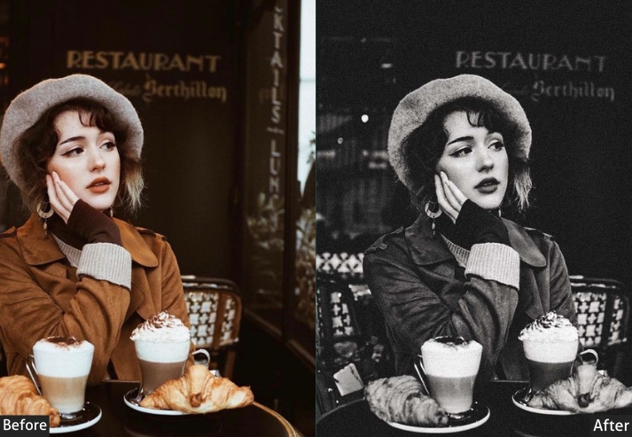
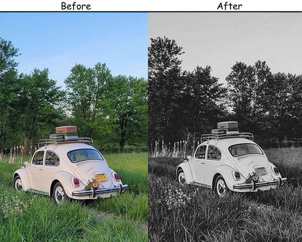
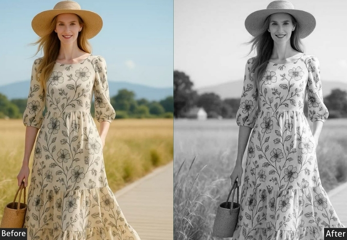
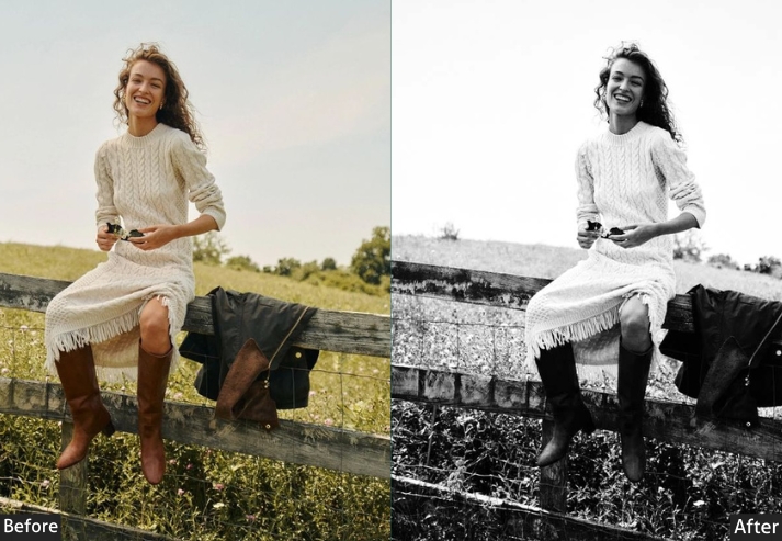
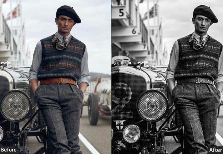
Purpose: highlight contrast and texture, turning photos into something both classic and striking.
Best For: Portraits, architecture, and any image where detail and drama are key.
Usage: When color feels like a distraction, these presets focus on the essentials.
Style: Bold, intense, and classically dramatic.
6. Vintage VSCO Presets
VSCO Vintage blends the muted, cool tones of modern social photography with classic grain and lifted blacks. The result is casual and effortless, like it was edited once and never over-touched.
Light Panel: Exposure +0.10 to +0.20 | Contrast +10 to +20 | Highlights −10 to −20 | Shadows +10 to +15.
Color Panel: Saturation −5 to −10.
Effects Panel: Grain +15 to +25.
Purpose: effortlessly stylish, with a relaxed, yet deliberate aesthetic.
Best For: Everyday moments, casual portraits, and social media photography.
Usage: authentic and easy-going, with a touch of style.
Style: Cool, understated, and effortlessly chic.
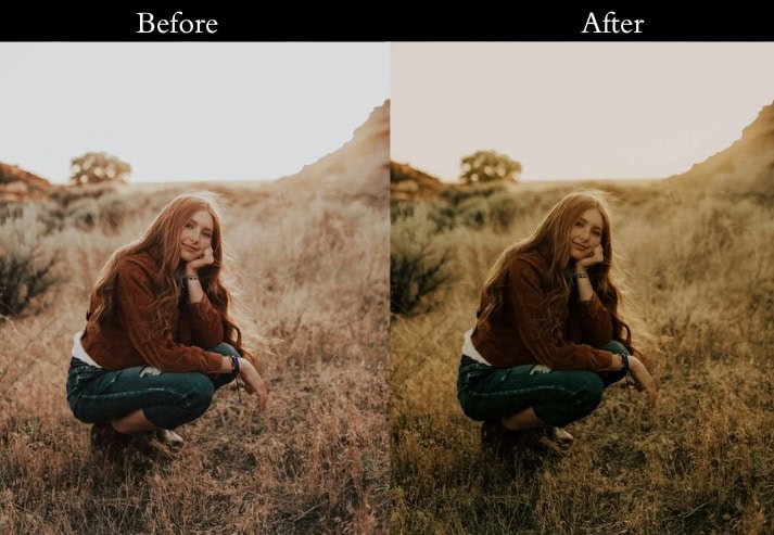
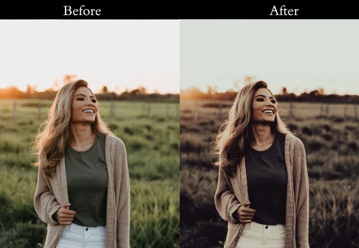
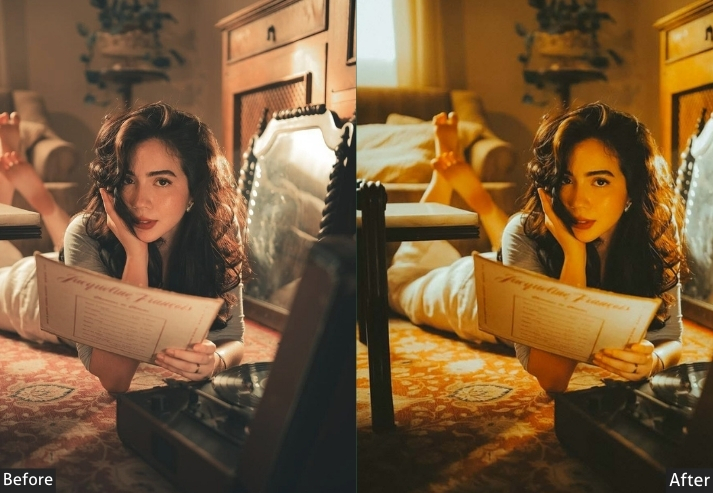
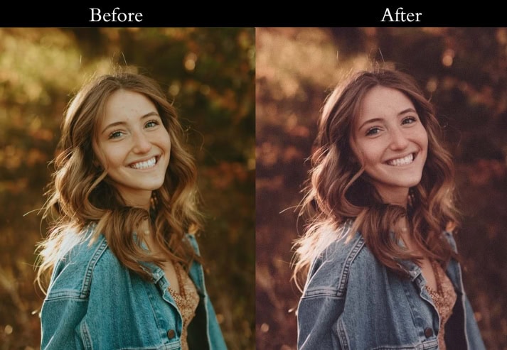
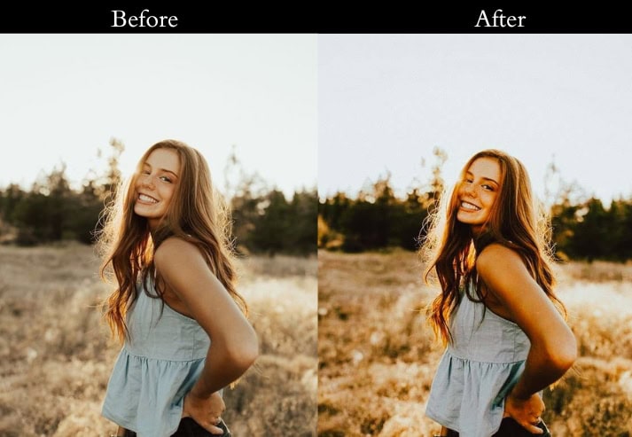
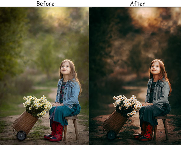
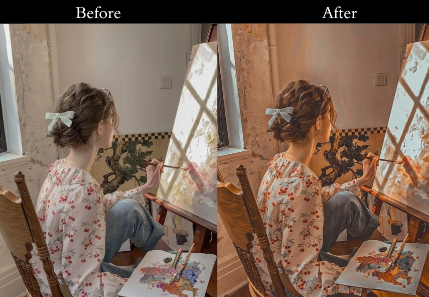
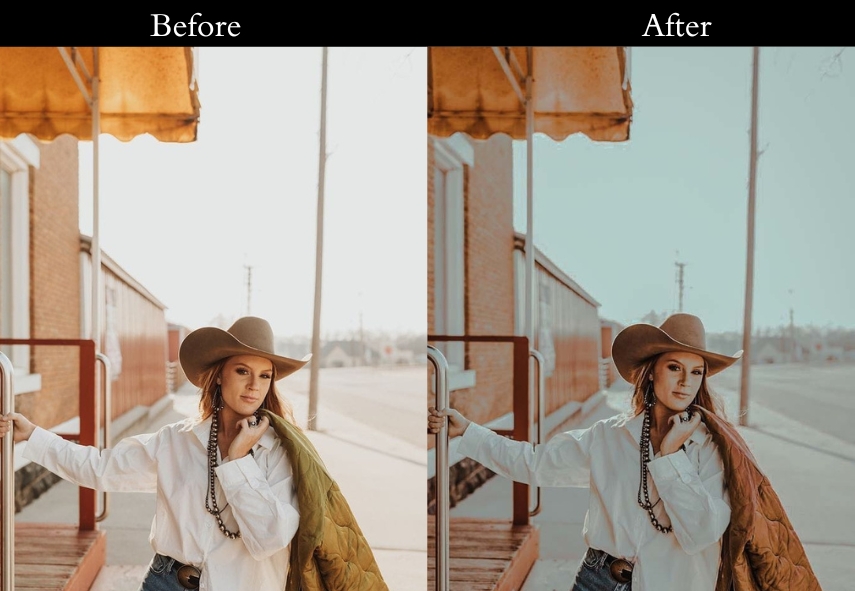
7. Warm Vintage Presets
Warm Vintage wraps images in a golden, amber glow. The boosted color temperature and lifted shadows create that coveted golden-hour feel even when the original light was flat.
Light Panel: Exposure +0.20 to +0.30 | Contrast +10 to +15 | Highlights −10 to −20 | Shadows +20 to +30.
Color Panel: Temp +20 to +30 | Saturation +5 to +10.
Effects Panel: Grain +20 to +25.
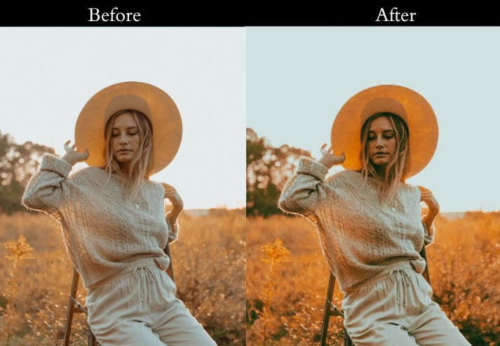
Purpose: the warmth and richness of your images (cherished memories).
Best For: Golden hour, cozy interiors, and scenes that thrive on warmth.
Usage: When you want your photos to resonate with warmth and comfort.
Style: Warm, inviting, and full of life.
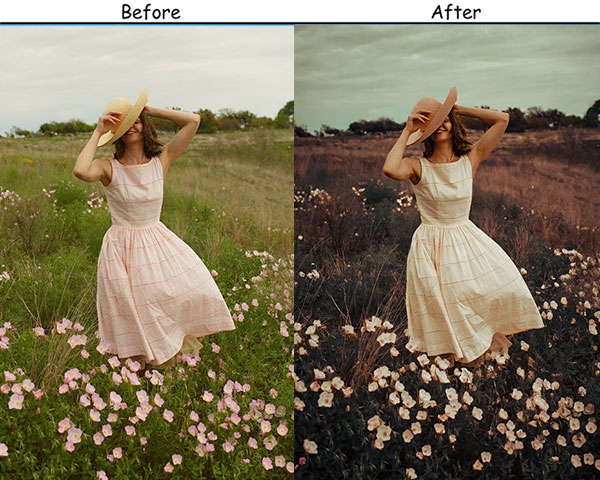
8. Vintage Fade Presets
Vintage Fade mimics the slow color loss of old printed photographs. Lifted blacks, reduced contrast, and slightly muted vibrance create that characteristic “old photo album” look.
Light Panel: Exposure +0.10 to +0.20 | Contrast −20 to −30 | Highlights −10 to −20 | Shadows +15 to +25 | Whites −5 to −10 | Blacks +10 to +15.
Color Panel: Vibrance −10 to −15.
Effects Panel: Clarity −10 to −20.
Purpose: soft, faded look that feels nostalgic.
Best For: Family photos, nature shots, and anything with a sentimental touch.
Usage: convey warmth and a sense of memory.
Style: Soft, hazy, and filled with gentle emotion.
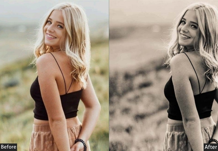
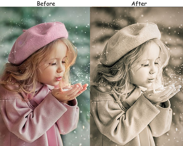
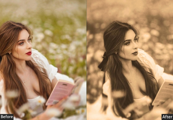
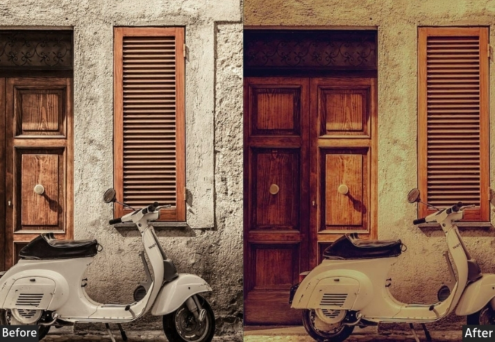
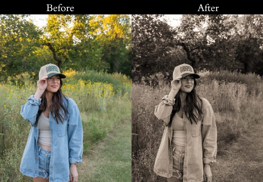
9. Sepia Tone Vintage Presets
Sepia Tone applies warm brown split-toning across highlights and shadows to replicate the look of 19th-century darkroom photography. The softened details and brownish cast feel genuinely aged, not just filtered.
Light Panel: Exposure +0.15 to +0.30 | Contrast +10 to +15 | Highlights −15 to −25 | Shadows +10 to +20 | Whites +5 to +10 | Blacks −5 to −10.
Color Grading: Highlights +40 to +50 (warm sepia) | Shadows +40 to +50 (warm sepia) in both highlights and shadows (+40 to +50).
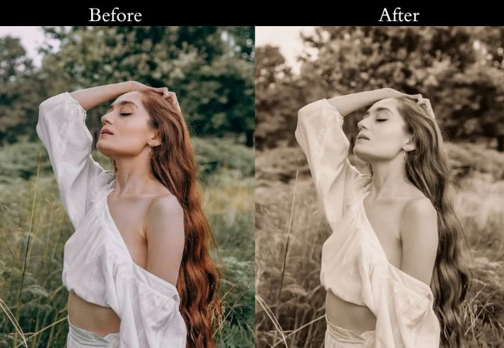
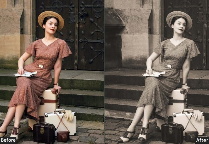
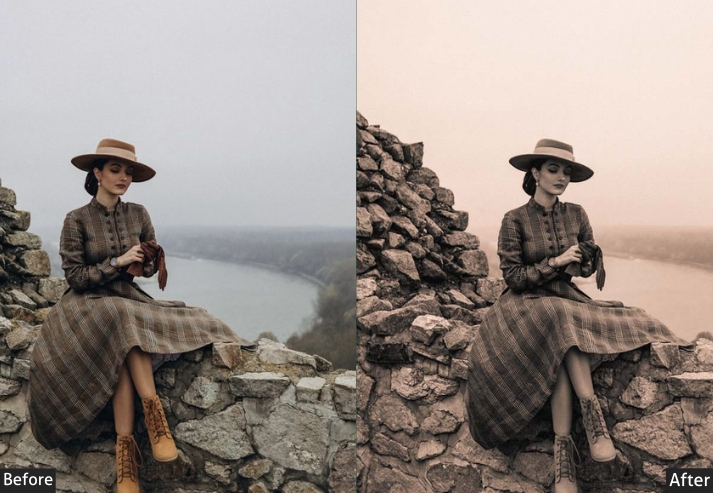
Purpose: warm, classic sepia tone.
Best For: Portraits, landscapes, and vintage-themed projects.
Usage: old-world, timeless effect.
Style: Warm, classic, and deeply nostalgic.
10. Retro Vibes Vintage Presets
Retro Vibes channels the bold, high-saturation color palettes of the 1970s and 80s. Boosted vibrance, punchy contrast, and a light grain give images an energetic, eye-catching quality that stands out on social media.
Exposure: +0.10 to +0.20 (Slightly brighten).
Contrast: +25 to +35 (Crank it up for that bold look).
Highlights: -5 to -10 (Just a touch to keep the details).
Shadows: +10 to +15 (Lift shadows to show more).
Saturation: +15 to +25 (Pump up those colors!).
Vibrance: +10 to +20 (Add extra pop to the colors).
Grain: +15 to +20 (Add a little texture).
Purpose: bold, colorful retro look.
Best For: Urban shots, fashion photography, and creative projects.
Usage: When you want your images to shine and make a statement.
Style: Bold, colorful, and full of energy.
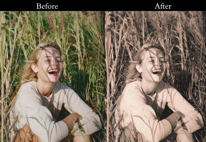
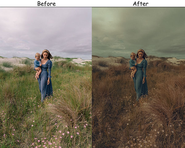
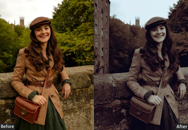
11. Rustic Vintage Presets
Rustic Vintage adds warmth, earthy tones, and texture, like a photo taken on film at a countryside wedding or an autumn hike. The lifted shadows and warm temperature give outdoor scenes a grounded, timeless quality.
Light Panel: Exposure +0.15 to +0.25 | Contrast +10 to +20 | Highlights −10 to −15 | Shadows +20 to +30 | Whites +5 to +10 | Blacks −5 to −10.
Color Panel: Temp +10 to +20.
Effects Panel: Grain +20 to +30.
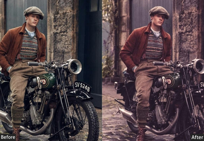
Purpose: warm, earthy tone with a touch of rustic charm.
Best For: Outdoor portraits, rustic weddings, and nature photography.
Usage: cozy, grounded feel in your images.
Style: Warm, earthy, and full of charm.
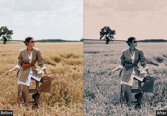
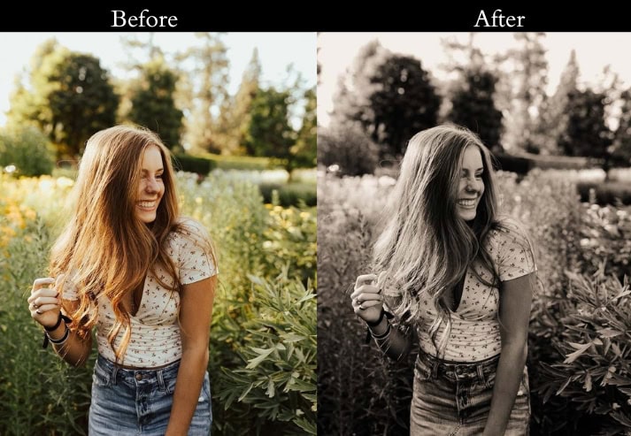
12. Monochrome Vintage
Monochrome goes beyond simple desaturation. It uses deep blacks, bright whites, high clarity, and grain to create dramatic, newspaper-quality images with a vintage editorial feel.
Light Panel: Exposure +0.20 to +0.30 | Contrast +30 to +40 | Highlights −20 to −30 | Shadows +10 to +20 | Whites +15 to +20 | Blacks −20 to −30.
Effects Panel: Clarity +15 to +25 | Grain +25 to +35.
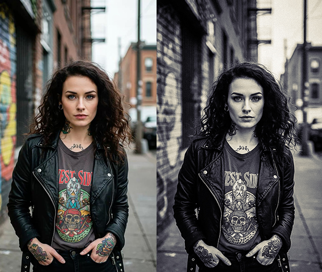
Purpose: dramatic, powerful black-and-white images with a vintage feel.
Best For: Portraits, street photography.
Usage: emotion and intensity without the distraction of color.
Style: Bold, dramatic, and timeless.
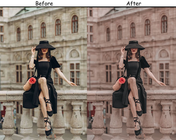
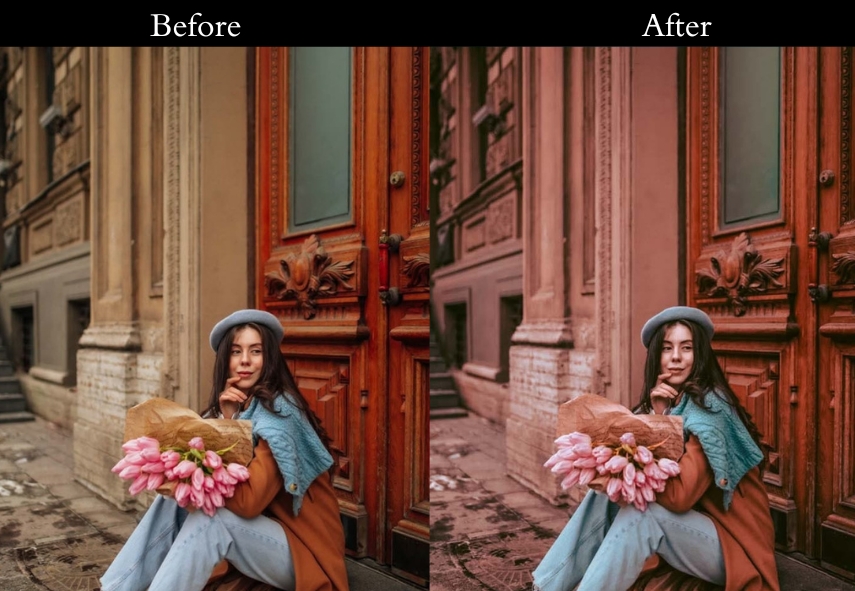
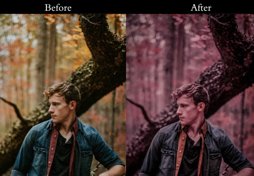
13. Redish/Dusty Rose Vintage Presets
This one adds a warm pink blush tone that flatters skin and creates a romantic, soft-focus feel. The reduced contrast and lifted shadows give this preset a delicate, feminine quality.
Light Panel: Exposure +0.15 to +0.25 | Contrast −10 to −20 | Highlights −20 to −30 | Shadows +15 to +25.
Color Panel: Temp +10 to +20 | Saturation −5 to −10.
Effects Panel: Grain +15 to +20.
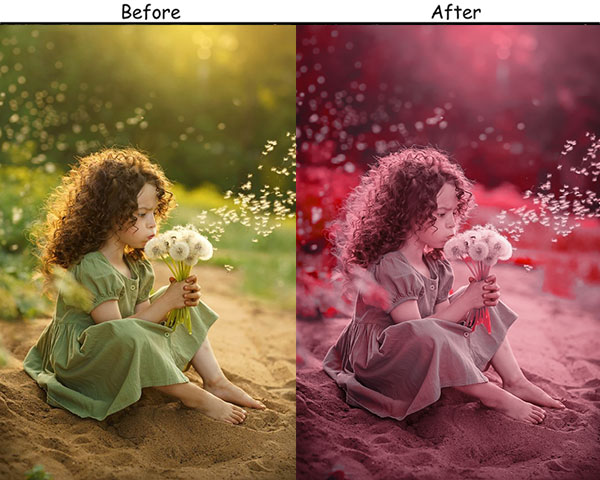
Purpose: Soft, romantic, and nostalgic look with a blush of vintage charm.
Best For: Weddings, love stories, and intimate portraits.
Usage: sweet memories.
Style: Soft, romantic, and gently nostalgic.
14. Rustic Sepia Vintage Presets
Rustic Sepia combines earthy outdoor warmth with a traditional brown split tone, creating images that look like they were found in a weathered family album from a century ago.
Light Panel: Exposure +0.20 to +0.30 | Contrast +20 to +25 | Highlights −15 to −20 | Shadows +10 to +15.
Color Grading: Highlights +30 to +40 (warm browns) | Shadows +20 to +30 (deep browns).
Effects Panel: Grain +25 to +35.
Purpose: warm, sepia-toned vintage look.
Best For: Outdoor portraits, rustic-themed shoots, and heritage photography.
Usage: age and warmth to your images.
Style: Earthy, warm, and timeless.
15. Faded Memories Preset
Faded Memories significantly reduces contrast and desaturates colors to produce that “found photo” look, as if the image has been sitting in a box for decades. The lifted blacks and reduced clarity add a soft, hazy quality.
Light Panel: Exposure +0.10 to +0.20 | Contrast −25 to −35 | Highlights −10 to −15 | Shadows +20 to +30 | Whites −5 to −10 | Blacks +10 to +15.
Effects Panel: Clarity −10 to −20 | Grain +20 to +25.

Purpose: soft, faded look that feels like a cherished memory.
Best For: Sentimental shots, vintage-themed photography, and soft portraits.
Usage: a tender, gentle touch.
Style: Dreamy, soft, and evocative of the past.
16. 80s Vintage
The 80s preset recreates the oversaturated, high-contrast look of photographs from the early consumer-camera era, with punchy colors, warm tones, and just enough grain to evoke Kodacolor film.
Light Panel: Exposure +10% | Contrast +15%.
Color Panel: Vibrance +20% | Saturation +30%.
Effects Panel: Vignette −10% | Grain +5%.
Detail Panel: Sharpening 0%.
Purpose: vibrant, over-the-top spirit of the 80s.
Best For: Cityscapes glowing with lights or fashion shots begging for flair.
Usage: Apply this when you want your photo to strut like it’s auditioning for an MTV video.
Style: Loud, colorful, and dripping with retro swagger.
17. 90s Vintage
The 90s preset replicates the washed-out, slightly cool look of disposable and early digital cameras: desaturated, slightly hazy, and full of effortless authenticity.
Light Panel: Contrast −10% | Fading +15%.
Color Panel: Saturation −20% | Temp −5% (cool).
Effects Panel: Vignette −5% | Grain +10%.
Detail Panel: Sharpening minimal (raw, unpolished).
Purpose: the effortless cool of the 90s.
Best For: Portraits with attitude or street shots oozing authenticity.
Usage: Slap this on when you’re craving that “I shot this on a thrift store camera” feel.
Style: Muted, relaxed, and oh-so-grungy.
18. Ash Vintage
This is a cool-toned, atmospheric preset with pulled-down saturation and a matte finish that creates a moody, editorial feel like a still from an arthouse film.
Light: Pull highlights down to -20% and lift shadows to +15% for depth.
Color: Cool the temperature to -15% and ease saturation to -10% for ashy tones.
Effects: Add a matte finish at +20% and a vignette at -10% for that ethereal edge.
Detail: Keep sharpening, minimal-let the mood do the talking.
Purpose: To craft a timeless, atmospheric vibe.
Best For: Landscapes shrouded in mist or portraits with soulful depth.
Usage: Use this when you want your photo to whisper secrets like an old film star.
Style: Cool-toned, moody, and quietly captivating.
19. Bali Vintage
Bali Vintage is warm, sun-drenched, and tropical, with boosted vibrance and golden-tinted highlights that make any outdoor photo feel like it was taken on a paradise island at golden hour.
Light Panel: Exposure +5%.
Color Panel: Temp +10% (warm) | Vibrance +15% | Highlights Tint +10% (gold).
Effects Panel: Vignette −5% | Clarity +10%.
Detail Panel: Sharpening subtly.
Purpose: warm, tropical nostalgia.
Best For: Beach snaps or travel pics.
Usage: When you’re dreaming of flip-flops and fruity drinks.
Style: Warm, golden, and effortlessly dreamy.
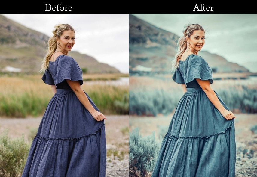
20. Blue Vintage
Blue Vintage soothes images with a cool, oceanic tone: softened contrast, boosted blue shadows, and a gentle fade create a serene, peaceful mood.
Light Panel: Contrast −5% | Fading +10%.
Color Panel: Blue Shadows +15% | Saturation −10%.
Effects Panel: Vignette −5% | Grain +5%.
Detail Panel: Sharpening minimal (soft edges).
Purpose: a peaceful, blue-toned glow.
Best For: Ocean views or winter shots needing tranquility.
Usage: a deep, calming breath.
Style: Cool, serene, and quietly beautiful.
21. Brown Vintage
Brown adds rich, coffee-toned warmth to indoor and portrait photography, making images feel intimate, cozy, and lived-in.
Light Panel: Temp +15% | Fading +10%.
Color Panel: Midtones Brown +20% | Saturation −5%.
Effects Panel: Vignette −10% | Clarity +5%.
Detail Panel: Sharpening minimal (cozy, soft).
Purpose: rich, comforting warmth.
Best For: Indoor portraits or scenes begging for intimacy.
Usage: Use this when you want your photo to feel like a warm hug.
Style: Rich, toasty, and oh-so-inviting.
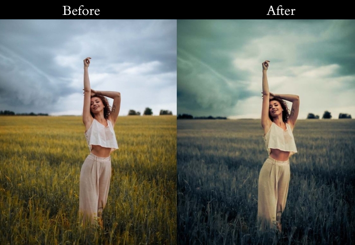
22. Dramatic Vintage
This one applies cinematic contrast, teal shadow tones, and a strong vignette to give photographs the high-stakes visual weight of a Hollywood film still.
Light Panel: Contrast +20% | Highlights −10%.
Color Panel: Saturation −15% | Shadows Tint +5% (teal).
Effects Panel: Vignette −15% | Grain +10%.
Detail Panel: Sharpening light.
Purpose: To give your images that big-screen gravitas.
Best For: Urban shots or portraits with star quality.
Usage: when you want your photo to feel Oscar-worthy.
Style: Bold, dramatic, and straight-up cinematic.
23. Cold Vintage
Cold Vintage significantly lowers the temperature and boosts clarity, creating a crisp, wintry feel that makes snowy landscapes or overcast city shots look sharp and immersive.
Light Panel: Exposure +5% | Temp −20% (cool).
Color Panel: Blue +10% | Saturation −5%.
Effects Panel: Vignette −5% | Clarity +10%.
Detail Panel: Sharpening minimal.
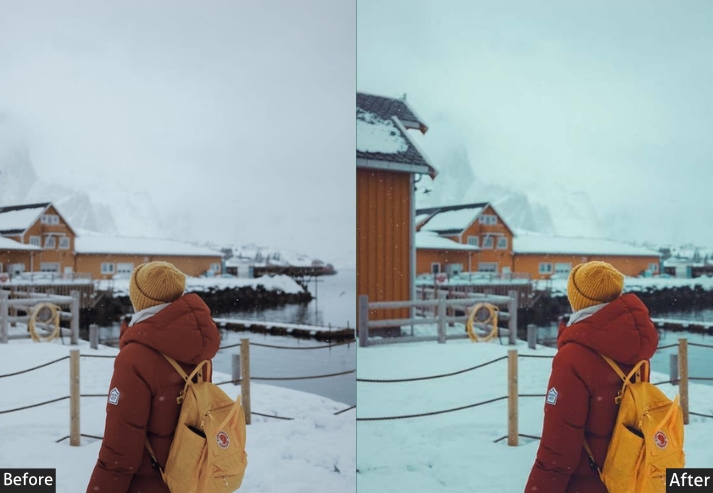
Purpose: To freeze your pics in a crisp, cool vibe.
Best For: Snowy scenes or anything needing a fresh bite.
Usage: when you want your photo to feel like an ice-cold adventure.
Style: Crisp, cool, and refreshingly clean.
24. Dark Blue Vintage
This pushes deep blues into the shadows and reduces overall exposure, creating a film noir–inspired look with depth and intrigue.
Light Panel: Exposure −10% | Contrast +15%.
Color Panel: Blue Shadows +25% | Saturation −10%.
Effects Panel: Vignette −20% | Grain +10%.
Detail Panel: Sharpening low.
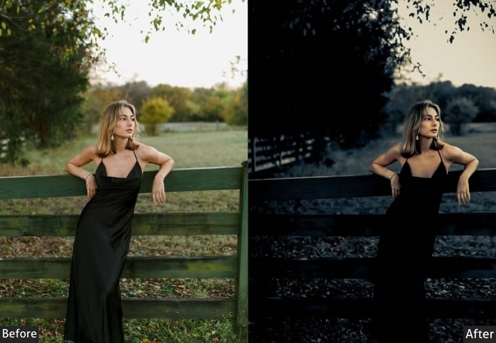
Purpose: mysterious depths.
Best For: Night shots or portraits with an edge.
Usage: Apply this when you’re channeling your inner film noir detective.
Style: Deep, moody, and intriguingly dark.
25. Dark Knight Vintage
Dark Knight is the most aggressive preset in this collection: heavy vignette, crushed blacks, desaturated tones with a green shadow cast, and maximum grain for an ultra-gritty, raw look.
Light Panel: Exposure −15% | Contrast +20%.
Color Panel: Saturation −20% | Shadows Tint +5% (green).
Effects Panel: Vignette −25% | Grain +15%.
Detail Panel: Sharpening minimal (raw look).
Purpose: dark, heroic intensity.
Best For: City streets or shots needing an extreme vibe.
Usage: Use this when your photo needs to fight crime in style.
Style: Dark, gritty, and fiercely epic.
26. Night Vintage
Night Vintage adds a blue shadow tint and reduced saturation, mimicking the flat, slightly desaturated tones of photos taken under natural moonlight or dim street lamps.
Light Panel: Exposure −10% | Shadows +25%.
Color Panel: Saturation −15% | Shadows Tint +5% (blue).
Effects Panel: Vignette −10% | Grain +10%.
Detail Panel: Sharpening soft.
Purpose: shadowy, enigmatic tale.
Best For: Landscapes or portraits with hidden stories.
Usage: when you want your photo to feel like a whispered secret.
Style: Shadowy, muted, and hauntingly beautiful.
27. Evening Vintage
Evening Vintage captures that fleeting magic-hour warmth, slightly lifted exposure, orange-tinted highlights, and a gentle fade that makes any photo look as if it were shot just as the sun dipped below the horizon.
Light Panel: Exposure +5% | Temp +15%.
Color Panel: Yellow/Orange Highlights +10% | Fading +10%.
Effects Panel: Vignette −5% | Clarity +5%.
Detail Panel: Sharpening gently.
Purpose: fleeting, magical evening glow.
Best For: Sunset shots, Romantic portraits.
Usage: Use when you want a soft, sunset-kissed feel.
Style: Warm, Dreamy, Golden-hour look.
28. Greeny Blue Vintage
This applies lifted green and teal tones with a soft fade that evokes faded seaside postcards and old travel photographs with a nostalgic, wanderlust feel.
Light Panel: Contrast −5% | Fading +10%.
Color Panel: Green/Blue +10% | Saturation −5%.
Effects Panel: Vignette −5% | Grain +5%.
Detail Panel: Sharpening soft (memory feel).
Purpose: wanderlust and vintage vibes.
Best For: Travel pics or beachy throwbacks.
Usage: Apply this when you’re missing that summer road trip.
Style: Soft, nostalgic, and postcard-perfect.
29. Gold Vintage
Gold Vintage drenches images in luxury: warm exposure, golden-tinted highlights, and lifted vibrance make portraits and fashion shots feel polished, elegant, and rich.
Light Panel: Exposure +10% | Temp +20%.
Color Panel: Yellow/Gold Highlights +15% | Fading +10%.
Effects Panel: Vignette −5% | Clarity +10%.
Detail Panel: Sharpening light.
Purpose: shine with timeless elegance.
Best For: Fashion shots or portraits oozing class.
Usage: when you want your photo to feel like royalty.
Style: Rich, golden, and luxuriously vintage.
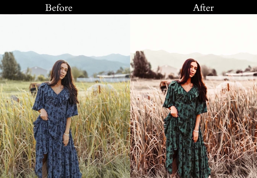
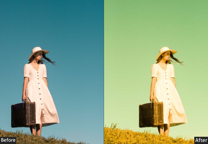
30. Green Vintage
Green Vintage enriches foliage and nature shots with a lush, organic tone: boosted greens, slightly cooled temperature, and a gentle fade make outdoor and forest photography feel immersive and alive.
Light Panel: Contrast −5% | Fading +10%.
Color Panel: Green Midtones +15% | Saturation −5%.
Effects Panel: Vignette −5% | Grain +5%.
Detail Panel: Sharpening soft (moss-like).
Purpose: To root your images in natural calm.
Best For: Outdoor shots or portraits in the wild.
Usage: when you’re craving a forest escape.
Style: Earthy, serene, and naturally vintage.
31. Light Blue Vintage
A clear summer sky, light and free-that’s the light blue preset in a nutshell.
Light Panel: Exposure +5% | Temp −5%.
Color Panel: Light Blue Highlights +10% | Fading +5%.
Effects Panel: Vignette −5% | Clarity +5%.
Detail Panel: Sharpening subtle.
Purpose: fresh, summery lift.
Best For: Beach days or bright, happy moments.
Usage: when you want your photo to feel like a sunny breeze.
Style: Light, airy, and delightfully fresh.
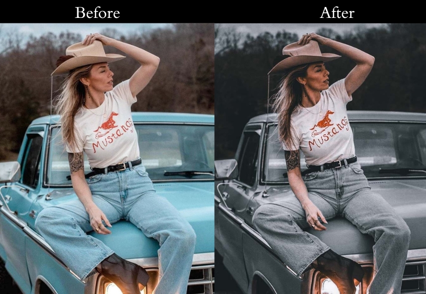
32. Matte B&W Vintage
Old black-and-white photos, soft and timeless, meet the Matte BW preset.
Light Panel: Contrast −10% | Matte +20%.
Color Panel: Saturation −100% (B&W) | Blacks +10%.
Effects Panel: Vignette −10% | Grain +10%.
Detail Panel: Sharpening low (classic feel).
Purpose: To turn your shots into vintage masterpieces.
Best For: Portraits or street scenes with soul.
Usage: when you want that old-photo-album magic.
Style: Timeless, matte, and beautifully classic.
33. Memory Vintage
Flipping through faded family pics, this is the memory preset’s sweet spot.
Light Panel: Contrast −10% | Fading +15%.
Color Panel: Saturation −10% | Temp +10%.
Effects Panel: Vignette −5% | Grain +5%.
Detail Panel: Sharpening gently.
Purpose: To wrap your pics in warm, sentimental haze.
Best For: Family shots or childhood throwbacks.
Usage: when you’re feeling all fuzzy and nostalgic.
Style: Warm, soft, and memory-lane lovely.
34. Navy Blue Vintage
Starry nights, deep and calm, the Navy Blue Vintage preset paints that picture.
Light Panel: Exposure −5% | Contrast +10%.
Color Panel: Navy Shadows +20% | Saturation −10%.
Effects Panel: Vignette −10% | Grain +5%.
Detail Panel: Sharpening soft (night sky feel).
Purpose: cool, starry spell on your images.
Best For: Night scenes or moody moments.
Usage: when you want your photo to feel like a midnight dream.
Style: Deep, serene, and celestial.
35. Old Film Vintage
Rewind to the days of clunky projectors-the Old Film Vintage preset nails that look.
Light Panel: Contrast −5% | Fading +10%.
Color Panel: Sepia +10% | Saturation −10%.
Effects Panel: Grain +15% | Vignette −10%.
Detail Panel: Sharpening minimal (grain-focused).
Purpose: To mimic the charm of vintage cinema.
Best For: Anything needing that old-movie flicker.
Usage: when you’re channeling your inner Hitchcock.
Style: Grainy, sepia-toned, and cinematic.
36. Red Pastel Vintage
This preset makes Soft pinks and blues at sunset-dreamy.
Light Panel: Exposure +5% | Contrast −5%.
Color Panel: Pastels (Pink/Blue/Yellow) +15% | Fading +5%.
Effects Panel: Vignette −5% | Clarity +5%.
Detail Panel: Sharpening soft (cotton-candy feel).
Purpose: To sprinkle your pics with fairy-tale charm.
Best For: Portraits or shots needing a romantic lift.
Usage: when you want your photo to feel like a pastel hug.
Style: Dreamy, soft, and pastel-pretty.
37. Purple Vintage
Twilight vibes, mysterious and cool, the Purple preset is your go-to.
Light Panel: Exposure −5% | Contrast +10%.
Color Panel: Purple Shadows +15% | Saturation −5%.
Effects Panel: Vignette −10% | Grain +5%.
Detail Panel: Sharpening subtle (hue-focused).
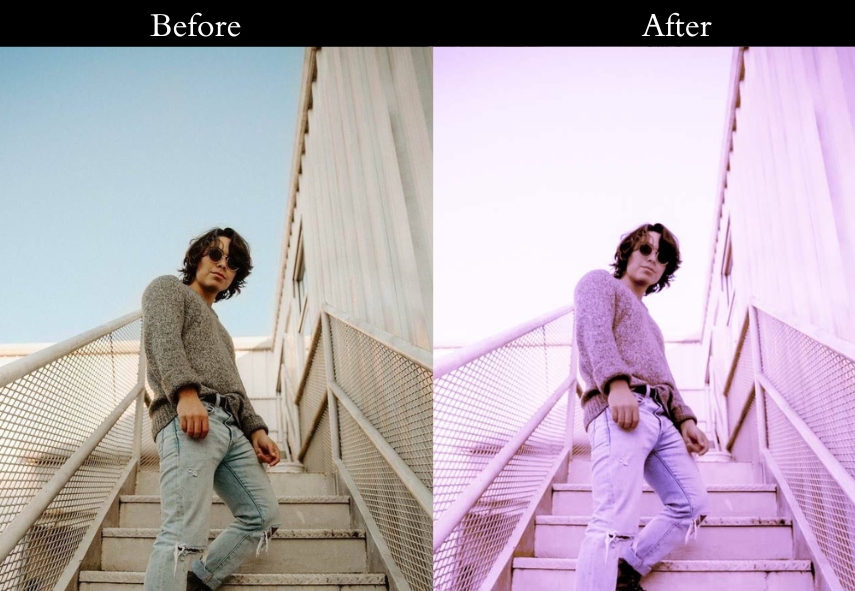
Purpose: a magical, dusky glow.
Best For: Night shots or portraits with flair.
Usage: when you want your photo to shimmer like twilight.
Style: Cool, rich, and mysteriously purple.
38. Light Red Vintage
The red preset screams nostalgia with a twist.
Light Panel: Exposure +5% | Temp +15%.
Color Panel: Red Midtones +20% | Saturation −5%.
Effects Panel: Vignette −5% | Clarity +10%.
Detail Panel: Sharpening clean (focus on reds).
Purpose: warm, bold nostalgia.
Best For: Urban shots or portraits with attitude.
Usage: when you want your photo to roar with retro fire.
Style: Warm, bold, and red-hot vintage.
39. Retro Light Vintage
The retro mood mixes warm and cool for that ultimate throwback.
Light Panel: Contrast −10% | Fading +15%.
Color Panel: Temp +10% | Saturation −10%.
Effects Panel: Grain +10% | Vignette −10%.
Detail Panel: Sharpening soft (Polaroid feel).
Purpose: To teleport your pics to the groovy past.
Best For: Street shots or anything needing a 70s vibe.
Usage: when you’re feeling funky and retro-cool.
Style: Faded, grainy, and totally throwback.
40. Sepia Dark Vintage
Old, weathered photos with a moody twist, the Sepia effect nails it.
Light Panel: Exposure −10% | Contrast +15%.
Color Panel: Sepia +25% | Saturation −20%.
Effects Panel: Vignette −20% | Grain +10%.
Detail Panel: Sharpening minimal (raw look).
Purpose: a dark, timeless edge.
Best For: Landscapes or portraits with gravitas.
Usage: when you want your photo to feel like a relic.
Style: Moody, dark, and sepia-soaked.
41. Sepia Matte Vintage
The Sepia Matte preset is pure nostalgic charm.
Light Panel: Contrast −5% | Matte +20%.
Color Panel: Sepia +15% | Saturation −10%.
Effects Panel: Vignette −10% | Grain +5%.
Detail Panel: Sharpening soft (whisper feel).
Purpose: vintage grace.
Best For: Still lifes or portraits that need tenderness.
Usage: when you want your photo to feel like a quiet memory.
Style: Matte, gentle, and nostalgic.
42. Sepia Soft Vintage
Faded postcards from yesteryear, the sepia soft preset brings that vibe.
Light Panel: Exposure +5% | Contrast −10%.
Color Panel: Sepia +10% | Saturation −5%.
Effects Panel: Vignette −5% | Clarity +5%.
Detail Panel: Sharpening soft (dreamy).
Purpose: a delicate sense of nostalgia.
Best For: Landscapes or shots needing a gentle touch.
Usage: when you’re craving that postcard charm.
Style: Dreamy, soft, and sepia-sweet.
43. Warm Dark Vintage
The warm dark preset delivers: Cozy up by the fire, dark, warm, and inviting.
Light Panel: Exposure −10% | Contrast +15%.
Color Panel: Warm Shadows +20% | Saturation −10%.
Effects Panel: Vignette −20% | Grain +10%.
Detail Panel: Sharpening soft (warm-focused).
Purpose: To create a deep, cozy vibe.
Best For: Indoor shots or portraits with heart.
Usage: when you want your photo to feel like a toasty night in.
Style: Warm, dark, and soulfully rich.
44. HDR Vintage
Trendy meets vintage, like scrolling through a hipster’s Instagram. The VSCO blends both worlds.
Light Panel: Contrast −10% | Fading +15%.
Color Panel: Saturation −15% | Temp −5% (cool).
Effects Panel: Grain +10% | Vignette −10%.
Detail Panel: Sharpening low (chill look).
Purpose: modern-vintage cool factor.
Best For: Lifestyle shots or portraits with flair.
Usage: when you want your photo to scream “aesthetic.”
Style: Faded, trendy, and VSCO vibes.
45. Serum Vintage
Fashion shoot meets vintage chic: the Serum preset is editorial gold.
Light Panel: Exposure +5% | Contrast −5%.
Color Panel: Highlights +10% (warm) | Shadows −10% (cool).
Effects Panel: Vignette −5% | Clarity +10%.
Detail Panel: Sharpening clean (stylish).
Purpose: sleek, stylish vintage look.
Best For: Fashion pics or portraits with edge.
Usage: when you want your photo to grace a magazine cover.
Style: Editorial, chic, and vintage-cool.
How to Install Vintage Lightroom Presets?
Installing Lightroom presets takes less than two minutes on both desktop and mobile. Here’s how to do it for each version:
Lightroom Classic (Desktop)
1. Download the preset ZIP file and extract it. You’ll find .xmp or .lrtemplate files inside.
2. Open Lightroom Classic. Go to the Develop module.
3. In the left panel, find the Presets section. Click the + icon → Import Presets.
4. Select your .xmp files and click Import. Your presets will appear in the Presets panel instantly.
Lightroom Mobile (iOS & Android)
1. Download the .dng preset files to your phone’s camera roll.
2. Open Lightroom Mobile and import one of the DNG files.
3. Tap the three-dot menu (…) → Create Preset. Name it and save it to your desired folder.
4. Your preset will now appear in the Presets tab whenever you edit a photo.
Lightroom CC (Cloud / Desktop app)
Go to File → Import Profiles & Presets, select your .xmp files, and click Import. If you’re synced across devices, the presets will appear on mobile automatically within a few minutes.
More Details: Lightroom Presets Import & Export Settings
Last Words
With these presets in your editing toolkit, you’re basically a time-traveling photo wizard. They are like a little piece of editing magic. So go ahead, open your photo collection, and start creating those beautiful, timeless images that’ll make everyone go, “Wow, where did you find that old gem?” Until next time, keep those creative sparks flying and remember, every photo is a chance to relive a moment in a whole new (old) way! Happy editing!
More Presets:
Kodak Portra Lightroom Presets Free Download
Classic Lightroom Presets Free Download
Black And White Lightroom Presets Free Download
Retro Lightroom Presets Free Download
Moody Lightroom Presets Free Download