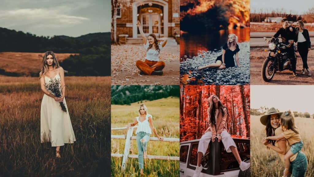
Most landscape photos don’t fail in the field. They fail in Lightroom. You nailed the composition. You waited for the light. You got the shot. But somewhere between importing that RAW file and exporting the final edit, something gets lost! The drama flattens, the colors go clinical, and the image that gave you chills at golden hour looks like a slightly nice screensaver.
Your camera captures everything and judges nothing. That means the atmosphere, the mood, the sheer weight of standing before a mountain range at 5 am. None of that survives the import unless you know exactly how to pull it back out. And that’s a skillset that takes years to develop. Or you use the right preset, and you get there in ten seconds.
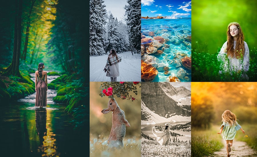
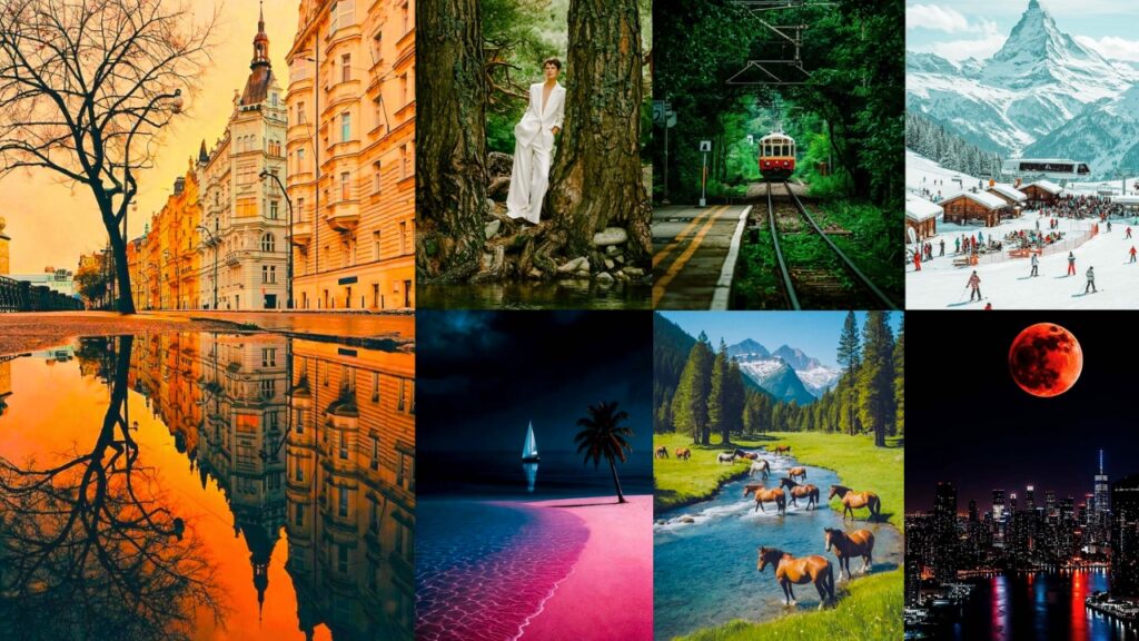
These Landscape Presets cover every terrain, every light condition, and every mood you’ll ever shoot in. Misty forests with that cool, desaturated depth. High-contrast desert shots where shadows go almost black, and the sand glows amber. Coastal scenes where the water shifts between teal and deep navy without looking fake. Mountain golden hours where the sky doesn’t just look orange. It looks warm, the way it actually felt standing there.

Pauline Jackson
My focus is subtle but intentional improvement: nothing exaggerated, nothing that overwhelms the original shot. Just cleaner light, better contrast control, and more natural color consistency so the image feels complete without looking “processed.”
50 Landscape Photography Lightroom Presets
Each preset was built around how light actually behaves in nature, not how Instagram thinks it should. That means they’re not just pretty in one type of photo. They’re intelligent starting points that work with your image instead of flattening it. Try one. Adjust two sliders. Export. That’s the whole process.
- Pauline Jackson
- 1. Moody & Dark Landscape Presets
- 2. Cinematic Landscape Presets
- 3. Vintage Landscape Presets
- 4. Drone Landscape Presets
- 5. Night Sky Landscape Presets
- 6. Winter & Snow Landscape Presets
- 7. Tropical Landscape Presets
- 8. Mountain & Forest Landscape Presets
- 9. HDR Landscape Presets
- 10. Golden Hour & Sunset Landscape Presets
1. Moody & Dark Landscape Presets
Some landscapes aren’t meant to be bright and cheerful. They’re supposed to feel heavy, mysterious, and deeply atmospheric. That’s exactly what moody dark presets do. They crush the blacks, pull down the exposure, and introduce cool, desaturated tones that make stormy skies, dark forests, and foggy cliffs look absolutely cinematic. If your photos could have a soundtrack, this preset would pick something by Hans Zimmer.
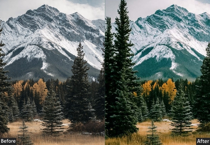
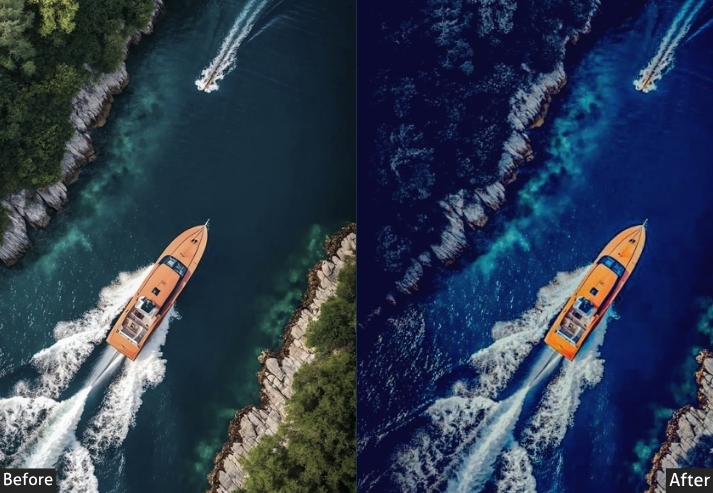
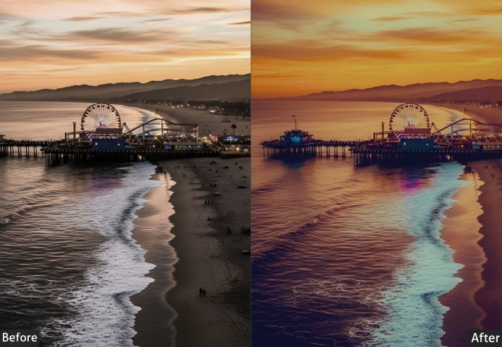
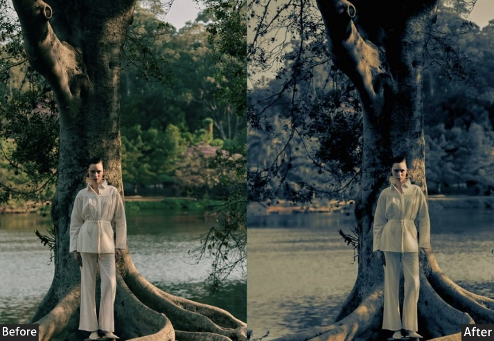
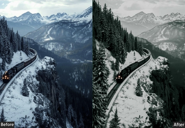
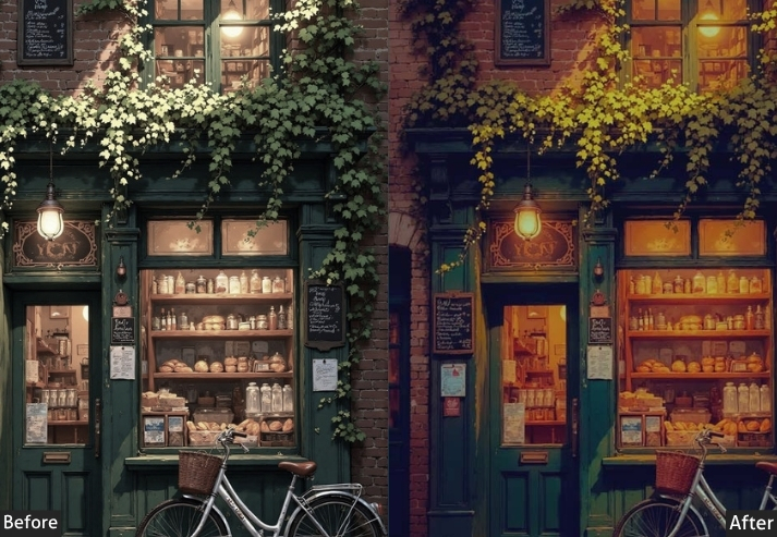
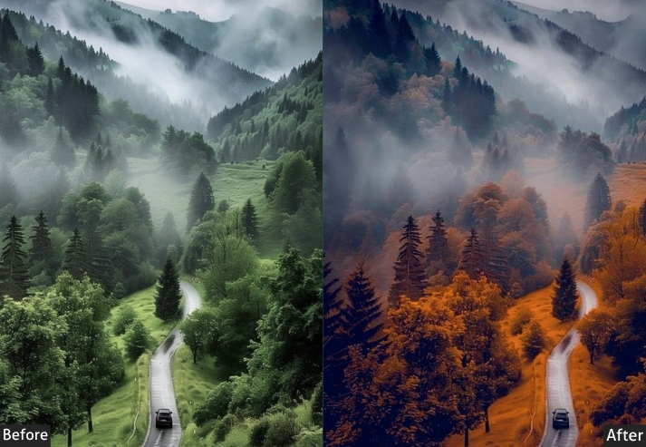
Light Panel: Exposure −0.50 | Contrast +35 | Highlights −60 | Shadows −20 | Whites −25 | Blacks −40.
Color Panel: Temp −400K | Tint −5 | Vibrance −15 | Saturation −10.
HSL - Hue: Blue −10 | Aqua −8 | Green +5.
HSL - Saturation: Blue +20 | Green −15 | Orange −20 | Yellow −10.
HSL - Luminance: Blue −20 | Green −15 | Orange −25.
Tone Curve: Shadows −15 | Highlights −20 | Slight S-Curve Dip in Midtones.
Effects Panel: Clarity +20 | Dehaze +20 | Vignette −35 | Grain +20 (Size 35 | Roughness 55).
Detail Panel: Sharpening +70 (Masking 65) | Luminance NR +20 | Color NR +10.
Color Grading: Shadows Hue 200 / Sat 30 | Midtones Hue 210 / Sat 10 | Highlights Hue 215 / Sat 8.
| Purpose | dramatic, emotionally charged visual stories. |
| Best For | Stormy skies, dark forest trails, cliffs, gothic ruins, dramatic ocean waves, pre-storm fields. |
| Usage | excellent for a black-and-white conversion base. |
| Style | Cinematic, dark, editorial, dramatic. |
2. Cinematic Landscape Presets
Cinematic presets borrow heavily from Hollywood film colorists, specifically that signature teal-and-orange look you see in every major blockbuster. These presets push warm tones into skin tones and midtones while simultaneously cooling the shadows into deep teals and blues. Landscape photos that look like movie posters. People will genuinely ask you which film camera you used.
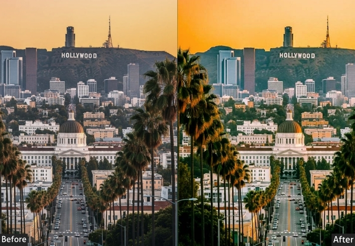
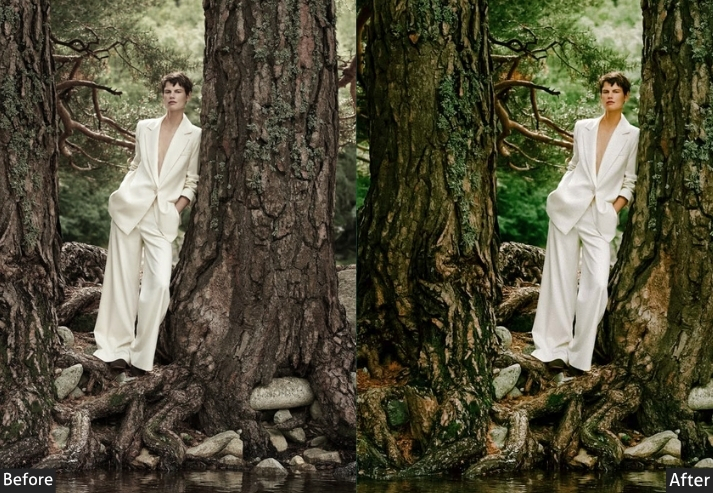
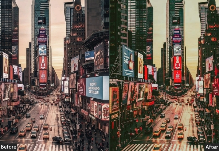
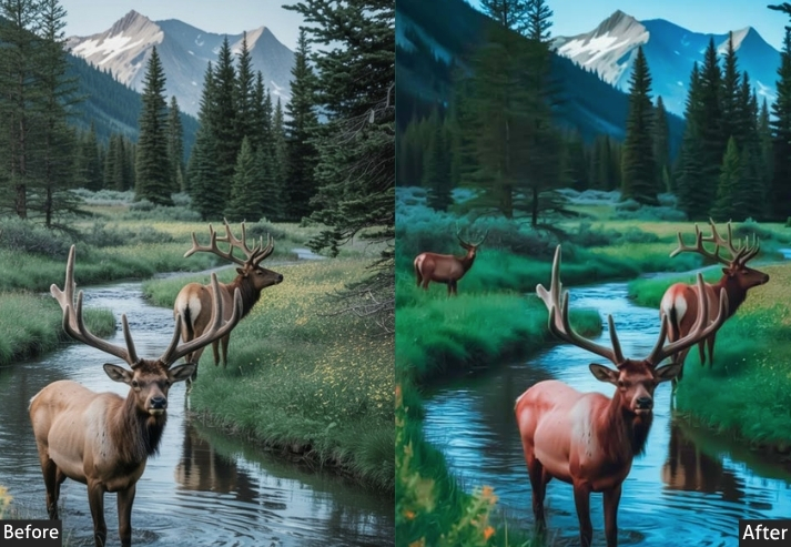
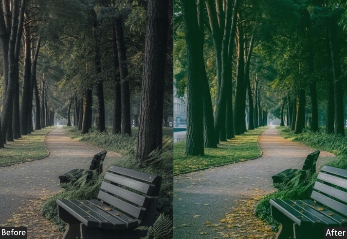
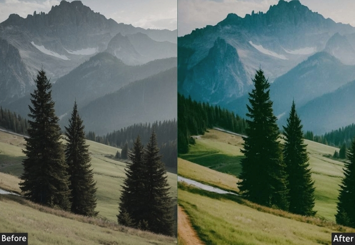
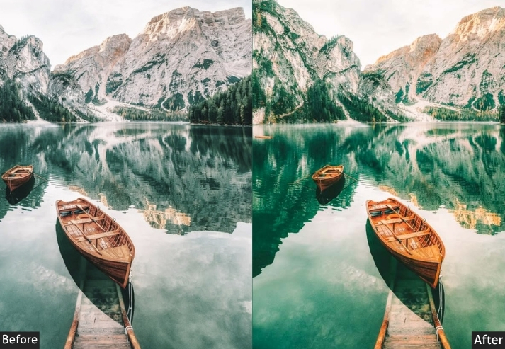
Light Panel: Exposure -0.20 | Contrast +30 | Highlights -40 | Shadows +20 | Whites -15 | Blacks -25. Color Panel: Temp +300K | Tint +5 | Vibrance +15 | Saturation +5. HSL → Hue: Orange +8 | Yellow +5 | Blue -10 (shift blue sky toward teal) | Aqua -15 (strengthen teal in shadows). HSL → Saturation: Orange +30 | Blue +25 | Aqua +20 | Green -10. HSL → Luminance: Orange +10 | Blue -15 | Aqua -10. Tone Curve: Classic faded film S-curve | Shadows lift bottom point ~15 (faded matte blacks) | Highlights -8 | Red channel gentle S (warmth) | Blue channel boost shadows + pull highlights down. Effects Panel: Clarity +15 | Dehaze +10 | Vignette -25 | Grain +15 (Size 30 | Roughness 50). Detail Panel: Sharpening +55 (Masking 60) | Luminance NR +20. Color Grading: Shadows teal (Hue ~190 | Sat ~40) | Midtones warm orange (Hue ~30 | Sat ~25) | Highlights warm cream (Hue ~40 | Sat ~15) | Balance slightly toward highlights.
| Purpose | Story-driven visual art. |
| Best For | Desert roads, mountain vistas, misty valleys, scenic overlooks. |
| Usage | works best on golden hour shots. adjust teal intensity in shadows via color grading. |
| Style | Filmic, bold, story-driven, editorial, blockbuster-worthy. |
3. Vintage Landscape Presets
Vintage film presets simulate the look of classic analog film stocks: Kodak Portra, Fuji Velvia, Kodachrome, and cross-processed slide film. They introduce color casts, faded blacks, grain structures, and subtle color shifts that digital cameras simply don’t produce. It’s nostalgia bottled into a preset. And it works BEAUTIFULLY on landscapes.
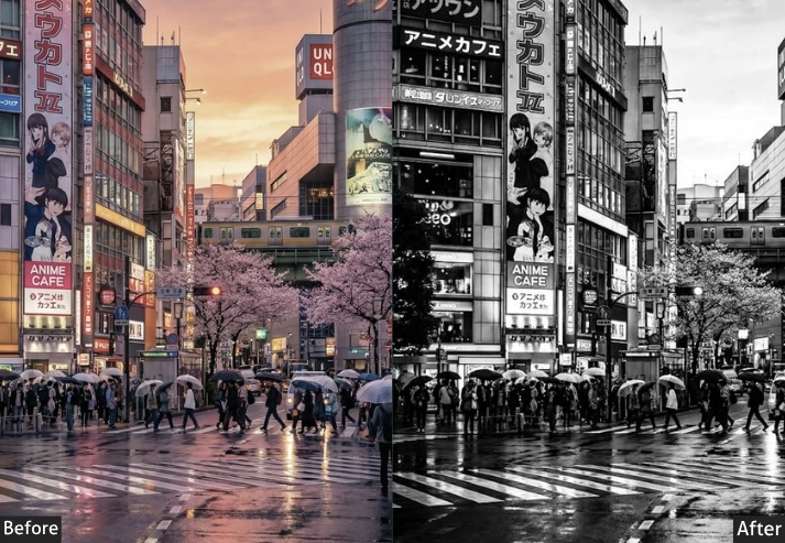
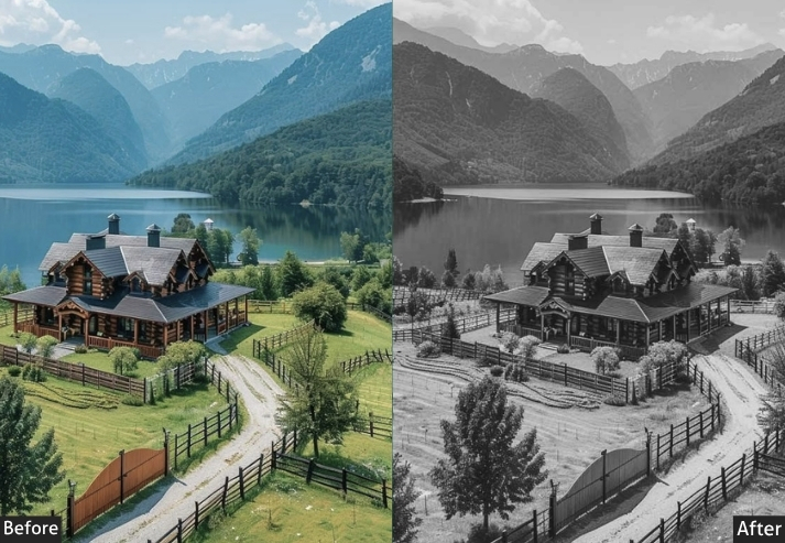
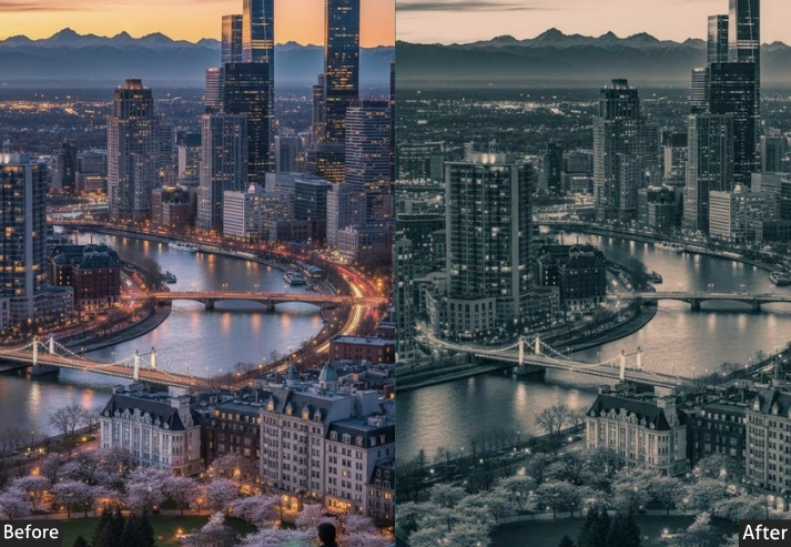
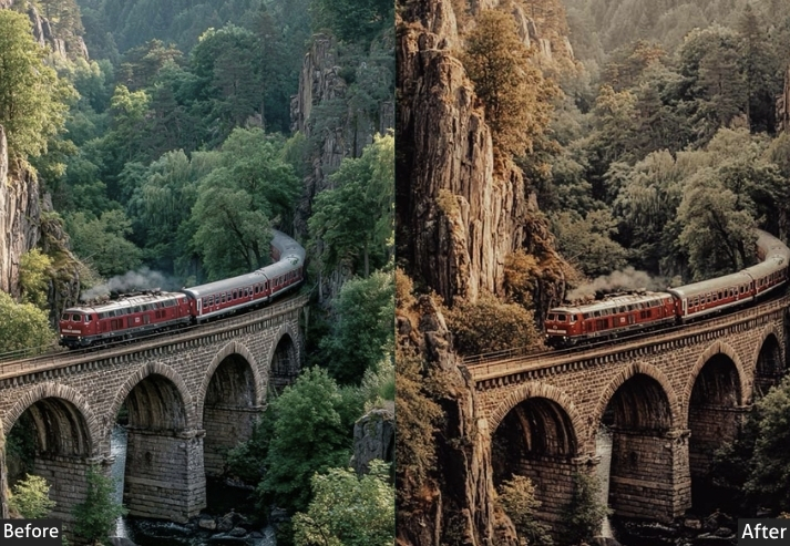
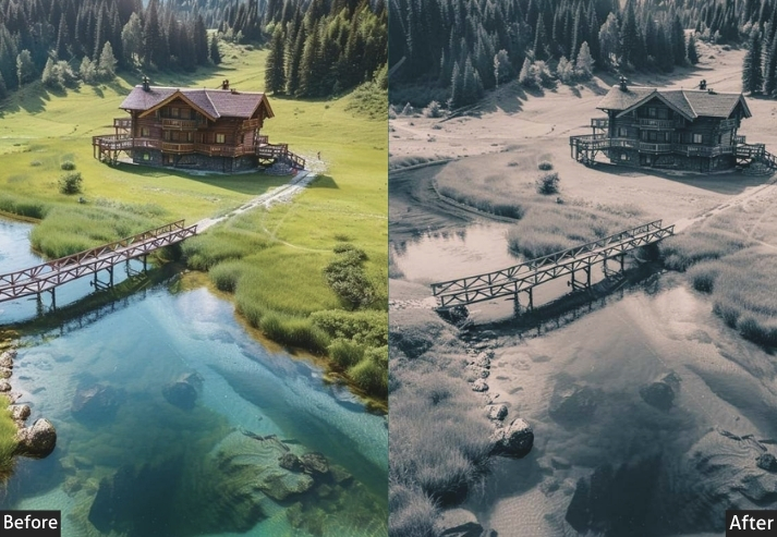
Light Panel: Exposure -0.15 | Contrast +15 | Highlights -20 | Shadows +25 | Whites -15 | Blacks +20 (lifted blacks = that "faded film" look). Color Panel: Temp +400K | Tint +8 (slight green like analog film) | Vibrance +15 | Saturation -5 (slightly muted, aged color). HSL → Hue: Red +10 | Orange +8 | Green +15 (shift to cooler filmic green). HSL → Saturation: Red +20 | Orange +25 | Green -10 | Blue -15 (muted sky — very filmic). HSL → Luminance: Orange +10 | Green -5. Tone Curve: Classic faded film look | raise shadow point to +20 (crushed blacks into lifted grey) | gentle highlight roll-off | split warm highlights and cool shadows (RGB channels). Effects Panel: Clarity +5 | Dehaze +5 | Vignette -25 | Grain +35 (Size 40 | Roughness 70). Detail Panel: Sharpening +45 (grain handles texture) | Luminance NR +20. Color Grading: Shadows green-teal (Hue ~165 | Sat ~20) | Highlights warm yellow-orange (Hue ~40 | Sat ~25) | Midtones neutral warm (Hue ~30 | Sat ~10).
| Purpose | Simulate the color, grain, and tonal qualities of classic analog film stocks for an authentic vintage aesthetic. |
| Best For | Country roads, rural farms, old landscapes, 70s-style road trips. |
| Usage | vary the shadow color grade for different film stocks. Kodachrome = warm; Velvia = vibrant. |
| Style | Nostalgic, retro, film-authentic, timeless. |
4. Drone Landscape Presets
Drone photography brings a completely new perspective challenge. The color and light behave differently at different altitudes. You’re often shooting through atmospheric haze, and the landscape’s scale changes everything. Aerial presets handle atmospheric correction, enhance the geometric beauty of fields and coastlines from above, and address the overexposed highlights that drone cameras often struggle with.
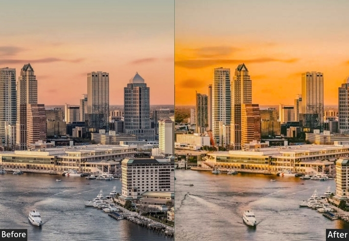
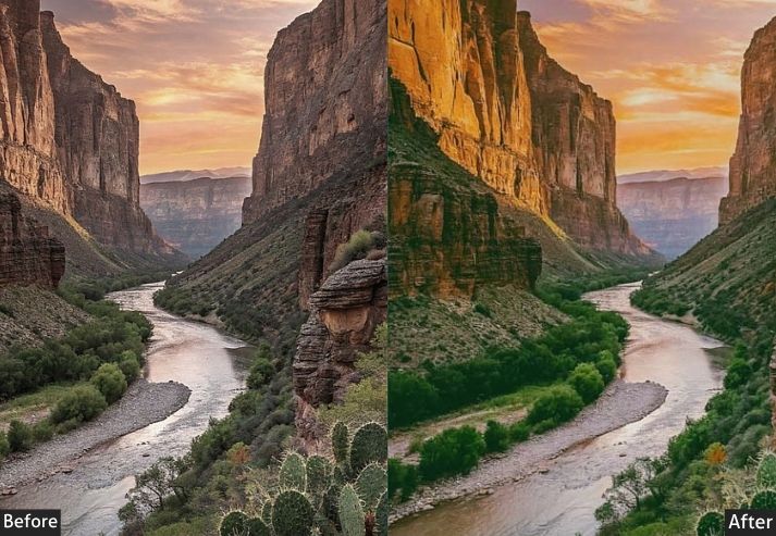
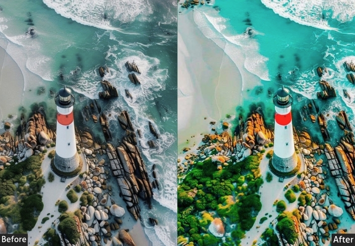
Light Panel: Exposure -0.30 (drone shots tend to overexpose) | Contrast +30 | Highlights -70 (strong — sky from above is brutal) | Shadows +35 | Whites -25 | Blacks -15. Color Panel: Temp -200K (aerial light is cooler) | Tint 0 | Vibrance +30 | Saturation +10. HSL → Hue: Aqua -12 (deeper water colors from above) | Blue -8 | Green -5. HSL → Saturation: Aqua +40 (rivers, oceans, lakes from above — gorgeous) | Green +30 (fields, forests) | Orange +20 (desert land). HSL → Luminance: Blue -15 (deepen sky) | Aqua +10. Tone Curve: S-curve with aggressive highlight pull-back | recover detail in aerial highlights. Effects Panel: Clarity +20 | Dehaze +30 (most important for aerial — cuts through ALL atmospheric haze!) | Vignette -10 | Grain +8. Detail Panel: Sharpening +65 (Masking 55) | Luminance NR +20. Color Grading: Shadows deep earthy green (Hue ~130 | Sat ~15) | Midtones neutral natural (Hue ~170 | Sat ~8) | Highlights cool aerial light (Hue ~210 | Sat ~10).
| Purpose | Correct aerial-specific color and exposure challenges, enhance ground-pattern visibility, and cut through atmospheric haze. |
| Best For | Drone photography, bird’s-eye landscape shots, coastal aerials, agricultural field patterns, city-to-nature transition shots. |
| Usage | increase based on altitude and humidity; apply at 80–100%. |
| Style | Geometric, grand-scale, awe-inspiring, documentary. |
5. Night Sky Landscape Presets
This is the most technically demanding and most rewarding category of landscape presets. Night sky presets have one incredibly hard job: lift a severely underexposed RAW file, reduce the noise that comes with high ISO shooting, and make the Milky Way pop against a dark sky without making the whole image look like a nuclear explosion. These presets are surgical, precise, and magical.
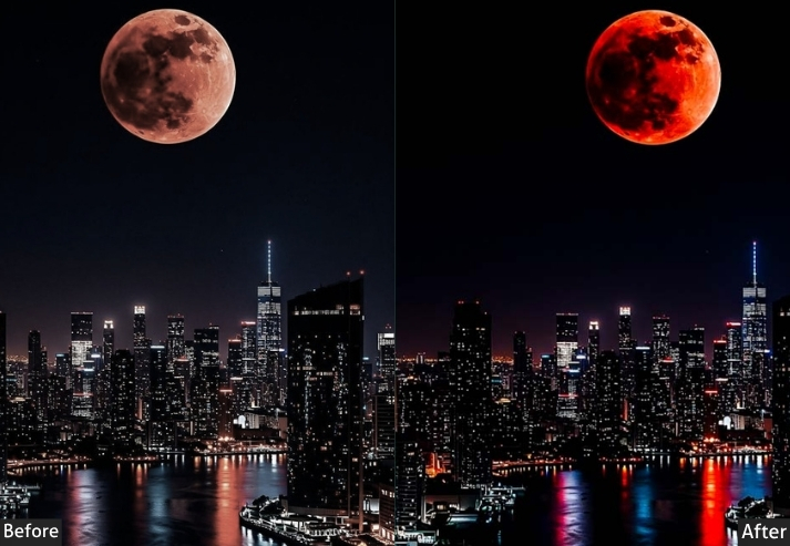
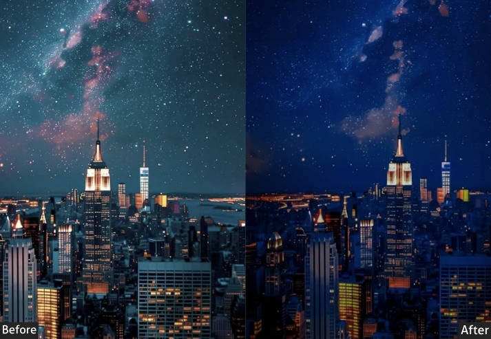
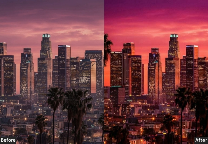
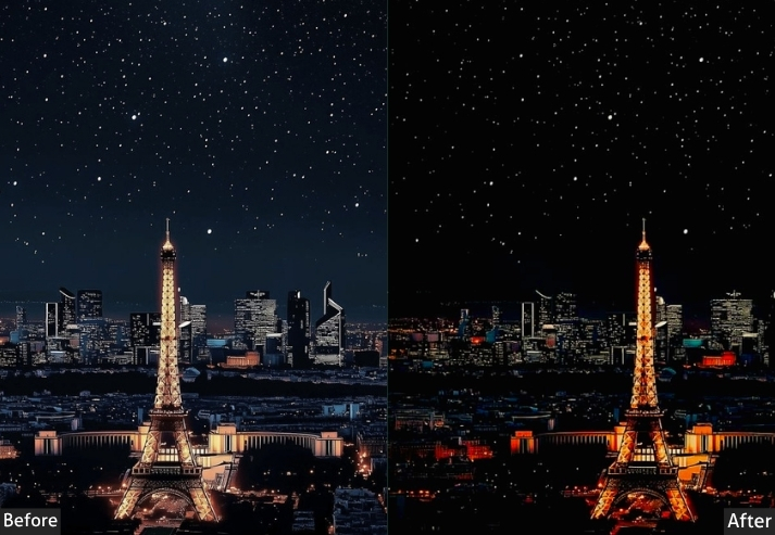
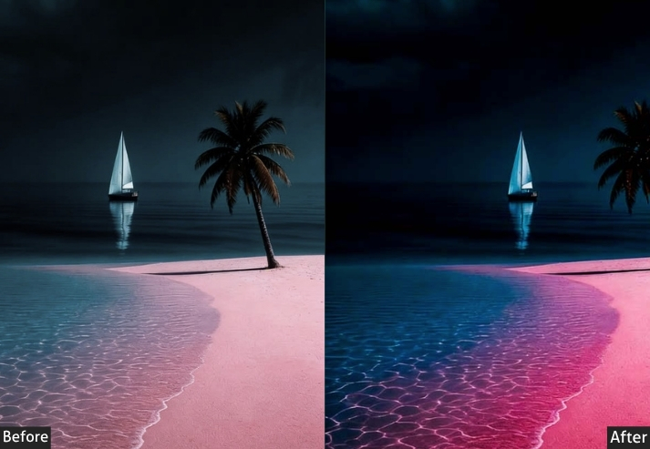
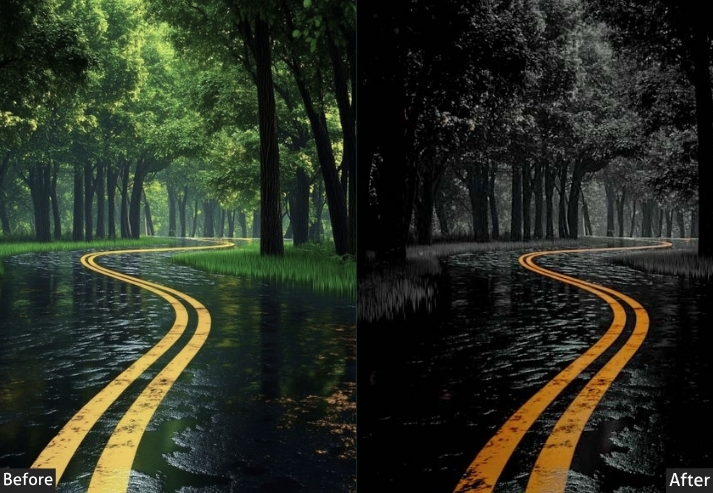
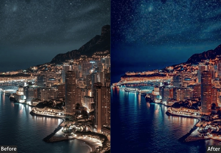
Light Panel: Exposure +1.20 (strong lift for dark night exposures) | Contrast +30 | Highlights -70 (protect bright stars and moon glow) | Shadows +60 (lift the dark foreground) | Whites -30 | Blacks -20. Color Panel: Temp -600K (night is cool and purple) | Tint +15 (slight magenta to pop Milky Way core colors) | Vibrance +40 (max up — night sky deserves this) | Saturation +20. HSL → Hue: Purple -10 (rich Milky Way hue) | Blue -15 (deeper midnight sky). HSL → Saturation: Purple +45 (THE Milky Way channel!) | Blue +35 | Aqua +20. HSL → Luminance: Purple +15 (make that Milky Way glow!) | Blue -10 (deep dark sky). Tone Curve: Bright, lifted overall exposure | Blue channel strong boost in shadows | Red channel warm up the foreground slightly. Effects Panel: Clarity +20 | Dehaze +15 | Vignette -40 (strong vignette — frames the sky beautifully) | Grain +30 (Size 45 | Roughness 65) — at night you EMBRACE grain. Detail Panel: Sharpening +50 (Masking 85 — mask sky to avoid sharpening noise) | Luminance NR +55 (heavy noise reduction — ISO 3200+ territory) | Color NR +40 (eliminates colored noise in dark areas) | Luminance Detail 50 | Luminance Contrast 40. Color Grading: Shadows deep cosmic purple-blue (Hue ~240 | Sat ~30) | Midtones neutral-cool (Hue ~225 | Sat ~15) | Highlights warm star light (Hue ~35 | Sat ~10).
| Purpose | Recover and enhance night sky exposures, reduce noise, and reveal the color and detail of the Milky Way and star fields. |
| Best For | RAW at ISO 1600–6400. |
| Usage | Use a graduated filter on the foreground for a separate exposure. |
| Style | Cosmic, awe-inspiring, deep, breathtaking. |
6. Winter & Snow Landscape Presets
Winter landscapes have a unique visual challenge: the snow tends to blow away, the shadows turn blue, and the whole scene can look either incredibly magical or just… cold and sad. A good winter preset walks that line beautifully: it keeps snow white without blowing out, adds a subtle cool-blue atmosphere, and gives the scene that “Narnia” energy. Yes, I said Narnia.
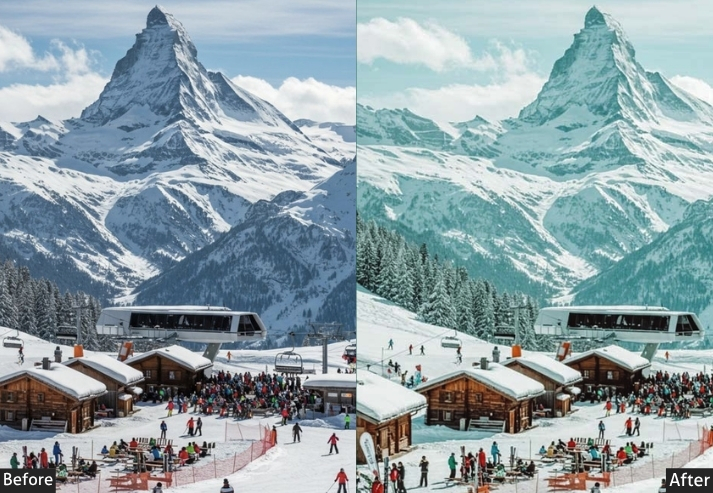
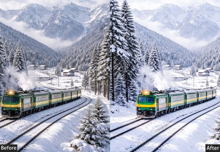
Light Panel: Exposure -0.20 | Contrast +20 | Highlights -65 (critical to recover snow detail!) | Shadows +30 | Whites -30 (pull back to protect snow) | Blacks -15. Color Panel: Temp -500K (cool, blue-shifted) | Tint -3 | Vibrance +15 | Saturation -5. HSL → Hue: Blue -8 (deepen sky blue) | Aqua +5. HSL → Saturation: Blue +25 | Aqua +15 | Orange -20 (reduce any warm cast). HSL → Luminance: Blue +10 | White/Aqua +15 (brighten snow shadows subtly). Tone Curve: Gentle S-curve with soft highlights | Blue channel slight lift in shadows (gives snow a cool blue shadow). Effects Panel: Clarity +20 | Dehaze +8 | Vignette -15 | Grain +12 (Size 25) — adds that cold film feeling. Detail Panel: Sharpening +70 (great for frost textures!) | Luminance NR +25 (snow can be noisy in shadow areas). Color Grading: Shadows cool steel blue (Hue ~220 | Sat ~25) | Highlights icy white with hint of blue (Hue ~210 | Sat ~8) | Midtones neutral-cool (Hue ~215 | Sat ~5).
| Purpose | Preserve snow detail, enhance winter atmosphere, and give cold-weather scenes their proper magical quality. |
| Best For | Snowy forests, frozen lakes, mountain snowscapes, frost-covered fields, ice photography. |
| Usage | Always expose in-camera carefully. This preset handles highlights aggressively. |
| Style | Crisp, cold, magical, serene. |
7. Tropical Landscape Presets
You traveled thousands of miles for that turquoise water shot, and your RAW file came back looking like a murky fish tank. We’ve all been there. Beach and ocean presets are tuned specifically for the unique color challenges of tropical water photography. They dial in the aqua and teal tones, correct the sky’s overpowering blue, and bring the sand to a warm, natural tone without going orange.
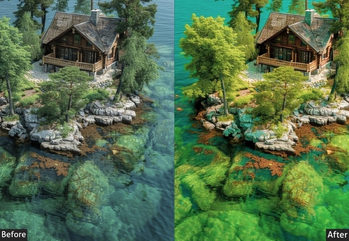
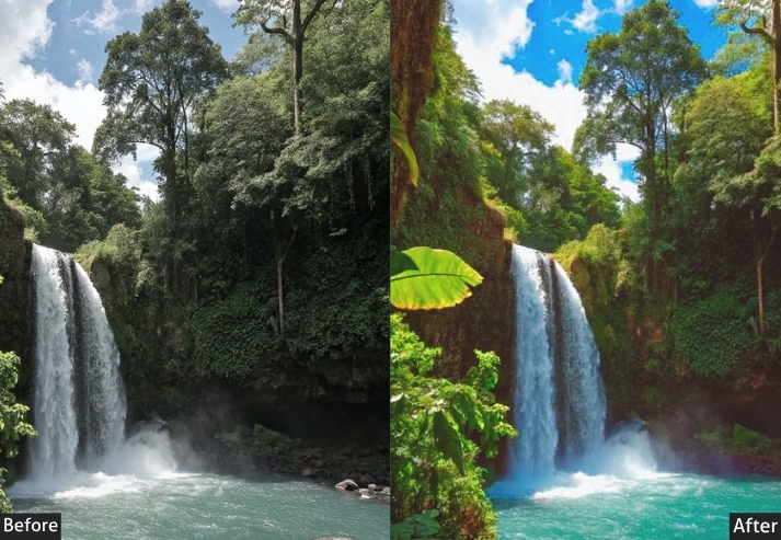
Light Panel: Exposure +0.15 | Contrast +20 | Highlights -40 | Shadows +30 | Whites +10 | Blacks -10. Color Panel: Temp +200K (keep it natural-warm) | Tint 0 | Vibrance +35 | Saturation +15. HSL → Hue: Aqua -15 (shift toward teal — this is the tropical water magic!) | Blue -5 | Orange +8 (make sand richer). HSL → Saturation: Aqua +50 (BOOSTED — tropical water signature) | Blue +30 | Orange +25 (sand/skin tones) | Green +20. HSL → Luminance: Aqua +15 (bright, clear water feel) | Blue +10 | Orange +10. Tone Curve: Slight lift overall, soft in highlights | Blue channel lift in midtones (adds depth to ocean water). Effects Panel: Clarity +10 | Dehaze +15 (clears haze over water) | Vignette -12 | Grain +5. Detail Panel: Sharpening +55 | Luminance NR +15. Color Grading: Shadows deep ocean teal (Hue ~185 | Sat ~20) | Midtones warm tropical (Hue ~30 | Sat ~12) | Highlights bright warm sky (Hue ~40 | Sat ~10).
| Purpose | Enhance the vibrant turquoise and teal tones of tropical water while keeping sand and sky natural and balanced. |
| Best For | Maldives, Caribbean, Bali, Hawaii beach photography, boat-day shots, coral reef overhead shots. |
| Usage | Aqua HSL saturation is the hero slider. works best under midday sun. |
| Style | Vibrant, tropical, travel-magazine worthy, wanderlust-inducing. |
8. Mountain & Forest Landscape Presets
Forests and mountains have a natural richness that RAW files constantly fail to capture. That deep, lush green of old-growth trees, the way light filters through a canopy, the misty valleys between ridges: a good mountain/forest preset leans into all of that. It deepens greens, adds shadow contrast, and gives the scene an almost tangible depth. You’ll smell the pine trees.
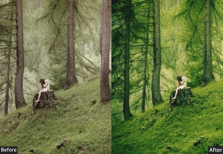
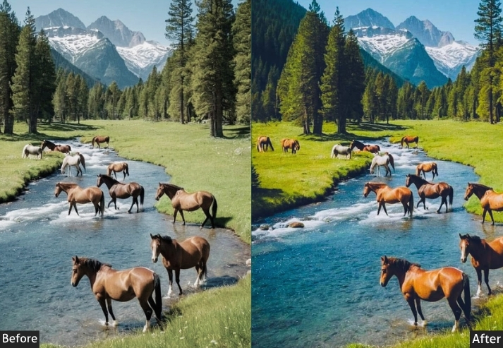
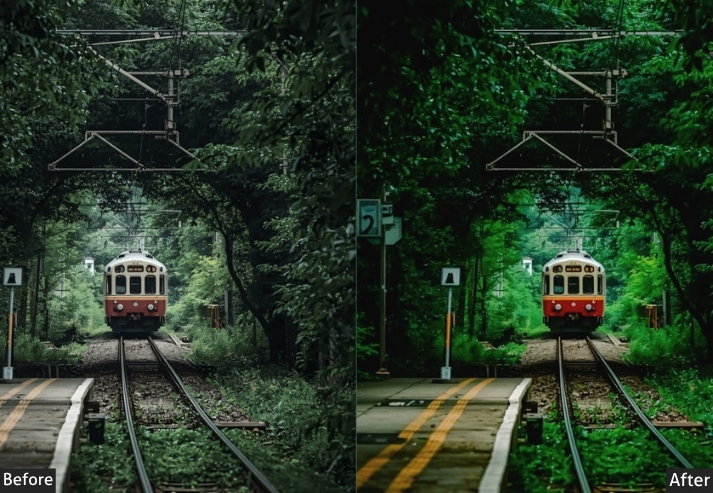
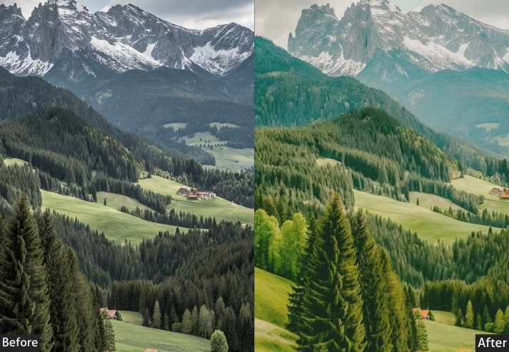
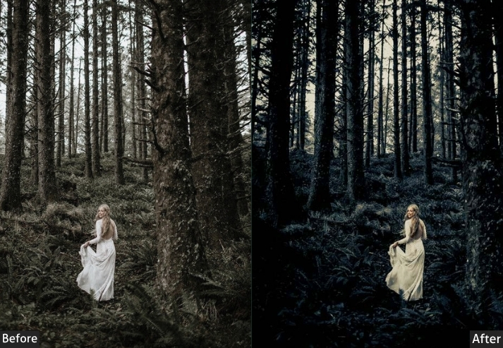
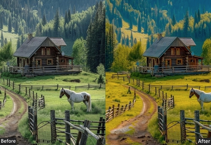
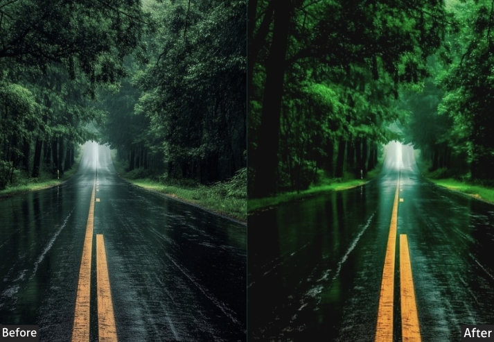
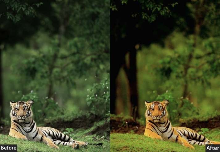
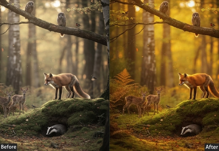
Light Panel: Exposure -0.10 | Contrast +35 | Highlights -30 | Shadows +20 | Whites +5 | Blacks -20. Color Panel: Temp -100K (cool and natural) | Tint +2 | Vibrance +25 | Saturation +10. HSL → Hue: Green -10 (shift to deeper, richer green) | Yellow +5 | Aqua -5. HSL → Saturation: Green +35 | Aqua +20 | Blue +20. HSL → Luminance: Green -10 (darker, moodier greens) | Yellow -5 | Blue -10. Tone Curve: Classic S-curve with slight shadow crush | Highlights soft pull-back (-10). Effects Panel: Clarity +25 (critical for bark, rock, and leaf texture) | Dehaze +20 (cuts through forest haze beautifully) | Vignette -20 | Grain +10 (Size 25). Detail Panel: Sharpening +75 (Radius 1.3 | Masking 60) | Luminance NR +15. Color Grading: Shadows deep forest green-teal (Hue ~175 | Sat ~20) | Midtones cool natural (Hue ~185 | Sat ~10) | Highlights soft warm cream (Hue ~40 | Sat ~8).
| Purpose | Deepen and enrich the green color palette of forest and mountain photography while adding atmospheric depth. |
| Best For | Pacific Northwest, Alpine forests, rainforests, mountain valley shots, hiking trail photography. |
| Usage | Adjust green HSL luminance per image brightness. Use dehaze slider based on atmospheric conditions. |
| Style | Lush, rich, adventurous, outdoorsy, national park editorial vibes. |
9. HDR Landscape Presets
HDR presets are for the landscape photographer who looks at their mountain shot and thinks, “I need to see EVERY. SINGLE. ROCK.” These presets work by recovering highlights in blown-out skies while simultaneously lifting shadows in dark valleys. The result is a photo where every tonal range is visible and detailed. Done right, it’s stunning. Done wrong, it looks like a 2008 video game cutscene. We’re going for stunning.
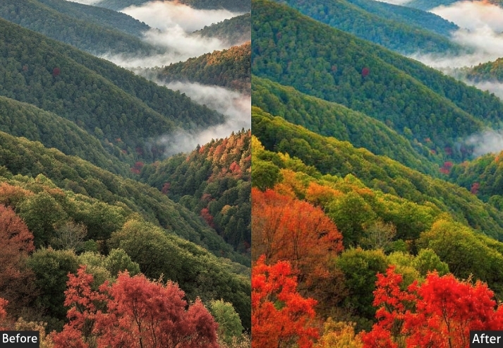
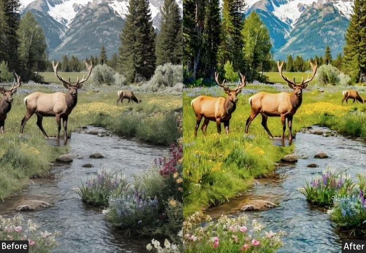
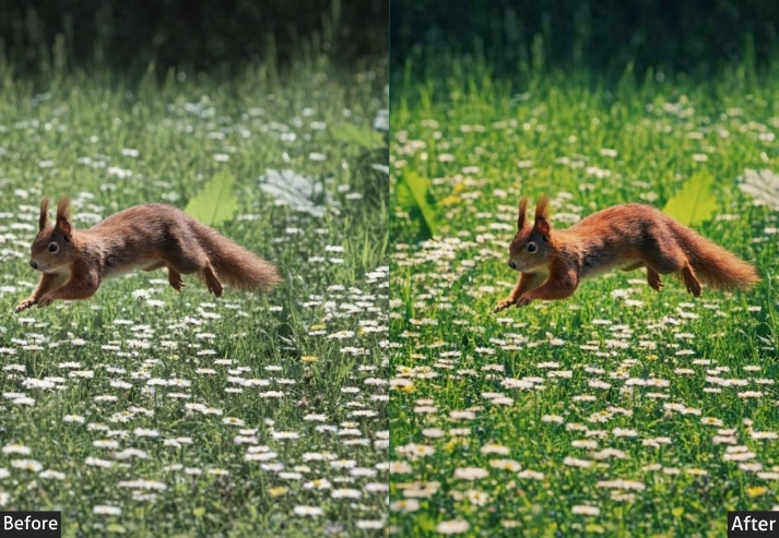
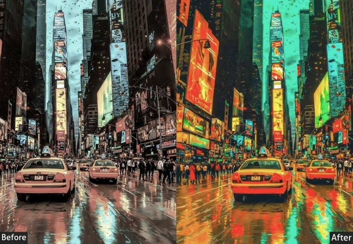
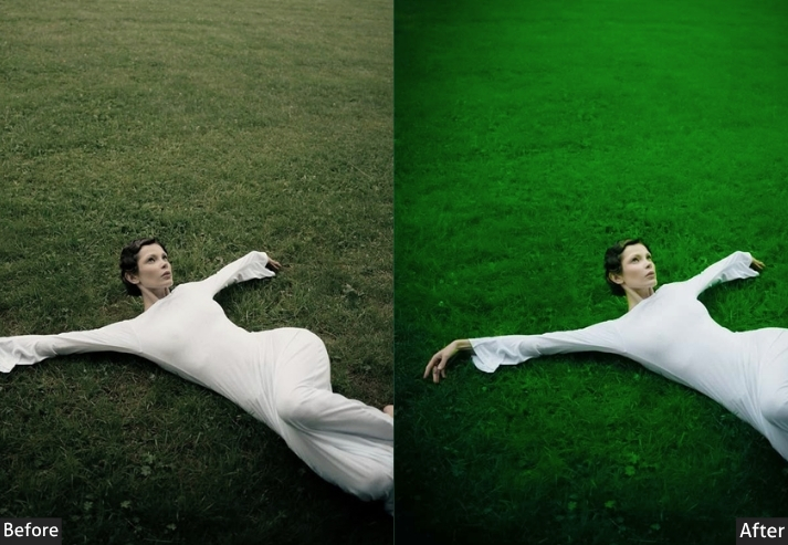
Light Panel: Exposure +0.10 (minimal global adjustment) | Contrast +40 | Highlights -80 (aggressive recovery) | Shadows +70 (aggressive lift) | Whites -20 | Blacks -20. Color Panel: Temp +100K (natural) | Tint 0 | Vibrance +30 | Saturation +15. HSL → Hue: Blue -5 | Green +5. HSL → Saturation: Blue +30 | Green +25 | Orange +20. HSL → Luminance: Blue -10 | Green +10. Tone Curve: Strong S-curve | shadows drop (-20) | highlights pull down (-15) | adds local contrast and punch. Effects Panel: Clarity +35 (key tool for HDR look) | Dehaze +25 | Vignette -20 | Grain +10 (keeps it from looking too digital). Detail Panel: Sharpening +80 (Radius 1.5 | Detail 35 | Masking 50) | Luminance NR +15. Color Grading: Neutral across all three (let the tonal range speak for itself) | slight warm push in midtones (Hue ~30 | Sat ~5).
| Purpose | Maximize tonal detail across the entire dynamic range. |
| Best For | Mountain peaks, canyon landscapes, scenes with high contrast between sky and foreground, waterfalls. |
| Usage | Use graduated filters to tone down sky separately. |
| Style | Detail-rich, punchy, technically impressive, dramatic. |
10. Golden Hour & Sunset Landscape Presets
If golden hour were a person, it’d be the life of the party: warm, glowing, and impossibly photogenic. Golden Hour presets are designed to enhance the natural amber and orange magic that occurs during the first and last hours of sunlight. They push warmth into the shadows, boost the orange and yellow channels, and make clouds look like they’re literally on fire. Photographers absolutely LOVE these because they’re crowd-pleasers. Your audience will stop mid-scroll every single time.
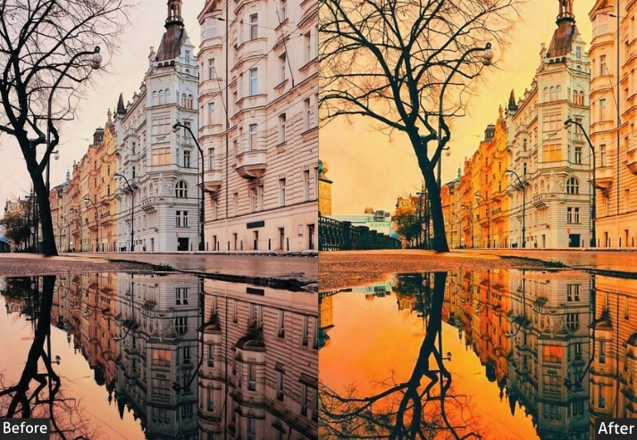
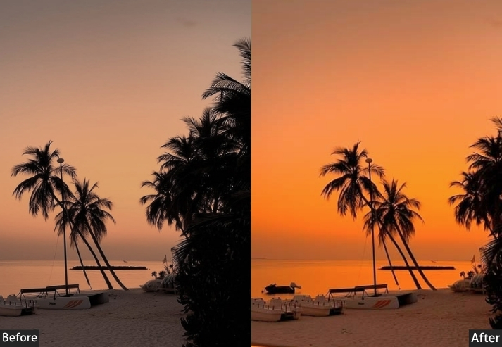
Light Panel: Exposure +0.30 | Contrast +25 | Highlights -45 | Shadows +30 | Whites +15 | Blacks -10. Color Panel: Temp +800K (shift toward yellow-orange) | Tint +8 | Vibrance +25 | Saturation +10. HSL → Hue: Orange +10 | Yellow +8 | Red +5. HSL → Saturation: Orange +35 | Yellow +30 | Red +20. HSL → Luminance: Orange +15 | Yellow +10 | Blue -15. Tone Curve: Shadows slight lift (+10 at bottom-left anchor) | Highlights gentle roll-off (-8 at top-right anchor). Effects Panel: Clarity +10 | Dehaze +12 | Vignette -18 | Grain +8 (Size 25 | Roughness 40). Detail Panel: Sharpening +60 (Radius 1.2 | Masking 70) | Luminance Noise Reduction +15. Color Grading: Highlights warm amber (Hue ~35 | Sat ~25) | Shadows deep orange-red (Hue ~20 | Sat ~15) | Midtones neutral-warm (Hue ~40 | Sat ~10).
| Purpose | enhance sunset colors without making them look fake or oversaturated. |
| Best For | Sunset over water, fields at dusk, backlit portraits in landscapes, desert sunsets, autumn evening shots. |
| Usage | works best on RAW files shot between 5–7 PM. |
| Style | Warm, cinematic, romantic, emotional. |
Final Thoughts
Here’s what separates photographers who grow fast from those who stay stuck: feedback loops.
The faster you can move from a RAW file to a finished edit, the more images you process, the more your eye develops, the better your next shoot becomes. Presets show you what your image could look like, and from there, your own creative instincts take over.
These presets give you a foundation across every landscape scenario you’ll encounter: golden hour, blue hour, overcast flat light, harsh midday sun, fog, snow, rain, and everything in between. Keep the ones that match your shooting style. Tweak them until they’re unmistakably yours. Build a signature edit that makes people recognize your work before they even see your name.
The best landscape photographers in the world aren’t the ones who found the most dramatic locations. They’re the ones who made any location look dramatic. That starts with knowing your edit, and it starts right here.
Download the pack, open that abandoned RAW file sitting in your rejected folder, and prove yourself wrong about it.
More Free Presets For You:
Drone Photography Lightroom Presets Free Download
Wildlife Lightroom Presets Free Download
4k Lightroom Presets Free Download
Outdoor Photography Lightroom Presets Free Download
Aesthetic Lightroom Presets Free Download