Haryana isn’t only a location. It’s a mood, the amber of mustard fields in February, the deep red of a bride’s lehenga against a brick kiln wall. It’s a farmer’s face at golden hour, carrying ten thousand untold stories. And your editing should be able to feel all of that, not only replicate some random Western aesthetic that has nothing to do with where you’re standing.
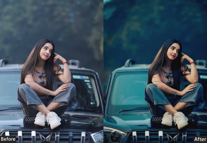
You know that feeling when you come back from a shoot in Haryana, open your laptop, and your RAW files look like someone sucked all the life out of them? 😩 The golden fields look dusty. The vibrant wedding colors look flat. That perfect sunset you chased for 45 minutes? Looks like a beige wall. Yeah. We’ve all been there. And it’s genuinely heartbreaking.
But here’s the thing nobody tells beginners… the magic isn’t just in the shot. It’s in the edit. And the fastest way to find that magic? A great preset that actually understands what Haryana looks like, feels like, and means to the people who photograph it. So, stop editing your Haryana photos the wrong way. Let’s make it perfect!
50 Haryana Lightroom Presets Free Download
If you’re slapping random Western presets on your wheat field shots and wondering why they still look flat! That’s the problem right there. Those presets weren’t built for this land, light, or culture. They were built for rain-soaked European cobblestones and Californian coffee shops. Not for the dust of a Rohtak highway or the fire of a Haryanvi wedding baraat.
Haryana has its OWN visual language. And once you learn to edit in that language? Everything changes. In this guide, we’re breaking down the most searched Haryana Presets: what they are, what they do, who they’re for, and the exact slider-by-slider editing process for every single one of them. Full Lightroom panel breakdowns…
Bookmark this. Screenshot it. Send it to your photographer friend who still thinks “editing” means bumping up the brightness. 😂 Ready? Let’s get into it. 👇
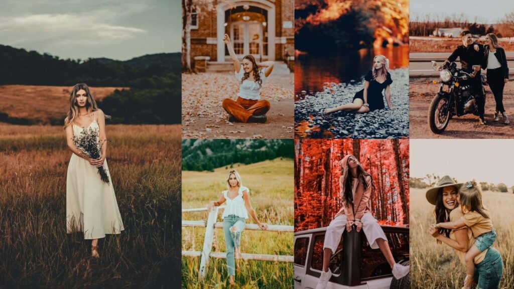
| Presets | Vibe |
| 1. Cinematic Nagpuri | Bold, warm, Bollywood-dramatic. |
| 2. Golden Hour | Nostalgic, sarson-golden, landscape magic. |
| 3. Dark & Moody DC | Brooding, emotional, noir portraits. |
| 4. Street | Cool aqua-green, adventure, viral on Reels. |
| 5. Wedding | Reds, golds, jewel tones – festive perfection. |
| 6. Village Portrait | Honest, earthy, documentary-style storytelling. |
| 7. Desert Dust | Editorial matte, trendy, southern Haryana terrain. |
| 8. Nature | Wildlife, forests, Field, Village view. |
| 9. Classic | Heritage sites, traditional culture. |
| 10. Matte Tone | Portraits, social media, travel. |
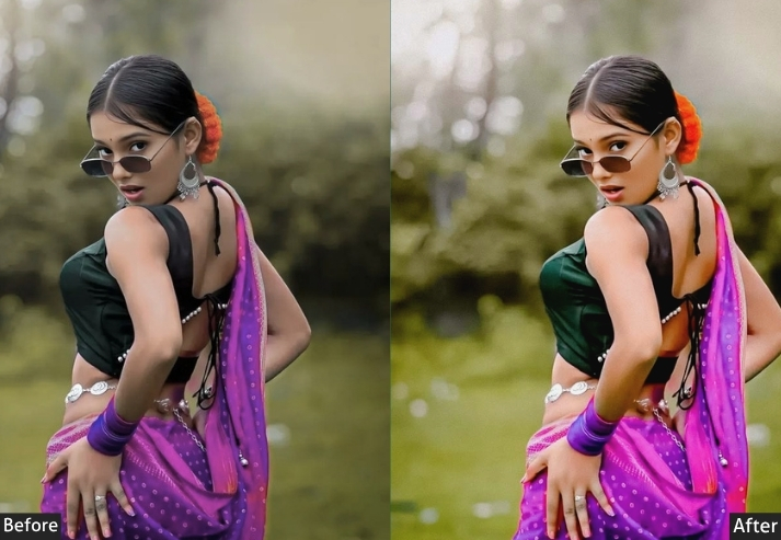
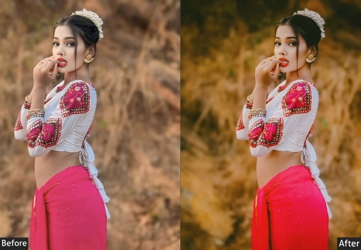
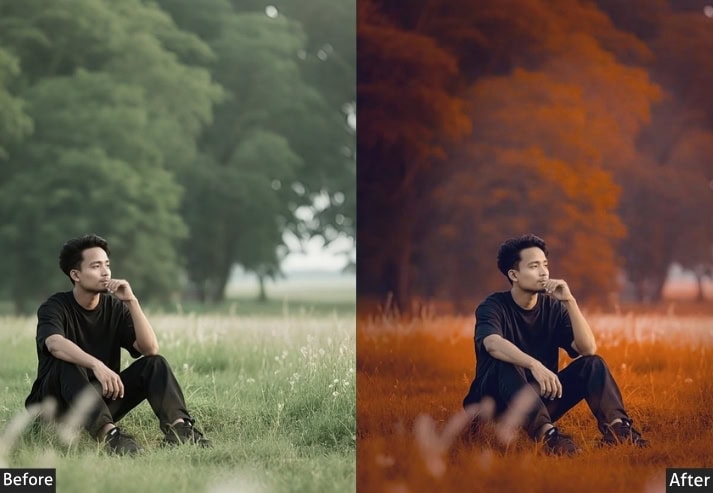
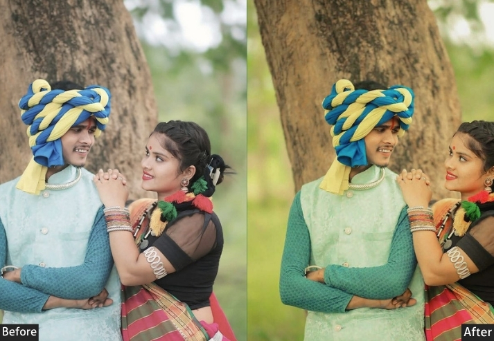
1. Haryana Cinematic Nagpuri Preset
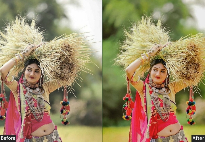
“Bollywood called. Your photo answered.” Okay, let’s talk about THE preset, the one that floods Pinterest boards and Reels every single week. The Nagpuri Cinematic preset is what happens when you take Haryana’s soul: bold colors, earthy textures, fierce portraits, and run it through a Bollywood color grading suite. Think rich amber shadows, deep saturated reds in dupattas, and skin tones that look warm like a dhoop of desi ghee. This preset turns a simple portrait shot in a sugarcane field into a movie still. No cap. 🔥
Light: Exposure +0.30 | Contrast +35 | Highlights -40 | Shadows +20 | Whites +15 | Blacks -30.
Color: Temperature +18 | Tint +8 | Vibrance +25 | Saturation +15.
Hsl / color mix: Red Hue +8 | Orange Saturation +25 | Yellow Luminance -15 | Aqua Saturation -20 | Blue Hue -12.
Effects: Clarity +20 | Dehaze +10 | Vignette -25 | Grain +12.
Detail: Sharpening +55 | Masking +40 | Noise Reduction +20 | Color Noise Reduction +15.
Color grading: Shadow Hue 30° Sat +20 | Highlight Hue 50° Sat +15 | Blending +50.
🎯 Purpose: To deliver cinematic drama with cultural richness, every photo becomes a frame from a Haryanvi film.
✅ Best For: Rural portraits, cultural events, bold outfits, and outdoor golden-hour shoots.
📌 Usage: tweak exposure ±0.20 based on your lighting. Fine-tune orange saturation for skin tone.
🎨 Style: Bold, warm, cinematic. Deep blacks + rich amber highlights = pure fire.
💡 Pro Tip: This preset LOVES natural light. Shoot between 4-6 PM when the sun goes golden. Apply this, and honestly… your Instagram comments will be unhinged. In a good way. 😄
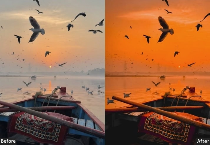
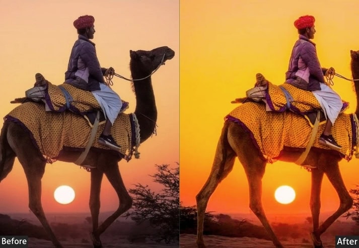
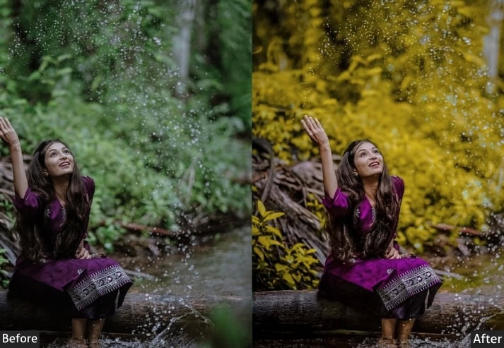
2. Golden Hour Preset
“Karnal to Kurukshetra in one click.” Close your eyes. Imagine standing in a sea of sarson (mustard flowers) in February, the sky painted in that specific shade of pale gold that only Haryana mornings know. That’s exactly what this preset recreates. It lifts yellows, warms the whole frame, and gives your landscapes that “grandmother’s old photograph” energy, but makes it HD. It’s the preset for every photographer who wants their wheat field photos to feel like a love letter to the land.
Light: Exposure +0.45 | Contrast +20 | Highlights -55 | Shadows +30 | Whites +20 | Blacks -20.
Color: Temperature +28 | Tint +6 | Vibrance +30 | Saturation +10.
Hsl / color mix: Yellow Hue +10 | Yellow Saturation +35 | Yellow Luminance +15 | Green Hue +12 | Orange Saturation +20.
Effects: Clarity +15 | Dehaze +8 | Vignette -15 | Grain +8.
Detail: Sharpening +45 | Masking +35 | Noise Reduction +15.
Color grading: Shadow Hue 45° Sat +18 | Midtone Hue 50° Sat +12.
🎯 Purpose: To transform landscape and outdoor shots into warm, golden visual poems of Haryana’s rural heartland.
✅ Best For: Wheat fields, mustard farms, morning fog, open sky shots, rural lifestyle photography.
📌 Usage: Works best on morning shots (6–9 AM). Dial back yellow saturation if your shot already has strong yellows.
🎨 Style: Nostalgic, warm, golden-hour glowy.
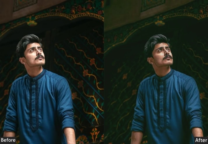
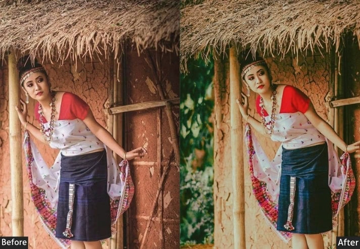
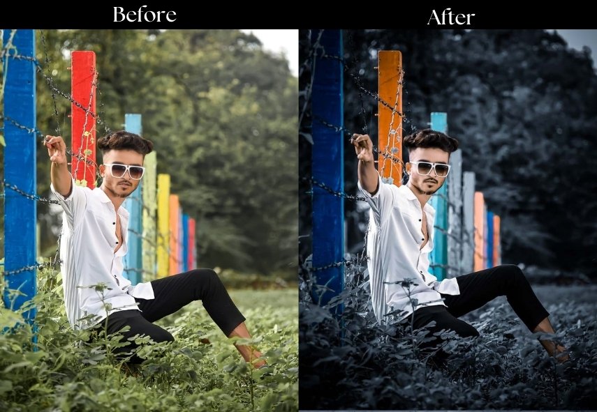
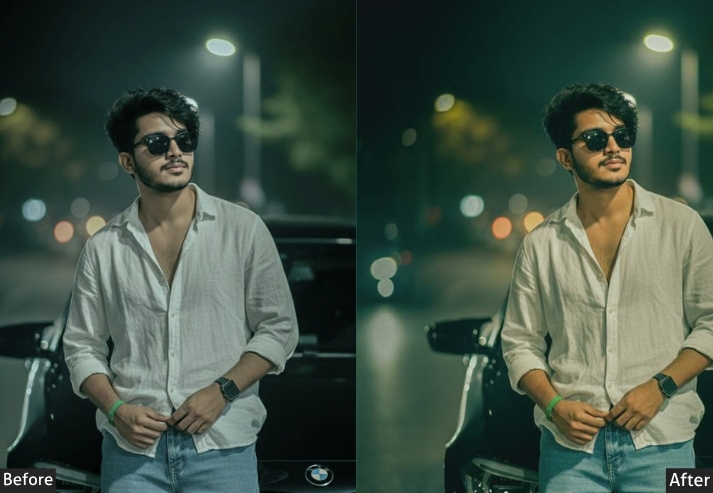
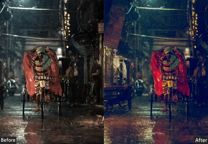
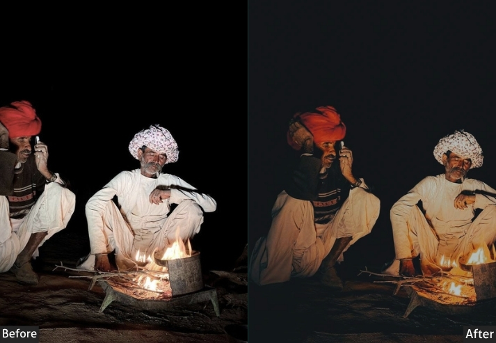
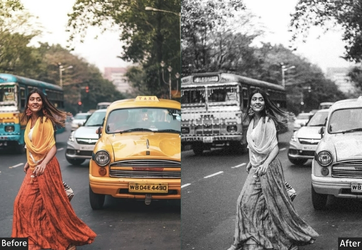
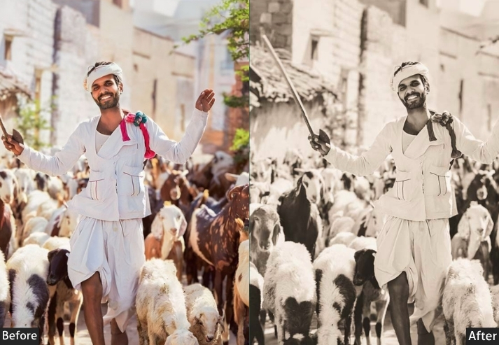
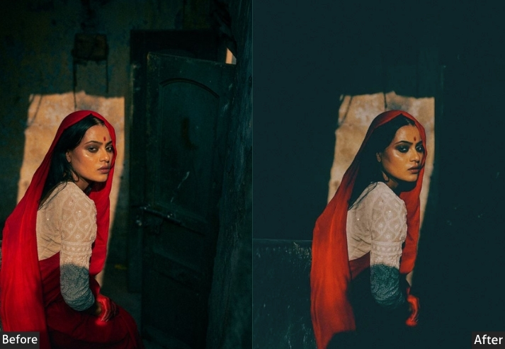
3. Dark & Moody Haryana DC Preset
“When your photo has main character energy, but make it brooding.” Here’s the one that photographers are absolutely obsessed with, and with good reason. This one is what happens when you crush your blacks, pull your shadows into near-oblivion, and let a sliver of warm highlight kiss the frame. It turns a simple portrait of a Haryanvi farmer into something that belongs in a National Geographic spread. It’s heavy, emotional, the kind of edit that makes people stop mid-scroll and go “bhai, kya photo hai yaar.” That’s the goal. Always.
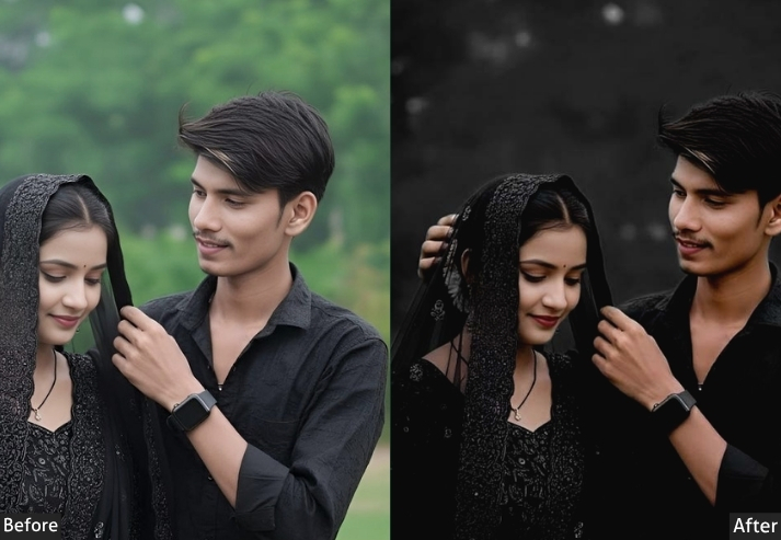
Light: Exposure -0.40 | Contrast +55 | Highlights -70 | Shadows -35 | Whites -20 | Blacks -60.
Color: Temperature +12 | Tint -5 | Vibrance -10 | Saturation -8.
Hsl / color mix: Red Saturation +15 | Orange Luminance -20 | Blue Saturation -20 | Green Luminance -25 | Aqua Luminance -15.
Effects: Clarity +30 | Texture +25 | Vignette -40 | Grain +18 | Feather +70.
Detail: Sharpening +65 | Radius +1.2 | Masking +55 | Noise Reduction +25.
Color grading: Shadow Hue 220° Sat +22 | Highlight Hue 40° Sat +18.
🎯 Purpose: To add powerful emotional weight and cinematic drama, turning every shot into storytelling art.
✅ Best For: Portraits, village scenes, low-light shoots, evening markets, character-heavy shots.
📌 Usage: Don’t use on already dark shots: shoot in good light, then apply. The contrast is the key magic here.
🎨 Style: Cinematic noir, brooding, intense. Cool shadows + warm highlights = that split-tone magic.
💡 Pro Tip: The vignette here is your best friend. It literally directs the viewer’s eye straight to your subject like a spotlight.
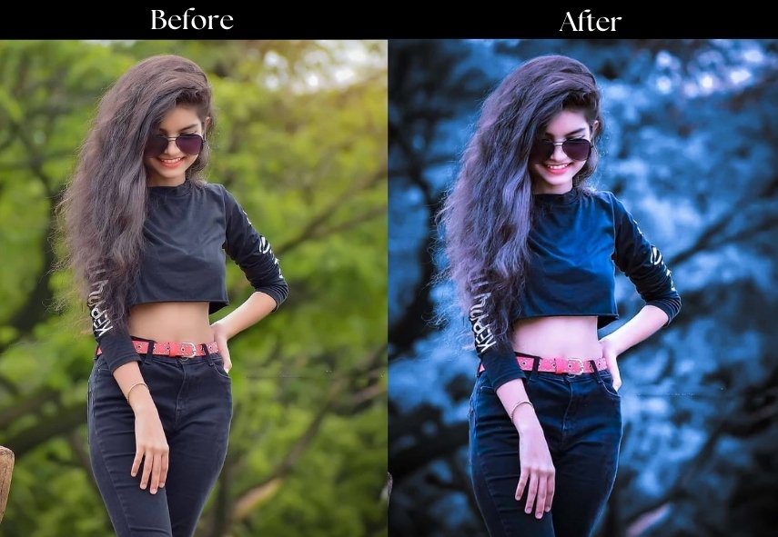
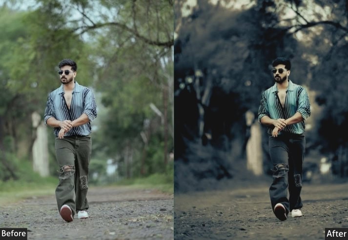
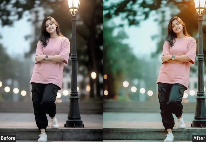
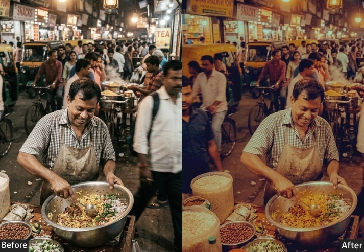
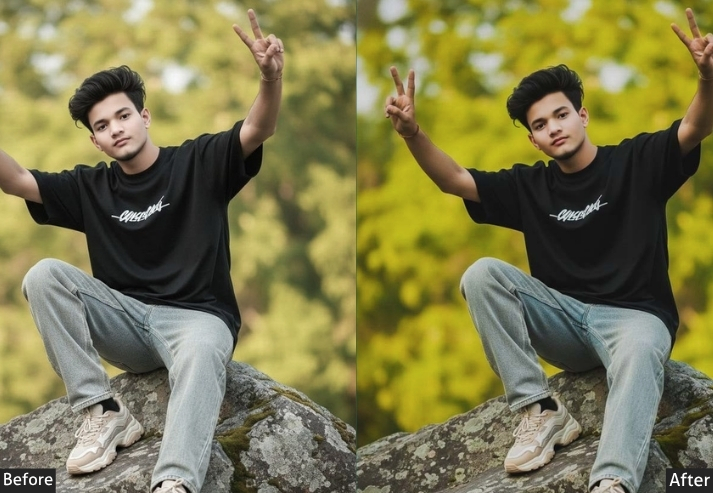
4. Haryana Street Preset
“Cool vibes, greener roads, and that Bullet echo in the background.” This is THE preset you’ve seen all over Instagram Reels and YouTube Shorts. Someone in a leather jacket on a Royal Enfield, on a dusty kuccha road, surrounded by deep green crops, with a super cool, slightly desaturated aqua-green tint and punchy contrast. It was born on the streets of Hisar and Rohtak and basically went viral overnight. The green shift in HSL is the secret sauce: it turns regular outdoor shots into these cinematic, adventurous frames that scream freedom.
Light: Exposure -0.20 | Contrast +40 | Highlights -45 | Shadows +15 | Blacks -40.
Color: Temperature -10 | Tint -5 | Vibrance +20 | Saturation -5.
Hsl / color mix: Green Hue -15 | Green Saturation +30 | Green Luminance -20 | Aqua Hue -10 | Aqua Saturation +25 | Orange Saturation +12.
Effects: Clarity +35 | Texture +20 | Vignette -20 | Grain +10.
Detail: Sharpening +60 | Masking +45 | Noise Reduction +18.
Color grading: Shadow Hue 180° Sat +25 | Highlight Hue 45° Sat +12.
🎯 Purpose: Creates an adventurous, cool outdoor vibe perfect for bike photography and open-road storytelling.
✅ Best For: Bike shots, highway photography, green crop fields, adventure shoots, lifestyle reels.
📌 Usage: After applying, check skin tones if they go too green, pull the orange hue back by +5 to +10.
🎨 Style: Cool, adventurous, street-cinematic. Green-teal shadows + crisp darks = addictive to scroll past.
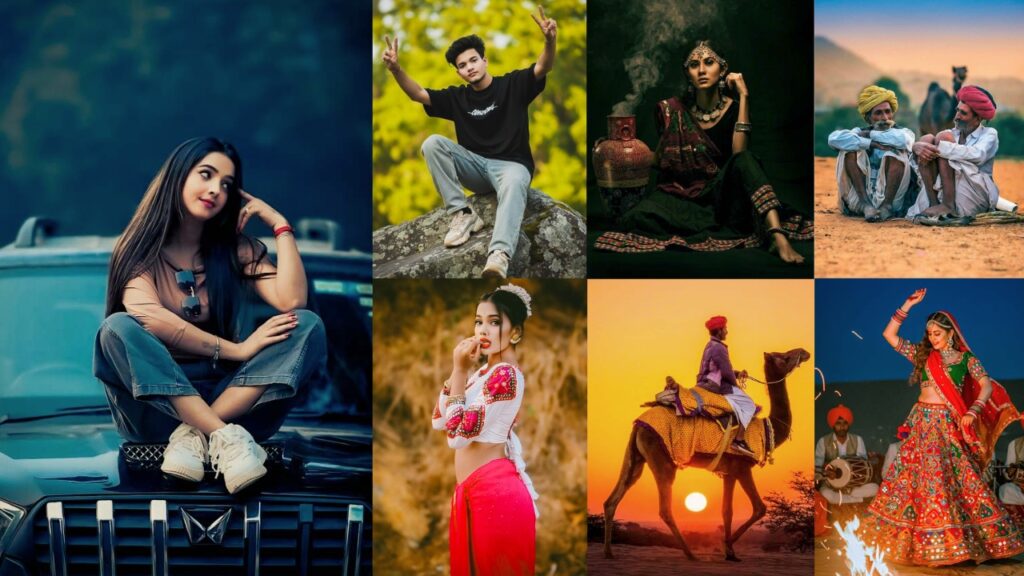
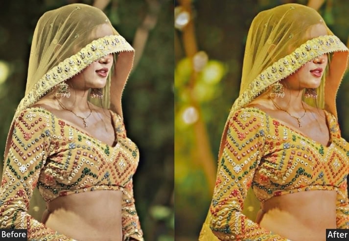
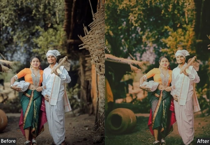
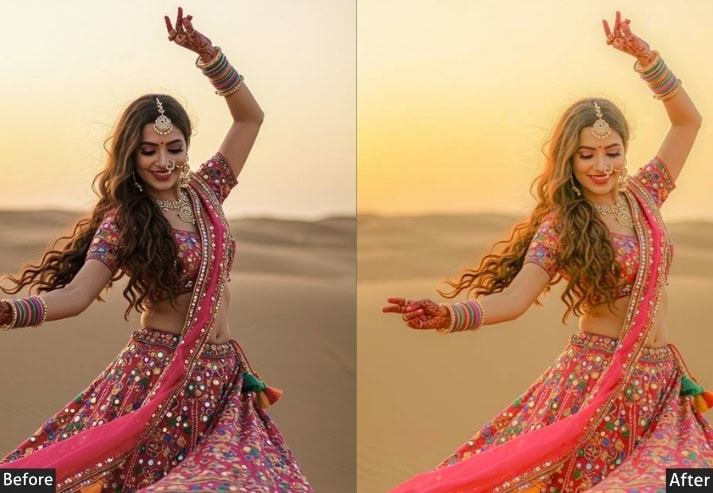
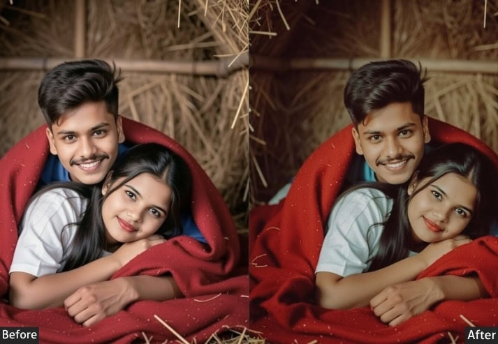
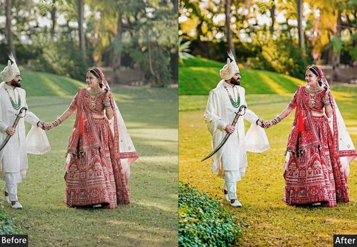
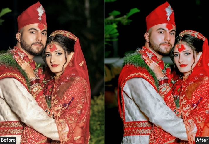
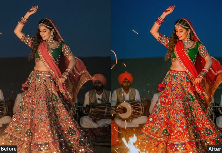
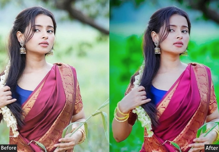
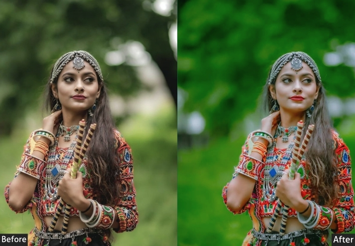
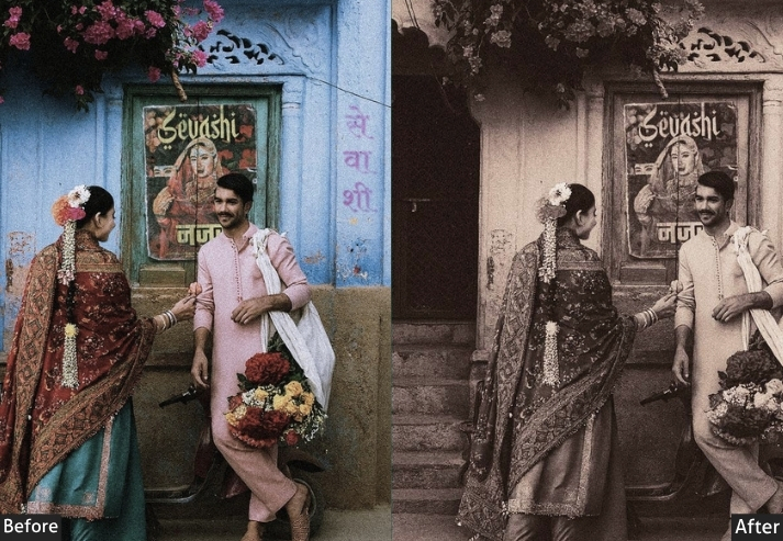
5. Haryanvi Wedding Preset
“Reds that pop, golds that glow, and love that shows.” If you’ve ever shot a Haryanvi wedding, the baraat procession, the pheras, the Haldi ceremony, you know the challenge. The palette is LOUD. Red lehengas, marigold garlands, turquoise dupattas, everything competing for attention. The preset is engineered to make all those colors co-exist beautifully without making the photo look like an over-saturation disaster. It specifically enhances reds and golds while keeping skin tones natural, because nobody wants to look like a traffic cone at their own wedding, right?
Light: Exposure +0.20 | Contrast +25 | Highlights -30 | Shadows +20 | Whites +15 | Blacks -25.
Color: Temperature +15 | Tint +5 | Vibrance +22 | Saturation +8.
Hsl / color mix: Red Saturation +25 | Red Luminance +8 | Yellow Saturation +28 | Orange Saturation +15 | Orange Luminance +10 | Green Saturation -10.
Effects: Clarity +12 | Vignette -18 | Grain +6 | Feather +80.
Detail: Sharpening +50 | Masking +45 | Noise Reduction +20 | Color Noise Reduction +25.
Color grading: Shadow Hue 30° Sat +15 | Highlight Hue 55° Sat +20.
🎯 Purpose: Enhances wedding colors authentically: reds, golds, and jewel tones all shine without blowing out.
✅ Best For: Baraat, Pheras, Haldi ceremony, portrait with wedding attire, family group shots.
📌 Usage: Shot in mixed lighting? Lower the orange saturation slightly and adjust the temperature after applying.
🎨 Style: Festive, vibrant, warm. A celebration in every pixel, exactly how a wedding should feel.
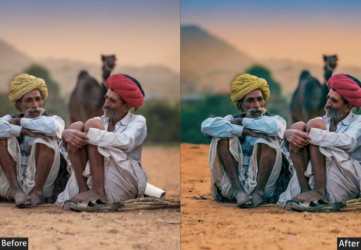
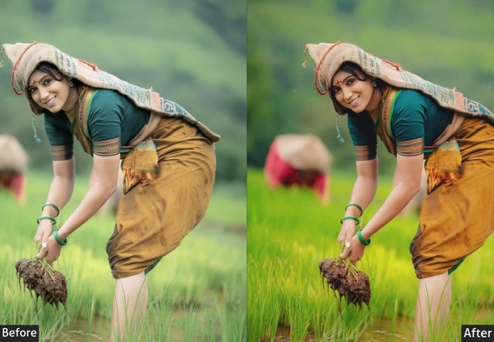
6. Haryana Village Portrait Preset
“That farmer’s eyes told a thousand stories. Your edit should honour every one.” There’s something sacred about a really good village portrait. The wrinkles on an elder’s hands, the dust in a child’s hair, the quiet dignity of someone who works the land every single day. This is designed to honor that. Natural skin tones, soft but precise details, earthy tones in the background, and a warmth that feels genuine. No over-processing. No Instagram-filter vibes. Just truth, in beautiful light. This one is for the documentary photographers and storytellers among you.
Light: Exposure +0.15 | Contrast +18 | Highlights -25 | Shadows +25 | Whites +10 | Blacks -15.
Color: Temperature +10 | Tint +4 | Vibrance +12 | Saturation -5.
Hsl / color mix: Orange Hue +8 | Orange Saturation +10 | Orange Luminance +8 | Yellow Saturation -8 | Green Saturation -12.
Effects: Clarity +22 | Texture +18 | Vignette -22 | Grain +14.
Detail: Sharpening +70 | Radius +0.8 | Masking +60 | Noise Reduction +18.
Color grading: Shadow Hue 35° Sat +12 | Highlight Hue 48° Sat +8.
🎯 Purpose: To preserve authentic human expression with warm, earthy tones that feel lived-in and real.
✅ Best For: Portrait photography, elder subjects, candid rural shots, documentary-style storytelling.
📌 Usage: Pair with a radial mask on the subject’s face to boost Clarity +10 on skin reveals stunning texture.
🎨 Style: Earthy, honest, documentary. The beauty of simplicity is elevated to the level of art.
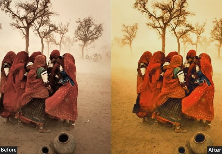
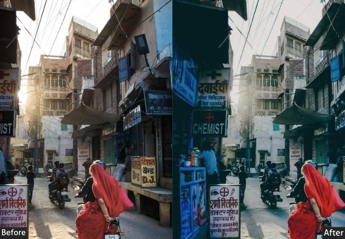
7. Haryana Desert Preset
“The sand remembers every footstep. Your photo should too.” Southern Haryana: Mahendragarh, Rewari, and Nuh have this unique semi-arid, dusty landscape that’s completely different from the lush north. The preset is built specifically for that terrain. It lifts blacks to create a signature matte look, desaturates the blues into a muted haze, and adds warm beige-brown tones throughout the image. The result? That super trendy, Pinterest-aesthetic, desert editorial look. Your Aravalli hill shots will never look the same again, and I mean that in the best possible way.
Light: Exposure +0.25 | Contrast -15 | Highlights -35 | Shadows +40 | Whites -10 | Blacks +20.
Color: Temperature +20 | Tint +8 | Vibrance -15 | Saturation -10.
Hsl / color mix: Blue Saturation -35 | Blue Luminance +10 | Orange Hue +5 | Yellow Saturation -12 | Green Saturation -20.
Effects: Clarity +8 | Dehaze -5 | Vignette -12 | Grain +20.
Detail: Sharpening +40 | Masking +30 | Noise Reduction +22.
Color grading: Shadow Hue 40° Sat +18 | Highlight Hue 55° Sat +10.
🎯 Purpose: A trendy matte aesthetic that suits the dusty, arid terrain of southern Haryana perfectly.
✅ Best For: Aravalli region, dry landscape shots, editorial portraits, travel photography.
📌 Usage: The Blacks +20 lift is what creates the matte. Reduce this to get deeper shadows.
🎨 Style: Editorial matte, muted, warm desert tones. Trendy, mysterious, effortlessly cool.
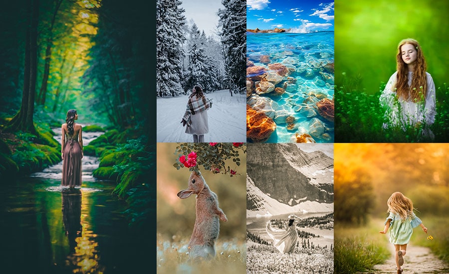
8. Nature Haryana Preset
“Haryana’s wild side doesn’t get enough credit. Let’s fix that.” Here’s something most people don’t realize! Haryana has genuinely stunning natural diversity. The Shivalik foothills near Panchkula, the Sultanpur Bird Sanctuary near Gurugram, the Kalesar National Park in Yamunanagar… It’s all there, waiting to be photographed. The Nature preset is built for this hidden side of the state. It’s clean and fresh, leaning into the natural palette rather than trying to impose one. Greens stay true but get a gentle boost, skies turn a richer blue, and the entire frame breathes with an organic, untouched quality. No drama, just beauty.

Light: Exposure +0.20 | Contrast +15 | Highlights -35 | Shadows +30 | Whites +10 | Blacks -15.
Color: Temperature -5 | Tint -3 | Vibrance +32 | Saturation +8.
Hsl / color mix: Green Hue -8 | Green Saturation +28 | Green Luminance +12 | Yellow Hue +5 | Yellow Saturation +15 | Blue Hue -12 | Blue Saturation +22 | Blue Luminance +8 | Aqua Saturation +18.
Effects: Clarity +12 | Texture +10 | Dehaze +10 | Vignette -10 | Grain +5.
Detail: Sharpening +48 | Masking +42 | Noise Reduction +16 | Color Noise Reduction +12.
Tone Curve: Lights +10 | Darks -8 | Shadows +5 | Highlights -12.
Color grading: Shadow Hue 190° Sat +10 | Highlight Hue 75° Sat +8 | Midtone Saturation +5.
🎯 Purpose: To authentically represent Haryana’s natural landscapes with clean, vibrant, and life-like colors that honor what the eye actually saw.
✅ Best For: Bird photography, forest trails, wildlife shots, river banks, nature reserves, botanical photography.
📌 Usage: Vibrance is smarter and protects skin tones. Don’t go above +35 Vibrance, or it starts to look artificial.
🎨 Style: Clean, fresh, organic. Like a deep breath of clean Haryana morning air captured in a single frame.
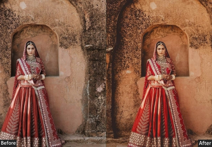
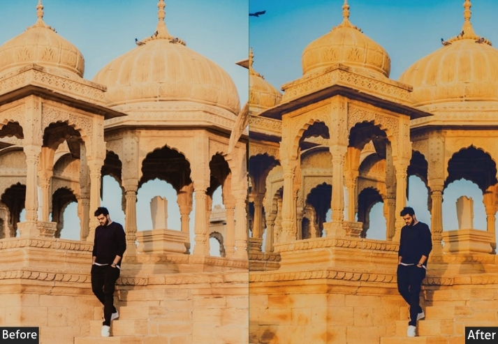
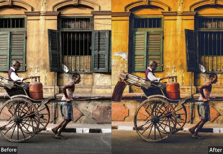
9. Classic Haryana Preset
“Old soul energy. Timeless, dignified, and deeply rooted in this land.” If there’s one preset that feels like Haryana’s cultural identity bottled up in a Lightroom panel, it’s this one. The Classic Haryana preset doesn’t chase trends. It doesn’t chase Instagram aesthetics. It takes your photo and says, “Let me show you what this place really is.” Warm mid-tones, slightly desaturated cooler colors to draw focus to the golden and earthy tones, a gentle S-curve that adds timeless, film-like contrast, and a touch of vignette to frame the subject with quiet authority. This is the preset for photographers who want their work to outlast every trend.
Light: Exposure +0.10 | Contrast +28 | Highlights -28 | Shadows +22 | Whites +8 | Blacks -22.
Color: Temperature +14 | Tint +6 | Vibrance +18 | Saturation +6.
Hsl / color mix: Orange Hue +6 | Orange Saturation +18 | Orange Luminance +6 | Red Saturation +12 | Yellow Saturation +10 | Yellow Hue +8 | Blue Saturation -18 | Aqua Saturation -15 | Green Saturation -10.
Effects: Clarity +15 | Texture +12 | Vignette -20 | Vignette Feather +85 | Grain +10.
Detail: Sharpening +52 | Masking +48 | Noise Reduction +18 | Color Noise Reduction +14.
Tone Curve: Highlights -8 | Lights +12 | Darks -10 | Shadows +8.
Color grading: Shadow Hue 35° Sat +14 | Highlight Hue 48° Sat +12 | Midtone Hue 40° Sat +8.
🎯 Purpose: To give photos a timeless, culturally grounded look that captures Haryana’s heritage with warmth and dignity rather than modern flashiness.
✅ Best For: Heritage sites, traditional ceremonies, elder portraits, cultural documentation, and historical architecture like forts and havelis.
📌 Usage: Don’t push vibrance above +20 with this preset. The whole point is restrained warmth, not punch.
🎨 Style: Warm, dignified, timeless. Like a well-kept photograph from your grandfather’s collection, but in stunning clarity.
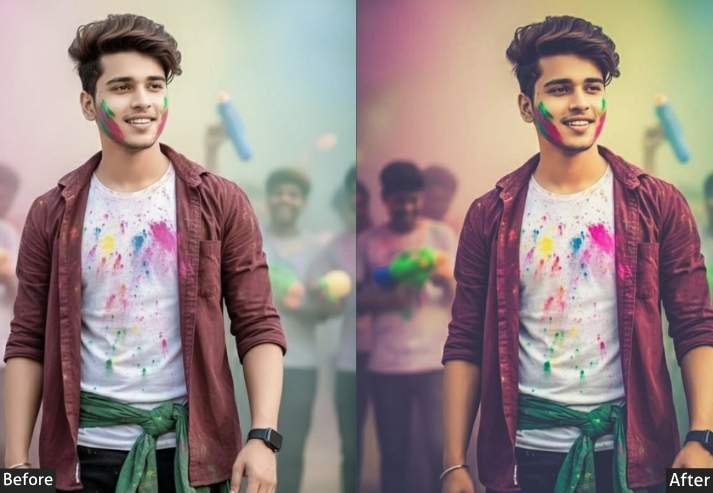
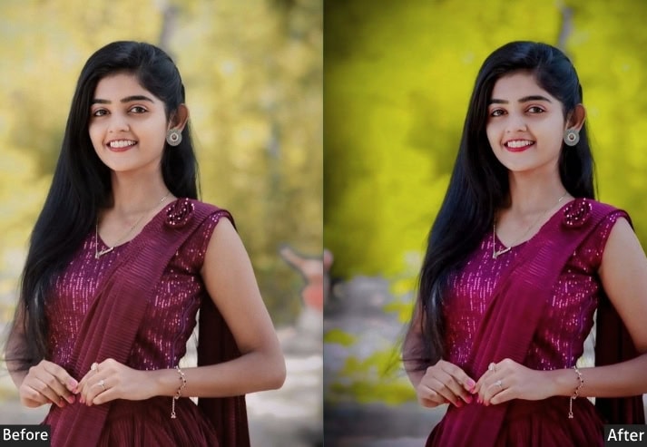
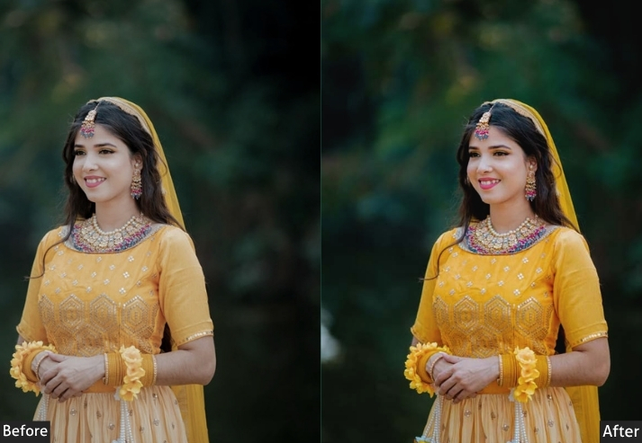
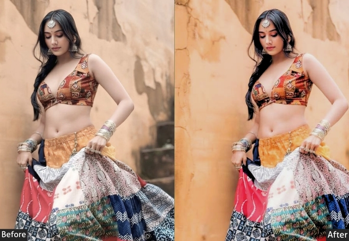
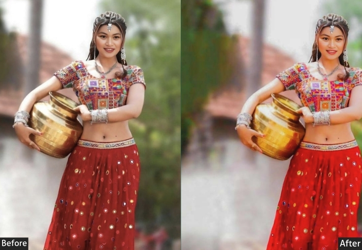
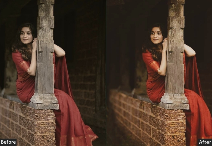
10. Matte Tone Haryana Preset
“The cool kid of presets. Smooth, faded, and impossibly stylish.” Matte presets are having a serious cultural moment right now, and the Matte Tone Haryana version puts a very specific desi spin on it. Instead of the cold, sterile matte you see in Western presets, this one goes warm-matte. Lifted blacks create that signature faded look, but the warmth is kept in the highlights and shadows, so the photo still feels like it belongs here in the mustard fields and brick kilns of Haryana rather than in some Scandinavian forest somewhere. It’s sophisticated without trying too hard, and it works on literally everything from portraits to landscapes. Versatile king. 🎭
Light: Exposure +0.18 | Contrast -20 | Highlights -40 | Shadows +38 | Whites -15 | Blacks +25.
Color: Temperature +16 | Tint +5 | Vibrance -8 | Saturation -5.
Hsl / color mix: Orange Hue +5 | Orange Saturation +8 | Orange Luminance +10 | Red Saturation -5 | Yellow Saturation -10 | Yellow Luminance +8 | Green Saturation -18 | Blue Saturation -25 | Blue Luminance +12 | Aqua Saturation -20.
Effects: Clarity +5 | Texture +8 | Dehaze -8 | Vignette -15 | Vignette Feather +90 | Grain +16.
Detail: Sharpening +38 | Masking +35 | Noise Reduction +20 | Color Noise Reduction +16.
Tone Curve: Shadows +18 | Darks +8 | Lights -5 | Highlights -10.
Color grading: Shadow Hue 38° Sat +20 | Highlight Hue 52° Sat +10 | Midtone Hue 42° Sat +12 | Blending +55.
🎯 Purpose: To create a sophisticated, faded-warm matte aesthetic that’s trendy yet distinctly rooted in Haryana’s earthy color palette.
✅ Best For: Portrait sessions, travel photography, social media content, editorial shoots, Reels thumbnail frames, any photo where you want that soft but impactful look.
📌 Usage: The Blacks +25 in the Light panel AND the Shadows +18 in the Tone Curve together are what create the proper matte lift. Remove either one, and the look falls apart. Both are essential.
🎨 Style: Warm-matte, faded, sophisticated.
More Fee Presets For You:
Indian Lightroom Presets Free Download
Indian Wedding Lightroom Presets Free Download
Japan Lightroom Presets Free Download
Korean Lightroom Presets Free Download