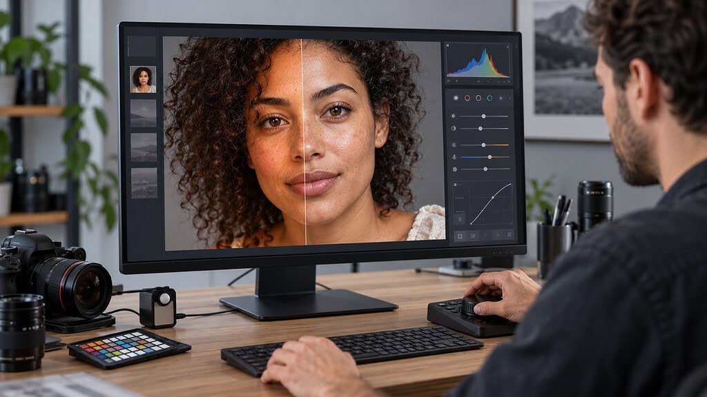
I can usually tell when I have been editing portraits for too long. At first, the photograph looks warm and flattering. Ten minutes later, it looks slightly orange. I cool it down, keep working, and suddenly the person looks gray. Then I check the same image on my phone and discover that the cheeks are red again.
If that sounds familiar, your eyes are not broken. Skin is one of the hardest colors to edit because it contains overlapping reds, oranges, yellows, highlights, shadows and reflected colors. A single face can be warm on one cheek, cool on the other and green underneath the chin – all in the same photograph.
The solution is not one magic HSL recipe. Natural-looking skin comes from correcting the photograph in the right order.
This guide shows you how to fix orange, red, gray and ashy skin in Lightroom Classic, Lightroom Desktop and Lightroom Mobile without removing the person’s real complexion or natural texture.
Quick answer: Select a neutral profile, correct global white balance, set the brightness of the face, and only then adjust skin color. Use Point Color or the Color Mixer for precise hue, saturation and luminance changes. If the problem affects only the person, create a People → Facial Skin or Body Skin mask rather than changing the entire photograph. Finish by checking the image on another color-managed display.
- What does “natural skin tone” actually mean?
- Why does skin turn orange, red, or gray in Lightroom?
- The correct order for editing skin tones
- How to fix orange skin in Lightroom?
- How to fix red or magenta skin in Lightroom?
- How to fix gray or ashy skin in Lightroom?
- Isolate skin with a People mask
- Lightroom Classic step-by-step workflow
- Lightroom Desktop step-by-step workflow
- Lightroom Mobile step-by-step workflow
- How to edit different complexions accurately
- Fixing mixed lighting and reflected color
- Group portraits: correct people individually
- Presets and natural skin tones
- Common skin-tone editing mistakes
- Monitor and room setup for reliable color
- Export settings that preserve skin color
- Frequently asked questions
- Final natural-skin-tone checklist
What does “natural skin tone” actually mean?
Natural does not mean making every person the same shade of peach. It means the skin looks believable for that individual, the lighting and the environment.
Deep skin should retain richness and tonal separation without becoming gray or excessively red. Light skin should keep subtle pink, peach and neutral variation without turning orange. Olive skin often contains yellow-green undertones that should not automatically be “corrected” into magenta. Brown skin may contain red, golden, neutral or olive undertones depending on the person and the light.
A successful edit preserves those differences. It also preserves normal variation within one face: warmer cheeks, cooler jaw shadows, slightly redder ears, darker areas around the eyes and specular highlights on the forehead or nose. The goal is credibility, not uniformity.
Why does skin turn orange, red, or gray in Lightroom?
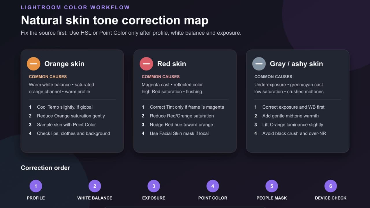
Before moving a slider, ask where the problem comes from.
| Appearance | Common causes | First place to look |
|---|---|---|
| Orange or overly warm | White balance too warm, warm camera profile, orange saturation, golden reflected light, spray tan or makeup | Profile, Temp, Orange saturation |
| Red or magenta | Tint too magenta, red LED light, reflected clothing, flushed cheeks, Red saturation, mixed lighting | Tint, Red/Orange channels, local mask |
| Gray or ashy | Underexposure, green/cyan cast, low midtone saturation, excessive noise reduction, crushed shadows, wrong display profile | Exposure, Tint, midtones, monitor |
| Yellow or sickly | Warm-green white balance, fluorescent light, yellow walls or grass reflection | Temp, Tint, local color correction |
| Good in Lightroom but wrong online | Uncalibrated monitor, wide-gamut export, app processing, night-mode display | Display settings and export color space (sRGB) |
If the walls, white clothing, and neutral objects also look orange, red, or green, start with global white balance. If everything else looks believable and only the face is wrong, use a targeted color adjustment or People mask.
The correct order for editing skin tones
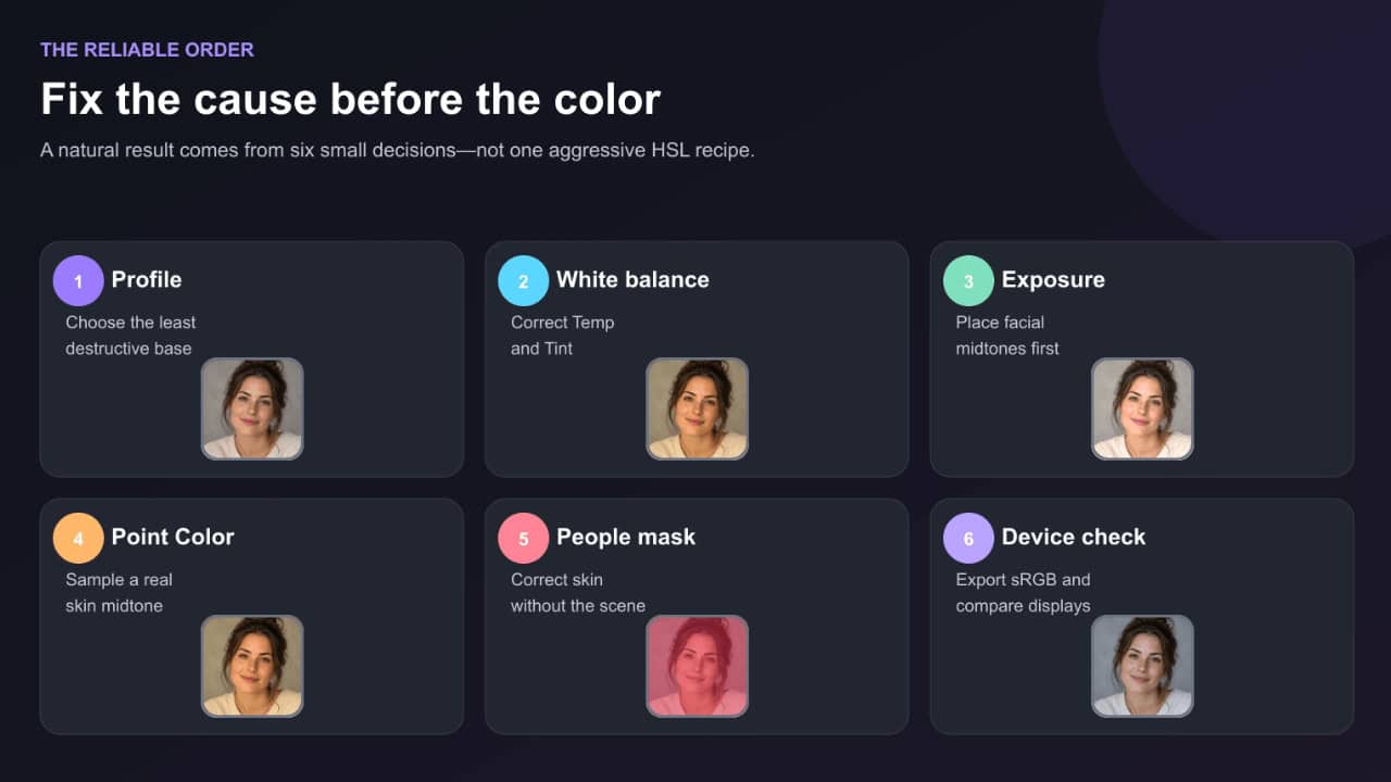
The order matters because later controls cannot fully repair mistakes made earlier. Reducing Orange saturation may disguise an incorrect white balance, but it can leave skin dull and make wooden backgrounds or clothing look strange.
Use this sequence instead:
- Choose a suitable profile.
- Correct global white balance.
- Set exposure and midtone brightness.
- Refine the skin color with Point Color or Color Mixer.
- Use a People mask for local correction.
- Check the result at different zoom levels and on another display.
Step 1: start with the right profile
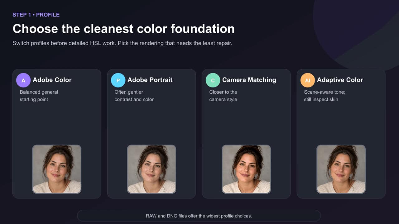
The profile determines how Lightroom translates the camera data into color and tone. It is the foundation underneath your sliders.
For a RAW portrait, compare these options before making detailed color corrections:
- Adobe Color: a balanced general-purpose starting point.
- Adobe Portrait: often gentler in skin and contrast, although the result depends on the camera.
- Camera Matching profiles: designed to resemble in-camera picture styles such as Camera Portrait or Camera Neutral.
- Adaptive Color: analyzes the image and can provide a useful tonal starting point, but you should still evaluate it on the subject’s face.
Do not assume that a profile with “Portrait” in its name is automatically best. Switch between two or three likely candidates while watching the cheeks, forehead, jaw shadows, and lips. Choose the profile that requires the least correction and preserves the most believable separation between skin colors.
JPEG, HEIC, and TIFF files have less profile flexibility because part of the color rendering is already baked into the file. RAW and DNG files provide considerably more room for white-balance and highlight recovery.
Where to find Profiles
- Lightroom Classic: Develop → Basic → Profile.
- Lightroom Desktop: Edit → Profile → Browse All Profiles.
- Lightroom Mobile: Edit → Profiles.
Apply the profile early. Changing it after detailed HSL adjustments can shift the colors you already corrected.
Step 2: Correct white balance before touching HSL
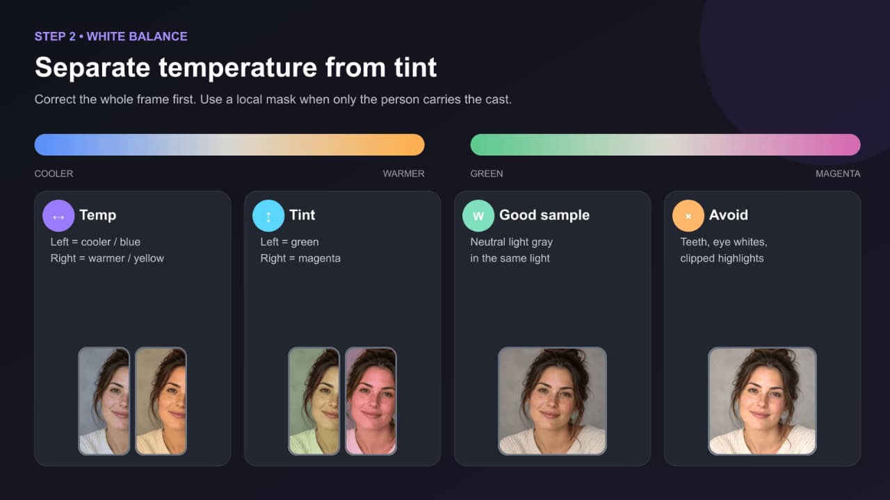
White balance controls two important directions:
- Temp: blue/cool to yellow/warm.
- Tint: green to magenta.
If the entire photograph looks warm and orange, move Temp slightly cooler. If the entire photograph looks pink or purple, move Tint slightly toward green. If the face looks gray-green, move Tint gently toward magenta.
Small movements are usually enough. Skin can move from believable to artificial quickly.
Use the White Balance Selector correctly
In Lightroom Classic, press W to activate the White Balance Selector. In Desktop or Mobile, open Color and use the eyedropper.
Click an area that should be neutral light gray. A gray card is ideal. Neutral clothing, a gray wall or another genuinely colorless surface can work when they are evenly lit.
Avoid sampling:
- Teeth or eye whites
- Bright specular highlights
- Areas clipped to pure white
- Fabric containing optical brighteners
- A “white” wall illuminated by colored light
- Neutral objects reflecting grass, colored walls or stage lighting
Adobe advises using a neutral light-gray area rather than a spectral highlight or an area that is completely white. After clicking, treat the result as a starting point and fine-tune Temp and Tint by eye.
No neutral object in the photograph?
Use visual anchors:
- Whites should look neutral unless the scene lighting intentionally colors them.
- Black and gray clothing should not lean strongly green, blue or magenta.
- Lips usually remain distinct from surrounding skin.
- The whites of the eyes should not become perfectly white; they naturally contain subtle color and shadow.
- Compare several photographs from the same lighting setup.
At golden hour, candlelight or under colored stage lighting, perfectly neutral white balance can destroy the atmosphere. Correct enough to make the person believable, then preserve some of the environmental warmth.
Step 3: Fix exposure before judging skin color
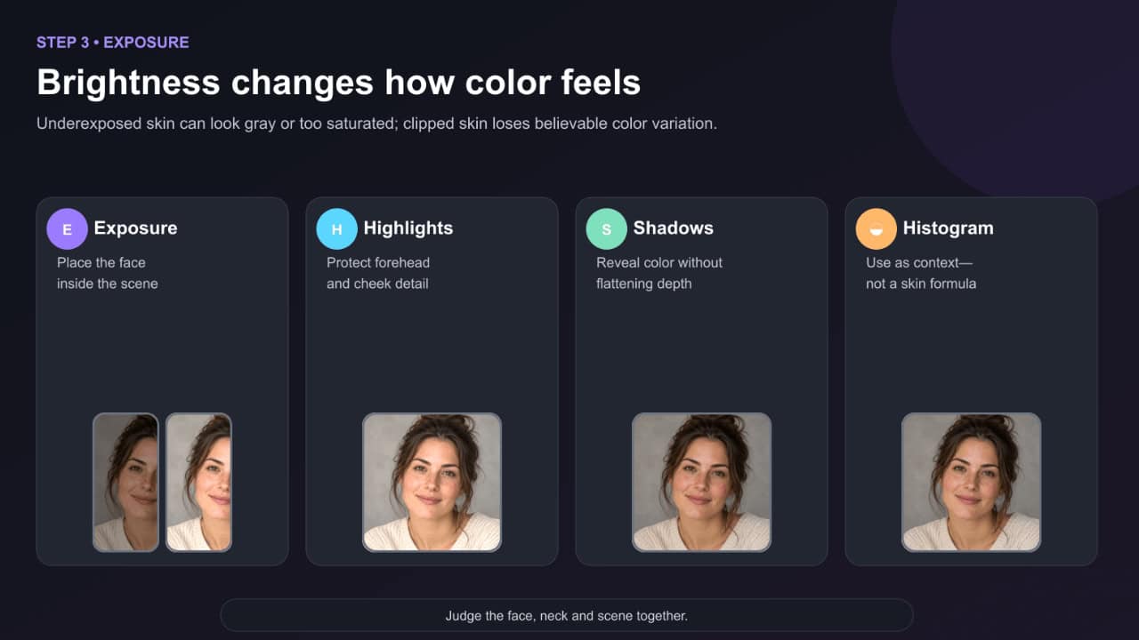
Underexposed skin often appears gray, muddy, excessively red or strangely saturated. Overexposed skin can lose color variation and look pale or plastic.
Set the face brightness before making detailed color decisions:
- Adjust Exposure until the face sits naturally in the scene.
- Reduce Highlights if forehead, cheek or nose highlights are losing detail.
- Raise Shadows gently when dark skin or side-lit faces lack separation.
- Set Whites and Blacks while watching the histogram and the photograph—not a memorized number.
- Zoom out. The face should not look pasted onto a darker background.
For a local brightness correction, use a People mask rather than pushing global Exposure until the background becomes too bright.
A note about deep skin tones
Do not judge deep skin only by the histogram’s average position. The histogram represents the entire photograph, not the correct brightness of one complexion. Look for dimensional highlights, separated midtones and clean shadow color. Raising shadows too far can make skin flat or gray; crushing them can remove undertone and texture.
Step 4: Use Point Color for precise skin correction
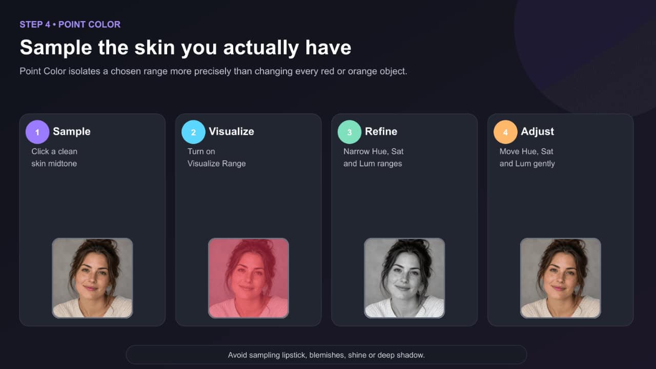
Point Color is usually the cleanest modern tool for correcting a specific skin color without changing every orange or red object in the same way.
In Lightroom Classic, open Develop → Color Mixer → Point Color. In Lightroom Desktop, open the Color controls and select Point Color. Availability and placement on Mobile can vary by release and device, but current versions expose targeted color controls through Edit and Color.
Point Color workflow
- Select the eyedropper.
- Click a representative midtone area of skin—not a shiny highlight, deep shadow, lipstick or red blemish.
- Turn on Visualize Range.
- Adjust the color range until the preview includes the intended skin but excludes as much hair, clothing and background as possible.
- Turn Visualize Range off.
- Make small Hue, Saturation and Luminance shifts.
- Zoom out and judge the whole portrait.
The controls include:
- Hue Shift: changes the selected color family.
- Saturation Shift: changes color intensity.
- Luminance Shift: changes the brightness of that color.
- Variance: controls how closely affected colors relate to the sampled color.
- Range: expands or narrows the selected hue, saturation and luminance limits.
Create more than one sample when the face contains distinct warm highlights and cooler shadows. One broad selection can flatten useful variation.
Step 5: Use the Color Mixer when you need broader control
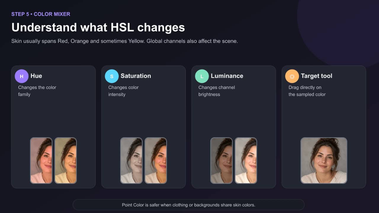
The Color Mixer, often called HSL, adjusts whole color channels. Skin most often occupies a mixture of Red, Orange, and sometimes Yellow.
- Hue changes what that color looks like.
- Saturation changes its intensity.
- Luminance changes its brightness.
Use the Targeted Adjustment tool when available. Select Hue, Saturation, or Luminance, place the cursor over the skin, and drag. Lightroom adjusts the color channels actually present beneath the cursor.
The Color Mixer is fast, but it is global. Reducing Orange saturation can also affect autumn leaves, wood, leather, makeup, and clothing. That is why Point Color or a skin mask is safer when the environment shares similar colors.
How to fix orange skin in Lightroom?
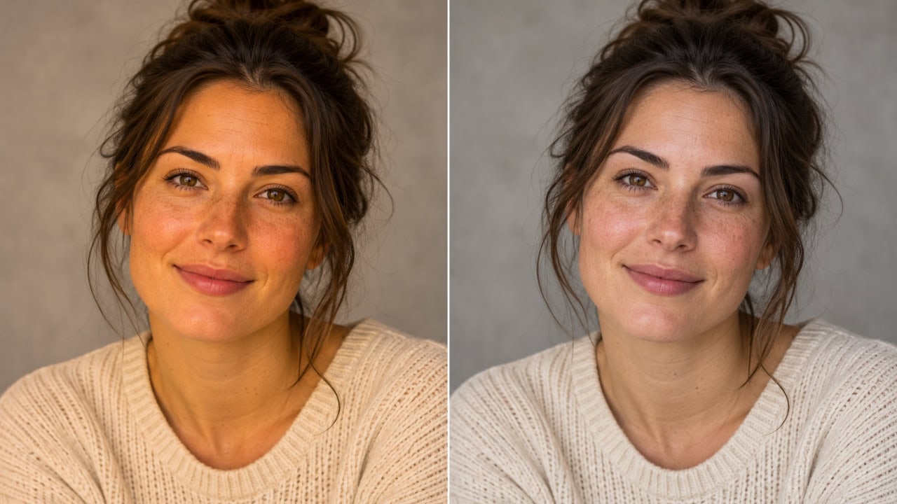
Orange skin is usually caused by a warm white balance, an intense orange channel, or a profile that renders warm colors too strongly.
Orange-skin correction recipe
- Compare Adobe Color, Adobe Portrait, and an appropriate Camera Matching profile.
- If the entire image looks warm, reduce Temp slightly. For RAW files, a movement of roughly 200–800 Kelvin cooler can be a useful starting test—not a required value.
- Check Tint. A strong magenta bias can make orange skin look redder.
- Set the face exposure before evaluating saturation.
- In Point Color, sample a skin midtone and reduce Saturation Shift gently.
- If using the Color Mixer, try Orange Saturation −5 to −20 as an initial range.
- Raise Orange Luminance +3 to +12 only if the skin is too dark or dense. Too much creates pale, flat skin.
- Inspect lips, blush, freckles and warm highlights. They should not disappear.
Do not automatically shift Orange Hue. Hue direction depends on the original cast. If the sampled skin is too red-orange, moving slightly away from red may help. If it is already yellow-orange, you may need the opposite. Point Color’s visual preview is safer than copying a fixed direction.
When orange is real
Golden-hour sunlight, a wooden interior, warm makeup, or reflected sand can genuinely warm the skin. Removing all of that color can make the subject look disconnected from the scene. Aim for believable warmth, not clinical neutrality.
How to fix red or magenta skin in Lightroom?
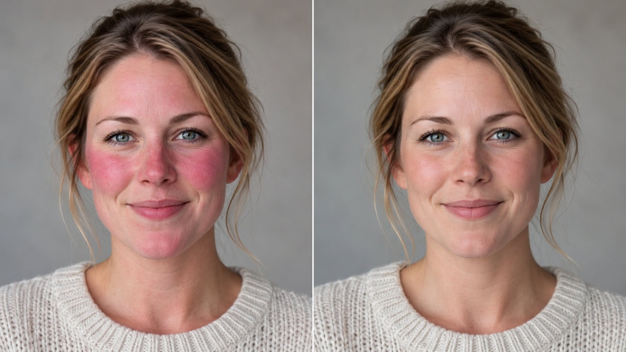
Red skin can come from an overall magenta white balance, emotional flushing, heat, makeup, sunburn, red clothing, reflected walls, stage lighting or one camera’s profile.
Red-skin correction recipe
- Look at neutral areas. If the entire frame is magenta, move Tint slightly toward green.
- If only the cheeks, ears or nose are red, leave global Tint alone.
- Sample the red area with Point Color and narrow the range.
- Reduce Saturation Shift until the redness settles without making the skin lifeless.
- In Color Mixer, test Red Saturation −10 to −30 and Orange Saturation −5 to −15.
- A small Red Hue movement toward orange can help some portraits, but watch lips and makeup carefully.
- Use a People → Facial Skin mask if the background or clothing also contains red.
- Subtract lips, eyes, hair or clothing from the mask when necessary.
Do not remove every red variation. Healthy skin frequently contains more red in the cheeks, knuckles, ears and around the nose. The edit should reduce distraction while keeping circulation and depth believable.
How to fix gray or ashy skin in Lightroom?
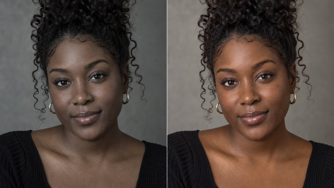
Gray skin is often treated as a saturation problem, but the real cause is frequently underexposure, green/cyan white balance, compressed midtones or overly heavy noise reduction.
Gray-skin correction recipe
- Raise Exposure gently—often +0.10 to +0.40 is enough to test the diagnosis.
- Check Tint. If neutrals and shadows look green, move Tint slightly toward magenta.
- Restore midtone separation with Shadows, the Tone Curve or a local skin mask.
- Add a small amount of Vibrance rather than a large global Saturation increase.
- In Point Color, sample the skin and increase Luminance or Saturation subtly.
- In Color Mixer, test Orange Luminance +5 to +15 and Orange Saturation +3 to +10 only if the skin genuinely lacks color.
- Reduce excessive noise reduction or negative Texture that has erased natural tonal detail.
- Check the Blacks slider and curve. Crushed or lifted black points can both make deep skin appear dull.
For deep complexions, “brightening” is not the same as making the skin lighter. Preserve the subject’s actual depth while restoring readable highlights, undertone and color separation.
Isolate skin with a People mask
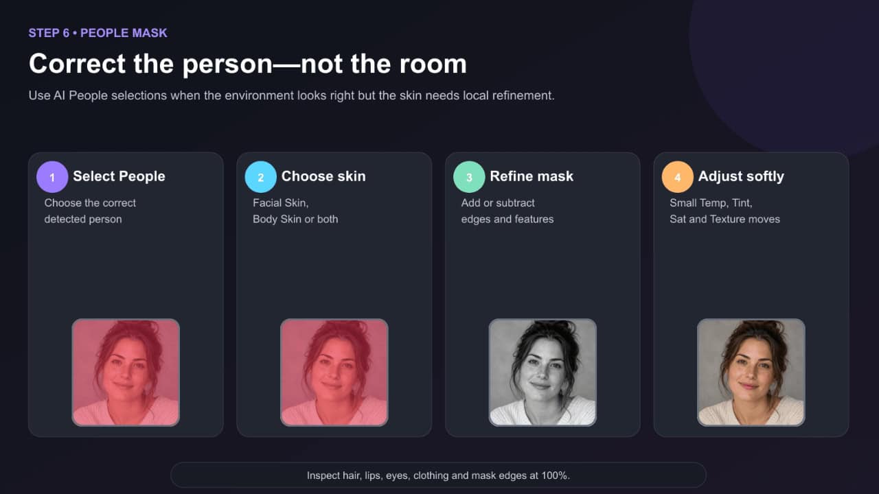
When the background looks correct and the person does not, stop making global changes.
Current Lightroom masking tools can detect people and offer selections such as Facial Skin, Body Skin, Lips, Teeth, Hair, Clothes and other features, depending on the photograph and application version.
People-mask workflow
- Open Masking.
- Choose People or Select People.
- Select the correct person when Lightroom detects more than one.
- Choose Facial Skin, Body Skin, or both.
- Create the mask.
- Inspect the overlay at 100%.
- Use Add or Subtract to repair edges and exclude lips, eyes, hair, clothing and background.
- Adjust Temp, Tint, Exposure, Saturation, Texture or Point Color gently within the mask.
Useful starting movements inside a skin mask might include:
- Temp: a very small cooler or warmer move
- Tint: a small green/magenta correction
- Saturation: approximately −5 to −15 for excessive redness
- Texture: approximately −5 to −15 for subtle softening
- Clarity: keep close to zero; strong negative values can create plastic skin
These are testing ranges, not a portrait preset. High-resolution beauty work, environmental portraits and documentary photographs need different amounts.
Mobile Quick Actions
Lightroom Mobile also includes Actions → Retouch, which can detect a person and expose controls for Skin, Teeth, Eyes, Hair and Clothes. This can be convenient for quick finishing, but correct white balance and exposure first. Don’t use Retouch controls to hide a global color-management problem.
Lightroom Classic step-by-step workflow
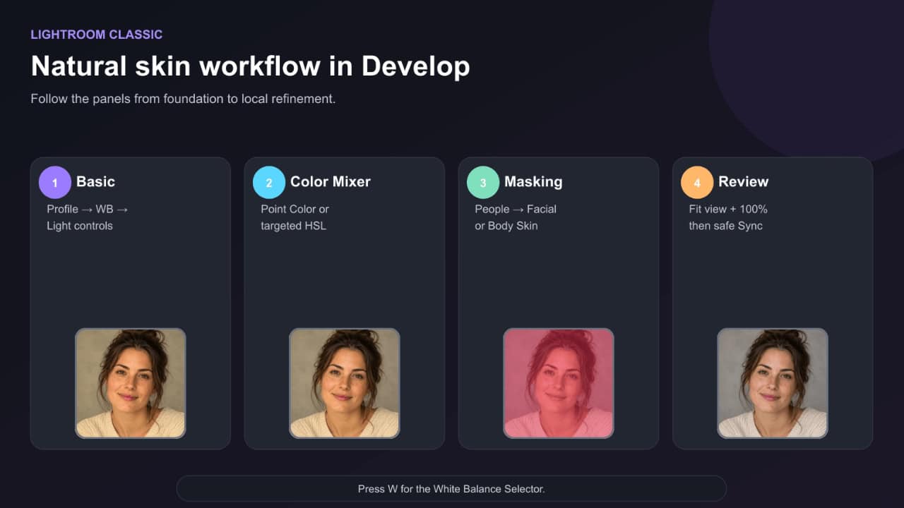
- Open the RAW file in Develop.
- In Basic, compare Profile options and choose the most natural foundation.
- Press W and sample a neutral light-gray area, then refine Temp and Tint.
- Adjust Exposure, Highlights, Shadows, Whites and Blacks.
- Open Color Mixer → Point Color.
- Sample a skin midtone, enable Visualize Range, and refine the selected range.
- Make small Hue, Saturation and Luminance changes.
- If needed, open Masking → People, select Facial Skin or Body Skin, and make local corrections.
- Zoom out for overall balance and zoom to 100% to inspect texture and mask edges.
- Synchronize only safe settings across photographs taken under the same light, then review every face.
Lightroom Desktop step-by-step workflow
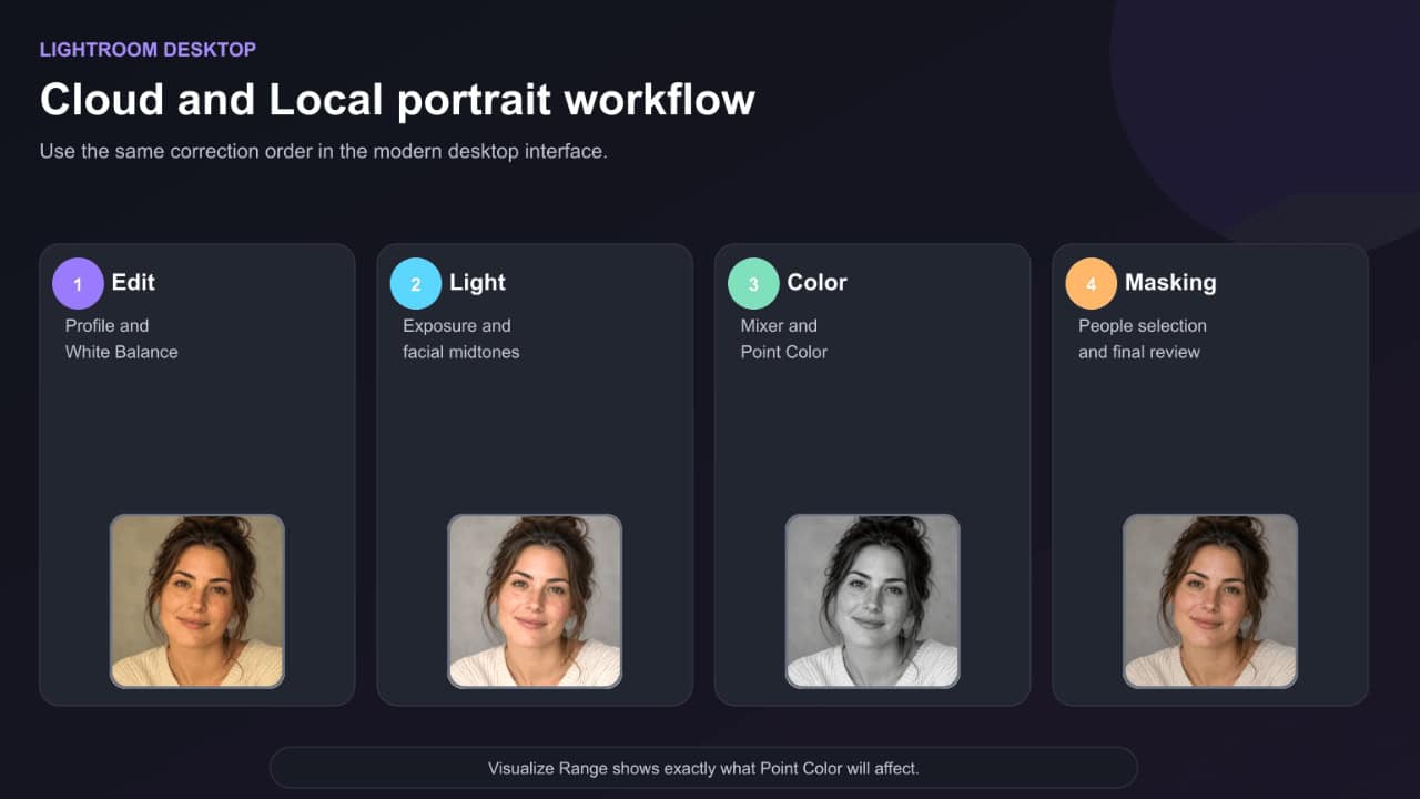
- Open the photograph in Detail view and select Edit.
- Choose a Profile.
- Open Color and correct White Balance with the selector or Temp/Tint controls.
- Open Light and set the face brightness.
- Use Color Mixer for broad HSL control or Point Color for a sampled skin range.
- Enable Visualize Range while refining a Point Color selection.
- Open Masking → People, select the individual and then Facial Skin or Body Skin.
- Make restrained local adjustments.
- Use Before/After and inspect the photograph on a neutral background.
Lightroom Mobile step-by-step workflow
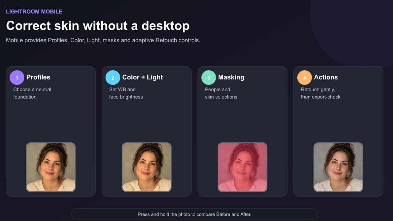
- Open the portrait in Detail view and select Edit.
- Open Profiles and choose a natural starting profile.
- Open Color and correct Temp and Tint.
- Open Light and correct Exposure, Highlights and Shadows.
- Use Color Mix or available targeted color controls to refine Red, Orange and Yellow.
- Open Masking → Create New Mask → People when available.
- Select Facial Skin or Body Skin and refine the overlay.
- Optionally use Actions → Retouch → Skin for a restrained finishing pass.
- Press and hold the photograph to compare Before and After.
- Check the exported image outside Lightroom before publishing.
How to edit different complexions accurately
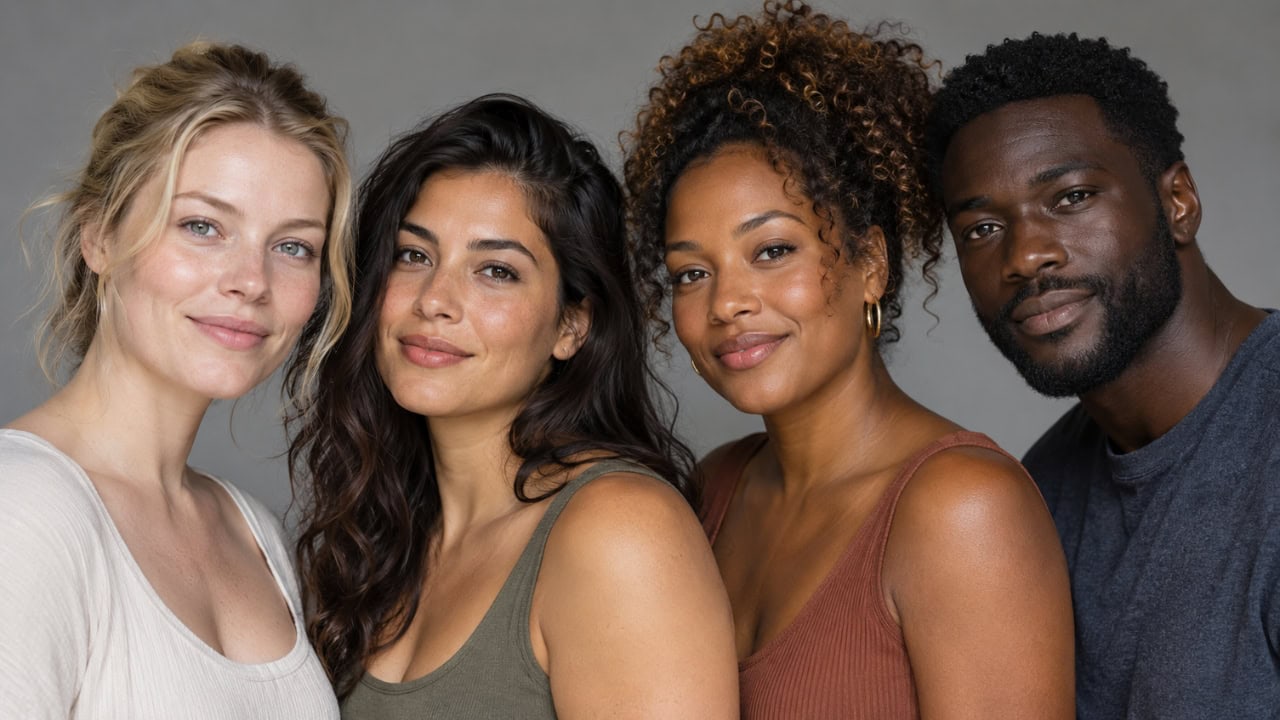
There is no separate “correct” hue for light, medium or deep skin. The reliable principles stay the same, but you should watch different failure modes.
Light complexions
- Preserve subtle pink, peach and neutral differences.
- Watch clipped highlights on the forehead, nose and cheeks.
- Avoid lifting Orange luminance so far that the face becomes pale and flat.
- Do not remove every red area; cheeks and ears naturally vary.
Medium and olive complexions
- Check for yellow-green casts before adding magenta globally.
- Keep natural golden or olive undertones rather than forcing peach.
- Be careful with Orange Hue shifts; they can make olive skin unnaturally pink.
- Compare the face with the neck and arms.
Deep complexions
- Preserve specular highlights and midtone color separation.
- Do not lift Shadows until the skin becomes gray.
- Watch red and magenta contamination from profiles and reflected light.
- Excessive noise reduction can remove fine tonal transitions.
- Use local exposure and color correction rather than brightening the entire scene.
Fixing mixed lighting and reflected color
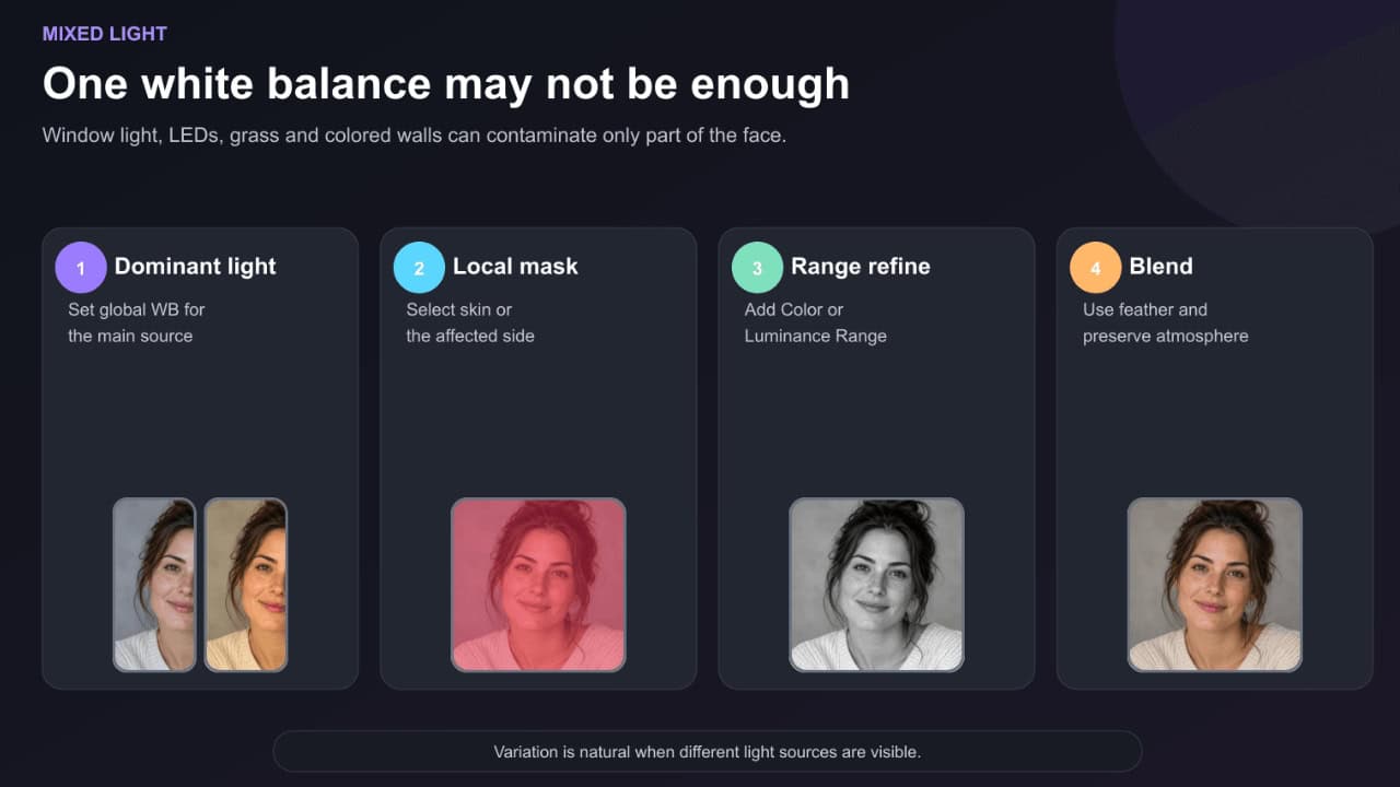
Sometimes one white balance cannot correct the photograph.
A person near a window may receive blue daylight on one side and warm interior light on the other. Green grass can reflect into the jaw. A red dress can color the neck and arms. LED lights can create patches that change color across the face.
Try this workflow:
- Set global white balance for the dominant light.
- Create a People or Facial Skin mask.
- Add or subtract a Brush, Color Range or Luminance Range selection.
- Correct only the contaminated region with Temp, Tint or Point Color.
- Use generous Feather for a natural transition.
Do not force both sides of the face to match perfectly when the scene contains intentionally different light sources. The viewer expects some variation.
Group portraits: correct people individually
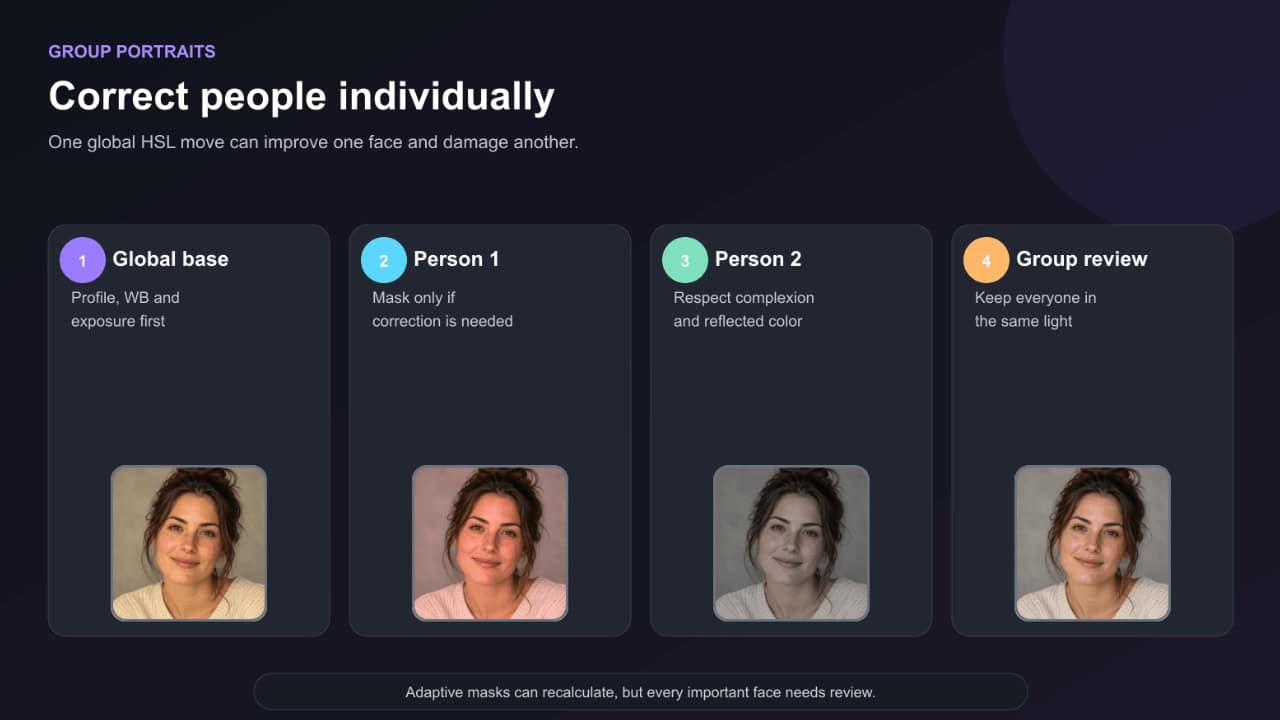
One HSL adjustment may improve one person and hurt another. Skin in a group differs because of complexion, makeup, angle, exposure and reflected color.
Set the overall profile, white balance and exposure first. Then create separate People masks for individuals who need additional correction. Keep the changes subtle so the group still feels photographed under one light.
When batch editing multiple photographs, synchronize the global foundation within the same lighting setup. Adaptive People masks can recalculate, but review the selection and color on every important frame.
Presets and natural skin tones
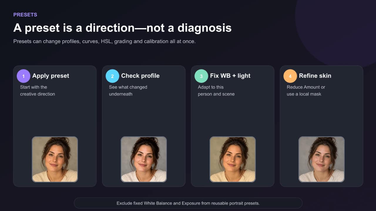
A good portrait preset is a starting direction, not a finished skin correction.
Presets can change the profile, tone curve, HSL, color grading and calibration. A preset built on one camera and complexion may push another portrait too orange, too red or too gray.
After applying a preset:
- Check whether it changed the Profile.
- Correct White Balance and Exposure.
- Toggle the preset off and on while watching only the skin.
- Reduce preset Amount when available.
- Inspect Red, Orange and Yellow channels.
- Adjust the skin locally rather than dismantling the entire look.
If you create your own portrait preset, consider excluding fixed White Balance and Exposure so it adapts more easily to new photographs.
For additional foundations, see the Lightroom Settings Guide and What Are Lightroom Presets?.
Common skin-tone editing mistakes
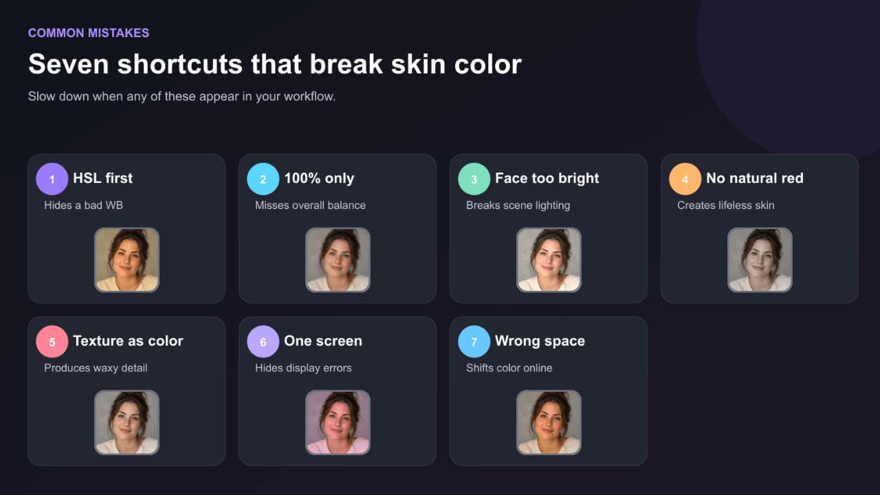
1. Reducing Orange saturation first
If white balance is wrong, this creates dull skin without removing the underlying cast. Correct profile, white balance and exposure first.
2. Editing only at 100% zoom
Close zoom is useful for texture, but color relationships are easier to judge when the whole portrait is visible. Move between Fit view and 100%.
3. Making the face brighter than the light allows
The face should fit the scene. Excessive local exposure makes the subject look pasted in.
4. Removing all redness
Lips, cheeks, ears and hands naturally contain red variation. Completely uniform skin looks artificial.
5. Using negative Texture as color correction
Texture changes detail, not the source of a color cast. Too much negative Texture produces waxy skin.
6. Trusting one screen
Night mode, vivid display settings, an uncalibrated monitor or a phone’s adaptive color can mislead you. Disable color-shifting modes and compare on another display.
7. Exporting in the wrong color space
For normal web and social delivery, export JPEG in sRGB unless the destination specifically supports another color space. Wide-gamut files can appear different in apps that manage color poorly.
Monitor and room setup for reliable color
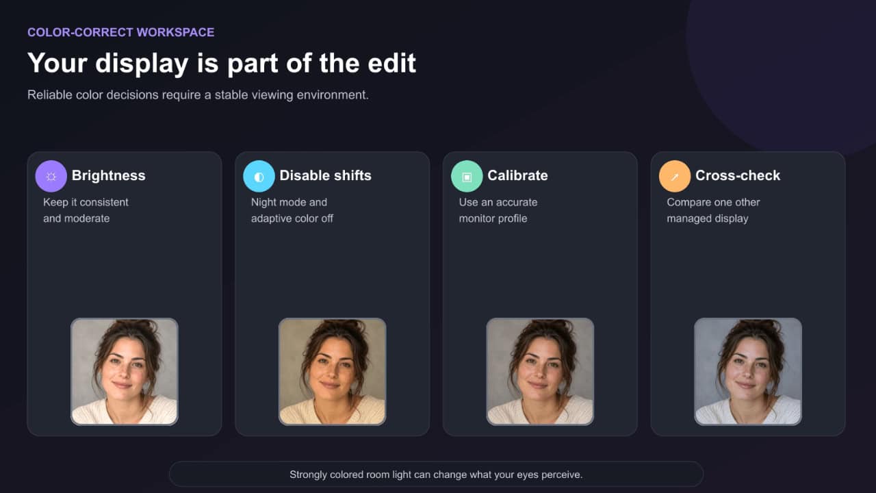
You cannot make consistent skin-color decisions on an unreliable display.
- Turn off Night Light, Night Shift, True Tone and vivid display modes while color-correcting.
- Avoid editing in a room flooded with strongly colored light.
- Keep display brightness consistent; an excessively bright monitor encourages dark exports.
- Calibrate and profile the monitor when color accuracy matters.
- Recheck important work periodically because monitor performance changes over time.
- View the final image against a neutral gray, black and white interface background.
Adobe’s Lightroom Classic color-management guidance recommends monitor calibration and explains that the monitor profile determines how colors are translated for display.
Export settings that preserve skin color
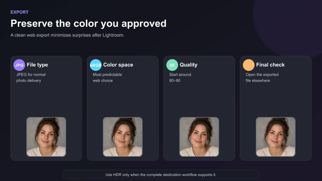
For websites and normal social sharing, use:
- File type: JPEG
- Color space: sRGB
- Quality: 80–90
- Output sharpening: appropriate to final dimensions
- HDR: off for the most predictable SDR delivery unless the destination workflow is fully HDR-aware
- Metadata: remove sensitive location information when appropriate
After export, open the actual JPEG or WebP—not only the Lightroom preview. Check it in a color-managed browser and on one other device.
Frequently asked questions
Final natural-skin-tone checklist
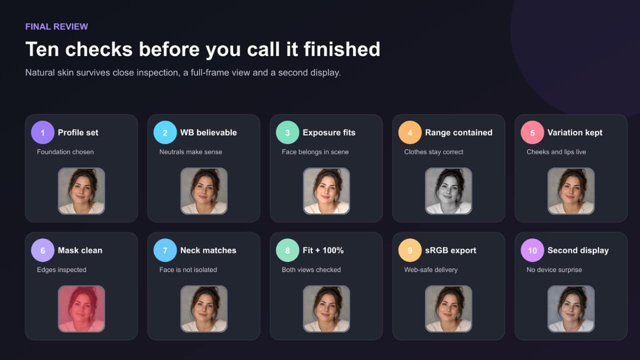
- Choose the profile before detailed color work.
- Correct global Temp and Tint using a genuine neutral reference when possible.
- Fix exposure before judging saturation.
- Sample a skin midtone—not a highlight, shadow, lip or blemish.
- Use Visualize Range to prevent Point Color from affecting unrelated objects.
- Preserve natural variation across cheeks, lips, ears, highlights and shadows.
- Use People masks when the problem is local.
- Check the face against the neck, arms and other people in the scene.
- Compare Fit view and 100% zoom.
- Export sRGB and inspect the exported file on another display.
Natural skin doesn’t come from forcing every portrait into the same orange-channel numbers. It comes from respecting the person’s complexion, reading the light, and making the smallest correction that solves the actual problem.
Start with the profile. Neutralize only what should be neutral. Set the brightness. Then use Point Color, the Color Mixer and People masks with restraint. When the subject still looks like themselves, only more believable, you are finished.