27.00$Original price was: 27.00$.18.00$Current price is: 18.00$.
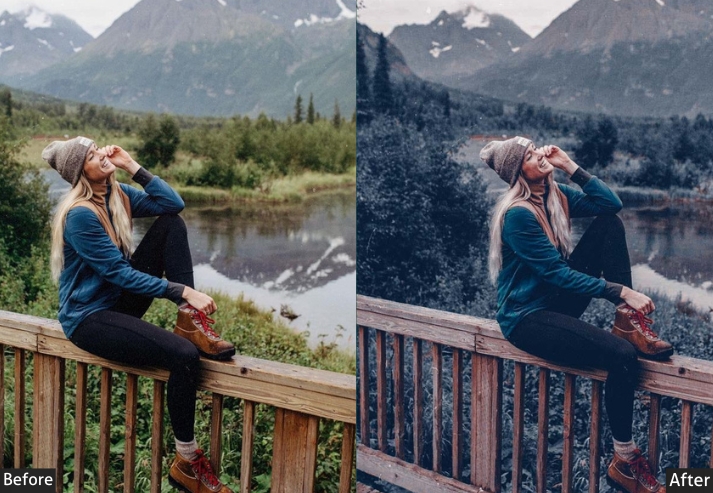
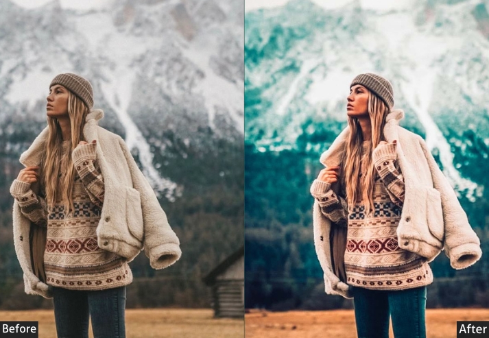
Most content creators don’t shoot one type of photo. They shoot five or six in a single week. A fashion post on Monday, gym content on Wednesday, a beach trip over the weekend, and client portraits squeezed in between. Editing each of those with a preset built for something else is how feeds end up looking inconsistent, even when every individual photo is good.
This combo is built so one editing style doesn’t have to stretch further than it should. Instead of hunting for a different preset pack every time your content changes, you get one library that already covers it.
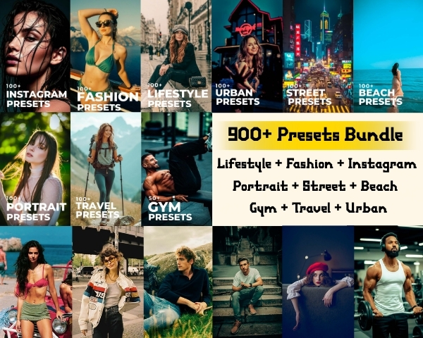
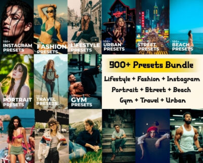
I’ve put together something kinda insane – a 9-in-1 ULTIMATE Presets Bundle that’s basically like having 9 professional editors in your pocket:
As a content creator, you’re expected to do EVERYTHING:
Monday? Fashion shoot downtown.
Wednesday? Beach lifestyle content.
Friday? Gym fitness collab.
Weekend? Street photography for your portfolio.
Gallery-Worthy Content Creator Presets Combo
(BUY 6 GET 3 FREE CAMPAIGN!)
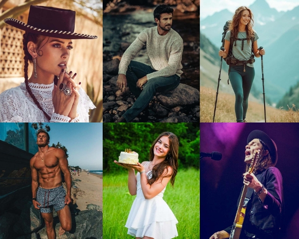
One preset style doesn’t cut it anymore. You need versatility, and this bundle has:
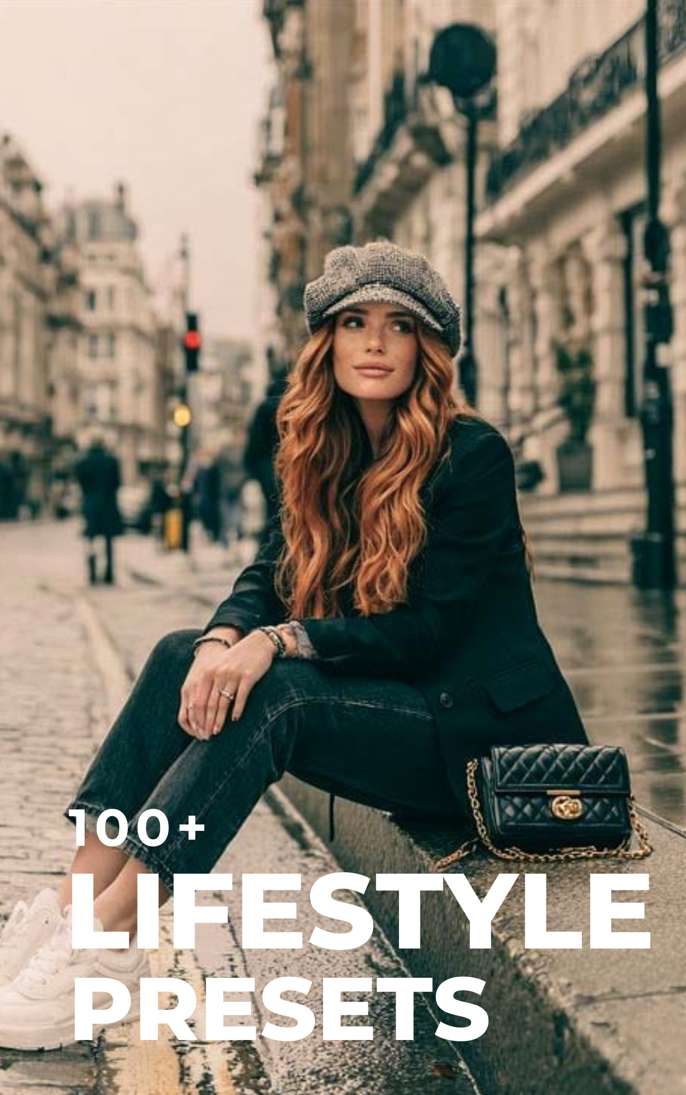
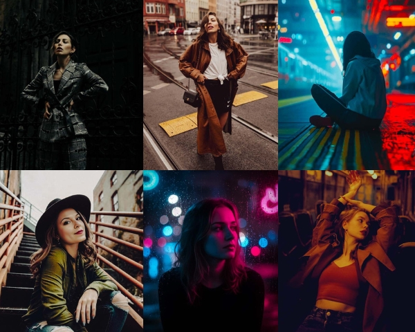
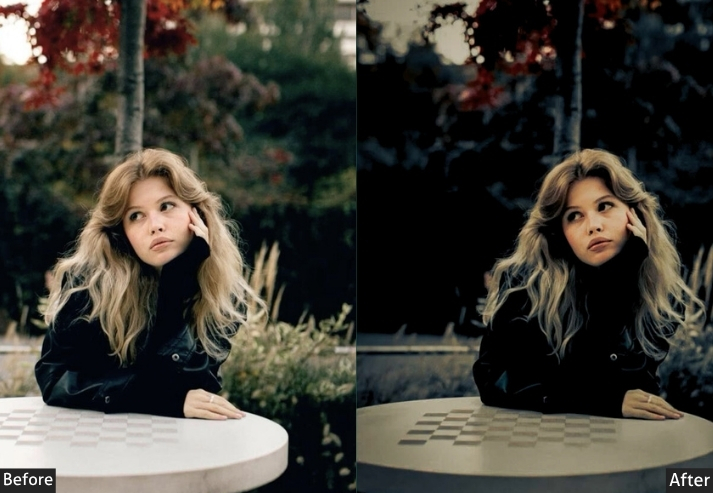
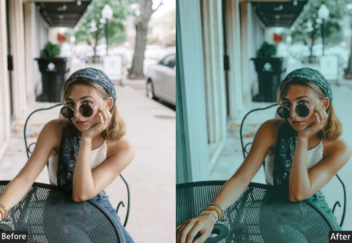
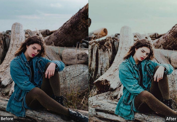
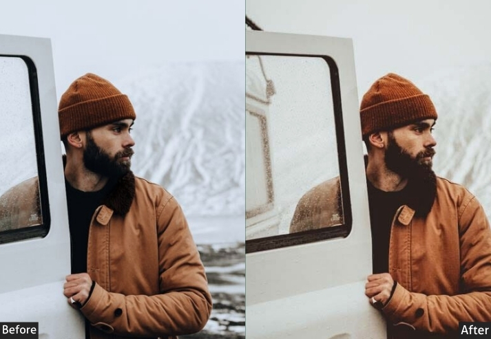
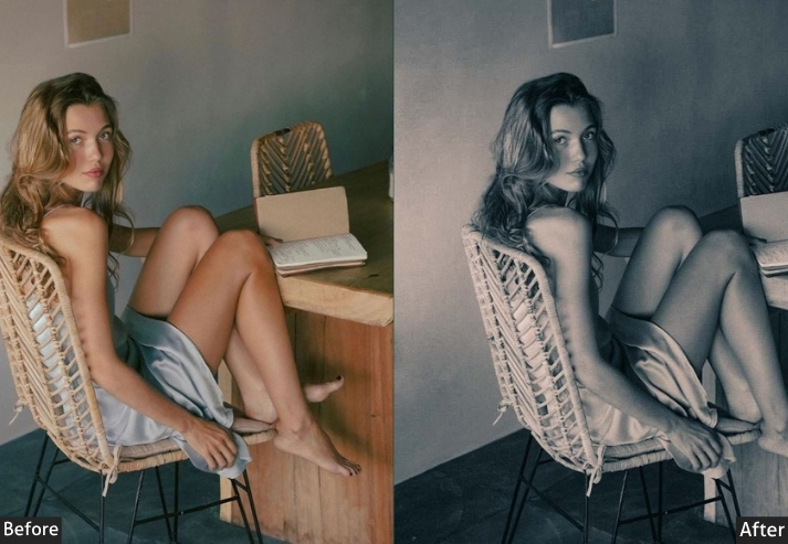
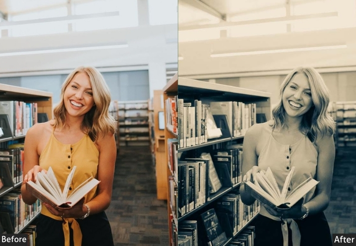
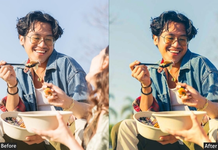
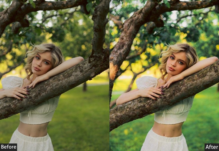
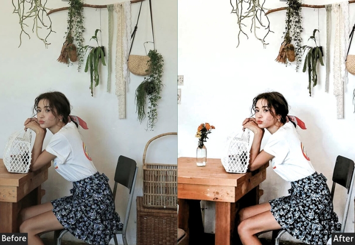
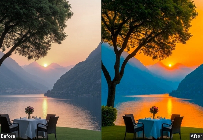
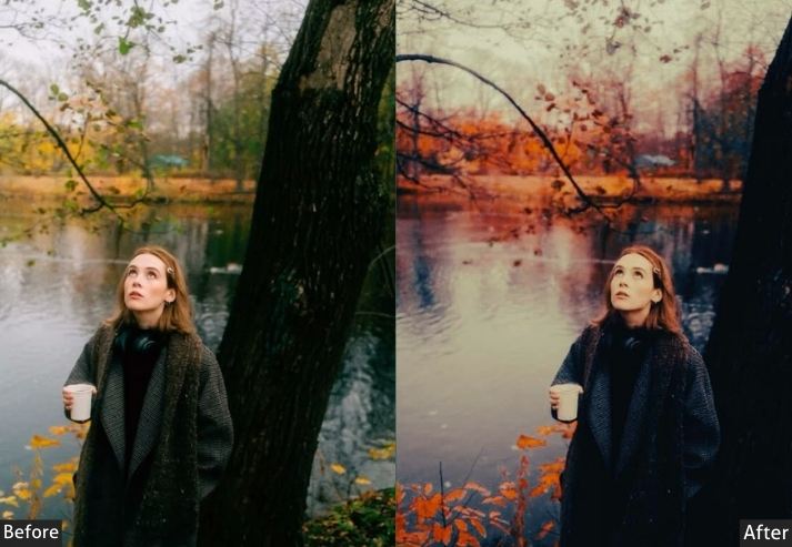
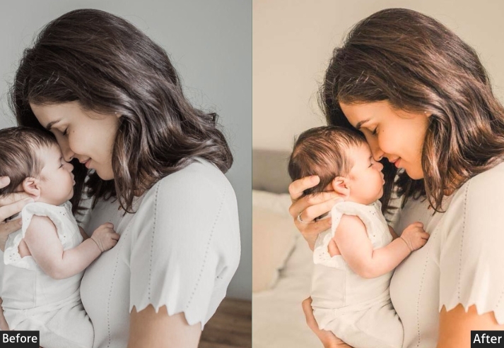
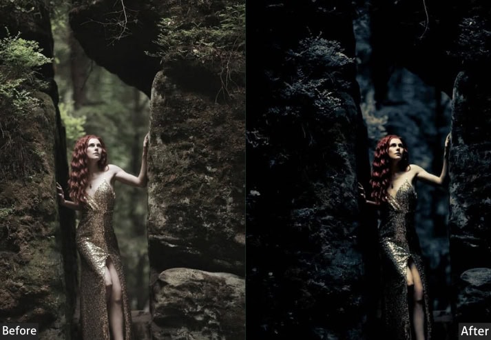
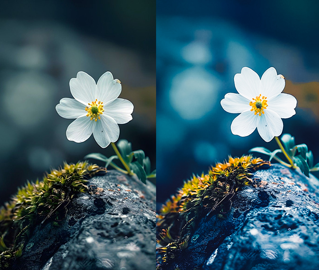
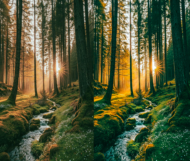
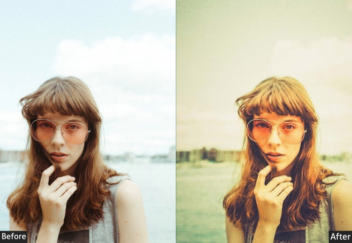
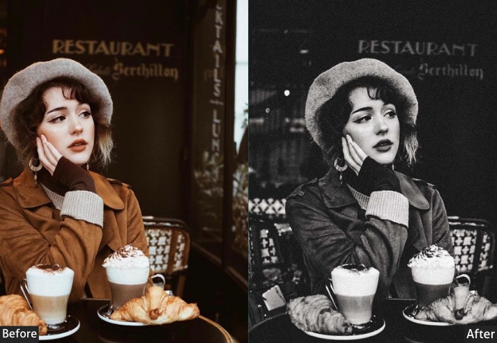
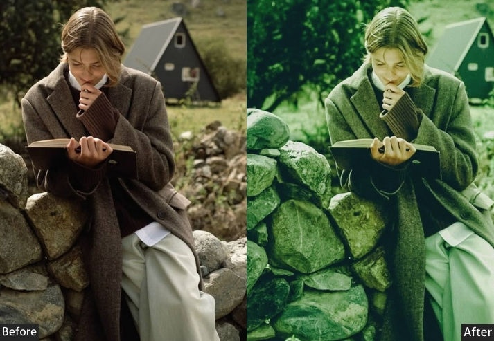
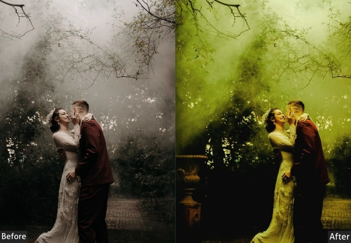
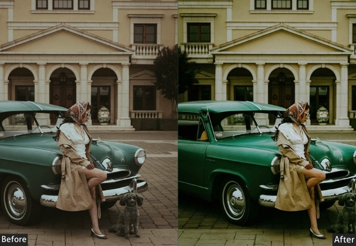
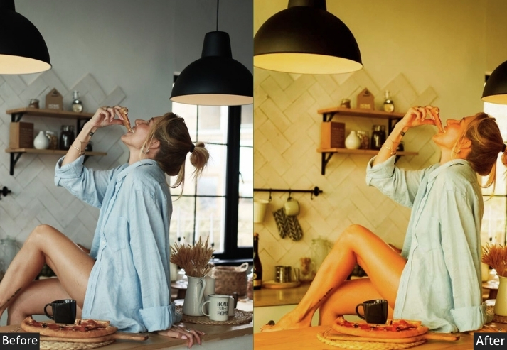
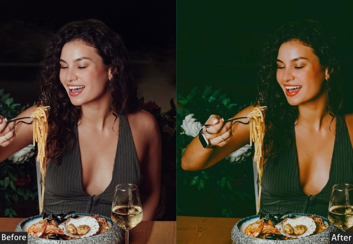
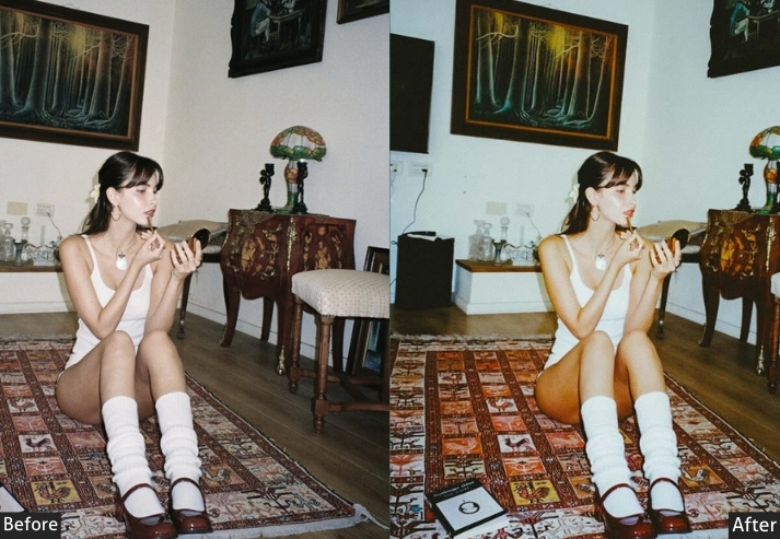
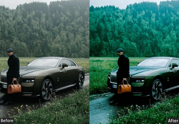
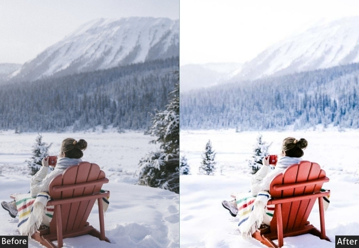
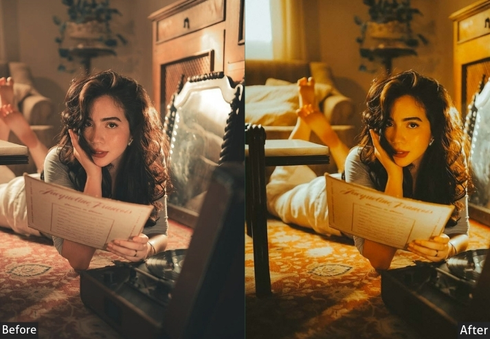
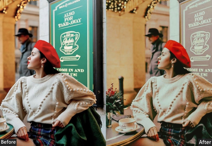
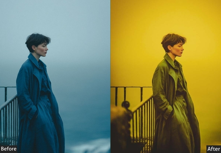
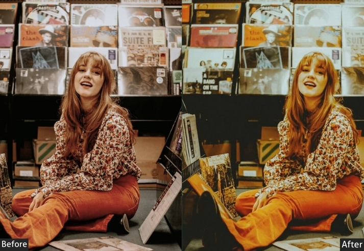
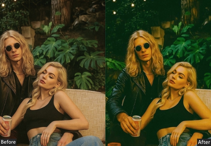
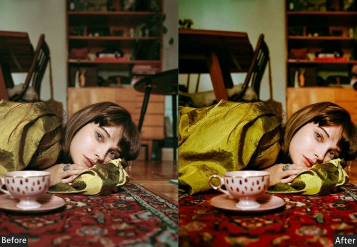
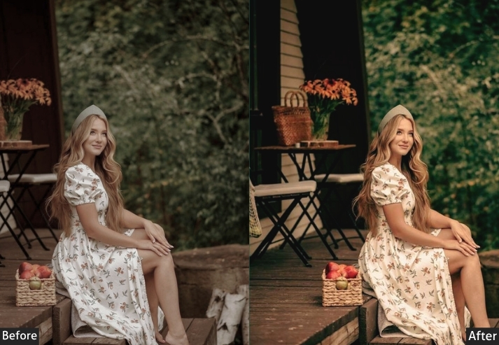
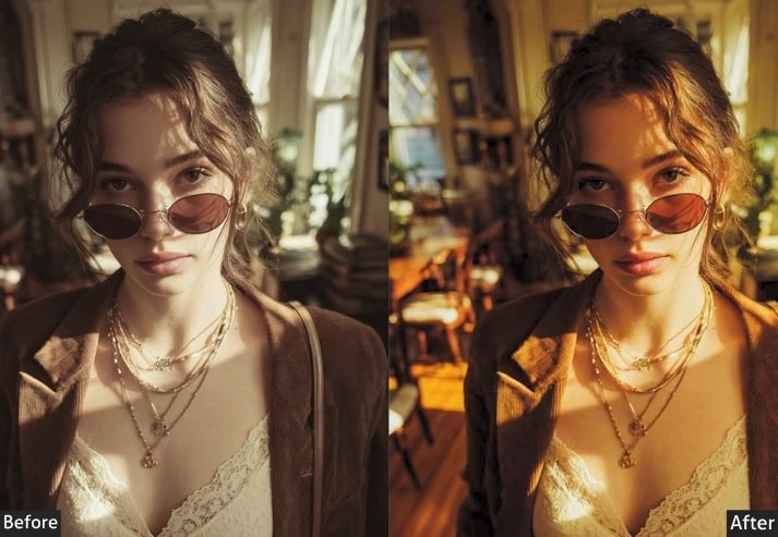
Lifestyle content lives and dies on consistency. The difference between a feed that looks curated and one that looks random usually isn’t the camera; it’s the color grade. This collection covers the full range creators need: crisp, bright-and-airy tones for minimalist feeds, warm golden-hour indoor looks for cozy content, and moody, dark-academia grading for a more cinematic brand.
Best for: Lifestyle bloggers, home décor, daily content, food photography.
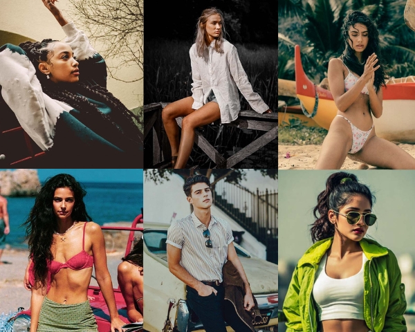
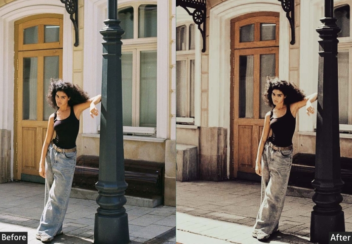
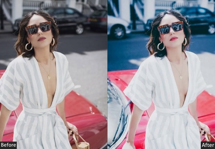
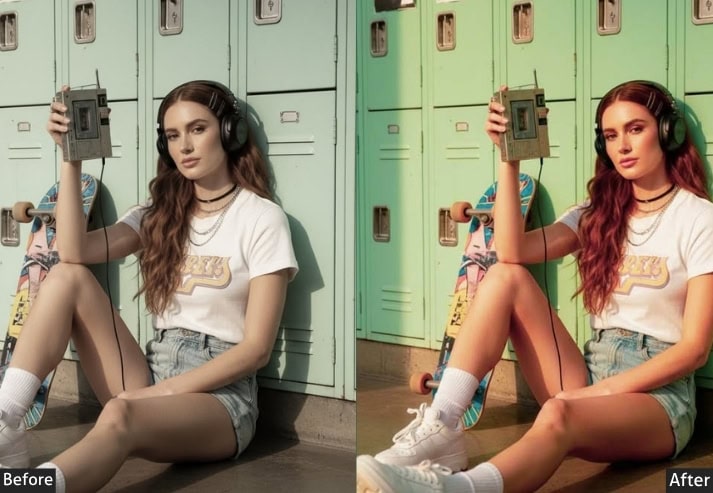
2. FASHION (100+ Presets)
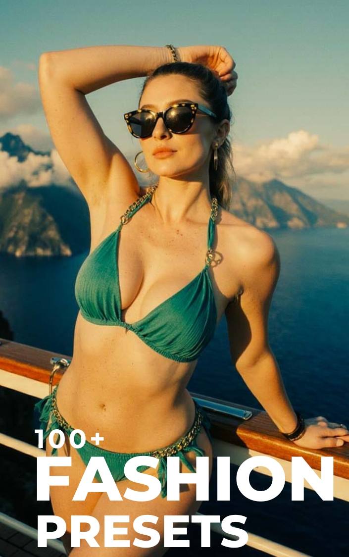
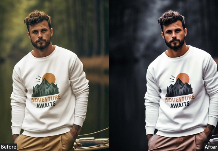
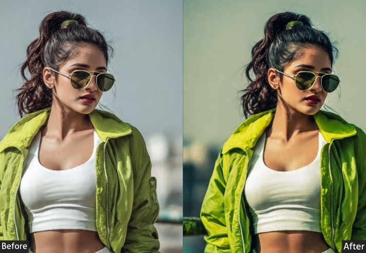
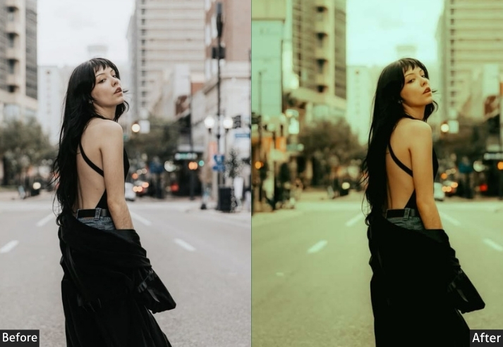
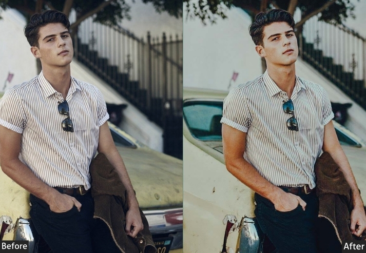
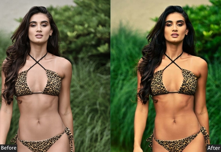
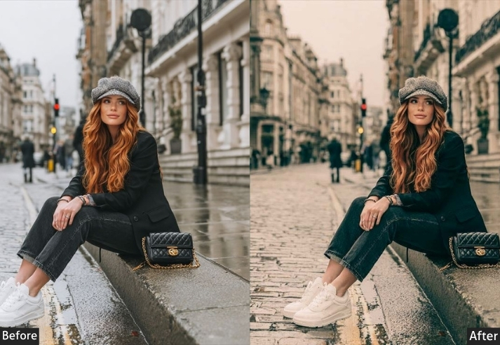
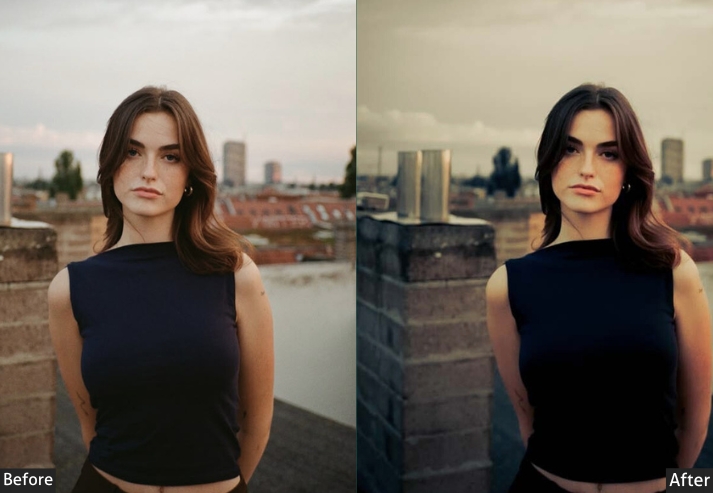
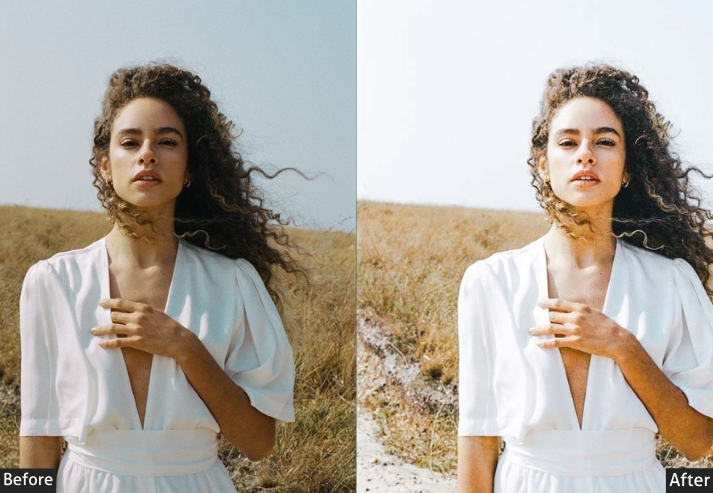
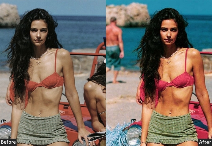
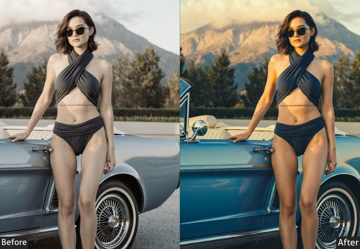
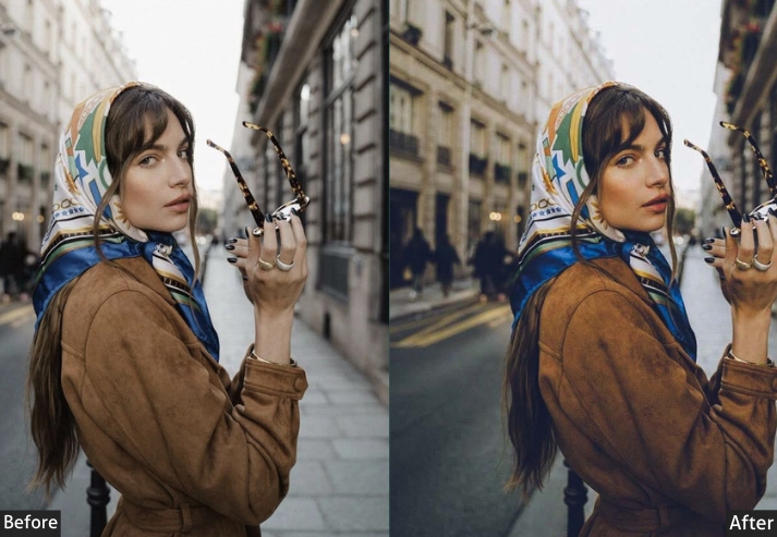
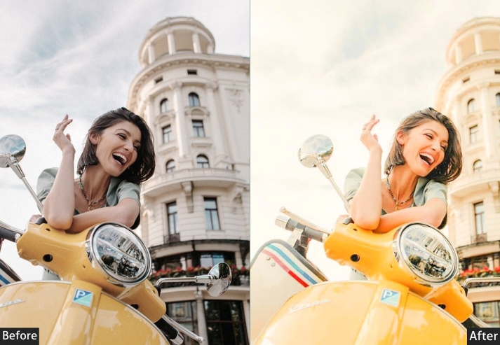
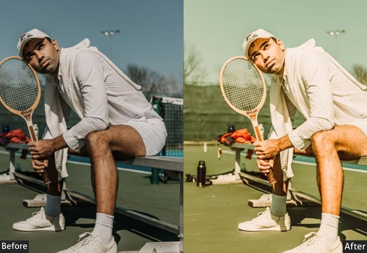
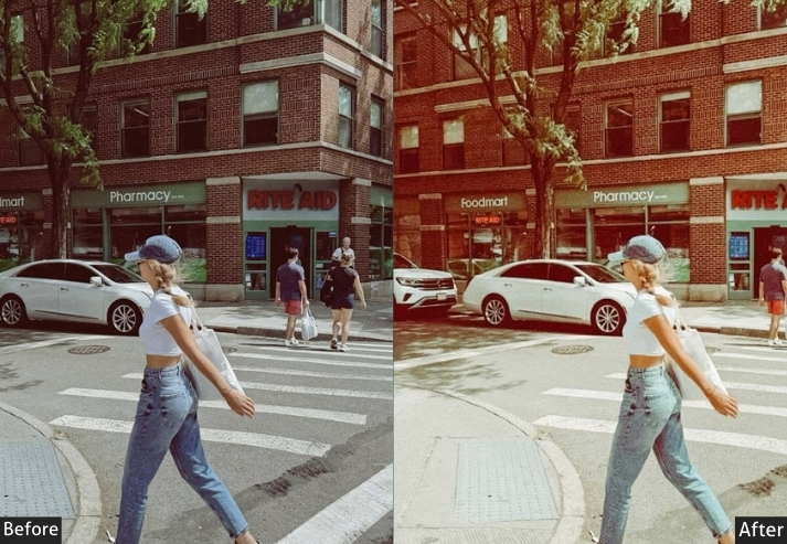
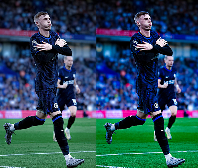
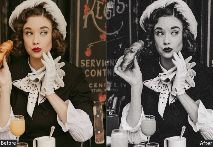
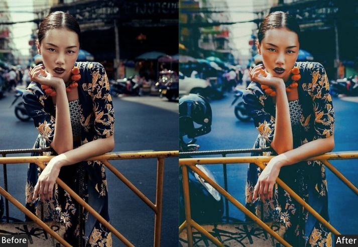
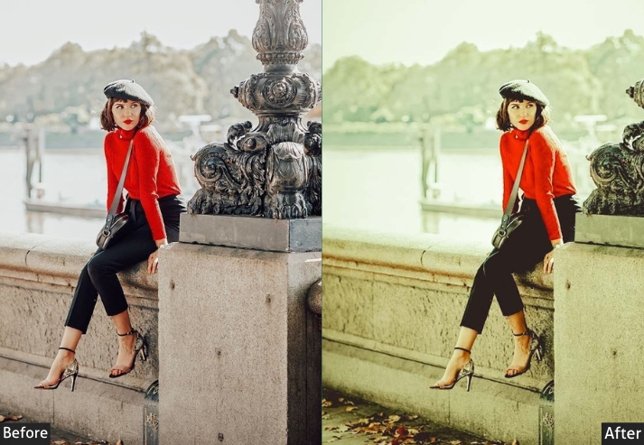
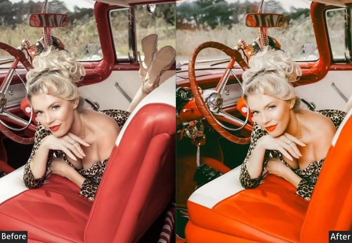
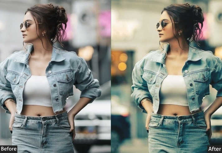
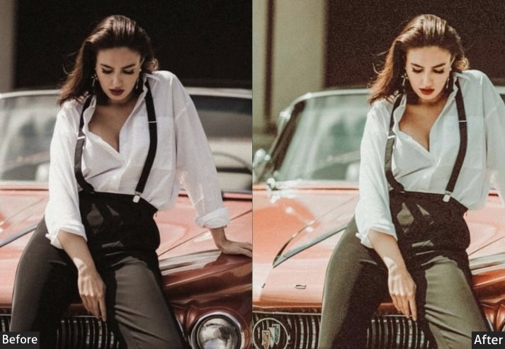
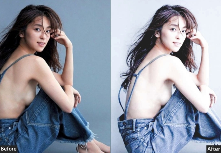
Fashion content has to read as intentional at a glance. A scroll-stopping OOTD post and a flat one are often the exact same photo, graded differently. This set spans magazine-style editorial grading down to soft, pastel-driven looks, so the same outfit can be styled for a streetwear audience or a boutique clientele without reshooting anything.
High Fashion Editorial (25) – Vogue vibes, magazine-ready.
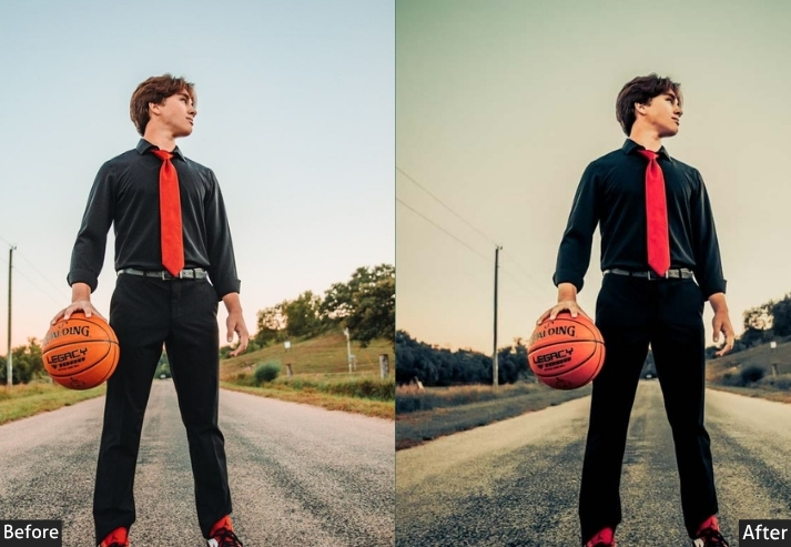
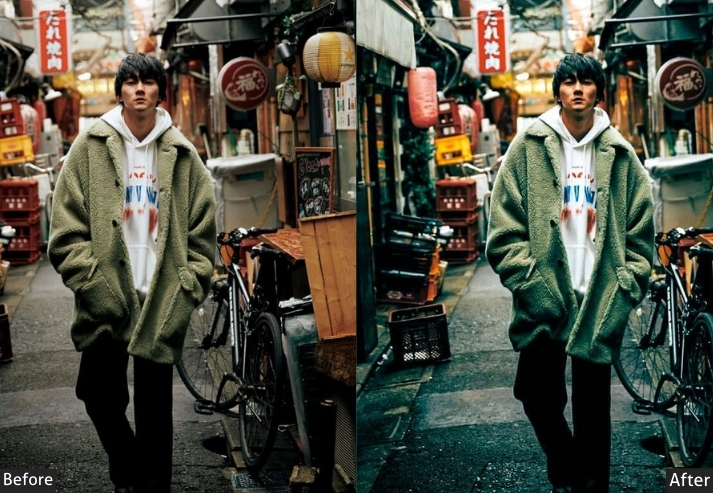
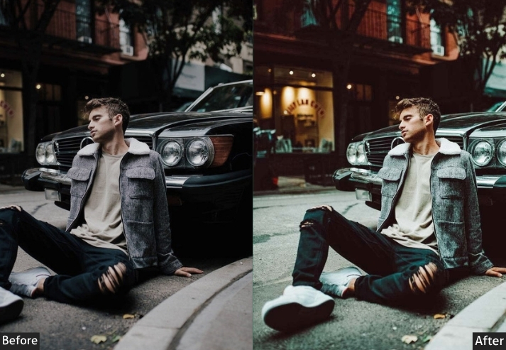
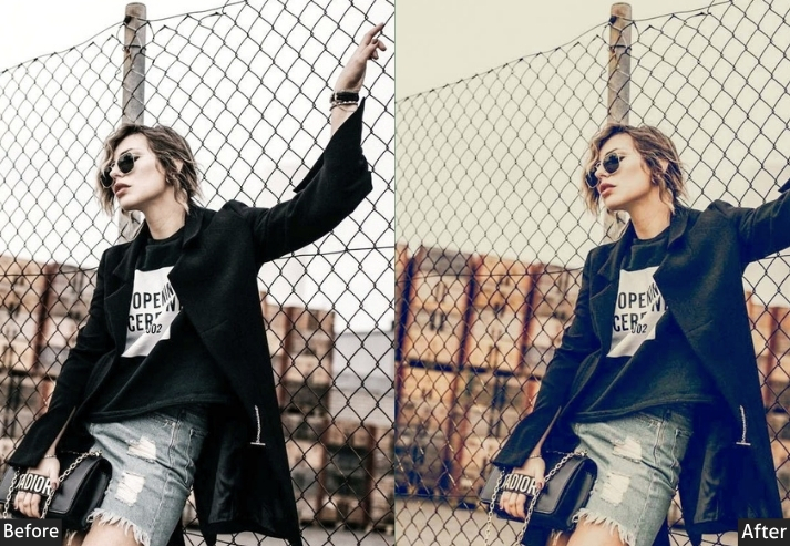
Street Style (25) – OOTD, sneaker culture, urban fashion.
Bold & Vibrant (15+) – Color pop, statement pieces.
Best for: Fashion bloggers, boutiques, clothing brands, and style influencers.
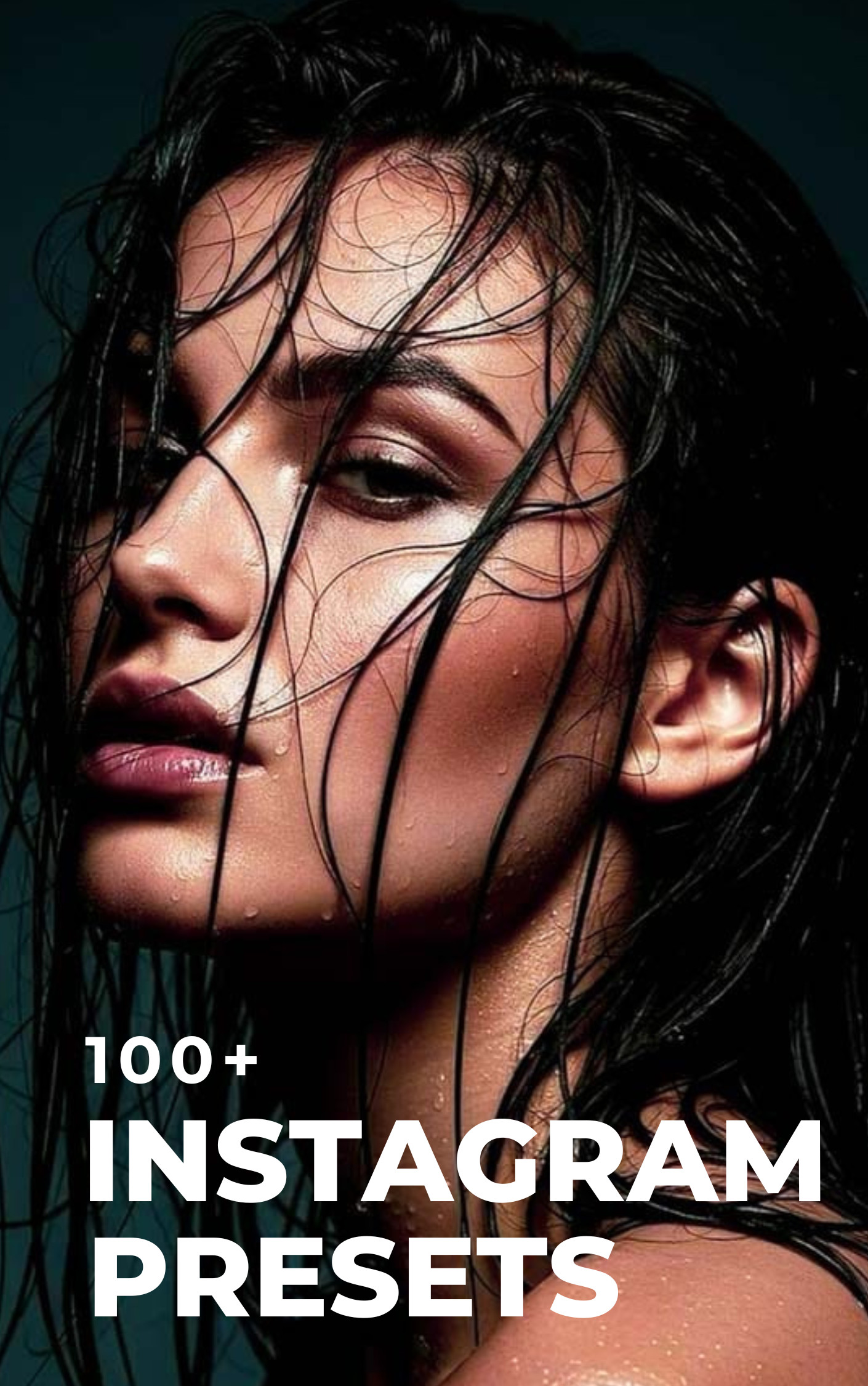
3. INSTAGRAM (150+ Presets)
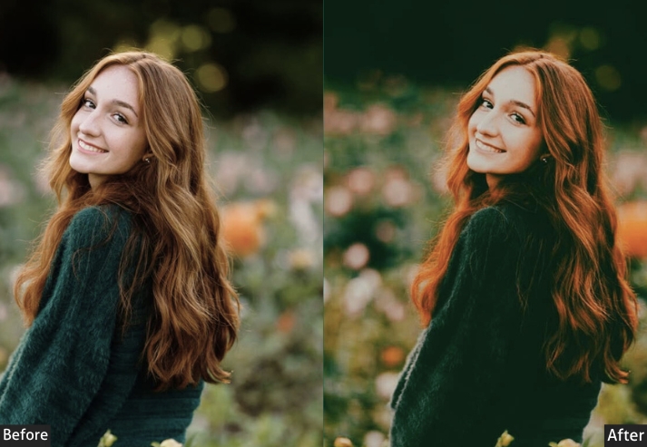
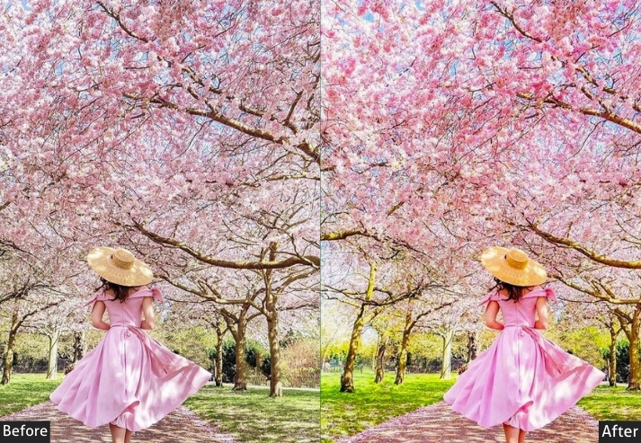
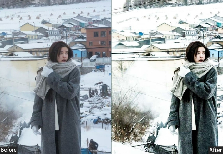
Instagram grading has its own logic, which reads well in a fast-scrolling feed, but it isn’t always what works for print or a portfolio. This is the largest category in the bundle because it’s built specifically around what performs on the platform: cohesive grid tones, seasonal variety, and trend-driven looks like Y2K and cottagecore.
Best for: Everyone with Instagram (literally), content creators, and small businesses.
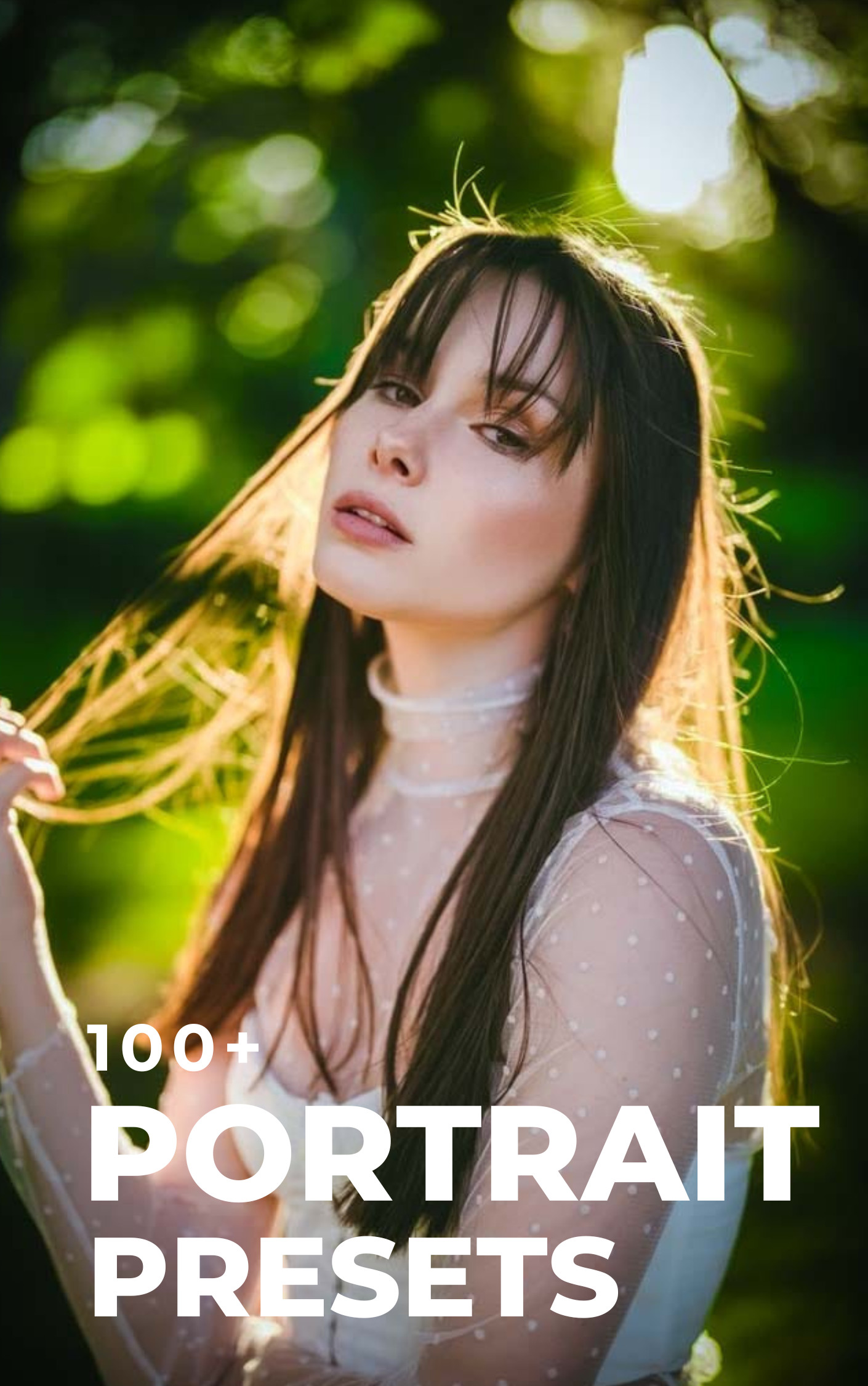
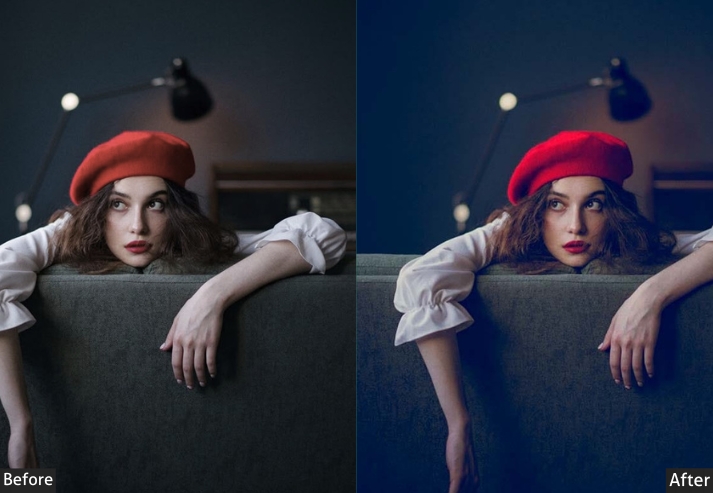
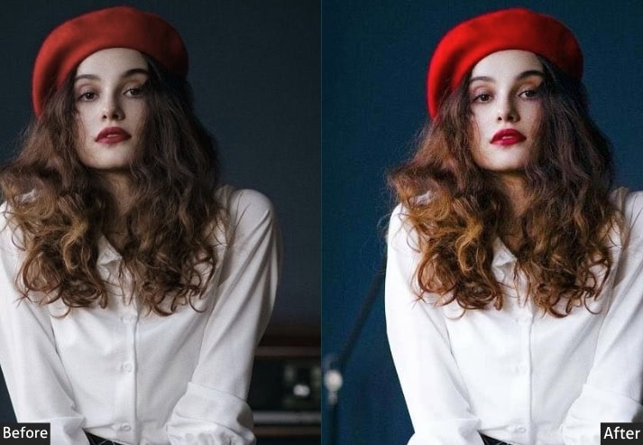
4. PORTRAIT (100+ Presets)
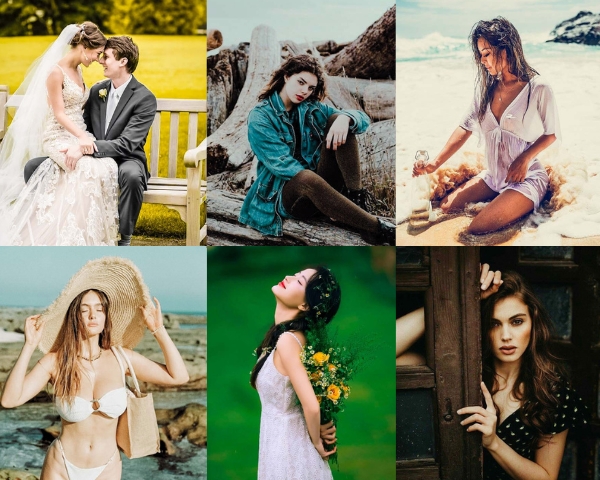
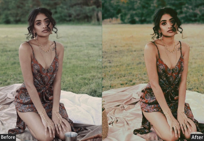
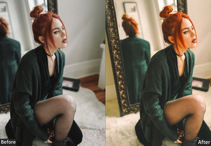
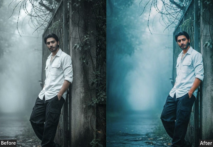
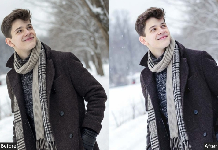
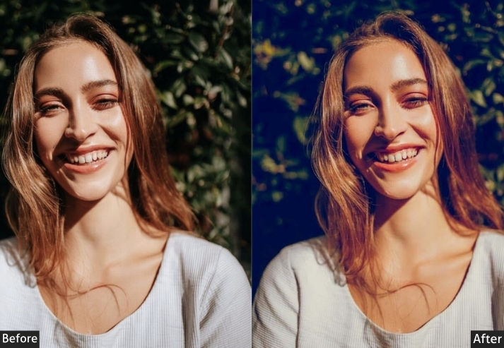
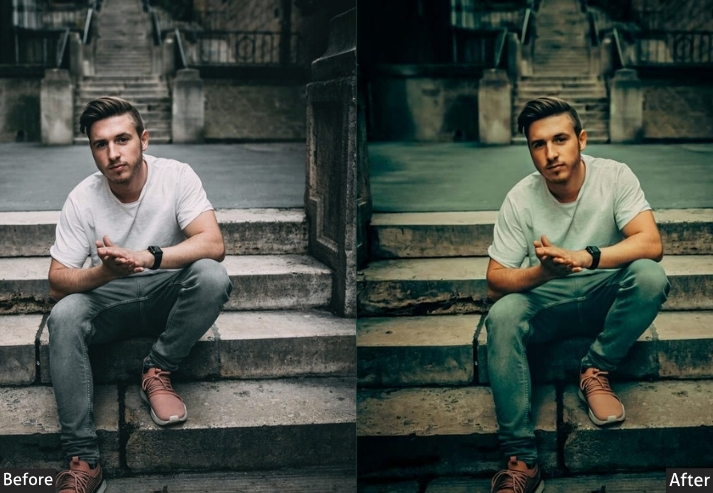
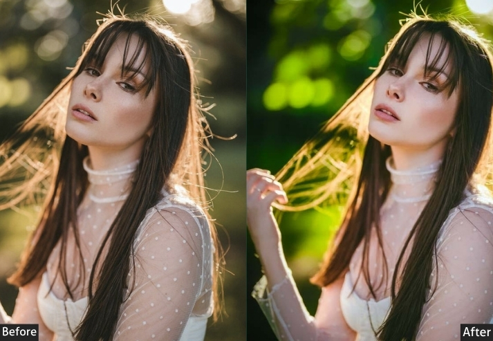
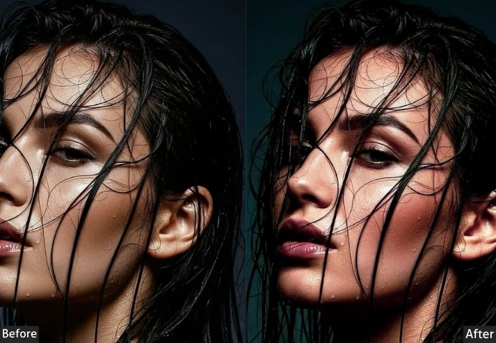
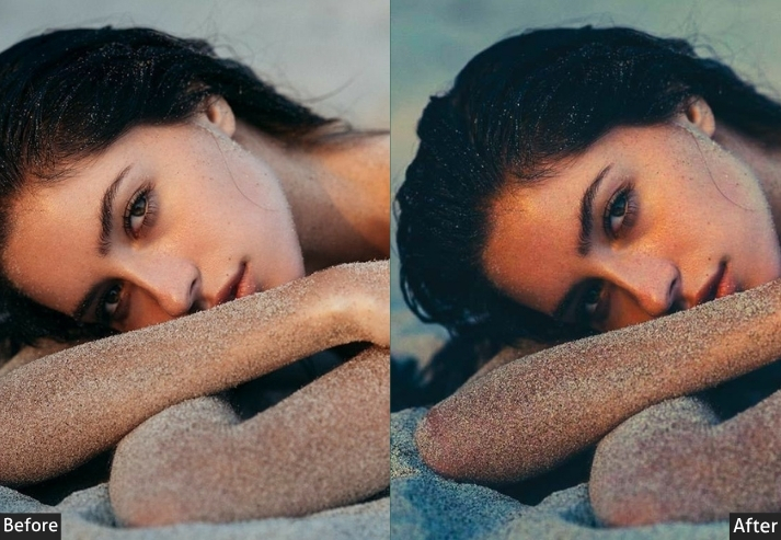
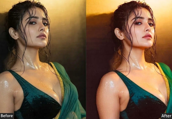
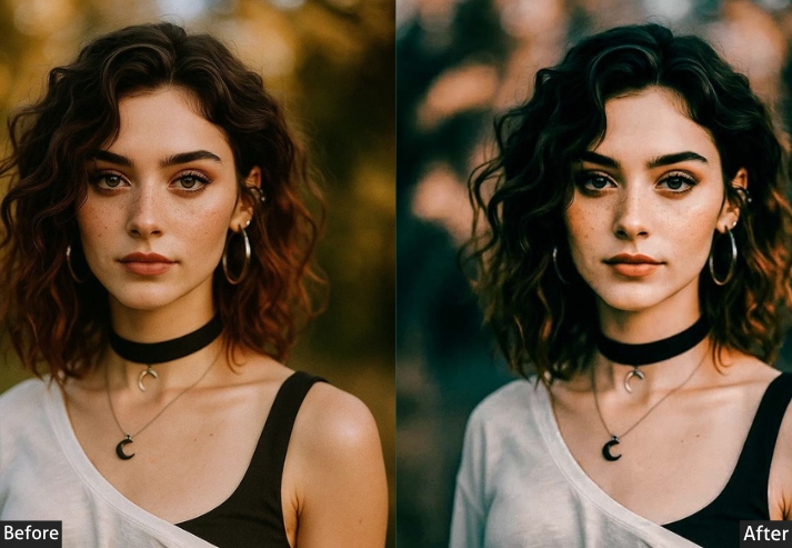
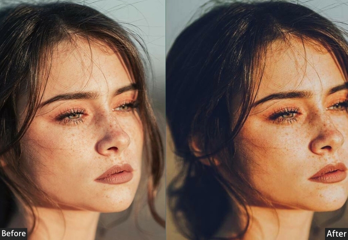
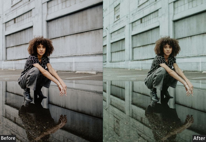
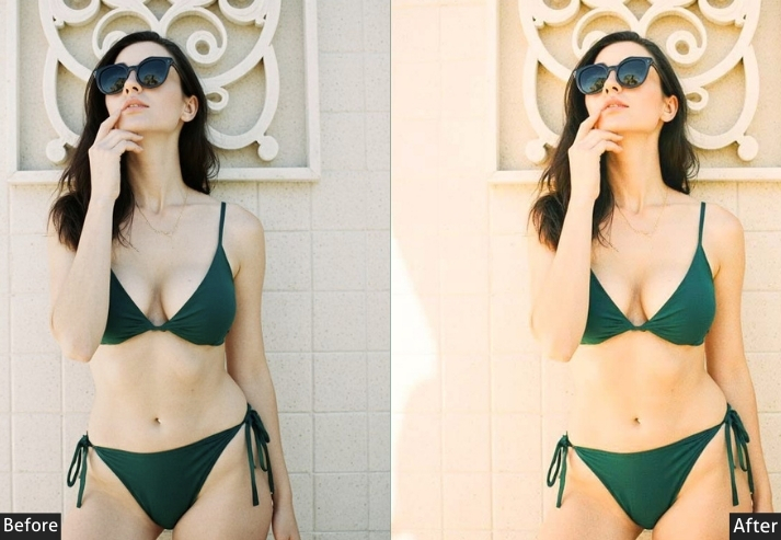
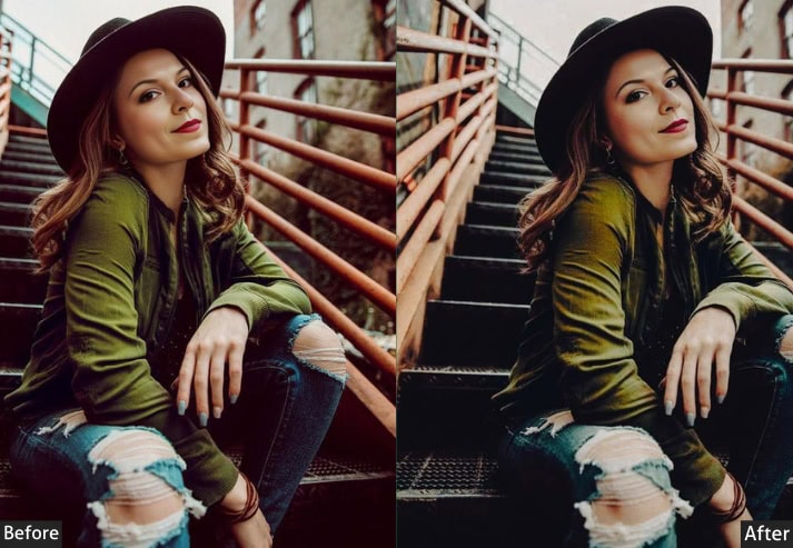
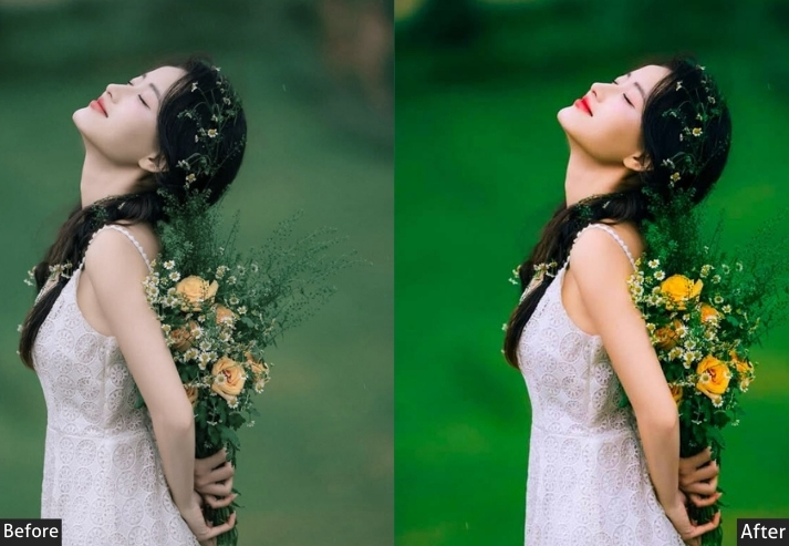
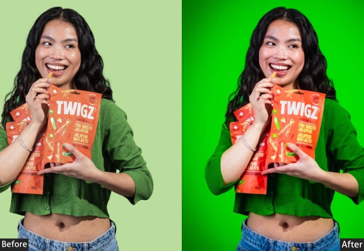
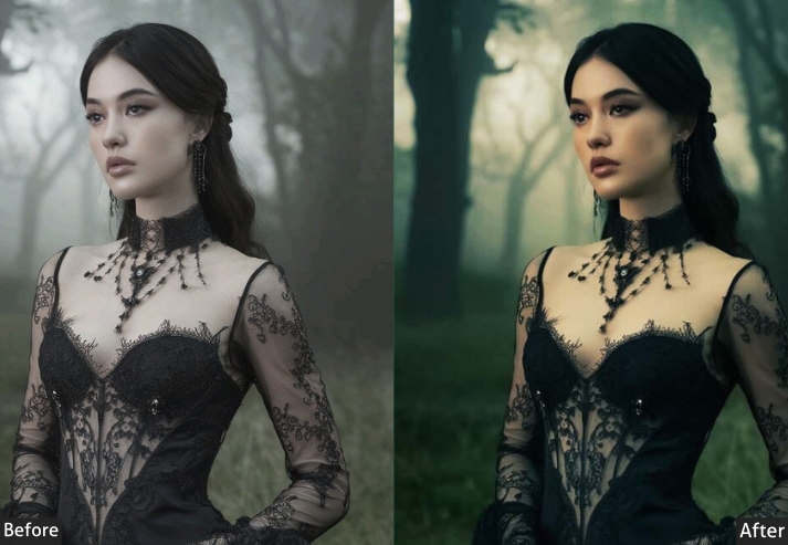
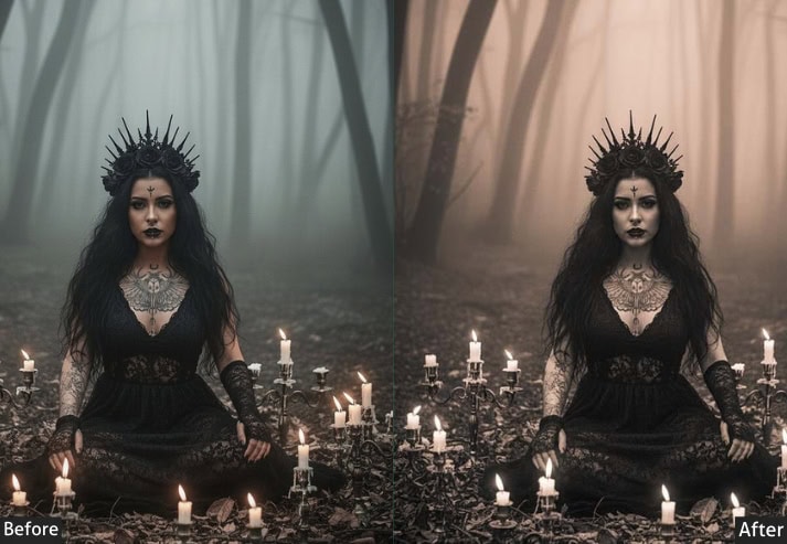
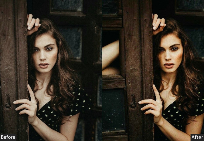
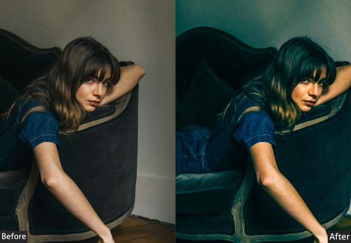
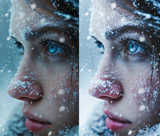
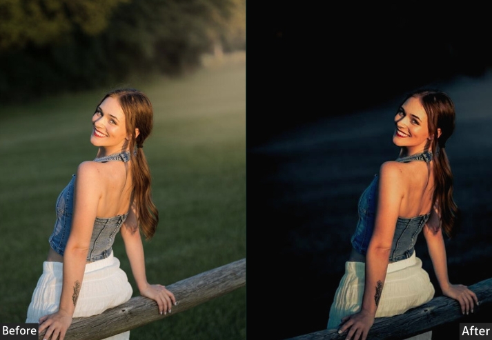
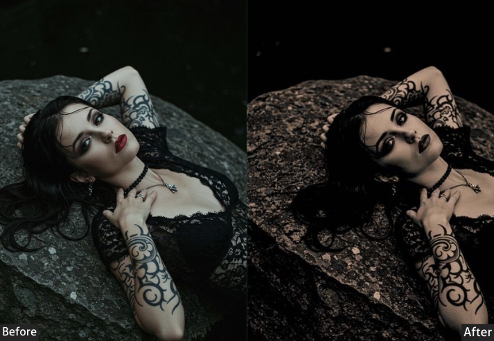
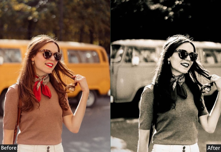
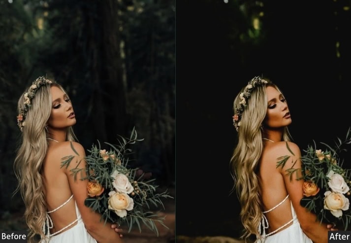
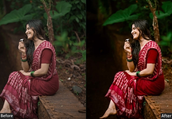
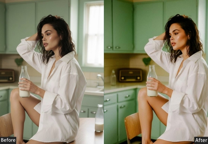
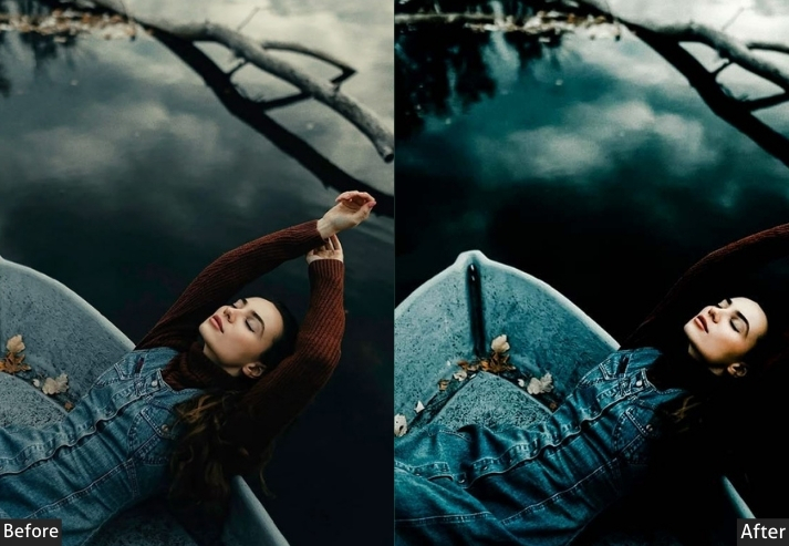
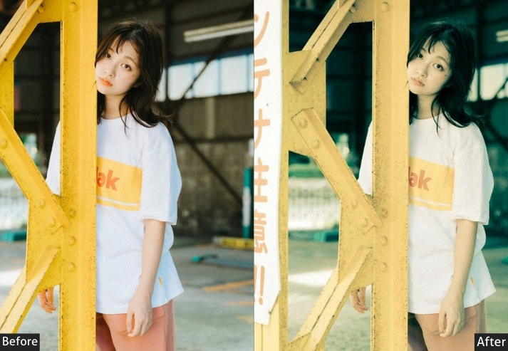
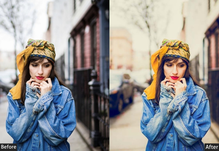
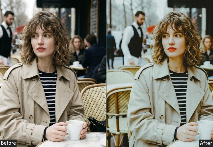
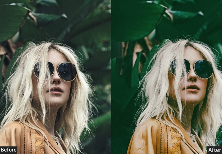
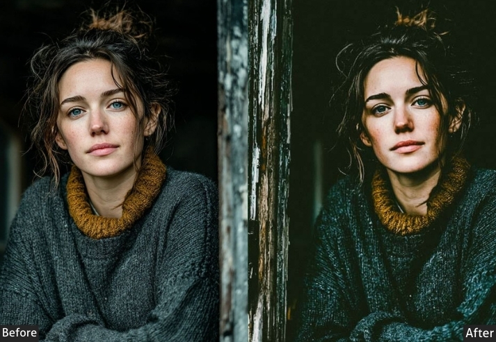
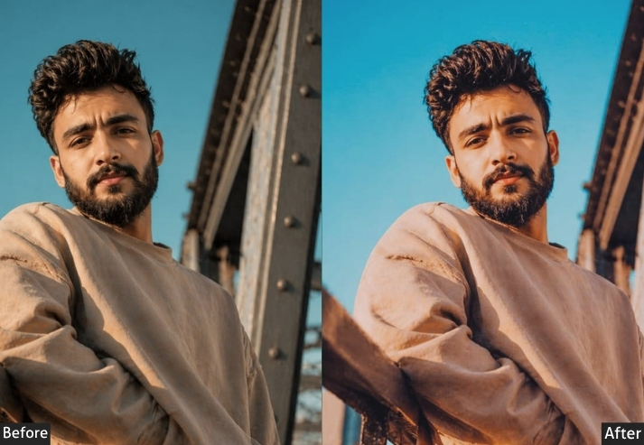
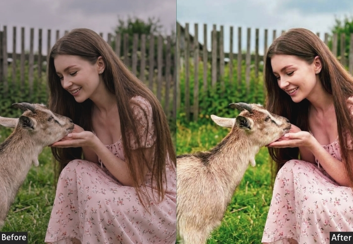
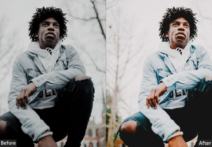
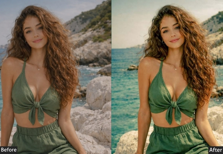
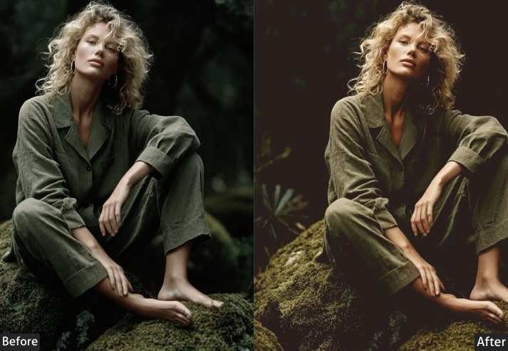
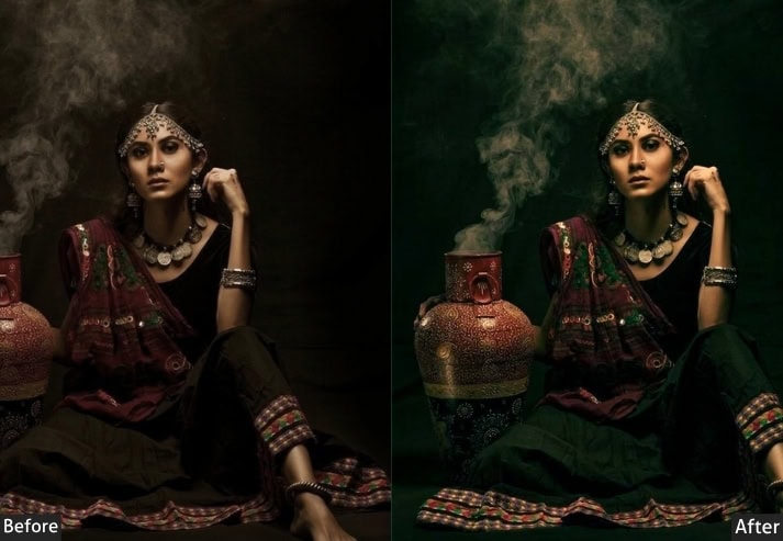
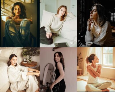
Good portrait editing is mostly invisible. The goal isn’t a filter; it’s making skin tones look accurate and flattering under whatever light you actually had. This category is built around that balance: clean studio-style correction, natural window-light warmth, and a smaller set of more stylized, cinematic looks for creative work.
Skin Tone Perfection (25) – Natural glow, flawless complexion.
Studio Quality (20) – Professional headshots, corporate clean.
Best for: Portrait photographers, headshot sessions, models, and profile pictures.
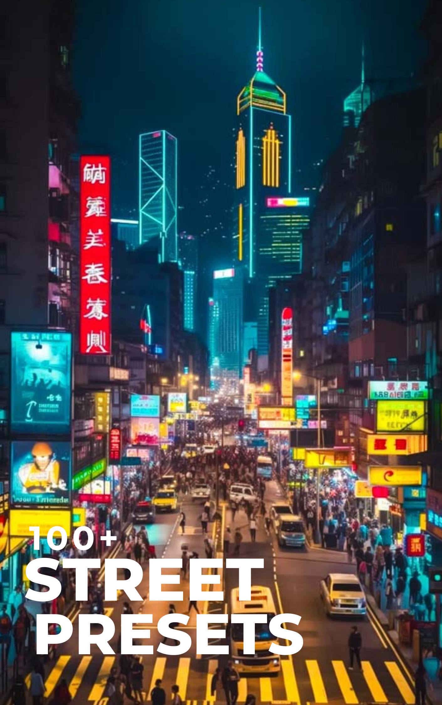
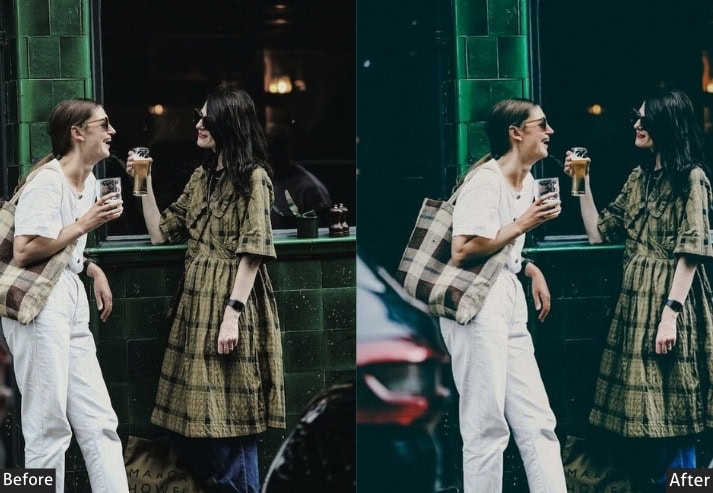
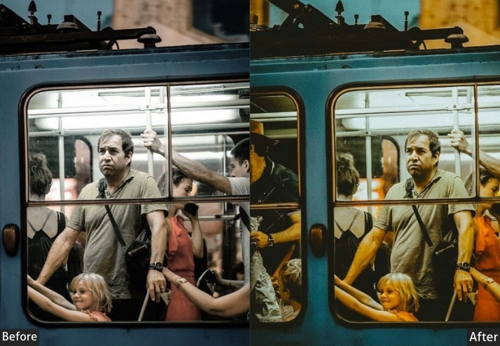
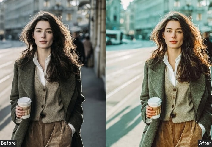
5. STREET (100+ Presets)
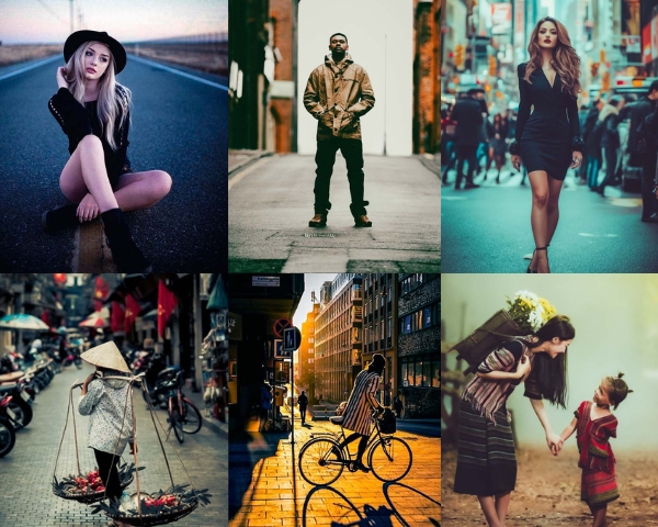
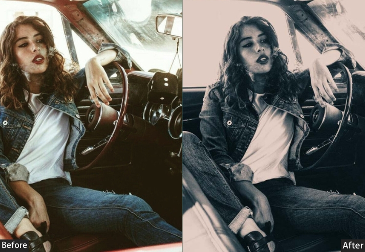
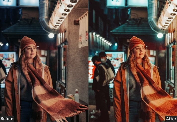
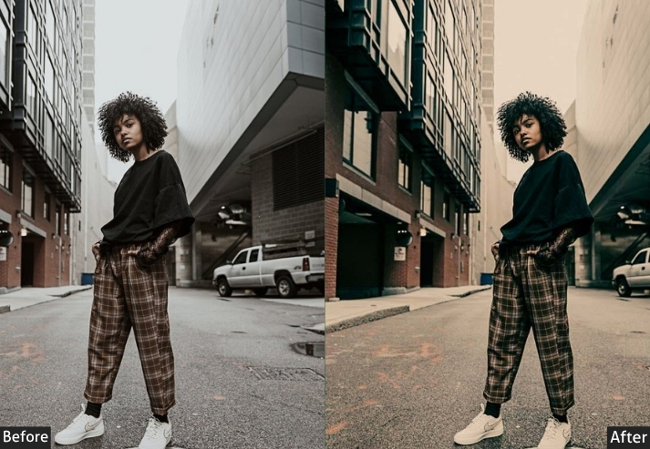
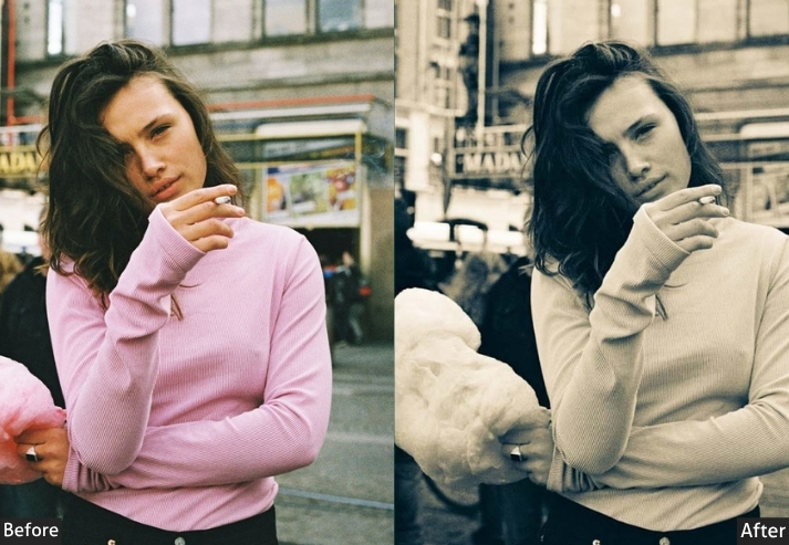
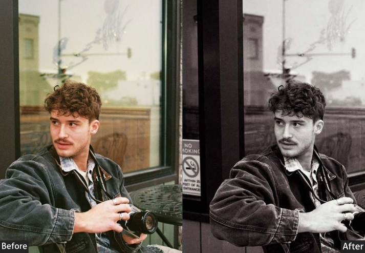
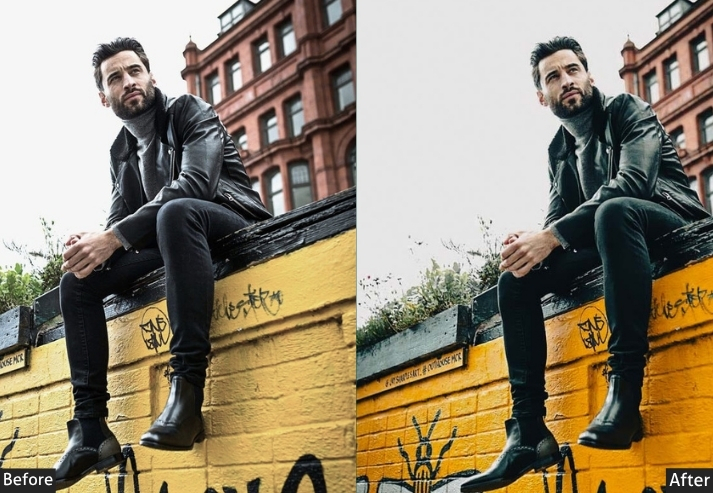
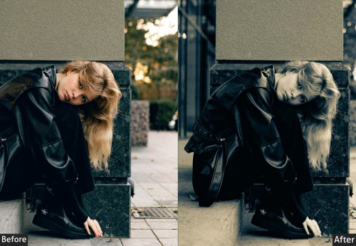
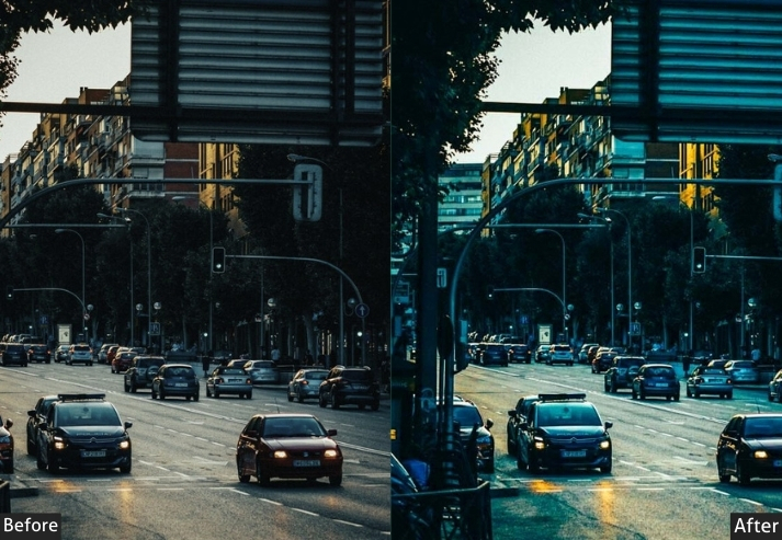
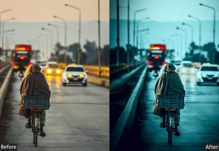
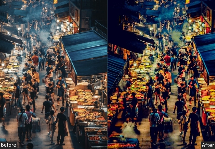
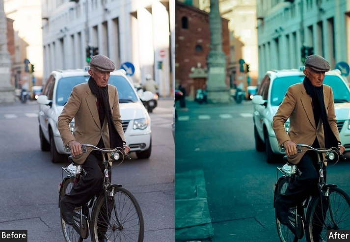
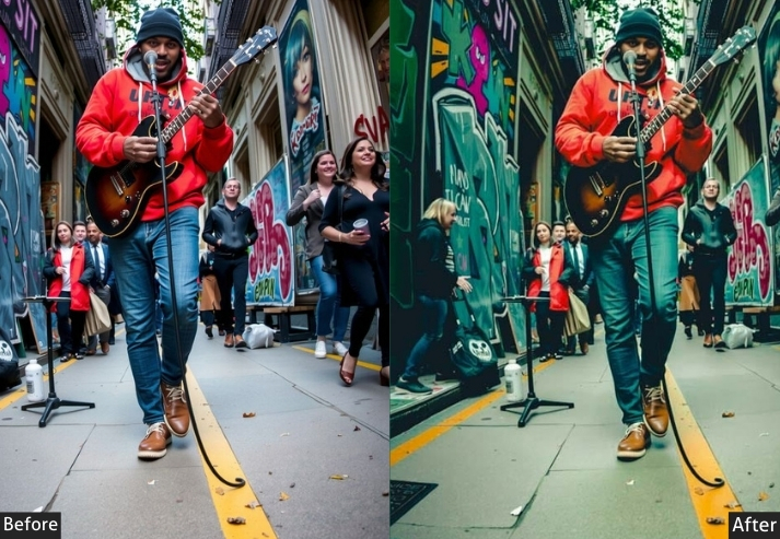
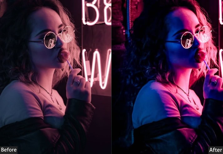
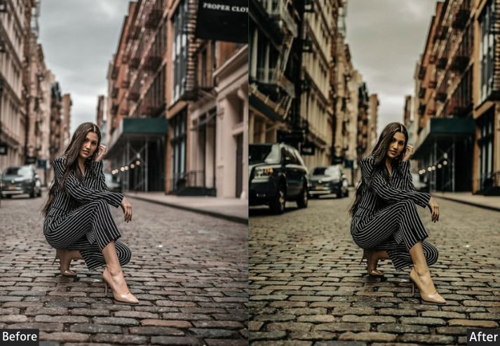
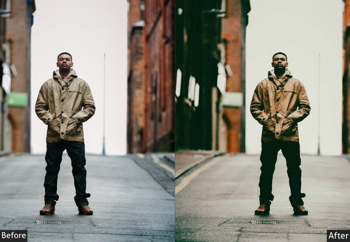
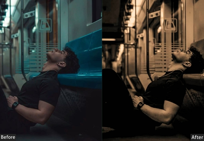
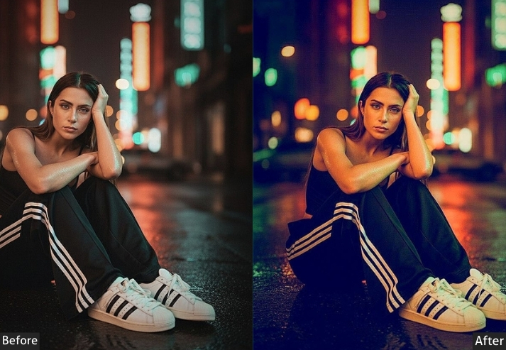
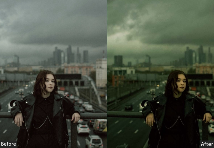
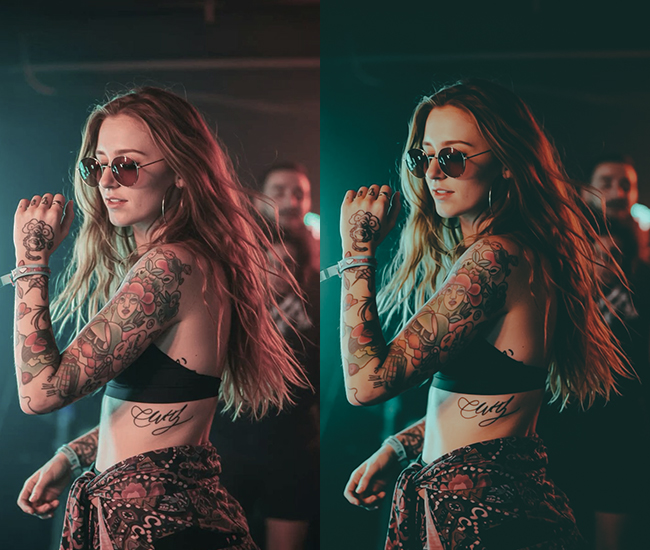
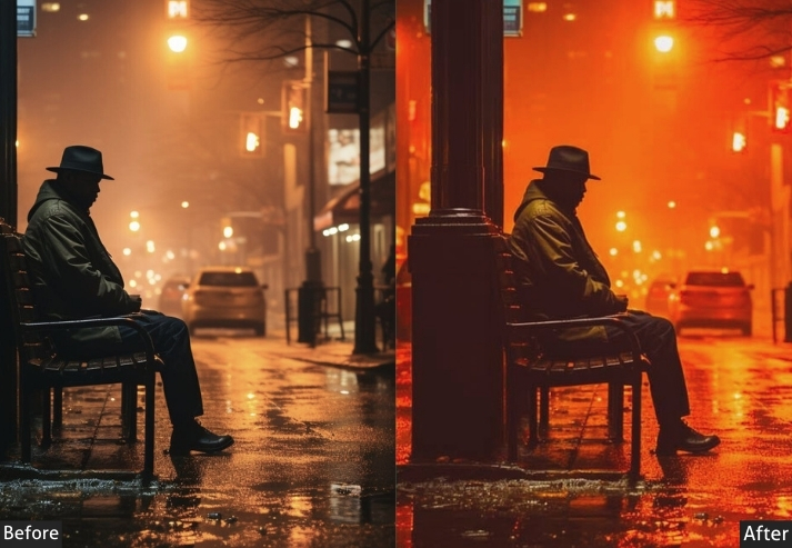
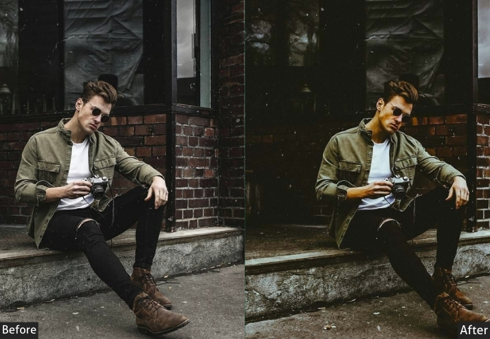
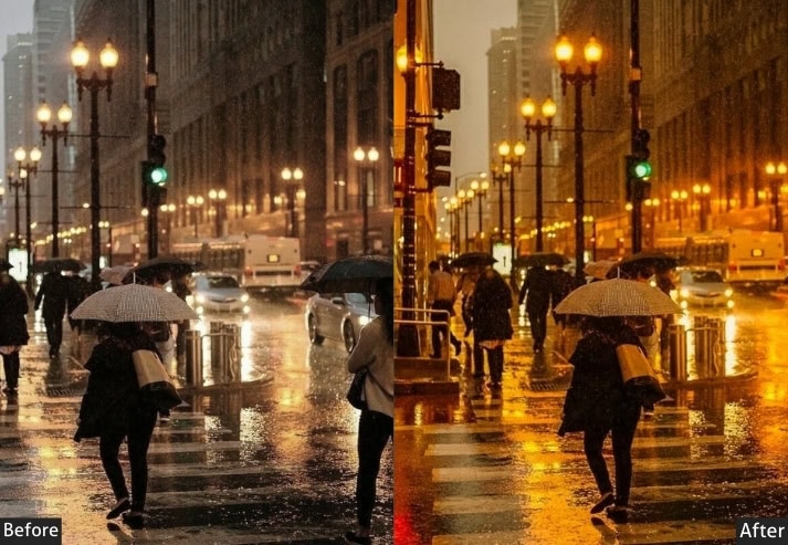
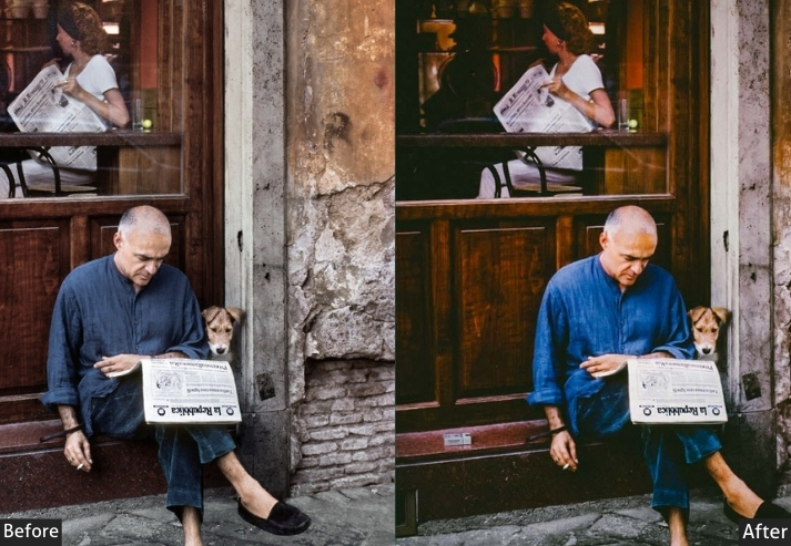
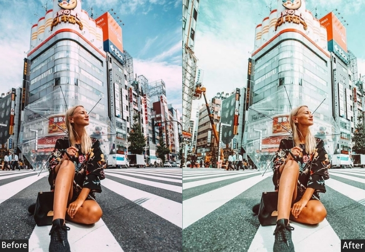
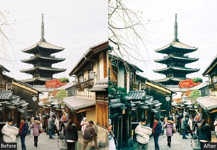
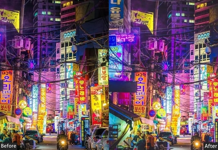
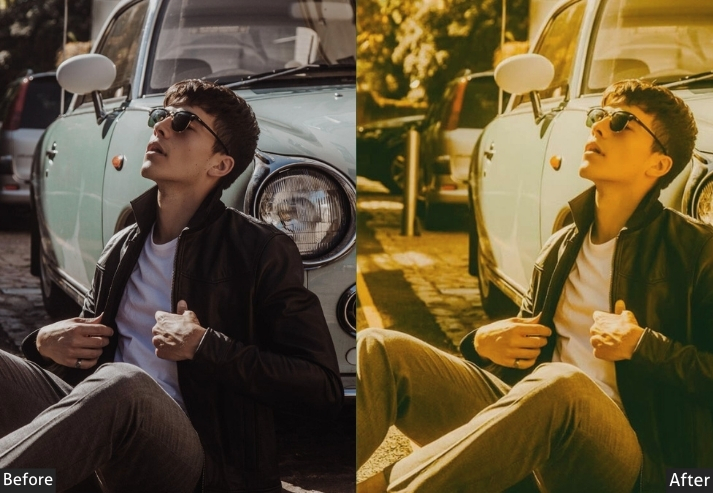
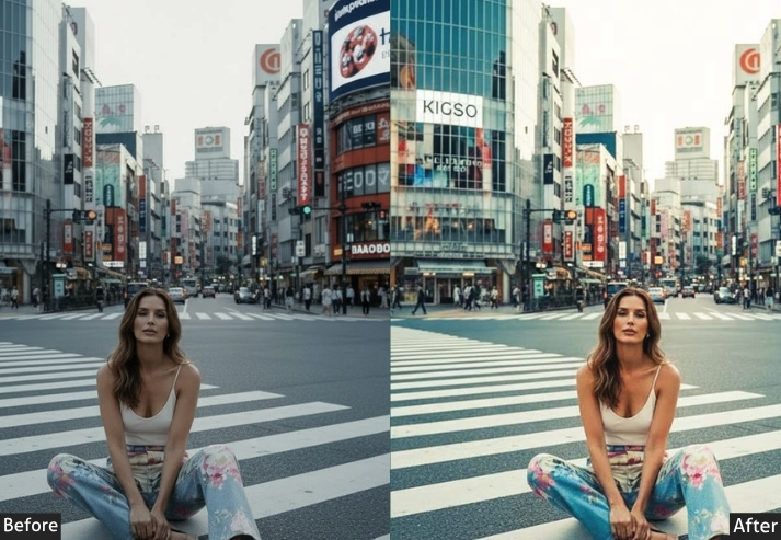
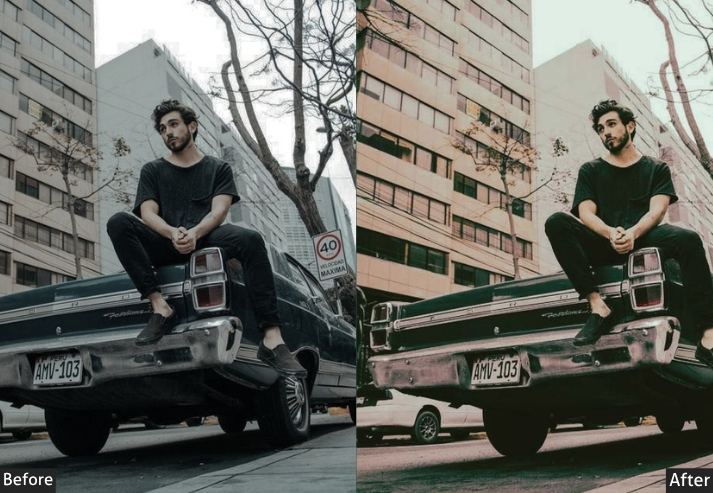
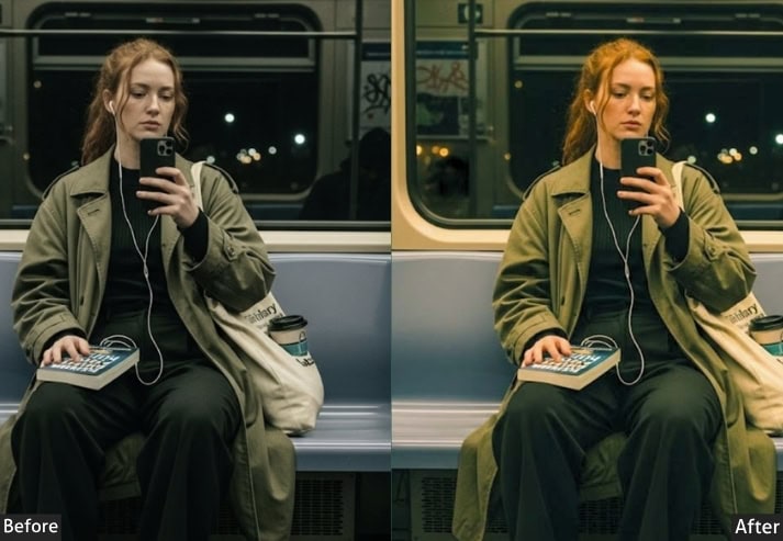
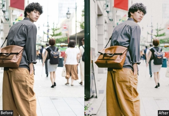
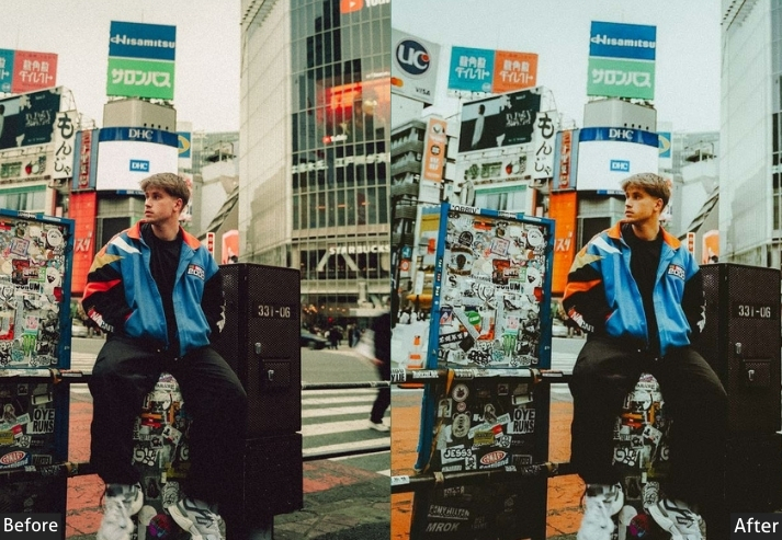
Street photography rewards restraint; over-processed HDR and washed-out film emulation are the two most common ways street shots get ruined in editing. This set is built around real urban texture: gritty documentary tones, neon-lit night grading, and warm golden-hour street looks that preserve shadow detail rather than crushing it.
Urban Grit (25) – Raw texture, concrete jungle, graffiti walls.
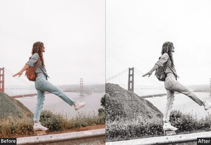
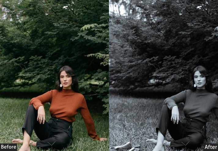
Street Photography Classics (25) – Documentary, B&W, photojournalism.
Neon & Night (20) – City lights, cyberpunk, Tokyo vibes.
Golden Hour Streets (15) – Sunset city, warm urban tones.
Architectural (15+) – Building lines, geometry, modern structures.
Best for: Street photographers, urban explorers, and documentary style.
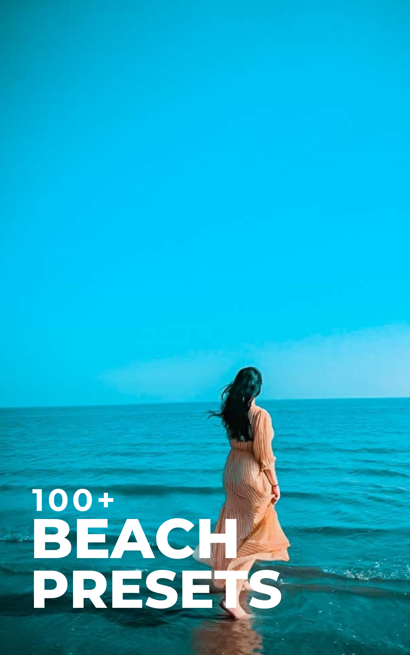
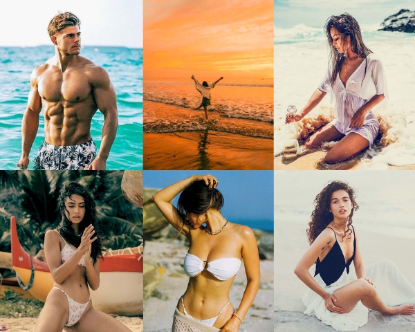
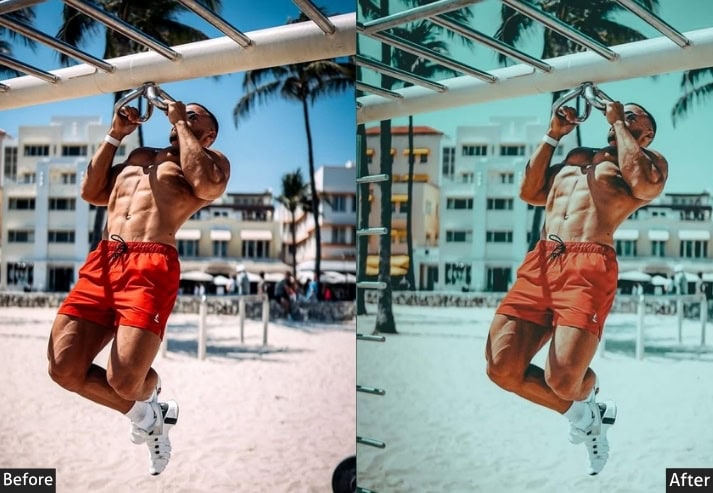
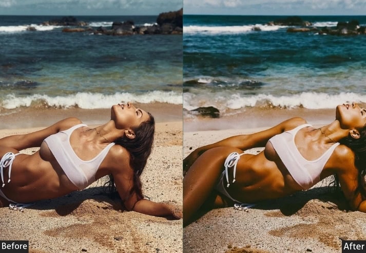
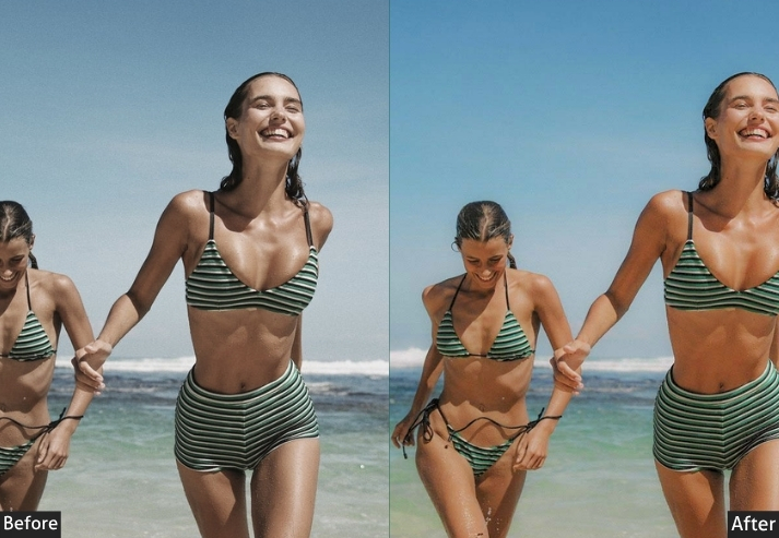
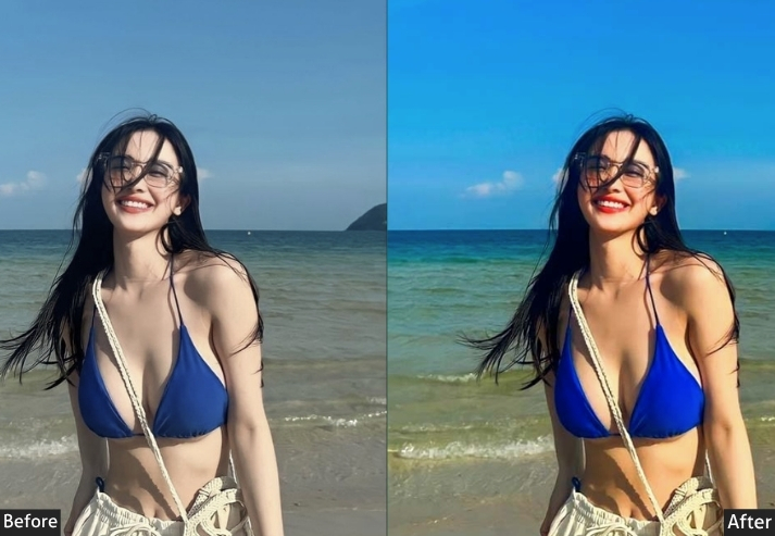
6. BEACH (50+ Presets)
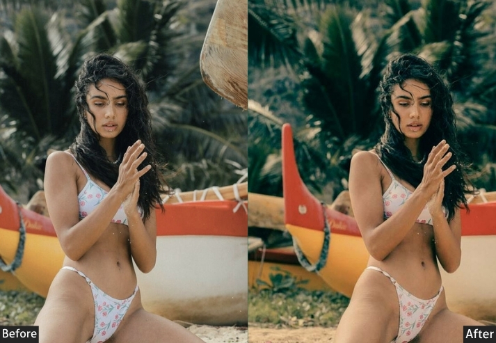
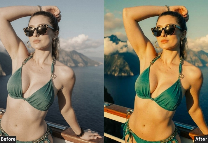
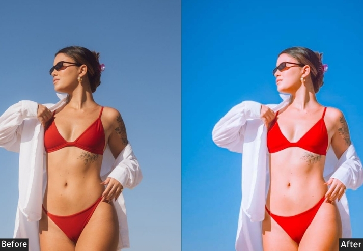
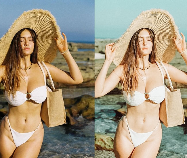
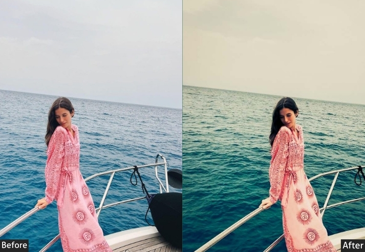
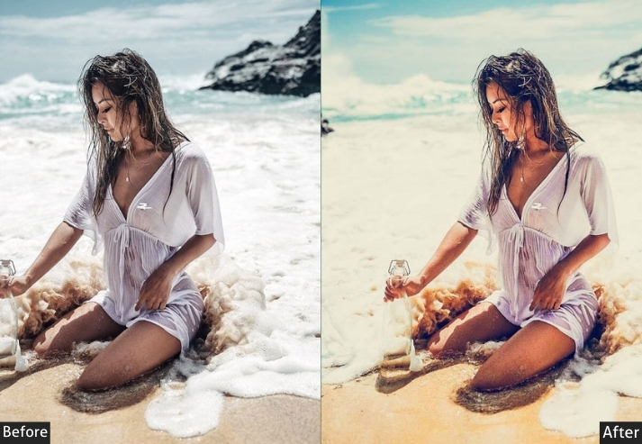
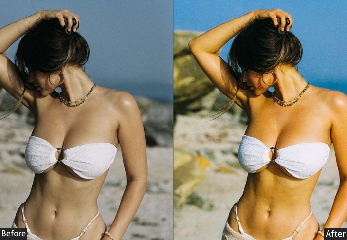
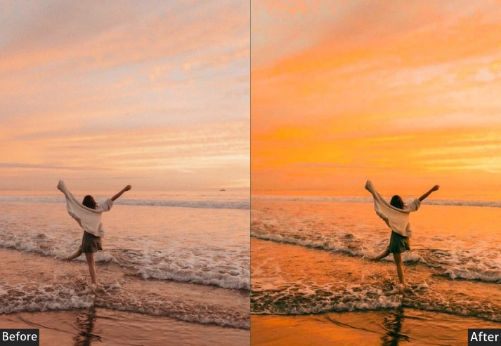
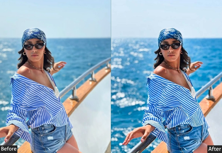
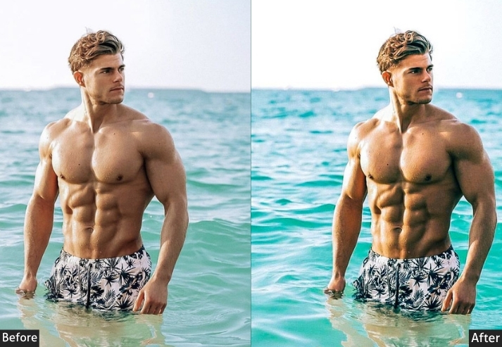
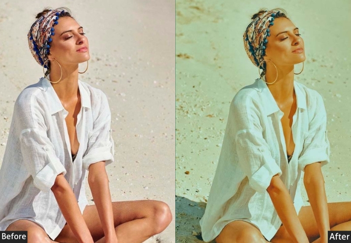
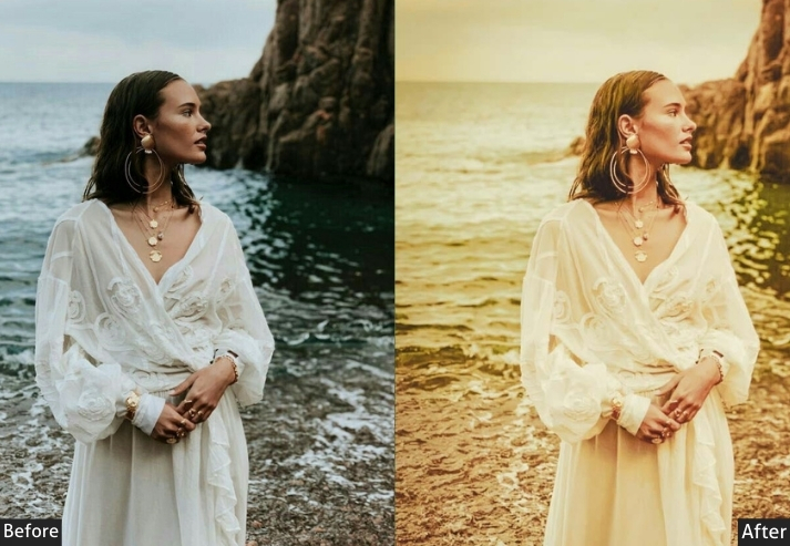
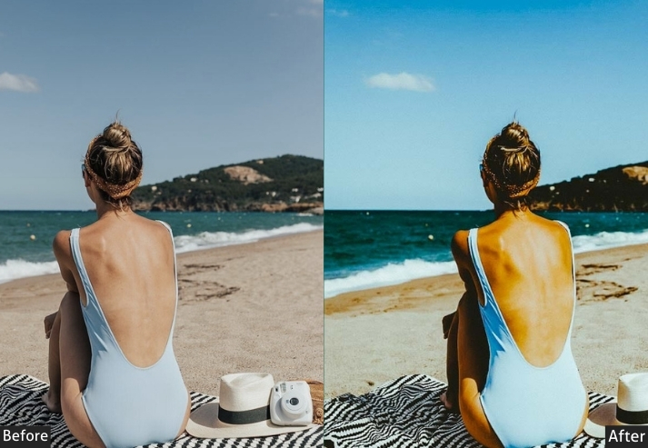
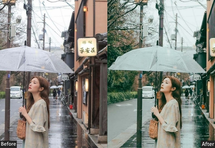
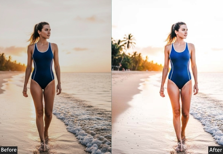
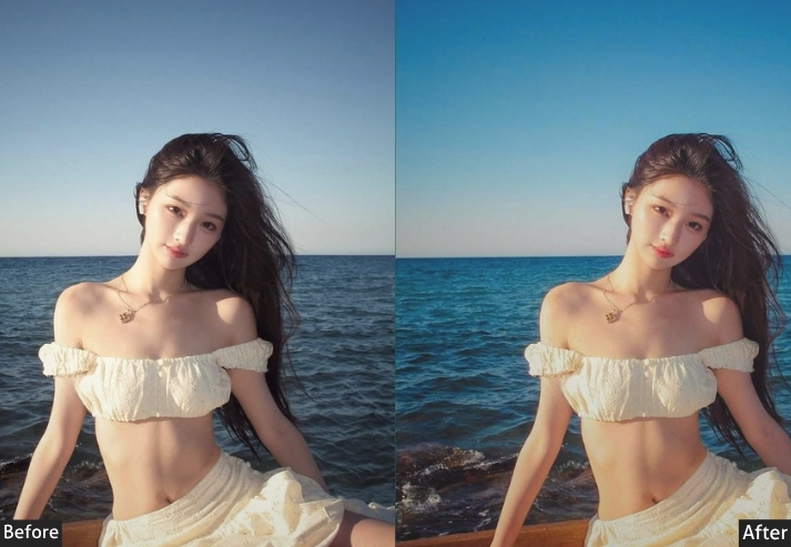
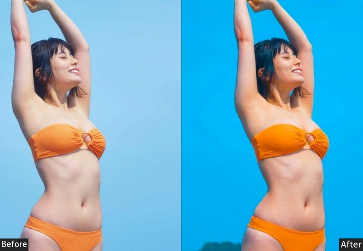
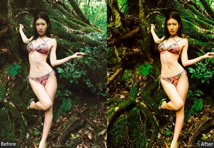
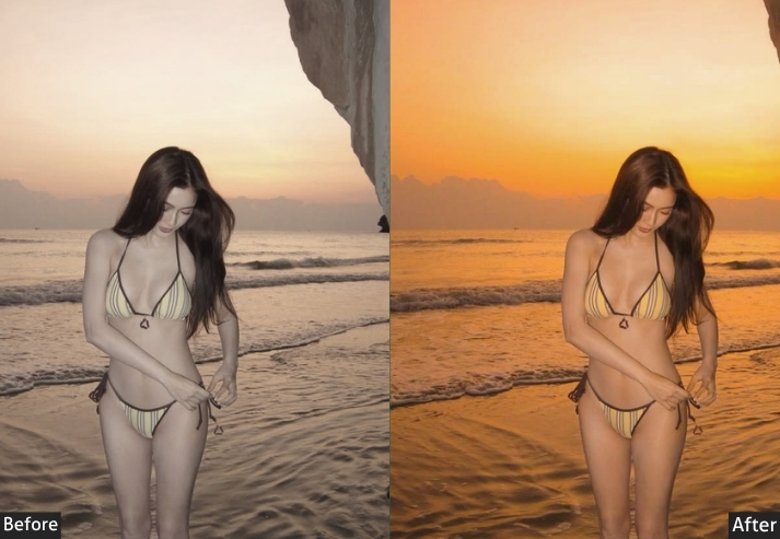
Beach and coastal content has one classic failure mode: orange, oversaturated skin tones from overly warm grading. This collection is built to avoid that, with tropical and sunset looks that stay natural, plus a moody, overcast-friendly set for shooting outside peak summer light.
Tropical Paradise (15) – Crystal waters, turquoise dreams, island life.
Sunset Beach (12) – Golden hour, pink skies, horizon magic.
Bright Beach Day (12) – Sun-bleached, sandy tones, summer bright.
Best for: Travel bloggers, swimwear brands, vacation content.
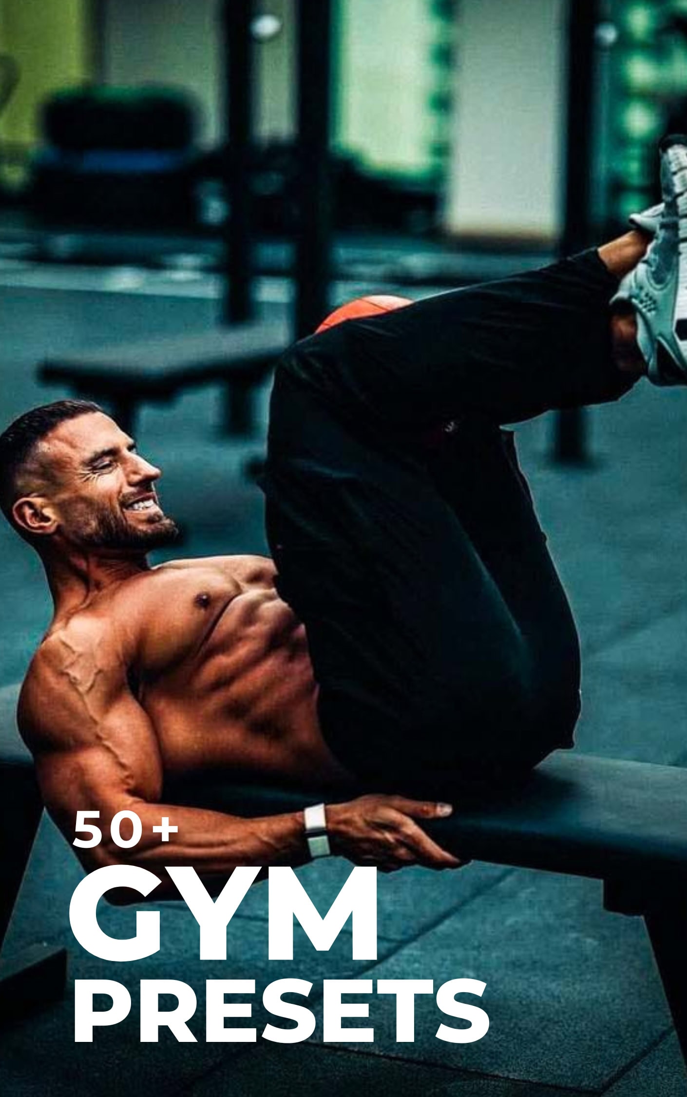
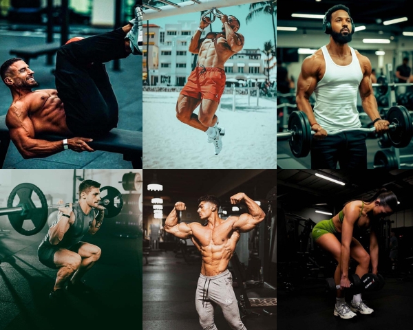
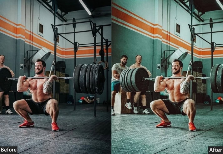
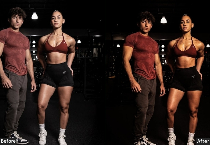
7. GYM (50+ Presets)
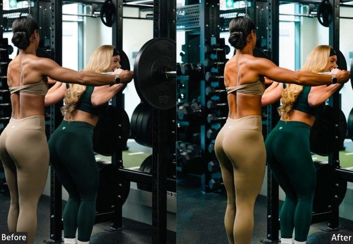
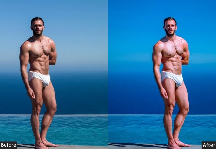
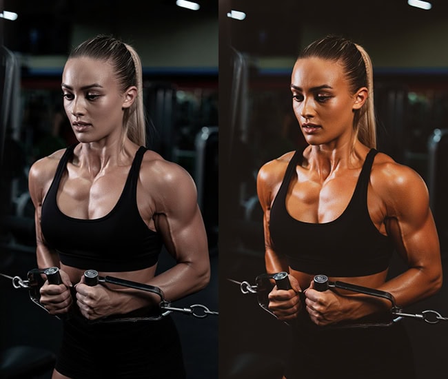
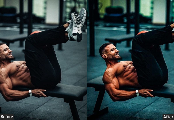
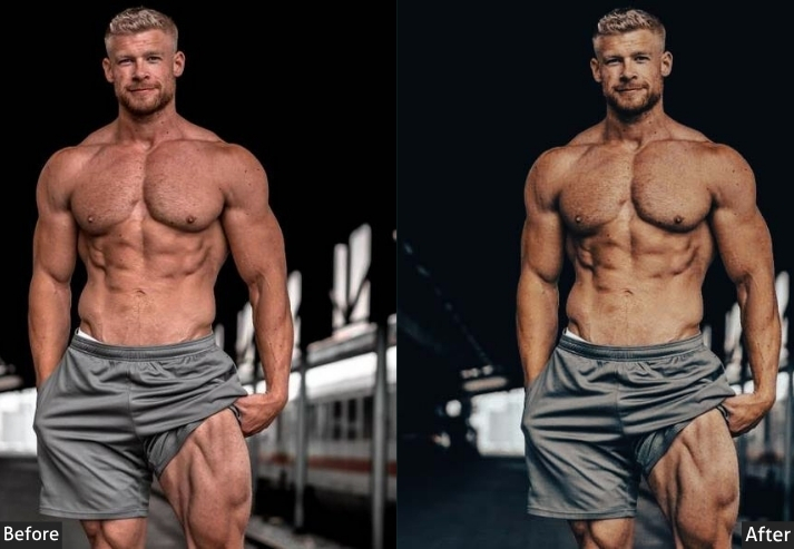
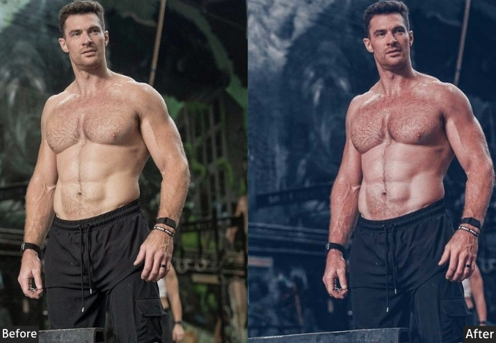
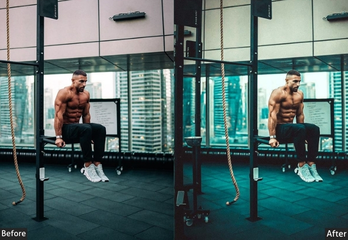
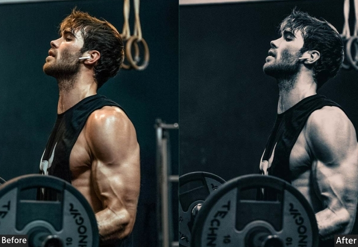
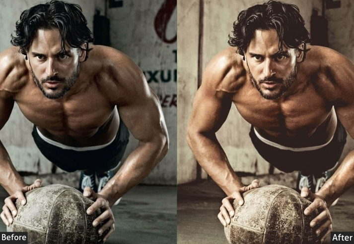
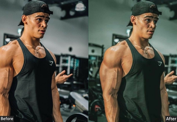
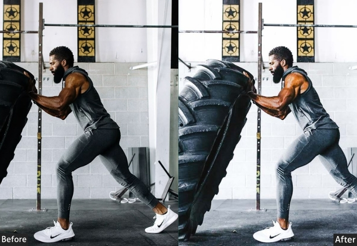
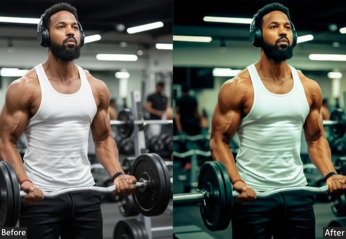
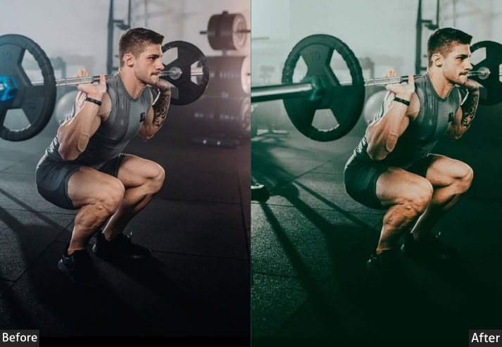
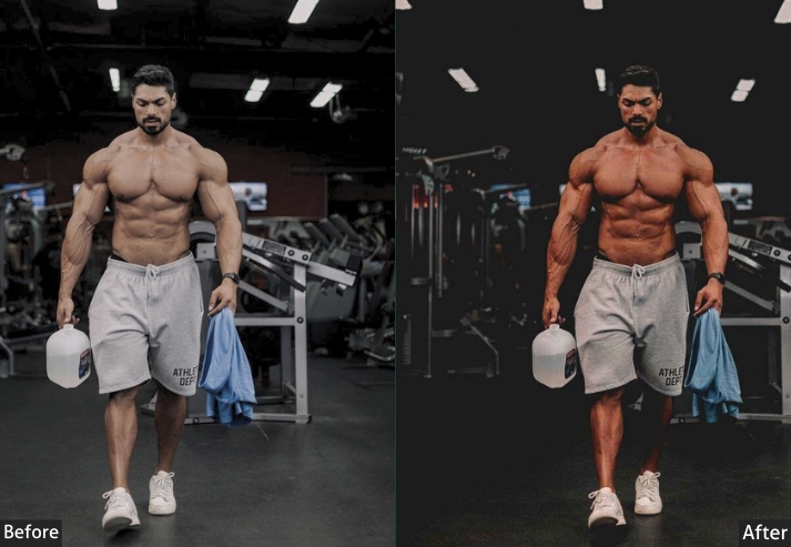
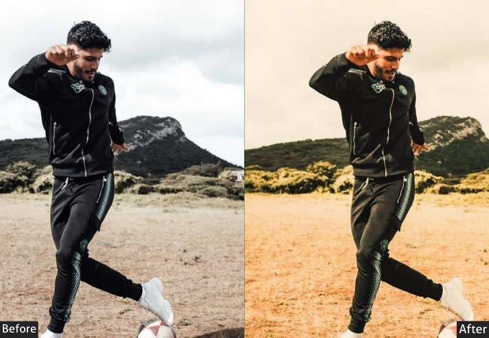
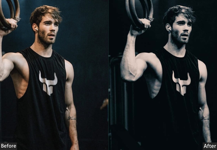
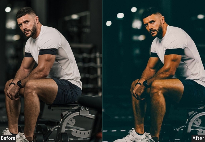
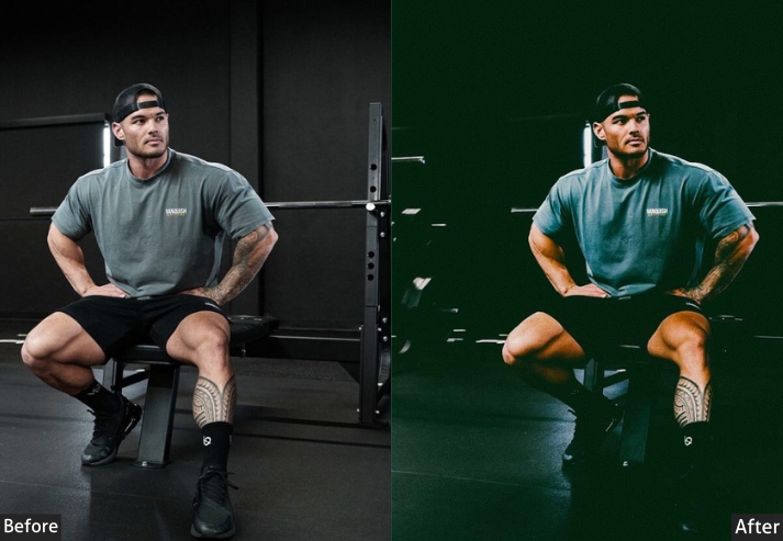
Fitness content needs energy without looking artificial: oversharpened, overcontrasted gym photos tend to read more like stock photography than real progress. This set balances muscle definition and motivating color with a natural finish, including a dedicated look built for before/after transformation tracking.
Best for: Personal trainers, fitness influencers, gym brands, workout content.
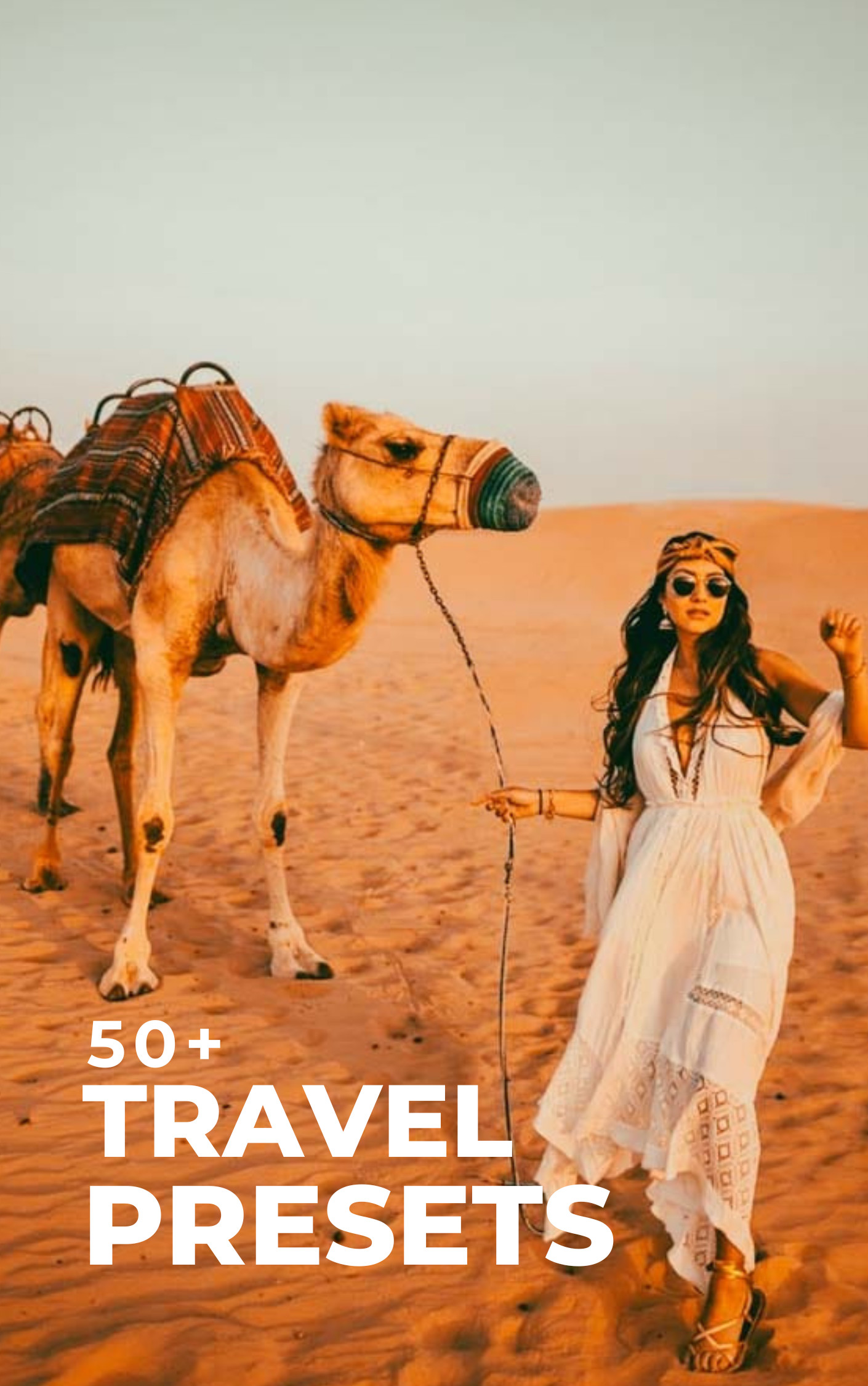
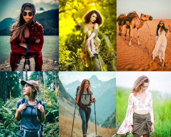
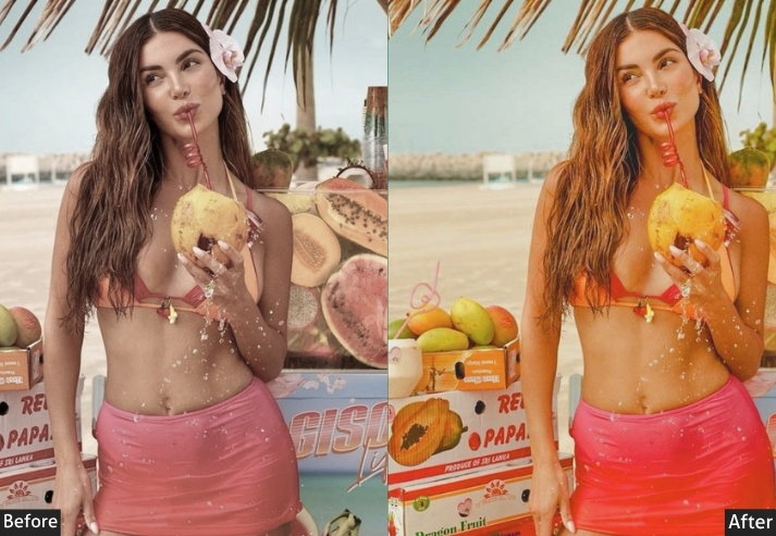
8. TRAVEL (50+ Presets)
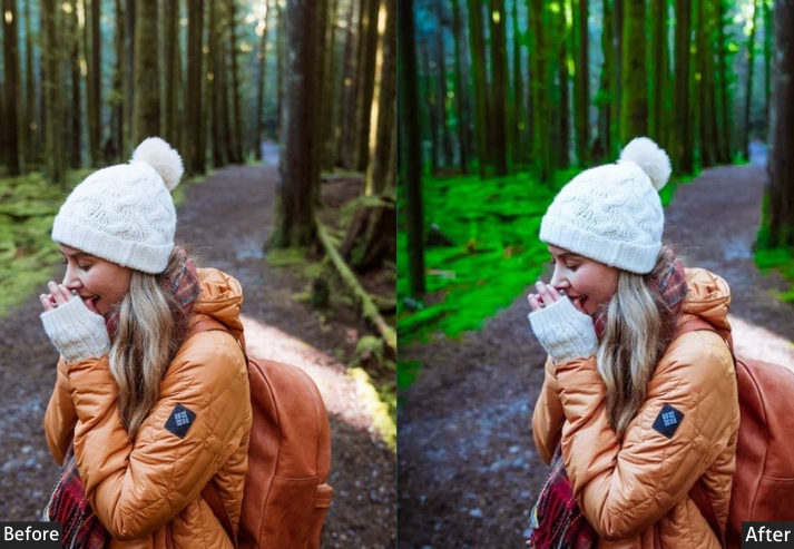
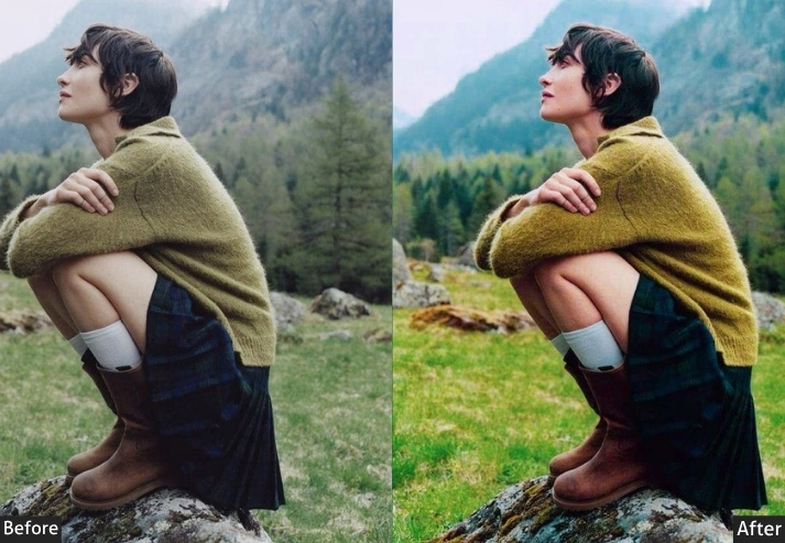
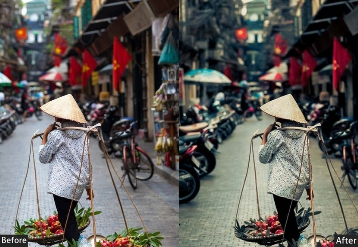
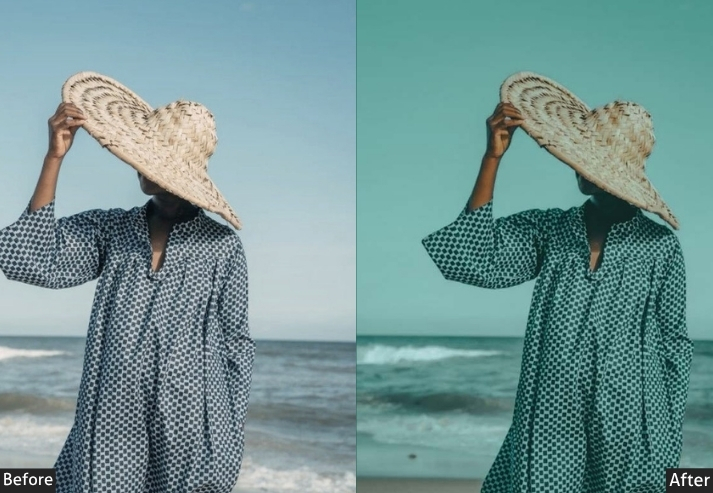
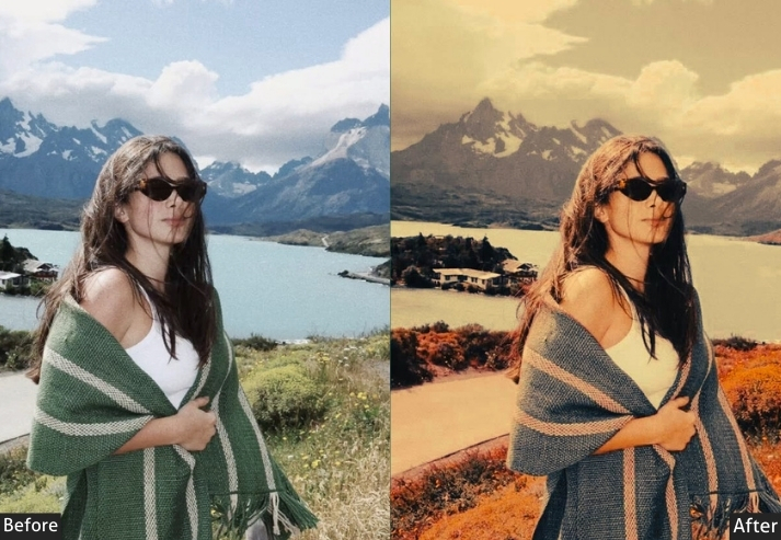
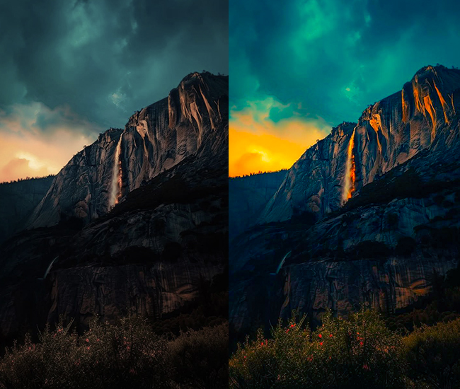
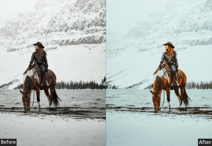
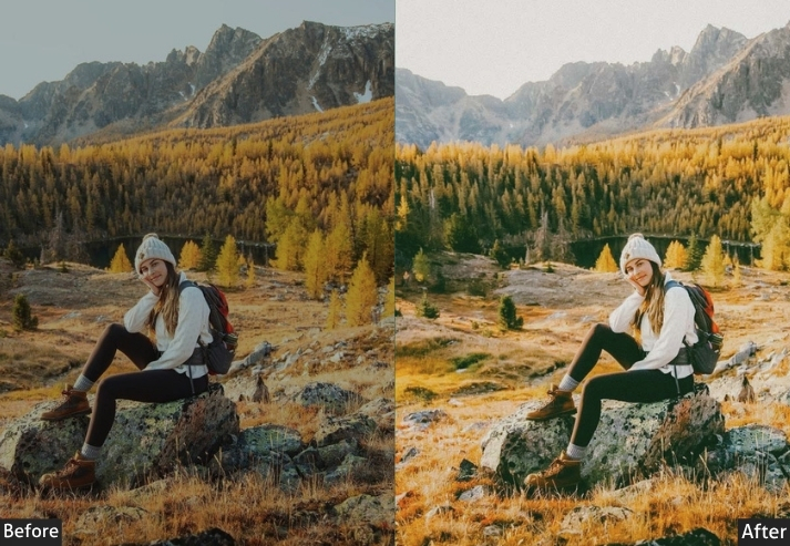
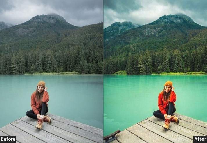
Travel content is competing with millions of near-identical sunset shots. This set is built to add a consistent visual signature across totally different locations and lighting conditions, from mountain adventure shots to warm, colorful street-market scenes.
Best for: Travel bloggers, digital nomads, wanderlust content.
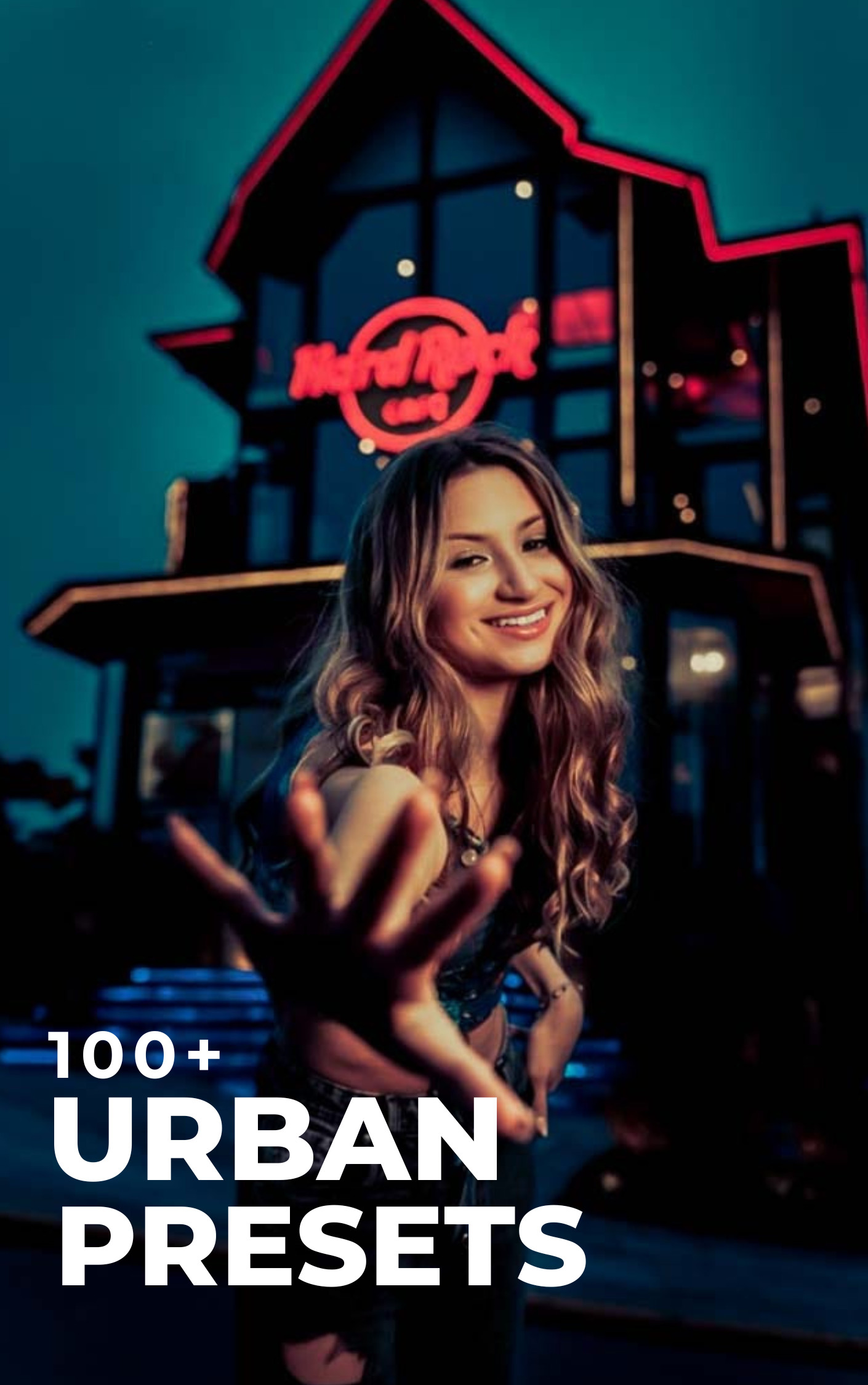
9. URBAN (100+ Presets)
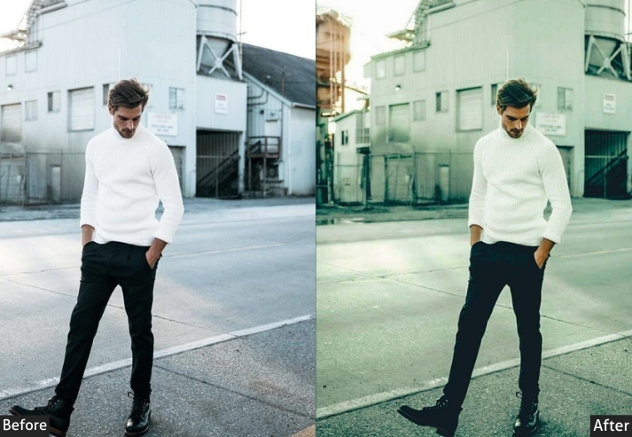
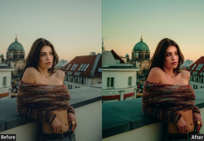
Urban and architectural photography lives or dies on contrast and color accuracy; a slightly off-white balance or crushed shadows can make a clean building look muddy. This set is built around strong line definition and mood, from clean modern minimalism to moodier industrial and night-city grading.
Modern City Life (25) – Downtown energy, metropolitan mood.
Industrial Vibes (20) – Warehouse aesthetic, factory chic, raw materials.
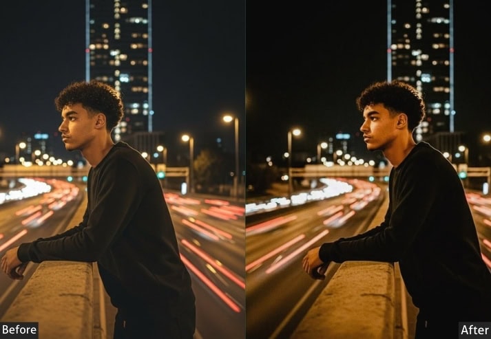
City at Night (20) – Nightlife glow, skyline silhouettes, bokeh lights.
I’m a beginner photographer, and this made editing so much easier. I don’t spend hours adjusting tones anymore, yet my pictures still look professional.
Rated 5 out of 5
Gayane Krylova –
I take a lot of indoor portrait shots, and lighting is usually a problem. These presets fix skin tones beautifully while keeping the background natural.
Rated 5 out of 5
Daniela Montaño –
I’d been creating content for almost two years, grinding out posts with no consistent look. Brands kept passing on me during negotiations, and I couldn’t figure out why my engagement was solid, my niche was clear. Turned out my feed looked chaotic. Once I found the right lifestyle warm-tone editing approach in this collection, everything snapped into a coherent visual identity. Within 60 days, I closed two paid brand partnerships with companies I’d been pitching for months. They both mentioned my ‘clean, consistent aesthetic’ in the onboarding call. That’s entirely due to the editing shift.
Rated 5 out of 5
Gregg Barnett –
I photograph cities: Tokyo, London, NYC, Marrakech. Not tourist shots, real street life. The problem with street photography is that most editing tools push you toward either over-processed HDR drama or washed-out film simulation that just looks aged. I wanted something cinematic but grounded. The urban street collection hits this balance exactly. The shadows hold detail, the skin tones on passersby stay natural, and the midtone contrast gives the image weight without feeling Instagram-filtered. I printed a 10-image Tokyo series for a gallery show, and every visitor asked about my editing process. The honest answer is: one click and minor tweaks.
Rated 5 out of 5
Imelda Almaraz –
My nighttime city shots used to be noisy and dull. Now they have a clean, cinematic glow that makes them look professional.
Rated 5 out of 5
Stavros Balla –
My portrait photography clients noticed the improvement immediately. Skin tones look natural, and the mood feels more premium.



Sandro Lino –
I’m a beginner photographer, and this made editing so much easier. I don’t spend hours adjusting tones anymore, yet my pictures still look professional.
Gayane Krylova –
I take a lot of indoor portrait shots, and lighting is usually a problem. These presets fix skin tones beautifully while keeping the background natural.
Daniela Montaño –
I’d been creating content for almost two years, grinding out posts with no consistent look. Brands kept passing on me during negotiations, and I couldn’t figure out why my engagement was solid, my niche was clear. Turned out my feed looked chaotic. Once I found the right lifestyle warm-tone editing approach in this collection, everything snapped into a coherent visual identity. Within 60 days, I closed two paid brand partnerships with companies I’d been pitching for months. They both mentioned my ‘clean, consistent aesthetic’ in the onboarding call. That’s entirely due to the editing shift.
Gregg Barnett –
I photograph cities: Tokyo, London, NYC, Marrakech. Not tourist shots, real street life. The problem with street photography is that most editing tools push you toward either over-processed HDR drama or washed-out film simulation that just looks aged. I wanted something cinematic but grounded. The urban street collection hits this balance exactly. The shadows hold detail, the skin tones on passersby stay natural, and the midtone contrast gives the image weight without feeling Instagram-filtered. I printed a 10-image Tokyo series for a gallery show, and every visitor asked about my editing process. The honest answer is: one click and minor tweaks.
Imelda Almaraz –
My nighttime city shots used to be noisy and dull. Now they have a clean, cinematic glow that makes them look professional.
Stavros Balla –
My portrait photography clients noticed the improvement immediately. Skin tones look natural, and the mood feels more premium.